What is Kandinsky Composition (1913)?
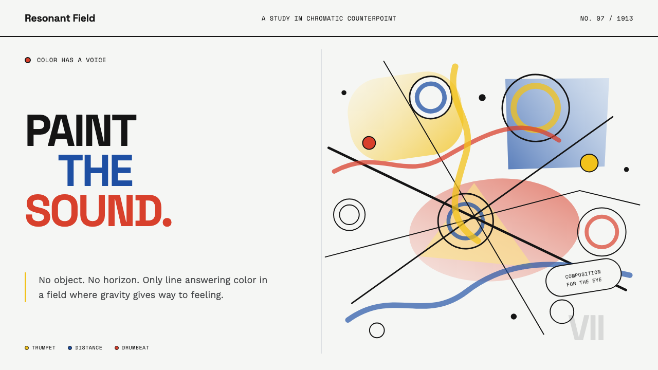
Kandinsky Composition (1913) treats color like sound — primary washes, hollow circles, and black diagonals colliding off-grid the way musical chords collide in counterpoint.
Kandinsky Composition (1913) in brief
In 1913 Munich, Wassily Kandinsky painted among the first canvases with no recognizable subject at all — only floating circles, slashing black diagonals, and clanging chords of yellow, blue, and red set loose across a luminous, near-white ground. This system captures that moment: painting cut free from the visible world, where color and line become a language of feeling and every mark answers another the way a musical phrase answers a preceding one.
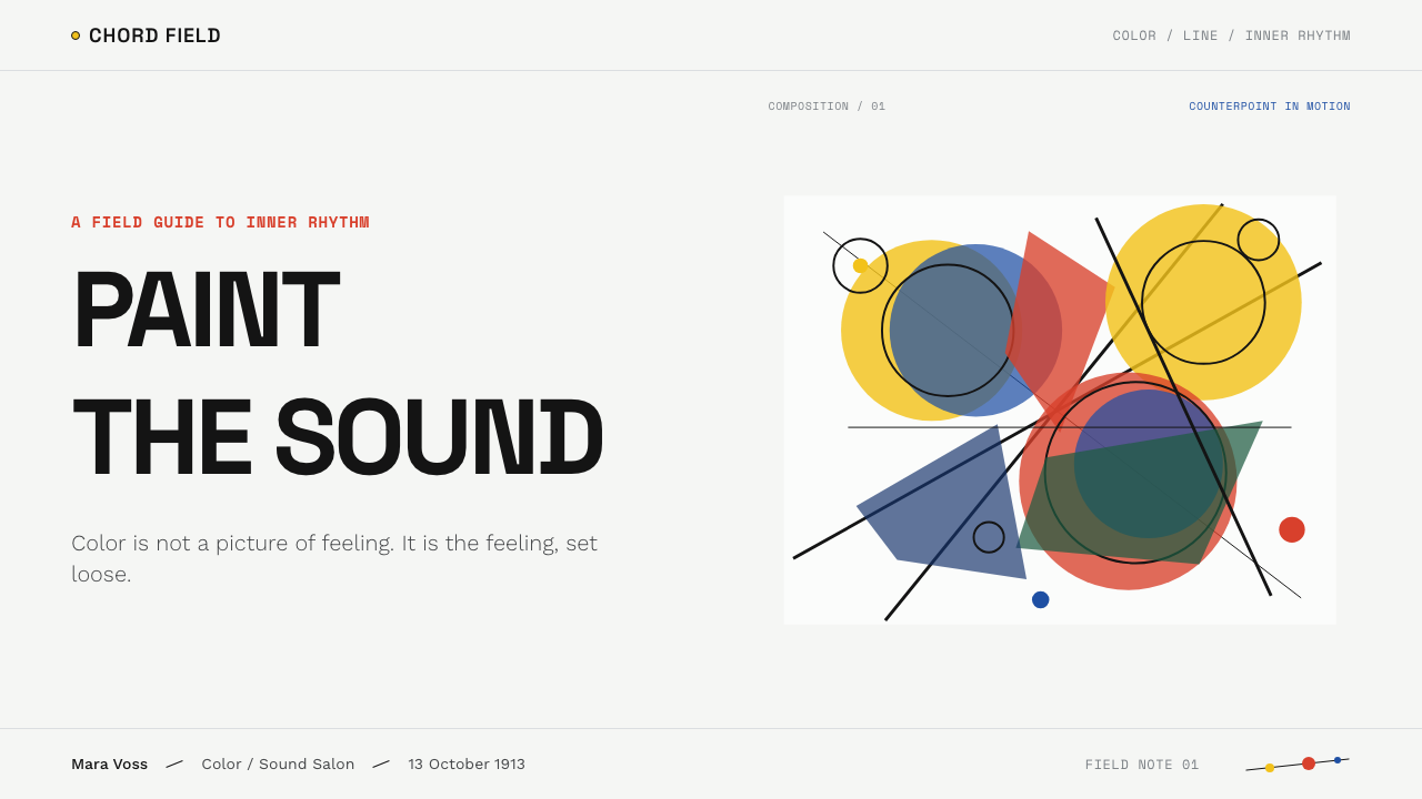
A cool, pale canvas holds hovering hollow circles, gestural black whip-lines, and translucent washes of primary color that collide and overlap like brushed oil, one wash showing faintly through another rather than sitting in a flat, opaque block. Kandinsky treated color the way a composer treats a musical note: capable of producing a chord when placed beside another color, or a dissonance when the pairing clashes, independent of what, if anything, the shapes were meant to depict.
Nothing in the system is centered and nothing is symmetrical. Circles, lines, and washes sit off the grid, weighted against one another the way a musical phrase is balanced against its answer rather than mirrored. The result is controlled chaos tuned to feeling rather than to any object it might resemble — energetic, unresolved, and deliberately alive.

Where does Kandinsky Composition (1913) come from?
In 1911, Kandinsky co-founded Der Blaue Reiter — The Blue Rider — an expressionist group of artists based in Munich, together with the painter Franz Marc. The group rejected the naturalistic representation still practiced by Impressionism, arguing instead for an art that expressed inner, spiritual truth through color and form rather than through recorded appearance. Even the group's name, drawn from Kandinsky's own affection for horsemen imagery and from blue as a color he associated with spiritual depth, signaled that ambition from the outset.
Much of the group's work and thinking developed in and around Murnau, a small town in Bavaria, where Kandinsky worked alongside fellow artists Gabriele Münter, his partner at the time, as well as August Macke and Paul Klee. Together they formed a loose but influential circle testing how far a painting could move away from recognizable subject matter while still carrying real emotional weight.
In 1911, Kandinsky published a theoretical treatise arguing that color functioned analogously to musical sound, capable of producing emotional chords and dissonances of its own, independent of whatever subject matter a painting might otherwise depict. That belief in a correspondence between color, sound, and inner feeling underlies the entire Composition series' logic — each canvas is numbered like a piece of music rather than titled after a scene, treating the act of painting as closer to composing than to depicting.
1913 marked the peak of this ambition, producing Composition VI and Composition VII, the two largest and most fully abstract canvases of the period. The following year, the outbreak of the First World War scattered the Blue Rider circle: Macke and Marc were both killed in the war, effectively ending the group's collective activity, while Kandinsky, a Russian citizen, was forced to leave Germany.
What defines the Kandinsky Composition (1913) look?
Color as Sound
Color pairings are treated the way musical notes are treated: two colors placed together can produce a felt chord, or a felt dissonance if the pairing clashes, independent of what shape carries the color. Composition means tuning these relationships, not arranging recognizable objects.
Hollow Circles
Circles appear as outlined rings rather than solid filled disks, floating free of any fixed position on the canvas. Their hollowness keeps them light and permeable rather than anchoring the composition like a solid weight.
Black Whip-Lines
Gestural black diagonals slash across the composition with the energy of a single confident hand movement, functioning as directional force rather than as a border or outline around any shape.
Translucent Overlap
Washes of primary color overlap so that one is faintly visible through another, the way brushed oil glazes interact, rather than sitting as flat, opaque, non-interacting blocks.
Off-Grid Asymmetry
Nothing is centered and nothing mirrors anything else. Balance is achieved through the felt weight of shapes and colors set against one another, the way a musical phrase balances against its answer rather than repeating it.
Pale Luminous Ground
A cool, near-white ground underlies the whole composition, functioning like a lit stage rather than an empty backdrop — it is bright enough that every color and line placed on it reads as active and charged.

Who shaped Kandinsky Composition (1913)?
The Russian-born painter who produced the Composition series and co-founded Der Blaue Reiter, arguing in his own theoretical writing that color functions like musical sound and can carry spiritual and emotional meaning independent of recognizable subject matter.
The painter who co-founded Der Blaue Reiter alongside Kandinsky, sharing the belief that art should express inner spiritual truth through color and form. He was killed during the First World War, contributing to the group's dissolution.
A painter and Kandinsky's partner during this period, working alongside him and other Blue Rider artists in Murnau, Bavaria, as part of the circle exploring how far abstraction could move from recognizable subject matter.
A painter associated with the Blue Rider circle in Munich, part of the loose but influential group testing how color and form alone could carry emotional and spiritual meaning without depicting a recognizable scene.
A painter within the Der Blaue Reiter circle active in Munich and Murnau during this period, whose work shared the group's interest in color's expressive power. He was killed during the First World War, alongside Franz Marc.
How do you use Kandinsky Composition (1913) today?
This system rewards contexts that want to feel energetic, expressive, and emotionally charged rather than calm or orderly — music and arts brands, creative-tool products, and editorial work built around ideas of feeling and expression all suit it well.
For presentation slides, a cover works well with a pale, near-white field holding one or two hollow circles and a single confident black diagonal, with primary-color washes kept translucent rather than solid. Content slides should resist a centered, symmetrical layout in favor of off-grid weighting, and data visuals can treat each data series the way the system treats color — as a voice in a chord rather than a flat, interchangeable category.
For web interfaces, the off-grid asymmetry principle works best applied selectively — a hero section or a marketing page can hold the full energy of colliding shapes and diagonals, while functional areas like navigation or forms keep enough order to remain usable, borrowing only the translucent color-wash treatment rather than the full compositional chaos.
For editorial and marketing work, the style supports headlines and imagery that feel dynamic and unresolved rather than static — full-bleed sections where a diagonal line or a hollow circle motif crosses a color block, treated as a single gesture rather than a repeating decorative pattern.
A common mistake is treating this system as simply 'colorful abstract shapes' and centering them symmetrically for balance — that directly contradicts the off-grid, counterpoint logic the style depends on. Another is filling circles and washes as flat opaque colors rather than translucent ones, which loses the layered, brushed-oil quality that gives the system its depth.
Kandinsky Composition (1913) — FAQ
What does it mean to say color 'becomes sound' in this style?
Kandinsky argued that placing colors together produces an effect analogous to combining musical notes — some pairings feel like a harmonious chord, others like a dissonance, and this happens independent of whatever shape carries the color. Designing with this system means tuning color relationships for that felt effect, the same way a composer tunes a chord, rather than choosing colors purely for decoration.
Why is the composition always off-grid and asymmetrical instead of centered?
Centering and symmetry produce a static, resolved feeling, which is the opposite of what this style is after. Off-grid weighting — balancing a shape on one side against a different shape's felt weight on the other, rather than mirroring it — keeps the composition feeling alive and unresolved, the way a musical phrase stays in tension until it is answered rather than simply repeated.
Why did Kandinsky move away from recognizable subject matter entirely?
He believed that depicting recognizable objects tied a painting to the visible, physical world and limited it to representing appearance rather than inner feeling. Removing subject matter let color and line operate as a direct, spiritual language of their own — which is why the Composition series is numbered like music rather than titled after a scene.
What happened to the Der Blaue Reiter circle that produced this style?
The group's collective activity effectively ended with the outbreak of the First World War in 1914. Franz Marc and August Macke, two of its core members, were both killed in the war, and Kandinsky, as a Russian citizen, was forced to leave Germany — bringing the intense, concentrated period that produced Composition VI and VII to an abrupt close.
Related design styles
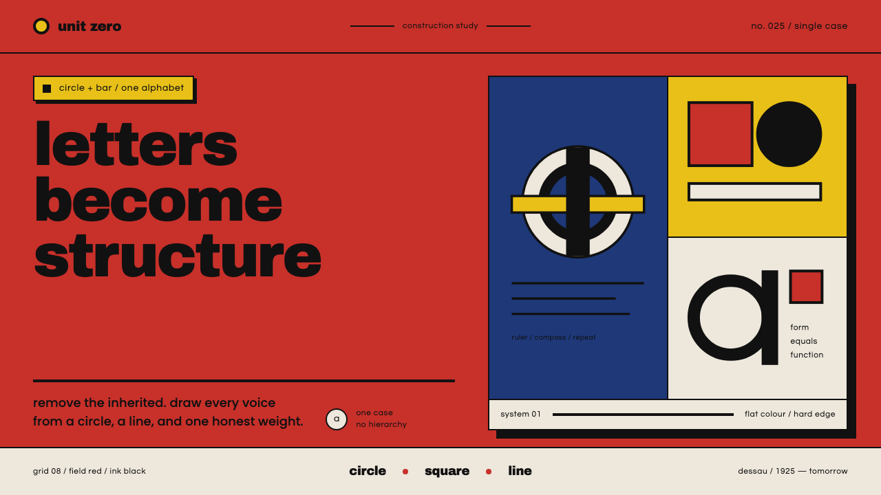 Bayer Universal BauhausLetters become structure. Bauhaus red, primary blocks, and black circle-bar f…
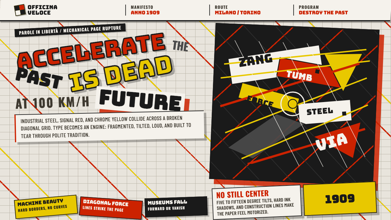 Italian Futurism (Marinetti 1909)Speed murders tradition. Signal red and chrome yellow slash a broken diagonal…
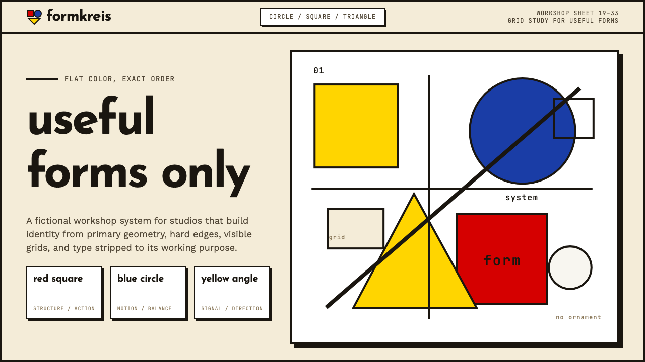 Bauhaus WeimarForm follows revolution. Primary red-blue-yellow on cream, hard shadows, no o…
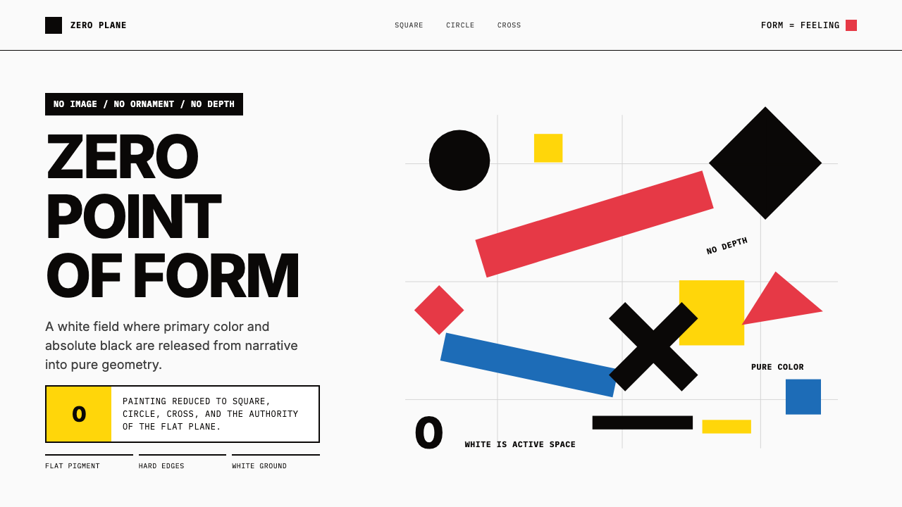 Malevich SuprematismGeometry declares zero. Red, yellow, blue and black blocks float on active wh…
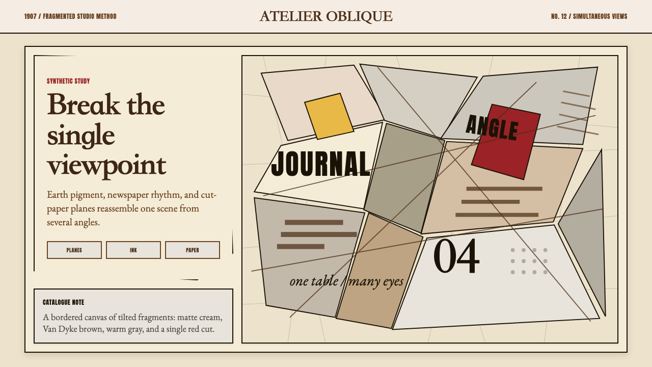 Picasso CubismSingle sight is shattered. Cream collage paper fractures brown-gray planes wi…
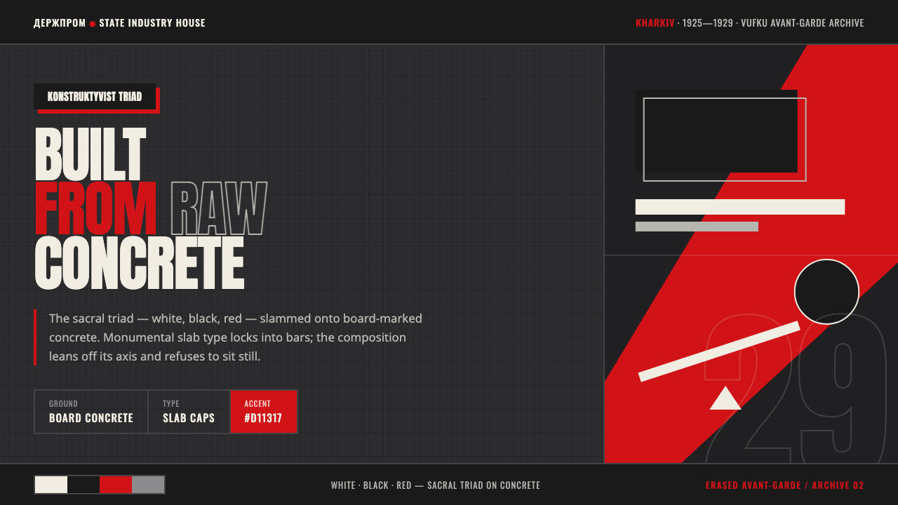 Kharkiv Constructivism (Derzhprom)Monumental, made structural. White-black-red triad on raw concrete, slab caps…