What is Eretz Israel Tourism Poster?
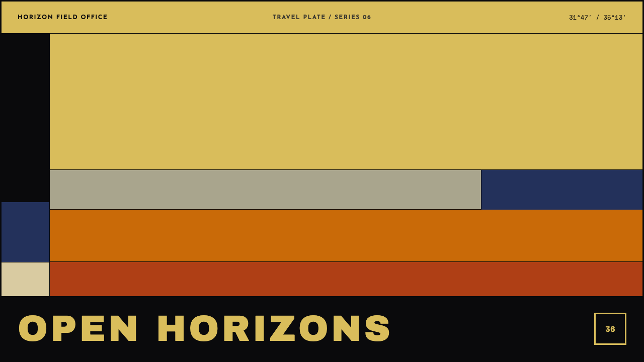
Eretz Israel Tourism Poster reduces a landscape to conviction: a few flat horizontal bands, six colours, hand-drawn geometric capitals, and a golden-ochre sky that fills most of the sheet.
Eretz Israel Tourism Poster in brief
Eretz Israel Tourism Poster is a light design style built from a single piece of interwar commercial art: Franz Krausz's 1936 six-colour stone lithograph, which carries just two words of English, Visit Palestine. The view looks west from the Mount of Olives. A tree in silhouette stands at the left edge, the walls of the Old City and the Dome of the Rock cross the centre, and above them a flat golden-ochre sky takes more of the sheet than everything else combined. The style's name uses the Hebrew term for the land, while the poster's own English lettering uses the name of the territory as it stood under the Mandate.
What the style takes from the sheet is discipline rather than scenery. The landscape is reduced to a handful of flat horizontal bands. Colour is limited to six, each laid down as a solid area. The lettering consists of hand-drawn geometric capitals, set in one widely spaced line across a band of ink-black at the foot of the page. There is no gradient, no airbrushed softness and no photographic tone anywhere. The city, the domes and the cypress trees survive only as outlines, and the sky is left almost entirely as a single field.
The result is a style of unusual confidence. A great deal of the page is deliberately given to one colour, and the subject is trusted to be recognisable from a few strokes. It is a poster in the old sense: a design that has to be read from across a street, understood in a glance and remembered afterwards, with the landscape reduced to a conviction about what a place should feel like.
Where does Eretz Israel Tourism Poster come from?
Between the world wars the travel poster was one of the most inventive corners of commercial art. Destinations were sold through compact, confident images printed by lithography, in which a few flat colours took the place of detailed illustration. The style's period runs from 1934 to 1948, in Mandatory Palestine, with Jerusalem, Tel Aviv and Jaffa as its cities, and the reference sheet itself was printed in 1936. The 1935 in the theme's identifier is a label; the sheet it studies is dated 1936, within that wider window.
The poster was made for the Tourist Development Association of Palestine and printed by Lith. Monsohn, the lithographic printer credited on the sheet. Franz Krausz painted in gouache, often from photographic studies that his wife made, and then flattened the result into planes that a lithographic stone could hold. This is a crucial detail. In colour stone lithography each colour is drawn on its own surface and printed in turn, so a limit of six colours is a technical fact, and the flatness of every area is a consequence of the process rather than a taste for simplicity.
The lettering belongs to a second tradition. Geometric grotesque capitals, drawn from circles, straight strokes and an even weight, became a hallmark of modern commercial design between the wars, because they could be read at distance and drawn quickly by hand. The style's sources also place the sheet in the orbit of Bauhaus-trained émigré commercial design, the current of designers who carried modern, geometric habits into advertising in new places. The point is not a biography of any one person, but the way that modernist vocabulary reached the travel poster.
Together these streams give the style its system: banded horizons, six colours, hand-drawn geometric capitals and no gradient anywhere. The theme's name uses the Hebrew term for the land, and the lettering on the poster uses the English name that tourist bodies of the period employed. Anyone using the style should treat it as a period travel poster, a designed object of its time, and let the formal discipline carry the work rather than the politics of any one name for the place.
What defines the Eretz Israel Tourism Poster look?
The golden-ochre field
A flat golden-ochre sky takes more of the sheet than everything else combined. This is the style's boldest decision: instead of filling the page with detail, it leaves most of it to a single warm colour. The field gives the poster its mood, a sense of heat and vast light, and it gives the eye somewhere to rest. In use, the rule is to resist crowding the sky. The empty area is not wasted space but the main subject.
Banded horizons
The landscape is stacked as a handful of flat horizontal bands: sky above, the wall of the city across the middle, ground and shadow below, then the dark band for the title. Each band is a single colour with a hard edge against its neighbour. The horizon becomes the organising structure of the whole layout, and everything else rests on those lines. Bands also divide a page cleanly into zones that can be read in sequence.
Six-colour economy
The palette is limited to six colours, a restriction that comes straight from stone lithography, where each colour needs its own printing. Colours are used as solid areas and sit directly beside one another without blending. This economy makes the poster legible and gives it a distinct, almost hand-printed warmth. In digital work the principle is to commit to a short list of flat fills and to resist adding extra tints.
Silhouette vocabulary
The city, the domes and the cypress trees are reduced to outlines that read as dark or light shapes against their bands. There is no texture on the walls, no individual leaves and no window-by-window detail. The silhouette is enough because the viewer already knows what the shape means. This gives the style its economy of drawing: a single confident contour carries a whole landmark, and recognisability replaces description.
Geometric capitals on a black band
The title is set in hand-drawn geometric capitals, spaced widely, in one line across a band of ink-black at the bottom of the sheet. The letters are built from circles and straight strokes with an even weight, and they read from a distance. The dark band does two jobs: it grounds the composition and it gives the lettering a clear, high-contrast home. Lowercase letters and multiple lines of title would break the effect.
No gradient, no photographic tone
There is no gradient, no airbrush softness and no photographic tone anywhere in the system. Even though the artist worked from photographic studies, the final image is a set of flat planes. This absence is the style's signature, and it is the quickest test of authenticity: if a smooth fade, a soft shadow or a photograph appears, the page has left the system and become something more generic.
Who shaped Eretz Israel Tourism Poster?
Krausz is the designer of the 1936 Visit Palestine lithograph on which the style is based. He painted in gouache, often from photographic studies made by his wife, and then flattened the result into planes a stone could hold. His real contribution to the style is the method itself: observation first, then deliberate reduction until only the structure, the silhouette and the single large field remain.
The Tourist Development Association of Palestine is the body for which the poster was produced, and its name stands among the key figures because the sheet is an advertisement before it is a work of art. Its needs explain the style: a destination had to be recognised in a glance, from a distance, by travellers who knew little about it. The poster sells a place through clarity and atmosphere, not through detail.
Lith. Monsohn is the lithographic printer credited on the sheet. Its place in the style is a reminder that this look was made on stone, by craft: each flat colour was a separate printing, and the shapes had to survive that process. The printer is the unseen co-author of the flatness, the registration and the crisp edges that define the system.
How do you use Eretz Israel Tourism Poster today?
The style suits subjects built on place and atmosphere: travel and tourism, hospitality, heritage and museum projects, cultural festivals, regional food and craft brands, and any story that benefits from a sense of sun, distance and vintage confidence. It works best where a single image or idea must carry the whole page, and it is a poor choice for dense, data-heavy products.
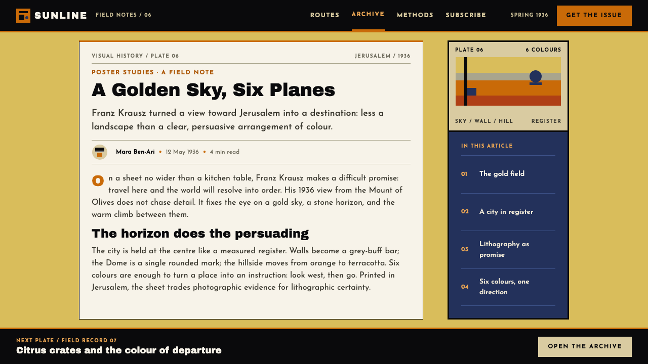
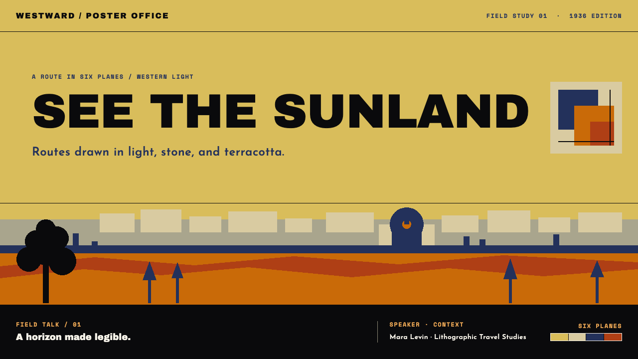
On slides, a cover can take the poster's structure directly: a vast single-colour field in golden ochre, one or two banded horizons, a small silhouette, and the title in widely spaced capitals on a dark band at the bottom. Content slides use bands as section dividers, with a short headline on the dark band and a calm field above for text. Data slides can express comparisons as stacked horizontal bands, each a flat colour, with no gradients in the fills.
In web interfaces, the style fits tourism sites, hotel and tour booking pages, cultural institution sites and campaign landing pages. A hero can be a flat colour field with a banded horizon and one silhouette, with the booking call to action placed on a dark band. Keep body sections plain and wide, use the six flat colours consistently, and avoid shadows and rounded, glossy buttons. Navigation works well as a single line of widely spaced capitals.
For editorial and marketing work, the poster idea is ideal for destination features, posters, covers and exhibition graphics. Lead with a large field and a single confident silhouette, put the title on a dark band, and let the captions remain short. Campaigns benefit from the style's visibility at a distance: it holds up on banners, signage and thumbnails because its shapes are simple and its contrasts are clear.
The most common mistake is to soften it. Adding gradients, soft shadows or photographic textures removes the very discipline the style is built on. A second mistake is to crowd the sky, filling the largest area of the page with text and detail that the design meant to leave empty. A third is to use more than the six colours, or to set the title in lowercase or in several lines. When the system loosens, the poster stops being a poster and becomes a generic travel template.
Eretz Israel Tourism Poster — FAQ
What exactly is the poster this style is based on?
It is Franz Krausz's Visit Palestine, a six-colour stone lithograph printed in 1936 and carrying two words of English. It shows a view west from the Mount of Olives, with a tree in silhouette at the left, the Old City walls and the Dome of the Rock across the middle, and a large flat golden-ochre sky above. The style distils its structure and discipline rather than copying the image.
Why does the theme say 1935 when the poster is from 1936?
The 1935 in the theme's identifier is a label, while the sheet it studies was printed in 1936. The style's period runs from 1934 to 1948, so both dates sit comfortably inside it. If you cite the poster itself, use 1936; if you refer to the style, treat the period range as the safer description.
Can the style be used for other destinations?
Yes. Its method is general: pick one place, reduce it to a few flat bands, choose six colours, commit most of the page to one warm field and let a single silhouette carry the identity. It works well for coastlines, deserts, mountain towns and historic cities. The key is to keep the system, rather than to copy the original colours or landmarks.
How does it relate to Bauhaus design?
The style's sources place the poster in the current of Bauhaus-trained émigré commercial design: the geometric lettering, flat colour and reduced forms echo modernist habits that spread through advertising between the wars. It is not a Bauhaus pastiche, though. Its palette is warm, its subject is a place rather than an idea, and its flat bands come from lithography as much as from theory.
Is the style suitable for dashboards or data-heavy interfaces?
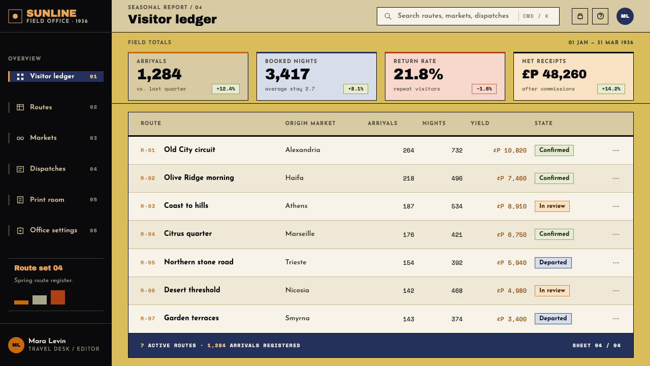
Rarely. Its strength is a big, simple, memorable image, and dense interfaces need many small elements and subtle hierarchy. It can supply a landing page, a report cover or a section divider, and it can shape simple banded charts, but the work inside the product should usually be in a quieter system. Use the poster for the front door and not for the whole house.
Related design styles
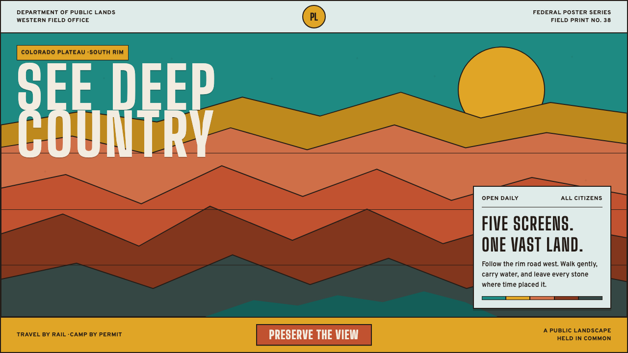 Grand Canyon WPA (1938)Public grandeur in five screens. Turquoise, ochre and terracotta stack in har…
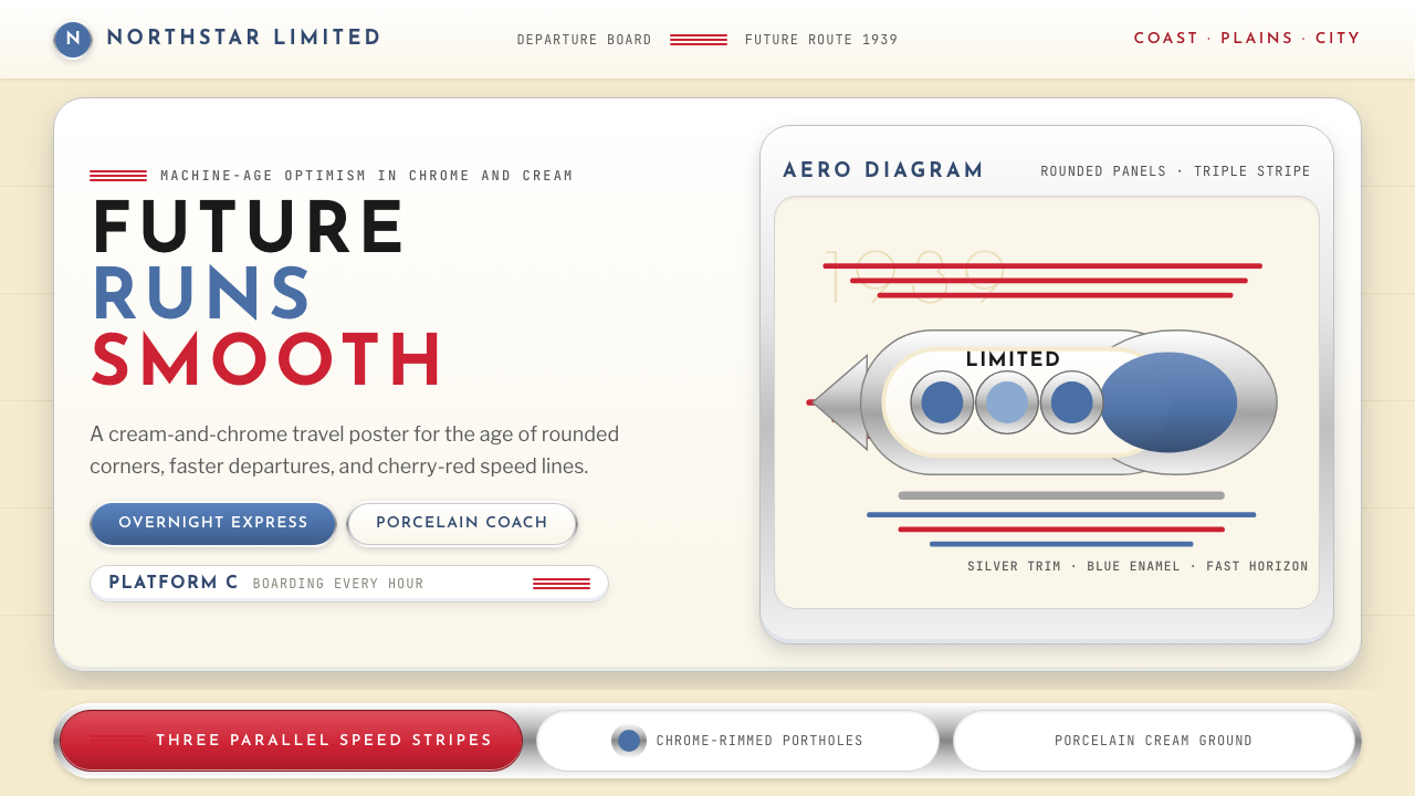 Streamline Moderne (1930s)Optimism made aerodynamic. Cream ground, chrome ovals, and cherry stripes dri…
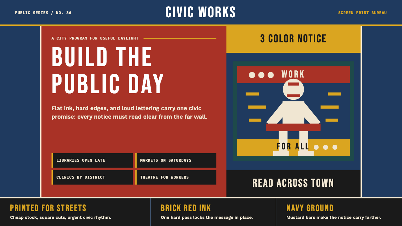 WPA Poster (Federal Art Project, 1936)Civic urgency in ink. Navy, brick red, mustard bands and Bebas Neue shout acr…
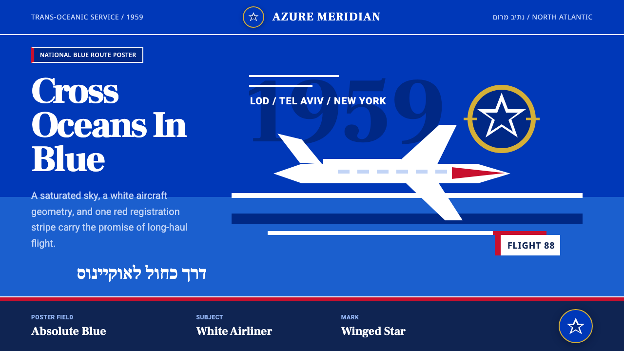 El Al Israel AirlinesNational blue takes command. White aircraft geometry cuts a flat jet-age post…
 Gulf Racing LiverySpeed made disciplined. Powder blue, orange stripe, black roundel, strict gri…
 Kuwait Oil-Era ModernismOil-boom optimism in concrete. Petrol-and-sky tower stripes band warm desert-…