What is Wednesday — Nevermore Academy?
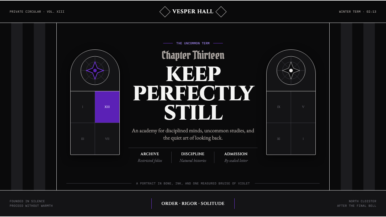
Nevermore Academy makes darkness architectural: bone-white capitals, rigid symmetry, and a single violet interruption held under absolute control.
Wednesday — Nevermore Academy in brief
Wednesday — Nevermore Academy is a dark gothic-academia visual language built from severe contrast and disciplined absence. Its image is a boarding school portrait reduced to ink-black grounds, bone-white engraved capitals, hard vertical stripes, and one stained-glass violet pane. The result is neither cozy scholarly nostalgia nor theatrical horror. It is dry, literary, watchful, and deliberately drained of warmth.
The style treats monochrome as structure rather than atmosphere alone. Black creates enclosure, white supplies the carved, institutional voice, and striped divisions make the page feel ruled and architectural. Violet is the sole exception: it appears as if stained glass has cast a narrow wound of color across an otherwise deadened room. Because it is so scarce, it reads as a signal rather than decoration.
Its central compositional principle is cold symmetry. Elements should appear placed by an institution that values order, restraint, and silence. Yet the layout cannot become blandly ceremonial: one dark pane, offset title block, or violet interruption may disturb the balance. That controlled disturbance gives the system its Wednesday-like severity — a face held still while something unsettling moves behind it.
Where does Wednesday — Nevermore Academy come from?
The visual reference begins with the Addams lineage, which dates from 1938 onward. That lineage supplies a world of morbidity, deadpan wit, and domestic gothic sensibility rather than a conventional fantasy-school warmth. Nevermore Academy recasts those inherited attitudes through the image of an elite boarding institution: ceremonial, enclosed, old-looking, and emotionally unsentimental.
Wednesday premiered on Netflix in 2022 as an eight-episode series. The academy’s visual identity arrives within a contemporary screen production, but its design language deliberately reaches backward. Gothic academia, monochrome goth, and a revival of German-Expressionist feeling converge in a world where interiors appear formal, shadows feel structural, and architecture seems to watch the characters as closely as they watch one another.
The production is associated with MGM Television in the United States, while key academy material was filmed at Cantacuzino Castle in Bușteni, Romania. That combination matters aesthetically. The academy is presented as an American fictional institution, yet its physical setting carries the mass, stone, and inherited gravity that a purpose-built contemporary school would struggle to suggest. The design therefore feels staged for the present but anchored in an older, more imposing architectural imagination.
Tim Burton, Alfred Gough, Miles Millar, Colleen Atwood, and Mark Scruton are the key figures named in the source material for this world. Their presence situates Nevermore within an authored screen language rather than an anonymous trend board. The style is not simply dark academic decoration: it is a coordinated portrait of character, costume, setting, typography, and controlled color, all arranged to make institutional order feel both seductive and threatening.
What defines the Wednesday — Nevermore Academy look?
Black and Bone White
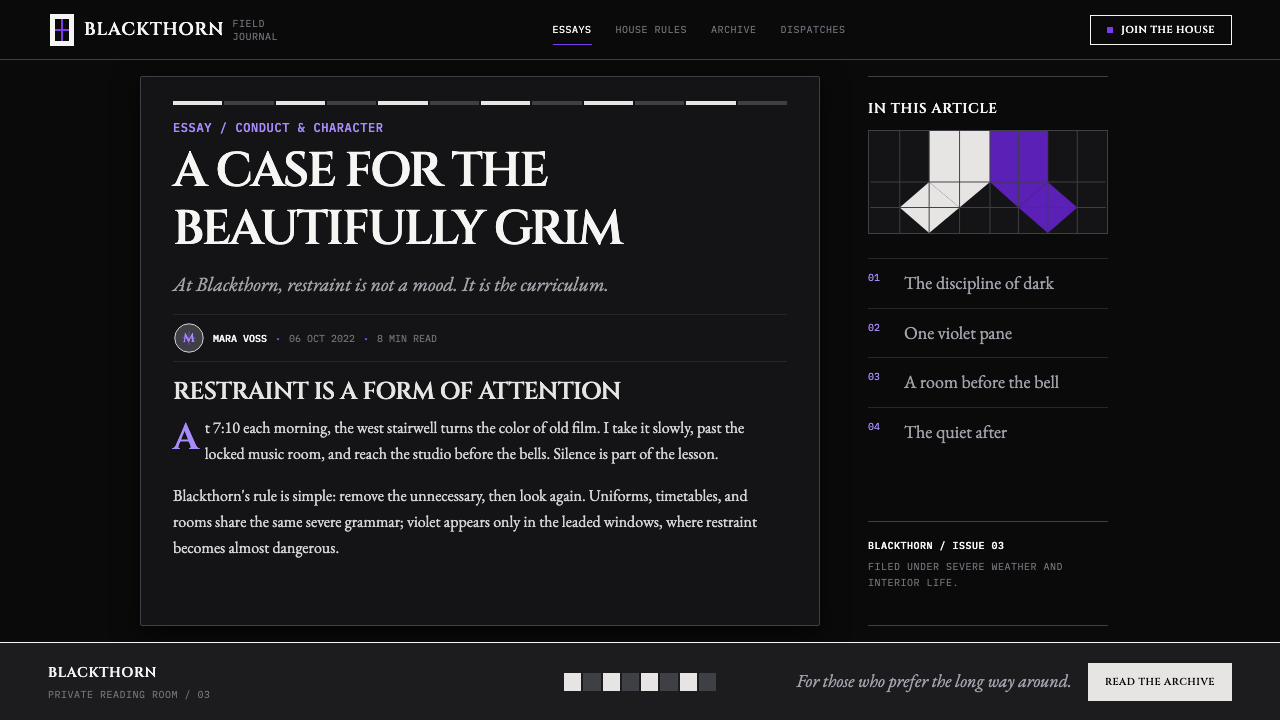
The palette begins with ink-black fields and bone-white lettering. Black should feel absorbent and enclosing, not glossy or luxurious. White should resemble engraving, chalk, bone, or weathered stone rather than a cheerful blank page. Their contrast creates the academy’s institutional chill and gives every title the force of an inscription.
Violet as a Wound
Violet is not a general accent color. It behaves like a stained-glass beam entering a sealed room: isolated, saturated in feeling, and sharply bounded. Use it for one pivotal pane, marker, selected state, or image interruption. When violet spreads across the composition, it loses the surgical precision that makes it unsettling.
Engraved Capitals
Display typography is bone-white, capitalized, and literary in bearing. It should look inherited from a school seal, memorial tablet, or carved lintel, with a grave rhythm that resists friendliness. Supporting text can remain quiet and readable, but the title must establish authority before the page offers explanation.
Vertical Discipline
Hard vertical stripes give the layout its spine. They can divide editorial columns, frame navigation, crop imagery, or simply stand as visual bars of restraint. Their role is architectural rather than ornamental: they make the page feel taller, narrower, and governed by rules that predate the viewer.
Cold Symmetry
Symmetry supplies ceremony and unease at once. Mirrored placement, centered emblems, and paired fields create a school-like formality, but the composition should avoid comfort. A single pane may darken, a title may shift, or violet may enter one side only. The break must be deliberate enough to feel like evidence.
No Warmth
The style excludes gold, cream, skin-toned softness, and any cue that turns the school into a welcoming heritage brand. Surfaces should remain cold, deadened, and emotionally spare. This is not darkness for spectacle; it is a refusal to soften the institution’s gaze or reassure the person encountering it.
Who shaped Wednesday — Nevermore Academy?
Tim Burton is named among the key figures associated with Wednesday — Nevermore Academy. In this visual context, the name locates the academy within a deliberately stylized gothic screen world: severe silhouettes, heightened architecture, deadpan darkness, and images that favor controlled oddness over natural warmth.
Alfred Gough is listed as a key figure for the source world. His inclusion helps identify Nevermore as a constructed narrative setting, not merely a collection of gothic motifs. The academy’s visual rules gain force because they support a world with its own social order, atmosphere, and dramatic pressure.
Miles Millar is also identified among the key figures. Within the style’s public reading, Nevermore’s controlled visual grammar reflects a setting where eccentricity is never allowed to dissolve the larger frame. Strange details remain more effective when rigid institutional structure holds them in place.
Colleen Atwood is named as a key figure in the material. Costume is inseparable from the academy’s visual identity because the world depends on silhouette, tonal restraint, and the refusal of ordinary warmth. Clothing, architecture, and typography all need to appear as parts of the same severe institution.
Mark Scruton appears among the named key figures. His inclusion underscores that Nevermore is experienced through environment as much as through character. The academy must feel spatially coherent: its black grounds, vertical divisions, pale inscriptions, and isolated violet light should imply rooms and corridors even on a flat page.
How do you use Wednesday — Nevermore Academy today?
For presentation slides, use the cover as an academy threshold: a black field, a centered or tightly framed bone-white title, vertical bars, and one contained violet pane can establish the world immediately. Content slides should keep the same discipline through clear columns and restrained labels. On data slides, charts should read as evidence posted in a forbidden archive; retain monochrome structure and allow violet to identify only the one fact that matters most.
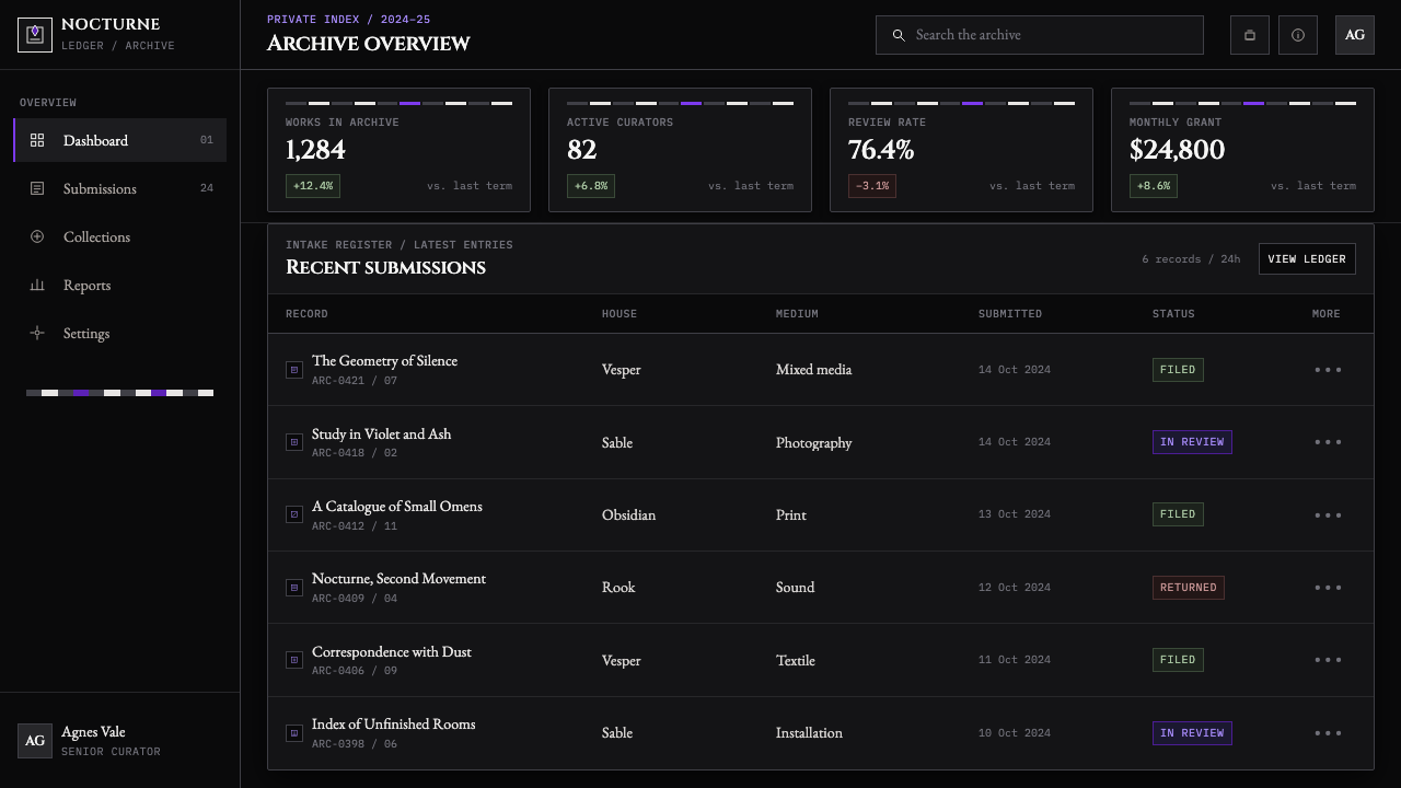
For web interfaces, this language suits dashboards, account spaces, research tools, and pricing pages that benefit from authority and hierarchy. Build the interface around dark panels, pale typographic anchors, and vertical divisions that make navigation feel architectural. A selected plan, urgent status, or active workspace may receive the violet interruption, but ordinary controls should remain quiet enough that the page never becomes a neon gothic theme.
For editorial and marketing work, let the system behave like a private-school dossier or a chapter opening in a dark novel. Use severe title pages, narrow reading columns, metadata set into ruled side areas, and image crops that preserve stone, shadow, windows, or silhouette. Marketing messages should be concise and declarative. The style is strongest when it withholds information slightly, inviting attention through atmosphere without sacrificing legibility.
The common mistake is to confuse this style with generic spooky decoration. Excessive purple, ornamental cobwebs, antique gold, cozy paper textures, playful Halloween symbols, and indiscriminate horror imagery all dilute its precision. Nevermore works because its darkness is orderly. Start with black, bone white, symmetry, engraved typography, and vertical discipline; introduce violet only when the composition needs a single controlled disturbance.
Wednesday — Nevermore Academy — FAQ
Is this simply a gothic-academia style?
It belongs to gothic academia, but its identity is narrower and colder. Many gothic-academia treatments rely on antique warmth, brown wood, candlelight, parchment, or romantic clutter. Nevermore removes those comforts. Its academy is defined by monochrome severity, black enclosure, pale inscriptions, rigid stripes, and a violet accent that behaves as an anomaly rather than a decorative flourish.
Why is violet used so sparingly?
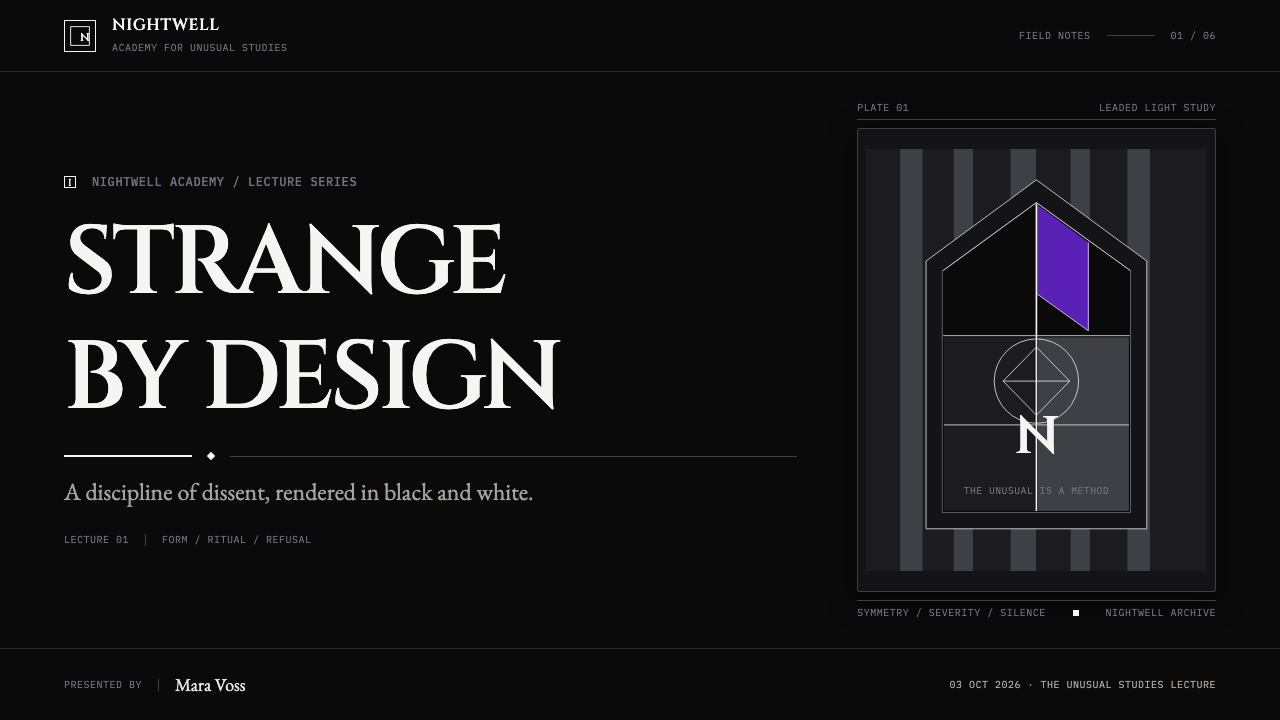
The source image describes a single stained-glass violet window bleeding across a black-and-white environment. That makes violet narrative as well as visual: it signals an intrusion into a world otherwise drained of color. If it becomes a broad background treatment or repeated decorative accent, the contrast collapses and the academy loses its cold, scalpel-like focus.
Can the style use photography?
Yes, provided photography serves the architecture of the composition. Favor images that preserve shadow, stone, strict facades, windows, corridors, formal costume silhouettes, or a face held in controlled stillness. Crop decisively and treat the photograph as one pane within the layout. Avoid warmly lit lifestyle imagery or expressive color photography, because those introduce the human softness this system is built to exclude.
Does perfect symmetry make every layout static?
It can, if symmetry is used as an endpoint rather than a source of tension. In Nevermore, symmetry establishes the institution’s command, while a small asymmetry reveals the disturbance beneath it. Keep the primary structure balanced, then allow one darker field, title shift, image interruption, or isolated violet pane to challenge that order. The page should feel controlled, not inert.
Where does this style work poorly?
It is a poor fit when a product needs immediate warmth, openness, playfulness, or sensory comfort. Family-oriented services, celebratory brands, food experiences, and gentle wellness contexts may find its institutional darkness distancing. The style works best when the subject can support secrecy, rigor, literary tension, archival authority, or a deliberately formidable point of view.
Related design styles
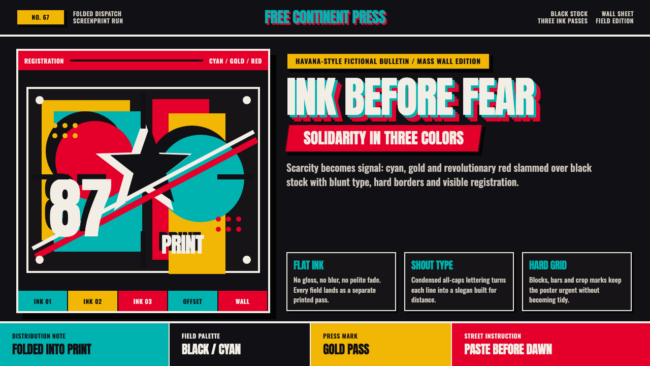 Cuban OSPAAAL Tricontinental PosterUrgency from scarcity. Cyan, gold and red slam over black in blunt silkscreen…
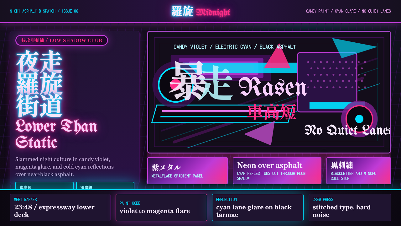 JDM BosozokuNight culture shouts. Candy violet, cyan neon, and stacked Mincho-blackletter…
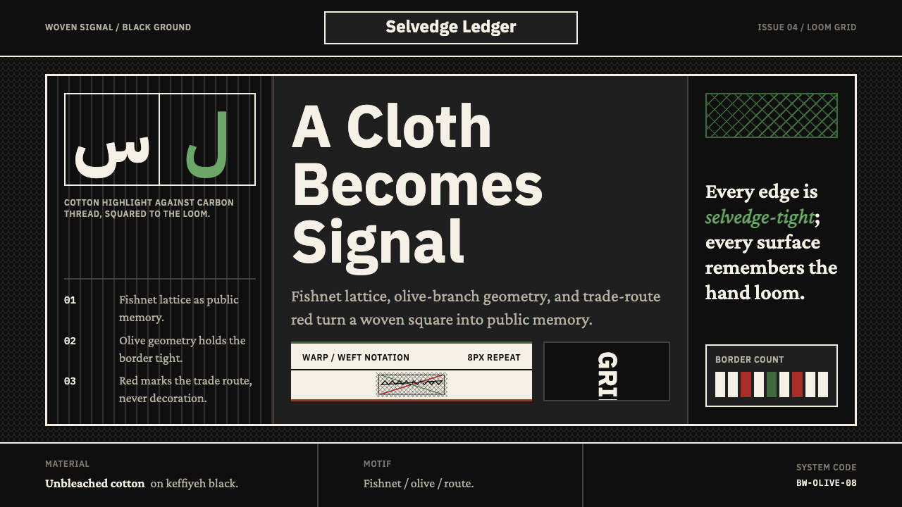 Levantine Keffiyeh Black & WhitePolitical textile, not ornament. Cotton type and fishnet lattice cut through…
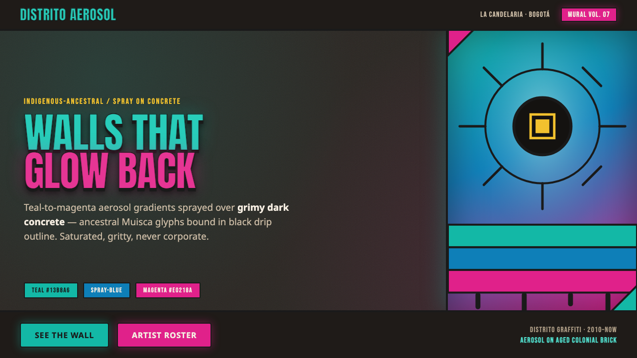 Bogotá Street MuralismNeon spray glowing off the wall. Teal-to-magenta aerosol on grimy concrete, i…
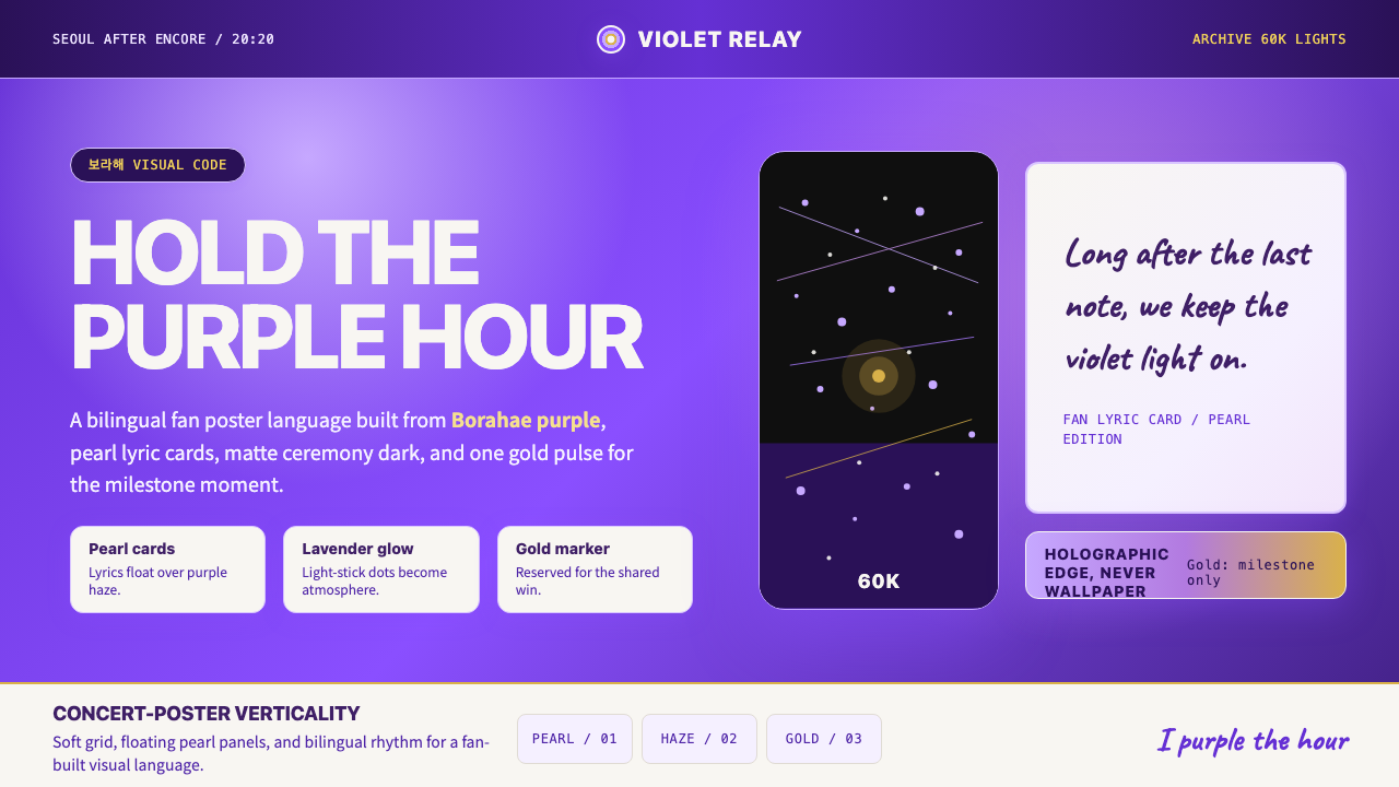 BTS Army Purple 2020Fandom becomes atmosphere. Borahae purple, pearl cards, lavender glow, one go…
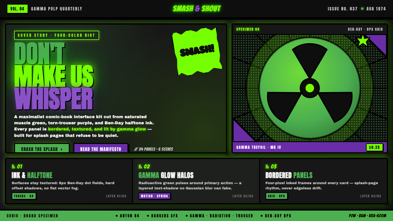 Hulk Gamma GreenDon't make us whisper. Muscle green, trouser purple, inked panels, Ben-Day ha…