What is Taylor Swift Eras (2023)?
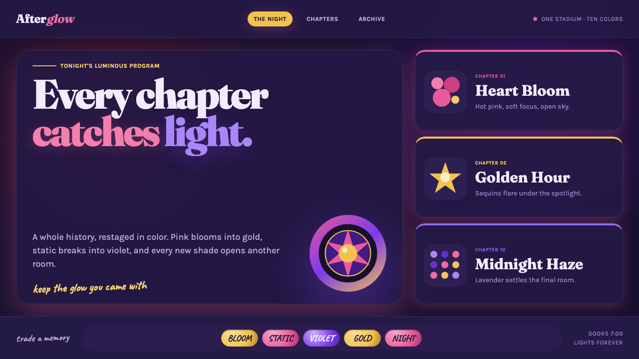
Taylor Swift Eras turns a discography into a midnight stadium interface: each chapter has its own glow, color memory, and unmistakable emotional weather.
Taylor Swift Eras (2023) in brief
Taylor Swift Eras is a dark, era-based visual language shaped by The Eras Tour, which launched in 2023. Its central idea is simple but expansive: a long body of music is organized as a sequence of distinct chapters rather than compressed into one uniform identity. Lover pink, 1989 seafoam, Speak Now lilac, Fearless gold, reputation static, and Midnights lavender form a changing visual program, each section carrying its own atmosphere while remaining part of one continuous night.
The style translates the concert experience into a digital system. Sections stack like a stadium program or setlist, with color bands, chapter headings, reflective surfaces, and moments of theatrical transition. It is intentionally sentimental and maximal in feeling, but it still needs structure. The visual drama comes from the contrast between a dark ground and luminous accents, between intimate scrapbook details and the scale of a sold-out arena.
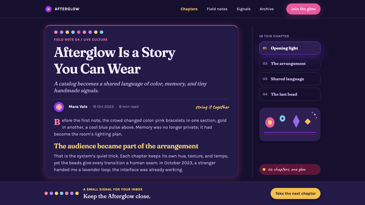
Its recognizable motifs are glow, shimmer, beadwork, and the language of fan-made keepsakes. Sequin-like fields catch highlights rather than becoming literal texture everywhere. Friendship-bracelet beads can spell era names between sections. Headings sit inside diffuse stadium light. The result should feel celebratory, chaptered, and emotionally legible: a design that knows every phase has its own color, but lets the full sequence read as one story.
Where does Taylor Swift Eras (2023) come from?
The Eras Tour launched on March 17, 2023, giving Taylor Swift’s catalog a live structure built around successive eras. Rather than treating a concert as a single visual campaign, the tour presented changing musical chapters as changing worlds. This chapter-based logic became the foundation of the style: identity is not fixed at the page level, but unfolds over time through a deliberate sequence of color, mood, and spectacle.
The source context places the creative world of Eras between Nashville and Los Angeles, while its audience expanded through global fan culture. That combination matters. The system feels professionally staged and large-scale, yet it makes room for personal references, collectible details, and shared fan vocabulary. A polished arena atmosphere is therefore balanced by the closeness of a scrapbook, bracelet, or remembered lyric-free visual cue.
The concert film released on October 13, 2023, extending the tour’s era-based visual branding beyond the stadium. The style belongs to contemporary stadium pop, but it is also inseparable from Swiftie fandom aesthetics: visual chapters are made to be recognized, revisited, compared, and emotionally claimed. In interface work, that means transitions should feel intentional. Each section can change its atmosphere, but the user should always sense that it belongs to the same larger performance.
What defines the Taylor Swift Eras (2023) look?
Chaptered Color
Color is not a decorative layer; it marks a change of era. Hot pink, seafoam, lilac, gold, static-toned darkness, and lavender should appear as distinct emotional environments. Let one chapter lead at a time, then use the next color as a visible handoff. The sequence should feel like a setlist moving forward, not a palette sampled all at once.
Midnight Ground
The dark background is the stage, not empty absence. It gives luminous accents somewhere to bloom and allows metallic or sequin-like highlights to feel suspended in space. Keep broad dark areas calm enough to hold information. When every surface glows equally, the sense of night disappears and the interface loses its theatrical depth.
Stadium Glow
Light should feel atmospheric and directional, as though it is arriving from a distant stage or an audience field. Use bloom behind major headings, key numbers, or era transitions, then let surrounding content remain clear. The glow is a cue for attention and occasion. It should frame a moment, not blur the hierarchy of the entire page.
Sequin Shimmer
Shimmer is the style’s emotional texture. It suggests beadwork, sequins, reflected light, and the small movements that make a large venue feel alive. Apply it selectively to hero surfaces, dividers, or celebratory states. A field of tiny highlights can imply glamour more effectively than literal, detailed material simulation.
Friendship Beads
Beads introduce an intimate, handmade counterpoint to the stadium scale. They work best as a connective device: spelling an era name, separating chapters, or rewarding close attention in a small detail. Their value comes from recognition and rhythm. If they become a border around every component, they stop feeling personal and start feeling ornamental.
Sentimental Scale
The system moves between close memory and public spectacle. Large headings and wide bands create the scale of an arena program, while small captions, beads, and glints keep the work emotionally specific. This contrast is essential. Without the intimate layer, the result is generic concert branding; without the large gestures, it loses the confidence and momentum of Eras.
Who shaped Taylor Swift Eras (2023)?
Taylor Swift is named as a key figure in the source material. The Eras Tour’s defining design premise is inseparable from the idea of an evolving catalog: individual eras remain recognizable, but their sequencing creates a larger narrative. That framework gives the style its chaptered identity.
Beth Garrabrant appears among the source material’s key figures. Within the Eras visual context, her inclusion points to the importance of image-making as an atmospheric language: color, light, and a strongly controlled mood can communicate an era before explanatory copy is needed.
Sam Wrench is listed as a key figure alongside the 2023 concert film context. The film’s existence reinforces an important principle for this style: stage-scale transitions, chapter boundaries, and changing atmospheres must remain readable when the experience moves beyond the live venue.
Joseph Cassell Falke is named as a key figure in the approved material. His inclusion situates the style inside a broader collaborative creative world rather than treating it as a single graphic treatment. Eras works because visual chapters, performance scale, and fan recognition all support one another.
How do you use Taylor Swift Eras (2023) today?
For presentation covers, treat the opening slide as the entrance to one era rather than a neutral title card. Choose a single chapter color, set the title against a midnight field, and give it a controlled halo or a small shimmering surface. Content slides should retain the chapter signal in a band, heading, or bead detail while leaving the main reading area calm. On data slides, use color to distinguish narrative phases or categories, not to decorate every value; charts should still read before the atmosphere is noticed.
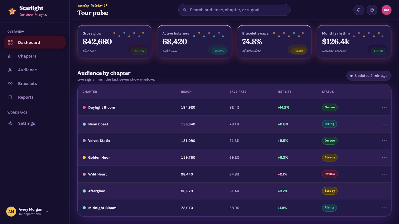
For web interfaces, the style is strongest in dashboards, recaps, member spaces, and pricing pages that benefit from visible progression. A dashboard can assign color chapters to different views or milestones, then use a dark shared frame to prevent the experience from fragmenting. Pricing pages can give tiers distinct moods while retaining consistent actions and readable comparison areas. Glow should identify focus, selection, or celebration rather than becoming the default state of every control.
For editorial and marketing work, use the style to make a campaign feel like a sequence of remembered moments. A long-form page can alternate era bands with quieter reading sections, while callouts borrow the visual language of a concert program or collectible keepsake. Marketing modules can use a bold chapter heading, a concentrated light field, and a single sentimental detail to create an event-like feeling without losing the message to decoration.
The common mistake is treating Eras as an excuse to place every recognizable color, sparkle, and reference into one viewport. That produces fan-themed clutter rather than era-based design. Let sections breathe, give each chapter a clear emotional lead, and preserve a shared midnight structure beneath the variation. The system succeeds when transitions feel earned and the user can tell where they are in the larger journey.
Taylor Swift Eras (2023) — FAQ
Is Taylor Swift Eras just a colorful pop-concert style?
No. Color is important, but the defining structure is chaptering. Each visual phase needs a distinct mood and a visible relationship to what comes before and after it. The system works when color, glow, and decorative detail all help the audience understand progression through a larger story.
Can several era colors appear on the same page?
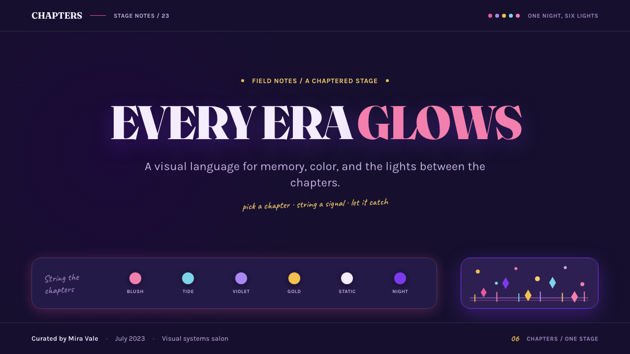
Yes, especially on a recap, timeline, or setlist-like page. Give one color the leading role and use the others as transitions, markers, or contained chapter signals. If every hue receives equal prominence, the page loses the sense of movement that makes the style feel like Eras.
How literal should friendship-bracelet imagery be?
Usually, less literal is more effective. Beads can function as a compact typographic or navigational cue, such as an era label between bands. Their purpose is to bring fan-made intimacy into a large-scale composition, not to turn every interface component into a novelty object.
Does the dark background have to dominate every screen?
The midnight ground is an important unifying device, but it does not require every surface to be dark. Brighter chapter panels can create relief and make transitions more legible. What matters is retaining enough darkness around luminous moments for glow, shimmer, and color changes to feel theatrical.
Where does this style work less well?
It can struggle in interfaces that require continuous visual neutrality, dense operational focus, or very restrained brand expression. The style carries nostalgia, celebration, and strong chapter cues, so it is most convincing when a product or campaign genuinely has a journey, milestone, or community memory to express.
Related design styles
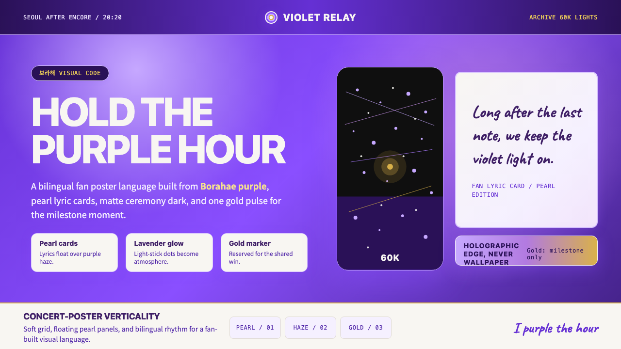 BTS Army Purple 2020Fandom becomes atmosphere. Borahae purple, pearl cards, lavender glow, one go…
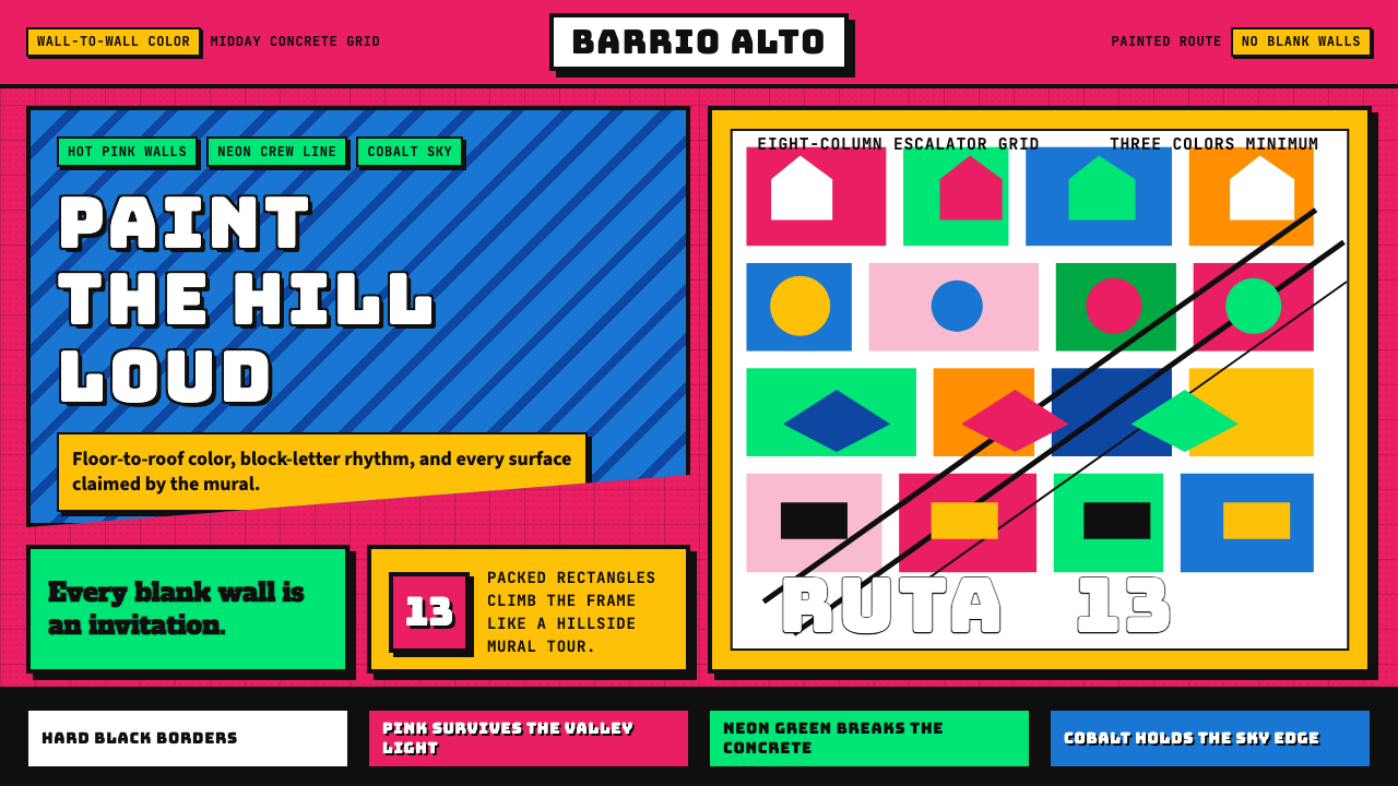 Medellín Comuna 13 MuralsRefuses blank walls. Hot pink, neon green, and cobalt blocks pack the grid li…
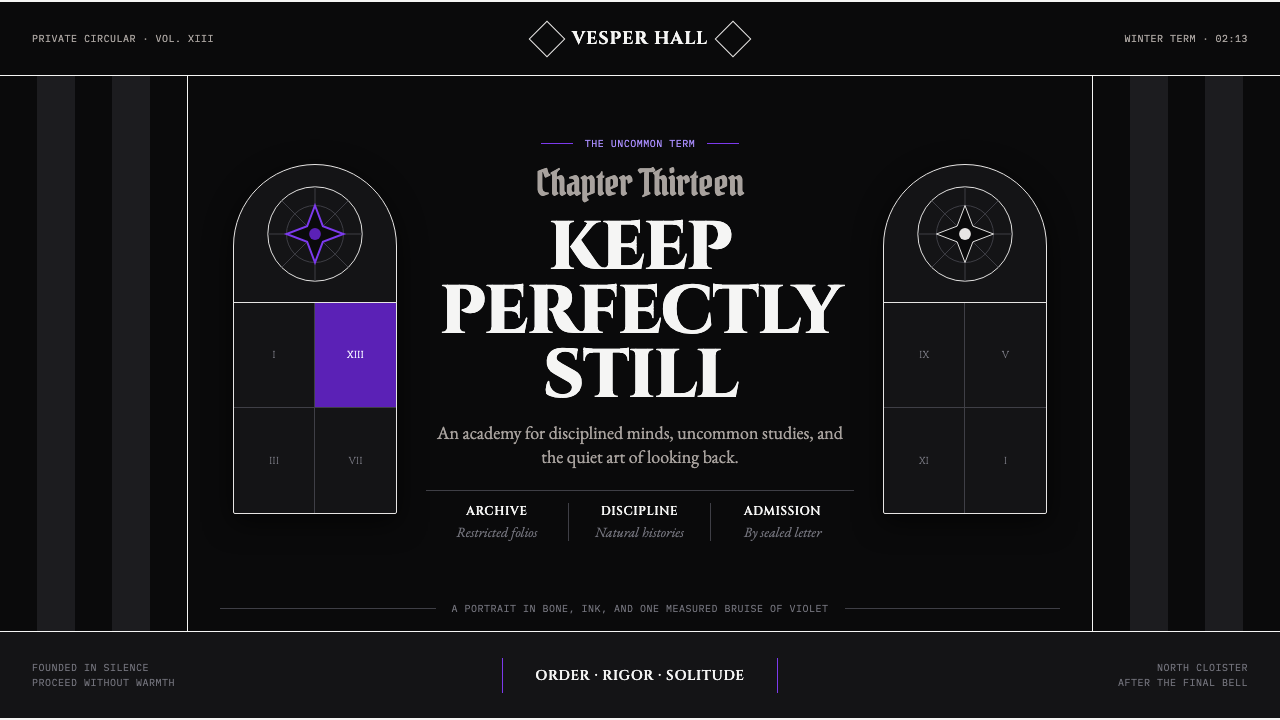 Wednesday — Nevermore AcademyCold symmetry cuts deepest. Bone-white capitals and hard stripes yield to one…
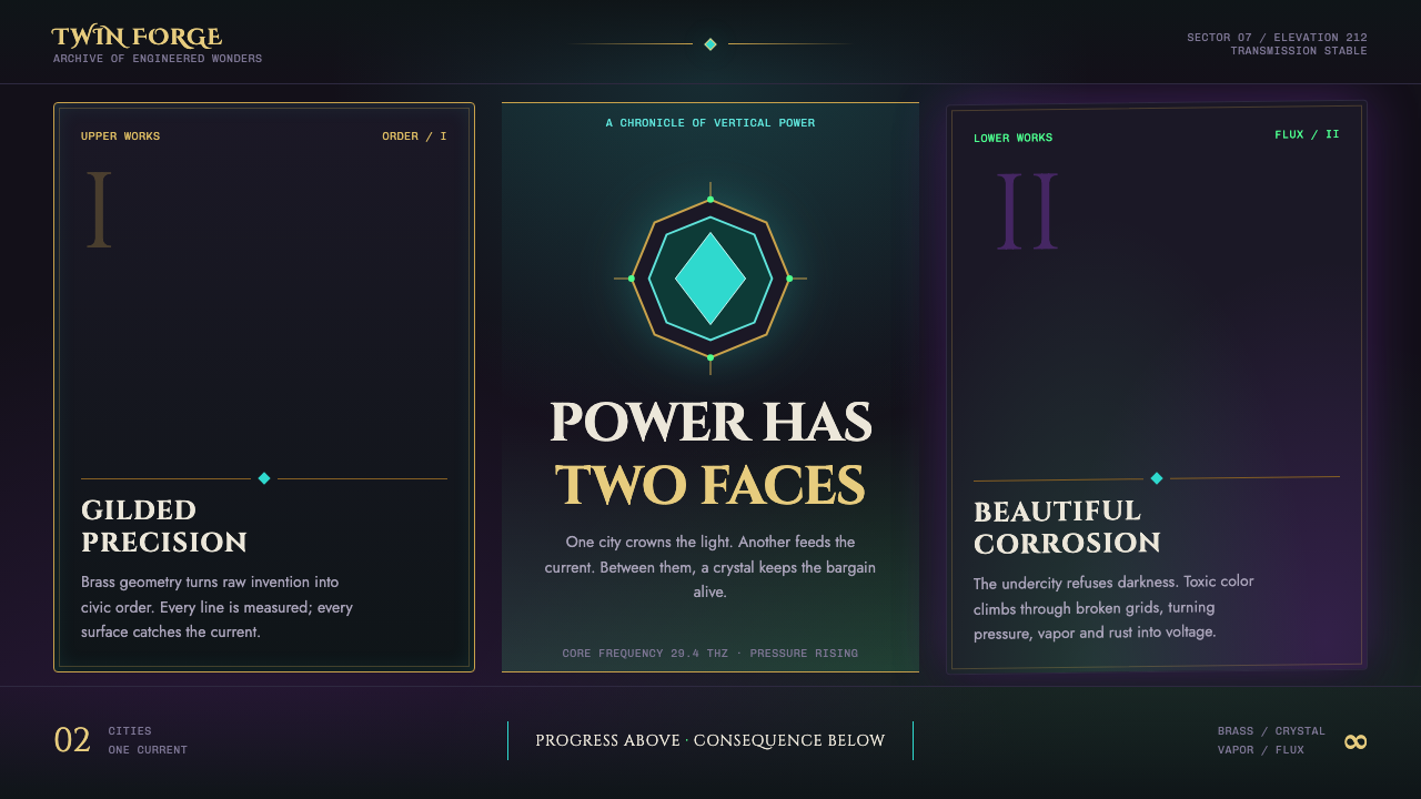 Arcane Hextech (2021)Progress and rot share a current. Brass symmetry meets teal crystal and toxic…
 Bollywood Neon MumbaiMumbai pop burns bright. Khand stacks glow over night-black, with pink-purple…
 Takashi Murakami SuperflatJoy has no depth. Pastel rainbow, scarlet accents, and black contours flatten…