What is Arcane Hextech (2021)?
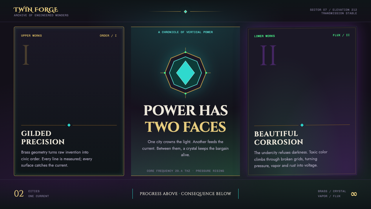
Arcane Hextech stages progress and decay on the same live wire: brass order above, toxic glow below, and crystalline energy binding both worlds together.
Arcane Hextech (2021) in brief
Arcane Hextech is a dark visual system defined by vertical tension. Its central image is a city split into gilded Piltover above and poison-lit Zaun below, with faceted hextech crystals acting as the luminous connection between them. The contrast is not simply wealthy versus poor, clean versus dirty, or technology versus chemistry. Both places are energized by invention, extraction, ambition, and danger; the style makes their shared infrastructure visible.
The upper world is organized, symmetrical, polished, and architectural. Brass, gunmetal, carved ornament, and formal geometry imply hierarchy, institutional confidence, and a belief that progress can be engineered into order. The undercity reverses that confidence. Its surfaces feel crooked, corroded, hand-worked, damp, and unstable. Neon green, shimmer violet, steam, oil, and chemical haze turn the same promise of advancement into something volatile and bodily.
Darkness is essential, but pure black is not. A colored atmosphere always presses upward from beneath the composition: cyan crystal light through vapor, green contamination through shadow, violet magic through industrial residue, or orange-red furnace light at moments of danger. The result is a jewel-toned darkness in which illumination is narrative evidence. Every glow suggests a source, a class position, a machine, a chemical reaction, or a system under strain.
Where does Arcane Hextech (2021) come from?
Arcane Hextech belongs to the visual world of Arcane, which premiered in November 2021. Its production period is identified as spanning roughly 2016 to 2021, with a second season in 2024. The style therefore reads as a contemporary screen-language rather than a historical period style: it deliberately combines recognizable design histories with painterly digital image-making and a fictional technological mythology.
The source places its development across Paris, France, and Los Angeles, USA, and identifies Christian Linke, Alex Yee, Pascal Charrue, and Barthélémy Maunoury as key figures. For a public-facing design description, their importance lies in the work’s collective authorship. Arcane Hextech should not be reduced to one isolated visual reference or one decorative motif; it is a coordinated system in which environment, material, light, architecture, and atmosphere reinforce one another.
Its named influences are Art Deco revival, painterly 3D animation, and dieselpunk or arcanepunk. Art Deco revival supplies the upper city’s symmetry, gilded geometry, ornamented arches, and civic grandeur. Painterly 3D animation prevents those forms from feeling sterile by allowing surfaces, light, vapor, and wear to remain expressive. Dieselpunk and arcanepunk introduce the logic of pipes, furnaces, industrial residue, chemical threat, and magical energy.
The resulting style is strongest when these influences remain in tension. Art Deco gives Piltover a belief in controlled elevation; industrial and chemical imagery gives Zaun a sense of leakage and descent; crystal energy crosses the boundary without resolving it. That unresolved connection is the theme’s defining idea. Innovation is beautiful, but it is never neutral, clean, or evenly distributed.
What defines the Arcane Hextech (2021) look?
Vertical Worldbuilding
Composition should feel stacked rather than merely divided. Ordered, gilded elements rise or occupy the visual high ground; corroded, vaporous, chemically lit elements gather below. This produces a social and emotional hierarchy without requiring explanatory copy. Even a single page can imply an elevated institution, an undercity pressure chamber, and the energy conduit joining them.
Brass Order
Brass is not a neutral metallic accent. It signifies polish, class, machinery made ceremonial, and the authority of a system that wants its mechanisms to look permanent. Use it through framed edges, filigree, formal arches, engraved details, and balanced geometry. Its shine should feel deliberate and maintained, never casually decorative.
Crystal Energy
Faceted cyan crystal light is the system’s connective signal. It cuts through smoke and gunmetal with a clean, charged presence, suggesting activation and technological possibility. Because it is visually precise, it works best as a focused source: a core, conduit, instrument, edge highlight, or controlled burst. Diffusing it everywhere weakens its narrative role.
Colored Darkness
The background should retain atmosphere rather than collapse into empty black. Teal haze, toxic green seepage, violet shimmer, and ember-like orange-red can emerge selectively from the dark. These tones create depth through contamination, steam, and suspended particles, not through clean digital gradients. Darkness remains active because something beneath it is always glowing, leaking, or burning.
Painterly Material
Surfaces should carry evidence of contact and weathering. Gunmetal can feel heavy, brass can feel polished, crystal can feel sharply cut, and undercity structures can feel stained or wet. The goal is not photorealism. It is material legibility with an expressive hand: edges, haze, corrosion, and reflected light should make the world feel handled rather than procedurally assembled.
Controlled Toxicity
Toxic green and shimmer violet belong to chemical corrosion and magical instability. They are strongest when treated as warning lights within a disciplined composition, not as a general-purpose palette. Orange-red serves a related role around furnaces and danger. Restricting these accents preserves the sense that hazardous energy has escaped containment.
Who shaped Arcane Hextech (2021)?
Christian Linke is listed among the key figures associated with Arcane Hextech. Within this source framing, the name belongs to the collective creative context behind a visual system where technological promise and urban decay remain inseparable.
Alex Yee is identified as a key figure in the source material. The style’s enduring value is its ability to make social contrast visible through spatial, material, and luminous contrast rather than through exposition alone.
Pascal Charrue appears among the source’s key figures. Arcane Hextech’s painterly three-dimensional character is central to its identity because it lets polish, corrosion, vapor, and energy coexist in the same image.
Barthélémy Maunoury is also named as a key figure. The system’s strength comes from coordination: Art Deco order, industrial grime, chemical illumination, and crystal energy operate as one visual argument.
How do you use Arcane Hextech (2021) today?
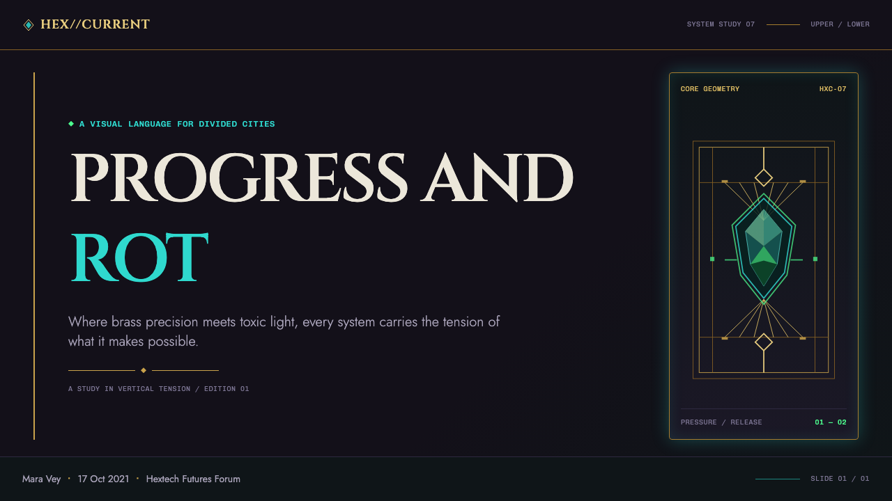
For presentation covers, use the vertical conflict as the organizing idea. A formal brass or architectural motif can occupy the upper field while a toxic, vaporous counterweight gathers below; a concentrated cyan crystal source can bridge the distance. Keep the title direct and ceremonial, with ample darkness around it. The cover should feel like a threshold between an elevated city and the machinery beneath it.
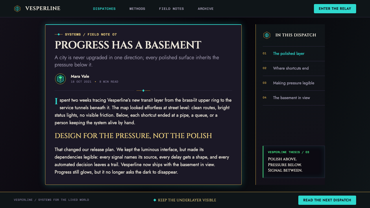
For content slides, maintain a stable, formal structure while allowing atmosphere to interrupt it. Use brass framing, restrained ornament, and symmetrical alignment for headings or key sections, then introduce haze, corroded texture, or an unstable glow near supporting details. Data slides should treat charts as instruments inside the world: clear signals, bright crystal energy for active values, and toxic accents only where risk, exception, or pressure needs emphasis.
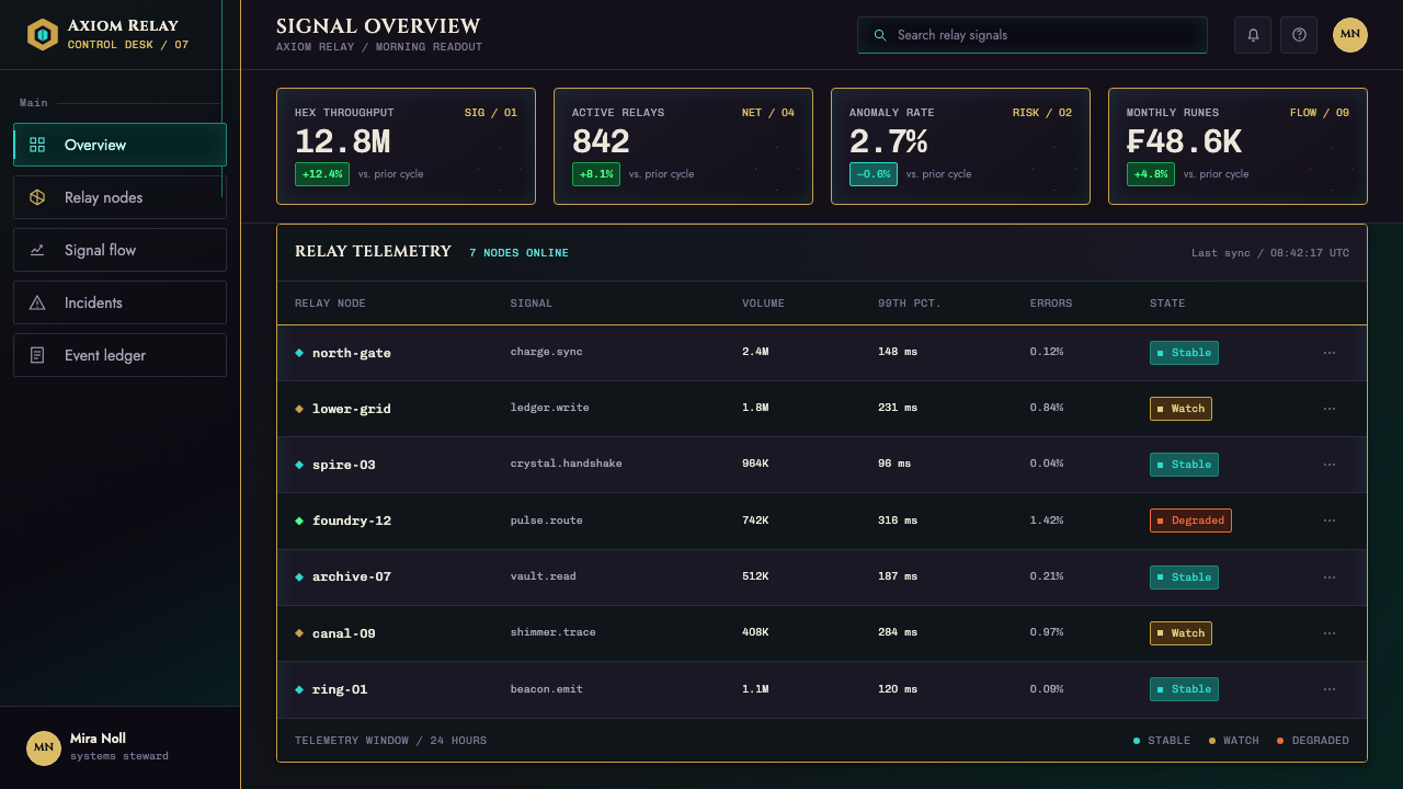
For web interfaces, this style suits dashboards, analytics tools, operations consoles, and pricing pages that benefit from a sense of powerful infrastructure. Prioritize legibility over spectacle. Panels can feel like gunmetal housings or brass mechanisms, but labels, states, and actions must remain easy to scan. Use luminous color as an information signal tied to status or interaction, not as background noise behind every control.
For editorial and marketing work, Arcane Hextech is effective when the story involves invention, access, consequence, transformation, or a system with hidden costs. A campaign can alternate polished institutional sections with rougher undercity passages, letting the visual transition carry the argument. Photography or illustration should preserve the painterly material language: vapor, reflected metal, crystal facets, and colored darkness are more useful than generic futuristic imagery.
A common mistake is borrowing only the neon and calling the result Arcane Hextech. Unrestricted cyan, green, violet, and orange-red quickly become generic cyberpunk, while immaculate brass alone becomes empty luxury. The style depends on contrast with discipline: upper and lower worlds, polish and corrosion, order and leakage, concentrated energy and surrounding dark. Remove that tension and the theme loses its reason for existing.
Arcane Hextech (2021) — FAQ
Is Arcane Hextech simply a cyberpunk style?
No. It shares neon, industrial atmosphere, and technological danger with cyberpunk, but its visual identity is built around a more specific vertical contrast. Formal brass symmetry and Art Deco revival language confront poison-lit industrial decay, while faceted crystal energy connects them. The style needs civic grandeur as much as it needs grime.
Why should the dark background contain color instead of becoming black?
Because the style’s darkness represents an active environment, not an empty void. Colored haze implies steam, chemistry, reflected energy, furnace heat, or magical instability. A fully black background removes the undercity’s pressure and makes crystal or neon accents feel detached from the world that should be producing them.
Can the brass side and the toxic undercity side appear in one interface?
Yes, and their coexistence is often the most faithful application. The important distinction is functional. Brass order should organize hierarchy, framing, and trust; toxic light should indicate pressure, hazard, mutation, or unstable energy. If both are used everywhere with equal intensity, the narrative contrast disappears.
Does this style work for a data-heavy dashboard?
It can, provided the interface treats atmosphere as a supporting layer rather than the information itself. Use the formal Piltover side to establish clear grouping and navigation, then reserve crystal and toxic illumination for meaningful states. Dense data needs a calm reading structure; the visual drama should clarify priority, not compete with it.
Related design styles
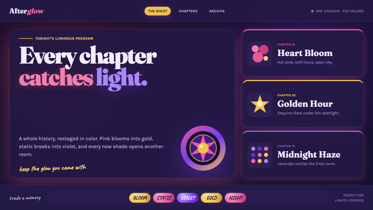 Taylor Swift Eras (2023)Every chapter catches light. Hot pink, lavender, gold and beadwork glow on mi…
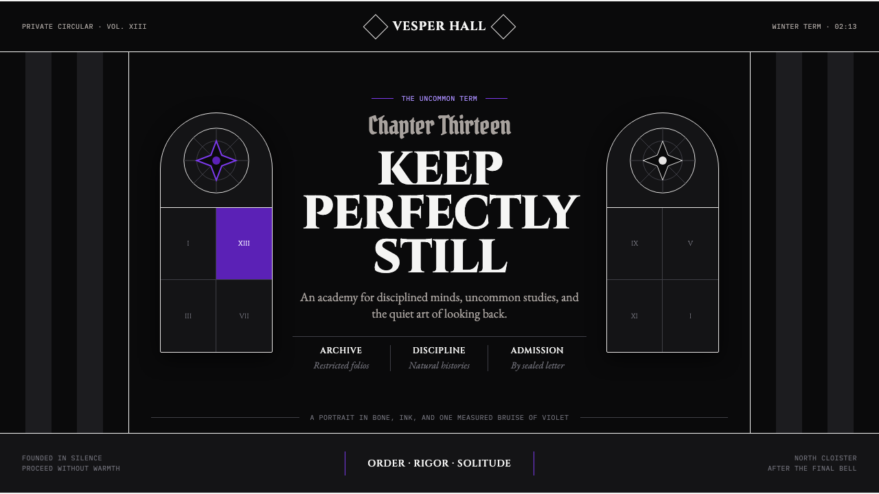 Wednesday — Nevermore AcademyCold symmetry cuts deepest. Bone-white capitals and hard stripes yield to one…
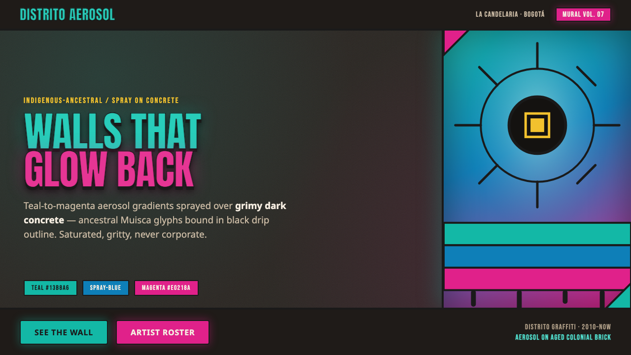 Bogotá Street MuralismNeon spray glowing off the wall. Teal-to-magenta aerosol on grimy concrete, i…
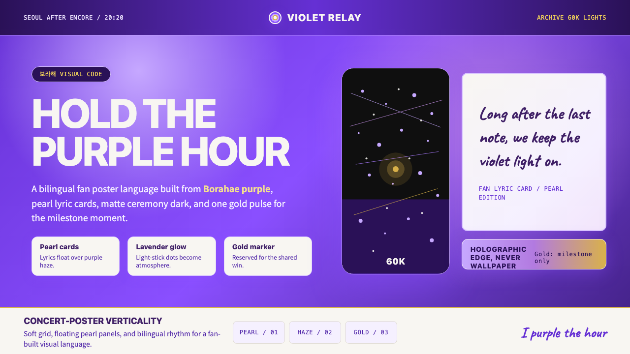 BTS Army Purple 2020Fandom becomes atmosphere. Borahae purple, pearl cards, lavender glow, one go…
 Oaxaca Indigenous-ModernActivist woodblock graphics. Cochineal carmine-fuchsia struck in black relief…
 PNG Bilum (Looped String Bag)Identity is striped. Vermilion, cobalt, and sunflower bands beat across loope…