Design style guide设计风格指南
What is PNG Bilum (Looped String Bag)?什么是 PNG Bilum (Looped String Bag)?
The bilum — Papua New Guinea's hand-looped string bag — encodes clan identity in stripe colour combinations so vivid they vibrate off the textile and into every digital surface they touch.比伦——巴布亚新几内亚的手工环编绳袋——用色彩条纹组合编码氏族身份,那种饱和度强烈到从织物跳脱而出,浸染一切与之相遇的数字界面。
PNG Bilum (Looped String Bag) in briefPNG Bilum (Looped String Bag) 速览
PNG Bilum (Looped String Bag) is a design language drawn from the living textile tradition of Papua New Guinea's highlands communities. At its core is a system of dense, saturated colour bands — vermilion, cobalt, sunflower yellow — set against a near-black ground, with stripe boundaries that are absolute and unblurred. No gradient softens the transition between one band and the next; each colour declares itself with full force before yielding to its neighbour.PNG 比伦(环编绳袋)是一套从巴布亚新几内亚高地社区活态纺织传统中提炼出的设计语言。其核心是高饱和色带系统——朱红、钴蓝、葵黄——铺陈在近黑底色之上,条纹边界绝对清晰,没有模糊。没有任何渐变柔化相邻色带之间的过渡;每种颜色在让位于邻色之前都以全部力量宣告自身。
The aesthetic is simultaneously tribal and graphic, ancient and billboard-loud. Where most design traditions counsel restraint in the use of high-saturation colour, the bilum tradition treats saturation as the medium itself — the higher the intensity, the more precisely clan identity is communicated. In a digital context, this translates to an interface language that feels bold, warm, and distinctly non-Western: a welcome corrective to the cool neutrality that dominates most contemporary screen design.这种美学同时具有部落性与图形性、古老性与广告牌式的强烈感。大多数设计传统劝告人们克制高饱和色彩的使用,而比伦传统则将饱和度本身视为媒介——强度越高,氏族身份传达得越精确。在数字语境中,这转化为一种感觉大胆、温暖且具有鲜明非西方气质的界面语言:对主导当代屏幕设计的冷中性色调,是一剂有益的矫正。
What distinguishes this style from mere bright-colour decoration is its structural rigour. The bands follow a rhythm — wide, narrow, wide — that creates a hierarchy within the stripe sequence. There is irregular, hand-looped texture implied beneath the boldness, a quality of being made rather than mechanically produced. Applied to screens, that organic tension gives the system depth without requiring actual depth effects: the composition breathes through colour contrast alone.将这种风格与单纯的亮色装饰区分开来的,是它的结构严谨性。色带遵循宽—窄—宽的节奏,在条纹序列内部创造层级感。在那种大胆之下,隐含着手工环编的不规则肌理——一种被制造而非被机械生产的品质。应用于屏幕时,这种有机张力无需真正的深度效果便能给系统带来纵深感:构图仅凭色彩对比就能呼吸。
See the PNG Bilum (Looped String Bag) design system →查看 PNG Bilum (Looped String Bag) 完整设计系统 →
Where does PNG Bilum (Looped String Bag) come from?PNG Bilum (Looped String Bag) 从何而来?
The bilum is among the oldest continuously practised fibre arts in Oceania. Archaeobotanical evidence and oral tradition both place the looped-string bag in the New Guinea highlands long before European contact, with some scholars tracing its origin to communities that had no access to woven cloth and developed looping as a complete fibre technology for carrying, storing, and displaying. The bags were made from plant fibres — pandanus, orchid vine, tree bark — worked into loops by hand without the use of needles or looms.比伦是大洋洲持续实践时间最长的纤维艺术之一。植物考古证据和口头传统都将这种环编绳袋的历史追溯到欧洲人接触之前的新几内亚高地,部分学者认为其起源于没有纺织布料的社区——这些社区把环编发展成一套完整的纤维技术,用于携带、储存和展示。绳袋由植物纤维制成——露兜树叶、兰花藤、树皮——徒手编织成环,不使用针或织机。
When Australian colonial administration arrived in the twentieth century, trade wool and synthetic dyes entered the highlands through patrol posts and trade stores. The effect was not homogenisation but intensification: highland women adopted the new materials and used the expanded palette to push the stripe tradition further. Synthetic vermilion, cobalt, and aniline yellow were brighter and more colourfast than anything available from plant dyes, and communities quickly incorporated them into the existing vocabulary of clan-specific colour combinations. By the mid-twentieth century, the bilum had become a highly visible marker of regional and clan identity in a way that was partly traditional and partly a response to new colonial social dynamics.二十世纪澳大利亚殖民管理进入后,贸易羊毛和合成染料经由巡逻站和贸易店铺流入高地。其效果不是同质化,而是强化:高地女性采用新材料,利用扩展后的色板将条纹传统推向更远。合成朱红、钴蓝和苯胺黄比任何植物染料都更鲜亮、更耐色,各社区迅速将其纳入已有的氏族专属配色词汇。到二十世纪中叶,比伦已成为地区与氏族身份的高度可见标志——部分延续传统,部分则是对新的殖民社会动态的回应。
After Papua New Guinea's independence in 1975, the bilum underwent a significant cultural revalorisation. It moved from being perceived as a purely functional or folk object to becoming a symbol of national identity. The Bank of Papua New Guinea featured bilum patterns on currency; government officials began carrying bilums at formal occasions as a statement of cultural pride. The Goroka market and its surrounding cooperative networks became important sites for both the production and the aesthetic standardisation of the highlands stripe tradition.1975年巴布亚新几内亚独立后,比伦经历了重大的文化重估。它从被视为纯粹功能性或民间物品,转变为国家身份的象征。巴布亚新几内亚银行将比伦图案印上货币;政府官员开始在正式场合携带比伦,作为文化自豪感的声明。戈罗卡市场及其周边的合作社网络成为高地条纹传统生产与美学标准化的重要场所。
From the 1990s onward, a generation of PNG artists and fashion designers began working the bilum into contemporary art practice and international fashion. Florence Jaukae Kamel, Ruth Choulai, and Wendy Choulai are among those who developed the visual language into gallery and performance contexts, while the Bilum Wear Project and Goroka cooperative movement formalised production networks that allowed bilum aesthetics to reach international audiences. The tension between commercial adaptation and cultural custodianship remains active: contemporary applications of the style carry an implicit responsibility to acknowledge the living community from which it comes.从1990年代起,一代巴布亚新几内亚艺术家和时尚设计师开始将比伦引入当代艺术实践和国际时尚。弗洛伦斯·乔凯·卡梅尔、鲁思·乔乌莱和温迪·乔乌莱等人将这套视觉语言发展到画廊和表演语境,而比伦穿着计划和戈罗卡合作社运动则将生产网络正规化,让比伦美学得以触达国际受众。商业改编与文化守护之间的张力至今仍然活跃:这种风格的当代应用隐含着承认其来源的活态社区的责任。
What defines the PNG Bilum (Looped String Bag) look?PNG Bilum (Looped String Bag) 的视觉特征是什么?
Colour色彩
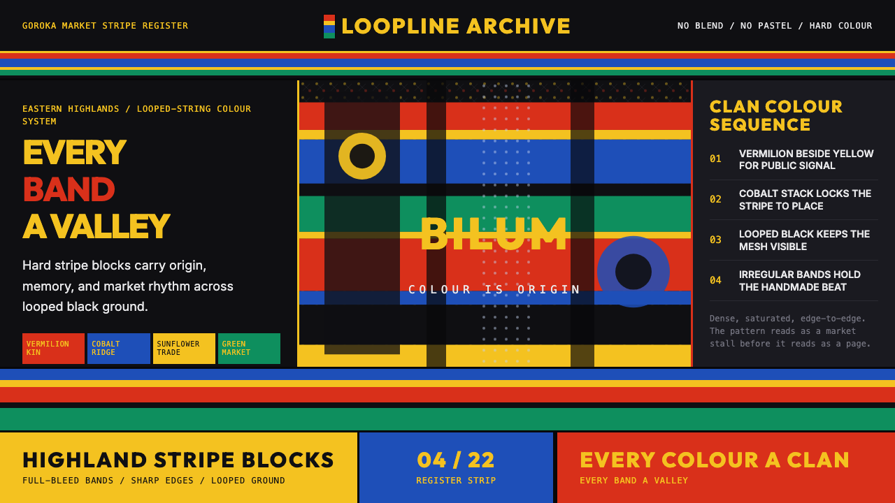
The palette centres on a trio of high-intensity primaries — a warm vermilion red, a deep cobalt blue, and a sunflower yellow — deployed against a near-black ground. Each colour is used at its most saturated expression: no tinting, no desaturation, no blending. The near-black background is not neutral in the Western sense but weighted and velvety, giving the saturated bands maximum contrast and visual vibration. Secondary colours appear only as transitional bands and are never allowed to dominate. The overall effect is chromatic intensity without chaos, because each colour occupies its own clearly bounded stripe.色板以三种高强度主色为核心——暖朱红、深钴蓝与葵黄——铺陈在近黑底色之上。每种颜色都以其最饱和的表达使用:无加白、无降饱和、无混融。近黑底色并非西方意义上的中性色,而是厚重而丝绒般的,赋予饱和色带最大对比度和视觉震动感。间色仅作为过渡色带出现,从不允许主导。整体效果是有秩序的色彩强度,因为每种颜色都占据自己清晰划定的条带。
Stripe Structure条纹结构
Stripes are the fundamental compositional unit. They run in one consistent direction — typically horizontal — and vary in width according to a hierarchy: a wide anchor band, a narrow transition band, a medium secondary band. This rhythm is not mechanical but intentional, producing a sequence that reads as both ordered and handmade. Boundaries between stripes are crisp and absolute; there is no feathering or softening at the edges. The stripe unit can be applied to backgrounds, borders, dividers, progress indicators, and header regions without losing its identity.条纹是基本的构图单元。它们沿一个一致的方向延伸——通常是水平方向——并按照层级变化宽度:宽幅主色带、窄过渡带、中等宽度副色带。这种节奏不是机械性的,而是有意为之,产生一种既有秩序又有手工感的序列。条纹之间的边界清晰且绝对;边缘没有羽化或柔化。条纹单元可应用于背景、边框、分隔线、进度指示器和标题区域,而不失去其身份。
Texture and Mesh Rhythm肌理与编织节奏
Beneath the bold colour blocking, the bilum tradition carries an organic mesh quality — the visible irregularity of hand-looped string, where each knot is slightly different from the last. In digital interpretation, this quality is expressed through subtle compositional asymmetries, slightly uneven spacing, and the occasional textural motif that breaks the rigidity of pure geometry. The effect is warmth within boldness: the system feels crafted rather than printed, rooted in human hands rather than machine output.在大胆色块之下,比伦传统携带一种有机编网质感——手工环编绳结的可见不规则性,每一个结都与上一个略有不同。在数字诠释中,这种品质通过细微的构图不对称、略微不均匀的间距,以及偶尔打破纯几何刚性的肌理母题来表达。效果是大胆之中的温暖:系统感觉像被制造而非被印刷,根植于人手而非机器输出。
Scale and Density尺度与密度
The bilum aesthetic is dense. Colour bands fill the available space without generous margins; elements sit close together rather than floating in white space. This density reflects the physical textile, where loops pack tightly and no material is wasted. In UI application, this translates to a layout that feels generous with colour and content rather than with emptiness. Breathing room is created by the contrast between bands, not by surrounding them with neutral space.比伦美学是致密的。色带填满可用空间,没有慷慨的边距;元素紧密相邻,而非漂浮在留白中。这种密度反映了实体纺织品的特性——织环紧密堆叠,没有材料被浪费。在界面应用中,这转化为一种在色彩和内容上慷慨、而非在空白上慷慨的布局。呼吸感由色带之间的对比而非中性空间所创造。
Dark Ground暗底
The near-black ground is not an afterthought but the structural foundation of the entire system. On a light background, the same saturated colours would appear differently — less vibrant, less dramatically weighted. The dark ground creates the optical conditions for maximum colour saturation: the bands appear to emit light rather than reflect it. This makes the system inherently suited to dark-mode interfaces and screen contexts where ambient light is low.近黑底色不是事后添加的,而是整个系统的结构基础。在浅色背景上,同样的饱和色彩会呈现出不同的面貌——不那么鲜亮,不那么戏剧性地有分量。暗底创造了色彩饱和度最大化的光学条件:色带看起来像在发光而非反射光。这使系统天然适合深色模式界面和环境光线较低的屏幕语境。
Communal Specificity集体特殊性
Every bilum colour combination belongs to a specific community or clan: the stripe sequence is not decorative but identificatory. In design application, this principle translates to a system where colour combinations carry meaning rather than being interchangeable. Choosing a specific palette within the bilum idiom implies commitment to that combination — it is not background decoration to be varied freely but a consistent identifier. This makes the style particularly suited to brand systems that value distinctiveness and community recognition over generic visual pleasantness.每种比伦配色组合都属于特定的社区或氏族:条纹序列不是装饰性的,而是识别性的。在设计应用中,这一原则转化为一个色彩组合携带意义而非可互换的系统。在比伦语汇中选择特定色板意味着对该组合的承诺——它不是可以自由变换的背景装饰,而是一个一致的标识符。这使得该风格特别适合重视独特性和社区认同胜过通用视觉愉悦感的品牌系统。
Warmth and Vitality温暖与活力
Despite its visual boldness, the bilum aesthetic reads as warm rather than cold, festive rather than austere. This warmth comes from the handmade origins — no element is perfectly regular — and from the specific palette, which foregrounds warm reds and yellows rather than the cool blues and greys that characterise most contemporary dark-mode design. The system feels alive in a way that purely geometric dark-mode interfaces typically do not.尽管视觉上大胆,比伦美学却读起来温暖而非冰冷,节日感而非严肃感。这种温暖来自手工起源——没有任何元素是完全规则的——也来自特定的色板:前景是暖红和黄,而非主导当代深色模式设计的冷蓝和灰。这个系统拥有一种纯几何深色模式界面通常所缺乏的生命感。

See the PNG Bilum (Looped String Bag) design system →查看 PNG Bilum (Looped String Bag) 完整设计系统 →
Who shaped PNG Bilum (Looped String Bag)?谁塑造了 PNG Bilum (Looped String Bag)?
One of PNG's most internationally recognised fibre artists, Kamel elevated the bilum from craft object to fine art through large-scale textile installations that interrogate gender, identity, and post-colonial belonging. Her work has been exhibited across the Pacific and in international contemporary art contexts, establishing a precedent for bilum aesthetics as a serious visual discourse rather than a cultural curiosity.巴布亚新几内亚最具国际知名度的纤维艺术家之一,卡梅尔通过大型纺织装置将比伦从工艺品提升为纯艺术,这些装置追问性别、身份与后殖民归属。她的作品在太平洋各地及国际当代艺术语境中展出,为比伦美学作为严肃视觉话语而非文化奇观奠定了先例。
A painter and visual artist who drew extensively on PNG textile traditions, Choulai worked to bridge indigenous visual vocabularies with contemporary fine art practice. Her paintings incorporate the stripe logic and colour saturation of bilum-making into two-dimensional compositions that operate comfortably in international gallery contexts while remaining deeply rooted in Papua New Guinean visual culture.一位广泛汲取巴布亚新几内亚纺织传统的画家和视觉艺术家,乔乌莱致力于将土著视觉词汇与当代纯艺术实践联结。她的绘画将比伦编织的条纹逻辑和色彩饱和度融入二维构图,这些作品在国际画廊语境中运作自如,同时深深扎根于巴布亚新几内亚视觉文化。
A fashion designer and cultural advocate, Wendy Choulai is credited with bringing bilum aesthetics into international fashion dialogue through wearable garments that translate the looped-string visual language into contemporary clothing. Her work through the PNG contemporary fashion movement helped shift perceptions of Pacific fashion from ethnographic interest to global design relevance.时装设计师兼文化倡导者,温迪·乔乌莱因将比伦美学引入国际时尚对话而著称——她设计的可穿戴服装将环编绳的视觉语言转化为当代服饰。她在巴布亚新几内亚当代时尚运动中的工作,帮助将太平洋时尚从民族志兴趣转变为全球设计相关性。
Not an individual but a networked community of highland women artisans centred on the Goroka market in Eastern Highlands Province, this cooperative movement shaped the aesthetic standardisation and commercial distribution of bilum work through the late twentieth century. The cooperatives established quality norms, training pathways, and market connections that allowed the bilum tradition to survive modernisation while remaining economically viable for the communities that practise it.这不是一个个人,而是以东高地省戈罗卡市场为中心的高地女性工匠网络社区。这一合作社运动在二十世纪下半叶塑造了比伦作品的美学标准化和商业流通。合作社建立了质量规范、培训途径和市场联结,让比伦传统在现代化进程中得以存续,同时对实践它的社区保持经济可行性。
A writer and cultural commentator whose documentation of PNG craft traditions, including the bilum, contributed to international awareness of Papua New Guinean material culture. Wilson's work forms part of the broader effort to establish rigorous documentation of living Pacific craft traditions at a moment when they were beginning to attract commercial and artistic attention from outside the region.一位作家兼文化评论员,其对包括比伦在内的巴布亚新几内亚工艺传统的记录,提升了国际社会对巴布亚新几内亚物质文化的认知。威尔逊的工作是在活态太平洋工艺传统开始吸引域外商业和艺术关注之际,为其建立严格文献记录的更广泛努力的一部分。
How do you use PNG Bilum (Looped String Bag) today?今天怎么用 PNG Bilum (Looped String Bag)?
The bilum design language is one of the rare systems whose visual intensity translates directly into digital media without loss. Its foundational properties — high saturation on a dark ground, sharp stripe boundaries, handmade warmth — are screen-native qualities that work as well on a monitor as they do on the physical textile. The challenge is not amplification but discipline: restraint in how many colour combinations are used simultaneously, and rigour in maintaining the stripe logic rather than treating the palette as freeform permission.比伦设计语言是为数不多几个视觉强度能在数字媒体中无损转化的系统之一。其基础属性——暗底上的高饱和度、锐利的条纹边界、手工感的温暖——都是屏幕原生品质,在显示器上与在实体纺织品上一样奏效。挑战不是放大,而是纪律:克制同时使用的配色组合数量,并严格维护条纹逻辑,而不是把色板当作自由发挥的许可证。
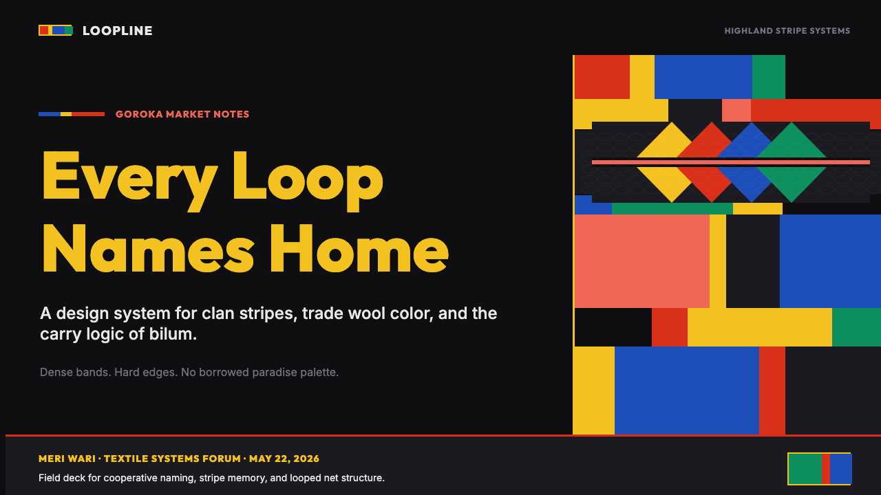
For presentation slides, the style has an immediate commanding presence that works exceptionally well for cover pages, section dividers, and data summaries. A cover slide benefits from a full-bleed stripe background — running horizontally across the frame — with title type reversed out in a light neutral against the dark field. For content slides, apply the stripe logic to the header band alone and keep the body field near-black with light type; this brings the identity mark down to a calibrated accent without competing with content. Data visualisations take on a distinctive character when chart elements — bar fills, line colours, segment hues — draw from the bilum primary trio rather than the standard business blue-and-grey.对于演示文稿,这种风格具有直接的压场气质,在封面页、章节分隔页和数据摘要上尤为出色。封面页适合使用满幅条纹背景——水平贯穿画框——标题字体在暗色底面上以浅中性色反排。内容页则只将条纹逻辑应用于标题色带,正文区域保持近黑色搭配浅色字体;这样品牌标识就以经过校准的强调形式呈现,而不会与内容竞争。当图表元素——柱形填充、折线色彩、扇形色调——从比伦主色三角取色而非标准商业蓝灰时,数据可视化便呈现出独特气质。
For web interfaces, the system is particularly suited to product pages, hero sections, landing pages, and navigation elements where identity impact is the priority. A dashboard or pricing page built on this system should treat the dark near-black as the base canvas and deploy colour bands as structural separators — between pricing tiers, between feature sections, between navigation levels. Interactive states and hover conditions benefit from drawing from the secondary colours in the bilum vocabulary; there is enough chromatic range within the palette to differentiate states without reaching outside the system.对于网页界面,该系统特别适合产品页面、英雄区块、落地页和导航元素——身份冲击力是优先考量的场景。基于这套系统构建的仪表板或定价页面,应将近黑色作为基础画布,将色带部署为结构性分隔符——在定价层级之间、在功能区块之间、在导航层级之间。交互状态和悬停条件适合从比伦词汇的副色取色;色板内有足够的色彩范围来区分状态,无需突破系统边界。
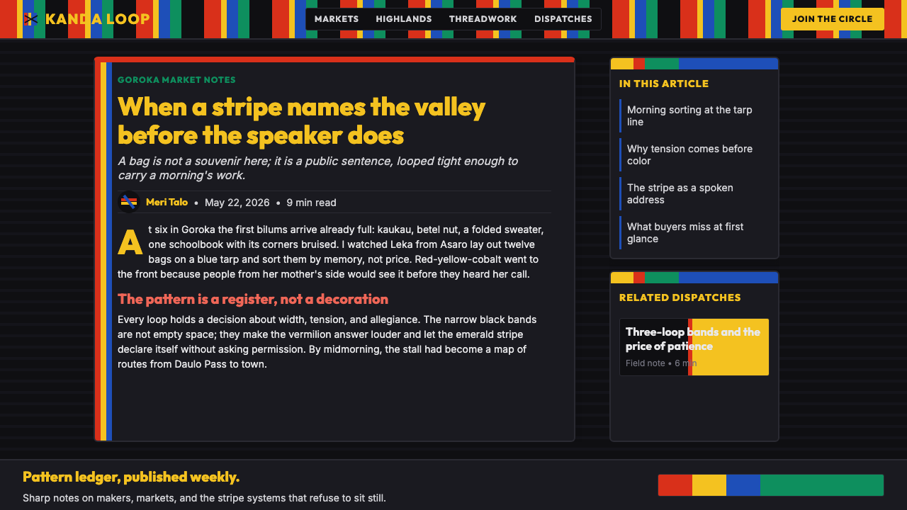
For editorial and marketing work, the bilum aesthetic offers a powerful alternative to the neutral, cream-and-grey palettes that dominate contemporary editorial design. An article layout using this system might employ a full-width stripe band at the top of each major section, with pull quotes rendered in the primary vermilion or cobalt against the near-black field. Marketing materials — event posters, campaign headers, social media assets — benefit most from the style's poster-like intensity: a single wide stripe in one primary colour, a narrow accent in a second, and all text reversed against the dark ground.对于编辑和营销内容,比伦美学提供了一种强有力的替代方案,对抗主导当代编辑设计的中性奶油灰调。使用这套系统的文章版面可以在每个主要段落顶部采用全宽条纹色带,引用语以主朱红或钴蓝色在近黑底上反排。营销材料——活动海报、活动头图、社交媒体素材——最能从这种风格的海报式强度中获益:一条主色宽带,一条第二主色窄强调带,所有文字在暗底上反排。
A common error when working with this style is treating the three primary colours as interchangeable accent colours to be rotated freely. In the source tradition, each clan's stripe combination is fixed and identificatory; randomising colour order undermines the system's coherence. Choose a specific combination and commit to it throughout a project. A second frequent mistake is attempting to soften the style with gradients, blurs, or transparent overlays in the interest of appearing more contemporary — these additions destroy the optical tension between saturated bands and dark ground that gives the system its vitality. Trust the contrast and let it work.使用这种风格时常见的错误是将三种主色视为可自由轮换的强调色。在源传统中,每个氏族的条纹组合是固定且具有识别性的;随机化色彩顺序会破坏系统的一致性。选择一种特定的组合并在整个项目中坚持它。第二个常见错误是试图用渐变、模糊或透明叠加来软化风格,以期显得更当代——这些添加会摧毁饱和色带与暗底之间赋予系统生命力的光学张力。信任对比,让它发挥作用。
See the PNG Bilum (Looped String Bag) design system →查看 PNG Bilum (Looped String Bag) 完整设计系统 →
PNG Bilum (Looped String Bag) — FAQPNG Bilum (Looped String Bag) · 常见问题
Is it appropriate to use bilum aesthetics in commercial design work without deeper cultural engagement?在没有深入文化理解的情况下,将比伦美学用于商业设计是否合适?
This is a genuinely contested question. The bilum is a living tradition belonging to specific highland communities in Papua New Guinea, not a historical artifact. Using its visual language — particularly the stripe colour combinations that encode clan identity — without acknowledgment carries risks of cultural appropriation. The more considered approach is to treat the style as an inspiration to be adapted rather than a template to be copied, to credit the source tradition explicitly in project documentation, and where possible to commission or consult with PNG artists and designers rather than simply importing the aesthetic. Many designers from the region have actively made bilum-derived work available for broader use, and engaging with those specific practitioners is preferable to anonymous adoption.这是一个真正存在争议的问题。比伦是属于巴布亚新几内亚特定高地社区的活态传统,而非历史文物。未经致谢就使用其视觉语言——尤其是编码氏族身份的条纹配色组合——存在文化挪用的风险。更审慎的做法是将这种风格视为可改编的灵感而非可照搬的模板,在项目文档中明确致谢源传统,并尽可能委托或咨询来自巴布亚新几内亚的艺术家和设计师,而不是简单地借用其美学。该地区的许多设计师已主动将比伦派生作品开放给更广泛的使用,与这些特定实践者接触优于匿名采用。
How does the bilum style work in light-mode interfaces given its dark-ground foundations?鉴于比伦风格以暗底为基础,它在浅色模式界面中如何运作?
The bilum palette is fundamentally dark-ground in origin — the near-black field is what creates the optical vibration of the saturated bands. A direct light-mode inversion does not work well: on white, the same colours become harsh and lose their luminous quality. However, the style can be adapted for light-mode contexts by treating the near-black as a textured dark-cream or deep warm grey, which retains enough contrast for the colour bands to sing while softening the overall visual weight. Alternatively, the stripe logic can be reduced to accent bands only — a narrow border at the top of a card, a section-header underline, a tag chip background — with the primary surface remaining near-white. This approach captures the identity mark of the style without requiring the full dark-ground commitment.比伦色板从根本上以暗底为基础——近黑底场正是创造饱和色带光学震动的条件。直接的浅色模式反转效果不佳:在白底上,同样的颜色变得刺眼,失去发光品质。然而,这种风格可以通过将近黑底处理为有质感的深奶油色或深暖灰色来适应浅色模式语境,这样既能保留足够的对比度让色带发声,又能软化整体视觉分量。另一种方式是将条纹逻辑简化为纯强调色带——卡片顶部的窄边框、段落标题下划线、标签芯片背景——主要界面表面保持近白色。这种方式捕捉了风格的身份标记,而无需完整的暗底承诺。
Can bilum aesthetics work for a professional services or enterprise product, or is it too bold?比伦美学能用于专业服务或企业产品吗,还是说它太过大胆?
Boldness is not the opposite of professionalism — it is the opposite of blandness. Several highly credible enterprise brands (construction, energy, logistics) use saturated colour systems precisely because they want to project confidence and visibility rather than cautious neutrality. The bilum system works well in enterprise contexts where identity differentiation, category ownership, and visual authority are valued. It is less suited to contexts that require clinical neutrality — medical, legal, financial services where understatement signals trust. The decision depends on what the enterprise wants to say: if the brand proposition is energy, directness, or distinctiveness, bilum aesthetics can support it credibly. If the proposition is restraint and precision, a different system will serve better.大胆不是专业性的反义词——它是乏味的反义词。几个高度可信的企业品牌(建筑、能源、物流)恰恰使用高饱和色系,因为它们想传达自信和辨识度,而非谨慎的中立。比伦系统在重视身份差异化、品类主权和视觉权威的企业语境中表现良好。它不太适合需要临床中立的语境——医疗、法律、金融服务中,低调暗示信任。决策取决于企业想表达什么:如果品牌主张是活力、直接或独特性,比伦美学可以有力地支撑它。如果主张是克制与精准,那么其他系统会更好地服务于此。
What types of projects benefit most from the bilum visual language?哪类项目最能从比伦视觉语言中获益?
Projects that benefit most are those where visual identity, distinctiveness, and warmth are primary values — cultural festivals, creative agencies, fashion and lifestyle brands, community platforms, social impact organisations, and products targeting audiences who value craft authenticity and non-Western aesthetics. Event identity systems are a natural fit: the stripe logic scales from a small badge to a full-bleed backdrop without losing coherence. Editorial projects covering Pacific, Oceanian, or Papua New Guinean subjects benefit from the cultural grounding the style provides. Any project looking to move away from the dominant cool-minimalist aesthetic of contemporary tech will find the bilum vocabulary a distinctive and credible alternative.最能获益的项目是那些将视觉身份、独特性和温暖感作为首要价值的项目——文化节庆、创意机构、时尚与生活方式品牌、社区平台、社会影响力组织,以及面向重视工艺真实性和非西方美学受众的产品。活动识别系统天然契合:条纹逻辑从小徽章到全幅背景都能保持一致性而不失凝聚力。涉及太平洋、大洋洲或巴布亚新几内亚主题的编辑项目,能从这种风格提供的文化根基中获益。任何希望从当代科技主导的冷调极简美学中脱身的项目,都会发现比伦词汇是一个独特且可信的替代方案。
How does bilum compare to other bold stripe-based design systems like Mondrian or Op Art?比伦与蒙德里安或欧普艺术等其他大胆条纹设计系统相比如何?
The surface similarities are real but the underlying logic is different. Mondrian used primary colours and grid intersections to explore pure pictorial structure with no referential content; his stripes are actually lines that create fields. Op Art exploits optical illusion through precise geometric repetition to disorient the eye. Bilum stripes are neither structuralist nor illusionistic — they are identifiers: each combination means something specific to a community. This gives the bilum system a social and communicative weight that the other two lack. Visually, bilum is warmer (the palette includes the near-black ground rather than white), looser (hand-looped irregularity rather than mechanical precision), and denser (colour bands fill space rather than creating intervals). The most important distinction is orientation: Mondrian and Op Art are about formal properties of vision; bilum is about belonging.表面上的相似性是真实的,但底层逻辑不同。蒙德里安使用三原色和网格交叉来探索纯粹的图像结构,没有指涉内容;他的条纹实际上是创造色域的线条。欧普艺术通过精确的几何重复来利用视觉错觉,扰乱观者的眼睛。比伦条纹既非结构主义也非幻觉主义——它们是标识符:每种组合对特定社区意味着具体的事物。这赋予了比伦系统另外两者所缺乏的社会性和传达性分量。视觉上,比伦更温暖(色板包含近黑底而非白色)、更松弛(手工环编的不规则性而非机械精确)、更致密(色带填满空间而非创造间隔)。最重要的区别在于取向:蒙德里安和欧普艺术关乎视觉的形式属性;比伦关乎归属。
Related design styles相关设计风格
 Pakistani Truck ArtBlessing crowds every inch. Fuchsia, kelly green, and gold stack into scallop…祝福挤满每寸空间:玫红、凯利绿与金色叠成扇贝边面板。
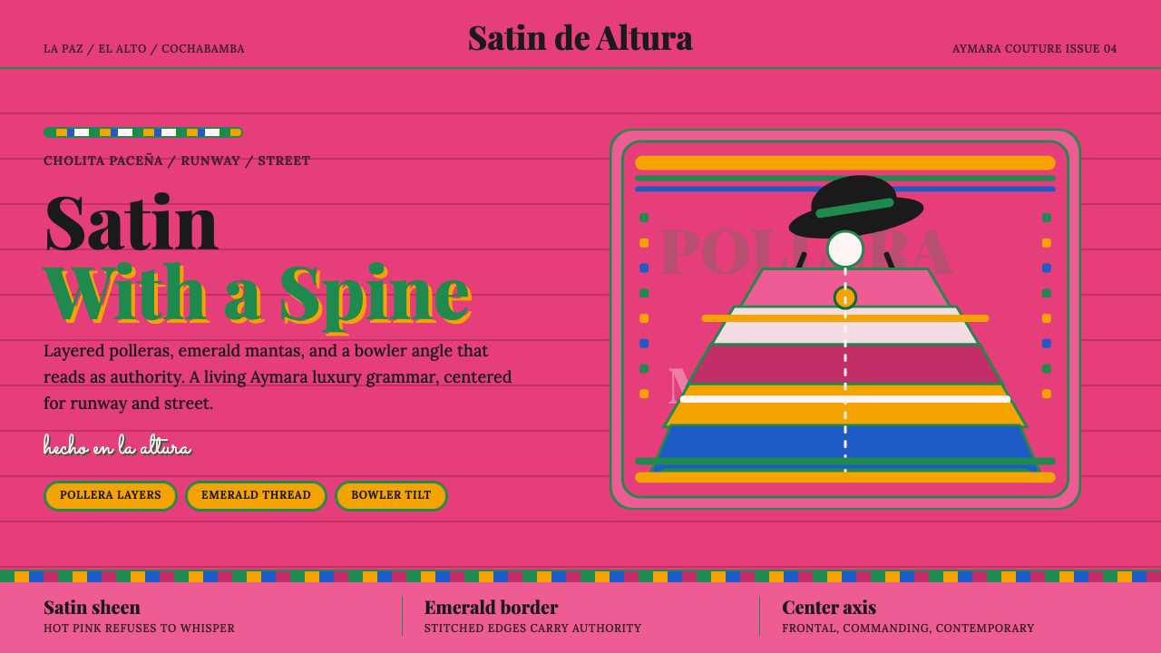 Bolivian Cholita FashionUnapologetic satin power. Hot pink fields, emerald stitches, centered pollera…拒绝低语的缎面力量。亮粉底、翡翠绣线与居中波列拉轴线。
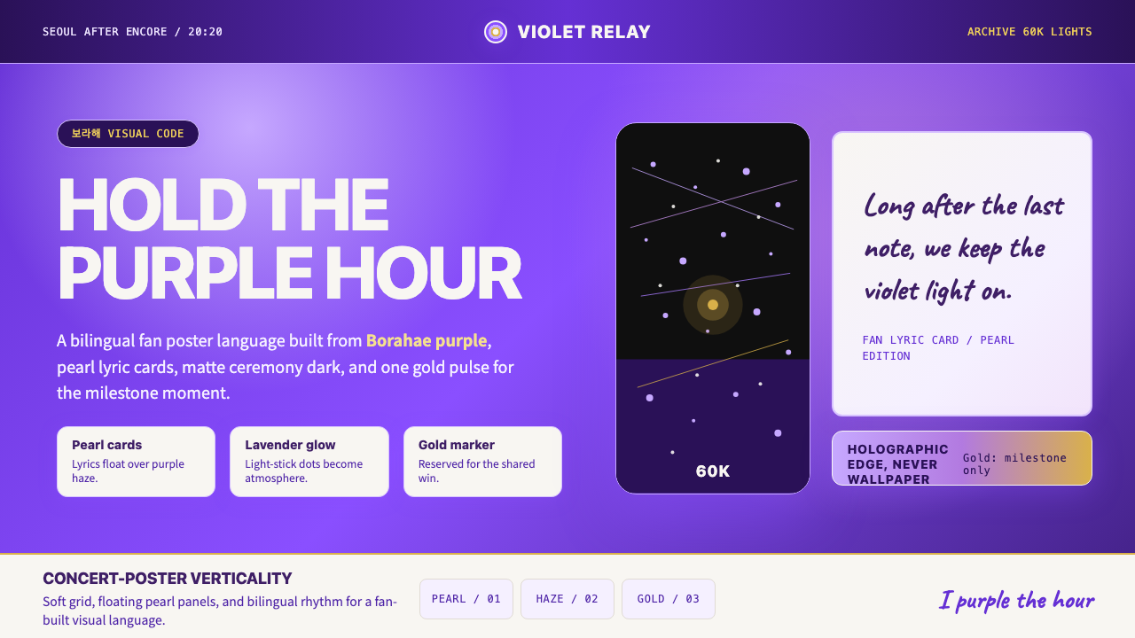 BTS Army Purple 2020Fandom becomes atmosphere. Borahae purple, pearl cards, lavender glow, one go…粉丝成为气氛:Borahae紫、珍珠歌词卡、薰衣草光晕与一束金光。
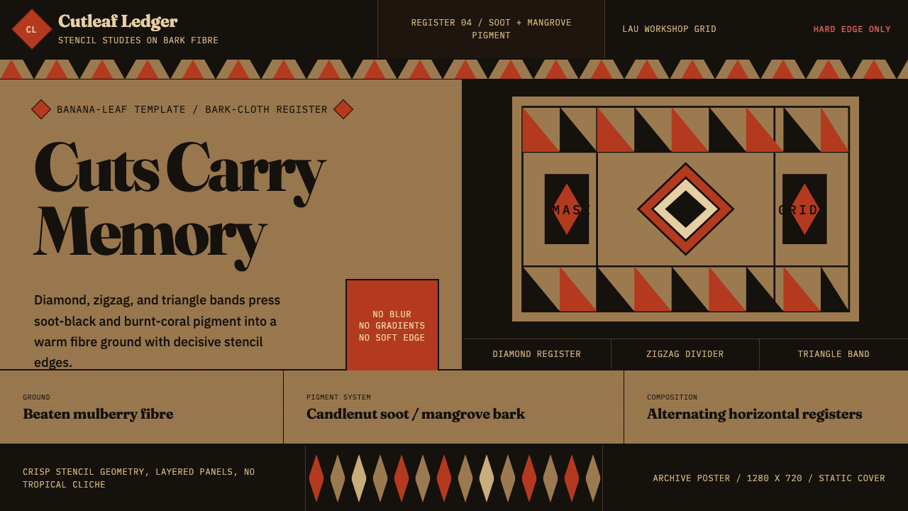 Fijian Masi (Bark Stencil)Stencil memory stays sharp. Soot black and burnt coral strike bark-fibre band…模板记忆锋利:烟黑与焦珊瑚红压入树皮纤维横带。
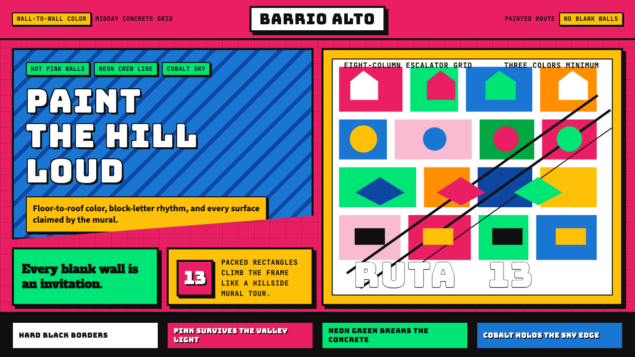 Medellín Comuna 13 MuralsRefuses blank walls. Hot pink, neon green, and cobalt blocks pack the grid li…拒绝空白墙:玫红、霓虹绿与钴蓝块面挤满网格。
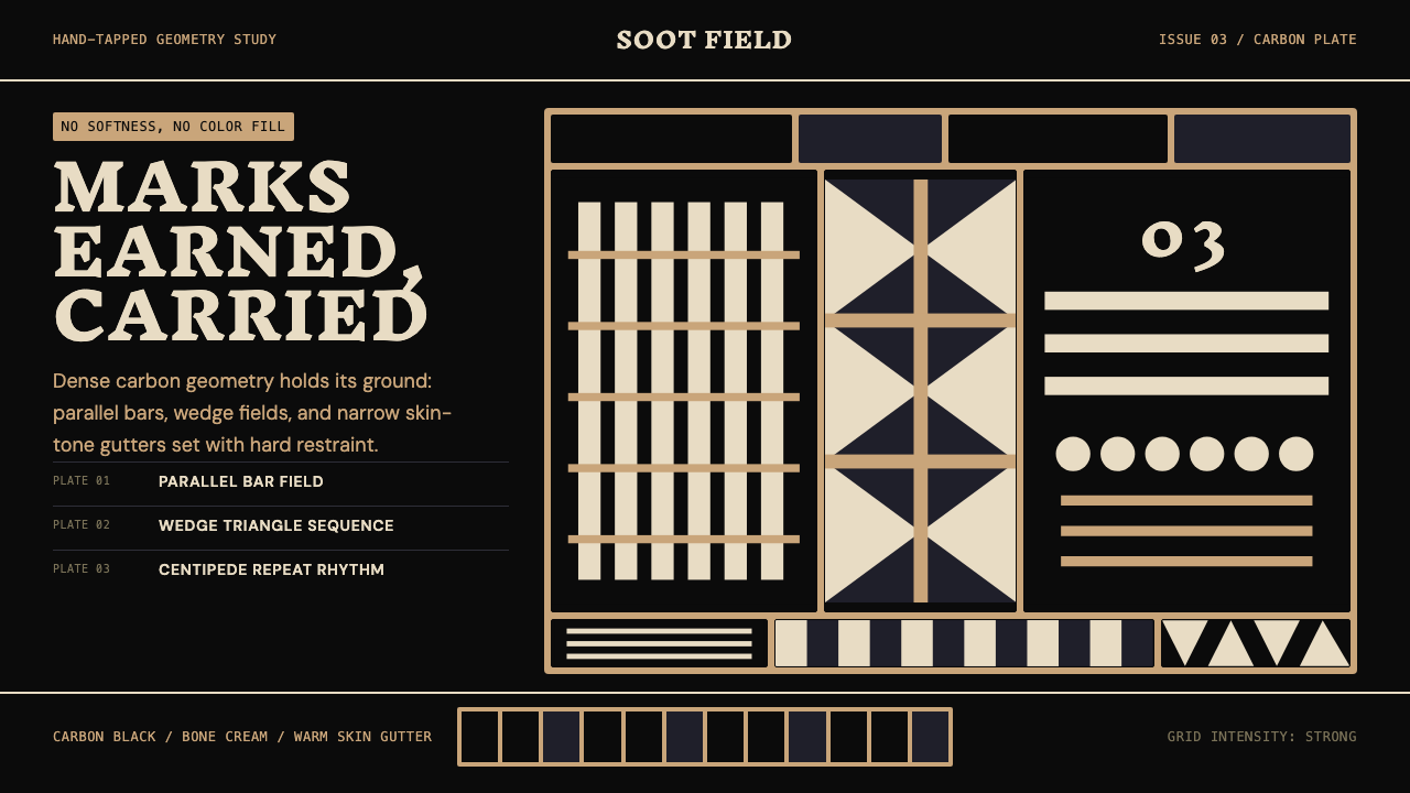 Samoan Tatau (Pe'a)Gravitas without softness. Soot-black geometry locks into warm skin-tone gutt…无柔化的重量:烟黑几何嵌入暖肤色窄沟。