What is Oaxaca Indigenous-Modern?
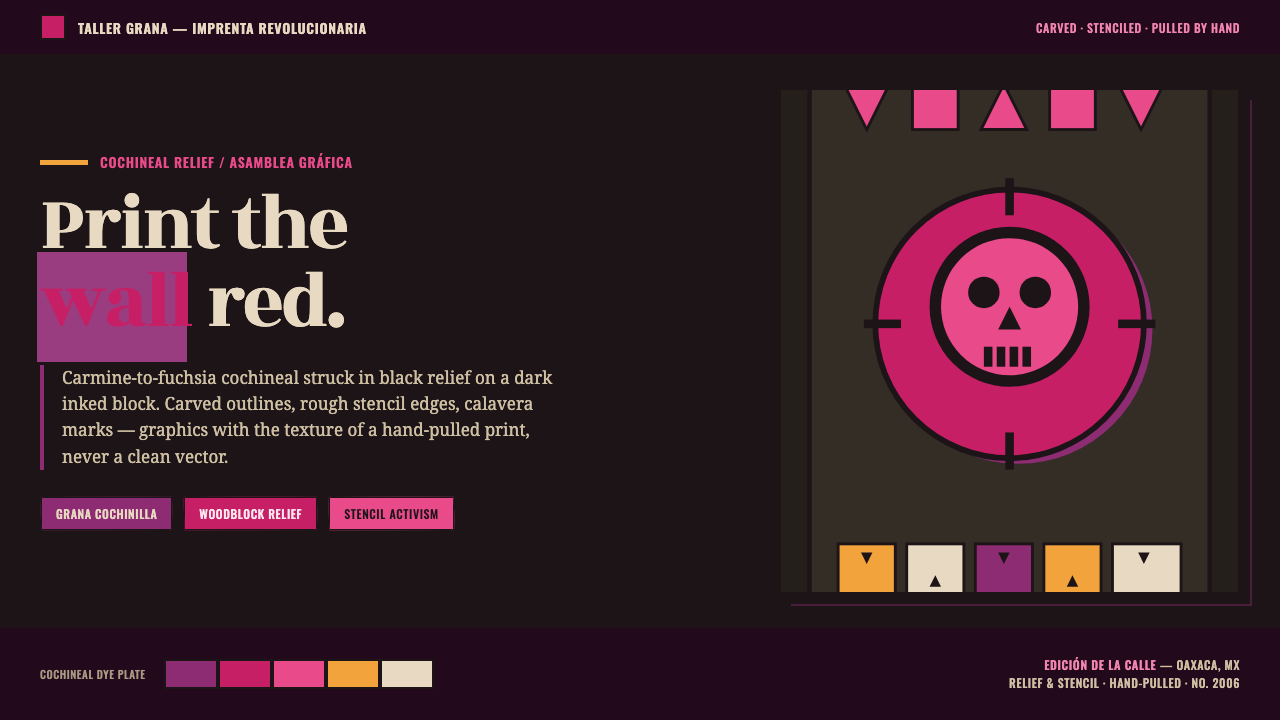
Oaxaca Indigenous-Modern turns the pressure of a hand-pulled street print into a contemporary visual language: cochineal heat, black relief, and imagery made to carry memory and dissent.
Oaxaca Indigenous-Modern in brief
Oaxaca Indigenous-Modern is a contemporary graphic fusion rooted in Oaxaca, Mexico, and shaped by ASARO, the Assembly of Revolutionary Artists of Oaxaca. Its visual language joins revolutionary woodblock and stencil printmaking with Indigenous motifs, calavera imagery, and the public urgency of street activism. It does not aim for polished neutrality. It aims to feel printed, handled, posted, and seen at close range: an image with enough force to survive a dark wall, a crowded street, or a quickly scanned screen.
The central color logic comes from grana cochinilla, the historic cochineal dye associated with Oaxaca. Its family runs through carmine, fuchsia, magenta, and, when iron enters the dye process, purple. Against a dark inked field, these hues do not behave like decorative accents. They flare out of black relief marks as signals of heat, life, warning, and collective presence. Color is concentrated, never politely dispersed.
The style is built around the physical logic of printmaking. Heavy carved outlines, black relief shapes, rough stencil edges, and irregular coverage give forms a hand-pulled presence rather than the clean consistency of a vector illustration. Calavera and Indigenous motifs can carry historical and cultural charge, while alebrije-like accents introduce bursts of strange, bright energy. The result is not nostalgia for an old medium; it is printmaking used as a living activist instrument.
Where does Oaxaca Indigenous-Modern come from?
The style belongs to a contemporary Oaxaca context, with its stated era beginning in 2010 and continuing into the present, while its political and visual roots reach back to the 2006 Oaxaca uprising. That connection matters because the style is not simply regional ornament translated into graphics. It is a language formed around public struggle, collective making, and the need for images that can circulate beyond formal galleries.
ASARO, the Assembly of Revolutionary Artists of Oaxaca, is the central collective named in this lineage. Its work in woodblock and stencil printing establishes the style's practical grammar: dark inked grounds, bold relief marks, carved contour, and edges that retain evidence of process. The associated setting of Espacio Zapata reinforces the sense of a working graphic culture rather than a detached decorative trend. The image is meant to be made, reproduced, encountered, and answered.
Shinzaburo Takeda is identified as a key figure in the formation of this print language and in its connection to the memory of the 2006 uprising. Within the approved account, his teaching provides an important bridge between artistic practice and the activist context from which the visual system grew. That bridge helps explain why craft detail is never merely craft detail here: the cut edge, the pressure of black ink, and the roughness of a stencil all remain part of the message.
José Guadalupe Posada supplies the calavera lineage carried into present-day street activism. Oaxaca Indigenous-Modern does not treat calavera as a floating seasonal symbol. In this source tradition, it is part of a graphic inheritance adapted by ASARO through revolutionary woodblock and stencil printmaking, Mexican muralism legacy, and Indigenous-motif activism. The contemporary work therefore holds several histories together without smoothing their friction away.
What defines the Oaxaca Indigenous-Modern look?
Cochineal Heat
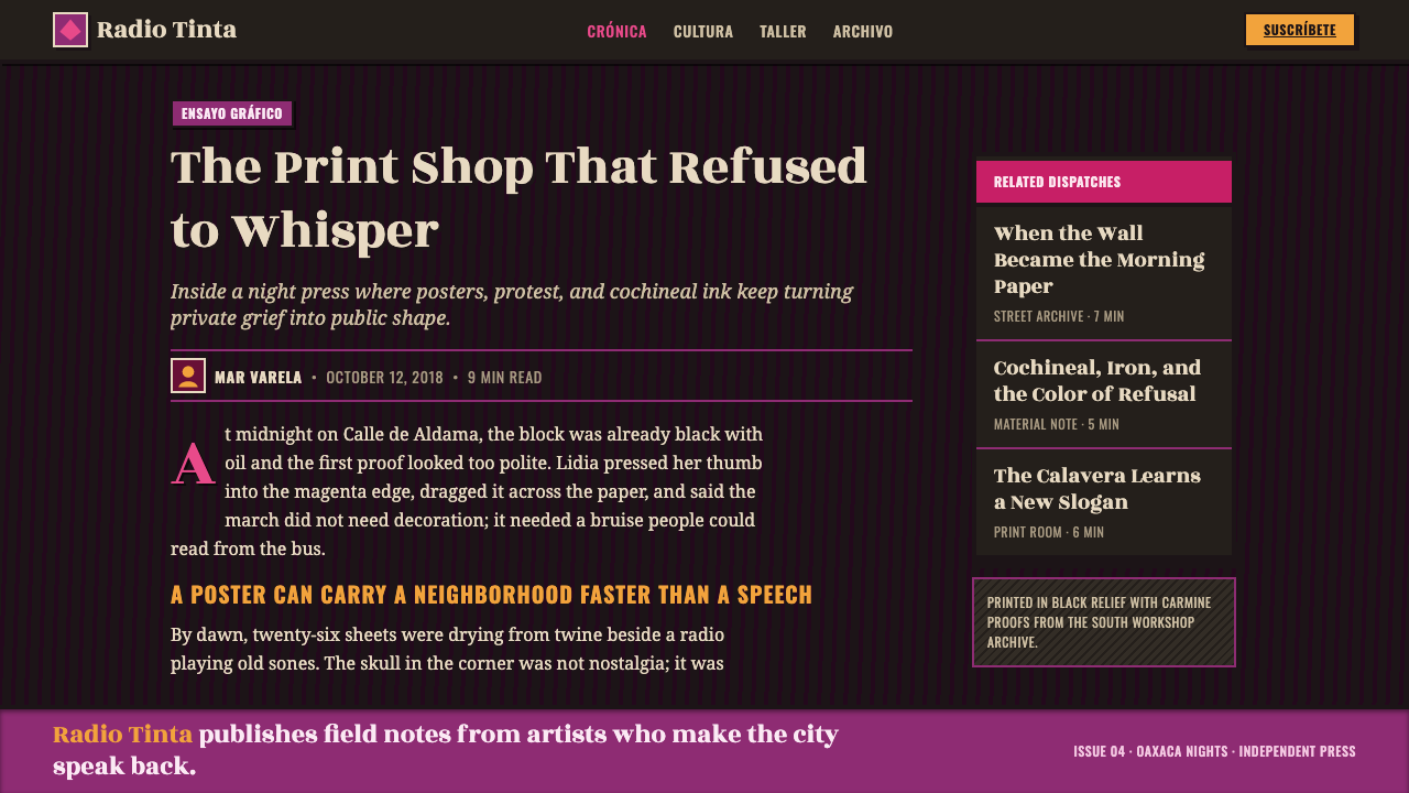
Cochineal-derived carmine, fuchsia, magenta, and purple form the emotional center of the palette. They are strongest when held against the dark inked field and black relief rather than spread evenly across every surface. The color should read as pigment with history: vivid, staining, and alive. Alebrije-like bright accents can intensify that energy, but they should feel like flashes within the print, not a cheerful decorative rainbow.
Black Relief
Black is not simply a background neutral. It behaves as relief ink, carved contour, and visual pressure. Thick black marks frame faces, bodies, symbols, and letters with the force of a woodblock impression. On a dark field, the system depends on separation through texture, edge, and the sudden arrival of cochineal color. The black should feel materially pressed onto the surface, not digitally softened into atmosphere.
Carved and Stenciled Edge
Clean vector perfection works against the style. Contours should appear cut, chipped, over-inked, interrupted, or slightly uneven, as though they emerged from a woodblock or passed through a stencil. This roughness is not a generic distressed filter. It is evidence of a production method and a refusal of frictionless polish. The edge should remain legible enough for public communication while retaining the physical resistance of the print.
Calavera and Indigenous Motif
Calavera and Indigenous motifs give the system its symbolic vocabulary. They should be treated as charged graphic forms, not interchangeable pattern inventory. A skull, mask-like face, creature, or emblem becomes most convincing when simplified by the demands of carving and relief: bold silhouette, forceful internal marks, and a readable relationship between black mass and colored accent. Their role is to concentrate memory, identity, and public address.
Dark Inked Field
The field is dark, inked, and active rather than empty. It should suggest a printed ground that receives relief marks, color bursts, and rough silhouettes. Its darkness gives cochineal hues their voltage and allows black forms to operate through density and tactile variation instead of conventional soft depth. Avoid turning it into a sleek cinematic backdrop; it belongs to a print surface, with grain, pressure, and visible making.
Activist Directness
This visual language is strongest when its composition has a public, declarative force. A single image, phrase, or emblem can dominate a field; secondary information should support that gesture rather than compete with it. The style inherits its energy from street activism, so ambiguity should come from layered symbol and rough materiality, not from vague hierarchy. It needs to be felt quickly and then examined more closely.
Who shaped Oaxaca Indigenous-Modern?
ASARO, the Assembly of Revolutionary Artists of Oaxaca, is the central contemporary collective in this style's approved lineage. Its woodblock and stencil practice carries calavera heritage into present-day street activism and anchors the aesthetic in Oaxaca rather than in a generic global print revival. The collective's significance lies in joining graphic production, public circulation, revolutionary printmaking, and Indigenous-motif activism into one visual field.
Shinzaburo Takeda is named as a key figure in the teaching context through which this print language took root in the struggle memory of the 2006 Oaxaca uprising. In the source material, his role helps explain the continuity between workshop knowledge and activist graphics. The style's carved marks and rough stencil logic are therefore not surface effects alone; they belong to an inherited way of making images under public pressure.
José Guadalupe Posada represents the calavera heritage named as a foundation for Oaxaca Indigenous-Modern. The contemporary language carries that lineage into ASARO's street activism, where skull imagery becomes part of a wider system of black relief, Indigenous motif, and revolutionary printmaking. His importance here is genealogical: the calavera is not an isolated icon but a visual thread that the present-day work reactivates.
How do you use Oaxaca Indigenous-Modern today?
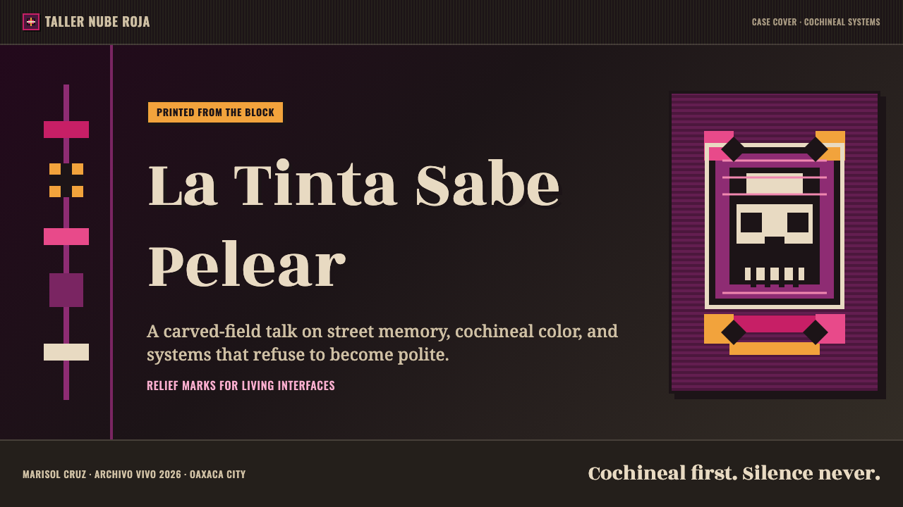
For presentation covers, use the style as a declaration rather than a theme applied everywhere. A dark inked field can hold one commanding calavera-derived silhouette, carved emblem, or rough typographic statement, with cochineal color concentrated where attention must land. Keep supporting information quieter and let the composition resemble a poster pulled from a street wall. The cover should establish pressure, identity, and subject before it explains detail.
For content and data slides, retain the print logic while making information easy to read. Use black relief-like dividers, rough-edged labels, and restrained cochineal accents to organize sections, categories, or warnings. Charts should be treated as printed symbols rather than glossy corporate objects: strong silhouettes, direct contrast, and clear annotation work better than decorative effects. A data page succeeds when it still feels like part of the activist graphic system without making comparison difficult.
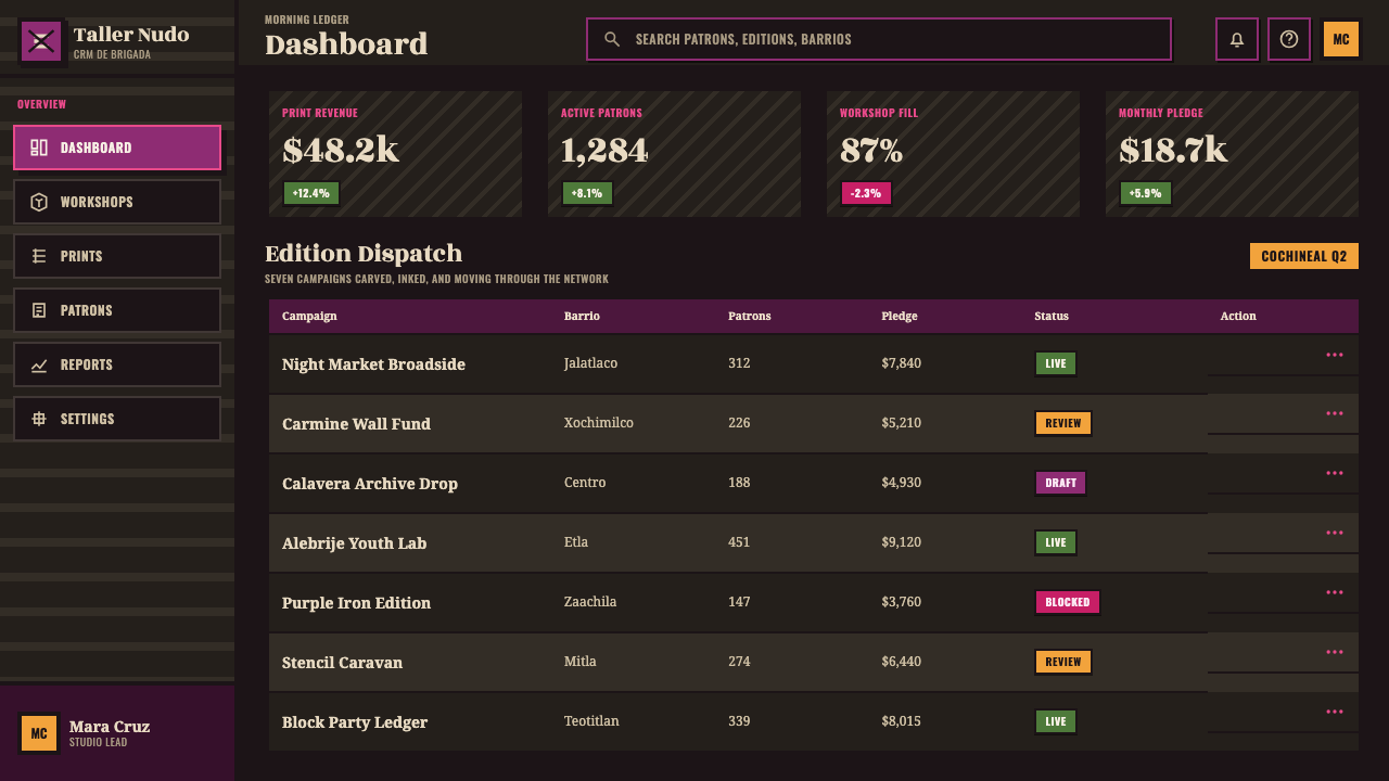
For web interfaces, the style is well suited to campaign pages, cultural archives, event platforms, and editorial dashboards where a strong public voice matters. A dark field can frame navigation, headings, alerts, and key calls to action, while carved textures distinguish panels and states. Dashboard information needs disciplined grouping so the rough visual language does not become visual noise. Let the hand-pulled texture live in large anchors, section banners, and selected controls rather than coating every functional surface.
For editorial and marketing work, use the style to build sequence and emotional escalation. Feature stories can open with a full-bleed dark print field, then alternate dense image-led moments with calmer reading areas that preserve the same cochineal and black logic. Marketing materials benefit when a single symbolic form is repeated as a campaign device across posters, social graphics, and landing pages. The repeated form creates recognition; variation in carving, cropping, and ink texture keeps the system alive.
The common mistake is reducing Oaxaca Indigenous-Modern to skulls, bright magenta, and a generic grunge texture. That strips the style of the specific relationships that give it meaning: Oaxaca, ASARO, woodblock and stencil practice, cochineal dye, Indigenous motifs, and street activism. Another mistake is making every edge equally rough and every color equally loud. The style needs contrast between dense black relief and open field, between concentrated pigment and darkness, and between one dominant public statement and its supporting information.
Oaxaca Indigenous-Modern — FAQ
Is Oaxaca Indigenous-Modern simply a Mexican folk-art style?
No. The approved source frames it as a contemporary graphic fusion rooted in Oaxaca and grown from ASARO's revolutionary woodblock and stencil printmaking. Indigenous motifs and calavera imagery are important, but they operate within a language of present-day street activism, dark inked fields, black relief, and cochineal color. Treating it as generic folk decoration removes the political and material conditions that define it.
Why is the palette centered on cochineal rather than any bright red or pink?
Because grana cochinilla is identified as the historic Oaxaca dye at the center of the system. Its movement from carmine through fuchsia and magenta, and toward purple with iron, gives the palette a material and regional basis. Using unrelated bright colors may preserve contrast, but it loses the specific dye logic that connects the visual language to Oaxaca and to the hand-printed character of the work.
Can the style be made clean and minimal for a modern interface?
It can be made more functional, but it should not be cleaned until its printmaking identity disappears. Modern interfaces need readable hierarchy and calm interaction states, especially in dashboards and pricing contexts. Preserve the style through selected rough-edged anchors, black relief logic, dark fields, and concentrated cochineal accents. If every panel becomes perfectly smooth and every mark becomes neutral, the result may be usable but no longer Oaxaca Indigenous-Modern.
How should calavera imagery be used responsibly in this style?
Use it as part of the stated lineage from José Guadalupe Posada through ASARO's present-day street activism, not as a detached novelty graphic. Pair it with the broader visual system: black relief, carved or stenciled marks, dark inked ground, cochineal color, and Indigenous-motif activism. Context matters as much as silhouette. A calavera used only to signal a vague Mexican atmosphere misses the style's collective, political, and print-based grounding.
Related design styles
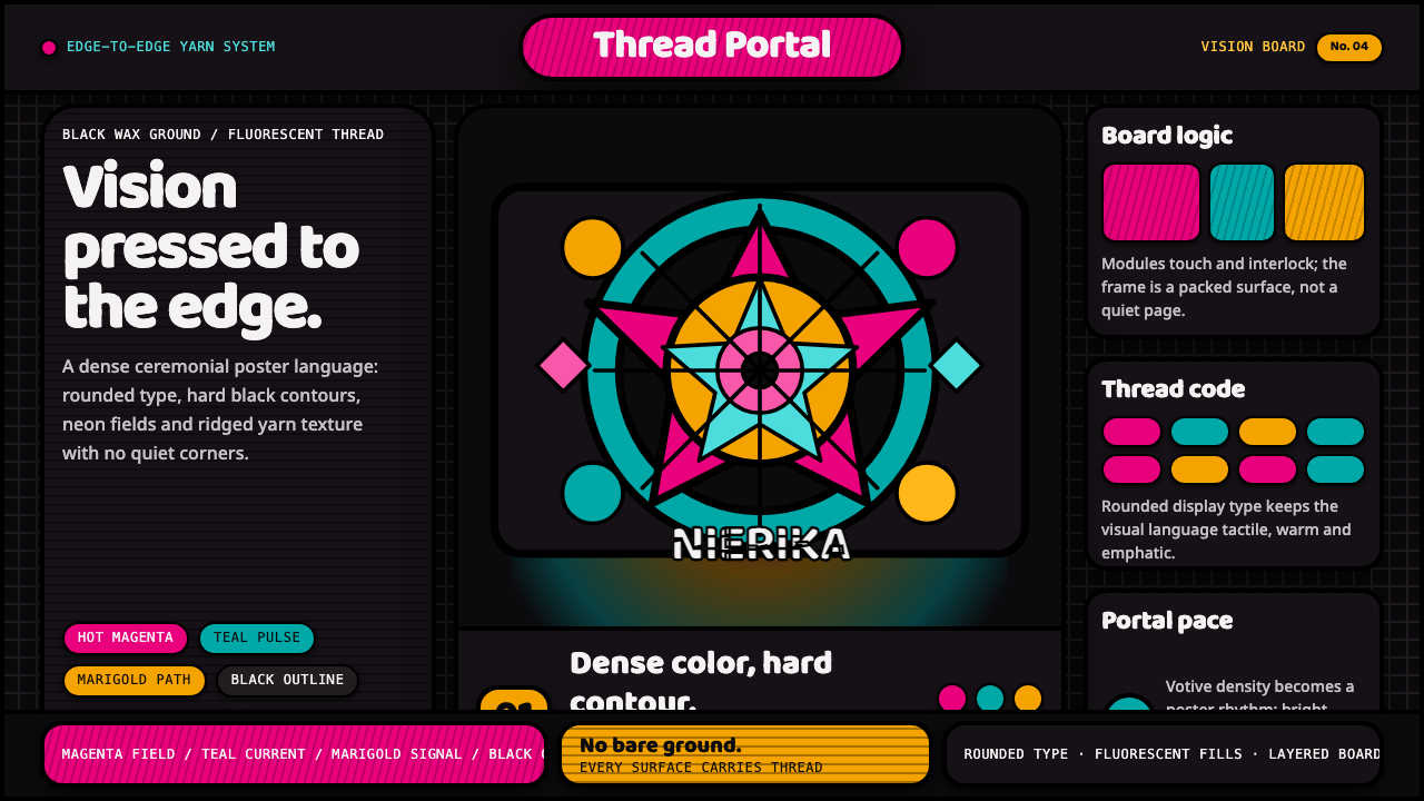 Huichol Yarn NierikaCeremonial density glows. Neon yarn colors lock into black-contoured, edge-to…
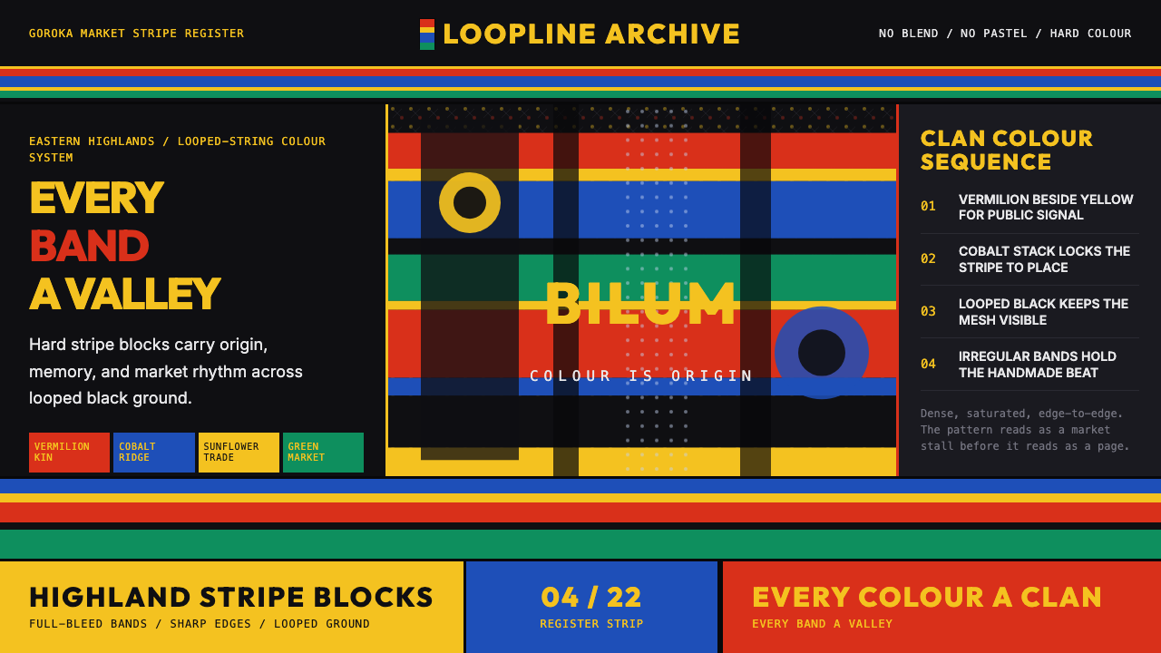 PNG Bilum (Looped String Bag)Identity is striped. Vermilion, cobalt, and sunflower bands beat across loope…
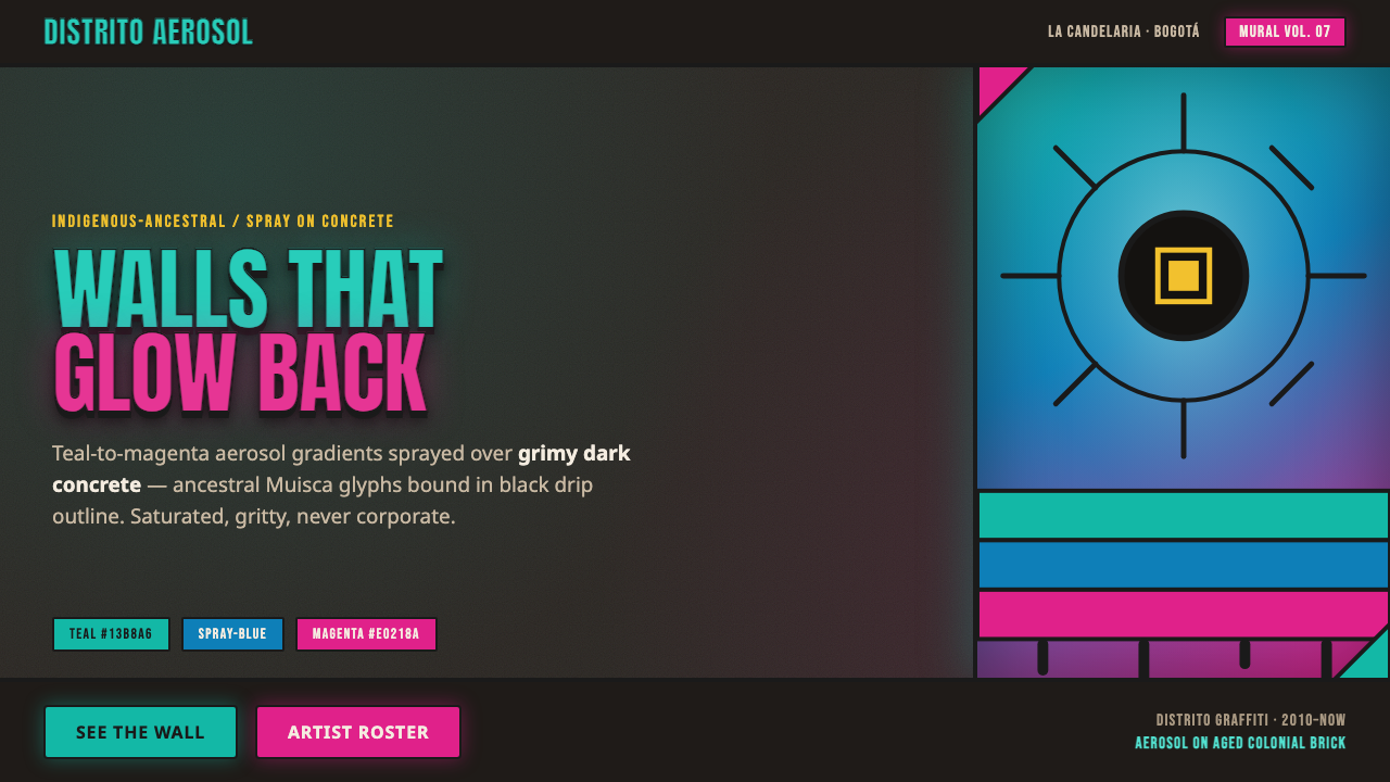 Bogotá Street MuralismNeon spray glowing off the wall. Teal-to-magenta aerosol on grimy concrete, i…
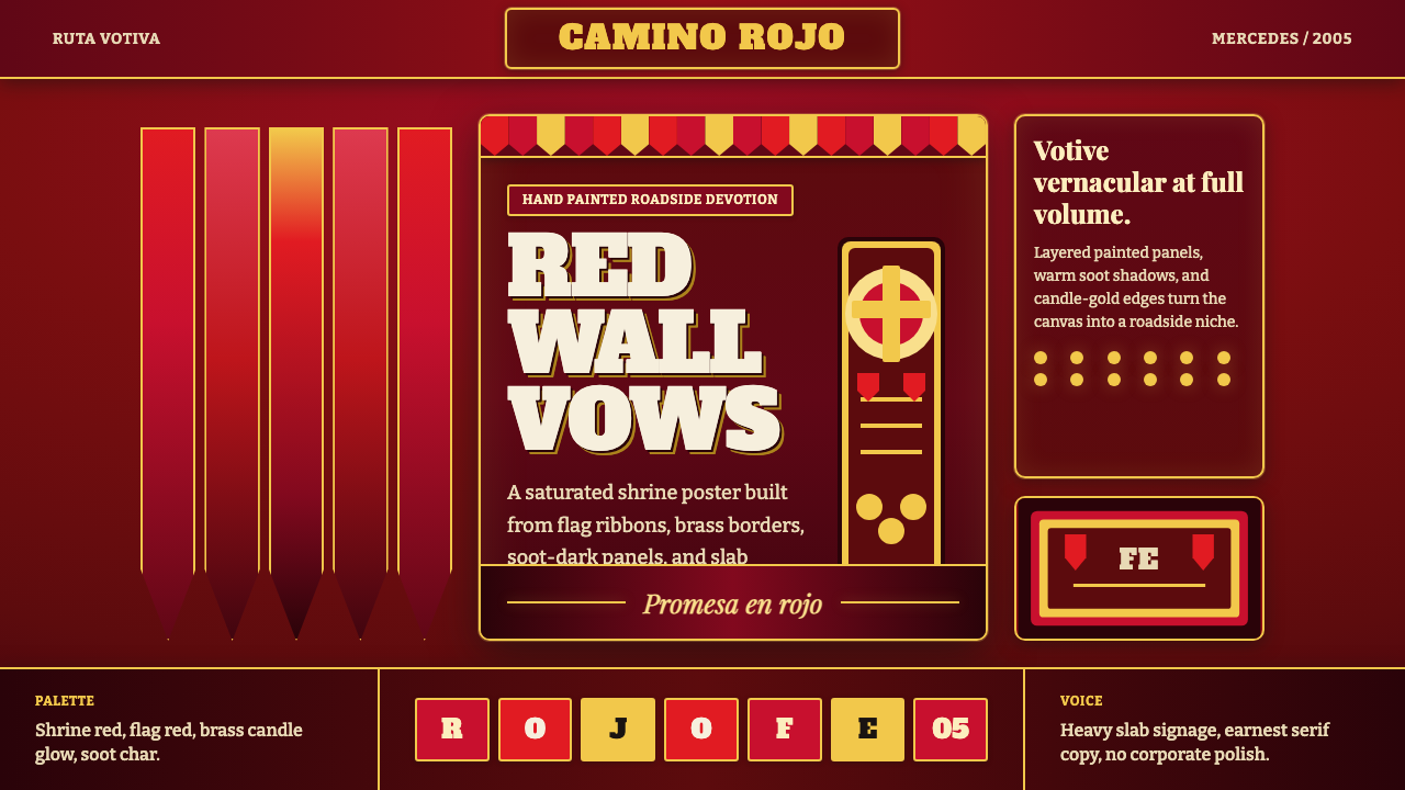 Gauchito Gil ShrineDevotion burns red. Flag ribbons, brass borders, and slab signage glow on soo…
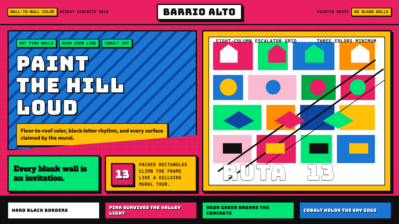 Medellín Comuna 13 MuralsRefuses blank walls. Hot pink, neon green, and cobalt blocks pack the grid li…
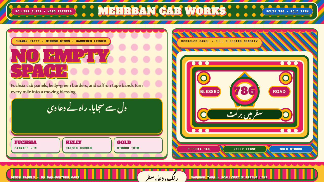 Pakistani Truck ArtBlessing crowds every inch. Fuchsia, kelly green, and gold stack into scallop…