What is Gauchito Gil Shrine?
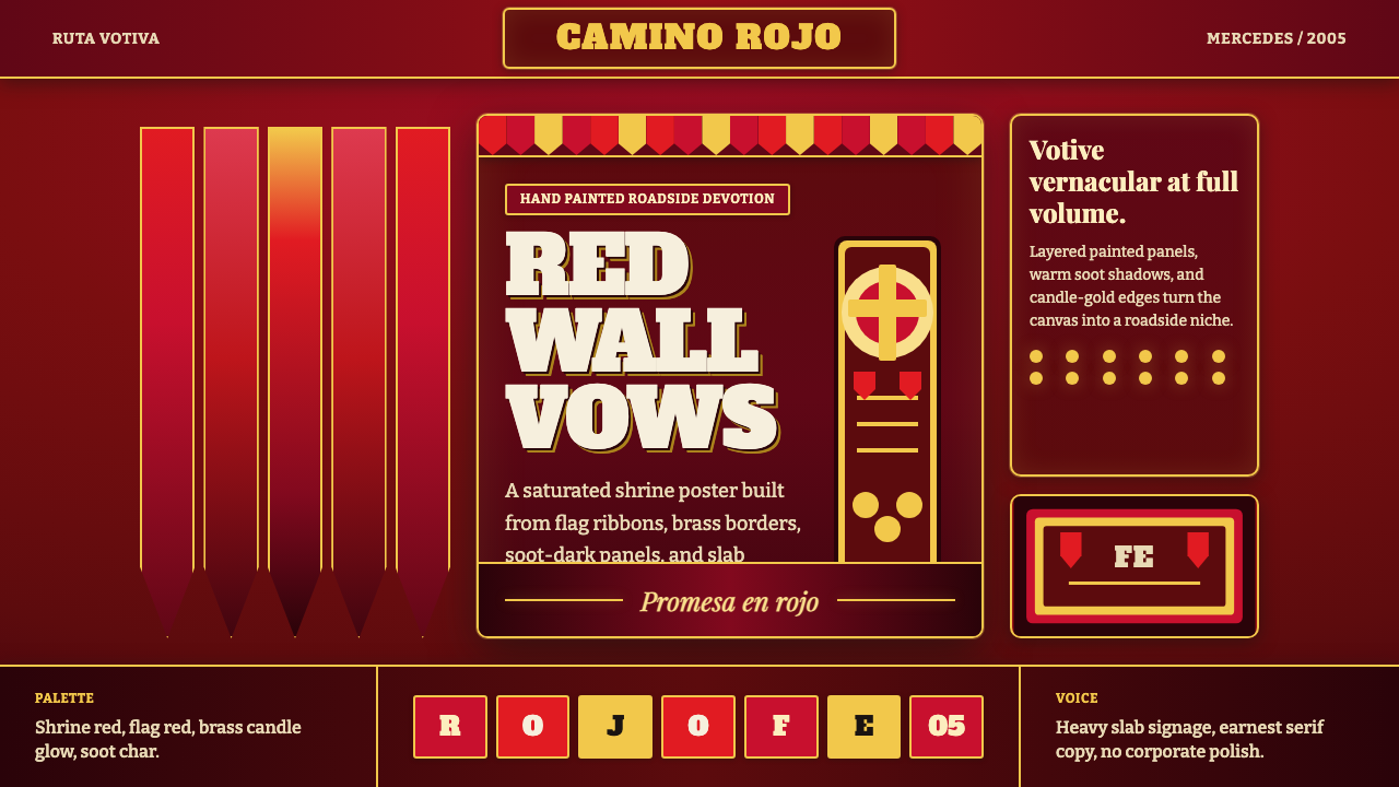
At a Gauchito Gil shrine, devotion does not whisper: it burns red against soot-dark wood, edged in brass and spoken through the gravity of hand-painted signs.
Gauchito Gil Shrine in brief
Gauchito Gil Shrine is a dark devotional style drawn from the roadside shrines dedicated to Argentina’s beloved folk saint Gauchito Antonio Gil. Its visual world is concentrated near Mercedes in Corrientes and repeated across the country: crimson structures beside the road, red flags and ribbons tied by devotees, burning candles, brass details, and surfaces darkened by smoke. The result is not polished ecclesiastical grandeur but an intimate, accumulated form of public devotion.
Red governs the style because it carries the story and presence of the saint. The ribbons recall Gil’s blood-soaked neck-scarf at his execution in 1878; painted shrine walls and the red cross behind him extend that association into architecture and iconography. Several reds may coexist, from deep blood tones to vivid flag color, but they should feel layered by repeated acts of offering rather than arranged as a decorative spectrum.
Translated into design, the shrine becomes a dense yet legible system of dark timber-like grounds, warm paper surfaces, brass borders, candlelit highlights, and emphatic serif lettering. Heavy slab forms provide the authority of roadside signage, while more earnest serifs carry narrative or devotional text. The aesthetic is roughened, warm, frontal, and emotionally direct: less like a neutral interface than a votive object assembled by many hands.
Where does Gauchito Gil Shrine come from?
The style begins with the legend of Gauchito Antonio Gil, whose story is dated to 1878 and whose devotion is rooted in Corrientes. Near Mercedes, roadside shrines became the visible centers of that devotion. Their repeated elements established a recognizable vocabulary: red-painted structures, a red cross, flags and ribbons, candles, brass-toned fittings, dark wood, and signs declaring presence with forceful lettering.
The ribbons are not incidental embellishments. They recall the blood-soaked neck-scarf associated with Gil’s execution, turning a strip of red cloth into both memorial sign and devotional offering. When many devotees attach flags and ribbons to the same shrine, individual gestures accumulate into a moving red envelope around the structure. The aesthetic therefore grows through repetition, weather, smoke, and participation rather than through a single author’s finished composition.
Between 1990 and 2010, a modern devotional boom carried this shrine language from its regional epicenter into broader Argentine visibility. What spread was not a formally controlled identity but a folk-Catholic votive vernacular. Anonymous devotees and shrine-builders repeated recognizable signs while adapting them to available materials, roadside conditions, and local acts of remembrance. Consistency came from shared devotion: red remained dominant, candles remained active, and the shrine remained unmistakably public.
Its design significance lies in that collective authorship. Gauchito Gil Shrine combines roadside-shrine iconography with devotional kitsch, allowing emotional intensity, handmade lettering, bright metal, darkened surfaces, and abundant red to coexist without embarrassment. Digital adaptations should preserve this accumulated character. If every edge becomes immaculate and every surface becomes interchangeable, the style loses the human evidence that gives it authority.
What defines the Gauchito Gil Shrine look?
Devotional Red
Red is narrative before it is decorative. Deep blood-red establishes the shrine wall; brighter devotional and flag reds identify offerings, calls to action, and moments of collective intensity. The tones should remain closely related, as though paint, cloth, and reflected candlelight were different manifestations of the same vow.
Soot-Dark Ground
The background is dark but rarely sterile black. It suggests wood repeatedly exposed to candle smoke: warm, uneven, and capable of holding traces of use. This depth makes red appear incandescent and gives pale paper panels the feeling of objects placed inside a shrine rather than generic floating cards.
Brass and Candlelight
Warm brass supplies the secondary emphasis. It belongs on borders, small emblems, dividers, and focal details, where it can catch an implied candle glow. The effect should be aged and devotional, not luxurious: brass marks care, continuity, and ritual attention rather than wealth.
Slab and Earnest Serif
Headlines use heavy slab serifs with the blunt confidence of hand-painted roadside signage. Supporting text shifts to an earnest, readable serif voice. Contrast comes through presence and cadence rather than fashionable delicacy; the words should feel declared, remembered, or offered.
Layered Offerings
Composition is additive. Ribbons cross borders, signs sit over darker panels, and paper-like notices appear attached rather than seamlessly integrated. Controlled overlap evokes a shrine built through successive visits. The layers may be dense, but the central message must remain frontal and immediately readable.
Weathered Directness
Wear is evidence of devotion, not a decorative distress filter. Smoke, softened paint, aged paper, and irregular hand-made edges should appear selectively where they explain material history. The underlying layout remains decisive, preventing vernacular richness from collapsing into picturesque clutter.
Who shaped Gauchito Gil Shrine?
Gil is the devotional center from which every visual sign derives. His legend, dated to 1878, gives red its memorial force through the blood-soaked neck-scarf associated with his execution. The red cross, roadside shrine, ribbons, and candles do not function as detachable motifs; together they announce his presence and connect the contemporary shrine to the originating story.
The devotees are the style’s continuing authors. By tying ribbons, raising flags, lighting candles, and returning to the shrines, they transform repeated symbols into a living visual language. Their contributions explain why abundance and variation belong to the aesthetic: each addition is personal, while its red color and devotional purpose join a collective field.
The shrine-builders give devotion a roadside body. Working with practical structures, painted surfaces, signs, metal details, and places for offerings, they establish the frame within which later gestures accumulate. Their importance is not individual celebrity but vernacular continuity: recognizable forms can be rebuilt across Argentina without becoming mechanically identical.
How do you use Gauchito Gil Shrine today?
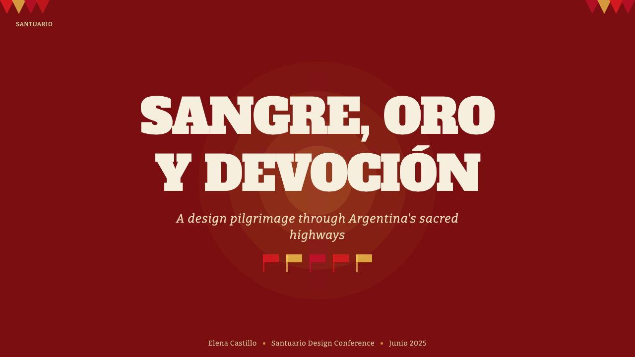
For presentation covers, treat the slide as a frontal shrine facade. A deep red or soot-dark field carries a compact title in heavy slab lettering, framed by restrained brass lines and one emphatic ribbon or cross-like axis. Content slides should become calmer: warm paper panels hold explanatory text, while red labels and dark structural bands maintain continuity without making every page equally ceremonial.
Data slides require disciplined translation. Charts should remain readable first, using the family of reds to distinguish emphasis and brass only for exceptional markers or reference points. Dark grounds can support pale labels and strong silhouettes, but decorative ribbons must not cross plotted information. The votive character belongs in the framing, headings, and material atmosphere rather than in distortions of the data.
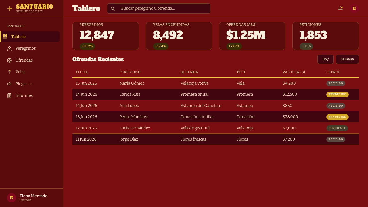
For web dashboards and pricing interfaces, use the shrine wall as a stable shell and let lighter paper-like surfaces carry dense information. Red can identify active states, urgent notices, selected plans, or primary actions; brass can signal valued or commemorative details. Borders should feel painted or metal-edged, while controls remain direct. A pricing tier may read like a hand-lettered offering board, but its terms must remain plainly comparable.
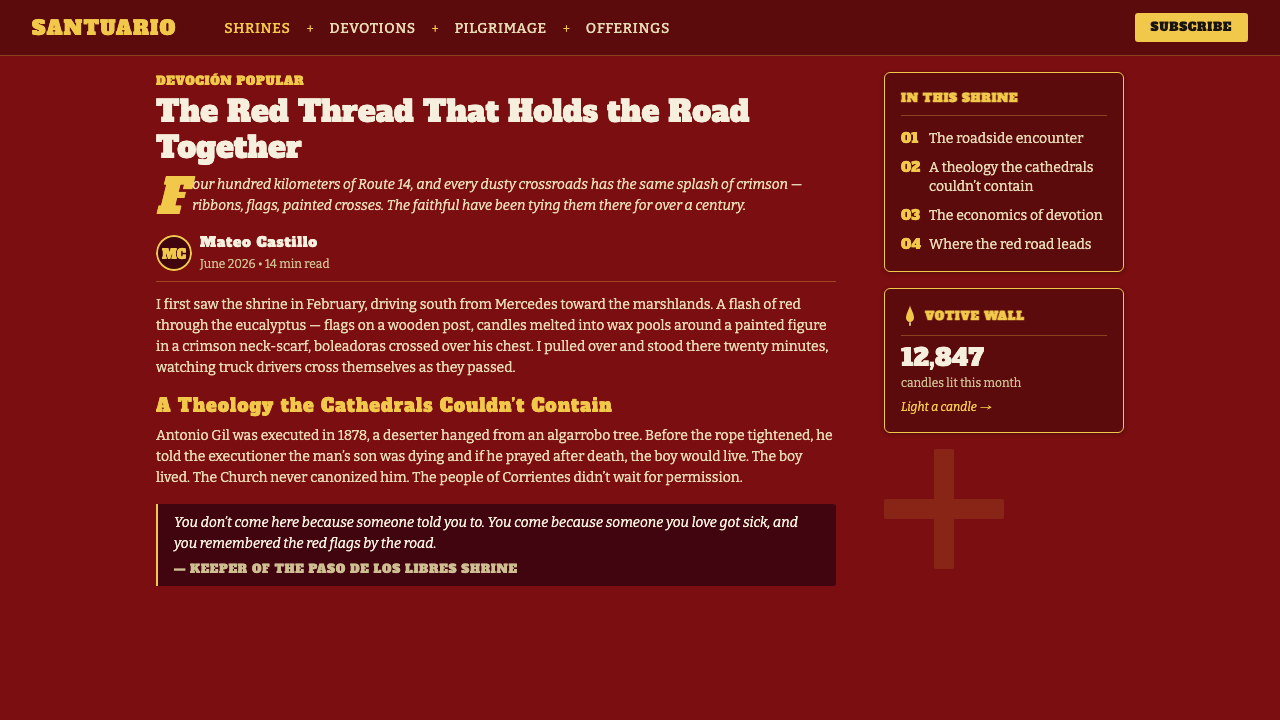
Editorial and marketing layouts benefit from the style’s narrative intensity. Long articles can alternate dark passages with warm paper sections, using slab headings as public declarations and serif body text as intimate testimony. Campaign pages may layer flags, signs, and candlelit accents around a central message. The strongest compositions choose one devotional focal point and allow surrounding textures to support it.
The common mistake is reducing the style to red-on-black spectacle. Saturating every surface with equally vivid red destroys hierarchy, while indiscriminate distress turns living vernacular into theatrical scenery. Brass should not become luxury gold, and slab lettering should not become parody western typography. Preserve the relationship among remembrance, offering, roadside construction, and accumulated human use; the visual drama follows from those meanings.
Gauchito Gil Shrine — FAQ
Is Gauchito Gil Shrine simply a red dark theme?
No. Its colors are inseparable from devotional meaning and material context. Red recalls Gil’s neck-scarf, marks flags and ribbons, covers the shrine, and appears in the cross behind him. Darkness comes from soot-marked wood and candlelit enclosure rather than abstract digital black. Removing those relationships leaves a dramatic palette but not the shrine vernacular.
How should red be balanced in an interface?
Begin with a deep red or soot-dark structural field, then reserve the most vivid red for devotional focal points and meaningful actions. Warm paper gives reading areas relief, while brass provides small moments of light. The aim is not to minimize red but to let different red surfaces behave like wall, paint, cloth, and signal.
Can the style work without distressed textures?
Yes, if the essential relationships remain: dominant devotional red, soot-dark depth, warm paper, brass accents, slab signage, serif narrative text, and layered offerings. Weathering strengthens the material story but should never substitute for it. A cleaner version can still feel authentic when its composition suggests attachment, repetition, and public devotion.
How is devotional kitsch different from careless clutter?
Devotional kitsch accumulates around a stable sacred focus. Flags, ribbons, candles, signs, brass, and paper notices may be abundant, but each belongs to remembrance or offering. Careless clutter lacks that hierarchy and treats every motif as equal decoration. Keep the saint, cross, title, or central message dominant, then let supporting layers testify to repeated participation.
Where does Gauchito Gil Shrine work best, and where does it struggle?
It excels in storytelling, cultural education, commemorative projects, event identities, editorial features, and campaigns that can sustain emotional directness and a strong sense of place. It is less comfortable in products that must appear neutral, clinically detached, or universally interchangeable. Dense operational interfaces can borrow its hierarchy and materials, but should temper the ceremonial layering around routine tasks.
Related design styles
 Belizean Garifuna PuntaNight rhythm burns. Indigo fields, flame-orange serif type, and flag stripes…
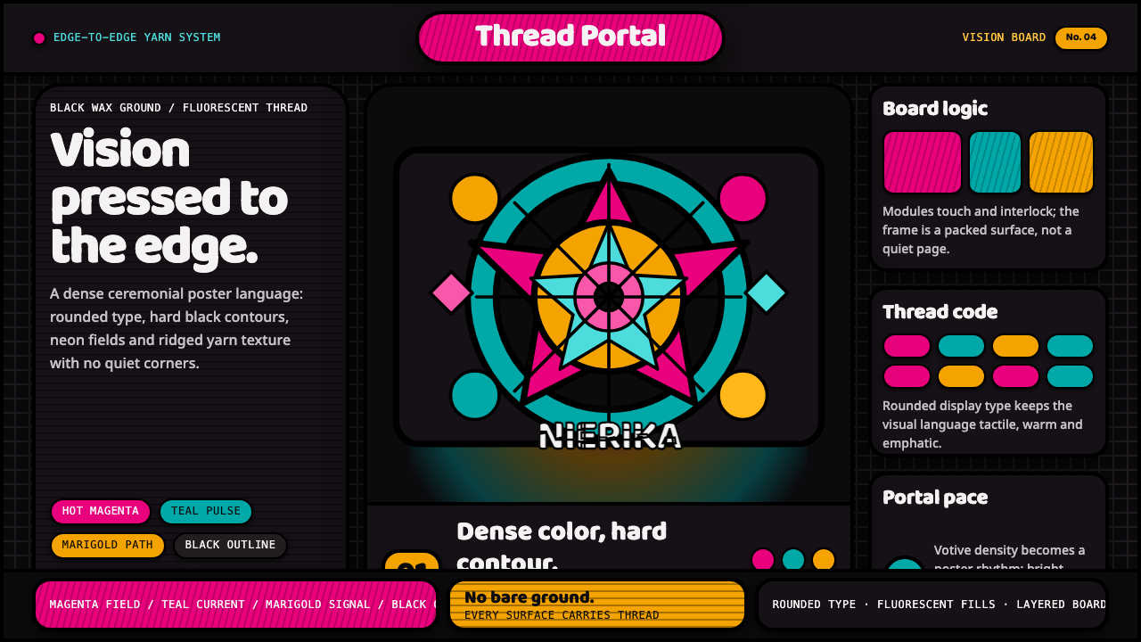 Huichol Yarn NierikaCeremonial density glows. Neon yarn colors lock into black-contoured, edge-to…
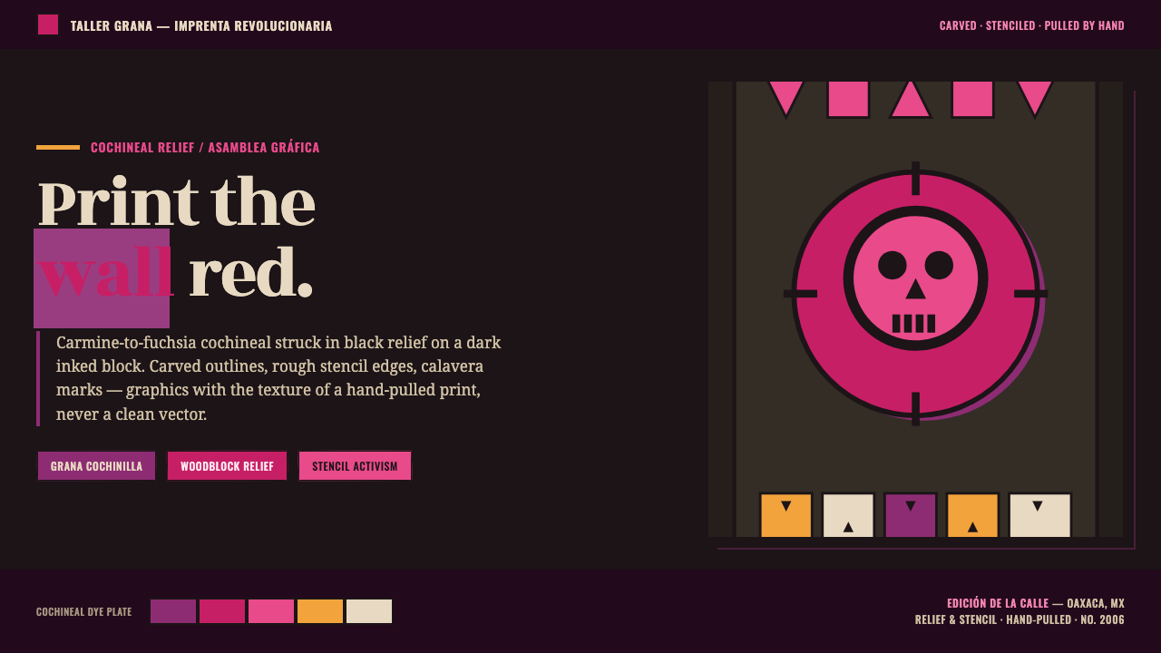 Oaxaca Indigenous-ModernActivist woodblock graphics. Cochineal carmine-fuchsia struck in black relief…
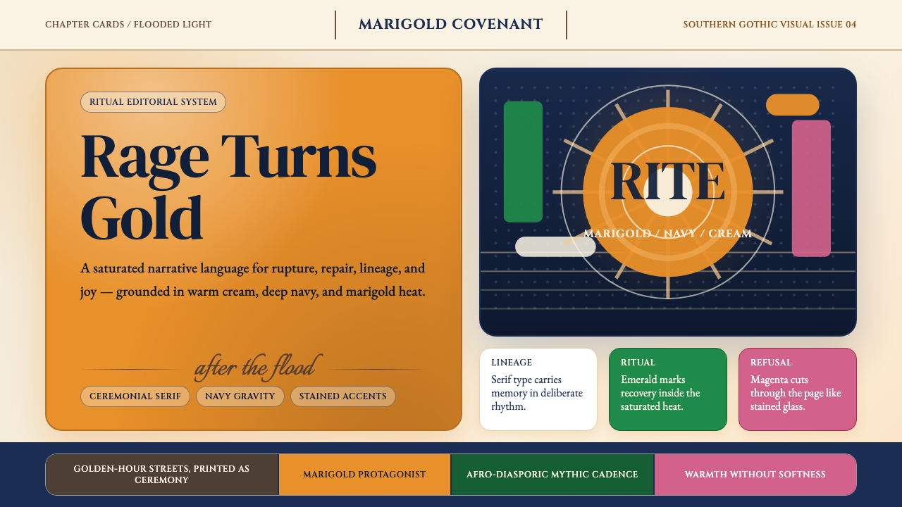 Beyoncé — LemonadeMythic heat refuses restraint. Marigold blocks, navy gravity, serif ceremony.
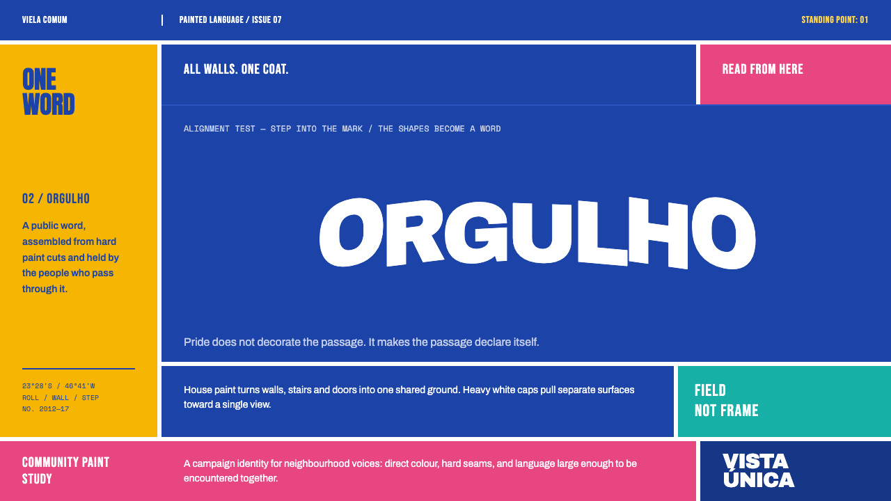 Boa Mistura Favela PaintingPride fills the passage. White Archivo Black caps snap across an ultramarine…
 Pakistani Truck ArtBlessing crowds every inch. Fuchsia, kelly green, and gold stack into scallop…