What is Boa Mistura Favela Painting?
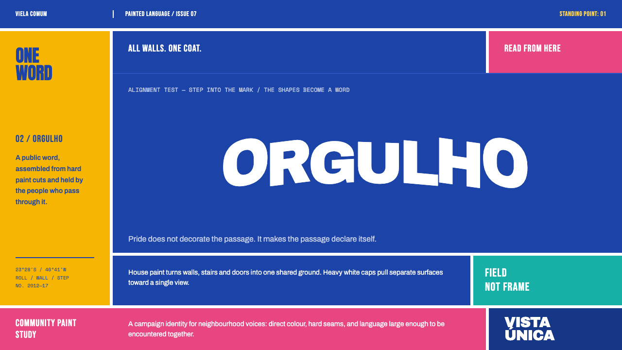
Boa Mistura painted whole alleys in one flat, saturated colour, then split a single white word across a dozen houses so that it snaps into type from only one standing point.
Boa Mistura Favela Painting in brief
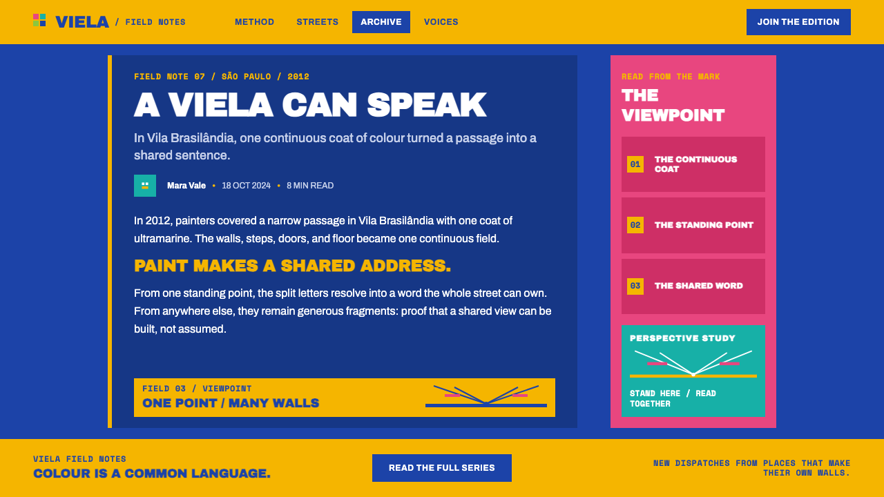
In 2012 the Madrid collective Boa Mistura went into the vielas, the narrow alleys, of Vila Brasilândia in northern São Paulo, carrying rollers and ordinary house paint. Each alley, its walls, steps, doors and floor, was coated in a single flat saturated colour until the building materials stopped being separate things. Brick, concrete and sheet metal became one continuous painted surface.
Then a single word went on in white heavy capitals. It was split across a dozen houses and skewed so hard that it only snaps into legible type from one standing point at the mouth of the alley. The words were Amor, Doçura, Firmeza, Beleza and Orgulho: love, sweetness, firmness, beauty and pride. The effect is part street art, part optical trick and part declaration.
The design system takes that literally. A page is one opaque field of deep ultramarine, the word is the only figure on it, and every edge is a paint cut, not a shadow. Nothing floats, nothing glows and nothing fades. There is also no filter that turns the alleys into 'favela chic': the work treats the place as somewhere people live, not as a backdrop for atmosphere.
Where does Boa Mistura Favela Painting come from?
Boa Mistura is a collective of artists based in Madrid, Spain, and the five names attached to the project are Javier Serrano, Juan Jaume, Pablo Purón, Pablo Ferreiro and Rubén Martín. The group sits within a Spanish urban-art scene made up of collectives rather than individual signatures, and the work in Vila Brasilândia reflects that approach: a shared voice and a shared method, with the identity of the group living in the paint rather than in a personal style.
The work was made in Vila Brasilândia, a neighbourhood in northern São Paulo, across two painting campaigns, in 2012 and in 2017, under the title Luz nas Vielas, 'Light in the Alleys'. The practice belongs to participatory community muralism, in which the people who live behind the wall are part of making it. The alleys were not a canvas supplied by an institution; they were the homes, steps and doors of neighbours.
The formal heart of the work is anamorphosis. A word is distorted, stretched and broken across separate surfaces until it resolves from a single viewpoint, and from any other position it dissolves into coloured shards. Reading becomes an act of positioning, as if the viewer must walk to the right place to be addressed. The words chosen, love, sweetness, firmness, beauty and pride, are affirmative: a vocabulary of qualities rather than problems.
What the project leaves behind for designers is a language of paint on rough surfaces: flat saturated colour, white heavy capitals, hard edges and one word at a time. Because it was made with rollers and house paint on real walls, its edges look like cuts made by a brush and a roller, with no software softness. Translating it to a screen means keeping that candour, and resisting the urge to add a polish that paint never had.
What defines the Boa Mistura Favela Painting look?
One flat saturated field
In this system the field is a deep ultramarine, applied as one opaque colour with no gradient, texture overlay or tint. The colour is saturated to the point where it stops reading as a background and starts to feel like a place. Walls, steps, doors and floor are the same colour, so the page behaves like an alley painted from end to end.
White heavy capitals
The type is white, heavy and capitalised, a black-weight grotesque with blunt, wide letters that hold their shape at a distance. One word carries the page. The contrast between white and the saturated field is as high as it can be without a second hue, and the weight of the letters gives the word the presence of a sign painted on a house.
Anamorphic split
The signature move is a word that does not arrive whole. Letters are stretched, skewed and broken across different planes, and the full word appears only from one position. In design this becomes type that bleeds across panel boundaries, crops at the edges or aligns only at a given scroll position. The break is part of the message, but the word must always be recoverable.
Paint-cut edges
Every edge is where one paint ends and another begins. Boundaries are hard and flat, with the finality of a brush stroke ending against a wall, and nothing is shadowed, glowing or blurred to soften them. Separation between elements comes from a change of colour or from space, never from lighting effects.
Material erasure
Single-colour paint erases the difference between brick, concrete, sheet metal and wood. The design equivalent is to refuse the usual signals of material: no bevels, no inner shadows, no textured cards. Surfaces and backgrounds share a colour and are separated by line, space or a change of field, so the page feels like one surface rather than a stack of objects.
One word at a time
Copy is cut down to single, affirmative words, nouns of quality such as love, sweetness, firmness, beauty and pride. Supporting text is minimal, and the hero word is allowed to occupy most of the page. This is not a style for paragraphs. It asks the writer to find the one word that can carry the whole surface.
Neighbourhood scale
The work is participatory and made at the scale of a neighbourhood, with the people who live there as part of it. Its visual voice is proud, direct and unironic. A design translation should keep that sincerity: no distancing irony, no poverty-tourism filter, and no treating the colour as an aesthetic costume.
Who shaped Boa Mistura Favela Painting?
The Madrid-based collective behind the Vila Brasilândia work. Its methods, rollers and house paint, shared authorship and an anamorphic trick, define the design language. The collective's name is its signature, and the work is meant to be read as an act of the group rather than of a single hand.
The five names tied to the project. The work reads as one voice: the same method and the same set of letters spread across a dozen houses, which fits the way they work together as a group. For designers the lesson is collective restraint: decisions are made for the whole wall, not for an individual patch of surface.
The people who live in the alleys, on whose homes the work was painted. Participatory community muralism puts them at the centre of the story rather than at the edge of the picture, which fits the affirmative vocabulary of the words themselves.
How do you use Boa Mistura Favela Painting today?
Boa Mistura is a bold, flat, declarative style. It works when the message is a single strong statement and the design can afford to be one colour and one word. It borrows its method from wall painting: pick a saturated field, commit to it completely, and let one heavy white word carry the surface.
For presentation slides, a cover can be a single full-bleed field of deep ultramarine with one white word in heavy capitals, large enough that it crops at the edges or is split across a seam. Content slides stay in the same field with one statement per slide, and section titles are single words. Data slides are plain: white bars or lines on the saturated field, direct labels and no gridline decoration, so that the chart reads like painted marks.
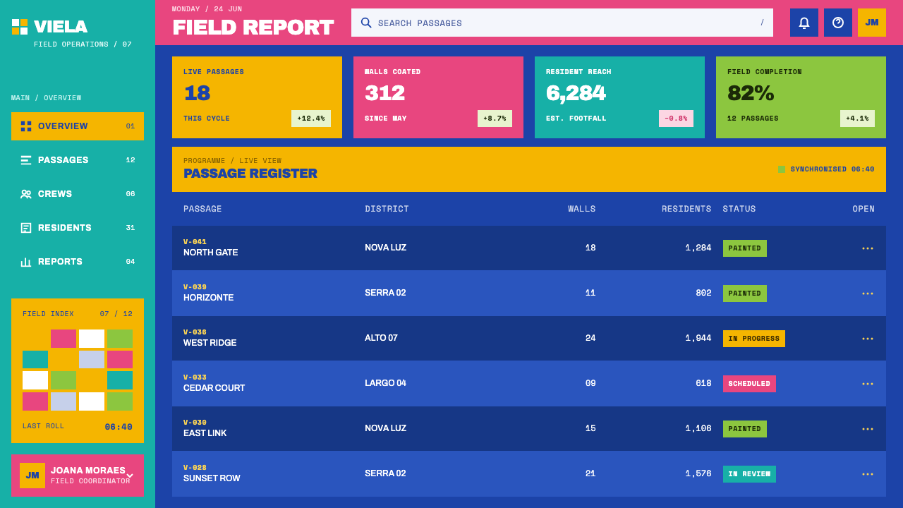
For web interfaces, the style suits campaign sites, community initiatives, non-profit and civic platforms, event pages and product launches built around one statement. Build pages as full-bleed colour fields with sparse content, set buttons as flat white blocks with heavy capitals, and use scroll to bring a split word into alignment. Avoid cards with shadows, glass panels, gradients and glowing hover states; the interface should feel painted rather than rendered.
For editorial and marketing work, it fits posters, social graphics, headline-led campaigns, murals and signage, community stories and anything that wants to speak plainly and proudly. Photography can sit in blocks beside the colour field, but it should be documentary and respectful rather than picturesque. Short, affirmative words work best; long copy lines dilute the effect.
The common mistake is to treat the style as a template for 'urban', 'street' or 'grit', adding spray textures, drips, grain or tagging marks. The original is clean, flat and rolled on with house paint, and its power comes from the discipline of one colour and one word. The second mistake is putting several colour fields on one page, which breaks the single-field logic. The third is using the style to make a real place's hardship look like scenery; the affirmation in the work depends on respect, so it should accompany genuine content rather than exoticise it.
Boa Mistura Favela Painting — FAQ
What is anamorphosis and why does it matter here?
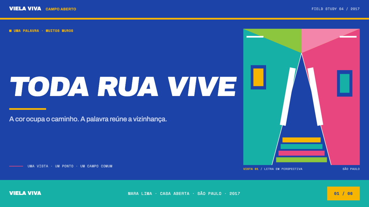
Anamorphosis is a way of drawing in which an image or word is deliberately distorted so that it only resolves when seen from one viewpoint. In Vila Brasilândia the word is broken across a dozen houses, and from the mouth of the alley it snaps into clear type. For design, it means that type can be fragmented or cropped as long as there is one moment, a scroll position or a crop, at which the whole word becomes readable.
Why one colour per page?
Because the original work painted walls, steps, doors and floor in a single colour until the building materials stopped being separate things. A second field of colour would put the boundaries back, and the page would stop feeling like one painted surface. The white word is the only figure; everything else is the field. Variety comes from the word, the scale and the crop, not from adding colours.
Is this a graffiti style?
Not in the usual sense. It comes from anamorphic street art and participatory community muralism, which are about collaboration and paint on walls, not about tags, drips and spray textures. The visual grammar is clean: flat saturated colour, heavy white capitals and hard edges. Adding grit and spray effects would move it away from the work it is based on.
Can I use it on a light background?
The style is built on a deep, saturated field with white type, so a pale page flips the contrast and loses the weight. Any single deep, saturated colour keeps the logic, and a light page does not. If a pale layout is unavoidable, use the saturated field as a large block and keep the white word inside it, so the painted-wall effect survives.
Where does the style struggle?
It struggles with dense data, long-form reading, delicate or luxury brands and anything that needs nuance, neutrality or a quiet voice. The style is loud on purpose, with one word and one field, so it works best for statements and campaigns. It also asks for respect: it was made with a community, so it should not be used as scenery.
Related design styles
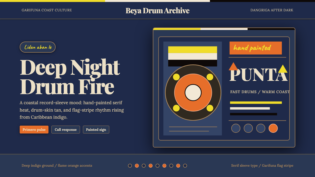 Belizean Garifuna PuntaNight rhythm burns. Indigo fields, flame-orange serif type, and flag stripes…
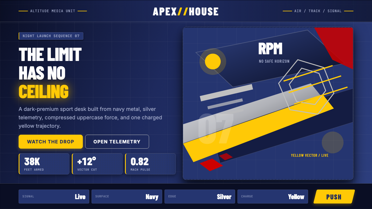 Red Bull Extreme SportsAdrenaline goes corporate. Navy chrome, condensed uppercase, yellow slashes a…
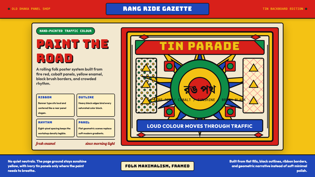 Bangladeshi Rickshaw Painting (Dhaka)Traffic shouts in color. Fire red, cobalt blue, and yellow panels lock into b…
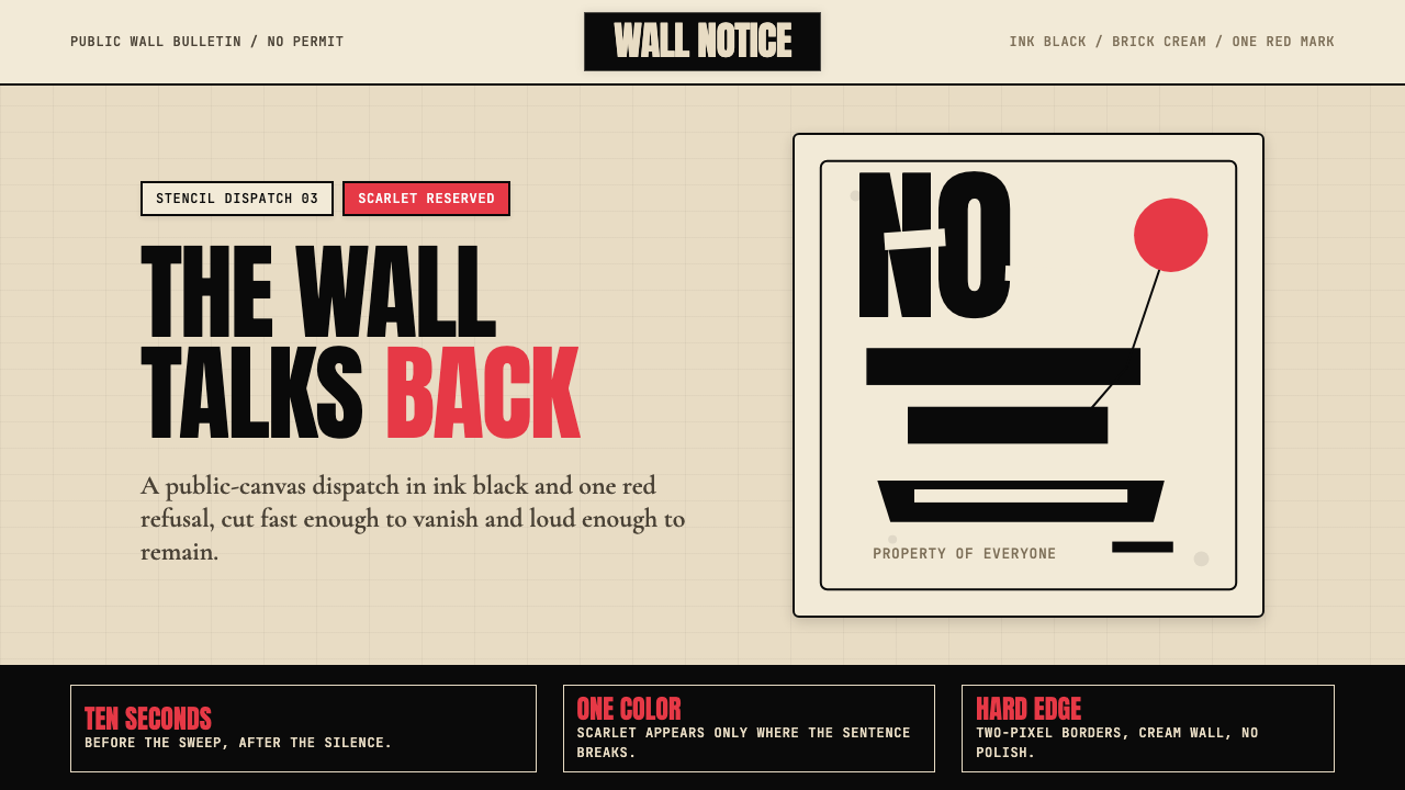 Banksy Stencil GraffitiProtest is reduced to a cut mark. Anton black on brick cream, one scarlet red…
 Gauchito Gil ShrineDevotion burns red. Flag ribbons, brass borders, and slab signage glow on soo…
 Kanjōzoku Loop RacerSpeed as contraband. Hot red numbers slice black tarmac with amber grid glare.