What is Bogotá Street Muralism?
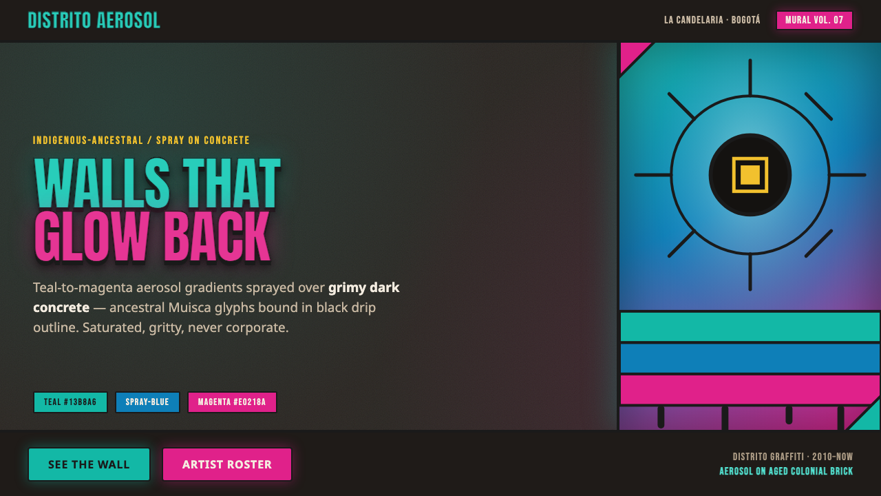
Bogotá Street Muralism turns the city wall into a nocturnal signal — neon aerosol, ancestral imagery, and black drip outlines glowing against concrete and old brick.
Bogotá Street Muralism in brief
Bogotá Street Muralism distills the contemporary mural scene of La Candelaria and Distrito Graffiti into a visual language of saturated aerosol, dark weathered surfaces, and monumental symbolic imagery. Teal, magenta, and related spray hues bloom across grimy concrete or aged colonial brick, while heavy black drip outlines hold the image together. The result is not polished illustration placed onto a wall; it is a wall-born system in which roughness, overspray, and visible pressure are part of the expression.
The style joins Latin American street muralism, aerosol graffiti, and Indigenous-ancestral iconography. Andean condors, Indigenous faces, and Muisca symbols function as more than decorative motifs: they give the composition cultural gravity and a sense of place. Typography follows the same logic. Heavy condensed stencil display type echoes sprayed lettering, with compressed forms that occupy the wall like physical objects. Everything is designed for a dark, imperfect ground, where contrast must feel luminous rather than clean or corporate.
Where does Bogotá Street Muralism come from?
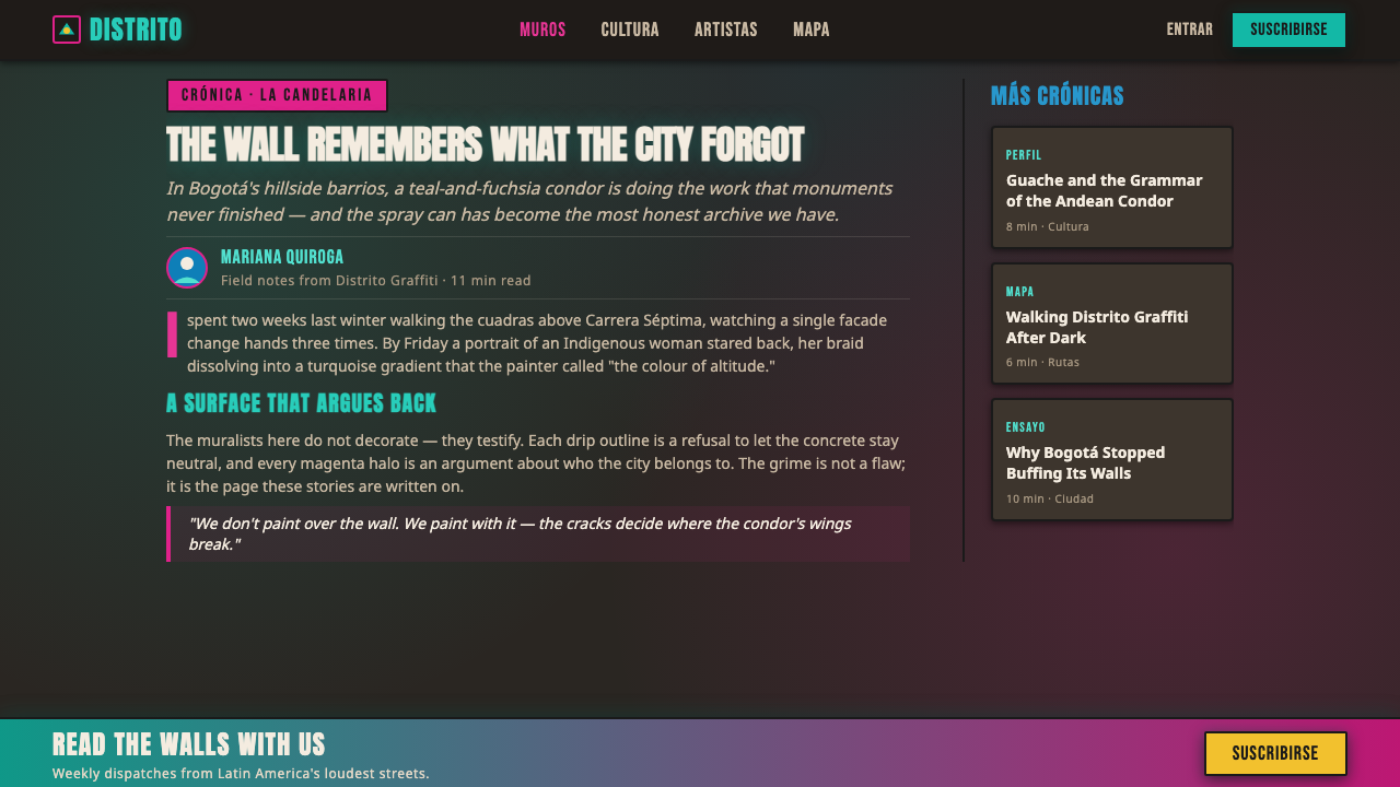
The style belongs to the contemporary Bogotá mural scene, identified in the source material as beginning around 2010 and continuing into the present. Its geography is specific: La Candelaria, the historic center with aged colonial brick, and Distrito Graffiti, a district associated with large-scale street painting. These locations matter because the visual language depends on the tension between inherited architecture and contemporary aerosol intervention. Old masonry provides a stained, uneven ground; spray color answers it with immediacy and force.
Its cultural vocabulary is shaped by Latin American street muralism and Indigenous-ancestral iconography. The recurring presence of Andean condors, Indigenous faces, and ancestral Muisca symbols places the image system within a Colombian and Andean frame rather than treating graffiti as a generic global aesthetic. The wall becomes a public surface where identity, memory, and urban presence can occupy the same field as lettering and color. The style therefore carries both visual intensity and a strong sense of situatedness.
Guache, whose name is given as Oscar Gonzalez, is presented as a central artist associated with this language, while El Marian is also identified among its key figures. Guache’s work is used in the source material as the clearest reference for glowing teal-to-magenta gradients over dark concrete and brick, surrounded by black drip contours. Together, these figures anchor the style in an active mural culture rather than a retrospective graphic trend. The aesthetic is contemporary, public-facing, and inseparable from the physical conditions of Bogotá’s walls.
What defines the Bogotá Street Muralism look?
Neon Aerosol Color
Color is saturated, luminous, and visibly sprayed. Teal-to-magenta transitions create the signature glow, while adjacent neon hues may intensify a focal image. The palette belongs on a dark wall, where it appears to emit light rather than sit politely on a neutral background. Color should feel pressurized and atmospheric, with overspray and uneven density preserving the hand of the aerosol.
Grimy Wall Ground
The surface is concrete, aged colonial brick, or an equivalent dark and weathered ground. Stains, abrasion, cracks, and tonal variation are not defects to erase; they establish the mural’s urban reality. A clean white canvas weakens the style because it removes the friction between luminous color and resistant material.
Black Drip Contours
Heavy black outlines define figures and lettering with the unmistakable evidence of wet paint and gravity. Drips may hang from a contour, interrupt a letter, or accumulate beneath a form. They provide graphic separation in the dark composition while refusing mechanical perfection. The outline is both a boundary and a record of the painting act.
Ancestral Imagery
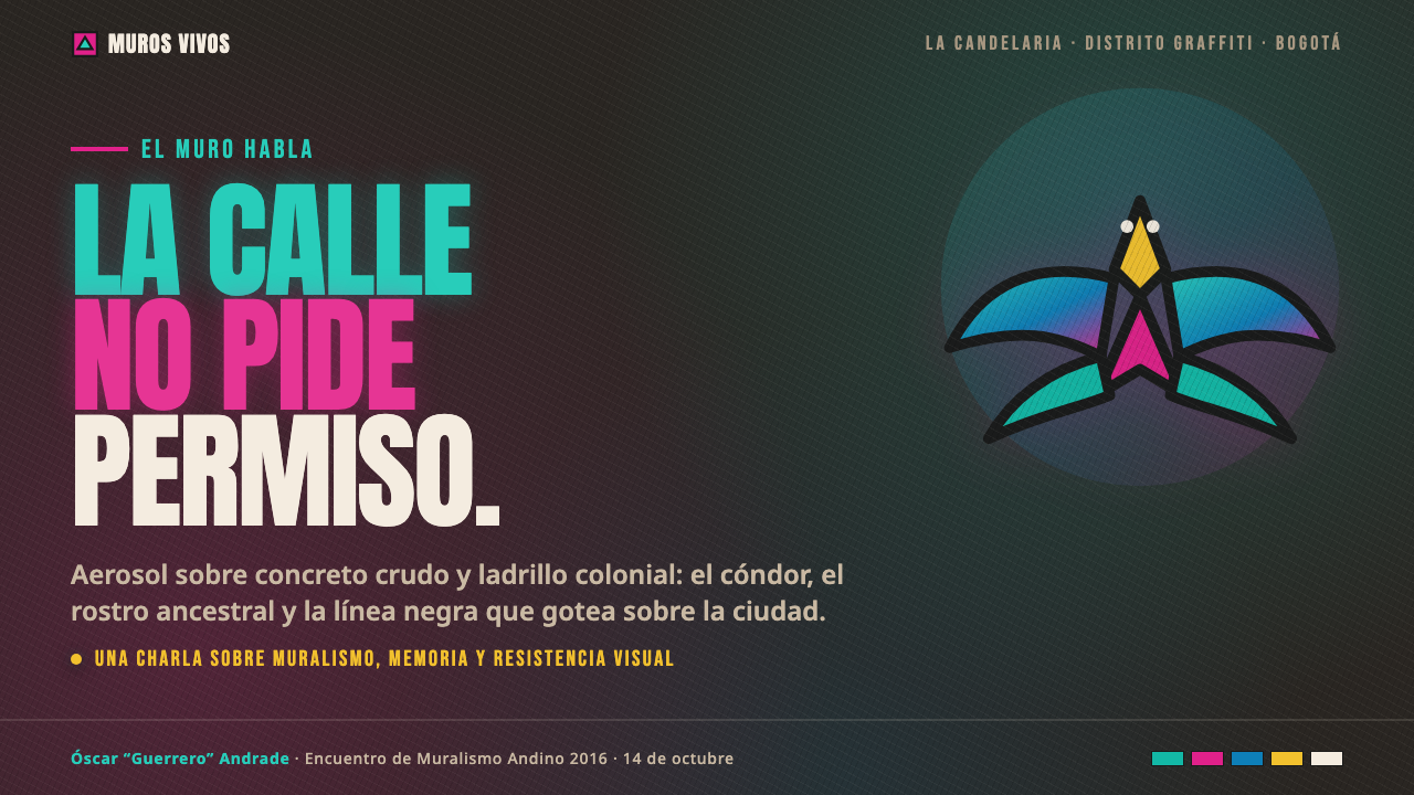
Andean condors, Indigenous faces, and Muisca ancestral symbols form the central image vocabulary. These motifs should read as monumental and emblematic, with enough visual weight to stand beside large lettering. Their presence gives the wall a cultural and geographic identity, preventing the neon treatment from becoming a merely psychedelic surface effect.
Condensed Stencil Type
Typography is heavy, condensed, uppercase, and stencil-like, echoing the practical force of sprayed lettering. Narrow proportions allow large words to occupy a wall without losing impact, while broken stencil joins suggest both industrial marking and handmade intervention. Type should behave as an image: blocky, assertive, and capable of carrying the same atmosphere as the mural.
Luminous Depth
Depth comes from aerosol buildup, dark surrounding space, and contrast between glowing color and black contour rather than from polished three-dimensional rendering. Gradients can feel smoky and radiant because pigment appears to diffuse into the wall. The illusion is atmospheric but still physical: light seems to come from paint, dust, and surface tension.
Who shaped Bogotá Street Muralism?
Guache is the central artist reference for Bogotá Street Muralism in the source material. His work embodies the combination of glowing teal-to-magenta aerosol, dark grimy concrete or aged brick, Indigenous and ancestral imagery, and black drip outlines. The style’s defining balance — luminous color held inside visibly hand-sprayed, culturally grounded forms — is most clearly articulated through this reference.
El Marian is named alongside Guache as a key figure in the contemporary Bogotá mural scene. Within this article’s system, that association places the artist inside a living culture of aerosol graffiti, Latin American street muralism, and Indigenous-ancestral iconography. The name helps identify the style as a collective urban language rather than the signature of a single isolated maker.
Muisca ancestral symbolism is not a person but a foundational cultural reference in the style. Its inclusion gives the visual system historical and geographic specificity, especially when paired with Indigenous faces and Andean condors. Used well, these symbols keep the mural from becoming generic neon graffiti and make the wall speak from a particular Colombian and Andean context.
How do you use Bogotá Street Muralism today?
For presentation slides, use the style most strongly on the cover, section openers, and data pages that benefit from dramatic contrast. A cover can place heavy condensed stencil type over a dark wall-like ground, with one large ancestral image or condor silhouette emerging through teal and magenta aerosol. Content slides should preserve a clear reading path, using black contour logic to separate text blocks from luminous color. Data slides can treat charts as sprayed symbols: bold, limited, and integrated with the gritty surface rather than floating in clean white space.
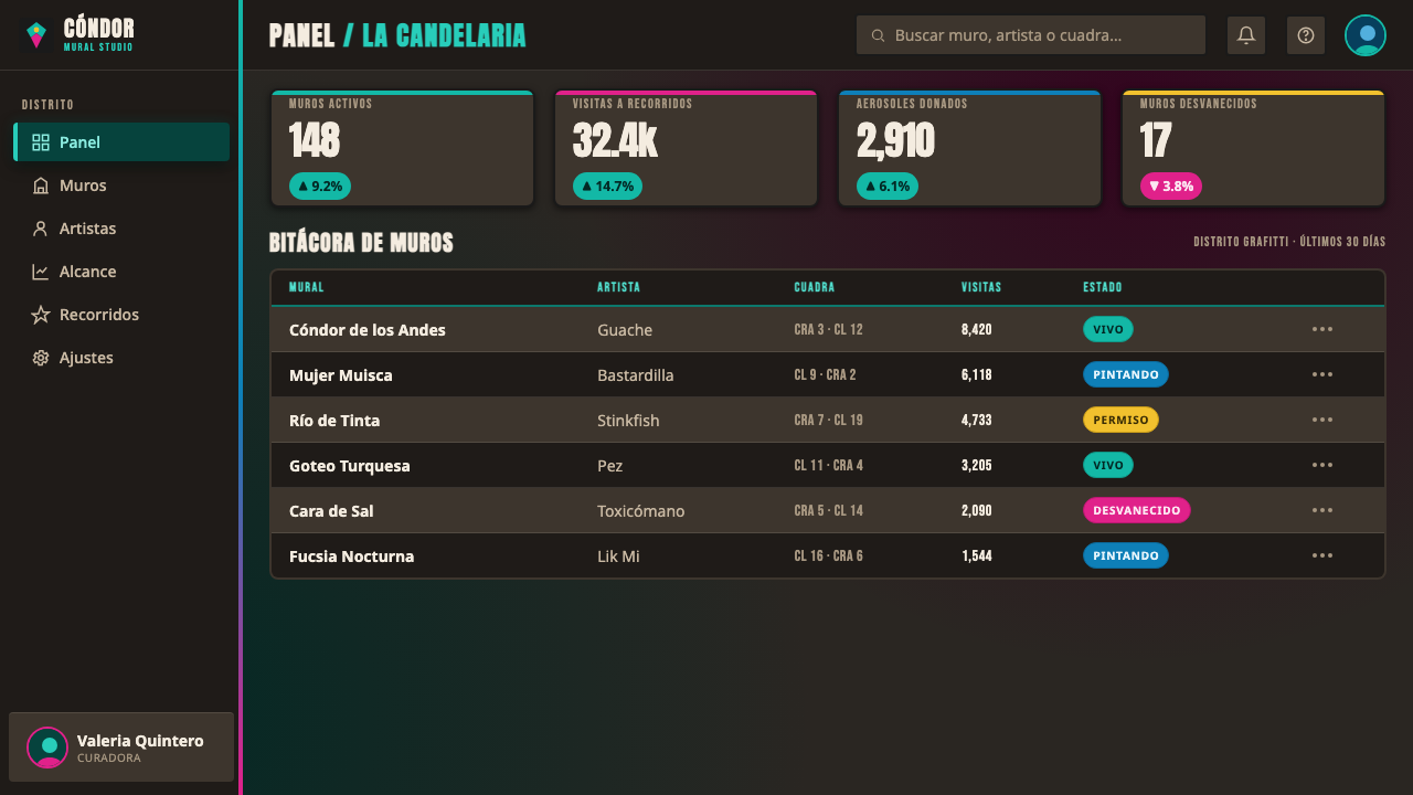
For web interfaces, Bogotá Street Muralism suits dashboards, analytics tools, and pricing pages that want to feel urban, expressive, and culturally grounded. Use a dark textured field, reserve neon color for active states and key distinctions, and give primary actions the visual force of a painted tag. Panels may be separated by rough borders, stencil labels, or black drip contours instead of soft corporate cards. The interface still needs disciplined hierarchy: the mural energy should frame information, not make every control compete at maximum intensity.
For editorial and marketing work, the style is effective for campaigns, cultural programming, music, urban development, and stories centered on place or identity. Headlines can behave like wall lettering, while body copy sits in calmer dark zones so the page remains readable. Marketing compositions work well when a single large image or symbol dominates and smaller supporting details appear like pasted notices or painted annotations. The contrast between aged material and luminous type gives even short copy a strong sense of public presence.
The most common mistake is copying the neon gradient and black outline while removing the wall, the cultural imagery, and the evidence of human spraying. That produces a generic cyberpunk surface rather than Bogotá Street Muralism. Another failure is making every element equally bright, equally distressed, and equally loud. The style needs dark intervals, one dominant visual signal, and enough restrained space for the condor, face, symbol, or headline to carry meaning.
Bogotá Street Muralism — FAQ
Is Bogotá Street Muralism simply a neon graffiti style?
No. Neon aerosol is one visible layer, but the identity of the style depends on the relationship between luminous spray, dark weathered walls, black drip contours, and culturally specific imagery. Indigenous faces, Andean condors, and Muisca ancestral symbols connect the surface to Bogotá and the wider Andean context. Remove those relationships and the result becomes generic decorative graffiti.
Can the style work on a clean white background?
It can be adapted, but the adaptation loses an essential source of tension. The style is designed around saturated spray colors pushing against grimy concrete or aged brick. On white, retain visible aerosol behavior, dark contouring, and material cues so the work still feels sprayed rather than digitally polished. A completely clean corporate surface works against the style’s identity.
How should typography behave in this style?
Typography should be heavy, condensed, uppercase, and stencil-like, with enough presence to stand beside a monumental image. It should feel physically applied to the wall, not selected as a neutral interface label. Keep the display treatment assertive, but give supporting copy a calmer setting and stronger spacing so the message remains legible. Distress is useful only when it reinforces the sprayed character rather than obscuring the words.
Does every application need ancestral imagery?
Not necessarily, but removing the imagery changes the style’s cultural meaning. A project can use the visual structure — dark wall, neon aerosol, black drips, and stencil type — with restraint, especially when the subject does not relate to Indigenous or Colombian contexts. If ancestral symbols are included, they should be treated as meaningful cultural references rather than interchangeable exotic decoration. The image vocabulary is strongest when its use is specific and respectful.
Related design styles
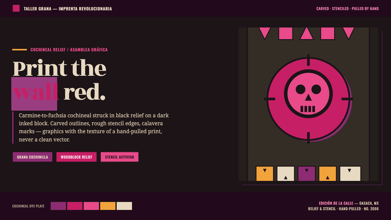 Oaxaca Indigenous-ModernActivist woodblock graphics. Cochineal carmine-fuchsia struck in black relief…
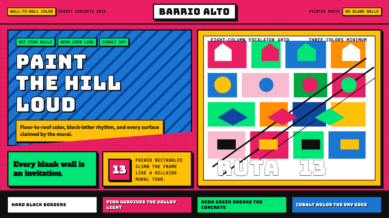 Medellín Comuna 13 MuralsRefuses blank walls. Hot pink, neon green, and cobalt blocks pack the grid li…
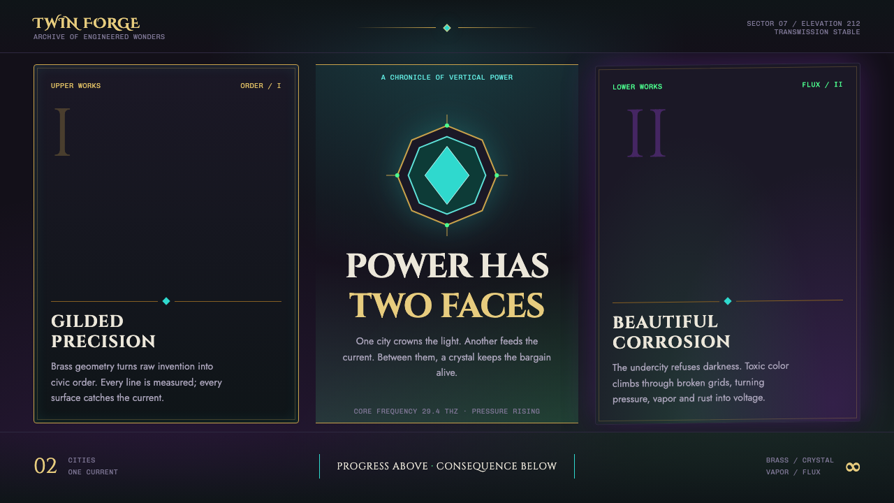 Arcane Hextech (2021)Progress and rot share a current. Brass symmetry meets teal crystal and toxic…
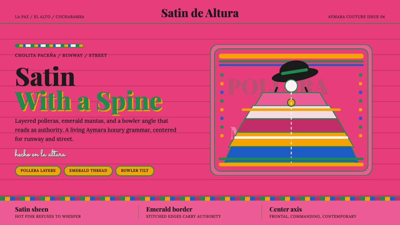 Bolivian Cholita FashionUnapologetic satin power. Hot pink fields, emerald stitches, centered pollera…
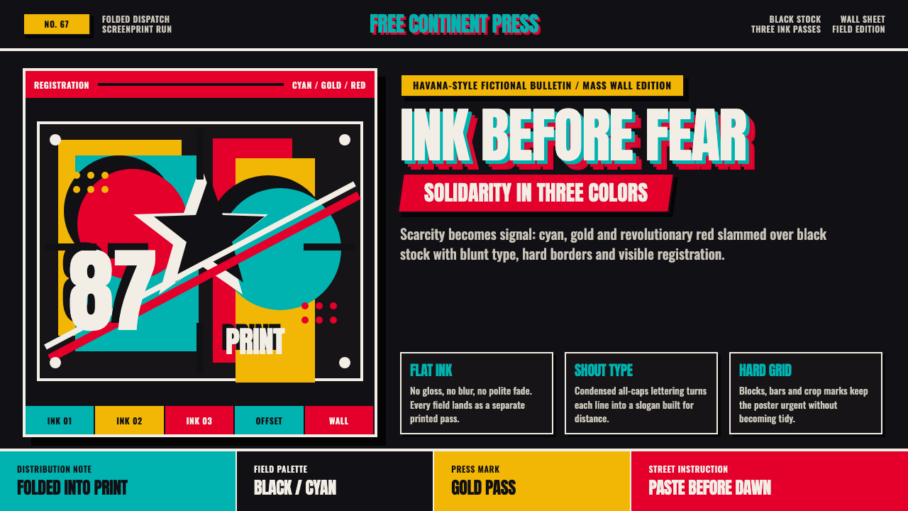 Cuban OSPAAAL Tricontinental PosterUrgency from scarcity. Cyan, gold and red slam over black in blunt silkscreen…
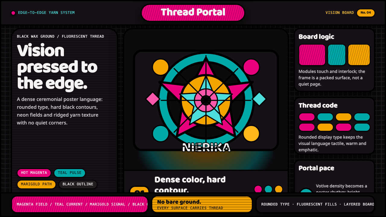 Huichol Yarn NierikaCeremonial density glows. Neon yarn colors lock into black-contoured, edge-to…