What is Jujutsu Kaisen?
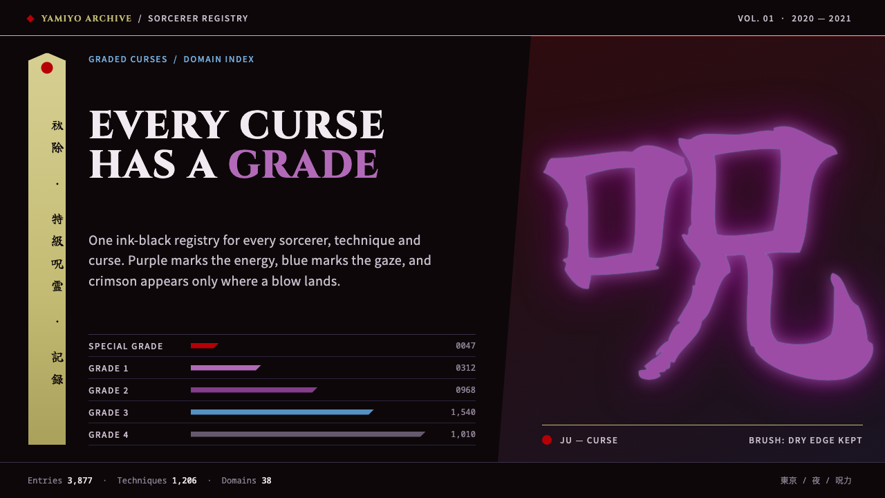
The Jujutsu Kaisen look is an ink-black night where cursed energy glows purple and pale blue, brush kanji hang on ofuda strips, and crimson is saved for the moment of impact.
Jujutsu Kaisen in brief
This is a dark design system built from MAPPA’s first season of Jujutsu Kaisen. Its base is the near-black ink night of the 2020 key visual. Cursed energy, the series’ supernatural power, flares in purple and pale blue, and a crimson wall of hands is kept for moments of impact. The system carries the series’ atmosphere of dread, ritual and sudden violence into an interface.
Type follows the same split between Latin and Japanese traditions. Headings are cut in Cinzel capitals, which look like inscriptions carved in stone, while episode title cards are brushed in Yuji Boku, a brush-script face with dry strokes. Vertical Japanese text and horizontal English sit side by side, so a single page reads as a dialogue between two writing systems.
Panels are hard-edged and angular, with no rounded corners. Labels hang like ofuda talismans, the long strips of paper used in Japanese exorcism. Domain circles radiate glyphs across the screen, and glow is spent only where power is being released. It is built for fan archives, character databases and dramatic launch pages.

Where does Jujutsu Kaisen come from?
Jujutsu Kaisen began as a manga by Gege Akutami, serialised in Weekly Shōnen Jump from March 2018. The television adaptation by MAPPA followed, with its first season airing from October 2020 to March 2021, and the film Jujutsu Kaisen 0 reached audiences in December 2021. The look in this system comes from that 2020 to 2021 window, when the anime defined how the series appears on screen.
The adaptation’s visual identity is tied to its production team. Sunghoo Park is listed among its key figures as director, Tadashi Hiramatsu is associated with character design and animation, and Hiroshi Seko with the series composition. Their work shaped an anime in which dark, nearly monochrome backgrounds throw coloured effects into sharp relief, and in which hand-drawn action is staged with unusual force.
The thematic materials come from older traditions. Ofuda, the paper charms of Japanese ritual, and the imagery of onmyōdō, the old Japanese system of divination and spiritual practice, give the series its vocabulary of seals, circles and hanging strips. They are set against contemporary Tokyo, an everyday city in which curses gather in schools, hospitals and crowded streets.
Three currents meet in the result. The first is dark-fantasy shōnen manga, a form that mixes teenage adventure with serious danger. The second is onmyōdō and Japanese exorcism imagery, supplying the talismans and ritual geometry. The third is contemporary Tokyo urban horror, which gives ordinary modern places an undercurrent of dread.
What defines the Jujutsu Kaisen look?
Color
The ground is a near-black ink night, deeper than a charcoal grey, with only slight variation between surfaces. Cursed energy is shown as purple and pale blue glow, used for focus, selection and ambient light. Crimson is the rarest and strongest colour: it is saved for warnings, emblems and the single moment of impact, so that it still shocks when it appears.
Typography
Latin headings are set in Cinzel capitals, a face drawn from classical inscriptions, giving titles the weight of carved stone. Episode and section title cards use Yuji Boku, a brush face with dry, forceful strokes. Japanese text may run vertically beside horizontal English labels. Body copy is plain and light so that the two display voices can remain dramatic.
Shape and edge
Panels are hard-edged and angular, with diagonal cuts and no rounded corners. Cut corners and slanted edges suggest blades and torn paper. Dividers are thin and sharp, and nothing is soft or cushioned. The overall silhouette feels like it could slice.
Ofuda labels and glyphs
Labels and tags are drawn as tall, narrow paper strips, like ofuda talismans hung from a wall, with vertical text and small red or purple seal marks. Hand-seal diagrams and circular glyphs appear as ornaments and icons. Domain circles use concentric rings with radiating characters to frame hero images or loading states.
Glow and light
Glow is the only source of depth, and it is rationed. Purple and pale blue halos mark what is active, such as a selected character or a hovered card, while inactive elements sit flat in the dark. Because light appears only where power is being released, the interface feels charged, not decorated.
Tone and motion
The tone is tense, ritualistic and stylish. Motion is sharp: elements slide in with a snap, circles spin up, and flashes of red cut through the dark on impact. Pauses are used as much as movement, the way a fight scene holds its breath before a strike.

Who shaped Jujutsu Kaisen?
Akutami is the creator of the Jujutsu Kaisen manga, serialised in Weekly Shōnen Jump from March 2018. The curse-and-exorcism world, its rules and its dark humour all originate in the manga, and the visual language of this system is an adaptation of that world to a screen.
Park is listed among the key figures of the MAPPA anime, which aired from October 2020 to March 2021. His direction is part of why the series looks as it does, with dark backgrounds and sharply timed action.
Hiramatsu is associated with the anime’s character design and animation. The look of its sorcerers, with angular silhouettes, sharp eyes and bold clothing shapes, feeds directly into the angular, hard-edged panels of the design system.
Seko is named in connection with the series composition of the anime. The structure of the season, its escalation from everyday school scenes to ritual combat, helps explain why the design saves its strongest colour for impact.
How do you use Jujutsu Kaisen today?
On slides, use this system for covers and key moments that need drama: an ink-black field, a Cinzel title in pale capitals, a brush-script subtitle and a single crimson mark. A purple glow can sit behind the one idea you want the audience to remember. Content slides should be hard-edged and spare, with angled dividers. It suits game, anime, film, cybersecurity and nightlife presentations.
For web interfaces, it works for fan archives, character and technique databases, episode guides and dramatic launch pages. Cards become angular panels, tags become vertical ofuda strips, and selected states glow purple. Keep body text in a clean light face on very dark panels, with enough contrast to be readable, and reserve crimson for errors and key alerts only.
On pricing and sign-up pages, the style can feel exclusive and ceremonial. Dark plan cards with angled edges, a purple halo on the recommended plan and a crimson warning only when something needs correcting set a serious, premium tone. Be careful that the drama does not slow down checkout; the form itself should stay plain.
In editorial and marketing work, use it for event teasers, season announcements and long reads about the series. Combine large Cinzel headlines with vertical Japanese lines, thin diagonal rules and a restrained circular glyph in the background. The strength of the look is that a handful of elements makes a poster; you do not need a lot of illustration.
The most common mistake is spending crimson and glow everywhere. If every element glows or is red, impact loses its meaning and the page becomes a wall of noise. Another mistake is softening the shapes with rounded corners or soft shadows, which turns a hard-edged ritual look into a generic dark theme. Keep the dark deep, the edges sharp and the colour rationed.

Jujutsu Kaisen — FAQ
What is the Jujutsu Kaisen design style?
It is a dark, angular interface style based on MAPPA’s first season of the anime, which aired from October 2020 to March 2021. It combines an ink-black ground, purple and pale blue glows for cursed energy, crimson reserved for impact, Cinzel capitals, brush-script title cards and ofuda-shaped labels.
What are ofuda and why do they appear?
Ofuda are paper talismans used in Japanese ritual. In the series they connect to exorcism and onmyōdō imagery, so the system draws labels as tall, narrow strips that hang like talismans, with vertical text and small seal marks.
Why is red used so rarely?
Crimson is the strongest signal in the palette, so it is saved for impact: warnings, emblems and the moment of a hit. If red is used everywhere, it stops meaning anything. The rest of the colour work is done by purple and pale blue glows on a near-black ground.
Does it work for light-mode pages?
Not really. This is a dark system by design: the near-black ground is what makes the glows and the single crimson accent readable. A light version would lose the sense of power being released out of darkness, so it is best used as a dark theme only.
What kinds of projects suit it best?
It suits fan archives, character and technique databases, episode and season pages, game and film launches, and any page that wants a tense, ritual mood. It is less suited to calm, informational products where drama would be a distraction.
Related design styles
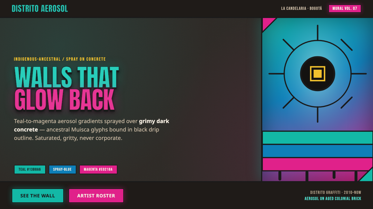 Bogotá Street MuralismNeon spray glowing off the wall. Teal-to-magenta aerosol on grimy concrete, i…
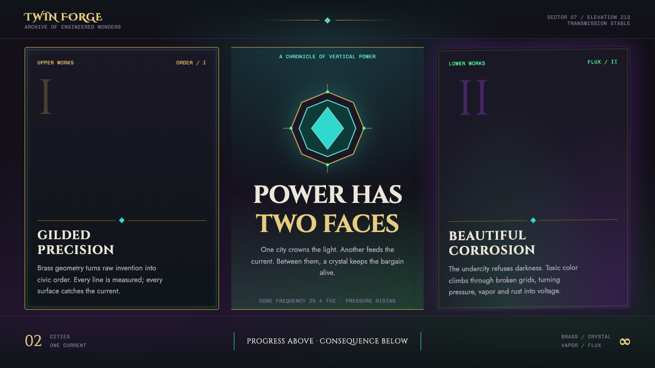 Arcane Hextech (2021)Progress and rot share a current. Brass symmetry meets teal crystal and toxic…
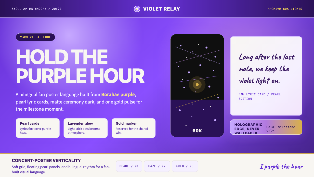 BTS Army Purple 2020Fandom becomes atmosphere. Borahae purple, pearl cards, lavender glow, one go…
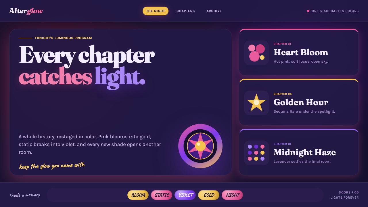 Taylor Swift Eras (2023)Every chapter catches light. Hot pink, lavender, gold and beadwork glow on mi…
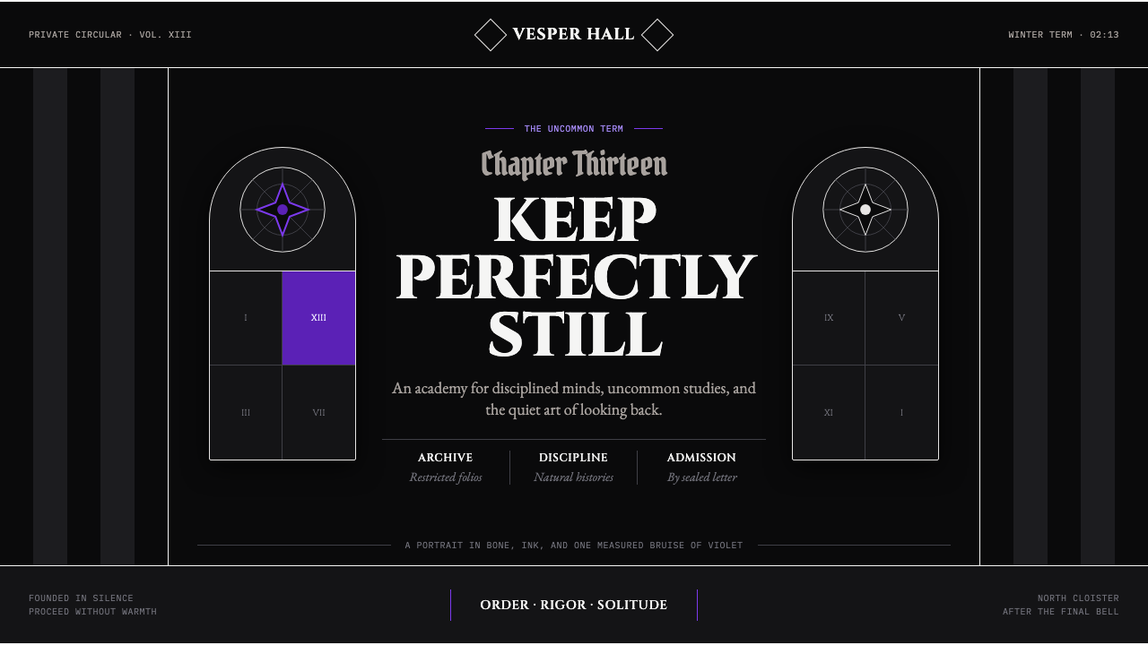 Wednesday — Nevermore AcademyCold symmetry cuts deepest. Bone-white capitals and hard stripes yield to one…
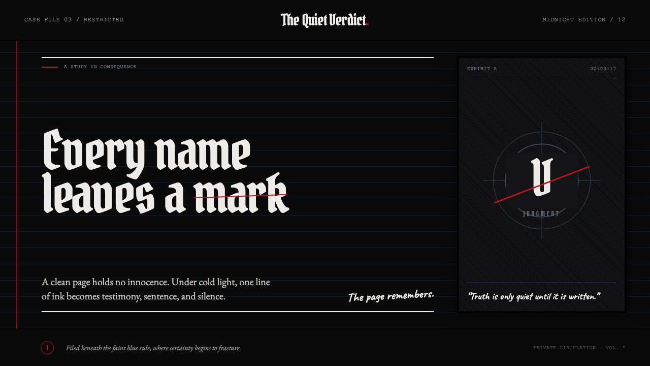 Death Note (2003)Silence becomes judgment. Bone-white blackletter and blue rules break under o…