What is Peter Pan Neverland (1904)?
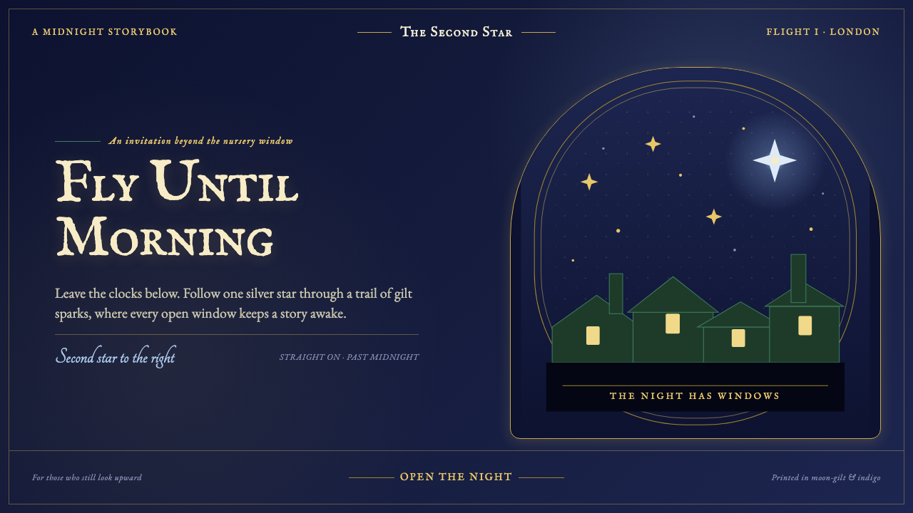
Peter Pan Neverland lets enchantment glint rather than shout: midnight sky, gilt sparks, and the hushed promise of an open window leading beyond London.
Peter Pan Neverland (1904) in brief
Peter Pan Neverland is a dark, storybook design language shaped by the night flight of the Darling children. A deep cobalt-to-indigo sky carries tiny gold sparks, silhouetted rooftops, chimneys, and the distant directional comfort of the second star to the right. Its atmosphere is not theatrical spectacle so much as private invitation: a familiar bedroom window has opened, and the ordinary city has become the threshold of adventure.
The style draws from J.M. Barrie’s 1904 stage play and from the illustrated editions associated with Peter and Wendy. It borrows the intimate luxury of Edwardian gift books: engraved title pages, leaf-gilt rules, decorative flourishes, and carefully framed pages made to feel precious in the hand. Yet its decorative richness remains contained by darkness. Gold appears as a glimmer against navy, not as an overpowering field.
Visually, Neverland relies on contrast between vast night and small signs of warmth. Cream-lit vignette windows puncture the dark; forest-green leaf motifs recall Peter’s costume; fine gold lines suggest dust, stars, and engraved ornament. The result should feel like a page seen by lamplight: ornate enough to reward attention, restrained enough to preserve mystery.
Where does Peter Pan Neverland (1904) come from?
The style begins in Edwardian London, where Peter Pan first appeared onstage in 1904 at the Duke of York’s Theatre. The city matters as much as the fantasy: London rooftops, nursery windows, and chimney silhouettes establish the earthly edge from which flight begins. Neverland is therefore not a generic magical sky. It is imagined as the dark beyond a recognizably domestic world.
Barrie’s story continued through the 1911 novel Peter and Wendy, while illustrated gift-book editions appeared across the period from 1906 to 1921. These editions supplied an important visual frame for the theme. Their pages could hold illustration, ornament, title lettering, and margin detail as parts of one object, rather than treating text as something merely placed beside an image.
The broader setting was the Golden Age of illustration and Edwardian children’s book illustration. Gift-book engraving gave printed pages a sense of ceremony through fine rules, ornamental borders, and concentrated detail. Peter Pan Neverland adapts that language for a dark field: the page becomes less like a bright nursery sheet and more like a gilt-edged view into the sky.
J.M. Barrie, Arthur Rackham, F.D. Bedford, and Nina Boucicault are the key figures named within this cultural setting. Rather than flattening their presence into a single visual signature, the theme treats them as part of the story’s theatrical, literary, and illustrated afterlife. London locations including Bloomsbury and Kensington Gardens remain essential emotional anchors: places where childhood, city life, and impossible flight can coexist.
What defines the Peter Pan Neverland (1904) look?
Night-Sky Ground
The foundation is a deep cobalt-to-indigo field with enough visual depth to suggest open sky, not a flat void. Darkness should feel protective and spacious. It gives every illuminated detail a reason to exist, while preserving the quiet distance required by the story’s nocturnal setting.
Gilt Spark
Gold is used in hairline rules, tiny stars, and brief ornamental flashes. It behaves like pixie dust or leaf gilt caught by light: precise, intermittent, and never loud. Its role is to guide the eye through darkness, making hierarchy feel discovered rather than announced.
Edwardian Serif
Typography should evoke an engraved title page or a hand-bound gift book. Serif forms carry literary gravity and a faint sense of ceremony, while generous breathing room keeps them from becoming heavy. Display text may feel embellished by context, but body copy should remain calm, legible, and story-led.
Silhouette and Window
Rooftops and chimneys are best treated as distant silhouettes, establishing London without burdening the composition with literal detail. Small cream windows introduce human warmth. They make the sky feel larger by showing what has been left behind: rooms, sleep, safety, and the ordinary world below.
Leaf and Filigree
Forest-green leaves and gilt filigree frame rather than crowd content. The leaf motif connects the page to Peter’s costume, while fine ornament recalls gift-book engraving. Both should gather at edges, titles, or transitions, allowing the central field to remain open enough for flight.
Quiet Enchantment
The governing principle is restraint. Effects should arrive as glints, vignettes, and small discoveries instead of grand visual claims. A page succeeds when it feels as though its magic might disappear if looked at too directly, balancing Edwardian richness with the hush of a late-night nursery.

Who shaped Peter Pan Neverland (1904)?
Barrie is the literary source of Peter Pan, beginning with the 1904 stage play and continuing through Peter and Wendy in 1911. His story supplies the theme’s essential tension: a domestic London night gives way to flight, but the nursery, rooftops, and open window remain emotionally present.
Rackham belongs to the illustrated world surrounding Peter Pan and the Edwardian Golden Age of illustration. Within this theme, his presence points to the importance of illustration as atmosphere: a book page can make fantasy persuasive through line, framing, darkness, and suggestion rather than through spectacle alone.
Bedford is named among the figures connected to the illustrated gift-book context. His inclusion reinforces the theme’s attention to the printed object itself: illustration, lettering, page borders, and ornament are not separate decorations but parts of a single reading experience.
Boucicault is among the key figures associated with the story’s early theatrical world. Her place in the theme keeps the design connected to performance as well as print. Neverland should retain the feeling of a curtain rising: the dark field frames an entrance into a world that is staged, literary, and dreamlike at once.
How do you use Peter Pan Neverland (1904) today?
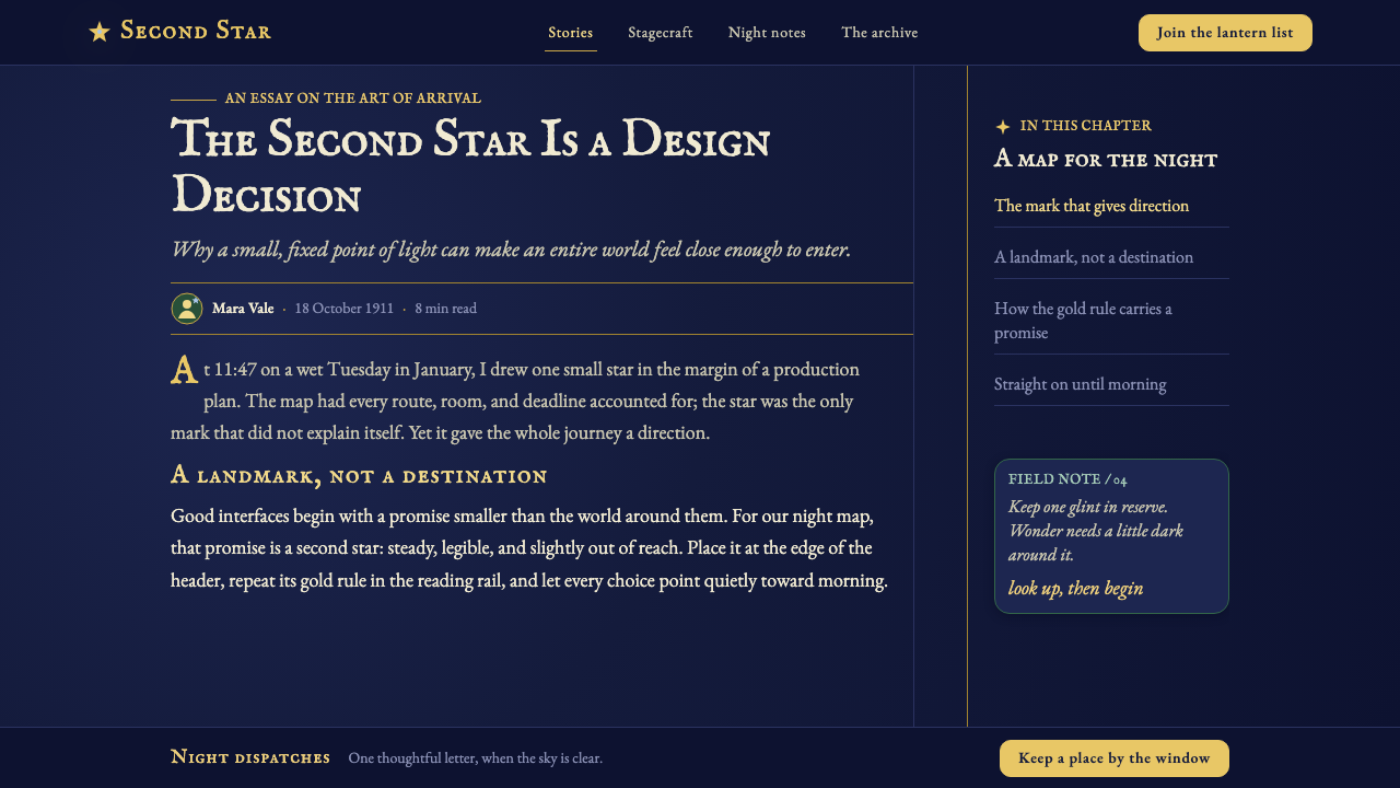
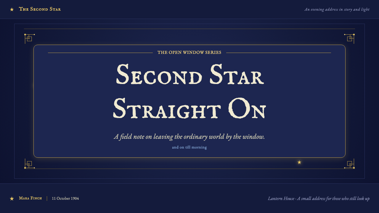
For presentation covers, treat the slide as an opened night window. Let the title occupy a calm, formal area while a roofline, gilded rule, or sparse stars establish the world around it. The strongest cover composition leaves meaningful darkness intact; it should feel like an invitation into the story, not a crowded fantasy poster.
Content slides work best when the book-like frame recedes and reading becomes primary. Use an Edwardian serif hierarchy, restrained gold dividers, and cream panels only where a quotation, key idea, or image needs warmth. For data slides, preserve legibility first: charts can sit within the night field, with gold used to mark the focal series and muted supporting marks allowed to remain subordinate.
For web interfaces, the style suits editorial dashboards, memberships, libraries, and premium reading spaces more naturally than high-speed utility products. Navigation can feel like a title-page index, while dark surfaces hold cream content windows and selective gilt emphasis. Pricing pages can use the contrast between mysterious sky and warmly lit information to make plans feel curated rather than aggressively sold.
For editorial and marketing work, build the rhythm of a gift book. A lead image or star field can open the page, followed by quieter reading sections, framed quotations, and occasional leaf motifs at transitions. Campaign pages benefit when the language promises discovery, wonder, reading, or nighttime imagination; the style is especially effective when a brand needs heritage without becoming museum-like.
The common mistake is turning Neverland into generic luxury darkness by covering everything in gold ornament. The style depends on absence: broad night, small lights, and a limited number of meaningful details. Another mistake is making every element whimsical. The Edwardian book structure must remain disciplined, otherwise stars, leaves, borders, and story references become costume rather than atmosphere.
Peter Pan Neverland (1904) — FAQ
Is Peter Pan Neverland simply a dark fantasy style?
No. Dark fantasy often relies on menace, dramatic contrast, or dense spectacle. Peter Pan Neverland is gentler and more literary. Its darkness is the protective night outside a nursery window, and its magic appears through tiny gold sparks, cream-lit rooms, and the suggestion of flight. Edwardian gift-book structure is as important as the night-sky palette.
How should gold be used without making the design feel ostentatious?
Use gold as a signal, not a surface treatment. It is strongest in fine rules, small stars, selected title details, and moments where the reader should pause. Let the midnight field do most of the visual work. If gold occupies every edge, heading, icon, and panel, it loses the fleeting quality that makes it feel like pixie dust.
Can this style support data-heavy dashboards?
Yes, if the storytelling layer remains secondary to comprehension. Reserve the night sky for the surrounding atmosphere, create clear cream reading areas where dense information is needed, and use gilt emphasis only for the most important comparison or status. Decorative stars and leaf motifs should stay away from chart axes, controls, and dense tables.
What imagery belongs naturally in a Neverland layout?
The most natural imagery is suggestive rather than literal: silhouetted roofs, chimneys, open windows, distant stars, fine leaves, and small pools of warm interior light. A scene does not need to depict every character or event. The style is more convincing when it leaves room for the reader to complete the flight in imagination.
Where does the style struggle?
It struggles when speed, neutrality, or broad daylight energy are the product’s central values. Highly utilitarian workflows may find its atmospheric framing distracting, while playful mass-market work can lose clarity if it adopts too much ornate book language. It works best where reading, discovery, heritage, or an intimate sense of occasion genuinely belongs to the experience.
Related design styles
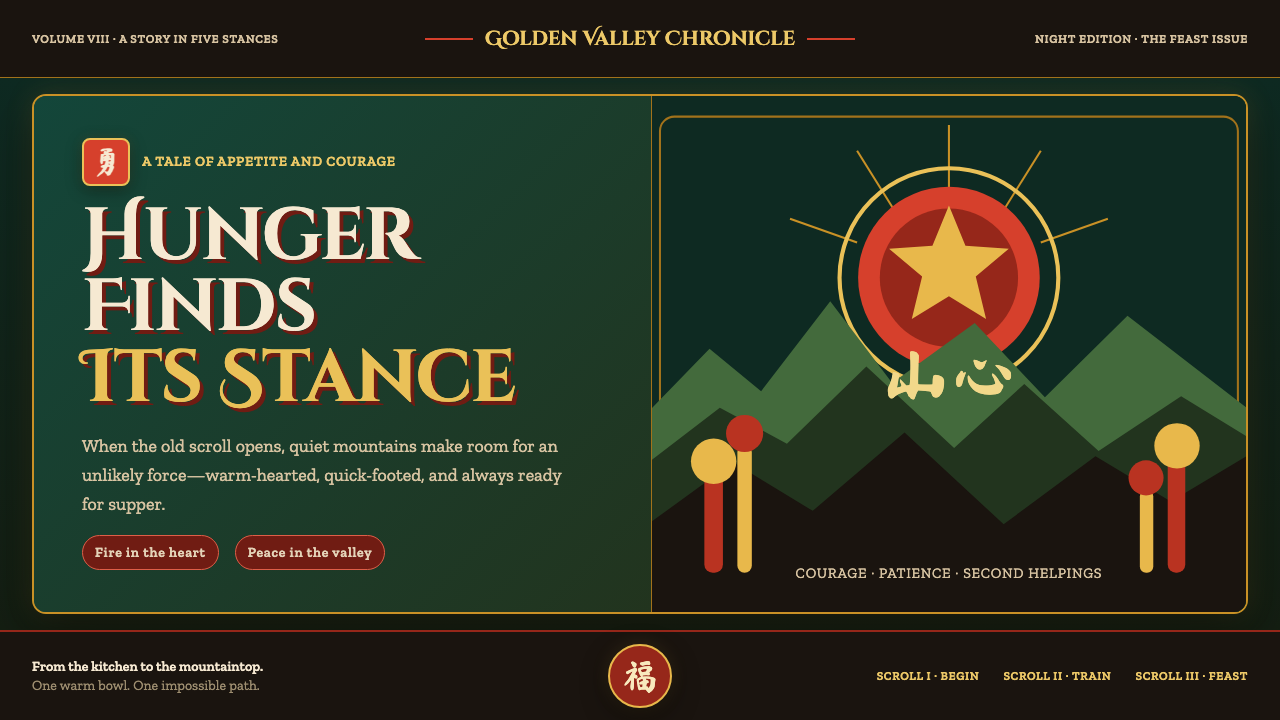 Kung Fu Panda (2008)Ancient calm meets comic momentum. Vermilion, gold and paper-cut peaks glow i…
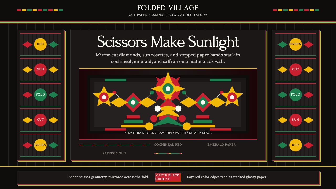 Polish Wycinanki (paper-cut folk art)Cuts sing in symmetry. Cochineal, emerald, and saffron layers blaze on black.
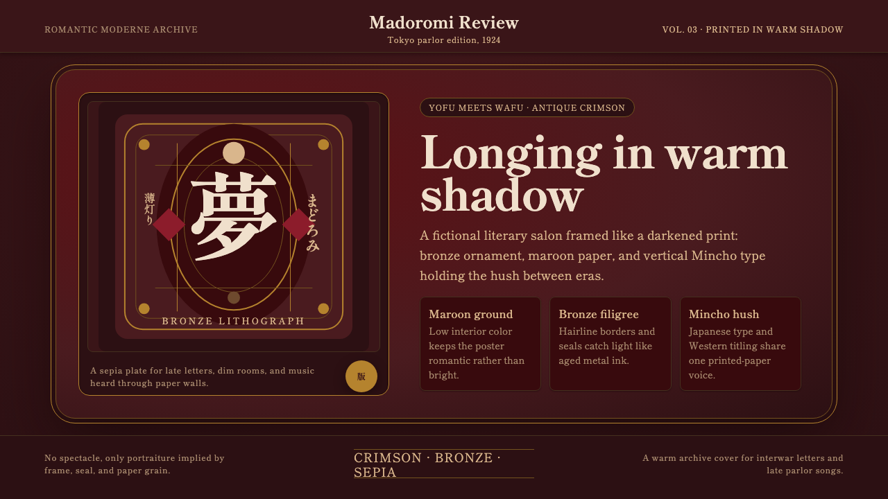 Taishō RomanLonging framed in bronze. Maroon ground, Mincho type, and sepia ornament hush…
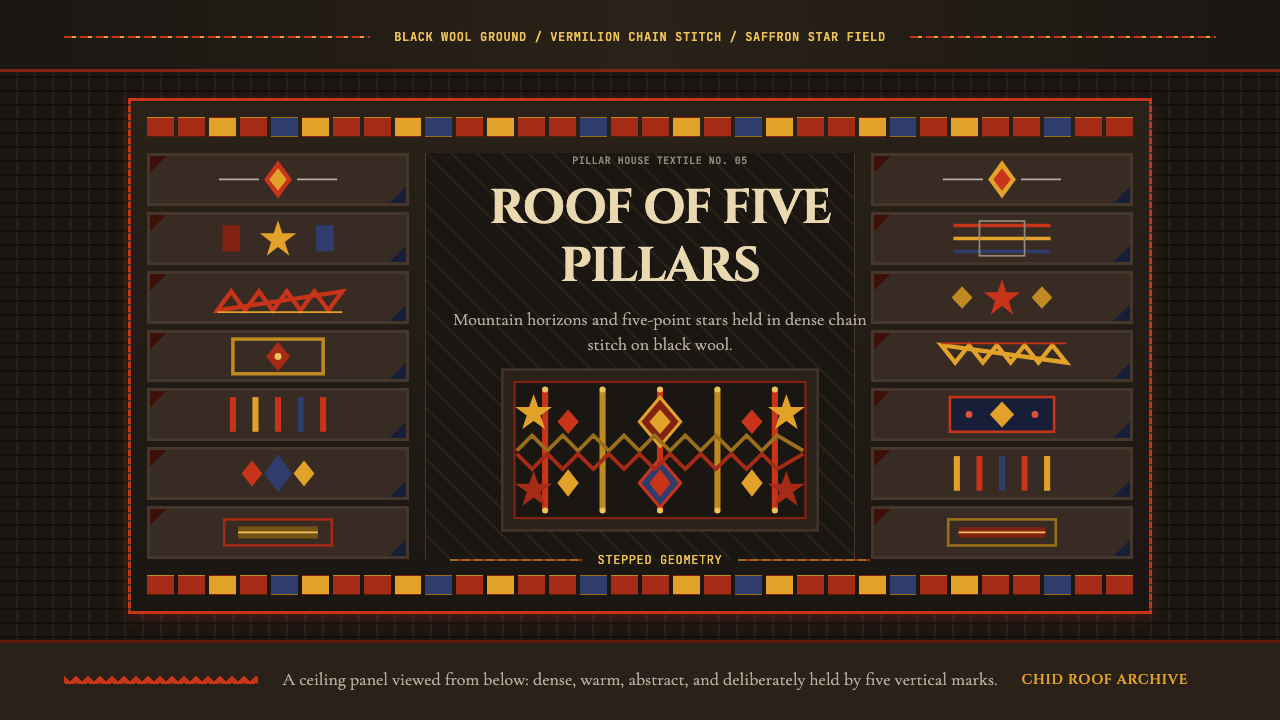 Tajik Pamir Needlework (Chid Roof)Cosmos stitched into wool. Vermilion diamonds and saffron stars hold a five-p…
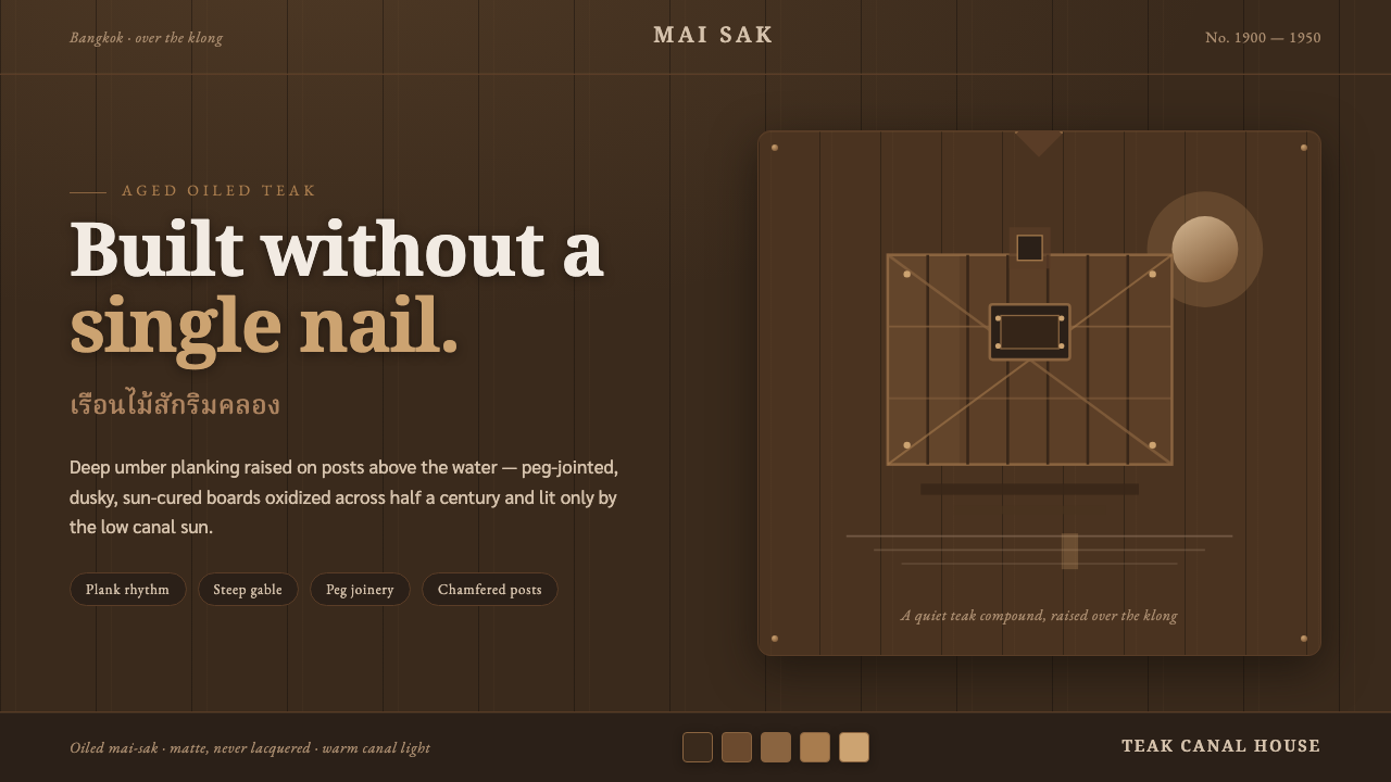 Thai Teak Canal HouseAged oiled teak, never fresh-sawn. Deep umber planks raised over the klong, l…
 Whisky CooperageBuilt for the long dark. Charred black grounds copper hoops and engraved seri…