What is Moomin (Tove Jansson ink)?
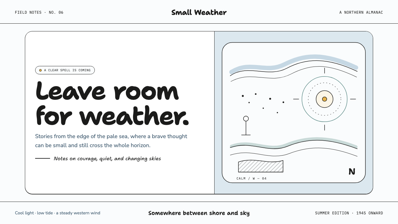
Moomin ink gives quiet a narrative role: a fragile black line, pale air, and enough empty paper for weather, danger, and tenderness to arrive.
Moomin (Tove Jansson ink) in brief
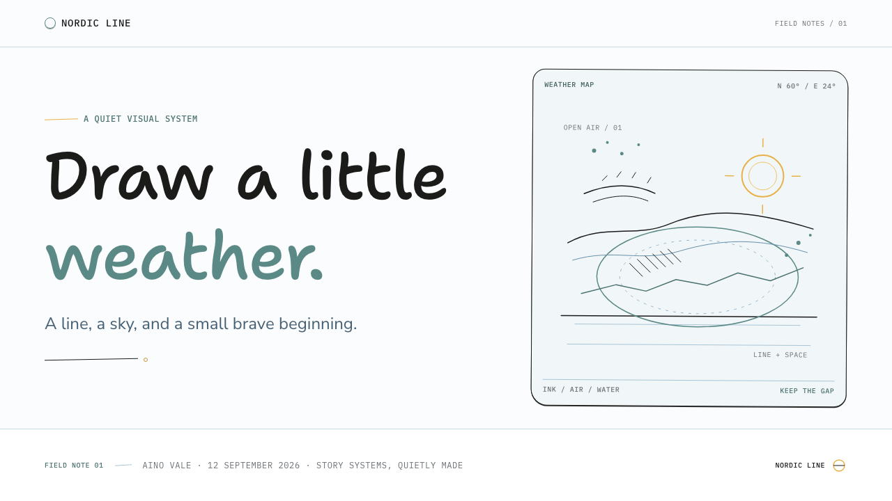
Moomin, in the ink-drawn manner associated with Tove Jansson, is a Nordic illustration language of fine black contour, sparse hatching, stipple, and expansive cool-white space. It evokes the world Jansson began drawing from 1945: round-nosed trolls, slender companions, distant coastlines, lighthouses, comets, and tiny figures standing in weather. The point is not to reproduce particular characters. It is to recover the emotional grammar of the line: observant, unhurried, slightly strange, and brave without becoming loud.
Its composition depends on absence as much as mark-making. A small figure may occupy only a quiet corner while a broad field of untouched ground becomes sky, sea, fog, or silence. The page does not need to be filled in order to feel complete. Instead, the unmarked surface establishes scale and mood, making a lighthouse seem solitary, a comet feel remote, or a conversation appear intimate against a wide northern horizon.
The visual result resembles a mid-century comic strip printed on tactile paper: spidery lines describe form without sealing it into heavy illustration, while crosshatch and stipple provide only the minimum darkness required. Cool white and restrained Baltic blue keep the atmosphere open. This is not decorative nostalgia. Its calmness is structural, because the line carries observation and the empty field carries feeling.
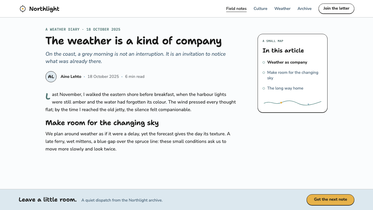
Where does Moomin (Tove Jansson ink) come from?
This visual world begins in Finland, in the Swedish-speaking Helsinki archipelago and the Pellinki islands. Its geography matters because the style is inseparable from pale Nordic light, flat sea, exposed weather, and the sensation of small lives placed within a much larger horizon. These are not ornamental background motifs; they explain why restraint can feel dramatic.
Tove Jansson began drawing the first Moomin book in 1945 with a dip pen and India ink. That material practice is visible in the character of the image: contours can be delicate but decisive, dark areas can accumulate through repeated marks, and blank paper remains active rather than unfinished. The drawing process encourages an economy in which every stroke must earn its place.
From 1954 through 1975, the Moomin comic strip appeared in the Evening News. The strip format reinforced a language of clear silhouettes, compressed incidents, and pauses between events. A small gesture, a distant object, or a patch of empty sky can carry the turn of a scene without needing theatrical rendering.
The style sits where mid-century Nordic children's-book illustration, European ink-line comic art, and Scandinavian modern meet. It shares modernism's economy but avoids impersonality. It shares comic art's narrative clarity but resists visual noise. The resulting atmosphere is gentle without being sentimental, and spare without becoming cold.
What defines the Moomin (Tove Jansson ink) look?
Fine Ink Contour
The contour is light, alert, and slightly irregular in the way a dip pen records pressure and movement. It suggests form rather than enclosing it with a heavy border. Characters, rocks, waves, and clouds belong to the same line world, so no object is treated as visually superior merely because it is closer to the viewer.
Breathing Space
Large quiet fields are not empty backgrounds waiting for decoration. They establish northern air, distance, and emotional pacing. A restrained composition lets a tiny subject feel exposed yet protected, and gives the viewer time to notice the smallest gesture or change in weather.
Hatch and Stipple
Shadow is made through crosshatch and stipple rather than broad filled areas or smooth tonal modelling. Darkness arrives as texture and accumulation. This keeps the image airy even when a scene becomes ominous, because the white ground remains visible through and around the marks.
Cool Nordic Atmosphere
Cool white is the dominant field, with Baltic blue used as a sparse atmospheric companion. The palette suggests pale sky and level sea rather than decoration or cheerful display. Black ink remains the narrative anchor, while blue helps the page feel maritime, distant, and calm.
Smallness and Weather
A lighthouse, comet, shoreline, or lone figure can be drawn with the same restraint as a domestic scene. This creates a particular scale relationship: the world is large, weather is real, and the characters remain expressive without needing exaggerated poses. Vulnerability becomes part of the picture's tenderness.
Quiet Narrative
The style trusts implication. Rather than explaining every event visually, it lets spacing, direction of gaze, and a few selected objects suggest a story. A page may feel adventurous because a comet is distant, or intimate because two figures share an unmarked field. Silence becomes a narrative device.

Who shaped Moomin (Tove Jansson ink)?
Jansson is the originating artist of this visual language. Beginning with the first Moomin book in 1945, her use of dip pen and India ink established the fine contour, spare texture, and emotional force of open paper. Her contribution is not simply a set of motifs; it is a way of making restraint feel alive.
Lars Jansson is a key figure in the Moomin tradition alongside Tove Jansson. Within the public history of the Evening News comic-strip period, his presence belongs to the continuity of a visual world that had to remain legible, spacious, and narratively precise across serial publication.
The Evening News strip, published from 1954 through 1975, is a crucial vehicle for the style. Its serial panels show how ink line can manage character, landscape, pacing, and humor without losing its quietness. It demonstrates that the approach works not only as illustration, but as a sustained narrative system.
How do you use Moomin (Tove Jansson ink) today?
For presentation covers, use a large field of cool white and allow one modest ink drawing to establish the scene: a distant lighthouse, a weather line, a small figure, or an abstracted comet-like mark. Keep the title calm and clearly separated from the drawing. The cover should feel like the beginning of a story, not an attempt to explain its entire subject at once.
For content and data slides, preserve the same spacious hierarchy. Treat diagrams, charts, and labels as quiet ink marks on an open field rather than as dense interface furniture. Use restrained hatching to distinguish selected areas, and let Baltic blue identify a meaningful thread rather than every category. Data becomes easier to contemplate when the page leaves room around it.
For web interfaces, this approach works especially well for reading experiences, personal archives, educational collections, and reflective dashboards. Navigation should be direct and unobtrusive. Panels should feel like paper regions rather than floating glossy objects, while small line illustrations can orient the user at section boundaries. A dashboard can retain practical clarity while making activity feel observed rather than surveilled.
For editorial and marketing work, use the style to frame a story of discovery, companionship, travel, weather, or careful making. Wide margins can hold captions, short notes, and small drawings. Marketing pages should resist turning every section into a campaign poster; a single quiet illustration and a well-paced sentence often carry more atmosphere than a crowded field of competing visual claims.
The common mistake is to treat Moomin ink as a collection of cute character cues or generic hand-drawn decoration. That loses the source of its power. Avoid copying recognizable characters, overcrowding the page with doodles, or making every line equally dark and expressive. The essential discipline is selective mark-making: retain open space, let texture describe shadow sparingly, and allow quietness to do narrative work.
Moomin (Tove Jansson ink) — FAQ
Is this style only appropriate for children's content?
No. Its connection to children's books is important, but its visual strengths are broader: clarity, emotional pacing, curiosity, and room for reflection. It can suit cultural institutions, journals, educational products, personal tools, and editorial storytelling. It becomes less suitable when a product needs overt luxury, relentless urgency, or highly technical visual density.
How should color be handled?
Let cool white do most of the atmospheric work, keep black ink as the structural voice, and use Baltic blue sparingly as air, sea, or orientation. The style loses its quietness when color becomes a reward system applied to every button, badge, or illustration. Color should feel environmental rather than promotional.
Can photography be used with Moomin ink?
It can, but photography should preserve the same sense of weather, distance, and open air. A quiet coastal view or a pale, minimally staged scene will sit more naturally beside fine ink than a crowded, glossy image. Treat the photograph as a pause in the story, not as a competing spectacle.
What makes an application feel authentic rather than merely cute?
Authenticity comes from the relationship between line, space, and narrative. Use a small number of meaningful marks, let blank areas establish scale, and make hatching serve shadow or atmosphere. If every available surface receives a whimsical drawing, the result becomes decoration. If marks are selective and the page can remain quiet, it can carry the source's courage and tenderness.
Related design styles
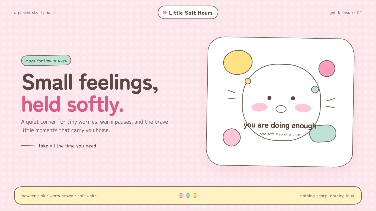 Chiikawa (2022)Tenderness made visible. Powder pink, warm-brown wobbles, and pill-soft forms…
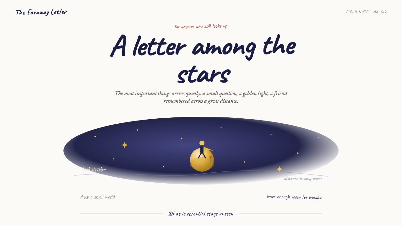 The Little Prince (1943)Tenderness floats alone. Indigo washes, golden stars, and handwritten notes b…
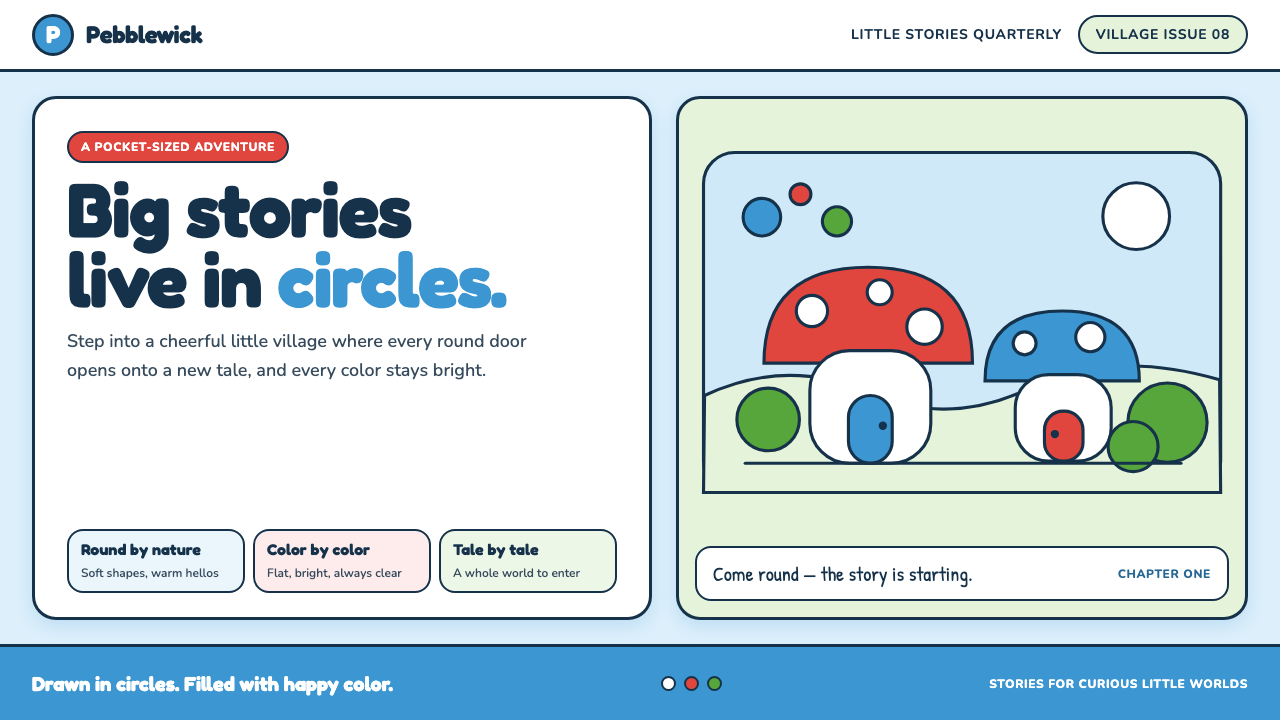 The Smurfs (Peyo, 1958)Joy comes full circle. Sky blue, candy red and soft ink outlines build a flat…
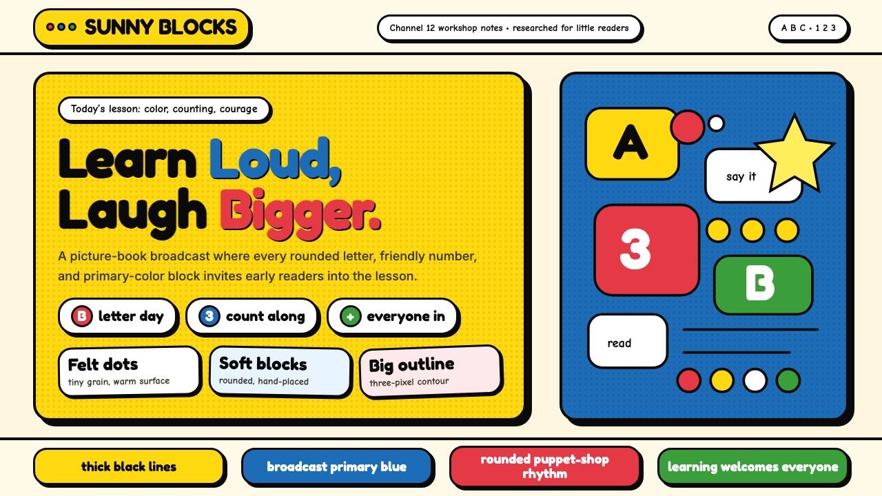 Sesame Street (1969)Learning feels handmade. Big yellow, monster blue, chunky outlines, and round…
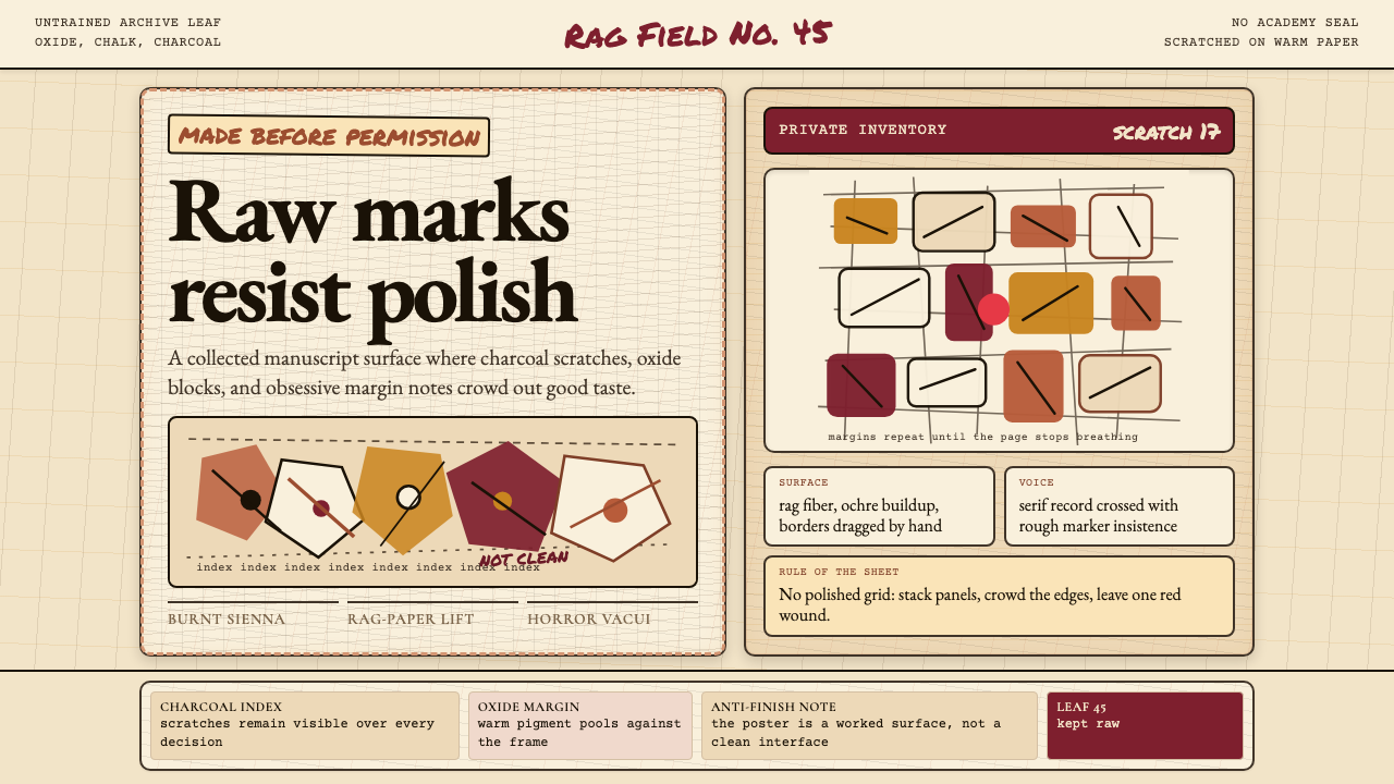 Art Brut (Dubuffet)Polish is refused. Bone-cream paper, earth pigments, scratched borders, dense…
 Headspace Orange MeditationMeditation becomes friendly. Orange blocks, DM Sans, and pill shapes soften e…