What is Chiikawa (2022)?
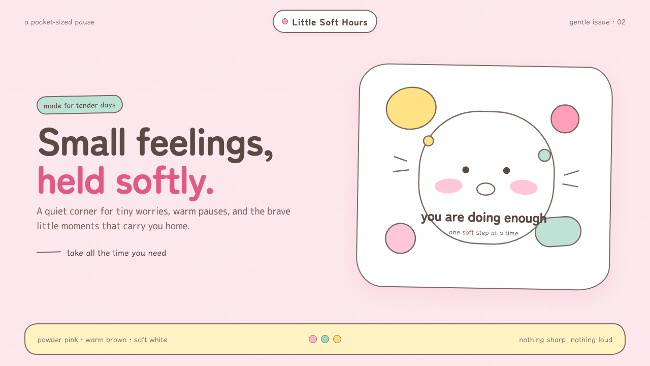
Chiikawa makes tenderness visible: powder-pink calm, warm-brown wobbles, and pill-soft creatures that hold every anxious little feeling.
Chiikawa (2022) in brief
Chiikawa is a character-driven visual world associated with Nagano, where design hugs before it explains. Its tiny creatures have pill-shaped pale bodies, dot eyes, blush-warmed cheeks, and expressions that remain simple enough to make emotion immediately legible. They do not need elaborate illustration to communicate worry, relief, excitement, or shyness. A small face, a softened posture, and a trembling outline are enough.
The style belongs to the broad tradition of Japanese kawaii character design, but its particular emotional register is yuru-kawa: loose, soft, and disarmingly cute. Rather than presenting cuteness as polished perfection, Chiikawa allows wobble, hesitation, and vulnerability to stay visible. The result is comforting because it does not demand confidence from either the character or the viewer.
Visually, the world avoids sharpness and spectacle. Powder pink behaves like a comfort blanket rather than an attention-grabbing brand field; pastel milk tones keep contrast gentle; and warm brown outlines define forms without the severity of pure black. Rounded shapes, irregular borders, and quietly flushed cheeks make the whole system feel hand-held, small-scale, and emotionally safe.
Where does Chiikawa (2022) come from?
The approved timeline begins in Tokyo, Japan, with a Twitter manga launch in 2020. That starting point matters because the visual language is built for immediate recognition in a compact, scrollable setting. A tiny face, a blush mark, and a wavering contour can carry feeling quickly, without requiring a dense scene or elaborate visual explanation.
The source identifies Twitter yonkoma manga as one of Chiikawa’s defining movements. Within that context, the style favors concise character signals over visual complexity. The creatures read at a glance because their bodies are reduced to soft, memorable silhouettes and their faces leave generous room for viewers to project their own small worries, hopes, and embarrassments onto them.
Japanese kawaii character design supplies the broader cultural frame, while yuru-kawa names the softer and looser edge of that frame. In Chiikawa, cute does not mean glossy, hyperactive, or aggressively cheerful. It means rounded, slightly unsteady, and emotionally approachable. The visual language turns minor vulnerability into a shared atmosphere rather than a flaw to conceal.
The next named point in the source is the television-anime premiere in 2022. Nagano and Doga Kobo are listed as key figures in the record. Together, the 2020 manga launch and 2022 anime premiere describe a movement from a social-media manga setting into a wider animated presence, while retaining the recognizable world of small round creatures, gentle color, and warm-brown linework.
What defines the Chiikawa (2022) look?
Comforting Color
Powder pink is the emotional ground of the style. It feels cushioned rather than promotional, while pastel milk tones keep the world light and gentle. Blush appears as a small sign of feeling, not a dramatic cosmetic statement. Color supports tenderness before it establishes hierarchy.
Warm-Brown Linework
Outlines wobble slightly and remain warm brown instead of hardening into pure black. The line establishes recognition without turning the character into a rigid icon. Its tiny irregularities make each form feel drawn by a caring hand, preserving softness even when the silhouette is extremely simple.
Pill-Soft Form
Bodies, containers, labels, and decorative motifs should favor pill-like, rounded forms. Corners are softened until objects appear approachable rather than engineered. The goal is not sterile geometric perfection; it is the bodily sense that a form could be held, squeezed gently, or protected.
Minimal Facial Signals
Dot eyes and small blush marks demonstrate how little is required for emotional recognition. Facial detail stays sparse so the smallest adjustment in placement or expression carries weight. This restraint creates an unusually open emotional surface: the viewer can read anxiety, tenderness, or delight without being overdirected.
Wobble over Precision
Borders and contours should feel gently unsteady, never mechanically sharp. Wobble is not a careless effect added after the fact; it is the visual evidence of fragility and warmth. It keeps a clean character system from becoming corporate, polished, or emotionally distant.
Quiet Emotional Scale
Nothing in the visual language needs to shout. Small creatures, muted pastel fields, and restrained facial marks make modest feelings feel important. The style works by lowering visual pressure: it invites attention through gentleness, then lets the viewer linger with the character’s emotion.
Who shaped Chiikawa (2022)?
Nagano is named in the source as the creator associated with Chiikawa’s tiny round creatures. The approved description centers the visual world on pill-shaped pale bodies, dot eyes, blush-warmed cheeks, and quivering warm-brown outlines. That combination makes emotional vulnerability readable without elaborate rendering.
Doga Kobo is listed as a key figure alongside the 2022 television-anime premiere. In the approved timeline, that premiere is the named later milestone after the 2020 Twitter manga launch, linking the established character language to an animated public presence.
Chiikawa itself functions as the central figure of the design system: a very small, anxious, and completely adorable presence asking to be treated gently. Its visual identity is not separate from that emotional premise. Rounded forms, pastel milk tones, and soft linework all answer the character’s request for care.
How do you use Chiikawa (2022) today?
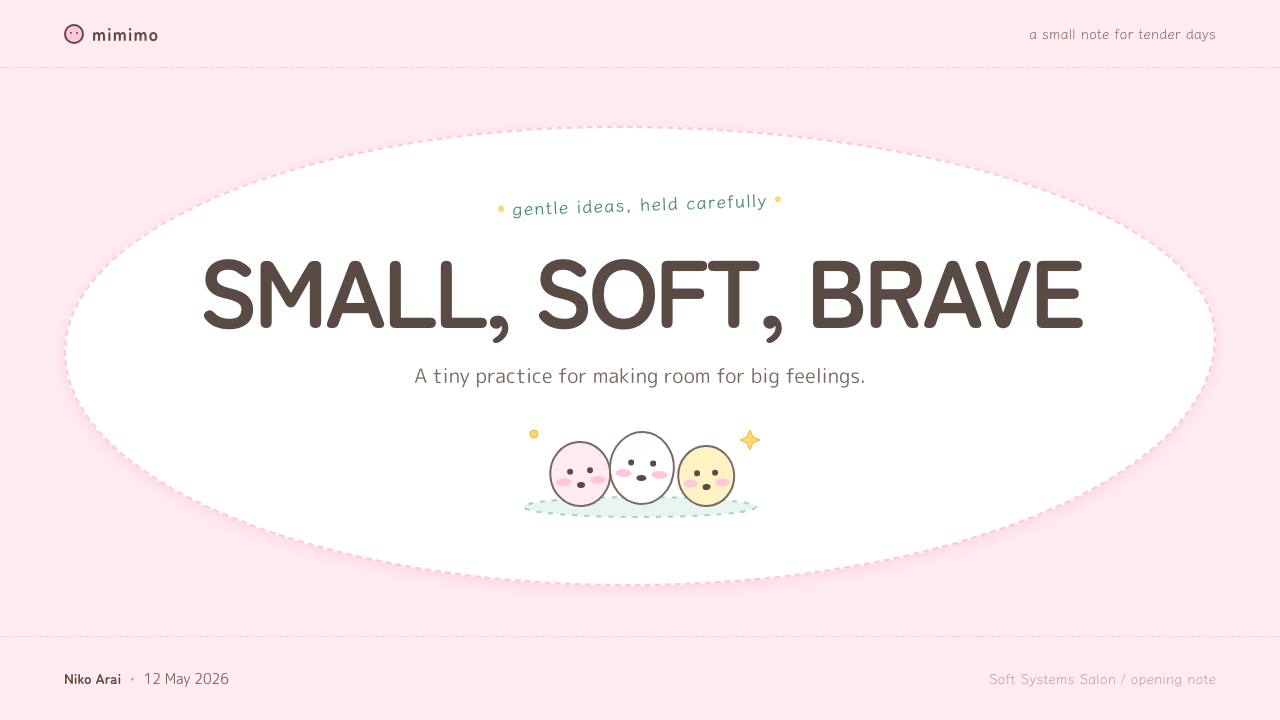
For presentation covers, treat Chiikawa as an emotional invitation rather than a mascot pasted onto a standard layout. Let a powder-pink field establish calm, give one small rounded character or object generous surrounding space, and set the title with a friendly, unforced presence. The cover should feel like a quiet greeting. Avoid turning the scene into a crowded merchandise collage, because its tenderness depends on room to breathe.
On content slides, use the character language to soften information rather than conceal it. Group material in rounded containers, use warm-brown dividers where definition is needed, and reserve blush-like accents for moments that deserve gentle emphasis. Keep hierarchy clear and reading paths calm. For data slides, translate categories into soft capsules, rounded markers, or small expressive companions, while ensuring that labels and comparisons remain more legible than decoration.
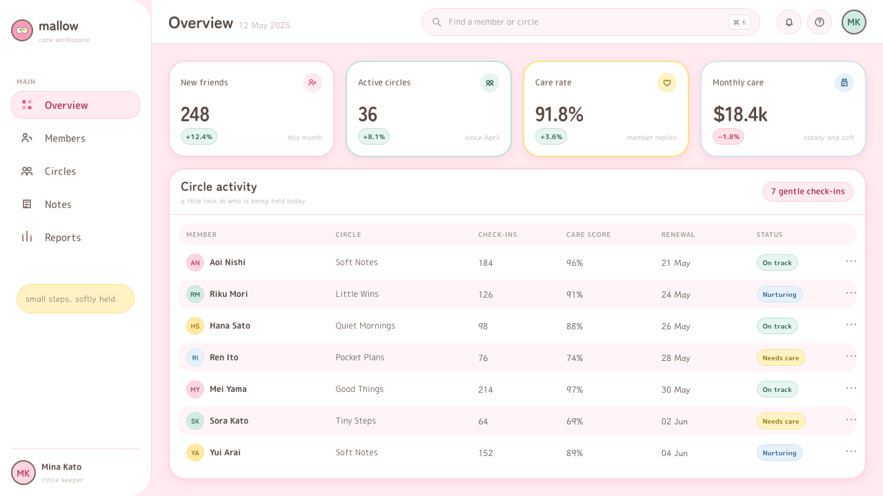
For web interfaces, Chiikawa is strongest where reassurance is part of the product experience: onboarding, progress states, friendly account pages, lightweight community spaces, and tools that help people through uncertainty. A dashboard can use pale pastel grounds and warm outlines to reduce tension around dense information, but primary actions and important status changes must remain unmistakable. Softness should make the interface easier to approach, never harder to operate.
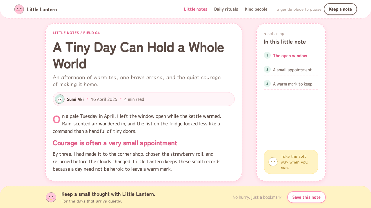
Editorial and marketing work can use the style to make a brand feel companionable. Article headers, newsletters, campaign landing pages, and explanatory cards benefit from a small emotional scene, a blush-toned accent, and copy that leaves room for a pause. The visual voice works especially well when the message acknowledges small daily feelings instead of overstating transformation. It can carry affection, nerves, relief, and encouragement without becoming sentimental spectacle.
The common mistake is to reduce Chiikawa to generic pastel cuteness. A pale pink background and round corners alone will not produce its emotional specificity. Do not replace the warm, wobbling line with severe black precision; do not overload every surface with faces; and do not make every element equally adorable. The style needs restraint, uneven hand-drawn softness, and a clear sense that the characters are small enough to deserve care.
Chiikawa (2022) — FAQ
Is Chiikawa simply a pastel kawaii style?
No. Pastel color is only one part of the system. Chiikawa’s distinctiveness comes from the relationship between soft color, warm-brown wobbling outlines, pill-like bodies, sparse faces, and visible anxiety. Generic kawaii can be bright, polished, or energetic; Chiikawa is specifically tender, small-scale, and emotionally exposed.
Why are the outlines warm brown rather than pure black?
Pure black can make simple forms feel graphic, strict, or visually loud. Warm brown still gives the creatures enough definition to remain legible, but it lowers the emotional temperature of the drawing. Combined with a slight wobble, it makes the line feel caring and handmade instead of rigid or commanding.
Can this style work for serious information?
Yes, when seriousness means helping people approach information without unnecessary anxiety. It can work for guides, dashboards, progress views, educational material, and explanatory marketing, provided the information hierarchy remains explicit. The character language should comfort the user around the content, not make important distinctions vague.
How should Chiikawa-inspired data visualizations stay readable?
Use softness in framing, not in the data logic. Rounded markers, pale grounds, and warm outlines can establish the atmosphere, while labels, category separation, and comparison cues stay direct. A small character may introduce or accompany a data story, but it should never compete with the evidence being shown.
What makes a Chiikawa-inspired layout feel inauthentic?
It becomes inauthentic when softness is applied as a surface filter while the composition stays loud, crowded, and controlling. Excessive decoration, severe outlines, relentless facial motifs, or overly polished symmetry erase the small hesitation that gives the style its heart. The essential quality is gentle permission: the design makes room for feeling.
Related design styles
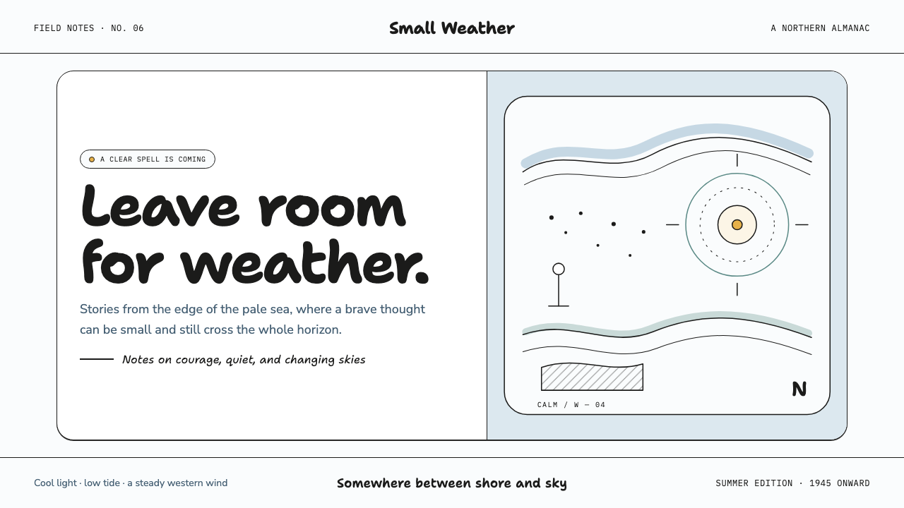 Moomin (Tove Jansson ink)Quiet makes the story brave. Fine black ink drifts through cool white and Bal…
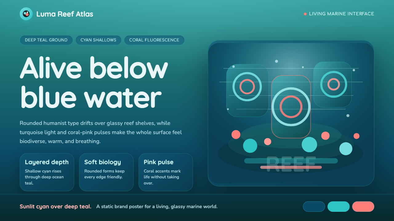 Great Barrier ReefAlive under deep teal. Quicksand curves, cyan glow, and coral-pink pulses bui…
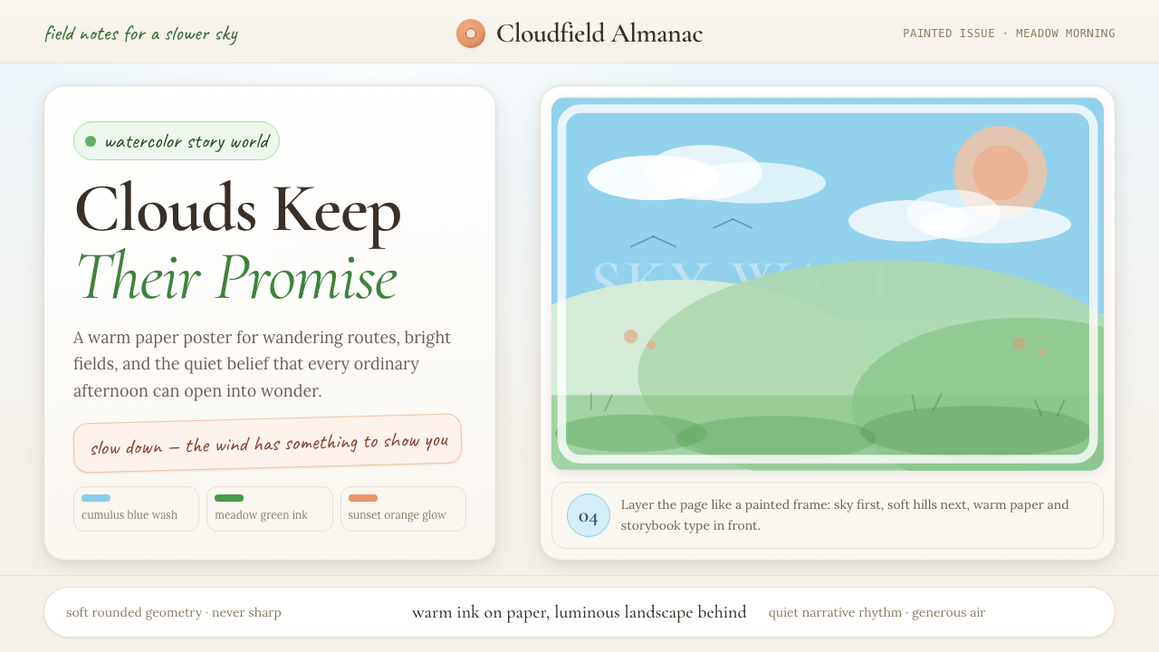 Studio Ghibli (Miyazaki)Hand-painted wonder breathes. Cumulus blue, meadow green, and Cormorant type…
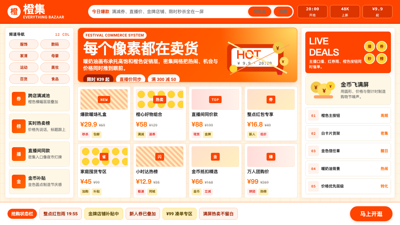 Taobao (淘宝)Every pixel sells. Orange on cream, dense price grids and gold coins shout ab…
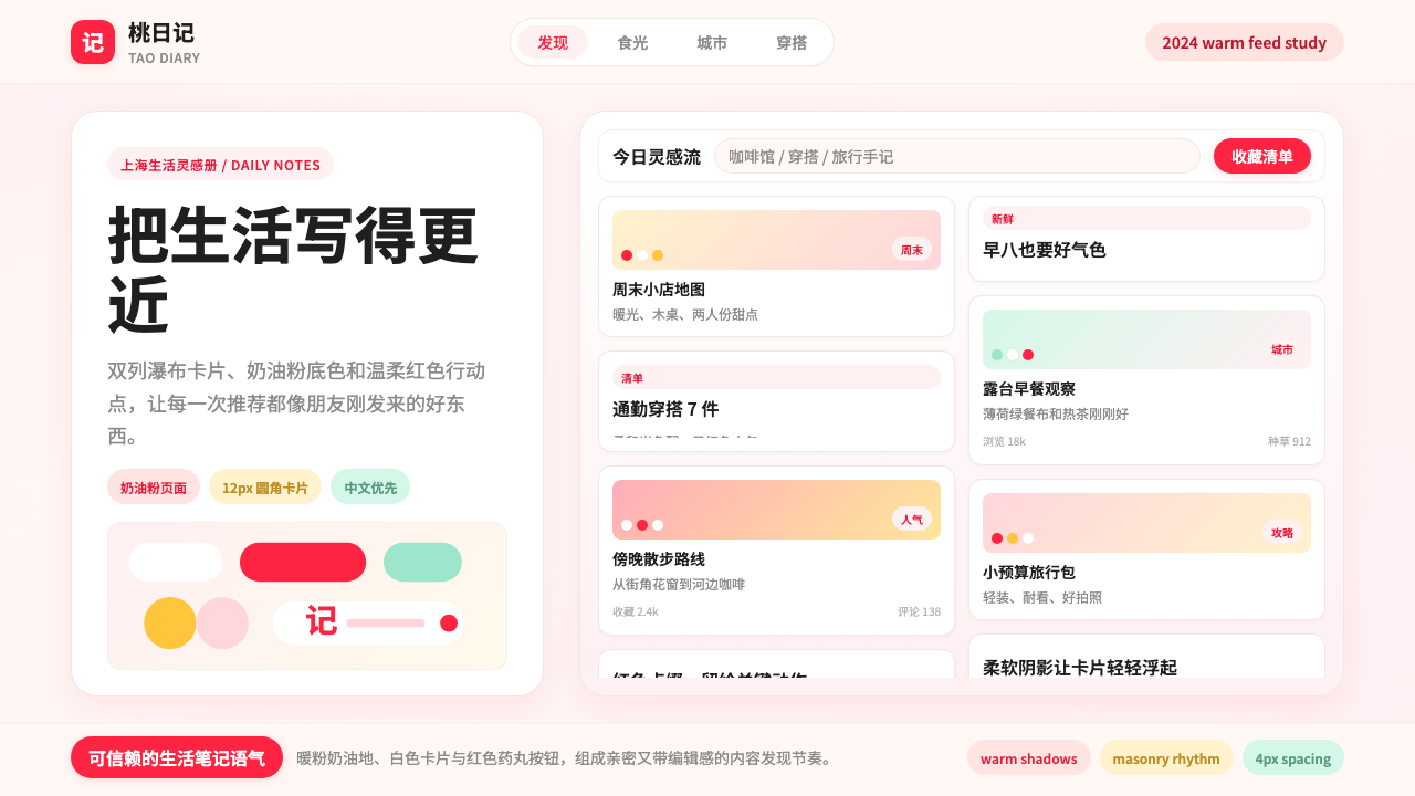 Xiaohongshu (RedNote) 2024Warm notes feel trusted. Cream-pink masonry cards glow with signature red acc…
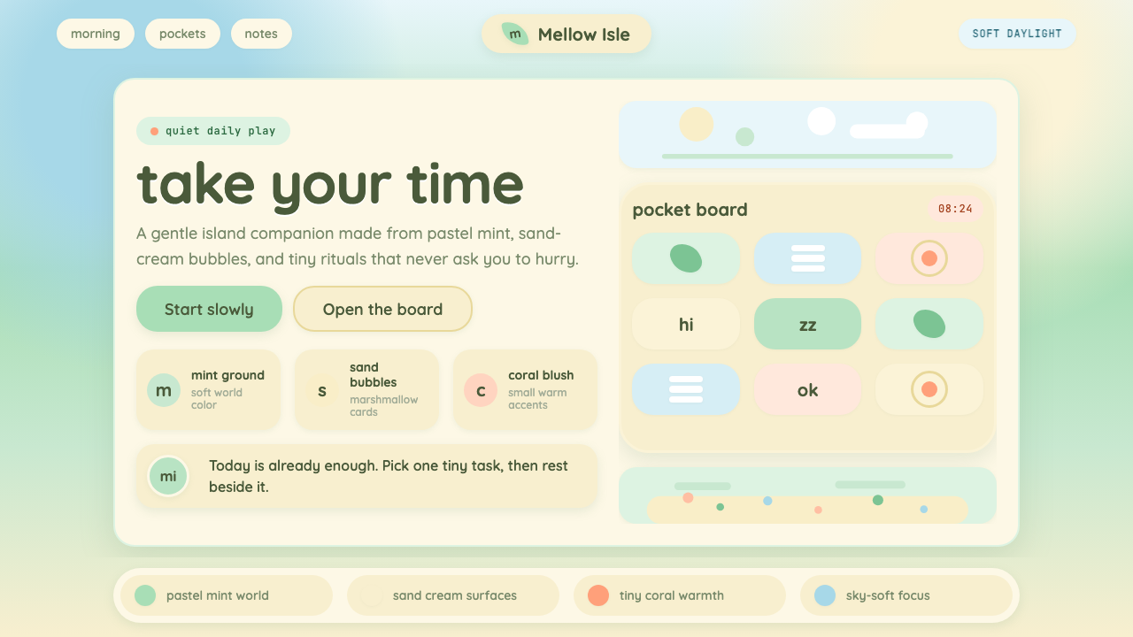 Animal Crossing — New HorizonsNo pressure, only daylight. Mint fields and sand bubbles soften every edge.