What is The Little Prince (1943)?
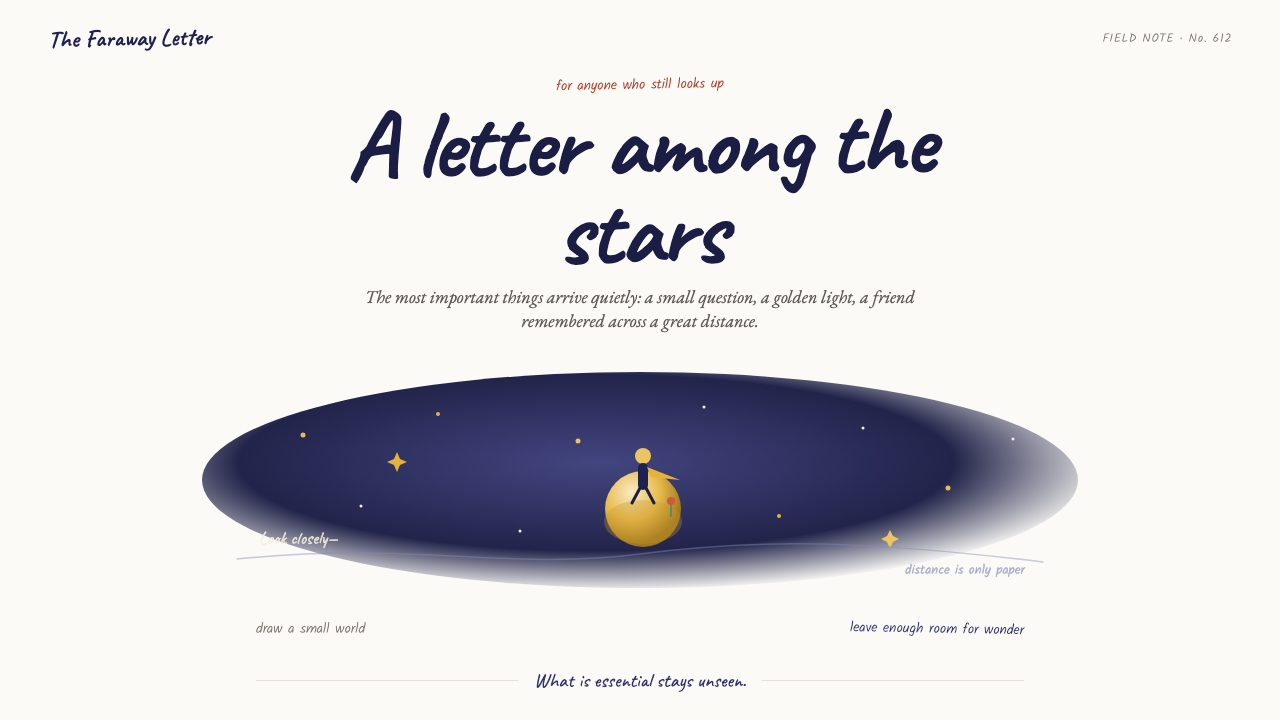
The Little Prince turns an interface into a quiet sheet of paper: indigo distance, golden glimmers, and a handwritten thought left gently in the margin.
The Little Prince (1943) in brief
The Little Prince style translates Antoine de Saint-Exupéry’s illustrated world into a digital visual language. Its central image is modest rather than monumental: a small boy with a golden scarf, a rose, or a pebble-sized planet suspended in an expanse of soft white paper. The composition asks the viewer to notice fragility, distance, and the meaning carried by a single small object.
Watercolor governs the atmosphere. Loose washes gather into deep indigo skies and then bleed toward star-flecked darkness; warm gold appears in hair, wheat, desert, and stars. These colors do not behave like polished interface decoration. They feel absorbed by paper, uneven at their edges, and emotionally connected to the image rather than assigned merely to hierarchy.
The style’s line work is equally important. Ink contours remain shaky, warm, and visibly human, never engineered into perfect geometry. Handwriting drifts across the page like a private letter from the aviator, while generous empty space removes the need for borders or frames. The result is tender, melancholy, and deliberately small in scale: the subject floats inside a much larger silence.
Where does The Little Prince (1943) come from?
The style originates with The Little Prince, associated here with 1943. The source material places its writing in New York exile during 1942 and records its first publication in April 1943. Its geographic identity is therefore deliberately double: French in literary heritage, and New York in its first printing by Reynal & Hitchcock.
Antoine de Saint-Exupéry is the figure at the center of this visual world. The style is not an abstract adaptation of a fable; it is specifically described as his watercolor hand brought to the screen. That origin explains its resistance to mechanical finish. A sable-brush wash, wavering ink outline, and handwritten note are not incidental flourishes: together they establish an illustrated page as the model for the whole composition.
The source material identifies French literary fable, mid-century watercolor book illustration, and aviation-era Romanticism as the movements surrounding the work. Their meeting point is visible in the relationship between a solitary figure and immense space. A boy, rose, or planet may occupy little of the page, yet the sky, desert, or blank paper gives that small subject emotional scale.
The named figures around the work include Consuelo de Saint-Exupéry, Curtice Hitchcock, and Léon Werth alongside Saint-Exupéry. For contemporary design use, this origin calls for restraint rather than historical costume. The objective is not to reproduce a book page literally, but to retain its essential conditions: watercolor uncertainty, handwritten intimacy, golden light, indigo distance, and faith that viewers can imagine what the picture leaves unseen.
What defines the The Little Prince (1943) look?
Paper and Negative Space
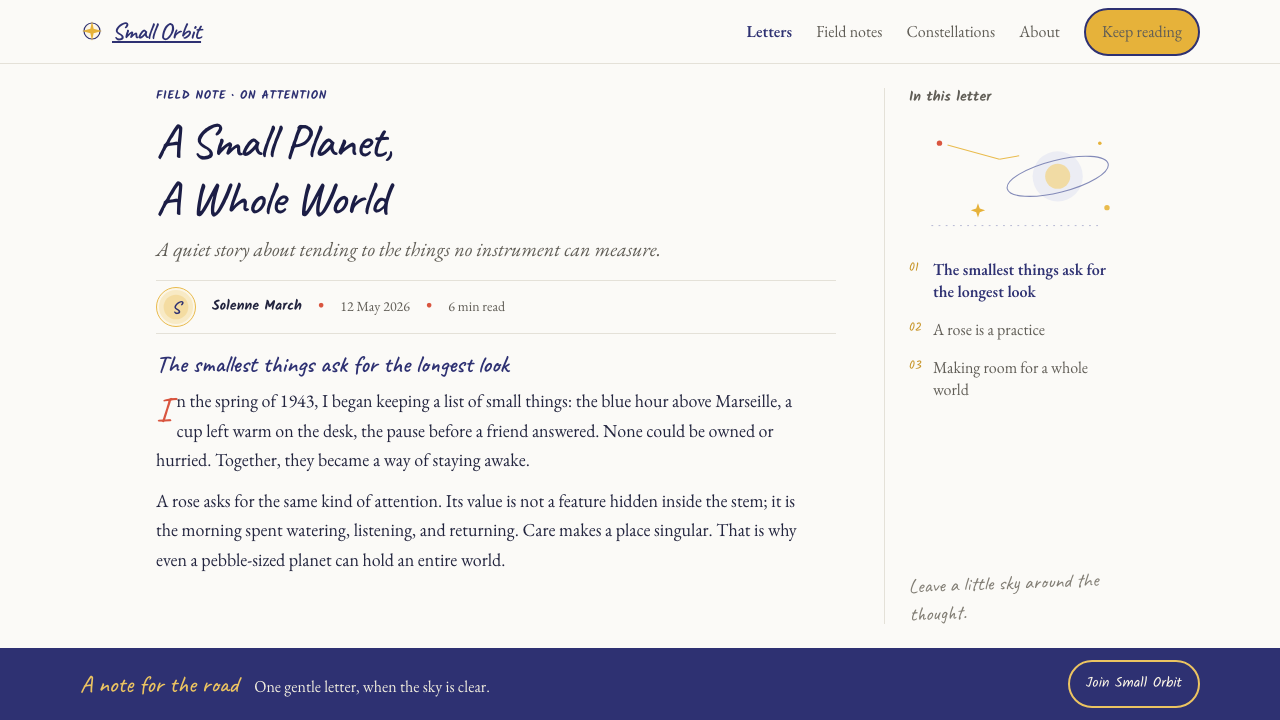
The ground should feel like soft white paper, open and breathable rather than like a contained panel. Avoid enclosing every thought. A small figure, rose, or note gains force because the surrounding field remains largely quiet.
Watercolor Atmosphere
Indigo washes should gather and diffuse with the looseness of pigment on paper. Their purpose is atmosphere, not glossy depth. Let transitions feel imperfect, airy, and capable of disappearing into white or into a star-flecked dark.
Golden Motifs
Gold belongs to the emotional vocabulary of the style: hair, wheat, desert, scarf, and stars. Use it as a quiet glow against indigo or white, keeping it scarce enough that each appearance feels discovered rather than applied.
Warm Ink Lines
Outlines should be light, irregular, and hand-drawn in feeling. They may contain hesitation and small variations, because their job is to suggest a presence rather than to seal objects into perfect digital shapes.
Handwritten Intimacy
Copy behaves like a margin note or private letter. It can drift beside an image, leave a thought unfinished in appearance, and create the sense that someone has entrusted the page to the reader. Formal corporate polish weakens this quality.
Smallness and Distance
Keep the subject visibly small against a generous field. This is not emptiness for its own sake; it is the visual condition that lets solitude, wonder, and the scale of a distant sky become legible.

Who shaped The Little Prince (1943)?
Saint-Exupéry is the central named figure of The Little Prince and the source of the style’s watercolor hand. The visual translation depends on that authorship: loose washes, warm ink, handwritten thoughts, and a small figure set against immense space.
Consuelo de Saint-Exupéry is named among the key figures in the source material. Her presence keeps the work’s context personal rather than purely stylistic, supporting an application that feels intimate, tender, and attentive to a single fragile subject.
Curtice Hitchcock appears among the key figures connected to the work’s New York publication context. The first printing by Reynal & Hitchcock is part of the source material’s account of how a French literary heritage entered print in New York.
Léon Werth is also listed as a key figure in the approved material. In a design reading, the name belongs to the work’s human constellation, reinforcing that this visual language is rooted in a literary fable rather than in a detached decorative trend.
How do you use The Little Prince (1943) today?
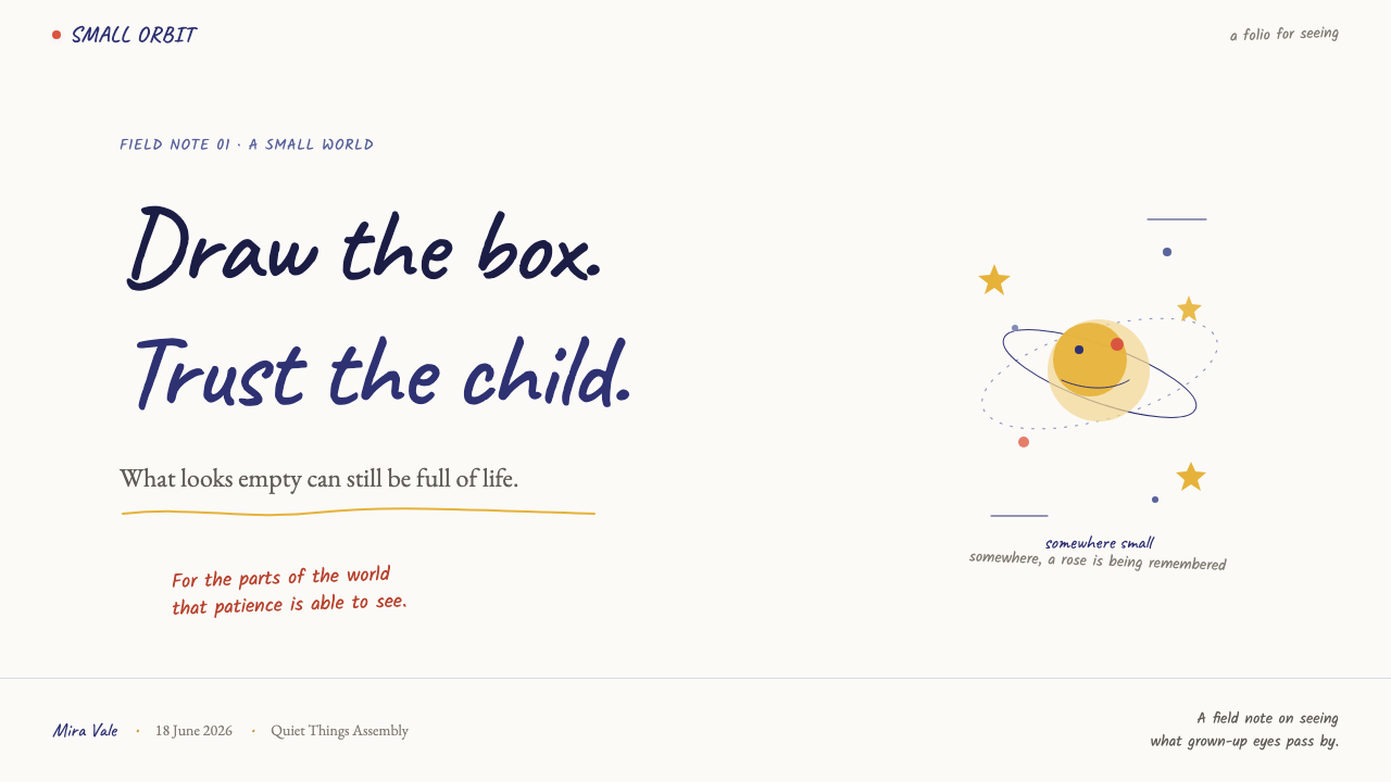
For presentation covers, use the page as an illustrated field rather than a branded billboard. Let a single small motif—a rose, scarf-like golden stroke, planet, or sparse stars—sit far from the title. The title should read like a thought written onto paper, while indigo is reserved for the distant sky or a concentrated watercolor moment. The empty area is part of the cover’s meaning.
On content slides, preserve the sensation of a private letter. Set headings and supporting copy with room to pause, and place a light handwritten aside where a conventional deck might use a callout box. Do not turn every point into a card. A faint ink line or small watercolor gesture can guide the eye, but the page should retain its open, unframed character.
For data slides, use the style to humanize interpretation rather than disguise evidence. Keep charts clear and quiet on a paper-like field; use indigo for the main visual argument and gold only to reveal a meaningful observation. A small handwritten annotation can explain why a point matters. Avoid dense ornamental stars, illustrated planets, or washes behind data labels, since those compete with reading.
In web interfaces, this approach suits reflective journals, reading experiences, learning products, personal archives, and editorial landing pages better than high-density operational dashboards. A calm white field can frame navigation, while an indigo wash marks a transition, selected story, or night-oriented section. Pricing pages can borrow the spaciousness and warmth, but their terms and comparisons must remain plain, stable, and easy to scan.
For editorial and marketing work, lead with one intimate image or sentence and let the copy unfold slowly. Use a rose, star, desert-like wash, or small distant silhouette as a recurring motif rather than filling the page with illustrations. The common mistake is to mistake the style for a generic celestial theme: crowded constellations, polished gold effects, rigid frames, and perfectly smooth vector art lose the source’s essential tenderness. The feeling comes from restraint, hand-made uncertainty, and a subject that remains small enough to be protected by the empty page.
The Little Prince (1943) — FAQ
Is this style simply a children’s-book illustration style?
No. Its accessible imagery can feel childlike, but its visual force comes from solitude, distance, handwritten intimacy, and the emotional scale created by empty space. A successful application should preserve that tenderness without reducing every message to cute decoration.
Can this style use a dark background?
Yes, particularly when the page evokes the indigo, star-flecked sky described in the source material. The dark field should remain spacious and watercolor-like, with gold used sparingly for stars or other luminous motifs. If every element becomes bright, the sense of distant night disappears.
How should typography relate to the handwritten notes?
Handwriting should feel like an intimate secondary voice, not a replacement for every readable sentence. Use it for a margin thought, a short question, or an emotional observation; keep the main information calm and legible so the note can remain personal and light.
Why are borders and frames usually avoided?
The source material explicitly describes soft white paper with no borders or frames. Removing those containers lets the figure, rose, and writing appear adrift, which is essential to the style’s sense of air and emotional distance. Use structure quietly through placement and space instead.
Related design styles
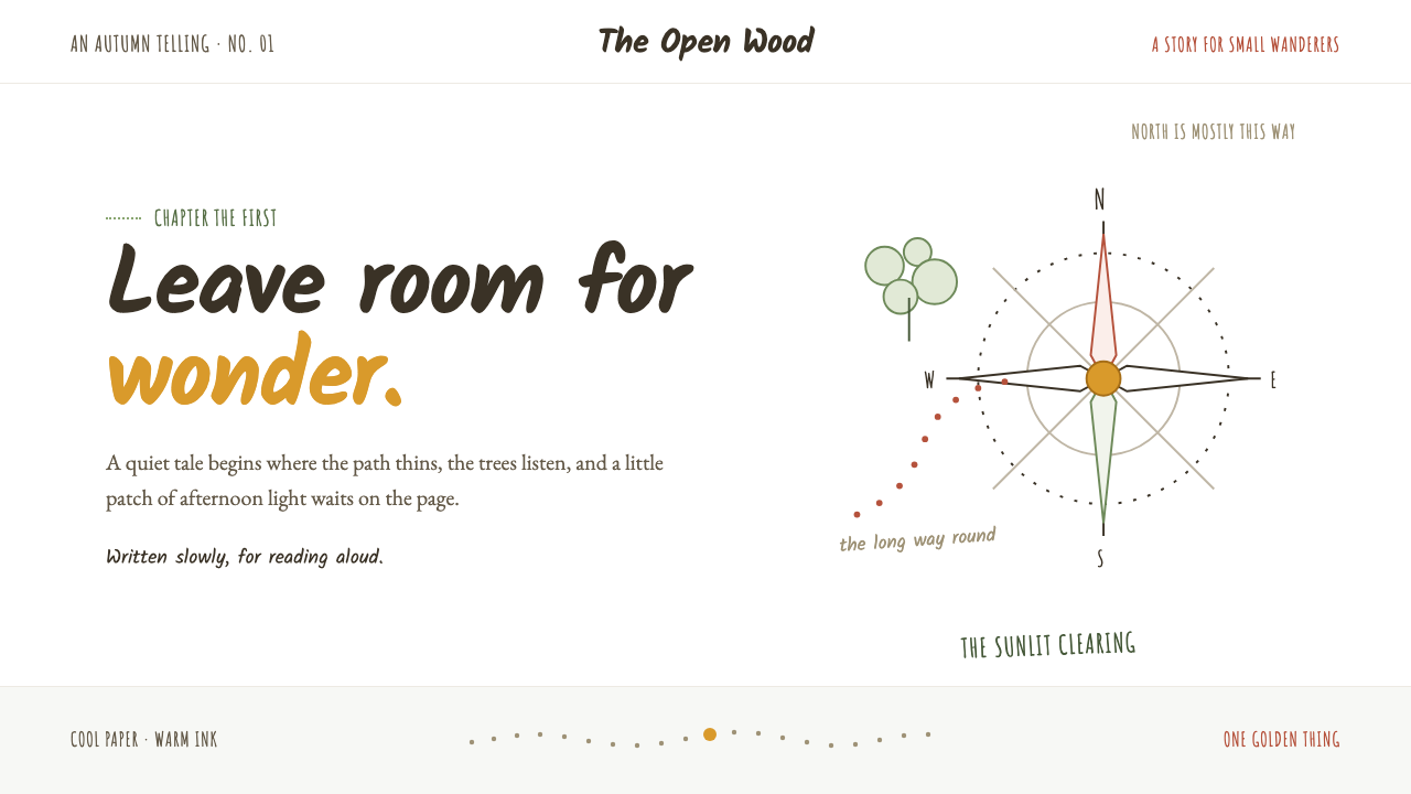 Winnie-the-Pooh (1926)Wonder lives in the white space. Loose sepia lines meet one small spot of hon…
 Moomin (Tove Jansson ink)Quiet makes the story brave. Fine black ink drifts through cool white and Bal…
 Chalk Café BoardWarmth written by hand. Dusty chalk script on graphite slate, framed by soft…
 Headspace Orange MeditationMeditation becomes friendly. Orange blocks, DM Sans, and pill shapes soften e…
 Peter Pan Neverland (1904)Enchantment glints, never shouts. Midnight navy holds gilt sparks and Edwardi…
 Quebec Clarence Gagnon Folk NaïfWinter bites softly. Barn red and smoke blue pochoir fields sit on snow-white…