Design style guide设计风格指南
What is Quebec Clarence Gagnon Folk Naïf?什么是 Quebec Clarence Gagnon Folk Naïf?
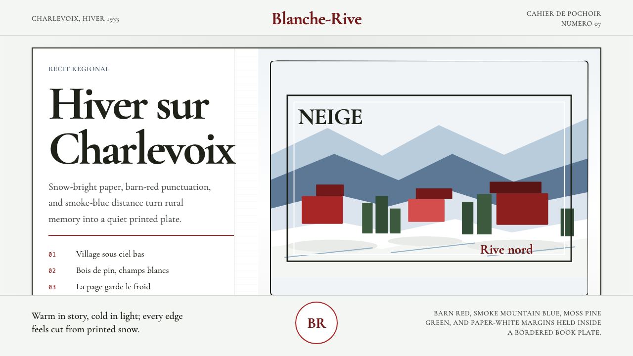
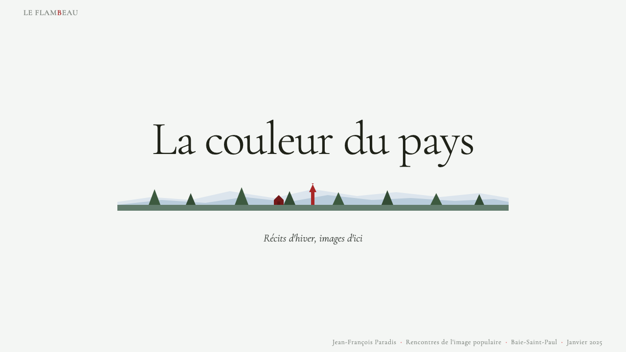
Flat stencil-cut snowfields, barn-red homesteads, and smoke-blue mountain shadows — Clarence Gagnon's pochoir illustrations for the 1933 deluxe Maria Chapdelaine set the visual grammar of Québécois folk naïf.平涂波绍尔雪原、谷仓红农舍、烟蓝山影——克拉伦斯·加尼翁为1933年豪华版《玛丽亚·夏普德莱恩》所作的版画,奠定了魁北克民间素朴风的视觉语法。
Quebec Clarence Gagnon Folk Naïf in briefQuebec Clarence Gagnon Folk Naïf 速览
Quebec Clarence Gagnon Folk Naïf is a design aesthetic rooted in the pochoir illustration tradition that Clarence Gagnon brought to its highest expression in the 1933 luxury edition of Louis Hémon's novel Maria Chapdelaine. Pochoir — a French stencil-printing method that builds images through layered hand-cut masks — produces color fields of remarkable flatness and saturation, with clean edges between tones that feel simultaneously hand-made and architecturally precise. The style translates this technique into a visual system of flat stencil-cut color panels, picture-book compositions, and the quietly dramatic palette of a Charlevoix winter.魁北克·克拉伦斯·加尼翁民间素朴风(Quebec Clarence Gagnon Folk Naïf)是一套植根于波绍尔版画传统的设计美学。克拉伦斯·加尼翁在1933年路易·埃蒙小说《玛丽亚·夏普德莱恩》的豪华版插画中,将这一传统发挥至极致。波绍尔(pochoir)是一种法国镂版印刷技法,通过分层手切模板叠印构建图像,产生出色域平坦饱和、色块之间边缘干净的视觉效果——既有手工痕迹,又兼具建筑般的精准。这套风格将该技法转化为一套由平涂色块、图画书式构图和夏尔瓦冬日肃穆调色板构成的视觉系统。
The aesthetic belongs to the broader tradition of Québécois folk narrative painting: images that tell communal stories, frame everyday rural life with gentle heroism, and treat the landscape not as backdrop but as protagonist. Snow is never merely white — it reads as the coolly luminous ground from which every warm accent (the red of a barn, the orange of a lantern, the olive of a frozen cedar) is made visible. Components in this visual language feel like illustrated story-page panels: self-contained, warm in spirit, and structured around the clarity of a single scene rather than the complexity of layered information.这种美学属于魁北克民间叙事绘画的更广泛传统:图像讲述集体故事,以温柔的英雄主义框架日常乡村生活,并将大地风光视为主角而非背景。雪地从不只是白色——它作为清冷发光的底面,使每一处暖色强调(谷仓的红、灯笼的橙、冻杉的橄榄绿)都得以彰显。这套视觉语言中的组件如同绘本书页:自成一体、温暖而有人情味,以单一场景的清晰感为结构核心,而非层叠信息的复杂性。
What distinguishes the style from general folk illustration is its particular balance of naïve directness and craft precision. Gagnon was academically trained and had spent years in Paris absorbing post-Impressionist colorism before returning to paint the Charlevoix region. His folk naïf sensibility is therefore knowing rather than untutored — it borrows the flat plane, the frontal animal, the simplified horizon of traditional folk art while applying the careful color relationships of a trained painter. The result is a visual register that feels simultaneously ancient and considered: warm without being sentimental, simple without being crude.这种风格区别于一般民间插画之处,在于它对素朴直接与工艺精准的特殊平衡。加尼翁曾接受学院训练,并在巴黎浸淫后印象派色彩学多年,才回到夏尔瓦地区写生。他的民间素朴气质因此是自觉为之,而非未经雕琢——它借用传统民间艺术的平涂色面、正面朝向的动物、简化的天际线,同时运用受过训练的画家所掌握的精心色彩关系。结果是一种视觉调性:既古老又经过深思,温暖而不伤感,简约而不粗糙。
See the Quebec Clarence Gagnon Folk Naïf design system →查看 Quebec Clarence Gagnon Folk Naïf 完整设计系统 →
Where does Quebec Clarence Gagnon Folk Naïf come from?Quebec Clarence Gagnon Folk Naïf 从何而来?
Clarence Gagnon was born in Montréal in 1881 and showed an early aptitude for painting the Québec countryside. After training at the Art Association of Montreal, he spent extended periods in Paris between 1904 and 1936, studying at the Académie Julian and absorbing the colorism of the Post-Impressionist and Symbolist circles that surrounded him. But unlike many Canadian artists who assimilated entirely into European modernism, Gagnon returned again and again to the Charlevoix region — particularly Baie-Saint-Paul and the villages of the lower Laurentides — where he developed a distinctive regionalist vision centered on winter landscapes, rural habitant life, and the particular quality of snow light under an overcast Quebec sky.克拉伦斯·加尼翁于1881年生于蒙特利尔,早年便展现出描绘魁北克乡野的才能。在蒙特利尔艺术协会受训后,他于1904至1936年间多次旅居巴黎,在儒利安学院研修,并沉浸于周围后印象派与象征主义圈子的色彩学中。但与许多完全融入欧洲现代主义的加拿大艺术家不同,加尼翁一再返回夏尔瓦地区——尤其是圣保罗湾和洛朗蒂德低地的村庄——在那里发展出一种独特的地域主义视野,以冬日风景、乡村习俗生活,以及魁北克阴天下雪地光线的特殊质感为核心。
The Charlevoix region had become, by the early twentieth century, an informal artists' colony. Marc-Aurèle Fortin, Horatio Walker, and eventually Jean Paul Lemieux all painted there, drawn by the same qualities that Gagnon celebrated: the dramatic landforms of the St. Lawrence Escarpment, the insular village culture preserved since New France, and a light that flattened forms and clarified silhouettes in ways that suited painterly simplification. The Charlevoix art colony was neither a formal school nor a declared movement — it was a shared geography that produced a recognizable family of visual sensibilities.二十世纪初,夏尔瓦地区已成为一个非正式的艺术家聚居地。马克-奥雷尔·福尔坦、霍雷肖·沃克,以及后来的让·保罗·勒米厄都曾在此写生,被同样吸引加尼翁的品质所召唤:圣劳伦斯断崖的壮阔地貌、自新法兰西时期便保存完好的封闭村庄文化,以及一种将形体压平、使轮廓清晰的光线——这种光线极适合绘画性简化。夏尔瓦艺术聚落既非正式学校,也非声明性运动,而是一片共同的地理,孕育出一个可识别的视觉气质家族。
The commission that crystallized Gagnon's folk naïf aesthetic came in the late 1920s, when the Paris publisher Mornay invited him to illustrate a luxury edition of Louis Hémon's Maria Chapdelaine — a novel first published in 1913 that had become the defining literary portrait of traditional Québécois rural life. Gagnon worked on the illustrations for several years, producing fifty-four pochoir plates that were hand-stenciled in Paris by specialist craftspeople under his supervision. The pochoir process suited his sensibility perfectly: its flat, bounded color fields echoed folk-art traditions while its layered precision allowed the subtle chromatic relationships — the way blue shadow falls across snow, the difference between a birch-white sky and a snow-white field — that distinguished his work from cruder folk illustration.确立加尼翁民间素朴美学的委托来自1920年代末。巴黎出版商莫尔纳邀请他为路易·埃蒙的《玛丽亚·夏普德莱恩》豪华版绘制插画——这部小说最初于1913年出版,已成为传统魁北克乡村生活的决定性文学画像。加尼翁历时数年创作了54幅波绍尔版画,由他监督下的巴黎手工艺人在巴黎逐张手工镂印完成。波绍尔技法与他的气质完美契合:平涂、有界的色域呼应民间艺术传统,而分层的精准性则容纳了微妙的色彩关系——蓝色阴影落在雪地上的方式,桦木白天空与雪白原野之间的差异——这正是他的作品区别于更粗糙民间插画的地方。
When the deluxe Maria Chapdelaine appeared in 1933, it was received as both an artistic achievement and a cultural monument — a refined embodiment of the Québécois folk imagination by a painter who had the technical training to formalize it without draining it of warmth. The book's visual language became enormously influential in Québec graphic culture, shaping poster art, book design, and eventually the broader visual vocabulary through which Québécois identity was represented throughout the twentieth century. Figures such as Jean Paul Lemieux extended the regionalist project in painting after the Second World War, while designers and illustrators continued to draw on the flattened palette, simplified composition, and narrative clarity that Gagnon had codified.1933年豪华版《玛丽亚·夏普德莱恩》问世时,它被视为一项艺术成就,也被视为一座文化丰碑——一位拥有技术训练的画家对魁北克民间想象的精炼体现,且并未因此抽干其温度。这本书的视觉语言对魁北克平面文化产生了深远影响,塑造了海报艺术、书籍设计,并最终成为整个二十世纪魁北克身份自我呈现的更广泛视觉词汇。战后,让·保罗·勒米厄在绘画中延续了地域主义事业;设计师与插画家则持续汲取加尼翁所编码的那种压平的色调、简化的构图与叙事性清晰。
What defines the Quebec Clarence Gagnon Folk Naïf look?Quebec Clarence Gagnon Folk Naïf 的视觉特征是什么?
Palette调色板
The color range is anchored by three defining chromatic relationships: barn red against snow white, smoke-blue mountain shadow against the paleness of frozen sky, and moss-green pine silhouette against both. These hues are not bright primaries — they are the muted, mineral tones of a winter landscape seen under overcast light. Warmth comes in small doses (a lit window, a red sash, a chestnut horse) against expanses of cool neutrality. Secondary accents — the ochre of bare birch bark, the blue-gray of frozen water — are drawn from the same natural source, so the palette feels coherent even when extended across many elements.调色板锚定于三组决定性的色彩关系:谷仓红对雪原白,烟蓝山影对冻天苍白,以及苔绿松林剪影对两者的对比。这些色相并非明亮的原色,而是阴天下冬日风景中那种沉静的矿物色调。温暖色以小剂量出现(一扇亮灯的窗户、一条红腰带、一匹栗色马),衬托在大面积的冷色中性底面之上。次要强调色——光裸桦树皮的赭色、结冰水面的蓝灰——都源自同一自然来源,因此即使扩展至众多元素,整体调色板仍感觉协调一致。
Flat Color Fields平涂色域
Color in this style is applied as flat, bounded areas rather than blended gradients. The pochoir technique from which the aesthetic derives produces clean stencil edges between color zones — sky meets hilltop in a crisp line, a horse's flank is a single unmodulated tone, a barn sits as a solid silhouette. This flatness is not crudeness; it is a deliberate formal choice that gives every composition clarity and graphic weight. Layered stencils produce occasional subtle overlaps where tones interact, but the overall impression is one of careful, bounded zones rather than continuous tonal gradation.这种风格中的色彩以平涂、有界的色域而非混融渐变的方式施用。美学所源自的波绍尔技法在色域之间产生干净的镂版边缘——天空与山顶在清晰的线条处相遇,马匹侧面是单一未经调和的色调,谷仓以实心剪影屹立。这种平涂并非粗糙,而是一种有意为之的形式选择,赋予每幅构图清晰感与平面重量。分层模板偶尔产生微妙的叠印区,色调在此相互作用,但整体印象是精心划定的色域,而非连续的色调过渡。
Pictorial Composition图画式构图
Compositions are organized like picture-book panels: a strong horizon line divides sky from ground, figures and structures are placed with frontal clarity rather than perspectival depth, and the eye is guided by the rhythm of repeating shapes — a row of fence posts, a line of spruce trees, the curve of a road disappearing into the middle distance. This narrative clarity means every scene reads as complete in itself, with foreground elements framed against simplified backgrounds. The viewpoint is typically at eye level or slightly elevated, giving the spectator a position of gentle overview rather than dramatic immersion.构图如绘本书页般组织:一条强烈的地平线将天空与地面分割,人物与建筑以正面清晰感而非透视深度置放,视线由重复形状的节奏引导——一排栅栏柱、一列云杉、一条消失在中景的弯路。这种叙事性清晰意味着每个场景读起来都自成一体,前景元素映衬于简化的背景之上。视点通常位于眼平线处或略高,给观者一种温和俯视的位置感,而非戏剧性的沉浸体验。
Snow as Ground and Light Source雪地:底面与光源
Snow functions simultaneously as compositional ground, light source, and chromatic anchor. Under overcast winter sky, snow in the Charlevoix landscape does not reflect direct sunlight — it emits a diffuse, cool luminosity that is both bright and tonally restrained. In this style, the white or near-white of snow creates the lightest value in most compositions, making every other element — however muted — appear to glow against it. Blue shadow cast by trees or buildings across the snowfield is one of the style's most characteristic marks: a cold, clean blue-gray that reads more as atmospheric phenomenon than as cast darkness.雪地同时充当构图底面、光源与色彩锚点。在夏尔瓦阴天冬日下,雪地不反射直射阳光,而是散发出一种弥漫的冷冽光感——既明亮又在色调上克制。在这种风格中,雪的白色或近白色构成大多数构图中最亮的明度值,使其他每一个元素——无论多么低调——都仿佛在其映衬下发光。树木或建筑在雪地上投下的蓝色阴影是这种风格最具特征的标志之一:一种寒冷、干净的蓝灰色,读起来更像大气现象而非沉重的投影。
Hand-Set Serif Typography手排衬线字体
Text in this tradition draws from the hand-set typefaces of early-twentieth-century Quebec book and poster printing: sturdy, optically balanced serifs with a slight irregularity of stroke that suggests craft process rather than mechanical precision. Type is treated as integral to the composition — title lettering may be sized to balance a large pictorial field, captions sit close to their images in a manner that recalls hand-annotation. The overall typographic register is warm and artisanal without being archaic or precious; it reads as the printed equivalent of the narrative clarity that governs the images.这一传统中的文字源自二十世纪初魁北克书籍与海报印刷中的手排字体:粗壮、视觉平衡的衬线字体,笔画带有轻微的不规则性,暗示手工过程而非机械精准。文字被视为构图的有机组成部分——标题字号可能与大面积图画场域相平衡,说明文字紧贴图像放置,让人联想到手工注释。整体排印调性温暖而富工艺感,但不显陈旧或矫揉造作;它读起来如同叙事性清晰在印刷层面的对应物。
Narrative Human and Animal Figures叙事性人物与动物
Human figures and working animals are a constant presence: habitants bundled in winter coats, habitant women in bright sashes, horse-drawn sleighs, cattle in barn doorways, sled dogs. These figures are never idealized — they are sturdy, front-facing or in simple profile, rendered in a few flat tones with clear silhouettes. Their scale relative to the landscape conveys the folk narrative theme: people are of the land, neither dominating it nor dwarfed by it. Figures give each composition a human heartbeat without becoming sentimental portraits.人物与劳作动物无处不在:裹着冬装的农民、身系鲜艳腰带的农妇、马拉雪橇、谷仓门口的牛群、雪橇犬。这些人物从不理想化——他们结实,正面朝向或呈简单侧影,用几块平涂色调和清晰轮廓呈现。他们与风景的比例关系传递出民间叙事主题:人属于这片土地,既不凌驾其上,也不被其矮化。人物为每幅构图注入一颗人性的心跳,却不沦为伤感的肖像。
Quiet Drama of Season季节的静默戏剧
The aesthetic carries the emotional register of a Charlevoix winter: silence, endurance, and a kind of beauty that asks to be noticed slowly. There is no bombast — compositions do not strain for grandeur. Instead, they accumulate quiet drama through the contrast of warmth against cold, shelter against open exposure, the human mark against the indifferent white field. This emotional restraint is part of the style's character; it reads as dignity rather than distance, as observation rather than sentiment.这种美学承载着夏尔瓦冬日的情感调性:寂静、坚忍,以及一种需要慢慢凝视才能察觉的美。没有轰轰烈烈——构图不追求壮阔。取而代之的,是通过温暖对冷寒、庇护对空旷暴露、人类印记对漠然白原的对比,积累出静默的戏剧性。这种情感克制是风格性格的一部分;它读起来是尊严而非疏离,是观察而非伤情。

See the Quebec Clarence Gagnon Folk Naïf design system →查看 Quebec Clarence Gagnon Folk Naïf 完整设计系统 →
Who shaped Quebec Clarence Gagnon Folk Naïf?谁塑造了 Quebec Clarence Gagnon Folk Naïf?
Gagnon is the central figure through whom the folk naïf aesthetic was formalized. Born in Montréal, he spent formative years at the Académie Julian in Paris while maintaining a deep attachment to the Charlevoix region. His fifty-four pochoir illustrations for the 1933 Maria Chapdelaine are the canonical expression of the style: flattened color, pictorial clarity, and a winter palette that became the visual language of Québécois regional identity. He was also a respected printmaker and plein-air landscape painter, but the Maria Chapdelaine commission remains his most culturally resonant achievement.加尼翁是将民间素朴美学正式化的核心人物。他生于蒙特利尔,在巴黎儒利安学院度过成型岁月,同时对夏尔瓦地区保持深厚眷恋。他为1933年《玛丽亚·夏普德莱恩》所作的54幅波绍尔版画是这种风格的经典呈现:压平的色彩、图画性的清晰,以及成为魁北克地域身份视觉语言的冬日调色板。他同时也是一位受人尊敬的版画家与外光写生画家,但《玛丽亚·夏普德莱恩》的委托仍是他文化影响力最深远的成就。
The French-born writer whose novel Maria Chapdelaine provided the literary substrate that Gagnon illustrated. Hémon spent only fourteen months in the Lac-Saint-Jean region of Québec before his death, but his careful observation of habitant life — the seasonal rhythms, the religious faith, the relationship between family and land — produced a portrait so accurate and sympathetic that it became a foundational text of Québécois cultural identity. The novel's subject matter — its frost, its isolation, its quiet heroism — is inseparable from the visual world that Gagnon built around it.法国出生的作家,其小说《玛丽亚·夏普德莱恩》为加尼翁的插画提供了文学基底。埃蒙在魁北克圣让湖地区仅生活了十四个月便辞世,但他对农民生活的细心观察——季节节律、宗教信仰、家族与土地的关系——产生了一幅如此准确而充满同情心的画像,以至于成为魁北克文化身份的奠基文本。小说的主题——严霜、孤立、静默的英雄主义——与加尼翁围绕它构建的视觉世界密不可分。
A major Québécois painter who shared Gagnon's attachment to the rural and working-class landscape of Québec, though his palette and technique diverged significantly. Fortin worked often with watercolor and developed a distinctive vision of the elms of Sainte-Rose and the Montreal waterfront, using flat color and strong outline in ways that parallel the folk naïf sensibility. His work extends the regionalist tradition into a more expressively colored and emotionally direct register, and he stands alongside Gagnon as one of the defining figures of the Charlevoix and greater Québec visual tradition.魁北克重要画家,与加尼翁同样深情于魁北克乡村与工人阶级风景,尽管他的调色板与技法大相径庭。福尔坦常以水彩作画,发展出对圣罗斯榆树与蒙特利尔海滨独特的视角,以平涂色彩与强烈轮廓线的方式呈现,与民间素朴气质相互呼应。他的作品将地域主义传统延伸至更具表现力的色彩与更直接的情感调性,与加尼翁并列为夏尔瓦及大魁北克视觉传统的奠基人物之一。
The painter most associated with carrying the Québécois regionalist tradition into the second half of the twentieth century. Lemieux's mature work shares the folk naïf aesthetic's love of simplified horizon lines, solitary figures in vast winter landscapes, and muted seasonal palettes — but extends these toward a metaphysical quietude that goes beyond illustration. His figures are often isolated against near-empty snowfields, giving the folk naïf visual vocabulary an existential weight that influenced later Québécois visual art and graphic design.最被认同为将魁北克地域主义传统延续至二十世纪下半叶的画家。勒米厄成熟期的作品与民间素朴美学共享对简化地平线、广袤冬日风景中孤独身影以及低沉季节调色板的热爱——但将这些延伸至超越插画的形而上静谧。他的人物常孤立在近乎空白的雪原上,赋予民间素朴视觉词汇一种存在主义的重量,影响了此后的魁北克视觉艺术与平面设计。
How do you use Quebec Clarence Gagnon Folk Naïf today?今天怎么用 Quebec Clarence Gagnon Folk Naïf?
Quebec Clarence Gagnon Folk Naïf is well suited to contexts where warmth, cultural specificity, and narrative authenticity are primary values — the opposite of contexts that call for technological coolness or corporate abstraction. The style's strengths are its ability to make a viewer feel located in a particular place and time, to make data or content feel curated and hand-considered, and to carry emotional warmth without tipping into saccharine sentimentality. Applied well, it creates the sense that a human hand was involved in every decision.魁北克·克拉伦斯·加尼翁民间素朴风非常适合温暖感、文化特殊性与叙事真实性是首要价值的场景——与要求科技冷感或企业抽象性的场景恰恰相反。这种风格的优势在于:使观者感到自己置身于某一特定地点与时间,使数据或内容感觉经过精心挑选与手工考量,并传递情感温度而不滑向廉价的甜腻伤感。运用得当,它营造出一种每个决定都有人的手参与其中的感觉。
For presentation slides, the style works best on covers and section dividers that carry an atmospheric, story-opening quality. A cover page might use a large flat-color composition — a simplified snowfield, a silhouetted structure — as the full bleed background, with title text in a robust serif placed in a white or cream panel that floats over the image like a book title. Content slides should maintain the palette's restraint: use the barn red or smoke blue sparingly for emphasis, keep backgrounds in the near-white or cream range, and let the composition breathe. Data slides can take on the style's pictorial clarity by treating charts as flat geometric fields — bar charts in the muted warm tones, background gridlines in the lightest possible grey.在演示文稿中,这种风格最适合带有大气感、故事开场品质的封面与章节分隔页。封面可将大面积平涂构图——简化的雪原、剪影化的建筑——作为满版背景,标题文字以粗壮衬线体置于漂浮于图像之上的白色或奶油色面板中,如同书名页。内容页应保持调色板的克制:谷仓红或烟蓝仅在需要强调时出现,背景保持在近白色或奶油色范围内,让构图有呼吸空间。数据页可借鉴风格的图画性清晰,将图表处理为平涂几何色域——柱状图用低沉的暖色调,背景网格线用最浅的灰色。
For web interfaces and digital products, the style suits editorial platforms, cultural organizations, food and heritage brands, and any product where craft narrative and regional authenticity are part of the value proposition. The approach: use a generous off-white or snow-white background as the dominant ground, apply barn red or smoke blue as the single primary interactive accent, and structure content in clear panel-like blocks that echo the pictorial composition of the source illustrations. Navigation should be typographic and clean; icon use should be minimal and when icons appear, they should feel drawn rather than constructed — simple closed silhouettes rather than multi-weight line icons.对于网页界面与数字产品,这种风格适合编辑类平台、文化机构、食品与遗产品牌,以及任何将手工叙事与地域真实性作为价值主张的产品。方法如下:以宽裕的米白色或雪白色作为主导底面,以谷仓红或烟蓝作为唯一的主要交互强调色,将内容结构化为清晰的面板式区块,呼应原始版画的图画构图。导航应以文字为主、干净简洁;图标使用应尽量减少,一旦出现,应感觉是手绘而非构建的——简单的闭合剪影,而非多线重的线性图标。
For editorial and marketing design, the style supports a storytelling-forward approach that reads as both warm and considered. A heritage brand's marketing page might alternate full-width image panels (flat color illustrations or photography treated in the style's palette) with text panels in an off-white field and a sturdy serif. Pull quotes sit in the margin in a smaller weight of the same typeface. Marketing materials for cultural events, winter tourism, or food-and-craft brands are natural homes for the aesthetic. The palette's coherence means it remains effective at smaller scales — postcards, social media tiles, and in-store signage all carry the same visual register.对于编辑与营销设计,这种风格支持以故事为先的方式,读起来既温暖又经过深思。遗产品牌的营销页面可将全宽图像面板(平涂插画或以风格调色板处理的摄影)与米白色底面上的文字面板交替排列,配以粗壮衬线字体。引用语以同一字体的较小字重置于页边。文化活动、冬季旅游或食品手工艺品牌的营销材料是这种美学的天然栖息地。调色板的内聚性意味着它在较小尺度上同样有效——明信片、社交媒体方图和店内标识都能承载同样的视觉调性。
A common mistake when applying this style is overloading it with decorative folk motifs — quilt patterns, botanical borders, folk-art flourishes — that conflict with its essential flatness and pictorial restraint. The Gagnon folk naïf aesthetic is not a folk-art sampler; it is a refined, trained eye's interpretation of folk visual culture. Ornament that is not structural or narrative should be removed. A second frequent error is allowing the palette to become too warm overall: the snow white and cool blue shadow are as essential to the style as the barn red. Removing the cool anchor allows the warm tones to tip into a generic rustic aesthetic that loses the style's defining quality — the cool bite of a Charlevoix winter.应用这种风格时最常见的错误,是将其过度装饰以民间图案——被子花样、植物边框、民间艺术花饰——这些与其本质上的平涂性和图画克制相冲突。加尼翁民间素朴美学并非民间艺术采样器,而是受过训练的眼光对民间视觉文化的精炼诠释。非结构性或非叙事性的装饰应当去除。第二个常见错误是让整体调色板变得过于温暖:雪地的白与冷蓝阴影与谷仓红同等重要。去除冷色锚点会使暖色调滑入一种通用的乡村质朴美学,失去这种风格的决定性品质——夏尔瓦冬日的冷冽气息。
See the Quebec Clarence Gagnon Folk Naïf design system →查看 Quebec Clarence Gagnon Folk Naïf 完整设计系统 →
Quebec Clarence Gagnon Folk Naïf — FAQQuebec Clarence Gagnon Folk Naïf · 常见问题
What makes this style different from general folk illustration or rustic design?这种风格与一般民间插画或乡村设计有何不同?
The distinction lies in the trained eye behind the naïve surface. Gagnon spent years absorbing Post-Impressionist colorism in Paris before applying it to Charlevoix folk subjects, which means his color relationships are carefully calibrated even when they appear simple. The style differs from generic rustic design in its cool chromatic anchor — the snow white and blue shadow that prevent warmth from becoming cloying — and in its compositional control, which is picture-book clear rather than decoratively complex. Genuine rustic or country folk aesthetics tend toward more pattern, more layering, and a warmer overall register. This style is quieter, cooler, and more formally disciplined.区别在于素朴表面背后那双受过训练的眼睛。加尼翁在巴黎汲取后印象派色彩学多年,才将其运用于夏尔瓦民间题材,这意味着即便他的色彩关系看似简单,实则经过精心校准。这种风格有别于通用乡村设计之处,在于其冷色调锚点——防止温暖色滑向甜腻的雪地白与蓝色阴影——以及其构图控制:清晰如绘本,而非装饰性地复杂。真正的乡村或民间美学往往倾向于更多图案、更多层次感,以及整体上更温暖的调性。这种风格更安静、更冷冽、形式上更为自律。
Can this style work effectively in digital interfaces, or is it inherently print-oriented?这种风格能在数字界面中有效运作吗,还是它本质上是为印刷设计的?
The style translates well to digital interfaces precisely because its foundational properties — flat color, clean edges, high tonal contrast between elements — are native to screen rendering rather than in tension with it. The pochoir technique produced flat bounded fields long before screens existed; those same properties that make screen colors vivid also suit this visual language. The main adaptation required is handling the snow-white ground carefully on bright screens, where pure white can feel harsh. An off-white or very slightly warm white preserves the style's luminous quality without the clinical brightness of full-white digital backgrounds.这种风格能很好地转化至数字界面,恰恰是因为其基础属性——平涂色彩、干净边缘、元素间高色调对比——是屏幕渲染的原生属性,而非与之对立。波绍尔技法早在屏幕诞生之前便产生了平涂有界色域;让屏幕色彩鲜艳的同样属性也适合这种视觉语言。所需的主要调适是在明亮屏幕上谨慎处理雪白底面——纯白在屏幕上可能感觉刺眼。略微偏暖的米白色能保留风格的发光质感,同时避免全白数字背景的临床亮度。
How should this style handle photography or photographic imagery?这种风格应如何处理摄影或照片类图像?
The style's relationship with photography requires deliberate curation. Full-color naturalistic photography imported directly tends to disrupt the palette's coherence and the compositional flatness that the aesthetic depends on. Photography works best when treated as a tonal field — converted to a limited palette duotone using the style's smoke-blue and near-white, or cropped to foreground silhouettes that echo the flat pictorial clarity of the pochoir illustrations. Winter landscape photography with overcast skies and snow-covered ground requires the least adaptation, since its inherent palette already aligns with the style. For editorial use, treating photography as a texture within a larger flat color composition — rather than as the hero element — preserves the style's visual coherence.这种风格与摄影的关系需要有意为之的策划。直接引入的全彩自然主义摄影往往会破坏调色板的内聚性,以及这种美学所依赖的构图平涂性。摄影最好被处理为色调色域——用风格的烟蓝与近白色转化为有限调色板的双色调,或裁切为呼应波绍尔版画平涂图画清晰感的前景剪影。阴天和积雪大地的冬日风景摄影所需调适最少,因为其固有调色板已与这种风格一致。对于编辑用途,将摄影作为更大平涂色彩构图内的质感元素——而非主角元素——能保持风格的视觉内聚性。
Is this style appropriate only for Canadian or Québécois cultural contexts, or can it be applied more broadly?这种风格只适用于加拿大或魁北克文化语境,还是可以更广泛地应用?
The style's cultural specificity is real but does not confine it to strictly regional applications. The underlying visual properties — flat color fields, pictorial composition, a cool luminous ground with warm accent tones, narrative human scale — are transferable design qualities that resonate wherever craft warmth, winter aesthetics, or thoughtful regionalism are valued. The style finds natural applications in winter tourism, heritage food and beverage brands, publishing design for narrative non-fiction, and cultural institutions across many geographies. What transfers is the aesthetic sensibility; what does not transfer automatically is cultural appropriation — using the specific symbols of Québécois rural life (habitant dress, snowshoe trapping culture, French-Canadian folk religious imagery) outside that cultural context requires care and intentionality.这种风格的文化特殊性是真实存在的,但并不将其限定于严格的地域应用。其底层视觉属性——平涂色域、图画式构图、以暖色强调为点缀的冷冽发光底面、叙事性的人类尺度——是可移植的设计品质,在任何珍视手工温度、冬日美学或深思熟虑的地域主义的场合都能引发共鸣。这种风格在冬季旅游、遗产食品与饮料品牌、叙事非虚构出版设计,以及跨越多种地域的文化机构中有着自然的应用空间。可转移的是美学气质;不会自动转移的是文化挪用——在魁北克文化语境之外使用该文化的特定符号(农民服装、雪鞋陷阱文化、法裔加拿大民间宗教图像)需要谨慎与自觉。
How does this style differ from other winter or Scandinavian folk aesthetics it might be confused with?这种风格与容易混淆的其他冬日或斯堪的纳维亚民间美学有何区别?
The most important distinguishing feature is the cool luminosity of the snow ground versus the warmer, candlelit intimacy of Nordic folk aesthetics. Scandinavian folk traditions — the Swedish Dalarna style, Norwegian rosemaling, Finnish folk textiles — tend toward denser pattern-work, symmetrical motifs, and a warmer amber or red-dominant palette that evokes indoor firelight and textile craft. The Gagnon folk naïf aesthetic is outdoor and landscape-centered: its warmth is accent rather than dominant, and the overarching impression is of cool, open, snowy space rather than warm enclosure. Its compositions are simpler and less pattern-based, with a narrative pictorial scene as the organizing unit rather than a decorative repeating motif.最重要的区分特征是雪地底面的冷冽光感,与北欧民间美学更温暖的烛光室内气息之间的差异。斯堪的纳维亚民间传统——瑞典达拉纳风格、挪威玫瑰绘画、芬兰民间纺织品——倾向于更密集的图案工作、对称母题,以及唤起室内壁炉与纺织手工艺的、以琥珀色或红色主导的更温暖调色板。加尼翁民间素朴美学是户外的、以风景为中心的:温暖感是强调色而非主导色,整体印象是冷冽、开阔、雪封的空间,而非温暖的室内围合。其构图更简洁、图案性更低,以叙事性图画场景作为组织单元,而非以装饰性重复母题。
Related design styles相关设计风格
 Amsterdam Canal HouseQuiet luxury in brick and cream. Playfair serif, narrow columns, amber window…克制的奢华。砖红配奶油纸面,窄列与琥珀窗光。
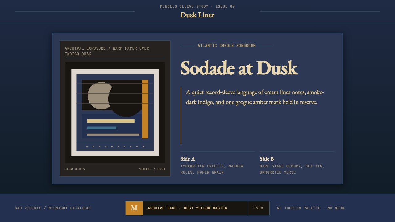 Cape Verdean Morna (Cesária Era)Longing in dusk. Indigo sleeve framing, Garamond liner notes, and one amber e…暮色里的乡愁:靛蓝唱片框、Garamond内页字与一抹琥珀火点。
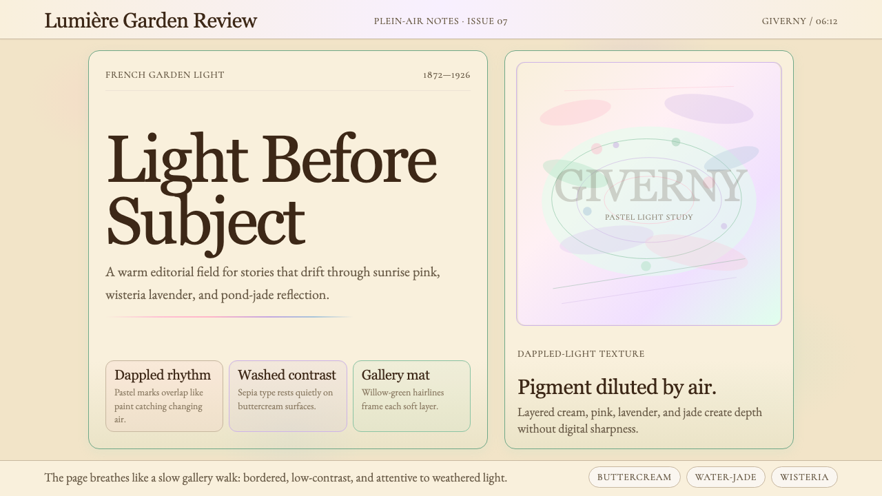 Claude Monet ImpressionistLight becomes the subject. Buttercream, pastel dapples, and Cormorant serif s…光成为主题。奶油底、粉彩斑点与Cormorant衬线柔化画面。
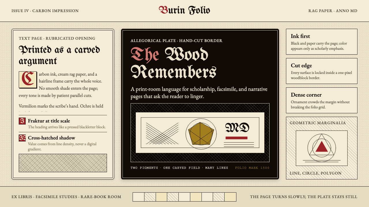 Dürer WoodcutInk remembers everything. Fraktur titles, rag-paper cream, and cross-hatched…木刻记住一切:哥特标题、破布纸奶油色与交叉排线。
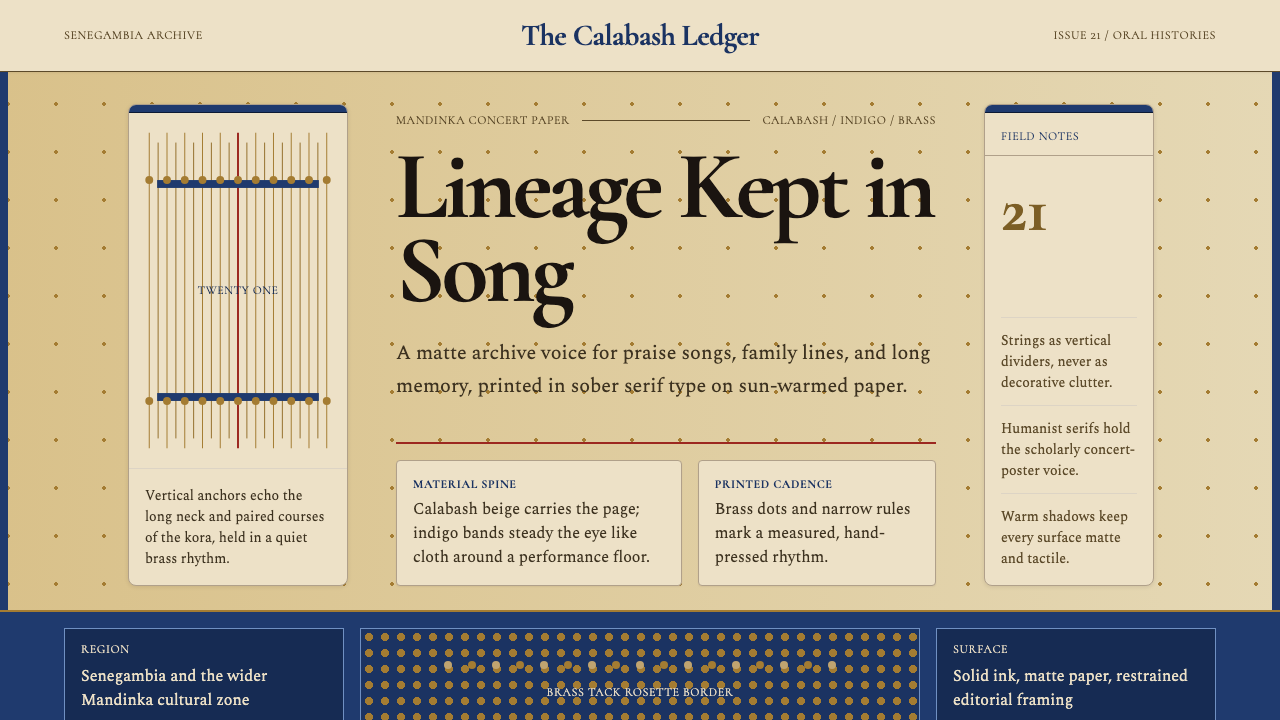 Gambian Griot Kora (21-string)Oral history feels tactile. Calabash beige, indigo bands, and 21 brass string…口述史有触感。葫芦米色、靛蓝带与21道黄铜弦线。
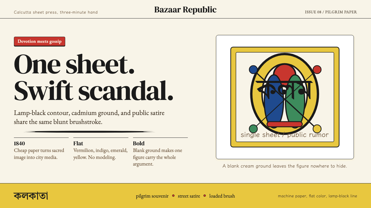 Kalighat Patua (Bengal)Satire swings fast. Cadmium yellow, vermilion and lamp-black line on cream pa…讽刺一笔挥出:奶油纸上明黄、朱红与墨黑轮廓线。