What is Chalk Café Board?
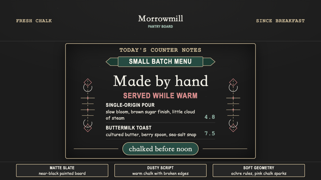
Before it was a design trend, the café chalkboard was a practical trick — erasable, cheap, and honest about what's fresh today — and this style keeps every bit of that handmade honesty.
Chalk Café Board in brief
Chalk Café Board is a design language translated directly from the hand-lettered menu boards of the independent coffee-shop world: white chalk drawn over a painted slate blackboard, standing in for a printed menu because it can be wiped clean and redrawn the next morning. The system keeps that origin visible rather than smoothing it into something crisp — a near-black, graphite-toned ground reads as painted slate, and every mark on it reads as chalk rather than digital ink.
Text hierarchy is built the way a sign-writer's hand actually builds it: a flourished, connected script carries accent words and headline moments, while bold, blocky capital letters — drawn rather than set — carry the words that need to be read first, like a price or a name. Around and between the type, small doodled ornaments do the framing work a rule or a border would do elsewhere: banners, arrows, laurel branches, and loose botanical curls, all drawn with the same slightly uneven hand as the lettering itself.
The defining quality is imperfection kept on purpose. Stroke width varies along a single letter, baselines drift slightly rather than sitting on an invisible line, and edges carry the soft, faintly diffused quality of chalk dust rather than a hard vector edge. None of this reads as sloppy — it reads as immediate, like the board was drawn that morning by a real hand, which is exactly the impression the style exists to create.
Where does Chalk Café Board come from?
The chalkboard menu has a long practical history well before it became a design trend: European bistros and brasseries have used a chalk-on-slate 'daily specials' board for generations, because chalk is cheap, erasable, and lets a small kitchen change its offering every day without reprinting anything. That practical convention — chalk as an honest, temporary record of what's actually available today — is the root the whole aesthetic grows from, and it is why the style still reads as trustworthy rather than merely decorative.
The specific look this design system captures crystallized in the 2010s, alongside the rise of independent, artisan-minded coffee shops that positioned themselves deliberately against mass-market chains. These cafés signaled authenticity through visible handmade choices — exposed materials, small-batch language on packaging, and hand-lettered signage instead of a printed lightbox menu — and the chalkboard became one of the clearest, cheapest ways to make that signal at the shop entrance.
That period also coincided with a broader handmade-craft branding revival: a renewed popular interest in calligraphy, sign-painting, and hand-lettering as skilled trades worth learning and commissioning, rather than techniques made obsolete by print and digital type. Independent sign-writers and hand-lettering artists turned what had been a purely functional specials board into a recognized decorative craft, and cafés began commissioning increasingly elaborate lettering — flourished scripts, doodled botanical framing — as a visible marker of care and authenticity rather than a plain list of prices.
Image-led social media accelerated the trend once it existed: a photogenic hand-lettered board photographs well and travels easily, which rewarded cafés for treating the chalkboard as shareable branding rather than a purely functional fixture. That feedback loop pushed the style toward its now-recognizable density of doodled ornament and confident, flourished capitals, spreading the same visual grammar across independent cafés far beyond its European origins.
What defines the Chalk Café Board look?
Slate Ground
The background reads as a painted slate blackboard: a near-black, graphite-leaning surface rather than pure black or a neutral digital dark gray. This ground is what makes every other mark on the page legible as chalk — without it, the same lettering would just look like white text on a dark background rather than a drawn sign.
Chalk Mark
Type and ornament are rendered in a dusty, slightly warm off-white rather than a clean, bright white, with edges that carry the soft, faintly diffused quality of real chalk dust rather than a crisp vector line. This softness is what separates the style from a simple white-on-black color inversion.
Script & Caps Hierarchy
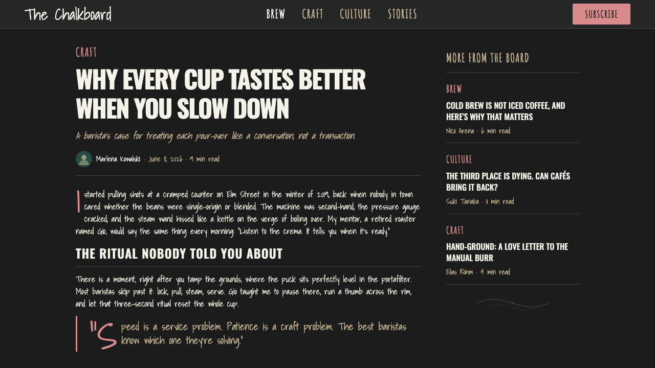
Two hand-drawn letterforms carry the whole hierarchy: a flourished, connected script for accent words and headline moments, and bold, blocky capital letters — drawn rather than digitally set — for the words that need to be read first. This pairing does the job a size-and-weight system would do in a typeset design, but entirely by hand.
Hand-Drawn Imperfection
Stroke width shifts slightly within a single letter, baselines drift rather than sitting perfectly flat, and no two repeated letterforms are identical. This imperfection is deliberate and load-bearing: it is the visual proof that a real hand, not a font file, produced the mark, and removing it collapses the style into generic script typography.
Doodled Ornament
Banners, arrows, laurel branches, and loose botanical curls frame the type the way a sign-writer would fill empty space around a word, drawn with the same slightly uneven hand as the lettering itself. These ornaments do the visual framing work a border or a rule would do in a typeset system, but they read as sketched rather than structural.
Warmth & Immediacy
The overall impression is intimate and casual rather than polished or permanent — a board that looks like it was drawn this morning and could be wiped clean tomorrow. This immediacy is the emotional payoff of every other characteristic: the imperfection, the chalk texture, and the hand-drawn hierarchy all exist to produce this one feeling.
Who shaped Chalk Café Board?
The tradespeople commissioned to draw a shop's chalkboard by hand, often the same craftspeople who paint window lettering and shop signage more broadly. Their working conventions — script for accents, blocky capitals for prices, doodled framing to fill empty space — are the direct source of this style's hierarchy.
Practitioners of the broader hand-lettering craft revival of the 2010s, working across chalkboards, packaging, and branding rather than café signage alone. Their renewed popularity helped turn chalk lettering from a purely functional habit into a recognized decorative skill worth commissioning.
Designers who specialize in the chalkboard menu specifically as a branding object rather than a generic sign, balancing legibility for a hungry customer against the decorative flourish that signals a café's craft identity. Their work is where the style's practical origin and its later decorative ambition meet most directly.
The broader 2010s movement toward visibly handmade branding — exposed materials, small-batch language, artisan signage — that gave the chalkboard its second life as a design object rather than a purely functional fixture. This movement is the context that explains why an old bistro convention suddenly became a widely imitated aesthetic.
How do you use Chalk Café Board today?
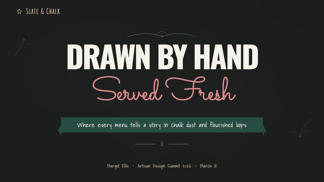
On a presentation cover, this style works best as a warm, handmade opening statement: a graphite slate field with the title drawn in flourished script or bold hand-lettered capitals, framed by a doodled banner or laurel rather than a straight rule. Content slides should keep the same drawn quality for headers while letting body copy stay simple and legible — the hand-lettered feel belongs to titles and emphasis words, not dense paragraphs, the same way a real chalkboard reserves its flourish for the dish name and keeps the description plain. Data slides are the hardest fit: numbers can be hand-lettered for a single hero statistic, but a full chart or table should stay clean rather than trying to force every axis label into a chalk script.
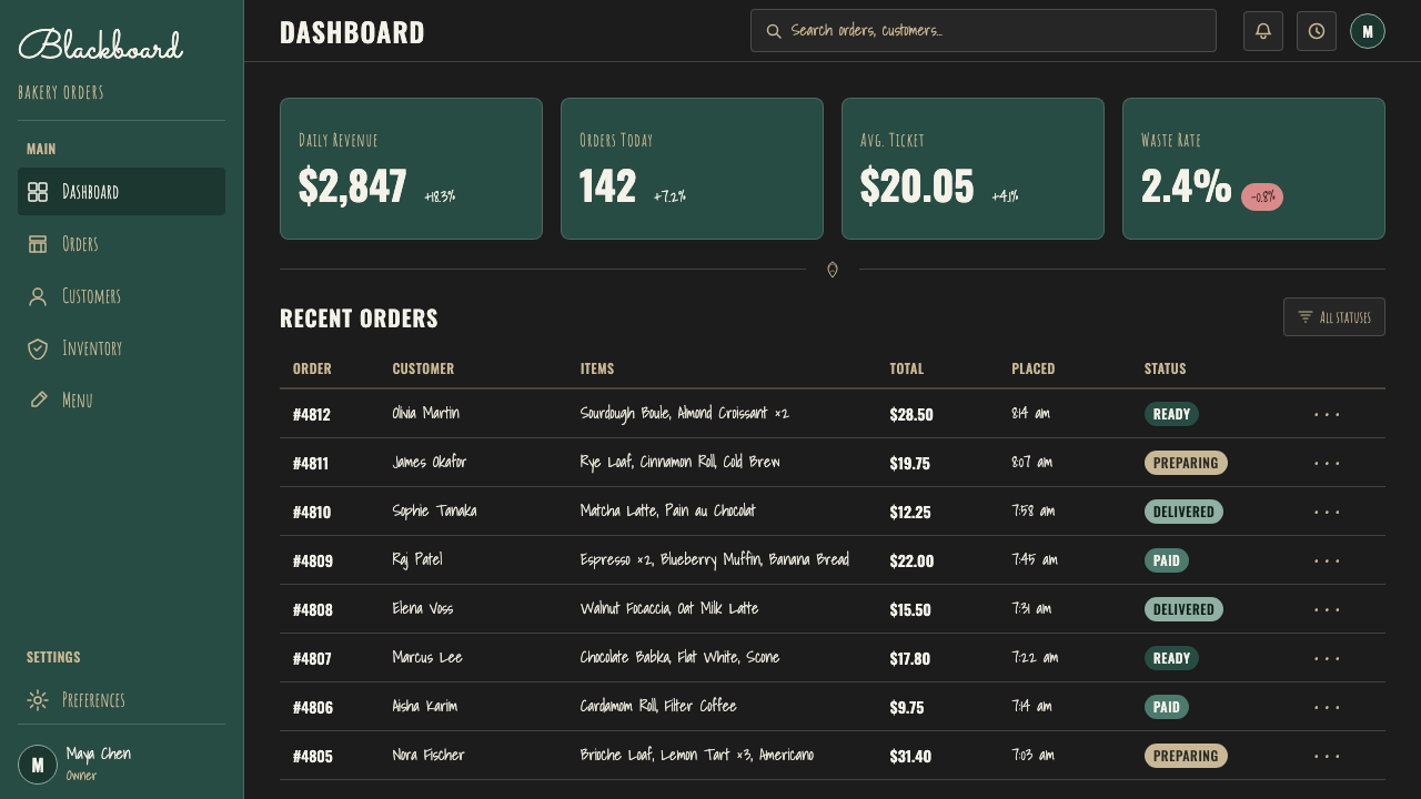
For web interfaces, this style suits small, personality-driven products more than dense dashboards — a specials-of-the-day widget, a founder's note, a seasonal announcement banner — where a slate ground and chalk-style headline signal warmth without sacrificing legibility. Pricing pages can borrow the motif for a single accent, such as a hand-lettered 'most popular' banner over one plan, but the actual numbers and feature lists should stay in a plain, legible typeface so pricing information itself is never a decoding puzzle.
In editorial and marketing contexts, the style is a natural fit for food, coffee, and hospitality branding, as well as any small-batch or artisan product story that wants to signal warmth and human care rather than corporate polish. A hero section can use a full hand-lettered composition, doodled ornament included, while supporting text drops back to a plain, readable typeface so the page doesn't ask a reader to decode script for more than a sentence at a time.
The style also works well for seasonal or limited-time messaging of any kind — sale banners, event announcements, daily updates — because its historical root is literally a message meant to change tomorrow, which gives it a built-in sense of freshness and immediacy that a permanent-feeling typeset headline does not have.
The most common mistake is over-lettering: filling an entire layout with flourished script and doodled ornament until nothing is legible at a glance, which betrays the style's origin as a menu meant to be read quickly by a hungry customer. A real chalkboard reserves its flourish for a handful of words and lets everything else stay simple — the style should be used the same way, as seasoning rather than the whole meal.
Chalk Café Board — FAQ
Is this style just a font choice, or is there more to it?
It is considerably more than a font. A convincing version needs the graphite slate ground, the dusty off-white chalk tone with soft diffused edges, a hierarchy built from a script-and-caps pairing rather than a single typeface, and doodled ornament framing the type. Dropping a script font onto a plain dark background without the rest reads as a shortcut rather than the full style.
Why does the style insist on visible imperfection instead of clean lettering?
Because the imperfection is the proof of authenticity that the whole style is built to communicate. A hand-lettered chalkboard signals that a real person, not a machine, made this today, and uneven stroke width or a drifting baseline is exactly what makes that signal credible. Smoothing those irregularities out would make the lettering look digitally generated, which defeats the point.
Can this style work on a light background instead of dark slate?
Not convincingly, because the whole visual logic depends on white or off-white chalk marks standing out against a dark, matte, slate-like ground. On a light background there is no chalk-on-slate contrast to reproduce, so the same lettering reads as generic script typography rather than a chalkboard, losing the specific reference the style is built on.
What kind of content is this style poorly suited to?
It struggles with dense, data-heavy, or highly formal content — legal documents, financial reports, enterprise software with dozens of fields on screen at once — because hand-lettered script is slower to read than set type and its casual warmth reads as inappropriate in contexts that need to signal precision or authority.
Where did the chalkboard menu tradition actually come from, before it became a design trend?
It comes from a genuinely practical habit in European bistro and brasserie culture: a chalk-on-slate board that lets a kitchen list its daily specials and change them the next day without reprinting a menu. The decorative, heavily lettered version this design system captures is a later, 2010s-era elaboration on that older, plainer working tradition.
Related design styles
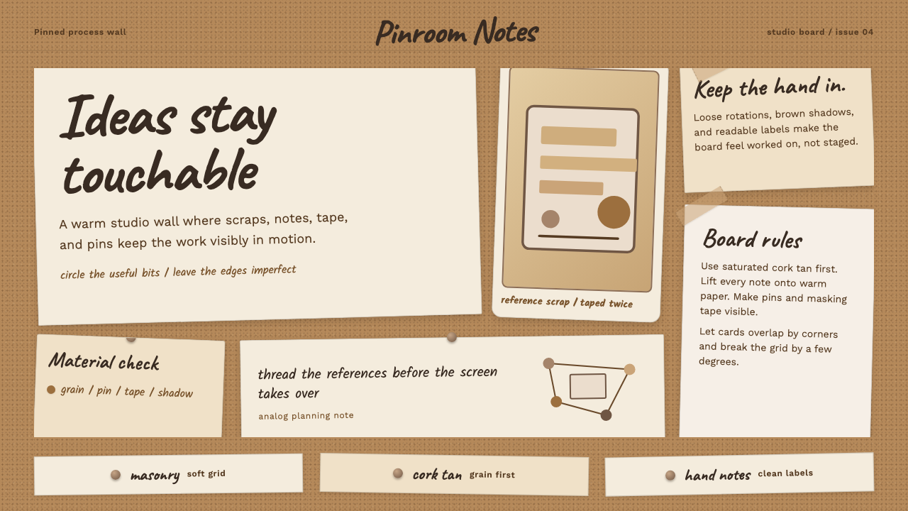 Cork Board StudioWarm ideas stay tactile. Cork tan, Caveat handwriting, pinned paper, and tape…
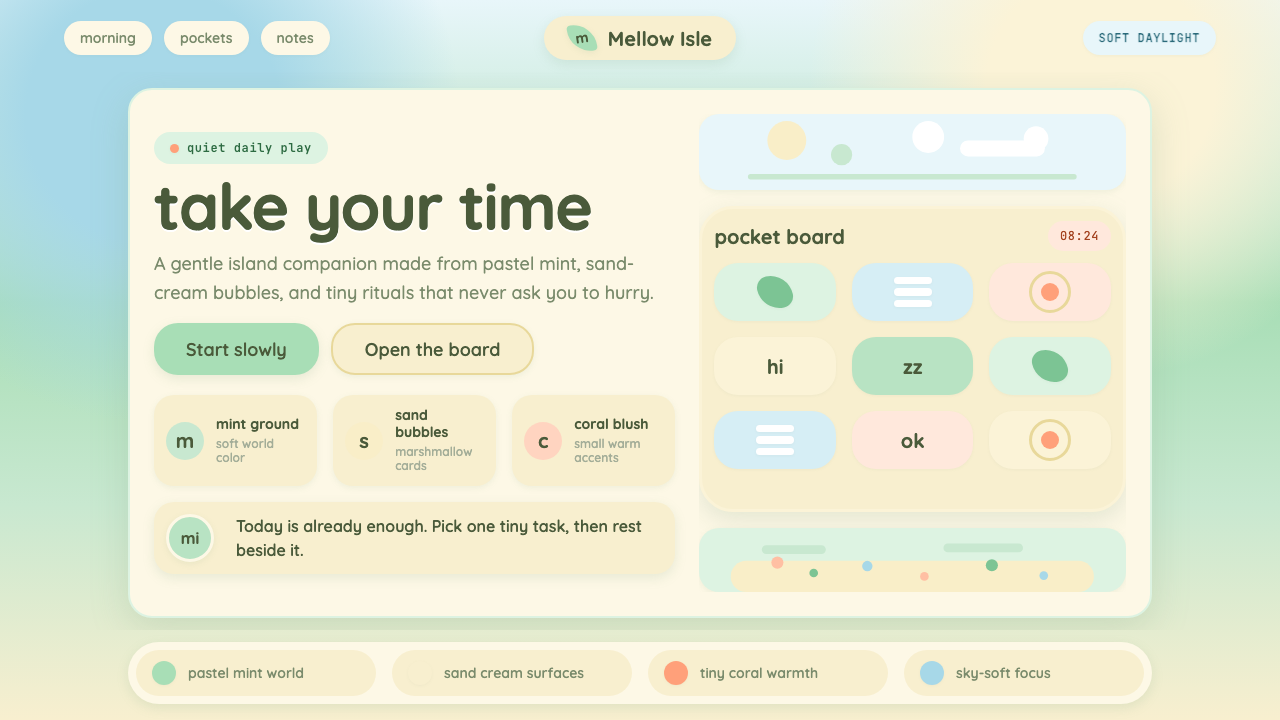 Animal Crossing — New HorizonsNo pressure, only daylight. Mint fields and sand bubbles soften every edge.
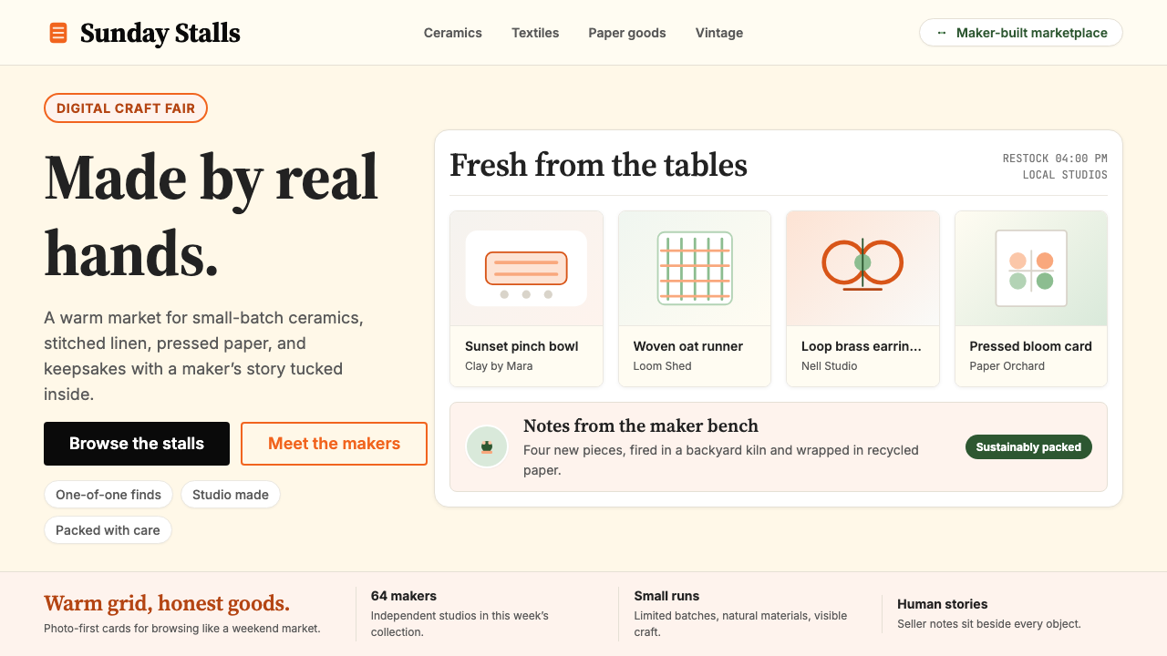 Etsy HandmadeA digital craft fair, in orange. Hand-drawn accents, cream backgrounds, delib…
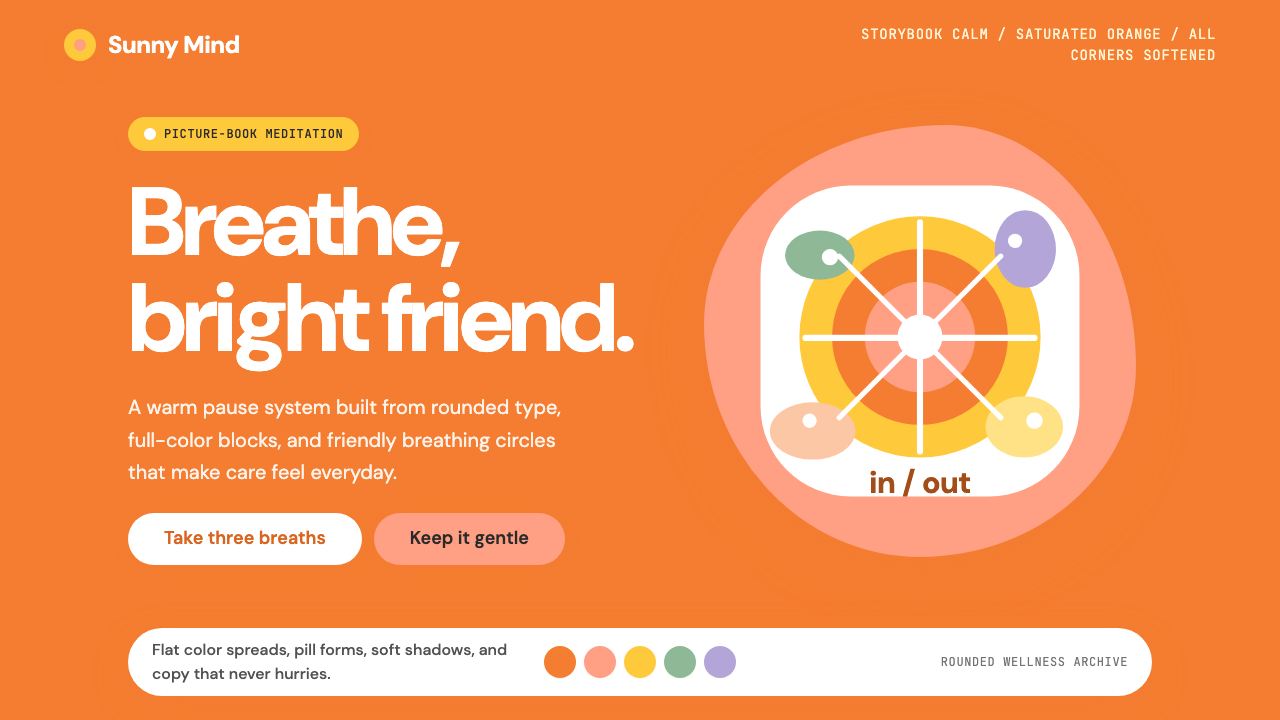 Headspace Orange MeditationMeditation becomes friendly. Orange blocks, DM Sans, and pill shapes soften e…
 Italian Gelato ShopWarmth is hand-scooped. Pistachio green, cream panels, high-contrast serif, c…
 The Little Prince (1943)Tenderness floats alone. Indigo washes, golden stars, and handwritten notes b…