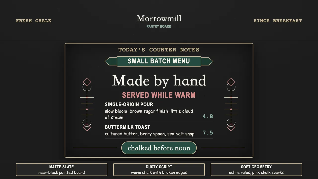
About Chalk Café Board
The chalk café board is the hand-lettered menu aesthetic of the 2010s artisan-café boom: white-chalk flourished script and bold capitals drawn over a painted slate blackboard. Doodled banners, arrows, laurels and botanical curls frame the type, and every stroke carries chalk dust and a little imperfection.
It reads as warm, handmade and immediate — chalk on near-black slate, never crisp digital type. This system translates that sign-writer's hand into screen tokens: graphite ground, dusty off-white "chalk", and a script-and-caps hierarchy that feels drawn rather than typeset.
- Origin
- Western Europe (and wider café culture)
- Era
- 2010–now (artisan café / craft-coffee era)
- Key figures
- Independent café sign-writers · Hand-lettering artists · Chalkboard menu designers
- Movements
- Chalk lettering / chalkboard menu design · Handmade-craft branding revival
Chalk Café Board design spec
Colors
Typography
The other 11 sections — buttons, cards, spacing, motion, techniques and more — open once you unlock. Download the DESIGN.md or send it to your AI in one click. Unlock once, yours forever.
Sign up nowStyles similar to Chalk Café Board
Also inspired by crafts & folk art, with a close feel.
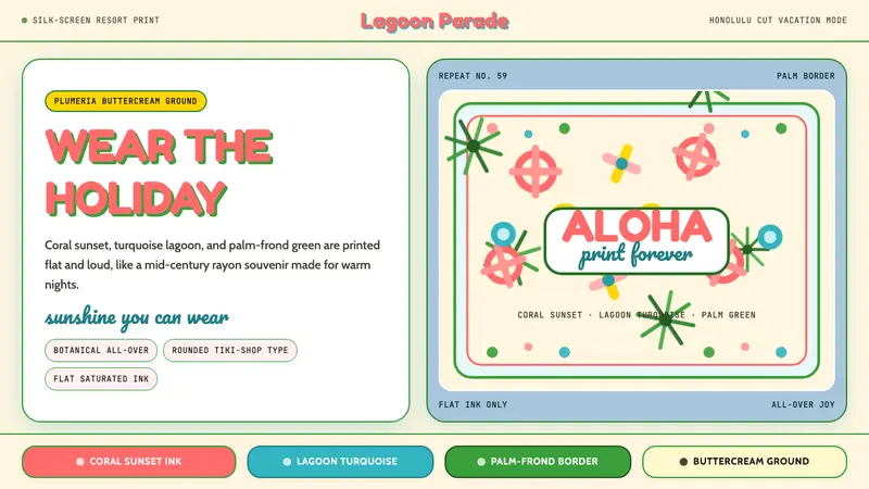 Hawaiian Aloha ShirtThe shirt is the holiday. Buttercream ground, coral Fredoka type, and flat tropical print.
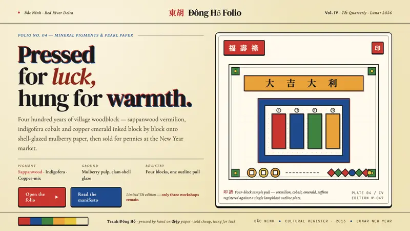 Vietnamese Đông Hồ WoodblockPressed for luck. Vermilion, cobalt, emerald and saffron blocks on pearl-shell paper, lampblack-outlined.
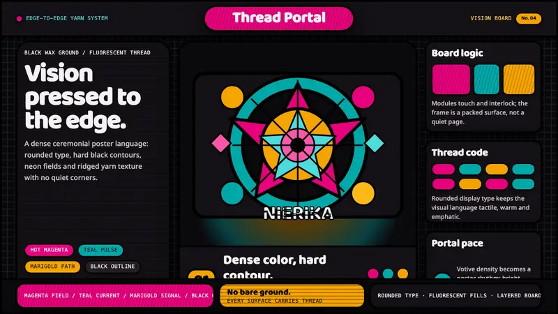 Huichol Yarn NierikaCeremonial density glows. Neon yarn colors lock into black-contoured, edge-to-edge grids.
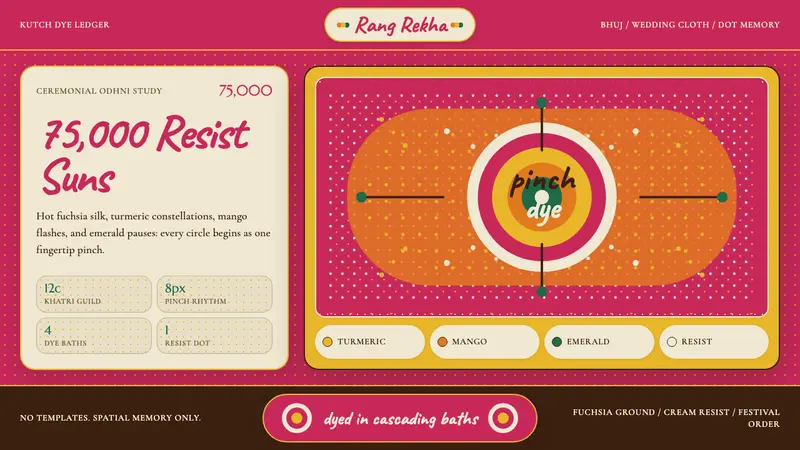 Gujarati Bandhani Tie-DyeFestival precision. Fuchsia cloth, turmeric dot constellations, Caveat lettering.