What is Cork Board Studio?
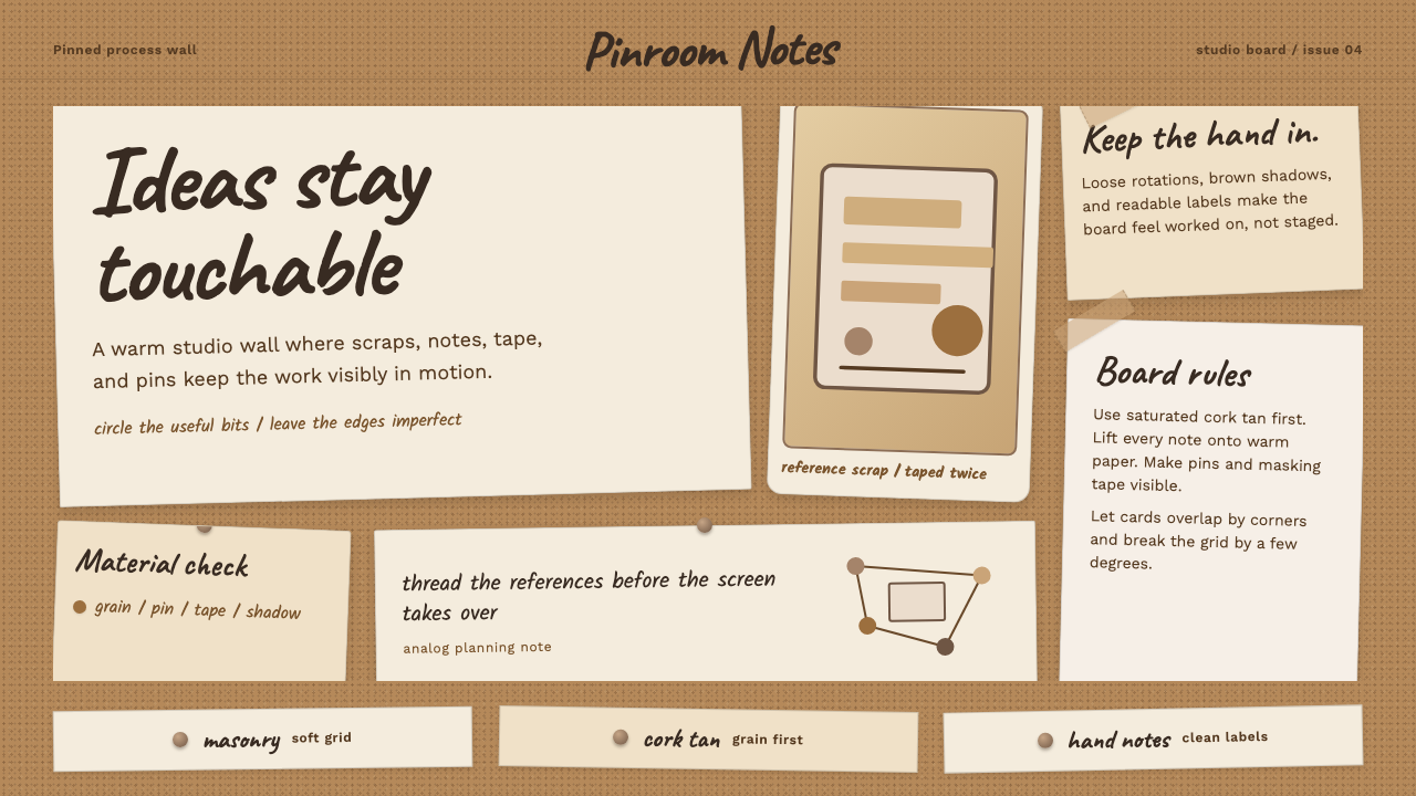
Cork Board Studio takes the pin-board on a creative studio's wall — warm cork tan, looping handwriting, pinned paper, curling tape — and turns it into a design system that stays a little askew on purpose.
Cork Board Studio in brief
Cork Board Studio renders the warm, tactile language of a creative studio's bulletin wall: a granular tan-brown cork sheet pinned with handwritten sticky notes, photographs, and torn scraps of paper. It is casual and hand-made in character, and deliberately a little askew — nothing sits perfectly straight, because nothing on a real pin-board ever does.
The ground is a saturated cork tan carrying real brown depth, never cream and never bleached-paper white; that distinction matters, because a cream background reads as a blank page while a true cork tan reads as an object with grain and weight. Push-pins, strips of masking tape, and loops of handwriting do the expressive work, while a clean, plain sans-serif keeps the actual labels and information legible underneath the mess.
In effect, this is a physical thinking tool translated to the screen. It borrows the studio habit of pinning up references and works-in-progress to think spatially — laying ideas out where they can be scanned, compared, and rearranged at a glance — rather than the polished, single-column logic of a finished document. That spatial habit of thought is precisely why the aesthetic keeps recurring in creative fields long after fully digital planning tools became available: arranging physical objects in a shared field of view still does something that a scrolling list does not.
Where does Cork Board Studio come from?
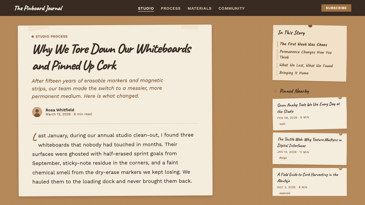
Cork itself is a specific material with a specific geography: the bark of the cork oak, Quercus suber, harvested primarily from the western Mediterranean and above all Portugal, which produces the majority of the world's cork. Long before it became a design aesthetic, cork sheeting was chosen for notice boards in twentieth-century offices, schools, and studios for a practical reason — it is soft enough to take a pin repeatedly and forgiving enough to close back over the small hole afterward, which plaster or bare wood is not. That same forgiving, reusable quality is what let a cork wall become a living surface, edited daily rather than framed and finished once.
The specific studio ritual this system draws from — pinning work directly to a wall for a group to look at together — has deep roots in design and architecture education, where the practice of hanging work-in-progress for a shared 'pin-up' or crit session has been standard pedagogy for generations. Long before anyone photographed a cork wall for a portfolio site, design schools were using exactly this method: tack the drawing to the wall, stand back, and discuss it as a group. The wall functioned as a kind of shared memory for a project, holding every stage of an idea visible at once rather than buried in successive private drafts.
Mood-boarding is the closer professional ancestor. In fashion, advertising, and film production design, physical corkboards and pin-boards were the standard tool for gathering fabric swatches, reference photography, and color samples into a single spatial view long before digital moodboard software existed — and many studios kept using the physical version even after digital tools arrived, because arranging objects in real space supports associative, comparative thinking in a way a scrolling screen does not. A costume designer or art director could stand back from a physical board and see relationships between colors and textures that a grid of digital thumbnails tends to flatten out.
The specific codification of this look as a contemporary design aesthetic belongs to the 2010s onward, largely within Western European studio and design-workplace culture, as creative studios began documenting and sharing their process publicly — behind-the-scenes photography of the actual pin-board became a way of signaling authentic, human-made process in contrast to polished, fully digital output. That turn toward visibly analog, tactile objects as a marker of creative authenticity is an ongoing, still-current movement rather than a settled historical style, and it is the direct source of this system's visual vocabulary. Because the movement is still unfolding, its conventions are looser and more variable than those of a decades-settled historical style, and new studios continue to add their own small variations on the same cork-and-pin idea.
What defines the Cork Board Studio look?
Color and Ground
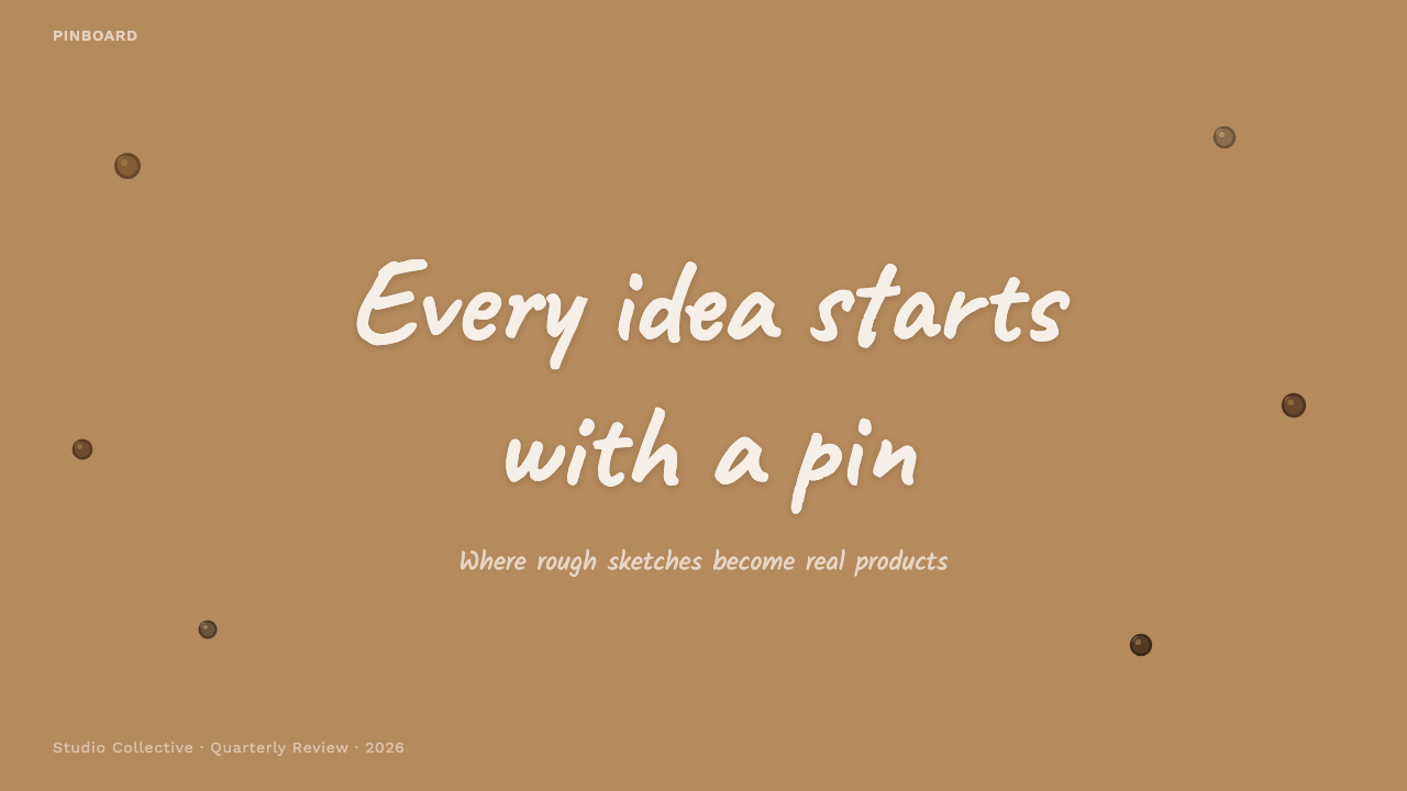
The ground is a saturated cork tan with genuine brown depth, not a cream or off-white paper tone. This is the single most important distinction to get right — swap the ground for cream and the system collapses into generic stationery rather than a real material surface.
Texture and Grain
The surface carries a visible granular, speckled cork texture rather than a flat, printed color field. That grain is what tells the eye it is looking at a material with physical depth, not a solid-color background.
Pins and Tape as Hardware
Push-pins and strips of masking tape are treated as literal fasteners holding elements onto the board, complete with the small shadow a real pin or a curling piece of tape would cast. They are functional signals of attachment, not decorative flourishes scattered for effect.
Two-Register Typography
A looping, casual handwriting style carries notes, captions, and asides — the voice of a person scribbling on a sticky note — while a clean, plain sans-serif carries anything that must be reliably legible: labels, headings, structural information. The two never merge into one another.
Deliberate Askew Composition
Elements sit at small, varied rotations rather than snapping to a perfect grid — a note tilted a few degrees one way, a photo tilted the other. This imperfection is a design decision signaling handmade and human, not a rendering error to be corrected.
Layered Overlap
Torn paper edges and overlapping photographs or notes create a sense of physical depth through literal stacking — one piece of paper genuinely sitting on top of another — rather than through soft drop-shadow gradients simulating depth from a flat plane.
Printed and Photographic Ephemera
Alongside handwritten notes, the board holds printed scraps — a photograph, a clipped reference image, a printed swatch — each treated as a distinct physical object with its own slight tilt and its own pin or piece of tape, rather than absorbed into a uniform grid of uniform tiles.
Who shaped Cork Board Studio?
Design and architecture schools have long used the practice of pinning work-in-progress directly to a wall for a shared critique session, standing back from the wall to review it as a group. This pedagogical habit — hang it up, look at it together, discuss it — is the working method this aesthetic ultimately depicts, predating any of its current decorative use by decades.
Mood-boarding — gathering swatches, images, and references onto a single physical surface to see them together in space — is the direct professional ancestor of this aesthetic, long practiced in fashion, advertising, and film production design before digital equivalents existed and often kept alongside them afterward.
The people who actually keep and use working pin-boards day to day — studio designers arranging reference material and creative planners mapping out a project's moving parts — are the source of the aesthetic's authenticity. The system depicts their working surface, not an invented decorative motif.
A broader, ongoing shift within creative industries back toward visibly physical, tactile tools — handwritten notes, pinned paper, sticky notes — as a counterpoint to fully digital workflows. This is a live, current movement rather than settled history, and it is what carried the pin-board from a private studio tool into a public design aesthetic from the 2010s onward.
How do you use Cork Board Studio today?
For presentation slides, a cover page works well as the full cork ground with a title card pinned slightly off-axis, a strip of tape crossing one corner, and nothing else competing for attention. Content slides should be treated as an arrangement of pinned index cards or sticky notes — each holding one idea, each tilted a few degrees differently — rather than as a conventional bulleted list on a solid background.
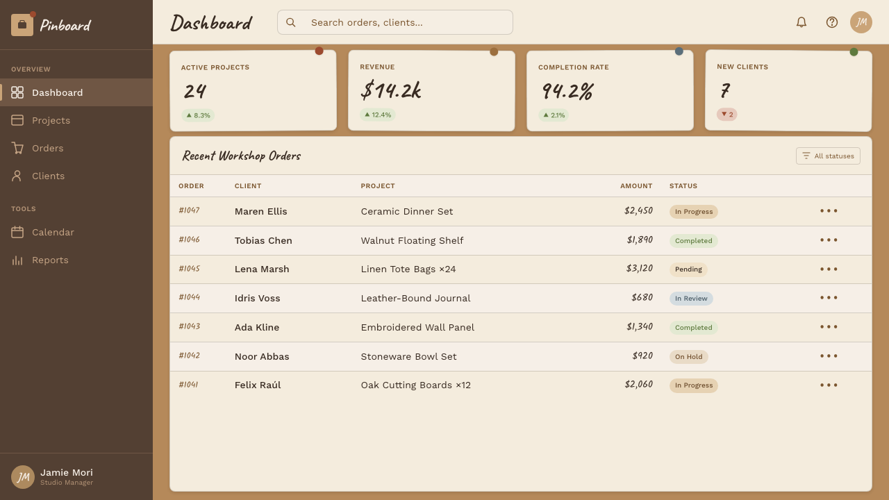
Data on slides reads well as pinned photo-style cards with a short handwritten caption beneath a number or chart, echoing the way a real studio might tack up a printed statistic. Keep the actual numbers in the clean sans-serif for accuracy, and reserve the handwriting purely for the caption or annotation layer.
For web interfaces, this system is a natural fit for project-management tools, creative-collaboration platforms, and brainstorming or whiteboard applications, where cards genuinely function like pinned notes and users are already thinking in terms of a spatial board rather than a linear document. On a pricing page, tiers can be rendered as individually pinned cards with a small strip of tape, which reads as friendly and approachable rather than as a corporate comparison table.
In editorial and marketing contexts, the style is especially strong for behind-the-scenes, process-oriented storytelling — case studies, studio portfolios, creative-agency about pages — where showing the mess of how something got made is itself the point. It reads poorly, by contrast, for content that needs to project polish, precision, or scale.
The most common mistake is pushing the rotation and clutter too far until the layout becomes genuinely hard to scan; real pin-boards are messy but still readable at a glance, and the design should preserve that readability rather than chase chaos for its own sake. A second common mistake is setting large blocks of body copy in the handwriting style — it belongs to short notes and captions only, and any substantial reading should stay in the clean sans-serif.
Cork Board Studio — FAQ
Is this the same as a scrapbook or collage aesthetic?
They overlap but are not identical. A scrapbook aesthetic is typically about personal memory-keeping and can use any background — paper, fabric, digital. Cork Board Studio is specifically the working surface of a creative studio: a cork-textured wall, push-pins and tape as literal hardware, and a functional two-register typography split between casual notes and legible labels. It is a workplace tool depicted as a design system, not a memory-keeping craft.
Can the ground be a lighter cream or white instead of cork tan?
Not without losing the material identity that defines the system. A cream or white ground reads as blank paper or a generic design-system background; only a genuinely saturated, brown-toned cork ground reads as a physical wall with grain and weight. If lighter surfaces are needed for readability within a panel, they should appear as an actual pinned paper note sitting on top of the cork, not as the base itself.
How much rotation and clutter is appropriate before it becomes too messy?
The target is a few degrees of tilt per element and enough overlap to feel handmade, while every individual note or card remains instantly readable on its own. A genuine studio wall is disorganized in aggregate but each pinned item is still legible at a glance; if a viewer has to tilt their head or hunt for information, the rotation has gone past what the style calls for.
What kinds of products suit this style best?
It suits creative-industry tools and brands directly — project planning, brainstorming and whiteboard software, portfolio and case-study sites, and any product that wants to feel like a working studio rather than a finished corporate product. It is a poor match for finance, legal, healthcare, or enterprise infrastructure products, where the deliberate messiness would undercut the sense of precision and reliability those contexts need to convey.
Is this simply a screen version of mood-boarding, or something distinct?
It is a design system distilled from the mood-boarding practice and the broader pin-up wall tradition, not a literal recreation of either. Mood-boarding is an open-ended working method — a designer can arrange anything, in any way, for any purpose. This system takes the recognizable surface texture of that practice — cork ground, pins, tape, torn paper, two-register type — and turns it into a repeatable visual language that can be applied consistently across an entire product or presentation, which a genuinely improvised studio wall was never designed to be.
Related design styles
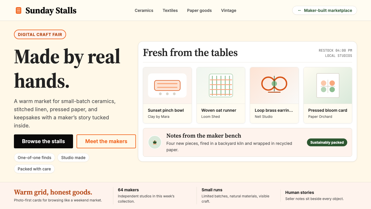 Etsy HandmadeA digital craft fair, in orange. Hand-drawn accents, cream backgrounds, delib…
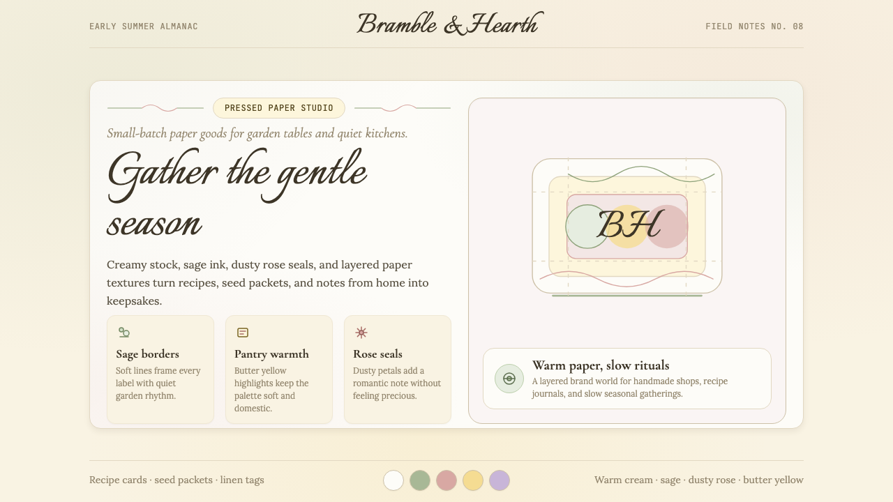 CottagecoreRural romance, hand-drawn. Sage and dusty rose, gingham textures, serif paire…
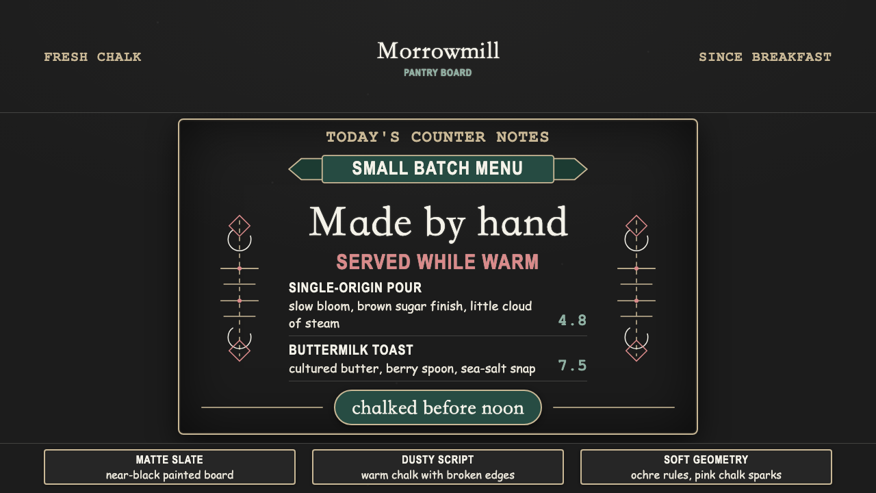 Chalk Café BoardWarmth written by hand. Dusty chalk script on graphite slate, framed by soft…
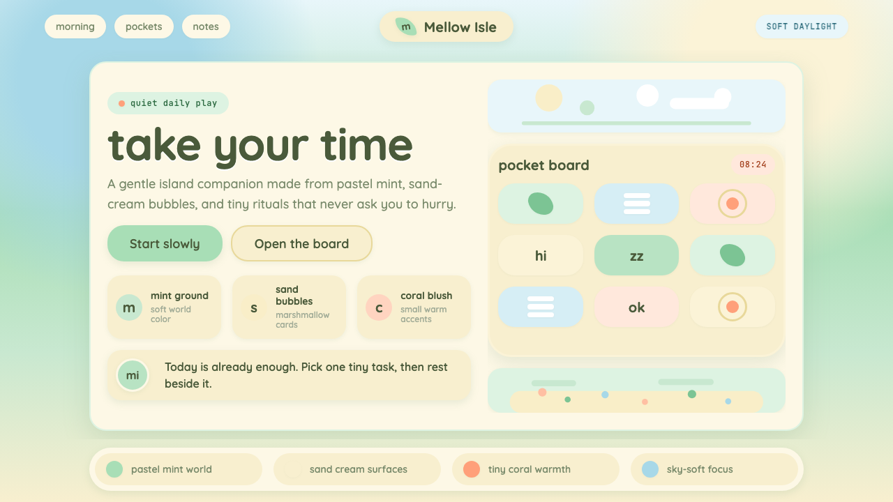 Animal Crossing — New HorizonsNo pressure, only daylight. Mint fields and sand bubbles soften every edge.
 CDMX Roma Norte CafeMexico City coffee, unhurried. Dusty rose, sage jade, and serif rhythm carry…
 Provençal MediterraneanWarmth refuses the clock. Terracotta, olive lines, and shutter blue frame slo…