What is Winnie-the-Pooh (1926)?
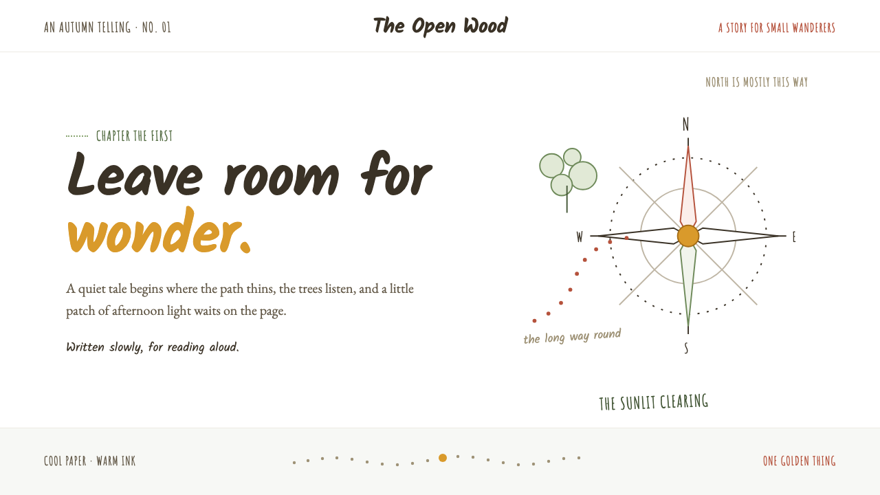
Wonder lives in the white space: a loose sepia line, a quiet page, and one small glint of honey gold.
Winnie-the-Pooh (1926) in brief
Winnie-the-Pooh draws its visual identity from the original 1926 book and its companion volume, The House at Pooh Corner, published in 1928. This is not the later saturated-cartoon interpretation. Its foundation is E.H. Shepard’s loose, dark sepia pen line: a bear, tree, honey jar, or small patch of woodland held in broad untouched white paper. The illustration does not attempt to fill the page or simulate a complete world. It makes a modest invitation, then leaves the reader room to enter.
The style treats absence as an active design material. White space is not a leftover margin around an image; it is the atmosphere in which the image can feel gentle, provisional, and alive. A confident contour is enough to establish a character or object, because the empty field gives that contour unusual importance. The result resembles a well-loved library book: cool white paper, brown-black ink, a restrained note of warmth, and the feeling that the page has been opened in a quiet afternoon.
Its secondary language comes from the Hundred Acre Wood map endpaper. Hand-lettered place names, a slightly unsteady compass rose, and dotted paths borrow the visual logic of an amateur cartographer rather than a polished information system. This unevenness is essential. The map does not perform authority through perfection; it makes exploration feel personal, as if the forest had been drawn by someone who knows its paths from memory.
Where does Winnie-the-Pooh (1926) come from?
The style belongs to England in the period from 1926 to 1928, centered on the original Winnie-the-Pooh books published in London by Methuen & Co. Its visual setting also reaches beyond the publisher’s page toward Ashdown Forest in Sussex, the landscape associated with the Hundred Acre Wood. That connection matters because the design never feels detached from place. Even a sparse drawing suggests paths, trees, clearings, and weather without requiring scenic abundance.
A.A. Milne, E.H. Shepard, and Christopher Robin Milne are the key figures named in the work’s origin. Within the visual system, Shepard’s pen-and-ink approach is the defining presence. His line is loose but not careless: it gives a figure enough solidity to be recognizable while allowing paper, gesture, and imagination to remain visible. The image feels observed rather than manufactured.
The historical context is the Golden Age of English children’s book illustration. In this setting, illustration could share the page with text without competing for dominance. The Winnie-the-Pooh page does not use images as spectacle or reward after reading. Text, picture, margin, and pause form one reading environment, where a small drawing can carry emotional weight precisely because it has not been made visually loud.
Hand-lettered cartography extends that environment from the individual vignette to the imagined geography of the Hundred Acre Wood. Place names, compass marks, and trails behave less like neutral navigation and more like evidence of a world being remembered. The map language links the books’ line drawing to a larger principle: storytelling can be built through suggestion, incomplete edges, and marks that retain the pressure of a human hand.
What defines the Winnie-the-Pooh (1926) look?
White Space
Untouched white paper is the style’s main field, not a neutral background waiting to be decorated. A drawing occupies only a small part of the composition, leaving silence around it. This gives each line room to register and lets the page feel open, calm, and available to the reader’s imagination. Filling that space with supporting motifs, cards, or texture would change the character of the system immediately.
Sepia Ink Line
The primary mark is a loose sepia-ink contour rather than a polished, enclosed cartoon outline. It suggests form with an economy of gesture: a bear, a tree, or a honey jar can be known through a few calm marks. The line should retain a hand-drawn unevenness and should never become mechanically uniform, glossy, or aggressively dark.
Honey-Gold Accent
Warm honey gold appears as a rare accent, like a small patch of afternoon sunlight rather than a full palette. Its scarcity gives it meaning. It can identify a moment of warmth, a small focal object, or a gentle invitation, but it should not spread into large decorative fields. The contrast between restrained warmth and cool white paper carries much of the mood.
Gentle Scale
The system avoids visual force. A single figure is allowed to remain small, and a small object is not enlarged merely to make the page feel busy or dramatic. Hierarchy emerges through placement, surrounding air, and the reader’s attention rather than through oversized type or competing illustration. The page feels intimate because it does not demand to be seen all at once.
Hand-Lettered Cartography
Chapter-opening details borrow the language of a handmade map: hand-lettered names, dotted routes, and a wobbly compass rose. These elements should feel discovered rather than engineered. Their charm lies in their slight instability, which makes the page seem connected to a remembered forest instead of an abstract branding system.
Unfinished Imagination
The visual language deliberately stops before complete description. It does not explain every branch, texture, distance, or expression. That restraint is not a lack of finish; it is a narrative choice. By leaving edges unresolved, the page allows a child’s imagination to complete the scene and gives the reader a role in making the world feel inhabited.
Who shaped Winnie-the-Pooh (1926)?
A.A. Milne is one of the key figures associated with the original Winnie-the-Pooh books of 1926 and 1928. In the design legacy of the work, the literary setting matters because it permits modestness: small incidents, quiet places, and a world that can be suggested without visual excess. The page design preserves that sense of intimate storytelling rather than turning it into spectacle.
E.H. Shepard defines the style’s visual voice through loose sepia-ink pen drawing. His approach makes contour, paper, and pause work together. Rather than enclosing every object in a finished scene, the line gives only what is needed for recognition and feeling. Contemporary adaptations should preserve this confidence in suggestion instead of replacing it with polished cartoon density.
Christopher Robin Milne is named among the key figures in the origin of Winnie-the-Pooh. Within the style’s public image, the name reinforces the perspective of childhood without making the visual language childish in a loud sense. The designs are small-scale, observant, and open-ended, inviting wonder through tenderness and space rather than through noise.
How do you use Winnie-the-Pooh (1926) today?
For presentation covers, use one quiet line illustration in a broad white field and let the title sit with generous breathing room. A honey-gold detail can guide attention to a subtitle, symbol, or small object, but the cover should retain the feeling of a page that has not yet been filled. Content slides should behave like chapter pages: restrained headings, short passages, and a modest illustrative interruption rather than repeated decorative framing.
Data slides can borrow the map’s logic without turning information into a novelty. Use dotted routes, hand-drawn directional marks, or softly irregular labels to connect stages in a journey, reading sequence, or process. Keep charts and annotations sparse enough that the audience can distinguish the information from the atmosphere. The map quality should make a sequence feel discoverable, not make the data less legible.
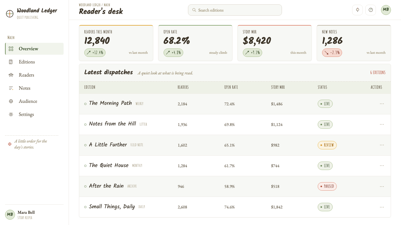
For web interfaces, this style is strongest in editorial dashboards, reading tools, educational products, and gentle planning experiences. A near-white field, dark brown-black text, and occasional honey warmth create a calm environment for attention. Navigation can use hand-lettered cues sparingly, while functional controls should remain direct and readable. The style is less about making every interface element look hand-drawn than about protecting spaciousness around tasks.
For editorial and marketing work, use the system to make a page feel like an illustrated chapter rather than a campaign poster. A small line drawing can introduce a section, and a map-like marginal detail can help readers move through a longer story. Marketing copy benefits from the style when it speaks with restraint: one warm emphasis, one clear proposition, and enough open paper around both to let the message land softly.
The most common mistake is confusing this style with any modern Winnie-the-Pooh cartoon language. Saturated character art, dense patterning, polished outlines, and large fields of warm color erase the original page’s quietness. Another mistake is treating hand-drawn irregularity as decoration applied everywhere. The style works only when its imperfect marks are balanced by discipline: abundant white space, a limited number of images, and warmth used as a rare event.
Winnie-the-Pooh (1926) — FAQ
Is this style the same as the later Winnie-the-Pooh cartoon look?
No. This style refers specifically to the page atmosphere of the original 1926 Winnie-the-Pooh and the 1928 companion volume: loose sepia-ink line work, extensive white paper, and rare honey-gold warmth. Later saturated-cartoon interpretations use a substantially different visual emphasis. The original system is quiet, spare, and dependent on suggestion.
Why is white space so important here?
Because the white gap is where the style’s sense of wonder happens. It isolates a small drawing, prevents the page from becoming visually insistent, and gives the reader room to imagine what lies beyond the contour. If the page is densely filled, the line drawing becomes merely an illustration. With open paper around it, the drawing becomes an invitation.
Can the hand-lettered map language be used in a digital product?
Yes, provided it does not interfere with function. It works well for chapter navigation, progress journeys, educational paths, and editorial wayfinding. Hand-lettered labels, dotted trails, and compass-like marks should support orientation rather than replace clear navigation. The useful principle is human suggestion around a reliable structure.
How much honey-gold should be used?
Very little. Its role is comparable to a spot of afternoon sun: it makes a small moment feel warm because most of the page remains cool and quiet. Use it for a focal detail, a gentle signal, or a small object. When it becomes a dominant background or repeated decorative color, it loses the rarity that gives it emotional force.
What is the hardest part of applying this style well?
Resisting the urge to add more. The original language depends on knowing when a line is sufficient, when an object can remain small, and when an empty area is already doing useful work. Its apparent simplicity makes excess especially visible. Successful work feels gently made, but every omission has been chosen with care.
Related design styles
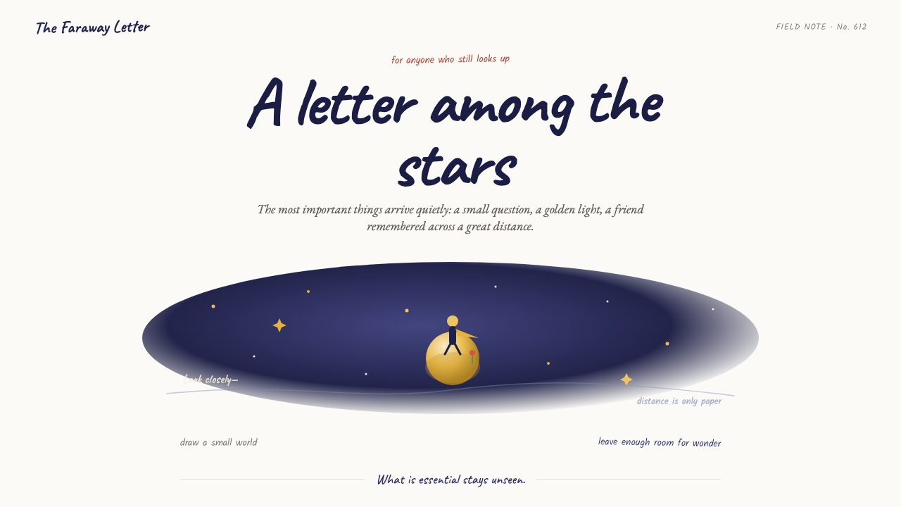 The Little Prince (1943)Tenderness floats alone. Indigo washes, golden stars, and handwritten notes b…
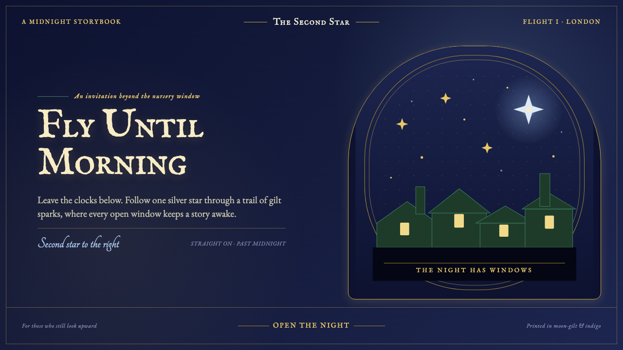 Peter Pan Neverland (1904)Enchantment glints, never shouts. Midnight navy holds gilt sparks and Edwardi…
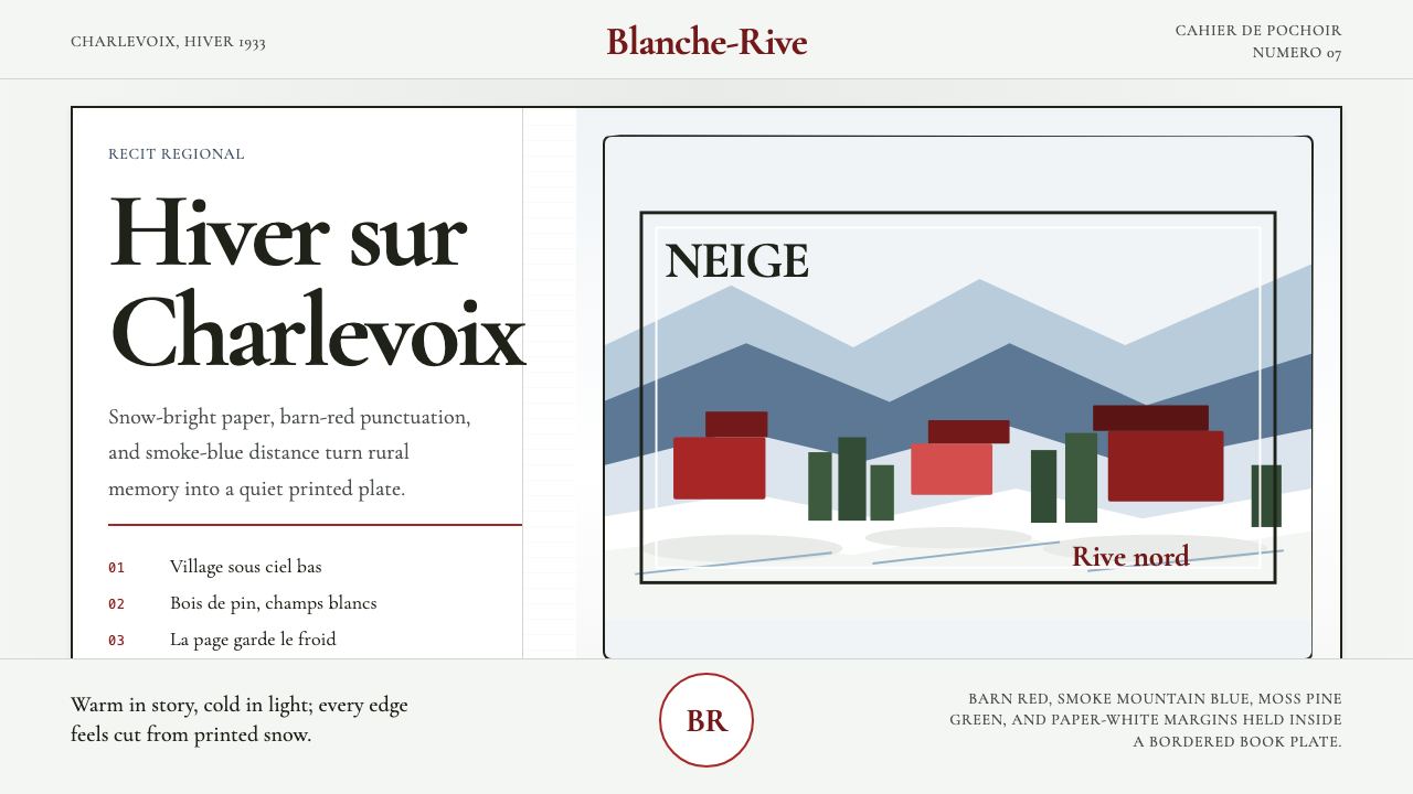 Quebec Clarence Gagnon Folk NaïfWinter bites softly. Barn red and smoke blue pochoir fields sit on snow-white…
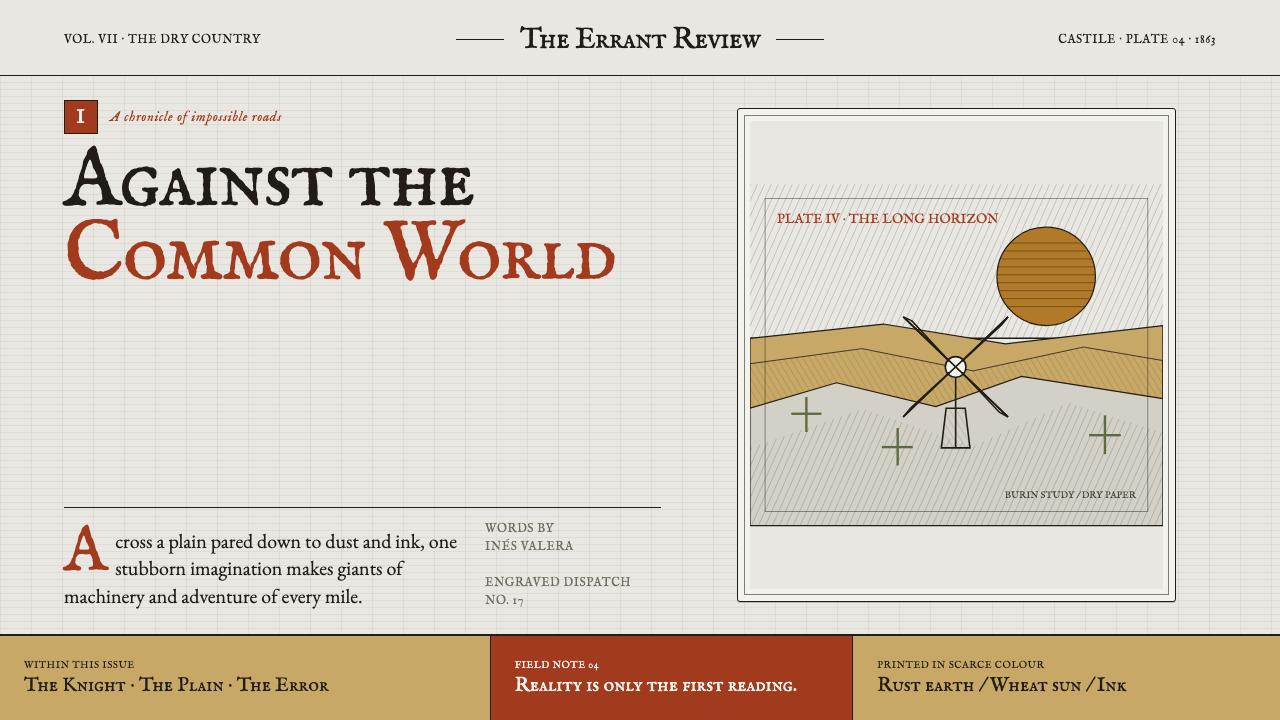 Don Quixote (1605)Imagination defies the plain. Rust capitals and cross-hatched ink score a dry…
 Pinocchio (1883 Marionette Workshop)Carved from honest timber. Red, blue and ochre punctuate crisp engraved lines.
 Slate Blackboard ChalkDust teaches. Blackboard green carries chalk script, pale smears, and boxed d…