What is Merry Cemetery Săpânța?
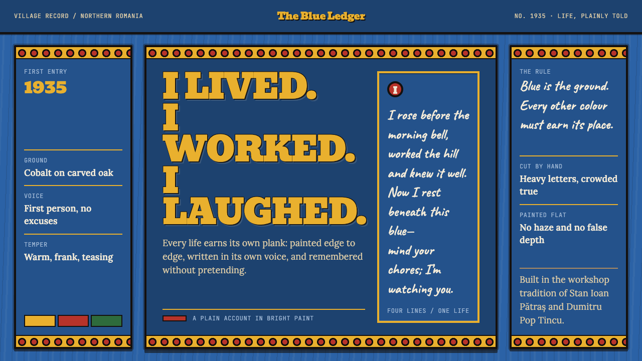
Săpânța's Merry Cemetery turned grief into a picture and a punchline — hundreds of cobalt-blue oak crosses where the dead speak in rhyme and a flat painted scene shows what they did all day.
Merry Cemetery Săpânța in brief
The Merry Cemetery of Săpânța is a village graveyard in Maramureș county, northern Romania, and one of the most recognisable visual systems in European vernacular art. Seven or eight hundred oak crosses stand on its slope. Each is painted edge to edge in the same cobalt blue. Each carries a small, flat, painted scene of what the dead person did with their days — weaving, herding, driving, soldiering — above a rhyming epitaph written in the first person, usually paid for by the person it commemorates.
The register is what makes it unusual. Cemeteries tend toward hush: dark stone, formal lettering, restrained ornament. Săpânța goes the other way. The pictures are cheerful and occupational, the verse speaks in the voice of the deceased, and it often carries a sardonic edge. Death is not hidden behind marble here; it grins and is allowed a few last lines. The lesson for designers is that gravity and warmth are not opposites: a heavy subject can be carried by a bright, direct visual manner without turning flippant.
As a design system, the cemetery reduces to three rules. Blue is the ground, and it is never negotiated: every plank carries it from one edge to the other. Everything else — figure, frame, lettering — is a flat shape riding on that blue, shown frontally, with no cast shadow and no modelled volume. And text is a lead actor, not filler: the verse is crowded onto the plank in heavy slab-like hand lettering, in whatever size the poem demands, so that each plank reads as a picture and a poem at once. Because the ground is deep and saturated rather than neutral black, the system belongs to the dark-theme family without ever feeling like a night-mode toggle.

Where does Merry Cemetery Săpânța come from?
Săpânța is a village in Maramureș, in the far north of Romania. The cemetery's story begins in 1935, when Stan Ioan Pătraș cut the first cross, and the look was settled within a year: by 1936 the planks had grown narrower, the figures were carved in relief and then painted, and the lettering was crowded in wherever the verse ran long. The pigments were not invented for the occasion. They were borrowed from the surrounding crafts — local rugs, women's dress, pottery and glass icons — so the cemetery speaks in a colour vocabulary the village already knew.
Three older traditions meet in it. The first is Maramureș wood carving: the cross is a carved object before it is a painted one, and the habit of working oak by hand gives the planks their proportions and the figures their blunt, relief-like solidity. The second is Romanian naive folk painting, with its frontal, flat, brightly coloured and fundamentally narrative pictures. The third is vernacular epitaph verse: the spoken habit of summing up a life in a few rhymed lines, here made literal and hand-lettered. None of the three was new. What the cemetery did was combine them into one repeatable format and hold it constant.
The first-person voice is the real innovation. A conventional epitaph is written about the dead by the living; at Săpânța the dead are handed the microphone. The picture says who they were, the verse says how they feel about it, and the two together do the work of a portrait, a biography and a punchline in the space of one narrow board. Cobalt blue ties them together, so hundreds of different crosses read as one choir.
The style did not end with its founder. Pătraș died in 1977, and his apprentice Dumitru Pop Tincu carried the workshop on. That continuity is why this system dates its origin to the first half of the twentieth century yet is better understood as a living craft than a closed period: a few constants (the plank, the blue, the frontal figure, the verse) and variable content (this person's trade, this person's rhyme), repeated across generations.
What defines the Merry Cemetery Săpânța look?
Cobalt Ground
One saturated cobalt blue covers every plank from edge to edge, and it is the decision that holds the whole system together. It is deep enough for warm shapes to glow against it, bright enough to read as colour rather than darkness, and constant enough that hundreds of different crosses feel like one family. Blue is the ground, never an accent; every other hue appears only as a shape sitting on it.
Borrowed Folk Accents
The secondary colours were not invented for the cemetery. They were taken from local rugs, women's dress, pottery and glass icons, so the accents carry the village's own craft vocabulary. They appear as small, flat patches, enough to make a garment, a tool or an animal legible and never enough to compete with the blue. Keep the accent list short and let the ground do the talking.
Flat Frontal Figures
People are shown facing the viewer, in flat painted colour, with no cast shadow and no modelled light. Because the figures began as relief carving and were coloured afterwards, they keep a blunt, cut-out solidity. Poses are chosen for legibility, not realism: the weaver, the shepherd, the driver and the soldier are each recognisable at a glance from their stance and their tools.
Occupation as Picture
Each plank carries one scene showing what the person did all day. It is not a collage or a biography in pictures but a single readable activity, which turns the image into a pictogram of a life. The picture is information, not ornament. For designers it suggests a plain rule: every illustration should say something specific about its subject, and say it in one scene.
Crowded Slab Lettering
The verse is hand-lettered in heavy, slab-like forms and set tight to the edges of the plank. When the poem runs long, the lettering is crowded in rather than cut: size flexes, lines pack together, and the board looks full. The irregularities of hand painting are part of the voice. This is type with a personality, not a neutral container for words.
First-Person Rhyme
The epitaph is written in the voice of the deceased, in rhyme, often with a sardonic edge. In system terms the copy is part of the style: short lines, direct address, a little teasing. A layout that borrows the blue and the planks but fills them with neutral corporate wording captures only half of the system.
Narrow Plank Format
The basic unit is a narrow board with the picture above and the verse below, repeated hundreds of times. A fixed format makes difference visible: with ground, frame and order held constant, the eye goes straight to what changes, which is the trade and the rhyme. Treat the plank as a template with two slots, not as a blank canvas.

Who shaped Merry Cemetery Săpânța?
Pătraș cut the first cross in 1935 and settled the format within a year: narrow planks, figures carved in relief and then painted, pigments borrowed from local crafts, and lettering crowded in wherever the verse ran long. He is the author of the template rather than of any single plank, which is why the style could be repeated hundreds of times without losing its identity. He died in 1977.
Tincu was Pătraș's apprentice and took over the carving after 1977. His role matters for design because it shows that the style is a transferable method, with fixed constants and variable content, rather than the private manner of one hand. The workshop continuing after its founder is why the cemetery remains a living practice and not a closed chapter.
The regional carving tradition supplies the material and the logic of the object: oak planks worked by hand, figures cut in relief, a tall format that can be read from a path. Seen this way, the painted cross is carved sculpture first and picture second, and its flat colour sits on a physical, slightly raised surface.
The naive folk-painting tradition supplies the pictorial manner: frontal, flat, brightly coloured scenes that tell a story without perspective or shading. It explains why the cemetery's pictures feel immediate and unsophisticated in the best sense, and why they translate so easily into modern flat illustration.
The habit of summing up a life in a few rhymed lines belongs to ordinary speech rather than professional poetry. The cemetery turns that spoken habit into painted text, in the first person and often with humour. It is the reason that text, not image, is the carrier of personality in this system.
How do you use Merry Cemetery Săpânța today?
The Merry Cemetery works best where there is a human story to tell. Its structure — a colour ground, one picture, one rhyme — transfers to almost any medium, but its character depends on being specific and warm. The first decision is always the ground: commit to the single deep blue, treat every other colour as a shape sitting on it, and resist the temptation to introduce neutral panels.
For slides, a cover can be a full field of blue with one flat illustration of the subject's trade near the top and the title set below in heavy slab lettering, like a verse. Content slides follow the plank: picture above, text below, one idea per slide, with a short caption that has some voice rather than a bullet list. Data slides should be treated as flat scenes too — bars and segments as plain blocks in a few accent colours against the blue, heavy labels set directly beside them, no grid lines, no shadows, no gloss.
For web interfaces the style suits profile pages, team and about pages, onboarding, storytelling sections and the product pages of craft or heritage brands. Cards become narrow planks, image over text, separated by gaps of the ground colour instead of soft shadows. A pricing section can present each tier as its own plank with a flat emblem and a one-line rhyming promise. It is a poor fit for dense analytic dashboards, where a saturated ground and crowded lettering compete with the data.
In editorial and marketing work, the format is excellent for profiles, oral-history features, cultural and food stories, event posters and anywhere a person's trade is the point. Headlines can behave like couplets; pull quotes can sit like epitaphs, in the first person, beneath a single illustration.
The common mistakes are three. First, softening the blue — pastel it, add a gradient or a drop shadow — which destroys the sense of a painted board. Second, importing graveyard clichés: this is not a gothic or horror look, it is the opposite, and a black-and-fog treatment contradicts everything it stands for. Third, borrowing the humour without the affection. The jokes at Săpânța are told by the dead about themselves; copy that mocks other people, or treats real bereavement lightly, misses the point and can hurt.

Merry Cemetery Săpânța — FAQ
Why is it called the Merry Cemetery, and is a cheerful graveyard disrespectful?
The name comes from the crosses themselves: bright blue boards, cheerful pictures of working life and epitaphs in the voice of the dead, often with a joke. The humour is internal to the community. The epitaphs are written in the first person and, in the account behind this system, usually paid for by the people they commemorate, so the dead are teasing themselves rather than being teased. For designers the lesson is affection. Borrow the warmth and the first-person voice, and avoid turning the tone into mockery.
Who made the crosses, and does the workshop still run?
Stan Ioan Pătraș cut the first cross in 1935 and settled the style by 1936. After his death in 1977 his apprentice Dumitru Pop Tincu continued the work, and the workshop carried on after him. That continuity is why the look is so consistent across hundreds of crosses made over many years.
Why blue, and is this really a dark theme?
In the account behind this system the blue began as a practical choice, a coat that protected the oak against rain, and became the identity of the place. In design terms it is a deep, saturated cobalt rather than black, so the theme is classed as dark while still reading as colour. Use it as a ground that light shapes sit on, not as a night mode that happens to be blue.
How do I turn a plank into a layout?
Fix the constants and vary the content. Choose one blue ground, a narrow tall panel, a single flat illustration above and heavy hand-lettered type below. Let the text run as long as it needs by tightening lines rather than shrinking the picture. Then repeat the panel in a row or grid, so that the eye reads the series first and the differences second.
Which products suit this style, and which do not?
It suits anything personal, narrative or craft-based: profiles, heritage and food brands, community projects, event material, storytelling decks. It struggles in dense data products, in contexts that demand neutrality such as finance or legal tooling, and in situations of real bereavement where the cemetery's humour would feel misplaced. When in doubt, ask whether the audience will smile with the subject or at it.
Related design styles
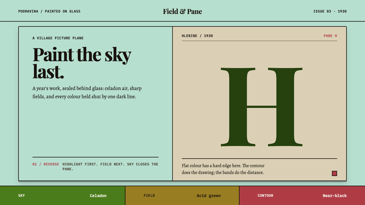 Hlebine Naïve PaintingPainted colour stays fresh. Celadon, field green and dark contours stack the…
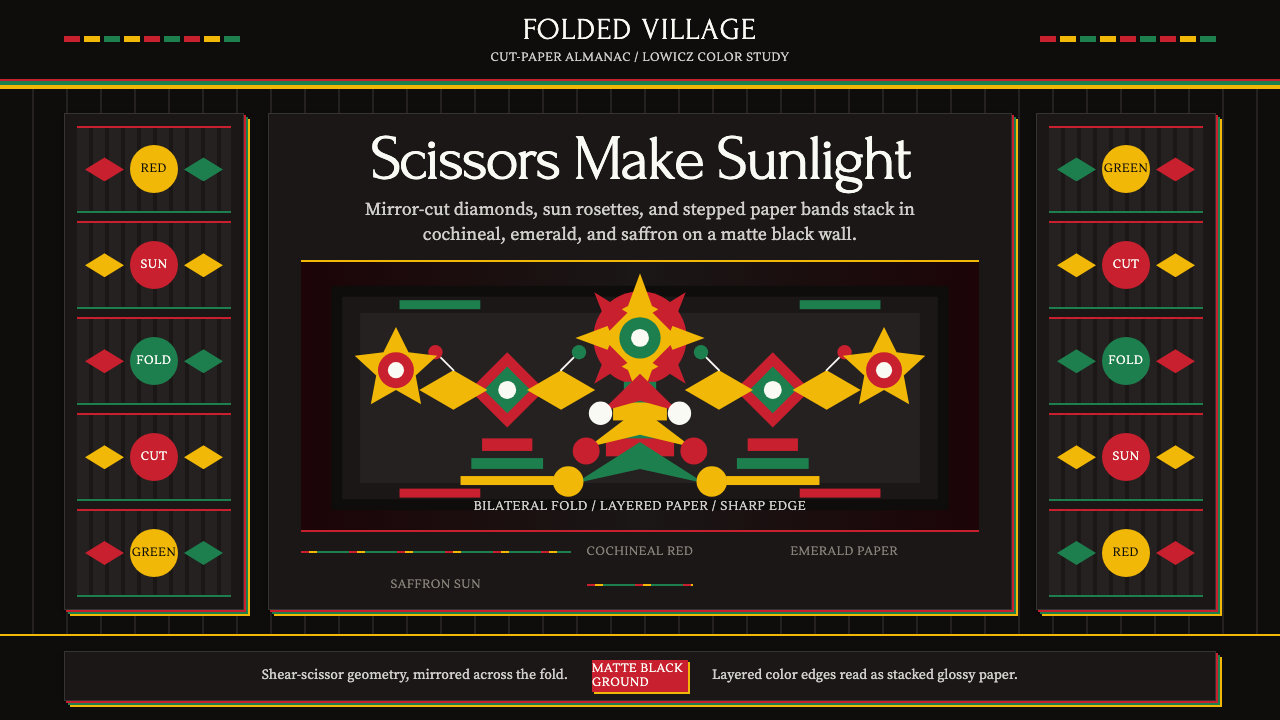 Polish Wycinanki (paper-cut folk art)Cuts sing in symmetry. Cochineal, emerald, and saffron layers blaze on black.
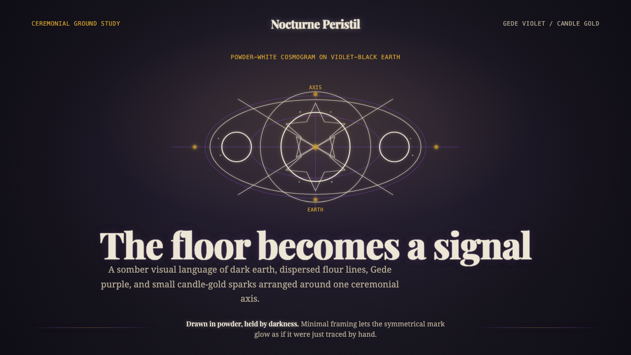 Haitian Vodou VèvèSomber ritual glow. Powder-white lines on violet-black earth, touched by cand…
 Peter Pan Neverland (1904)Enchantment glints, never shouts. Midnight navy holds gilt sparks and Edwardi…
 Pithora Rathwa Ritual WallVows fill the wall. Bright horse rows crowd deep mud-brown plaster edge to ed…
 Polish Wycinanki PinkFolk papercut maximalism. Hot-pink roosters and mirror-cut bouquets layered o…