What is Hlebine Naïve Painting?
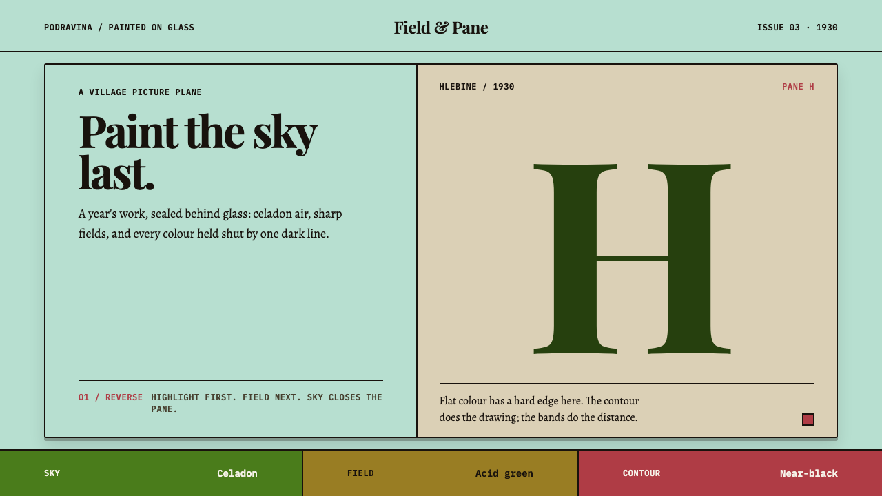
Hlebine Naïve Painting builds a picture the way Croatian farmers painted on the back of glass: flat saturated colour, a dark contour around every shape, and layers stacked up rather than receding.
Hlebine Naïve Painting in brief
Hlebine Naïve Painting is a design style drawn from the village of Hlebine on the Podravina plain in northern Croatia, where from 1930 a handful of farmers began painting the year they were living through: reapers, vineyards, floods, deer weddings and snow. Its look is a cold celadon ground standing in for sky, acid field green, folk red and wheat ochre laid on flat and saturated, with every shape closed by the same near-black contour.
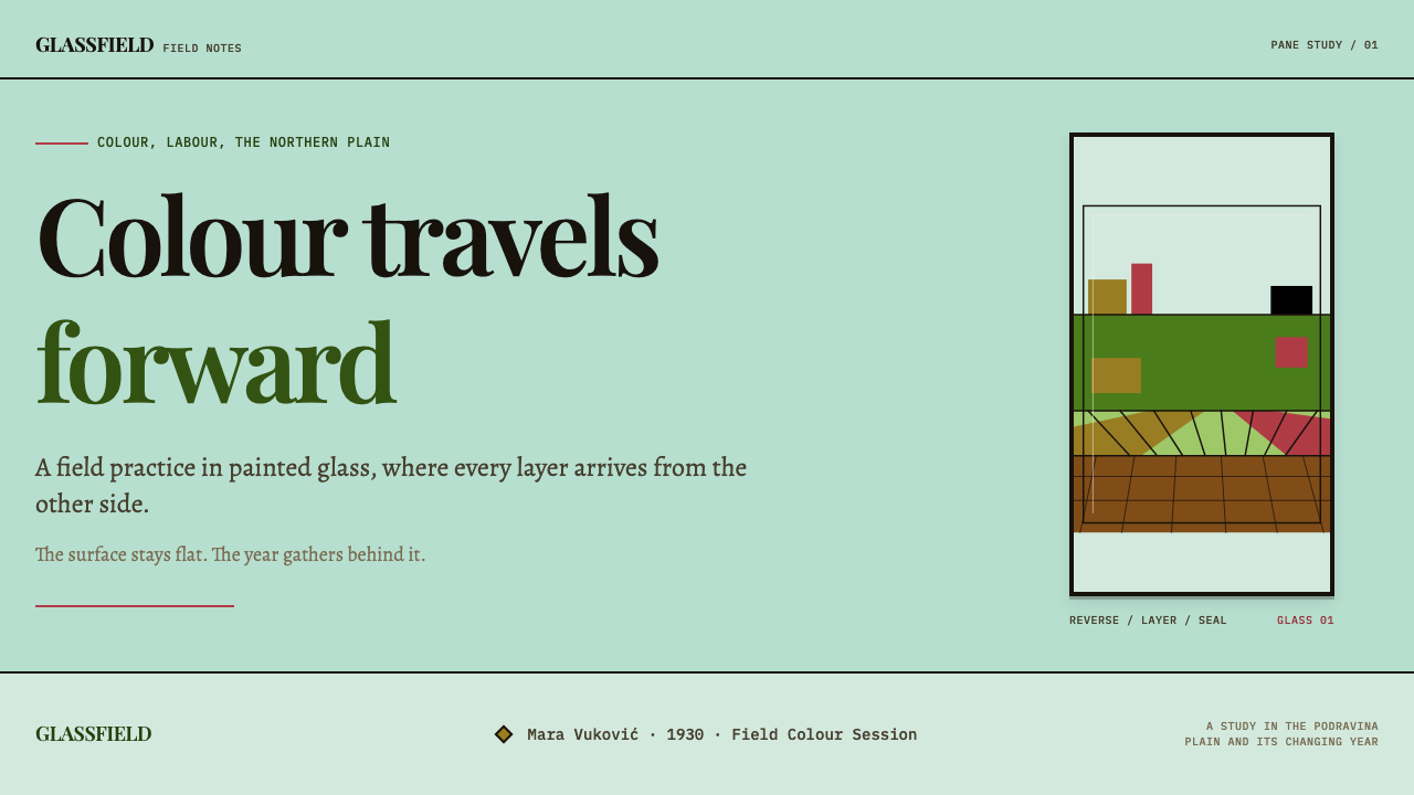
The signature technique is reverse glass painting. The painters worked in oil on the back of a pane of window glass, so the highlights went down first and the sky last, and the finished picture, seen from the front through the glass, looks lacquered rather than brushed. Ivan Generalić said he switched to glass because the colours stayed fresher. The style takes this literally: colour is clean, edges are hard, and no brushstroke shows.
Space is built by stacking, not by perspective. There is no vanishing point. Sky, field and foreground are bands piled upwards, as if the picture were a set of shelves. It is a deliberately unschooled way of seeing, but it is consistent, and that consistency is what makes it a usable system rather than a quaint imitation.
Where does Hlebine Naïve Painting come from?
The Hlebine school begins in 1930 in a village in Koprivnica-Križevci County, in the Podravina region of northern Croatia. The subjects are small and local: the field a painter works, the vineyard on the hill, the village in winter. The source places the wider era between 1900 and 1950, and the school was codified over time through the Zemlja group and the Croatian Museum of Naïve Art in Zagreb.
Krsto Hegedušić is the hinge between village and city. A trained painter associated with the Zemlja group, a Zagreb artists' circle, he encouraged the farmers of Hlebine to paint their own surroundings instead of imitating academic painting. The villagers who followed, Ivan Generalić, Franjo Mraz and Mirko Virius among them, became the best-known names of the school, and their pictures are the source of the colours and compositions this style uses.
The glass technique has a European folk lineage called Hinterglasmalerei, painting on the back of glass, which long served devotional pictures and domestic decoration in central Europe. Hlebine adapted it to secular subjects. Painting backwards imposes a particular discipline: outlines and the finest details have to go down first because they cannot be corrected under later layers, and the background arrives at the end. This explains why everything in a Hlebine picture is outlined, and why the background is flat.
The tradition was later gathered into institutions. Croatian naïve art became recognised as a named tradition, and the Croatian Museum of Naïve Art in Zagreb became one of its main custodians. That framing matters here. 'Naïve' is a technical and cultural category, not an insult. The farmers' pictures keep a seriousness about time, labour and weather, painted by people who lived inside the subject.
What defines the Hlebine Naïve Painting look?
Celadon Sky Ground
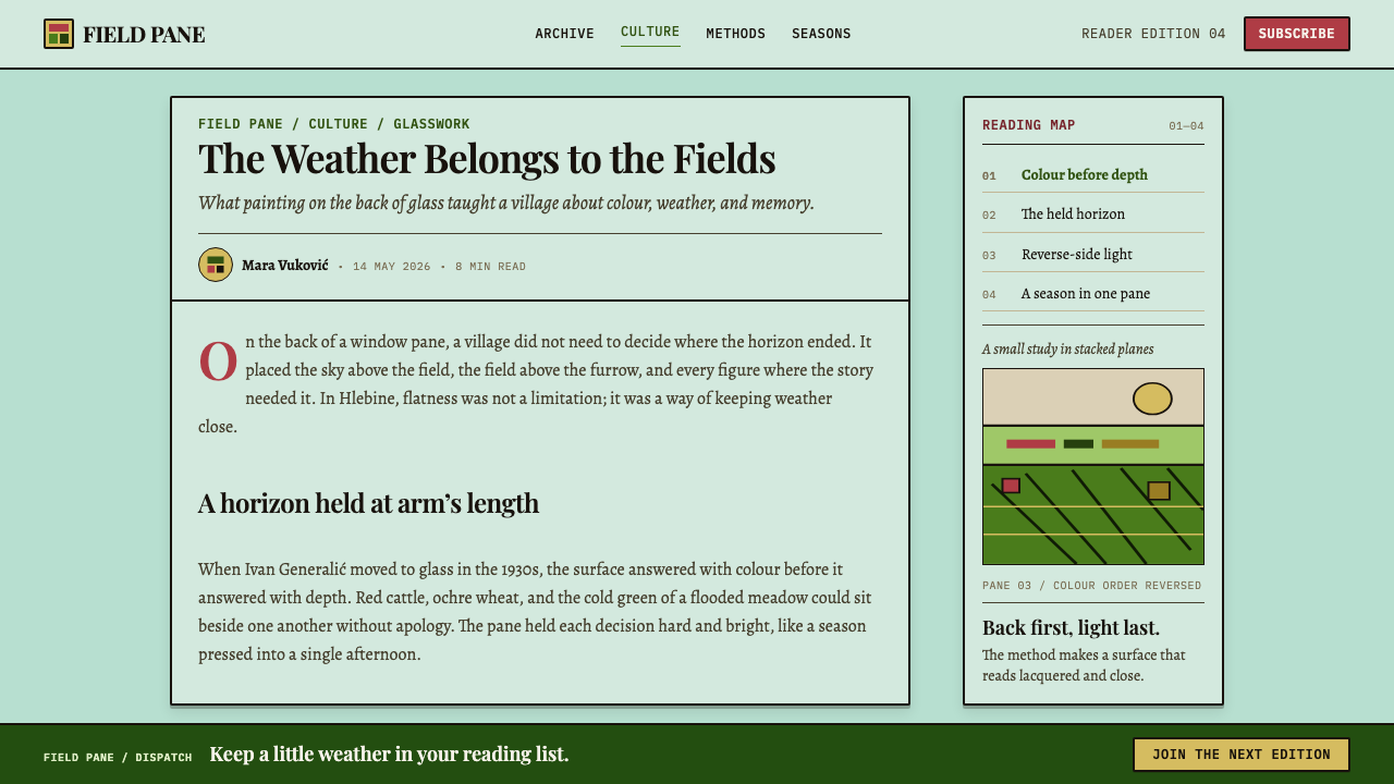
The page ground is a cold celadon, the Podravina sky as seen through glass. It is not white and not a neutral grey: it carries a faint green-blue chill that makes the warmer colours on top look warmer still. It acts as the picture's air and as the first thing the eye reads.
Acid Field Green
Fields and vegetation are painted in a sharp, slightly acidic green, laid in a single flat tone. It is the dominant mass in most compositions and gives the style its freshness. Variation comes from shapes and rows, not from shading inside the green.
Folk Red and Wheat Ochre
Folk red turns up in skirts, roofs and ribbons, while wheat ochre belongs to the harvest and to the earth. Both are flat and saturated. They work as warm punctuation against the cold sky and the green field, and they keep the palette tied to rural life and seasonal labour.
Near-Black Contour
Every element is drawn shut with the same dark contour, whether it is a figure, a haystack, a roof or a tree. The line is even and unshaded. It is a trace of the reverse glass method, in which outlines go down first, and it gives the picture its poster-like clarity and its quiet toughness.
Stacked Horizontal Bands
Depth is made by stacking sky, field and foreground as horizontal bands, never by a vanishing point. Distant things sit higher, near things lower, and sizes stay close to constant. The layout reads like a set of shelves or a tiered stage, which gives it a naturally ordered, scannable structure.
Lacquered Flatness
Because the colour is seen through glass, the surface looks smooth and slightly glossy, with no brushwork or texture. Fills are flat and saturated, edges are crisp, and there is no softness between neighbouring shapes. Visual richness comes from the number of patterned details, never from blending.
Seasons and Labour
The subject matter is the farming year: reaping, vineyards, floods, snow and the odd surreal wedding of deer. Scenes are crowded with small repeated figures doing ordinary tasks. The style is at its most convincing when its content has the same quality: specific, local and busy with life.
Who shaped Hlebine Naïve Painting?
The best-known painter of the Hlebine school. He said that he turned to glass because it made the colours fresher, which is the practical heart of the style. His pictures show the flat saturated colour, the dark contour and the stacked space that this system turns into rules.
A farmer-painter of Hlebine and one of the villagers who followed the path opened by Hegedušić. His work belongs to the same school of crowded, local scenes painted in oil on glass, and it confirms that the style was a shared village practice rather than the invention of one hand.
Another painter counted among the core of the Hlebine school. Together with Generalić and Mraz he represents the first circle of villagers who turned their own working lives into subject matter, and he is part of the evidence that the palette and contour logic were common to the group.
A trained painter linked to the Zemlja group, who encouraged the Hlebine farmers to paint what they knew. He is the bridge between a city art world and the village, and his role explains why a rural practice became a named and collected tradition rather than staying a local habit.
The Zagreb museum devoted to Croatian naïve art, named in the source as one of the institutions through which the Hlebine school was codified. It stands for the way a village practice became a recognised canon, and it is a reason to treat this style with the seriousness of a collected tradition.
How do you use Hlebine Naïve Painting today?
Hlebine Naïve Painting is most convincing in products and stories that are warm, local and human, and that want to feel handmade without becoming rustic kitsch. Applying it well means respecting its logic: layered flat colour, one consistent contour, and space built from bands, not an overall colour scheme added to a conventional layout.
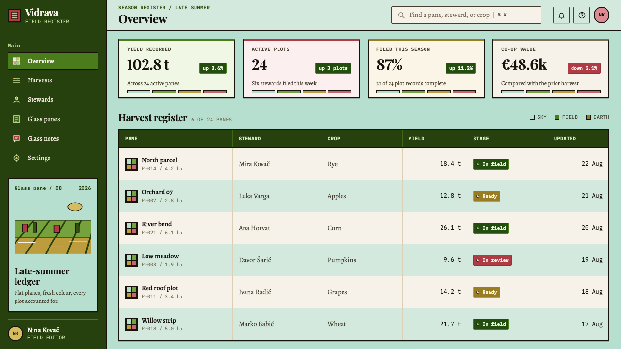
On slides, a cover can use a celadon field with a stack of two or three horizontal bands along the bottom: a green field, a strip of ochre, a small red roof or figure, each outlined in the same dark line. Content slides work well when the page is divided into bands, with simple text blocks sitting in their own tier. Data slides should keep the flatness: bars as plain outlined blocks, areas filled with one solid colour, and no gradients or drop shadows.
In web interfaces the style suits food and farm brands, family and community products, children's learning, local tourism, craft marketplaces and cultural institutions. Cards become outlined panels with a flat fill, buttons are solid colour with the dark contour, and sections are stacked as horizontal bands on the celadon ground. Pricing plans can be laid out as separate horizontal bands, one per tier. Avoid soft shadows and glass-morphism, which contradict the idea of painted colour seen through glass.
For editorial and marketing work, the style supports seasonal campaigns, regional stories, cookbooks and heritage features. Illustrations should be flat, outlined and crowded with small repeated figures, and photography is best replaced by or paired with drawn scenes. Headlines can be simple and warm, with generous space around them, leaving the colour to carry the mood.
The most common mistake is losing the contour: if shapes are filled but not outlined in the same dark line, the picture falls apart into soft colour patches. A second mistake is introducing perspective, such as receding roads or a vanishing point, which breaks the stacked-band logic. A third is using the palette as pastel decoration, because the fields are acid and saturated and the sky is cold. Watering them down turns the lacquered clarity into a generic children's-book look.
Hlebine Naïve Painting — FAQ
What does 'naïve' mean in this style?
It is a category in art history for painters who work outside academic training, not a judgement of quality. In Hlebine, farmers painted their own lives in a consistent, deliberate manner. The style keeps that directness: flat colour, firm outlines and no borrowed perspective. The result looks simple, but it is carefully controlled.
Why is every shape outlined in the same dark line?
Because of how reverse glass painting works. The painter works from the back, so outlines and fine details go down first and the background last, and nothing can be corrected under later layers. The even dark contour is the visible trace of that method, and it gives the image its clear, poster-like structure.
Why is there no perspective?
The painters did not use a vanishing point. They stacked sky, field and foreground as bands, the way a child or a folk painter stacks a scene on a page. The style keeps this on purpose, so depth comes from layering and placement. Introducing perspective would make the picture look half-schooled rather than clearly built.
Can I use it on a white background?
You can, but the system is built on the cold celadon ground, which stands in for the sky seen through glass and makes the warm colours glow. On pure white the greens and reds look harsher and the glass effect is lost. If you need a white page, use celadon in large bands so the character survives.
Is this style only for rural or children's products?
It is strongest there, but not limited to them. Anything that benefits from local, human warmth can use it: food, travel, community platforms, cultural institutions and educational tools. It is a poor fit for products that rely on technical precision or a luxury tone, because the style is deliberately direct, saturated and unpolished.
Related design styles
 Slime Mold PlasmodiumYellow glows because the ground is dim. Sulphur Physarum sporangia on decayin…
 Winnie-the-Pooh (1926)Wonder lives in the white space. Loose sepia lines meet one small spot of hon…
 Slate Blackboard ChalkDust teaches. Blackboard green carries chalk script, pale smears, and boxed d…
 Azerbaijani Gobustan PetroglyphAncient rock speaks. Ochre incisions glow across dark lichen-mottled stone.
 Bahraini Dhow Pearl-Diving BoatMineral and sun-bleached. Gulf turquoise, canvas cream, and pearl rows frame…
 Baybayin ScriptCarved, not written. Curvilinear baybayin ash-rubbed into tobacco-brown bambo…