What is Slate Blackboard Chalk?
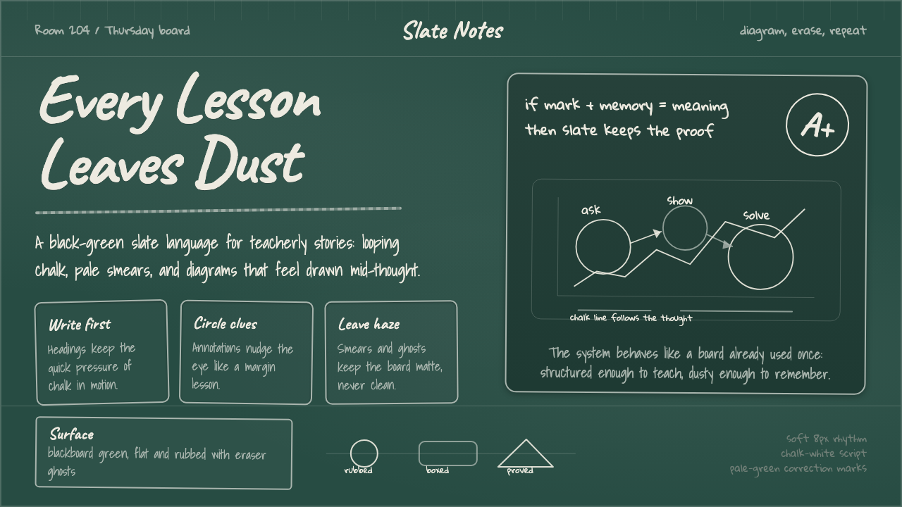
Long before the whiteboard, the projector, or the screen, the chalkboard was the original shared display — a slab of dark stone or enameled steel that an entire room learned to read at once.
Slate Blackboard Chalk in brief
Blackboard Chalk draws its design language from the physical classroom board itself, treated not as a metaphor but as a literal material: a matte, dark surface covered in white chalk marks, pale ghosted erasure smears, and boxed or freehand diagrams drawn directly onto the working surface. The system distinguishes two historical materials that share a name and a role — the original dark slate board of the nineteenth century, and the green porcelain-enamel board that gradually replaced it through the middle of the twentieth — and settles on the deep, near-black green that most people now picture when they hear the word 'blackboard,' even though the surface is rarely literally black.
What makes a surface legible as a chalkboard rather than a generic dark background is texture and evidence of use: the faint tooth of slate or enamel under raking light, the soft haze left behind when an eraser drags across a previous lesson without fully removing it, and handwriting that loops and connects the way cursive does when written quickly, at arm's length, standing up, for an audience at the back of a room. Diagrams are drawn freehand rather than drafted — a circle is slightly imperfect, a box's corners don't quite meet — because that imperfection is what a real chalkboard always looks like.
This is a vernacular system rather than an authored one: no single designer invented the look of a chalkboard, and that absence of a named author is part of the point. The visual grammar accumulated over more than a century of daily use in classrooms nearly everywhere handwriting and public instruction existed, which is why the system reads as universally recognizable rather than tied to any particular country, brand, or era of design history.
Where does Slate Blackboard Chalk come from?
The dedicated classroom blackboard emerged in the early nineteenth century as an alternative to the individual handheld slate that students had used for centuries: a single large writing surface, mounted at the front of a room, let one teacher demonstrate to an entire class simultaneously rather than checking each student's private slate in turn. Early boards were literally quarried slate, sometimes assembled from several smaller slabs mounted together, or wood panels painted with a mixture that gave a dark, chalk-receptive matte finish.
The practice spread quickly through the first decades of the 1800s in both Britain and the United States, credited in different popular accounts to different early adopters — among them the Scottish headmaster James Pillans in Edinburgh, remembered for assembling individual slates into one large classroom board and for pioneering the use of colored chalk in map-drawing lessons, and instructors such as George Baron at the United States Military Academy at West Point, where a large board and chalk were reportedly used to teach mathematics as early as 1801. Within a generation, the chalkboard had gone from a novelty to a standard fixture of the schoolroom.
For roughly a century, these boards were genuinely black or near-black slate. That changed around the middle of the twentieth century, when American manufacturers began producing boards from steel panels coated in porcelain enamel rather than quarried stone — a shift driven partly by cost and durability, and partly by claims that a dark green surface produced less glare and eye strain under classroom lighting than true black. The resulting color became so strongly associated with education that it acquired its own informal name among sign painters and manufacturers, even as the material itself was no longer black at all — a naming lag that survives in the word 'blackboard' still being used for a surface that has been green for most living memory.
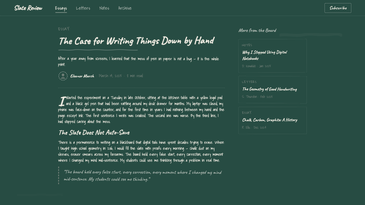
The chalkboard's real authorship, though, belongs to no manufacturer or inventor: its visual vocabulary was built collectively, over generations, by teachers who developed characteristic handwriting suited to being read from the back of a room, and by the accumulated residue of decades of lessons only partially erased before the next one began. That vernacular quality — a look created by use rather than by design intention — is what the system is built to preserve, even as the physical chalkboard itself has been steadily displaced in classrooms by the whiteboard and, more recently, by digital displays.
What defines the Slate Blackboard Chalk look?
Color
The ground is a deep, near-black green — dark enough to read as black at a glance, but carrying a cool green undertone that distinguishes it from a neutral charcoal or true black. White chalk provides the primary contrast, with a pale, slightly dusty off-white for annotation and secondary marks rather than a bright, clean white. There is no cream or warm neutral anywhere in the system; every tone stays cool and slightly desaturated, as if seen under fluorescent classroom light.
Matte Slate Texture
The surface is uniformly matte — no gloss, no reflective sheen, and no simulated shine of any kind. Under close inspection it should carry the faint, even tooth of ground slate or fired enamel, a texture fine enough to hold chalk dust but never smooth enough to read as glass, plastic, or screen. This matte quality is non-negotiable: any glossy treatment immediately breaks the illusion of a real physical board.
Chalk Script
Headings and key text are rendered in the loose, looping cursive of handwriting produced quickly, standing up, at arm's length, for readers at the back of a room — connected letterforms with slightly inconsistent stroke weight, closer to a teacher's board hand than to any polished script typeface. This handwritten quality should feel spontaneous rather than calligraphic; a too-perfect cursive undermines the sense of a real lesson being written in real time.
Erasure Ghosting
A soft, uneven haze — the residue of a previous lesson dragged sideways by an eraser but never fully removed — should appear as a background layer beneath the primary content, always subtle and never competing with foreground text. This ghosting is what turns a flat dark field into a surface with history: evidence that other lessons happened here before this one.
Freehand Diagrams
Charts, boxes, and geometric figures are drawn as if by hand and chalk rather than drafted with mechanical precision: circles are slightly out of round, straight lines carry a faint waver, and boxed diagrams have corners that nearly but don't quite close. This deliberate imperfection is essential — a perfectly vector-precise diagram on a dark green ground reads as a modern presentation slide wearing a chalkboard costume, not an actual board.
Chalk Dust
Fine particulate texture — a light scatter of white dust along the board's lower edge, in the folds of erasure marks, or drifting faintly at the margins of heavily written areas — reinforces the physicality of the material. This dust should stay peripheral and understated, functioning as atmospheric detail rather than a decorative pattern spread evenly across the whole surface.
Who shaped Slate Blackboard Chalk?
A Scottish headmaster at the High School of Edinburgh in the early nineteenth century, Pillans is popularly remembered for assembling individual student slates into a single large board mounted at the front of a classroom, and for pioneering the use of colored chalk in geography and map-drawing lessons. Whether he was truly first is debated among historians of education, but his name recurs in nearly every popular account of the chalkboard's early adoption.
An instructor at the United States Military Academy at West Point, Baron is credited in several accounts with one of the earliest documented uses of a large classroom board and chalk in the United States, reportedly teaching mathematics with one as early as 1801. His classroom stands among the earliest on record to treat a shared board, rather than individual student slates, as the primary teaching surface.
No single designer created the chalkboard's visual language. Its looping cursive headings, its characteristic erasure ghosting, and its freehand boxed diagrams were shaped collectively by more than a century of ordinary classroom use, worldwide, by teachers developing a legible board hand and students copying it down. This anonymous, cumulative authorship is precisely what gives the system its universal, unbranded familiarity.
Beginning around the middle of the twentieth century, American manufacturers reengineered the chalkboard from quarried slate into steel panels finished with porcelain enamel, a change usually attributed to lower cost, greater durability, and claims that a dark green surface reduced glare compared to true black under classroom lighting. This industrial shift is the reason most people now picture a deep green surface, rather than genuine black stone, when they hear the word 'blackboard.'
How do you use Slate Blackboard Chalk today?
Blackboard Chalk works best as a system for signaling instruction, explanation, and unpolished honesty — anywhere a brand or piece of content wants to feel like a teacher working something out in real time rather than a finished, mass-produced document. It reads well for education, tutoring, and knowledge-sharing products, and for any brand that wants to claim approachable expertise; it reads badly wherever the message needs to feel sleek, luxurious, or machine-precise, since the whole point of the system is visible, human imperfection.
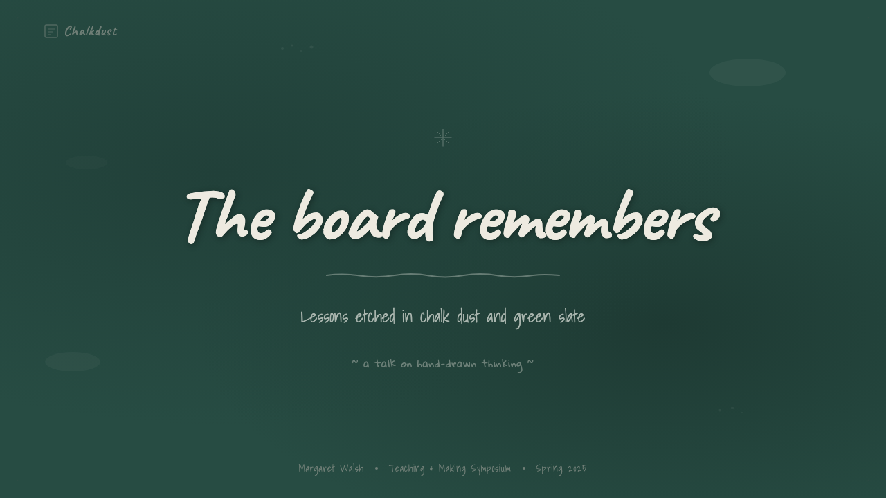
On a presentation cover slide, the system rewards a single hand-lettered title in chalk script over the dark green ground, with a light scatter of chalk dust or a partial erasure ghost in one corner suggesting the board was just used. Content slides should treat each slide like a fresh pass across the same board: consistent dark ground throughout, headings in chalk script, body copy in a plainer but still slightly irregular hand rather than a crisp digital sans, and freehand-style rules or boxes instead of straight vector lines. Data slides can lean directly into the freehand-diagram idiom — bar charts and simple figures drawn as if chalked directly onto the board, imperfect edges included, which reads as approachable and pedagogical rather than sterile.
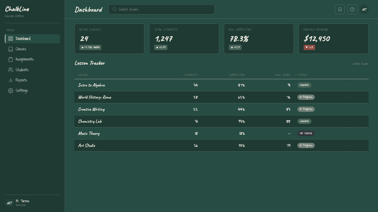
For web interfaces, the system suits learning platforms, course and tutoring products, and any dashboard that wants to feel like a lesson rather than a spreadsheet — progress indicators drawn like chalk tally marks, section dividers rendered as a chalk-drawn rule rather than a crisp hairline. Pricing pages benefit from framing each tier like an item written and boxed on the board, with the recommended plan given the clearest, most confidently drawn box rather than a modern floating card with a drop shadow, which would break the material illusion.
In editorial and marketing contexts, the system suits explainer content, how-to writing, and any brand voice built around patient teaching rather than polished authority — recipe explanations, DIY guides, course landing pages. Full-bleed marketing sections work well using the dark green ground as a constant base with chalk-script section headers and pale erasure-ghost texture used sparingly behind pull-quotes, always leaving enough contrast for body text to stay legible.
The most common mistake is treating the ground color as literal black rather than the cooler, greener dark tone the vernacular actually uses, which flattens the system into generic 'dark mode' styling. A second common mistake is over-cleaning the surface — removing all erasure ghosting and chalk dust in pursuit of a crisp, modern look — which strips away exactly the evidence of use that makes the system read as a real chalkboard rather than a dark background with white handwriting-style type dropped onto it.
Slate Blackboard Chalk — FAQ
Is this system the same as generic 'handwritten' or 'notebook' styling?
No. Notebook-style design typically uses a light paper ground with ruled lines and dark ink, evoking a personal notebook. Blackboard Chalk is specifically institutional and public rather than private — a dark, matte, shared surface meant to be read by a whole room at once, with light-on-dark contrast rather than dark-on-light. The two share a handwritten quality but come from entirely different objects and contexts.
Should the ground always be dark, or can this style work on a light background?
The system is built around darkness as a defining trait, not an optional variation — the entire premise is white chalk on a dark, matte ground, and that light-on-dark relationship is what reads as a chalkboard rather than a whiteboard or a notebook page. A light-background version would need an entirely different reference object and effectively becomes a different system, even if it borrows the handwritten typography.
How much erasure ghosting and chalk dust is appropriate before it looks messy rather than authentic?
As a rough guide, ghosting and dust should always read as a quiet background layer that never competes with the primary chalk-script content sitting on top of it. If a viewer's eye is drawn to the erasure texture before the actual heading or diagram, it has gone too far. The effect should whisper 'this board has a history,' not shout it.
Does this style require the specific green associated with classroom boards, or is any dark tone acceptable?
The specific cool, deep green-black tone matters more than it might seem, because a neutral charcoal or a warm near-black reads as generic 'dark mode' rather than as this particular vernacular object. The green undertone is what makes viewers unconsciously recall a classroom rather than a phone screen at night, so it is worth protecting even though the difference is subtle rather than dramatic.
What is the most common failure mode when applying this system digitally?
The most common failure is polishing away everything that signals real chalk on a real surface — using a clean digital script font instead of an irregular hand-drawn one, vector-perfect diagrams instead of freehand ones, and a flat, texture-free dark background instead of a matte, faintly grained one. Each of those choices individually seems like a minor simplification, but together they turn a chalkboard into a dark-mode slide deck with a decorative font, losing the material honesty the system depends on.
Related design styles
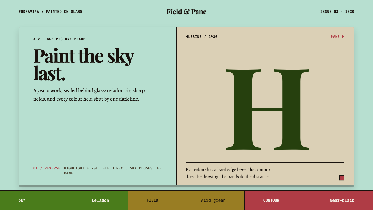 Hlebine Naïve PaintingPainted colour stays fresh. Celadon, field green and dark contours stack the…
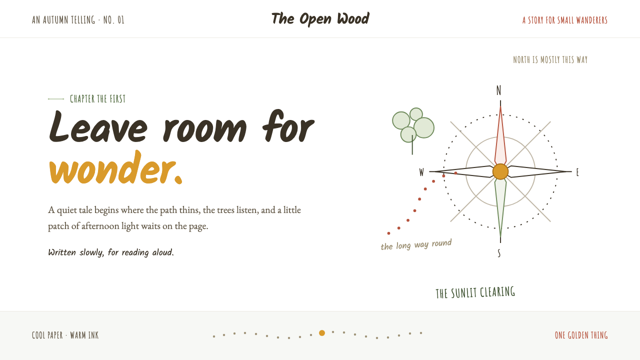 Winnie-the-Pooh (1926)Wonder lives in the white space. Loose sepia lines meet one small spot of hon…
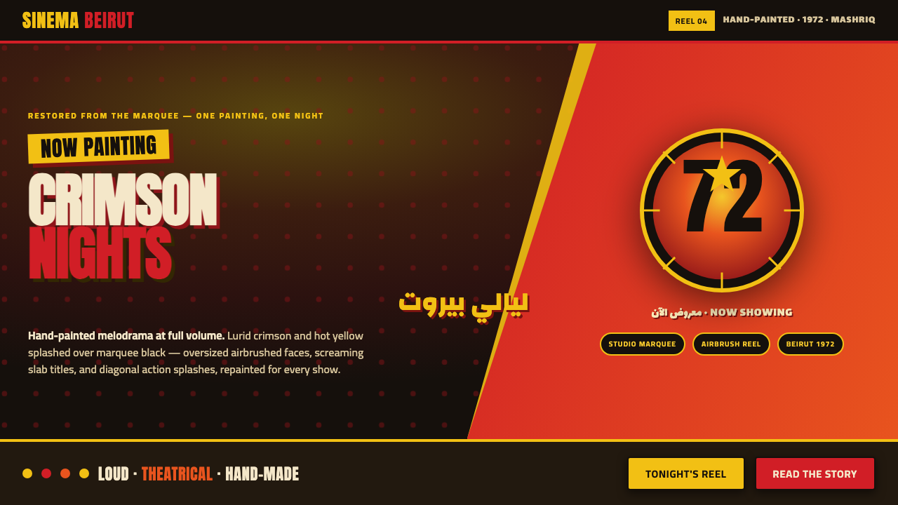 Lebanese Film PosterMelodrama at full volume. Lurid crimson and hot yellow on marquee black, slab…
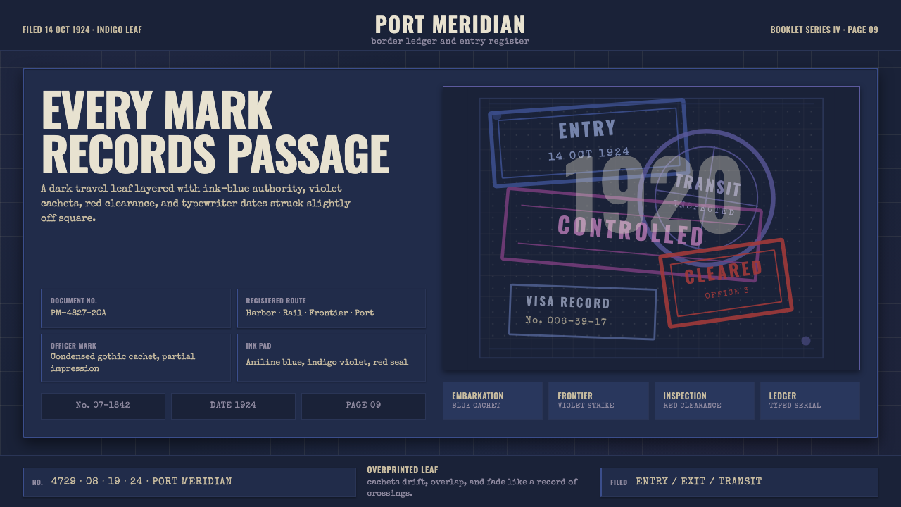 Vintage Passport StampsInk remembers passage. Indigo leaf, blue-violet cachets, red seal, typewriter…
 Argentine Bandoneón 1900 (Tango)Gaslit tango luxury. Midnight velvet, brass fileteado, and pearl-button geome…
 BathyspherePressure turns precise. Cyan porthole light cuts gunmetal grids and rivet row…