What is Lebanese Film Poster?
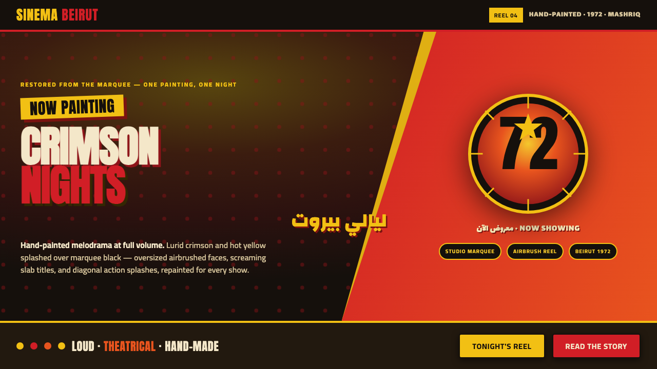
Lebanese Film Poster turns Beirut’s hand-painted cinema spectacle into a screen language of marquee black, lurid crimson, hot yellow, and faces that refuse to stay quiet.
Lebanese Film Poster in brief
Lebanese Film Poster revives the hand-painted Arab cinema advertising that illuminated Beirut’s marquees through the 1960s and 1970s. Its world is melodrama at full volume: cinema-black grounds, crimson and hot yellow paint, oversized airbrushed faces, and heavy slab Arabic titles that behave less like labels than shouted declarations.
The visual system is deliberately theatrical. Figures are spotlit and pushed forward through extreme contrast; diagonal splashes imply action; brushwork gradients preserve the evidence of a human hand; and display type occupies the composition with unapologetic force. Saturation is not a finishing touch but the emotional engine of the design.
Nothing here aims for tasteful restraint. The style is loud, lurid, painterly, and maximal, translating the physical drama of a hand-painted marquee poster into interfaces, editorial pages, presentations, and promotional surfaces. Its success depends on sustaining that conviction across every element rather than placing a few retro colors on an otherwise quiet layout.
Where does Lebanese Film Poster come from?
The style belongs to the Middle Eastern cinema culture of Beirut, Lebanon, within the broader period from 1950 to 1990. Its defining moment was the peak hand-painted era of the 1960s and 1970s, when painted advertising gave cinema-going a public, spectacular presence through marquee-scale faces, forceful titles, and colors designed to be seen immediately.
Its visual identity grew from Arab hand-painted movie-poster art, mid-century airbrush illustration, and Egyptian-Lebanese melodrama cinema. These movements converge in a shared language of emotional excess: faces enlarged until they become icons, action organized along diagonals, and color pushed toward the edge of plausibility so that the poster feels less like information than an event already in progress.
The hand-painted origin matters because the system is not simply a historical palette. Its gradients are brushwork gradients, its edges carry pressure and gesture, and its compositions feel assembled by an illustrator responding to drama rather than by a neutral layout machine. The handmade quality gives the exaggeration its authority: the image is theatrical because a person made it theatrical.
The revival also depends on preservation. Beirut cinema poster painters, Lebanese celluloid archivists, and Mashriq movie-print preservationists represent the connected practices through which this visual memory survives. Lebanese Film Poster turns that recovered language toward contemporary screens while keeping its essential commitments intact: black grounds, saturated paint, monumental faces, diagonal energy, and display type that behaves like a cry.
What defines the Lebanese Film Poster look?
Marquee Black and Saturated Color
Cinema-black is the stage, while lurid crimson and hot yellow provide the glare. The palette should feel painted rather than polished: red carries danger and desire, yellow creates heat and visibility, and black gives both colors their theatrical force. Saturation is used boldly, not timidly, but the dark ground keeps the spectacle legible.
Screaming Display Type
Bold slab Arabic titles are the headline actors of the composition. They should be oversized, emphatic, and impossible to mistake for supporting copy. Type is not placed politely beside the image; it presses into the same theatrical space, competing with faces and splashes for attention while remaining unmistakably readable.
Airbrushed Faces
Faces are enlarged and spotlit until they become emotional symbols. High contrast separates the eyes, cheekbones, and expression from the black field, while painterly transitions keep the figure from feeling mechanically cut out. The gaze should confront the viewer directly, making the poster feel like a star entrance or a moment of accusation.
Diagonal Action
The composition gains motion from diagonal splashes, slashes, and directional clusters. Horizontal calm is not the default; elements should appear to surge, collide, or spill across the frame. Diagonals are especially useful for connecting a face, a title, and a burst of color into one continuous melodramatic gesture.
Brushwork Gradients
Gradients are allowed because they belong to the painted language, not to a smooth digital surface. Crimson can bleed into yellow, light can bloom around a cheek, and color can feather outward like an airbrush or loaded brush. The transitions should retain visible gesture and variation so that softness feels handmade rather than sterile.
Spotlight Contrast
Light is organized as theatrical attention. Figures and titles emerge from darkness through sharp value contrast, while secondary material is allowed to recede. This creates a poster-like hierarchy without requiring restraint: the viewer knows where to look because the brightest, warmest, and most expressive areas are deliberately staged.
Unapologetic Maximalism
Lebanese Film Poster treats abundance as a structural principle. Large faces, forceful type, splashes, gradients, and saturated color are meant to coexist in productive competition. Empty space may appear, but it should feel like a pause inside the performance, not a demand for minimalism. Every element must heighten the drama or sharpen the message.
Who shaped Lebanese Film Poster?
These painters are the style’s central creative presence: the artists who turned cinema advertising into hand-made spectacle. Their legacy is visible in oversized faces, saturated paint, diagonal action, airbrushed transitions, and titles that seem to project beyond the poster surface. The system treats their collective practice as a visual vocabulary rather than attaching it to a single named author.
Lebanese celluloid archivists represent the preservation work that keeps this visual culture available for revival. Their role connects the contemporary system to the forgotten cinema advertising of Beirut and to the material memory of the hand-painted era. Without preservation, the style would survive only as a vague retro impression; with it, its theatrical details can be studied and carried forward.
Mashriq movie-print preservationists broaden the frame beyond a single city, preserving the printed and circulated evidence of regional cinema culture. They stand for the wider network through which hand-painted movie imagery, melodramatic conventions, and bold display language remained legible across the region. In this system, preservation is part of authorship because it makes visual inheritance possible.
How do you use Lebanese Film Poster today?
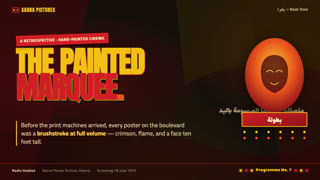
For presentation covers, commit to the marquee effect immediately. Use a cinema-black field, one dominant painted face or tightly cropped figure, and a slab Arabic title treated as the main visual event. Crimson or hot yellow can flood the image through a diagonal splash, while airbrushed light separates the subject from darkness. The cover should feel like a film has just erupted behind it.
Content and data slides should preserve the same hierarchy without becoming visually chaotic. Let one face, title, or color burst establish the slide’s emotional anchor, then place supporting information in clearly separated blocks with strong contrast. Data can be staged like poster evidence: the most important figure receives the brightest treatment, while secondary labels recede into the black field. Repeated brush textures should support the story, not cover every surface.
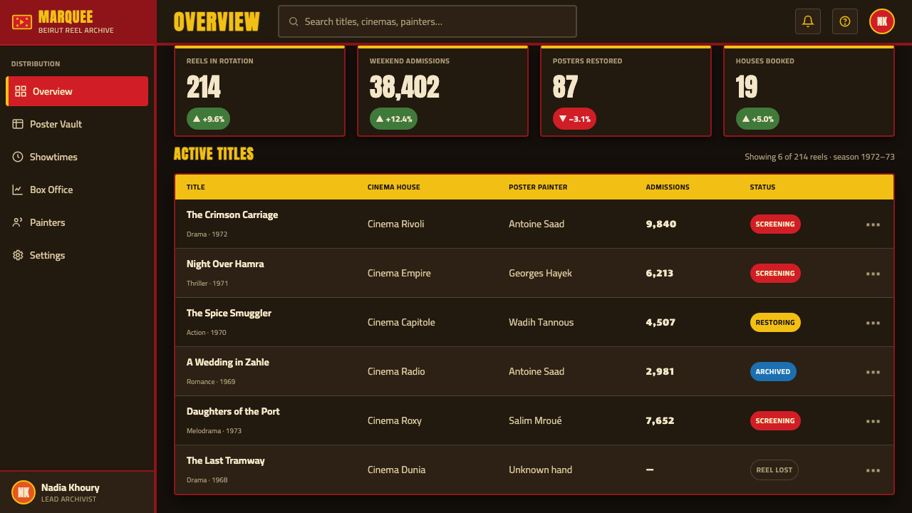
For web interfaces, the style suits dashboards and pricing pages that need a memorable, high-impact identity. A dark foundation can hold bright status states, tier distinctions, or active controls in crimson and hot yellow. Cards and panels should feel like painted frames or poster fragments, with strong spotlight contrast and assertive headings. The system is especially effective when the interface has a promotional or cinematic purpose rather than a quiet utility-first mood.
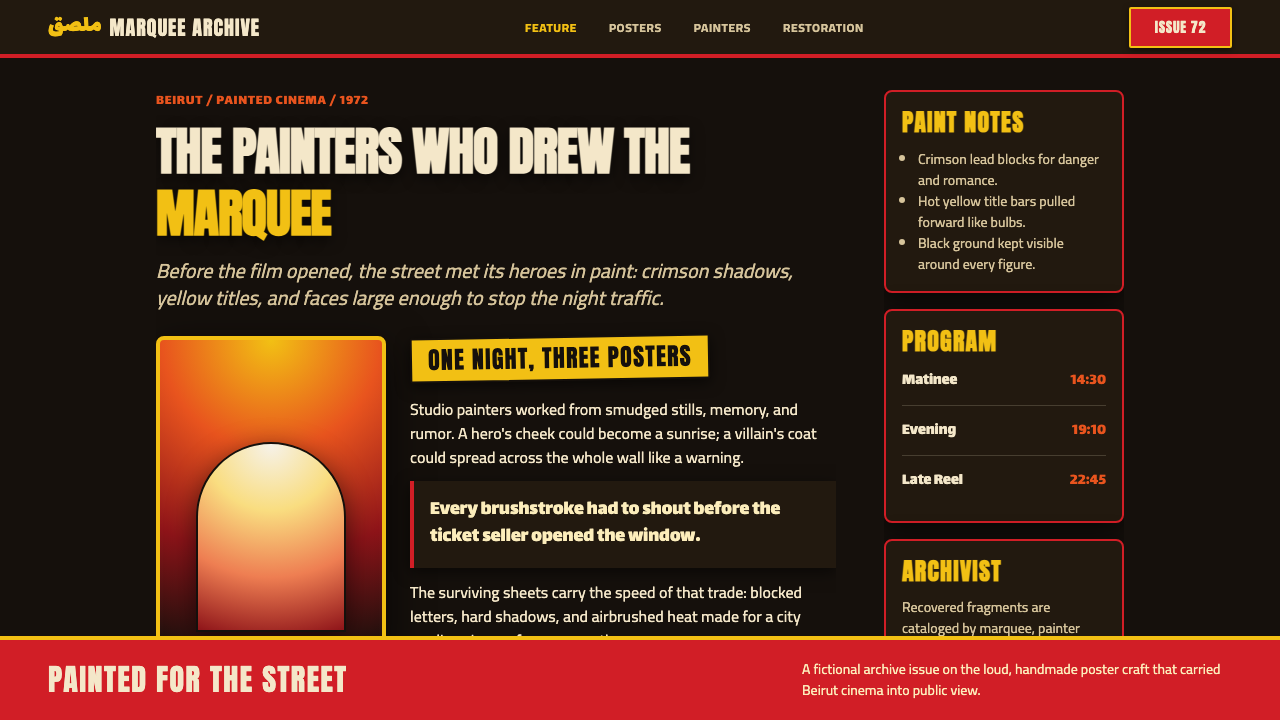
For editorial and marketing work, build pages as theatrical compositions. A feature story can open with an oversized face, a diagonal color sweep, and a title that occupies the same visual territory as the image. Campaign sections can alternate between black-dominant fields and saturated painted interruptions, while pull quotes and calls to action borrow the force of marquee lettering. The hand-made texture should remain visible enough to make the page feel authored.
The common mistake is confusing maximalism with indiscriminate noise. Adding every face, color, splash, gradient, and title treatment at equal intensity destroys the spotlight hierarchy that makes the style work. Choose a dominant emotional subject, let one color lead the scene, and make the remaining elements support the drama. The goal is not quietness; it is controlled overload.
Lebanese Film Poster — FAQ
Is Lebanese Film Poster simply a generic retro cinema style?
No. Its identity comes from the specific combination of Beirut’s hand-painted Arab cinema advertising, the peak era of the 1960s and 1970s, mid-century airbrush illustration, and Egyptian-Lebanese melodrama cinema. Remove the handmade brushwork, the black marquee ground, the oversized faces, or the shouting slab titles, and the result becomes generic nostalgia rather than this system.
Can the style work without a black background?
It can, but the black field is one of its strongest identity anchors. A lighter ground may preserve the crimson, yellow, faces, and diagonal movement, yet it will reduce the marquee-like drama and make the palette feel less incandescent. If the background changes, restore the theatrical contrast through concentrated shadow, spotlighted figures, and saturated painted interruptions.
Why use gradients if the style is meant to feel hand-painted?
Because the relevant gradients are brushwork gradients, not sterile digital smoothing. They describe airbrushed light, paint bleeding from crimson into yellow, and color feathering around a face. The transition should show gesture and variation. A perfectly uniform gradient weakens the style because it removes the evidence of the hand that gives the exaggeration its character.
How should the face and title share attention?
They should compete theatrically but remain structurally connected. A face can dominate the light while the title dominates the silhouette, or the title can cut across the figure as a diagonal force. What matters is that both feel like headline material. Supporting information must retreat into clearer, quieter areas so the main confrontation remains readable.
Does this style suit every kind of product or interface?
No. It is strongest where spectacle, emotion, and immediate recognition are useful values: cinema-related work, promotional campaigns, dramatic editorial, and interfaces with a strong entertainment character. It struggles when the experience depends on quiet neutrality, restrained hierarchy, or a calm atmosphere. Its loudness is the point, but that loudness must match the product’s promise.
Related design styles
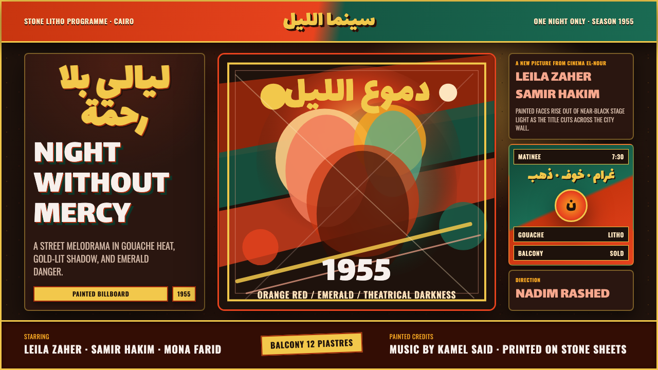 Egyptian Film Poster (Cairo)Melodrama at billboard scale. Near-black ground, ruq'ah titles, orange-red ag…
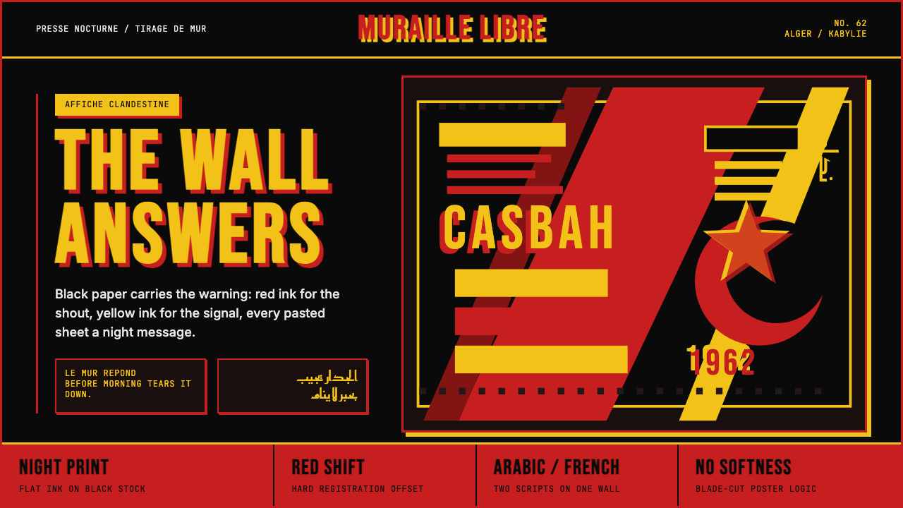 Algerian Casbah Poster (1954–1962)Every surface is a manifesto. Blood red, warning yellow, and stencil type hit…
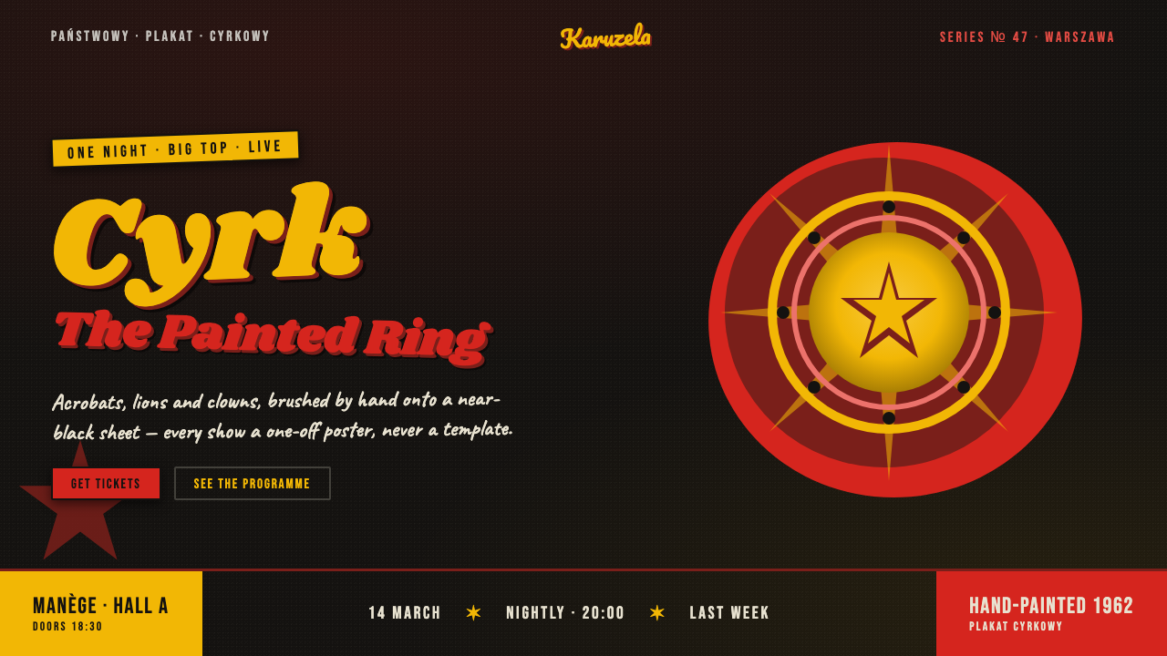 Polish Cyrk Circus PosterPainterly state-circus maximalism. Vermilion and circus yellow blaze from nea…
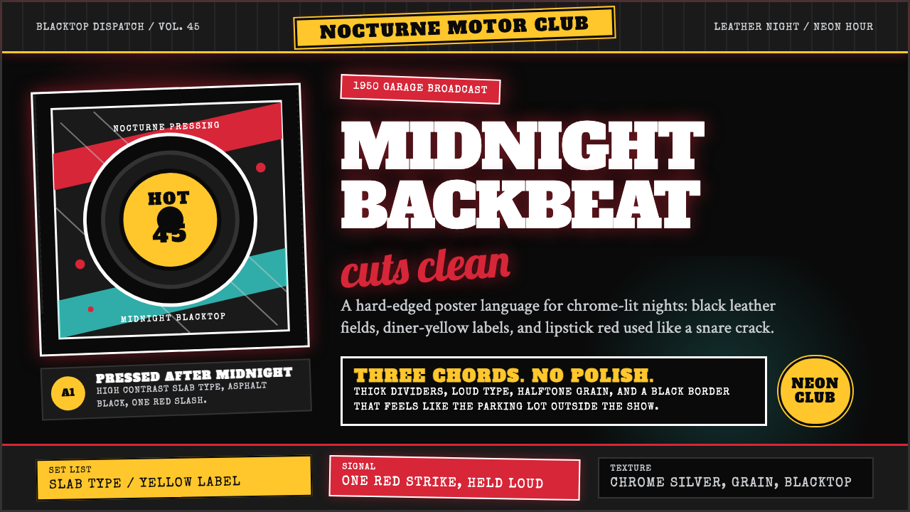 Rockabilly Greaser (1950)Loud after midnight. Asphalt black, chrome-yellow circles, and one lipstick-r…
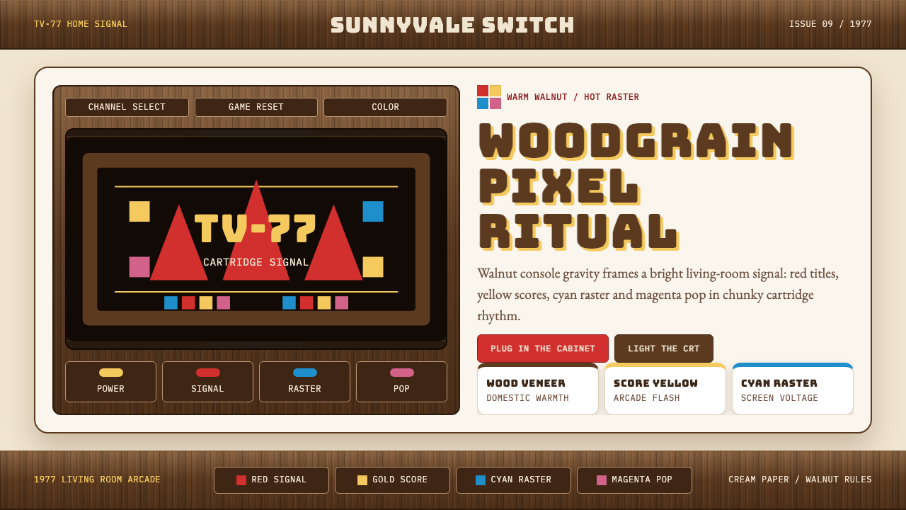 Atari 2600 (Woodgrain)Woodgrain meets raw pixels. Walnut panels frame Bungee type and CMYK raster b…
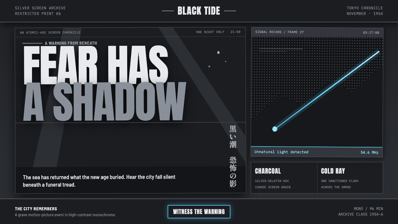 Godzilla (1954 Showa)Fear takes monumental form. Charcoal halftones split under one atomic-blue ra…