What is Egyptian Film Poster (Cairo)?
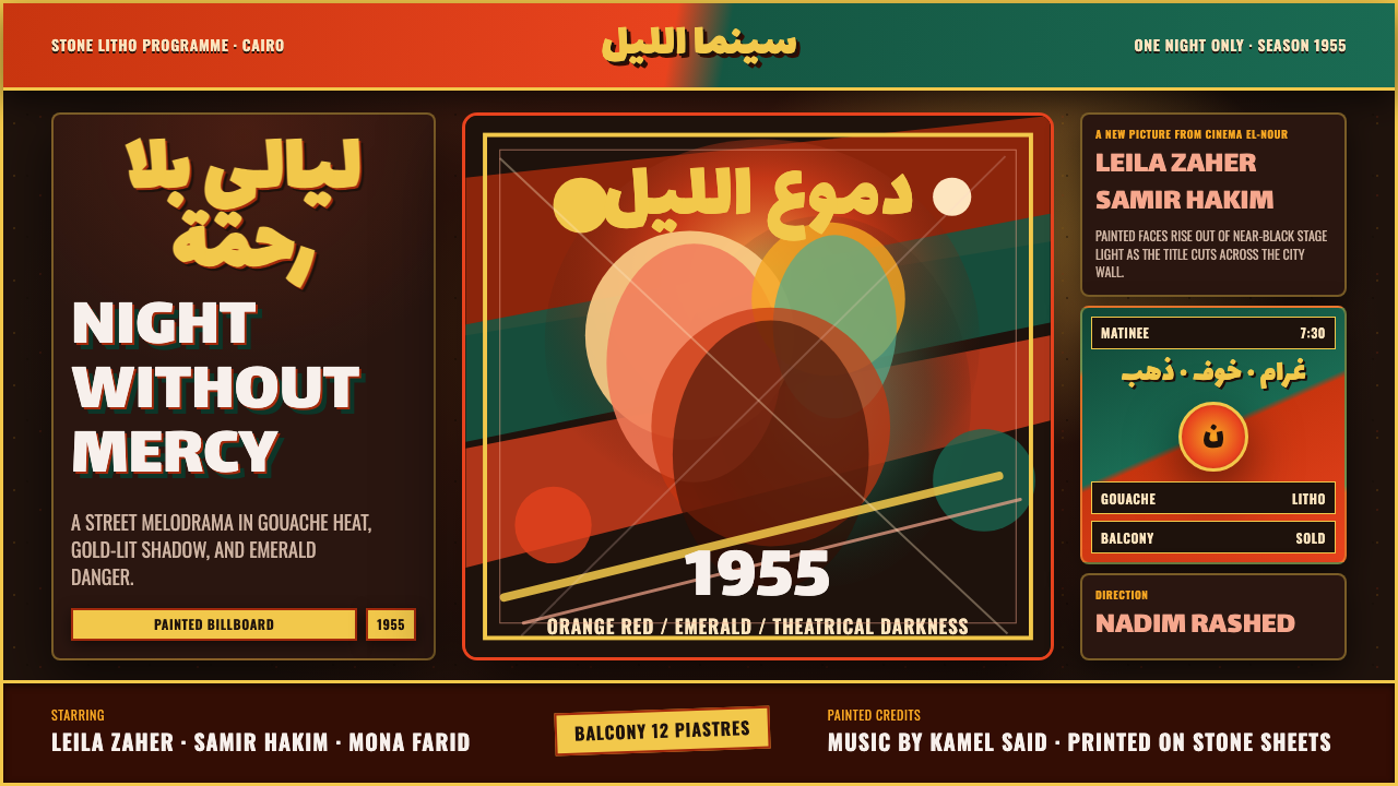
Egyptian film posters turned Cairo’s golden-age melodramas into painted public spectacle — faces blazing through darkness, ruq'ah titles in motion, and orange-red colliding with emerald.
Egyptian Film Poster (Cairo) in brief
Egyptian Film Poster is a visual style derived from the hand-painted cinema advertising that filled Cairo’s streets during the 1940s through the 1960s, when the city supported the world’s third-largest film industry. Designed to command attention at billboard scale, these posters translated cinematic melodrama into concentrated images: enlarged faces, charged expressions, theatrical darkness, urgent lettering, and saturated colors arranged for immediate emotional impact.
Its defining atmosphere comes from contrast. A near-black ground acts like a darkened theater, allowing spotlit faces and painted gestures to emerge with unusual intensity. Orange-red supplies heat, danger, desire, or confrontation, while emerald creates a cool but equally forceful counterweight. Neither color behaves as a polite accent. Their collision is part of the drama, making the composition feel emotionally divided even before the viewer understands its characters.
Typography is not detached from the image. Swirling ruq'ah Arabic titles behave like painted action, sweeping across portraits and shadows with the energy of a performer’s gesture. Gouache gives faces, clothing, and light a visibly handmade character, while stone-lithographic reproduction preserves the poster’s broad tonal divisions and public scale. The result is neither restrained modernism nor naturalistic illustration: it is cinema condensed into a single, confrontational surface.
Where does Egyptian Film Poster (Cairo) come from?
The style belongs to Cairo’s golden age of cinema, broadly spanning the 1940s to the 1960s, with the supplied visual referent centered around the middle of that period. Film production operated at extraordinary scale: Cairo was home to the world’s third-largest film industry. Its movies required an equally visible public language, and the city’s streets became exhibition spaces where large poster sheets announced stories through painted faces, titles, and scenes of heightened emotion.
These advertisements were made within a hand-painted poster tradition rather than assembled from polished photographic publicity alone. Illustrators worked in gouache, a medium suited to dense color, decisive highlights, and broad theatrical shadows. At billboard scale, subtle realism mattered less than emotional legibility. A face needed to remain expressive from across a street; a confrontation had to read through posture and color; a title had to enter the composition with the force of an image.
Stone-lithographic printing carried the paintings onto billboard sheets. That reproductive context reinforced the visual language described by the surviving material: strong silhouettes, saturated color regions, illuminated faces, and darkness organized as a substantial shape rather than an empty background. The printed poster was therefore both artwork and urban signal. Its purpose was not quiet contemplation but immediate recognition, anticipation, and emotional persuasion.
Artists such as Gasour and Vassiliou are identified with this Cairo poster culture. Their work exemplifies an image-making system in which melodrama governs every formal choice: scale enlarges emotion, spotlights separate protagonists from surrounding darkness, and incompatible colors intensify conflict. The contemporary Egyptian Film Poster style distills those recurring qualities without treating them as decorative nostalgia. Its real inheritance is the conviction that publicity can perform with the same theatrical force as the film it advertises.
What defines the Egyptian Film Poster (Cairo) look?
Color Conflict
Orange-red and emerald form the signature opposition. The warm color brings bodily heat and urgency; the green answers with a colder, equally saturated presence. They should meet visibly rather than dissolve into a blended harmony. Near-black surrounds both, while occasional lighter passages belong chiefly to illuminated skin, lettering, or concentrated highlights. Color functions as emotional casting: it tells the viewer where attraction, danger, and conflict reside.
Theatrical Darkness
The ground is not merely dark; it behaves like a stage after the house lights fall. Faces, hands, and fragments of costume emerge selectively, leaving other areas submerged. This controlled visibility creates suspense and allows several portraits to coexist without requiring a literal shared setting. Darkness provides continuity, while spotlighted passages determine narrative rank. The composition should feel revealed by light, not evenly illuminated.
Ruq'ah Title Gesture
Ruq'ah Arabic lettering supplies movement as well as language. Its title strokes should feel written or painted into the scene, with turns and sweeps that answer the direction of faces and gestures. The lettering may cross dark space or press close to portraiture, but it remains a commanding shape. Supporting information stays quieter so that the principal title performs as the verbal equivalent of a dramatic entrance.
Spotlit Portraiture
Faces carry the narrative burden. They are enlarged, emotionally explicit, and separated from darkness by concentrated highlights rather than gentle ambient light. A principal face may dominate while secondary figures appear smaller or less fully revealed, establishing a cast hierarchy at a glance. Expression matters more than anatomical neutrality: the poster promises love, suspicion, fear, or confrontation through the intensity of eyes, brows, and turned profiles.
Painted Surface
The gouache origin should remain perceptible. Color arrives in decisive masses, highlights feel brushed on, and transitions retain the compression of a painted poster rather than the seamless polish of a photograph. This handmade quality is not casual roughness. It is controlled exaggeration serving distance and scale. Texture supports the image’s emotional temperature, but must never become so busy that faces or titles lose their immediate readability.
Billboard Composition
Every major element is designed to survive public distance. The title, principal face, and dominant color opposition establish a rapid reading sequence; minor credits and scene fragments occupy subordinate zones. Overlap is useful because it compresses several strands of melodrama into one field, but the focal order must remain unmistakable. The best compositions feel crowded with consequence, not crowded with unrelated detail.

Who shaped Egyptian Film Poster (Cairo)?
Gasour is named among the illustrators associated with Cairo’s hand-painted film-poster tradition. In the supplied account, the artist represents a practice built around gouache, billboard scale, and melodramatic concentration: illuminated faces emerge from theatrical darkness while saturated colors turn emotional conflict into immediate public imagery. Gasour’s relevance to the style lies in this union of painterly performance and commercial communication.
Vassiliou is likewise identified with the illustrators who gave golden-age Egyptian cinema a painted street presence. The name stands within a poster culture that treated publicity as spectacle rather than neutral documentation. Faces, shadows, Arabic title brushwork, and opposing saturated colors were organized to project across a city street, turning the emotional promise of a film into a single large and forceful composition.
The broader tradition also depended on the hand-painted poster practitioners whose individual names are not supplied here. Collectively, they transformed Cairo’s film production into an urban visual environment during the 1940s through the 1960s. Their shared craft established the style’s durable grammar: gouache portraiture, stone-lithographic billboard sheets, near-black theatrical space, animated ruq'ah titles, and color contrasts powerful enough to communicate melodrama before a passerby knew the plot.
How do you use Egyptian Film Poster (Cairo) today?
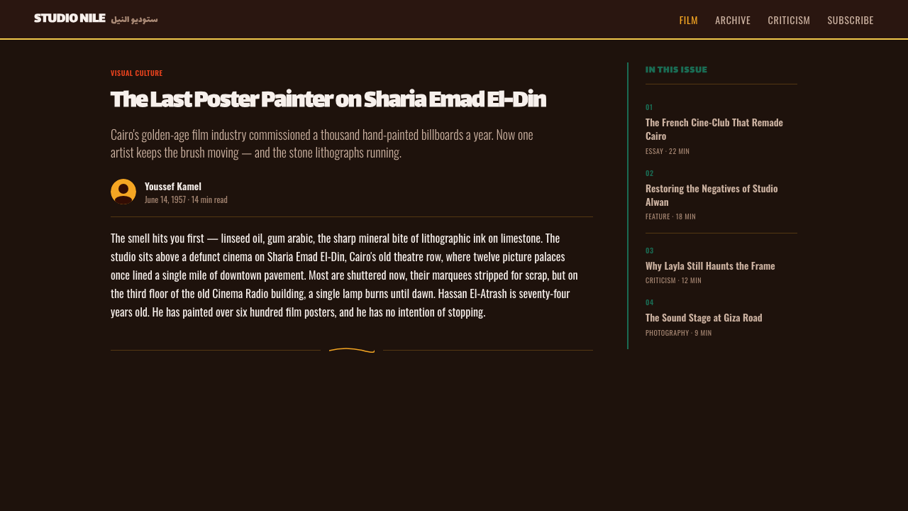
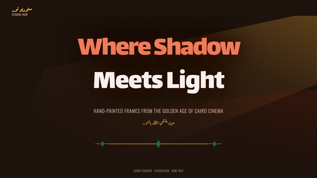
For presentation covers, the style works best when it behaves like a film announcement rather than a decorated title page. Place one dominant portrait or tightly cropped face against near-black, reveal it with a concentrated spotlight, and let an orange-red or emerald field establish the emotional key. The title should enter as a large ruq'ah-inspired gesture, with supporting information held back. The cover must be understandable from across a room, preserving the billboard logic of the source.
Content slides need more restraint without losing theatrical hierarchy. Use darkness as a continuous field, reserve illuminated areas for the central argument, and treat each section heading as a compact title event. A secondary portrait, painted object, or colored sweep can establish mood, but body information should occupy calmer regions. For data slides, charts should inherit the poster’s dramatic opposition: one dominant series in orange-red, a competing series in emerald, and quieter supporting marks against the dark ground. Emphasis should follow the story in the data, not distribute color evenly.
In web interfaces, Egyptian Film Poster is most convincing on entertainment dashboards, catalog views, and pricing or membership pages that can support a cinematic voice. Use the near-black ground to unify panels, spotlight selected content with painted imagery, and reserve the opposing saturated colors for meaningful states or tier distinctions. Navigation and controls must remain legible and stable; the expressive title treatment belongs to major headings, not every label. A pricing page can frame tiers like a cast, with one leading offer receiving the strongest light and color contrast.
Editorial and marketing layouts benefit from the style’s ability to compress narrative. An article opener can pair a large painted face with a sweeping Arabic title and a narrow introduction emerging from darkness. Campaign pages can alternate intense poster-like scenes with quieter reading passages, allowing the audience to recover between emotional peaks. Calls to action should appear as decisive color events rather than decorative badges. Cropped portraits, scene fragments, and brushlike lettering can recur across a campaign, provided their hierarchy changes with the message.
The common mistake is to confuse melodrama with indiscriminate excess. Filling every region with faces, brush texture, bright color, and oversized lettering destroys the spotlight logic that gives the style its force. Another error is using orange-red and emerald as fashionable accents without staging a meaningful conflict between them. Begin with darkness, decide which face or message must emerge, and allow the remaining elements to support that revelation. The style succeeds through concentrated intensity, not constant visual shouting.
Egyptian Film Poster (Cairo) — FAQ
Is Egyptian Film Poster style simply a dark retro cinema theme?
No. Darkness and historical atmosphere are only the setting. The style’s deeper structure comes from Cairo’s hand-painted publicity culture: billboard-scale hierarchy, gouache portraiture, ruq'ah title brushwork, theatrical spotlights, and the confrontation between orange-red and emerald. A generic dark layout with film grain or nostalgic decoration may suggest old cinema, but it lacks the painted emotional staging that makes this tradition distinct.
Why are faces so dominant in the composition?
Because the poster must communicate melodrama rapidly and at public distance. An enlarged, spotlit expression can promise romance, fear, betrayal, or confrontation before the viewer reads supporting information. Several faces can also imply relationships without depicting a complete scene. Their differences in scale and illumination establish narrative hierarchy: the most visible face feels like the protagonist, while partially submerged portraits suggest rivals, witnesses, or emotional complications.
Must every design use both orange-red and emerald?
The opposition is a defining feature of the supplied style, but both colors need not occupy equal territory. One can dominate a face, title, or garment while the other appears as a concentrated counterforce. What matters is perceptible tension, not balanced distribution. If both colors are spread everywhere, their dramatic relationship weakens. Near-black space should remain substantial enough for each saturated passage to feel like an event.
Can photography replace hand-painted portraiture?
Photography can provide source imagery, but an untreated photograph usually feels too continuous and observational for this visual system. The poster tradition depends on painted selection: highlights are concentrated, shadows become large theatrical masses, expressions are clarified, and color is organized for emotional force. A photographic adaptation should therefore preserve that selective logic, making the image feel staged and pictorial rather than merely placing a conventional publicity still on a dark background.
Where does the style work poorly?
It struggles where neutrality, prolonged reading comfort, or quiet procedural clarity is the primary goal. Dense administrative tools, documentation-heavy products, and interfaces requiring many equally weighted controls can be overwhelmed by theatrical hierarchy and saturated conflict. The style is strongest when a design has a protagonist, a decisive message, or an emotional sequence. Where everything must remain equally calm and available, its spotlight logic has little useful work to do.
Related design styles
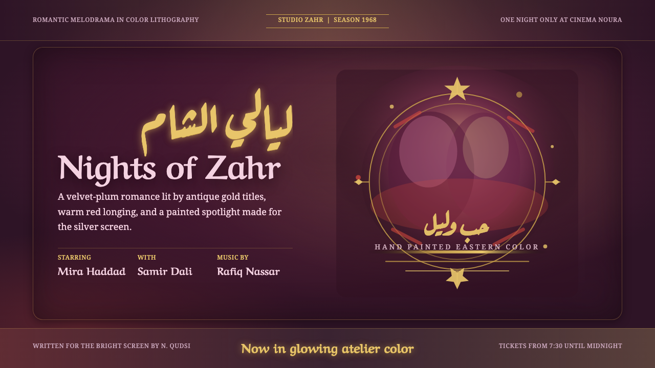 Damascus Cinema PosterGlows like hand-painted cinema. Plum ground, gold Ruqaa title, red spotlight…
 Lebanese Film PosterMelodrama at full volume. Lurid crimson and hot yellow on marquee black, slab…
 Polish Cyrk Circus PosterPainterly state-circus maximalism. Vermilion and circus yellow blaze from nea…
 Kustom Kulture PinstripeGarage baroque burns hot. Rye woodtype, black lacquer, gold hairlines, flame…
 Telugu Tollywood PosterMythological marquee maximalism. Crimson over maroon, gold-outlined Telugu di…
 Beirut Golden-Age PosterFestival glamour after dark. Midnight blue carries foil-gold type and magenta…