What is Kustom Kulture Pinstripe?
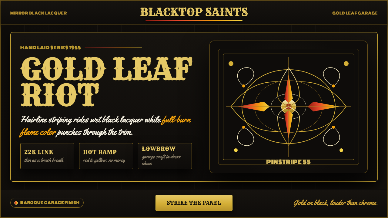
Kustom Kulture pinstriping is hot-rod garage art turned baroque — hairline gold strokes and full-throttle flame gradients laid straight onto mirror-black lacquer.
Kustom Kulture Pinstripe in brief
Kustom Kulture is the visual language of the post-war Southern California hot-rod scene: the sign-painter's craft of pinstriping — thin, freehand, flowing lines of paint or gold leaf — pushed past decoration into a full aesthetic system. It is lowbrow by pedigree (garage work, county-fair sideshows, biker culture) and baroque by instinct: asymmetric, ornate, layered, and unapologetically excessive.
The signature move is contrast at maximum voltage. A hairline gold stroke, laid in real metal leaf, curls and whips across a ground of deep, glossy, near-black lacquer — the kind of surface a car body has after a dozen coats of nitrocellulose and hand-rubbing. Flames run the full combustion cycle in a single gradient, from hot red through orange into yellow, always at full saturation, never muted or dusty. Nothing here is restrained; the restraint of a Bauhaus grid or a Swiss typographic system is the opposite instinct from what Kustom Kulture is doing.
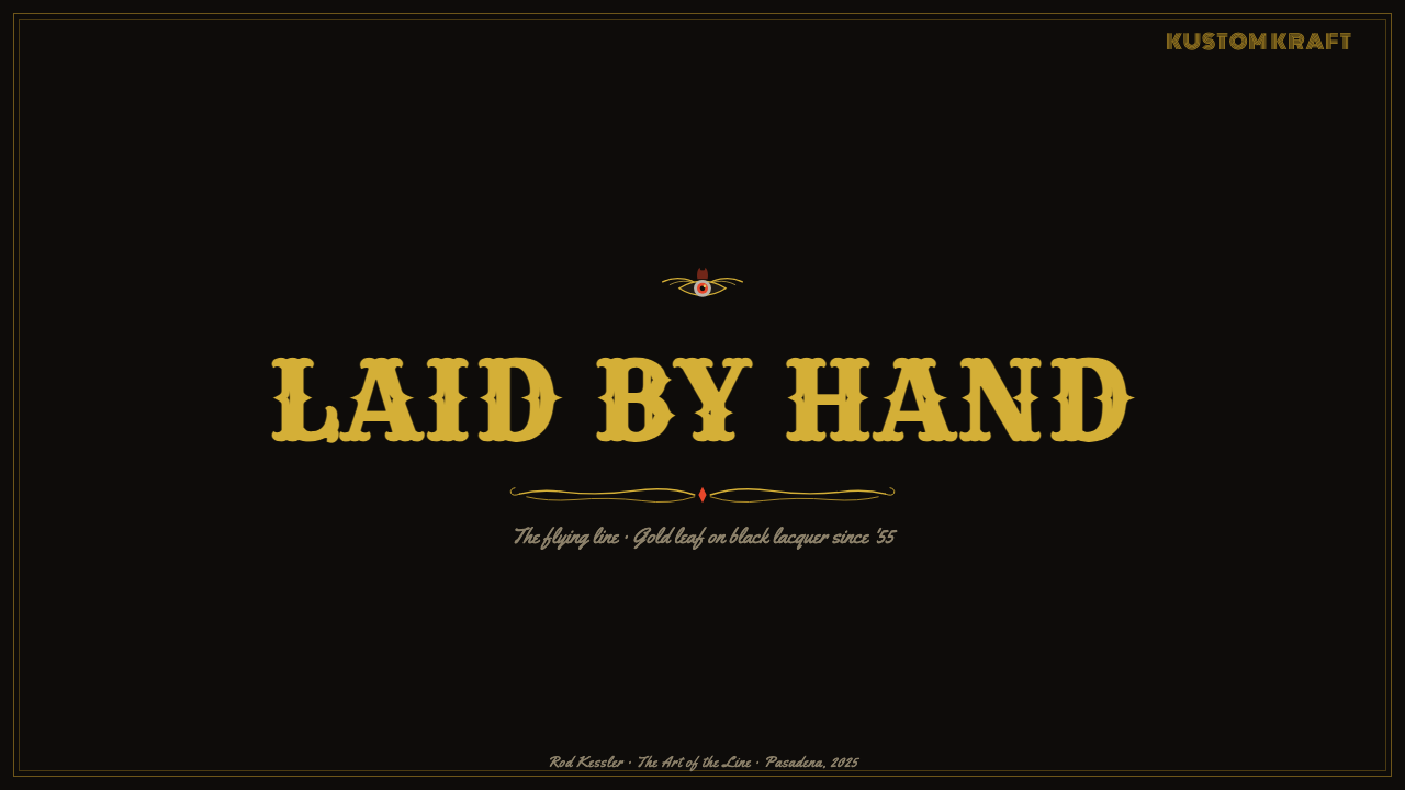
Where a modernist system removes ornament to reveal structure, Kustom Kulture piles ornament on top of structure until the structure is a rumor. Flying lines wrap fenders the way scrollwork wraps a circus wagon. Motifs like the flying eyeball and the monster skull sit alongside the pinstripe not as illustration bolted onto a layout but as if they had grown out of the same brushstroke. The whole system reads as wet — freshly lacquered, still catching light — even when reproduced flat on a page or a screen.
Where does Kustom Kulture Pinstripe come from?
The craft that Kustom Kulture is built on — pinstriping — long predates hot rods. Sign painters and coach painters had used thin freehand lines to finish carriages, fire engines, and shopfronts for well over a century, using the stripe both to hide a seam or panel joint and to add a flourish a factory finish could never achieve. What changed after the Second World War was the canvas: instead of a stagecoach or a delivery wagon, the stripe went onto a chopped, channeled, lowered automobile built by a young ex-serviceman with surplus parts, spare time, and a point to prove.
The figure who fused the old sign-painting trade with the new car culture was Von Dutch — Kenneth Howard — who worked in the 1950s Southern California hot-rod scene laying pinstripes and flame jobs directly onto glossy black nitrocellulose lacquer, freehand, using real 22–23 karat gold leaf rather than paint for his finest lines. Dutch treated the car body itself as the only acceptable canvas; his work was struck straight onto the metal rather than sketched on paper first, which is part of why the style still reads as immediate rather than planned. He is also credited with popularizing the 'flying eyeball' motif that became one of the movement's recurring emblems.
Alongside Von Dutch, figures like Ed 'Big Daddy' Roth and Dean Jeffries pushed the visual world outward from the pinstripe itself into monster caricatures, custom show cars, and the wider iconography of the hot-rod fairground — a scene that ran from garages and drag strips into car shows and biker gatherings, and eventually into mainstream novelty culture through the 1960s. What had started as a practical trick of the sign-painter's trade became a subcultural aesthetic prized precisely because it looked hand-done and impossible to mass-produce.
Kustom Kulture's influence kept expanding for decades after its 1950s origin, resurfacing through the 1970s custom-van boom and the 1990s lowbrow art movement that canonized Roth's monster illustrations and Von Dutch's pinstripe work as fine-art-adjacent artifacts rather than mere garage ephemera. The style's home has always stayed the same, though: the American hot-rod garage and its glossy black paint jobs.
What defines the Kustom Kulture Pinstripe look?
Color
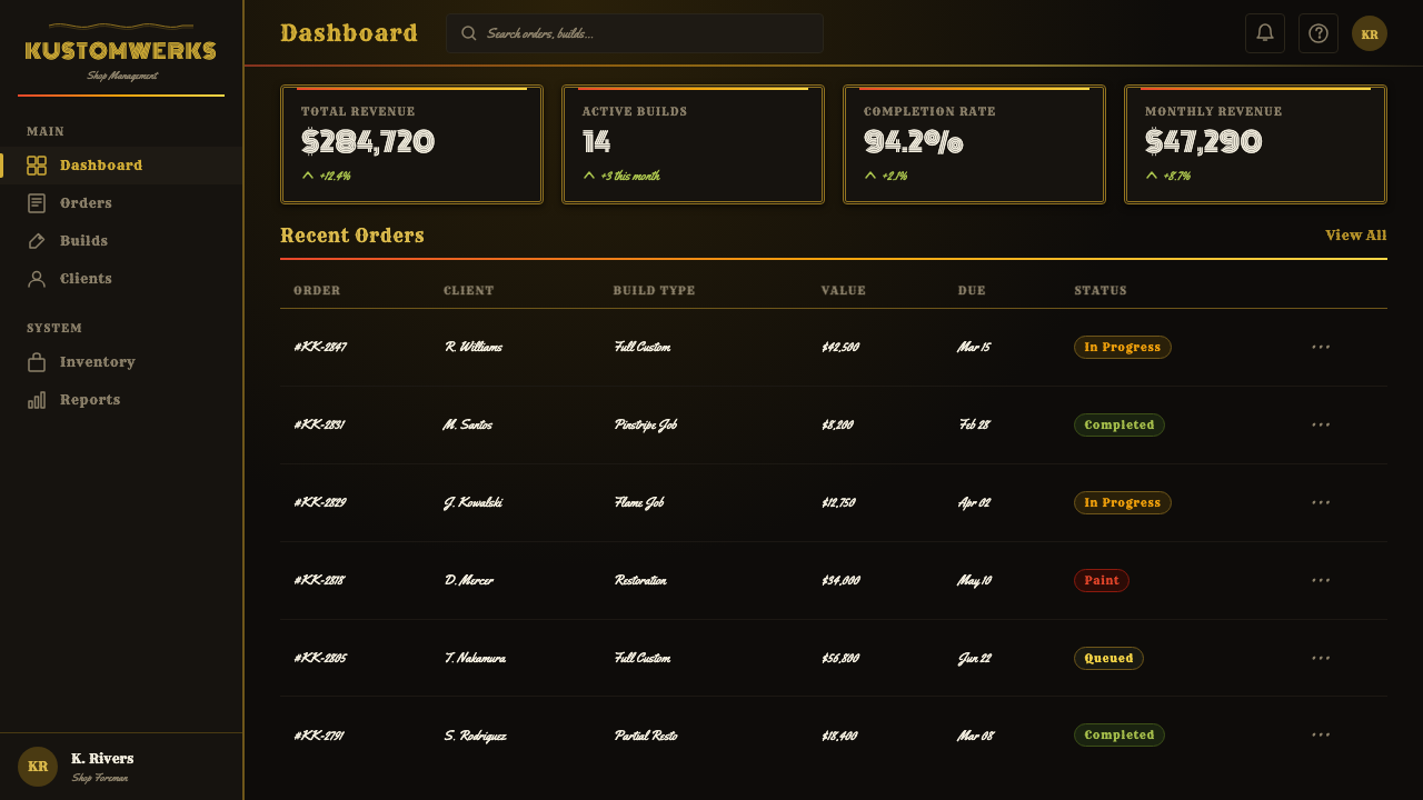
The ground is a deep, glossy near-black — the color of a freshly lacquered car body, not a flat print black. Against it, gold reads as a precise, metallic hairline rather than a flat yellow-brown; the contrast between the two is the entire foundation of the palette. Flame passages are the one place saturation runs loose: red, orange, and yellow blend across a single continuous gradient meant to read as heat rather than as three flat colors sitting side by side.
Line and Stroke
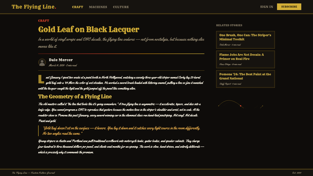
The pinstripe itself — a continuous, tapering, freehand line — is the signature mark of the entire system. It never runs at a constant width; it swells and narrows the way a loaded brush naturally does, curling back on itself in long, confident sweeps rather than following a ruled path. This is the one place the system insists on evidence of the hand: a line that looks machine-drawn or perfectly uniform reads as a betrayal of the craft.
Flame Gradients
Flames are treated as a single combustion event compressed into a gradient, always moving from red at the root through orange to yellow at the tip, echoing the way a real flame looks hottest at its core and cools toward its edge. The flame shapes themselves are pointed, licking, and asymmetric — they never repeat as a stamped pattern, which is part of what keeps the motif reading as fire rather than as decorative stripes.
Ornamental Motifs
Recurring emblems — the flying eyeball, monster skulls, winged and grinning creatures — sit at the same visual register as the pinstripe scrollwork around them, rather than as separate illustrations dropped onto a background. They are drawn with the same loaded, confident line quality as the stripe itself, so a skull's outline and the flourish curling away from it feel like the same gesture, not two different design passes.
Surface and Sheen
The ground is never treated as matte or flat. It carries the implied sheen of many coats of hand-rubbed lacquer — a surface that catches and bends light rather than absorbing it evenly. Even in a static, two-dimensional composition, the black ground should suggest depth and reflection, as if a viewer could see a distorted highlight sliding across it, rather than reading as a plain, uniform fill.
Composition and Asymmetry
Layouts favor asymmetric, flowing arrangements over any grid-like structure. A composition typically has a dominant sweep — one long stripe or flame passage establishing the direction of movement — with secondary motifs clustered and layered around it rather than distributed evenly. Balance comes from visual weight and motion, not mirrored or evenly spaced elements; the eye is meant to follow the line's path the way it would follow a stripe painted around the curve of a fender.
Woodtype and Script Lettering
Headline lettering draws on two distinct hands: heavy, condensed woodtype letterforms — the kind cut for nineteenth-century circus and fairground posters — for blunt statements, and loose, connected brush-script for anything that needs to feel hand-signed. The two are never blended into a single letterform family; a composition picks one register per passage, the way a real garage sign might mix a bold shop name with a looser, more personal signature line beneath it.
Who shaped Kustom Kulture Pinstripe?
Von Dutch is the figure most directly credited with fusing sign-painter pinstriping with hot-rod culture in 1950s Southern California, working freehand directly onto glossy black lacquer car bodies and reserving real 22–23 karat gold leaf for his finest lines. He treated the car itself as the only legitimate canvas — never sketching on paper first — which is a large part of why the style still reads as immediate and unrepeatable rather than templated. He is also credited with popularizing the flying eyeball motif that recurs throughout the movement's iconography.
Roth expanded the Kustom Kulture visual world outward from the pinstripe into monster caricature and custom show-car design, becoming one of the movement's most recognizable public faces through the 1960s hot-rod show circuit. His grinning, exaggerated monster illustrations helped define the cartoonish, slightly menacing character work that sits alongside pinstriping and flame motifs in the broader style, and his show cars carried the aesthetic beyond the garage and into mainstream novelty culture.
Jeffries worked alongside the same 1950s–60s Southern California custom-car scene, contributing to the wider hot-rod fairground iconography that pinstriping and flame work belonged to. His presence in the movement's core circle underscores that Kustom Kulture was never a solo act but a small, tight scene of painters and builders working in close proximity, trading techniques and pushing the same visual vocabulary across different cars and different shops.
How do you use Kustom Kulture Pinstripe today?
Kustom Kulture is a high-voltage, maximalist style, and applying it well means resisting the urge to tame it into something quiet. The system depends on contrast running at full intensity — deep glossy black against precise metallic gold, cool structure against hot flame gradient — and diluting any half of that pairing collapses the whole effect into a generic 'grunge' or 'rockabilly' look rather than the specific, hand-painted intensity the style is built on.
For presentation covers, the style rewards a bold, near-black field with a single sweeping gold or flame element used as the dominant compositional gesture — one long stripe curling across the frame — rather than scattering multiple ornamental motifs evenly across the slide. Content and data slides are the harder case: keep data containers plain and dark, and reserve the pinstripe and flame vocabulary for section dividers and headline treatments rather than trying to decorate the data itself.
For web interfaces, the style is a strong fit for dashboards and pricing pages aimed at an enthusiast or subcultural audience — automotive, motorcycle, tattoo, or garage-adjacent brands — where a near-black interface with gold hairline dividers and flame-gradient accents on key actions reads as authentic rather than costume. It is a poor fit for anything that needs to read as calm, trustworthy, or corporate; the style's intensity works against those goals.
For editorial and marketing work, Kustom Kulture suits feature stories and promotional material where a garage or custom-car sensibility is the actual subject rather than a borrowed skin. Pull quotes can use the brush-script hand for a personal, hand-signed feel, while primary headlines lean on the heavier woodtype register; flame-gradient rules work well as section markers precisely because they are meant to look painted, not printed.
The most common mistake is treating this as a generic 'tattoo flash' or 'grunge' style and reaching for cracked textures or muddy desaturated color instead of the specific pairing this system depends on: wet, glossy near-black, precise metallic gold hairlines, and full-saturation flame gradients. A second common error is over-populating a composition with motifs at equal weight — several skulls, several flame bursts, several scrollwork flourishes all competing — when authentic Kustom Kulture work almost always has one dominant sweeping gesture that everything else defers to.
Kustom Kulture Pinstripe — FAQ
What is the difference between Kustom Kulture and generic 'tattoo flash' style?
Tattoo flash traditionally lives on paper — flat sheets of pre-drawn designs meant to be chosen and transferred onto skin. Kustom Kulture originates on the car body itself, with the pinstriper working freehand directly onto glossy lacquer, and its defining contrast — precise metallic gold against a deep, wet-looking near-black ground — is specific to that automotive origin. The two share some motifs and emerged from overlapping circles, but Kustom Kulture's core signature is the pinstripe line and the flame gradient, neither central to flash sheet design.
Can Kustom Kulture work on a light background?
It is possible but works against the style's origin. The near-black ground is not an arbitrary choice — it evokes the glossy nitrocellulose lacquer of a 1950s custom car body, and the gold hairline only reads as precise and metallic when it has that deep, reflective darkness to cut across. On a light ground, the same gold line loses its contrast advantage and starts to read as a plain mustard-yellow squiggle, and flame gradients lose the glow-against-darkness that makes them read as heat. A light-ground variant is best treated as a rare accent within an otherwise dark composition, not as the default.
Why does the pinstripe line have to vary in width rather than stay uniform?
The varying width is direct evidence of a loaded brush moving under hand pressure — thinner where the brush lifts and turns, thicker where it presses and sweeps. This is the one structural signature that separates authentic Kustom Kulture linework from a vector-drawn imitation: a perfectly uniform stroke, however gold or however elegant its curve, reads immediately as digital rather than hand-struck, because real pinstriping brushes physically cannot maintain constant width through a sweeping curve. The variation is not a stylistic flourish layered on top — it is the mark of the craft itself.
Does the flame motif always need to be a full red-orange-yellow gradient?
The full gradient is the canonical form because it mirrors how a real flame actually looks — hottest and reddest at its root, cooling toward yellow at the licking tip — and it is this specific temperature logic that makes the motif read as fire rather than as a striped decorative pattern. A flame rendered in a single flat color, or in colors outside the red-to-yellow combustion range, tends to lose that reading entirely and becomes closer to generic decorative scrollwork. The gradient is doing representational work, not just adding visual richness, which is why it should be treated as close to non-negotiable within this system.
What kinds of products or brands does Kustom Kulture struggle to fit?
The style struggles anywhere calm trustworthiness, corporate neutrality, or broad mainstream approachability is the goal — enterprise software, financial services, healthcare, children's products, or any brand that needs to read as safe and unremarkable. Its intensity, its subcultural garage origin, and its deliberately hand-made irregularity all work against those contexts. It is strongest where an automotive, motorcycle, tattoo, or lowbrow-adjacent audience is the actual target and authenticity to that scene matters more than broad palatability; used outside that context, it tends to read as costume rather than identity.
Related design styles
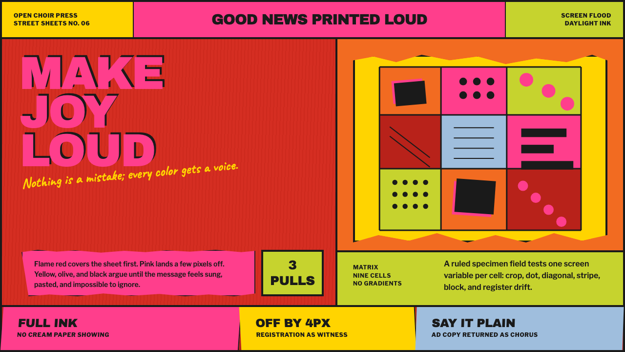 Corita Kent SerigraphJoy printed at full volume. Flame red, hot pink, and misregistered type flood…
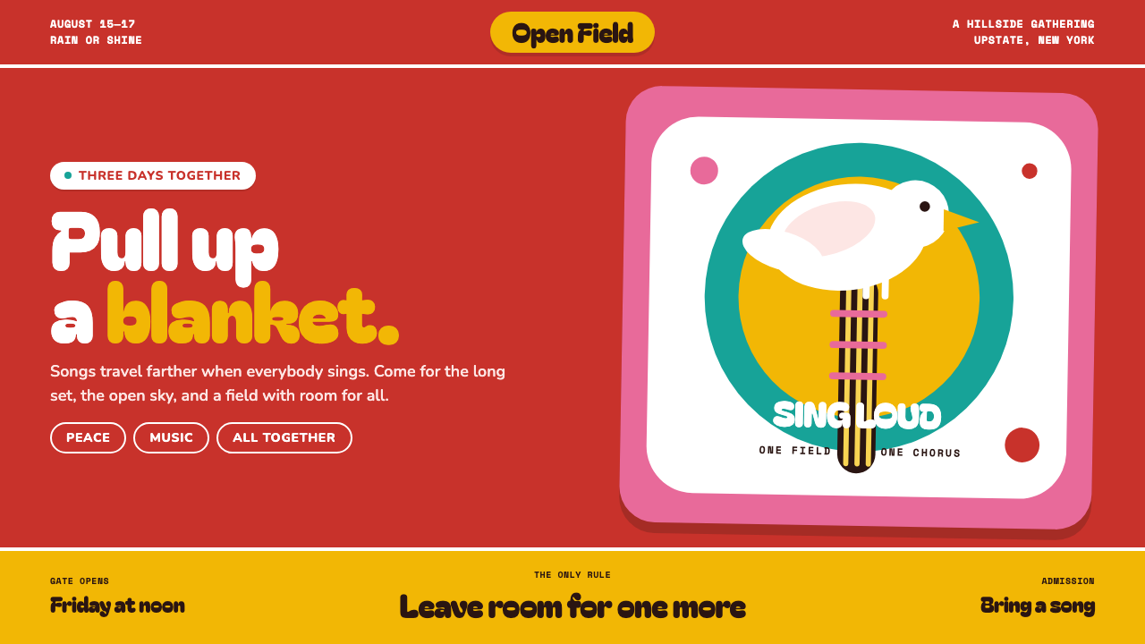 Woodstock (1969)Peace goes poster-loud. Vermilion ink, plump white forms, and bulging hand-cu…
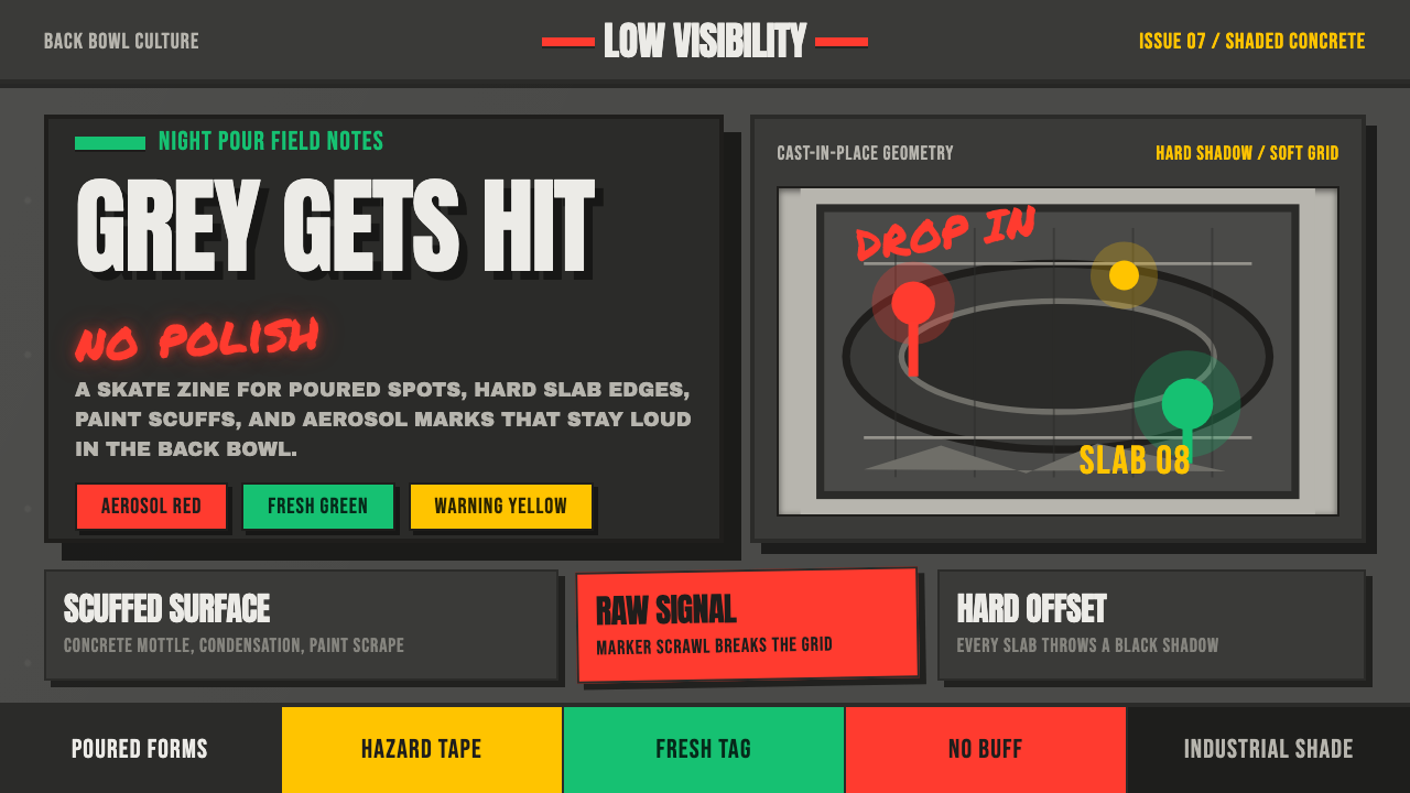 Concrete SkateparkRaw concrete detonates. Grey slab blocks carry red, green, and warning-yellow…
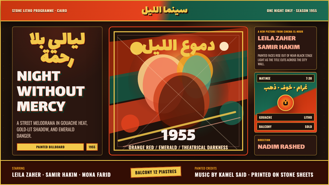 Egyptian Film Poster (Cairo)Melodrama at billboard scale. Near-black ground, ruq'ah titles, orange-red ag…
 Highlife Record SleevePrint it loud. Hot orange fields and fat slab type keep the sleeve gloriously…
 Osaka Love Hotel NeonReads only in the dark. Hot-pink neon tubing blooms over wet plum-black aspha…