What is Lowrider Candy Paint?
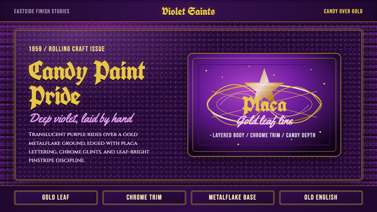
Lowrider candy paint turns a car body into a jewel — translucent color poured over metalflake so the surface has depth you can fall into, finished with hand-lettered pride.
Lowrider Candy Paint in brief
Lowrider Candy Paint is the visual language of Chicano car culture: a translucent jewel-toned finish laid over a metalflake base, so the paint has genuine optical depth rather than a flat, opaque color. Purple is the signature hue, though the same technique appears in candy red, candy gold, and other jewel tones — the point is never the specific color but the sensation of looking into the surface, not just at it.
Over that lacquered depth goes a second, entirely different layer of craft: gold-leaf pinstriping traced by hand in continuous, confident lines, and lettering in a heavy blackletter style — locally called placa — used for club names, dedications, and nicknames. Script names in a looser, cursive brushstroke often ride alongside the blackletter, softer and more personal where the placa is formal and declarative.
The whole style reads as maximalist and proud rather than restrained. Nothing about it apologizes for being loud, reflective, or ornamented — the chrome, the depth, the gold line work, and the lettering are all meant to be seen from a distance, in motion, under the sun, and to announce ownership and identity as clearly as any name on a jacket.
Where does Lowrider Candy Paint come from?
Lowriding took shape in the barrios of East Los Angeles in the years after the Second World War, as Mexican-American veterans and young Chicanos returning to civilian life began modifying cars in a way that ran directly against the era's dominant hot-rod culture. Where hot-rodders stripped weight and raised cars for speed, lowriders did the opposite: they dropped the suspension so the frame rode inches off the pavement, favoring visibility and style over velocity. The credo that circulated in car clubs — 'low and slow' — was itself a rebuttal to a car culture built around going fast.
That inversion was not just mechanical, it was cultural. Lowriding emerged alongside the Chicano civil rights movement of the 1960s and 1970s, and the cars became rolling declarations of identity at a moment when Mexican-American communities were asserting pride in the face of discrimination. A car cruising slowly down a boulevard, dropped low, covered in hand-applied ornament, was a deliberate act of visibility — the opposite of blending in.
Two technical innovations made the full style possible. Hydraulic suspension systems, adapted from surplus aircraft parts starting in the late 1950s, let owners raise and lower a car at will — solving the practical problem that a permanently lowered frame scraped on uneven road surfaces and, not incidentally, giving rise to the hopping and dancing competitions that became a fixture of lowrider car shows. Candy paint itself became achievable at scale once companies like House of Kolor began manufacturing translucent candy toners and metalflake specifically for the custom automotive trade, giving backyard and small-shop painters access to a jewel-depth finish that had previously required improvised, unreliable techniques.
By the 1970s and 1980s, car clubs across East LA and beyond had turned this into a mature, competitive craft tradition — with pinstripers, letterers, and painters developing reputations the way tattoo artists or sign painters do, each car a showcase piece built to be judged at club meets and street cruises alike. The style has never been static: later decades folded in additional chrome, deeper hydraulics setups, and more elaborate mural work, but the core grammar — candy over metalflake, gold line work, blackletter placa — has remained the signature of the tradition since its golden age.
What defines the Lowrider Candy Paint look?
Color
Color here is built in layers, not mixed flat. A reflective metalflake base sits underneath, and a translucent jewel-toned lacquer — most iconically a deep violet-purple — goes over it, so light passes through the color and bounces back off the flake beneath. The effect shifts with viewing angle and light: the same panel can read as a near-black plum in shade and an electric violet in direct sun. Gold appears constantly, but always as an accent — leaf, pinstripe, or lettering fill — never as a broad background.
Surface Depth
The defining sensation of the style is depth you can look into rather than a color you look at. This is achieved entirely through material layering — metalflake, translucent candy toner, clear lacquer — rather than through any flat graphic effect. When this style is translated to a two-dimensional or digital surface, the goal is to suggest that same layered, glassy depth: richness and glow rather than a single flat fill, with highlights that feel like they are coming from beneath the surface rather than sitting on top of it.
Blackletter Placa
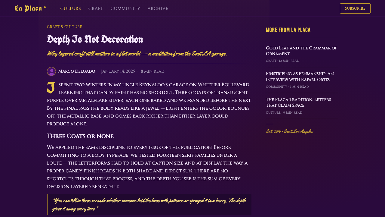
The lettering system called placa uses a dense, heavy blackletter style — the same visual family associated with Old English lettering — reserved for club names, dedications, and formal declarations of identity. It is drawn with confident, unbroken strokes, usually outlined in a contrasting thin line, and its weight and angularity are meant to project permanence and gravity. This is a hand-lettering tradition, not a typeface pulled from a menu — every placa carries the individual hand of the letterer who drew it.
Gold Pinstriping
Pinstriping is applied entirely freehand, in continuous sweeping lines that trace panel edges, frame lettering, or run independently as decorative flourishes — pinstripers traditionally work with a long-haired brush rather than tape or a ruler, and the slight organic waver in a hand-drawn line is part of its authenticity, not a flaw to be corrected. Gold is the dominant metal, chosen to read as warm and precious against the cool jewel-tone paint beneath it, though silver striping appears as well. The line work always has a clear beginning, middle flourish, and taper — it behaves like a signature, not a border.
Chrome and Reflection
Chrome trim, wire wheels, and polished hardware are treated as essential to the composition, not afterthoughts — they are what catches and scatters light across the candy-painted surface and makes the depth effect legible from a distance. A candy-painted panel photographed or rendered without any reflective chrome nearby tends to look flat and loses much of its intended drama; chrome and mirror-bright metal are what supply the glints that prove the surface has depth in the first place.
Ornament Density
This is a maximalist tradition by design: a single vehicle typically carries multiple layers of ornament at once — pinstriping, lettering, sometimes mural work — all coexisting on the same candy-painted ground. Empty, undecorated space is not a value the style pursues; every surface is treated as an opportunity for craft. Restraint, when it appears, shows up as disciplined composition — line work that respects panel edges and lettering that sits in a considered spot — rather than as an absence of ornament.
Who shaped Lowrider Candy Paint?
Founded by painter Jon Kosmoski in Minnesota, House of Kolor became the company most responsible for turning candy paint from a fragile, improvised backyard technique into a reliable, widely available product line. Its translucent candy toners and metalflake bases gave custom painters — including the East LA shops central to lowrider culture — consistent, repeatable materials to achieve the deep jewel-tone finishes the style depends on, and the brand name is still used almost generically within the custom paint trade today.
Car clubs formed the social and competitive backbone of the entire tradition — organizations with names, colors, and membership rules that turned individual car ownership into a collective, reputational practice. Clubs organized the cruises and car shows where finished vehicles were judged, and club names are frequently the very words rendered in blackletter placa lettering on the cars themselves, making the club system and the visual style inseparable from one another.
A generation of largely self-taught pinstripers and letterers working out of small East LA custom shops developed and refined the freehand gold-line and placa lettering vocabulary, treating each commission the way a sign painter or tattoo artist would — building individual reputations car by car, passing technique informally from working alongside more experienced painters rather than through any formal school.
How do you use Lowrider Candy Paint today?
Lowrider Candy Paint transfers best into contexts that can support its density and its glow, because the style's entire identity rests on layered depth and hand-crafted ornament rather than restraint. Applying it well means treating color as something with an underlying surface to shine through, and treating lettering and line work as deliberate, individually placed craft elements rather than generic flourishes.
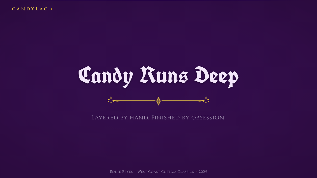
For presentation cover slides, the style rewards a bold, dark, jewel-toned field with a single strong point of gold linework or blackletter typography as the focal element — a title treated as if it were painted on rather than typed. Content and data slides should keep the deep candy-toned ground but simplify: let the jewel color and a hint of metallic sheen carry the mood while data visualizations use clean, high-contrast gold-on-dark or cream-on-dark marks so numbers remain legible against a richly colored background.
For web interfaces such as dashboards, the style is more demanding than most and works best in limited doses — a dark, glowing jewel-tone background for hero sections or brand moments, with functional UI elements (tables, forms, dense data) pulled back to simpler, higher-contrast treatments so usability doesn't fight the drama of the surface. Pricing pages can use the jewel-depth background effectively for a single hero panel or featured tier, with gold accenting the recommended plan the way pinstriping would trace a highlight panel.
For editorial and marketing work, the style is a natural fit for anything about craft, pride, heritage, or car culture itself — feature headers, cover art, and section dividers can carry the full richness of layered color, gold linework, and blackletter type, while body text should sit on a calmer, simplified ground so the ornament reads as a considered accent rather than visual noise competing with reading.
A common mistake is flattening the style into a single bright purple fill with a gold border — that discards the entire point, which is depth built from layers, not a flat color choice. A second common mistake is using blackletter or script type at small sizes for body text, where it becomes illegible; placa-style lettering belongs in headlines, titles, and dedications, exactly as it does on the cars themselves, never in dense paragraphs.
Lowrider Candy Paint — FAQ
Is candy paint the same thing as metallic paint?
No, though they're often confused. A standard metallic paint mixes reflective particles directly into an opaque color coat, producing a sparkle on top of a flat hue. Candy paint is a two-part system: a highly reflective metalflake base goes down first, and then a separate, translucent jewel-toned lacquer is sprayed over it. Light passes through that translucent top layer, bounces off the flake underneath, and comes back out — which is what produces the sensation of looking into the color rather than at a sparkly surface. It's a more laborious, multi-stage process, and that layered construction is exactly what gives lowrider candy paint its signature depth.
What is placa lettering, exactly, and where does the word come from?
In this context, placa refers to the heavy blackletter-style lettering used on lowriders to spell out club names, dedications, or personal nicknames — visually related to the Old English lettering family, but drawn freehand by a letterer rather than set from type. The word itself is Spanish and carries a broader meaning of 'plaque' or 'marker,' reflecting the lettering's function: it identifies and marks the car as belonging to a person or a club, the same way a plaque marks a building or a monument.
Why is purple the color most associated with this style, if the technique works with any hue?
Purple became the most iconic candy color partly because deep violet shows off the layered depth effect especially dramatically — it reads as near-black in shadow and vividly saturated in direct light, a wider range of apparent change than most other hues offer. It also became strongly associated with specific, influential show cars and car clubs whose vehicles were widely photographed and admired, which cemented purple as the color most people picture first. That said, the technique itself is color-agnostic — candy red, candy gold, candy green, and others are equally authentic applications of the same layered method.
Does this style require a dark background to work?
It strongly prefers one. The entire visual effect depends on translucent color reading as deep and glowing, and that reading requires enough surrounding darkness or contrast for the jewel tone to feel luminous rather than merely bright. Placed on a light or white ground, the same purple or red loses the sense of looking into a depth and simply reads as a saturated flat color, and the gold linework and blackletter lettering — designed to glint against a dark, reflective ground — lose much of their visual logic as well. This is a style built around darkness the way stained glass is built around light passing through it.
Is this style only appropriate for automotive-themed projects?
Automotive and car-culture subject matter is the most natural fit, but the underlying visual grammar — layered translucent color, gold accent linework, bold hand-lettered typography, a dark glowing ground — travels reasonably well to any project that wants to signal craft, pride, and heritage rather than corporate polish: music and nightlife branding, craft and maker-culture content, or any story about a specific cultural community expressing identity through decoration. It is a poor fit for contexts that call for calm, neutral, or minimal presentation, since the style's ornament density and saturation are central to its meaning, not incidental to it.
Related design styles
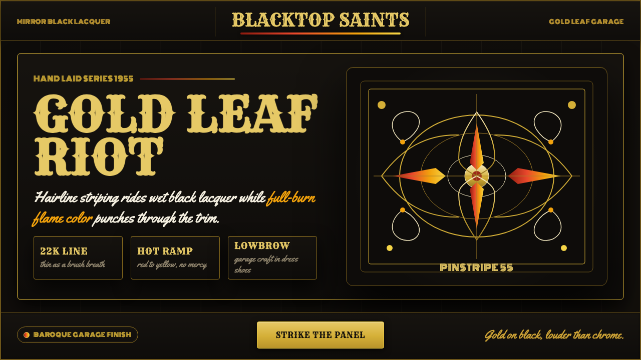 Kustom Kulture PinstripeGarage baroque burns hot. Rye woodtype, black lacquer, gold hairlines, flame…
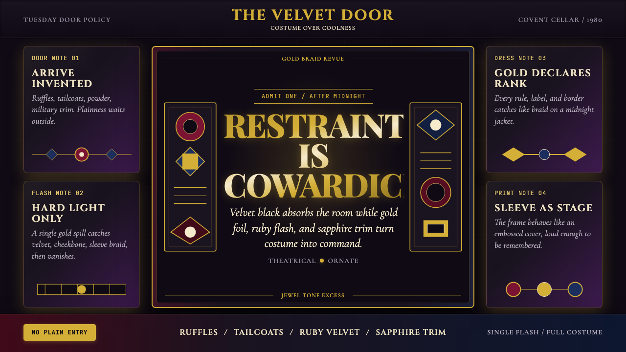 New Romantic Blitz (1980)Theatre outruns cool. Velvet black, gold foil serif, ruby and sapphire grid e…
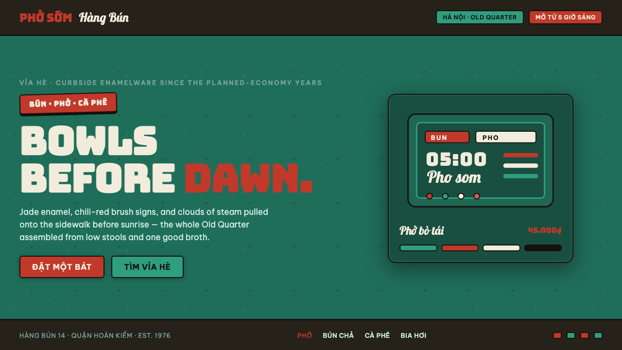 Phở Street-Stall EnamelHanoi's curbside noodle stall, systematized. Jade enamel ground, chili-red br…
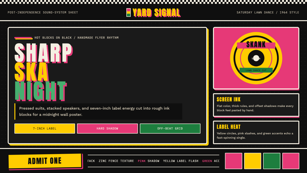 Rude Boy Jamaica Ska (1960)Street swagger hits hard. Hot pink and yellow blocks, checker trim, chunky ty…
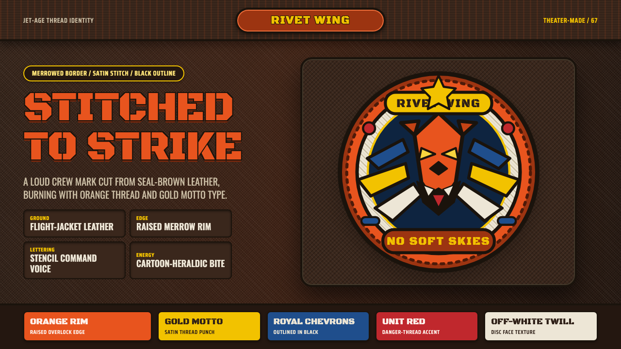 Squadron PatchStitched swagger. Orange merrow rims and stencil type burn over seal-brown le…
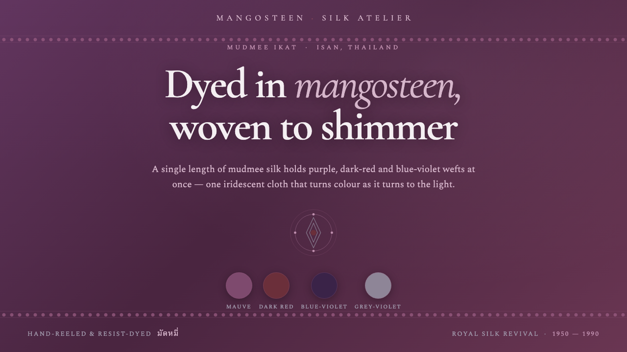 Thai Mangosteen SilkOne cloth, many colours. Mangosteen-dyed mauve ground, layered red and blue-v…