What is Wimbledon (Purple-Green)?什么是 Wimbledon (Purple-Green)?
Wimbledon's visual identity is 147 years of British ceremony compressed into regal purple, grass-court green, and hushed cream — a design language that feels less like branding and more like protocol.温布尔登的视觉身份是147年英国典礼感的压缩结晶——皇家紫、草场绿、静默的奶油白,这套设计语言读来不像品牌,更像一种礼仪规程。
Wimbledon (Purple-Green) in briefWimbledon (Purple-Green) 速览
Wimbledon's design language is the visual expression of lawn tennis's oldest and most ceremonious Grand Slam. Founded in 1877 at the All England Lawn Tennis and Croquet Club (AELTC) in the London borough of Merton, the tournament has maintained a consistent aesthetic identity for nearly a century and a half — one built on saturated regal purple, the vivid green of its grass courts, warm cream linen, and restrained gold accents. The result feels less like a designed brand system and more like an inherited heraldic canon.温布尔登的设计语言,是草地网球界最古老、最富典礼感的大满贯的视觉表达。锦标赛于1877年在伦敦默顿区的全英草地网球与槌球俱乐部(AELTC)创立,此后近一个半世纪始终保持着高度一致的视觉身份——以饱和的皇家紫、草场绿、温暖的奶油亚麻色和克制的金色点缀为核心构成。整体感觉不像是一套被设计出来的品牌系统,更像是一套世代相传的纹章规范。
Where many sports brands chase modernity, Wimbledon moves in the opposite direction: continuity is the value. The all-white player dress code — strictly enforced since the Victorian era — is mirrored in the visual system's preference for clean grounds, unhurried spacing, and a palette that never shouts. Serif type carries the identity's weight; a roman letterform with inscriptional gravity handles display duties, while a refined editorial serif handles running text. Gold filigree dividers and bordered panels reinforce the sense of a tournament that considers its own history a living document.当许多体育品牌追逐现代感时,温布尔登走向相反的方向:延续性才是核心价值。球员的全白着装规定——自维多利亚时代严格执行至今——在视觉系统中同样有其镜像:干净的底面、从容的间距、一套从不喧哗的色板。衬线字体承担着视觉身份的重量——带有铭文气质的罗马体处理展示级别的文字,精炼的编辑衬线体承担正文段落——金色细线分隔符和带边框的面板强化了一种感觉:这是一项将自身历史视为活文献的赛事。
The result is an aesthetic with a very specific emotional register: heraldic, ceremonious, hushed. It signals tradition rather than disruption, prestige rather than accessibility, and patience rather than urgency. Applied well, it confers authority on anything it touches — a scoreboard, a programme, a website header. Applied carelessly, it can tip into pastiche of English nostalgia. The discipline lies in understanding what the system is protecting, not just what it looks like.这套美学有着非常特定的情感频段:纹章式的、仪式性的、静默的。它传递的是传统而非颠覆,是声望而非亲和,是从容而非紧迫。运用得当,它能为所触及的任何事物赋予权威感——记分牌、赛程手册、网页头部。运用不慎,则会滑入对英式怀旧的模仿。这套系统的精髓在于理解它所守护的是什么,而不仅仅是它看起来是什么。
See the Wimbledon (Purple-Green) design system查看 Wimbledon (Purple-Green) 完整设计系统
Where does Wimbledon (Purple-Green) come from?Wimbledon (Purple-Green) 从何而来?
The All England Lawn Tennis and Croquet Club held its first Championship meeting in July 1877 — initially conceived as a fundraiser to repair a broken pony roller on the croquet lawn. Twenty-two men entered the singles draw; about two hundred spectators attended. The winner was Spencer Gore, a rackets player who had never previously competed seriously in lawn tennis. The prize was twelve guineas and a silver challenge cup. What began as a one-day club fixture would, over the following decades, evolve into the sport's most revered institution.全英草地网球与槌球俱乐部于1877年7月举办了首届锦标赛——最初只是为了筹款修缮槌球场上一台坏掉的小马辗压机。二十二名男子参加了单打赛事,约两百名观众到场。冠军是斯宾塞·戈尔,一位从未在草地网球赛事中认真竞技过的拍球运动员。奖品是十二枚金币和一只银质挑战杯。这项最初只是俱乐部一日赛事的活动,在此后数十年间,逐渐演变为这项运动最受尊崇的机构。
The tournament's visual character solidified gradually over the late nineteenth and early twentieth centuries, shaped by the aesthetics of British Victorian and Edwardian sporting pageantry. The AELTC's colors — a particular saturated purple paired with a vivid, almost heraldic green — became the club's official palette and were applied to everything from member ties and blazers to the painted woodwork of Centre Court's famous covered stands. The cream ground, drawn from the warm white of traditional lawn tennis clothing, completed the three-note palette that remains canonical today. Gold was introduced as an accent drawn from the trophies themselves: the gentlemen's singles trophy, a silver gilt challenge cup, and the ladies' singles trophy, the Venus Rosewater Dish.锦标赛的视觉气质在十九世纪末到二十世纪初逐渐成形,由英国维多利亚与爱德华时代体育庆典的美学塑造。AELTC的配色——一种特定的饱和紫与一种鲜明的、近乎纹章式的绿——成为俱乐部的官方色彩,应用于从会员领带、运动外套到中央球场著名有盖看台彩绘木工的一切之上。奶油色底,取自传统草地网球服装的暖白色调,构成了这套三音符色板的完整形态——这一传统延续至今。金色作为点缀色,其来源是奖杯本身:男子单打的镀金银质挑战杯和女子单打奖杯维纳斯玫瑰水盘。
The architectural and typographic sensibility of Wimbledon's visual identity owes much to the classical traditions of British institutional design. Inscriptional roman letterforms — the kind carved into stone memorials and engraved on silver plate — have always governed the tournament's display typography, lending the aesthetic a gravity that photographic or hand-drawn alternatives would not achieve. This tradition connects Wimbledon's visual language to a broader lineage of British formal design: the typefaces of the Bank of England, the headed paper of the Lord Chamberlain's Office, the signage of the Royal Household.温布尔登视觉身份的建筑与字体气质,深受英国机构设计古典传统的影响。铭文式罗马体字形——那种刻入石碑、雕于银器的字体——始终主导着锦标赛的展示级排版,赋予整套美学一种摄影或手绘替代方案无法达到的庄重感。这一传统将温布尔登的视觉语言与更宏观的英国正式设计谱系相连:英格兰银行的字体、宫务大臣府的信头纸、皇室的标识系统。
The twentieth century brought modernization without transformation. Television coverage from the 1950s onward required the visual identity to function at new scales and in new media, but the AELTC consistently resisted the temptation to refresh the palette in favor of trendier or more legible alternatives. Broadcasting introduced the famous purple and green on-screen graphics, queue wristbands, and the Championship's distinctive scoreboard aesthetic — all of which reinforced rather than diluted the established visual canon. By the time global sports branding became a professional discipline in the 1990s and 2000s, Wimbledon's identity was already so thoroughly naturalized that it required no reinvention. Its age was its equity.二十世纪带来了现代化,但未带来根本转变。从1950年代开始的电视转播要求视觉身份在新尺度和新媒介下运作,但AELTC始终抵制了以更时髦或更易读的替代方案刷新色板的诱惑。广播电视引入了著名的紫绿屏幕图形、排队腕带和锦标赛标志性的记分牌美学——所有这些强化而非稀释了已有的视觉规范。到1990至2000年代全球体育品牌设计成为专业学科时,温布尔登的视觉身份已充分自然化,无需重塑。它的年龄本身就是它的资产。
What defines the Wimbledon (Purple-Green) look?Wimbledon (Purple-Green) 的视觉特征是什么?
Color色彩
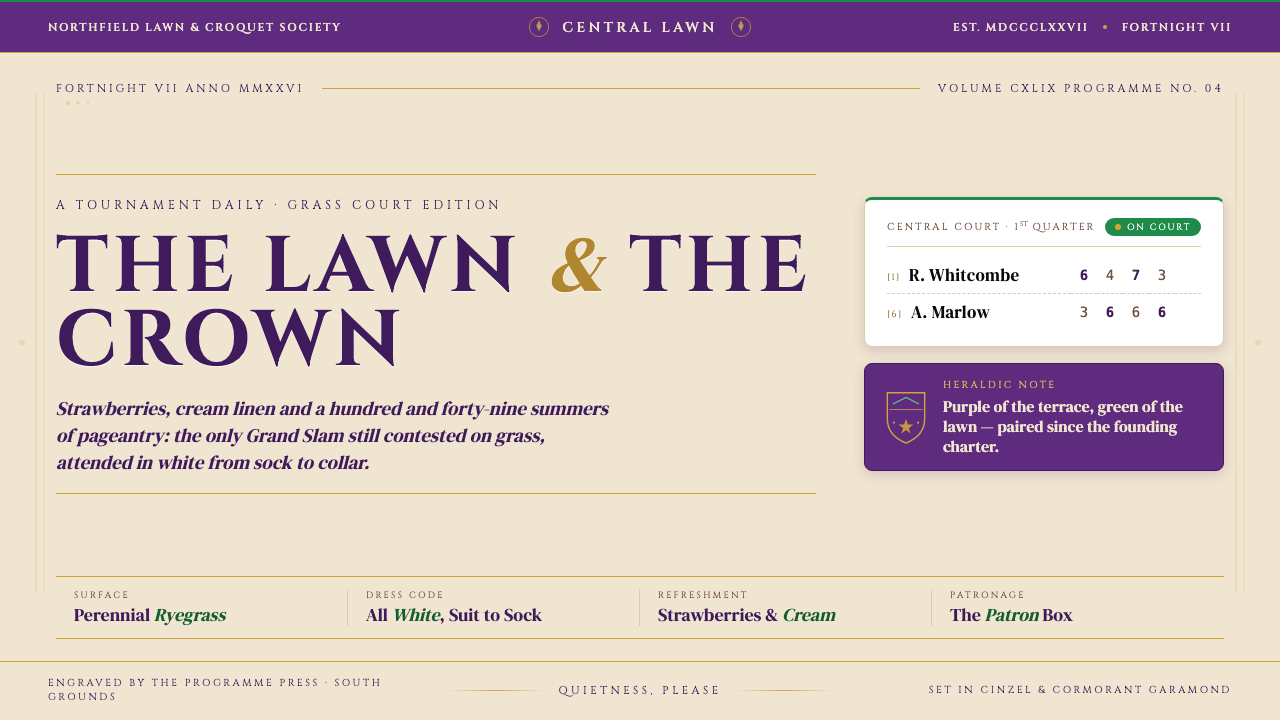
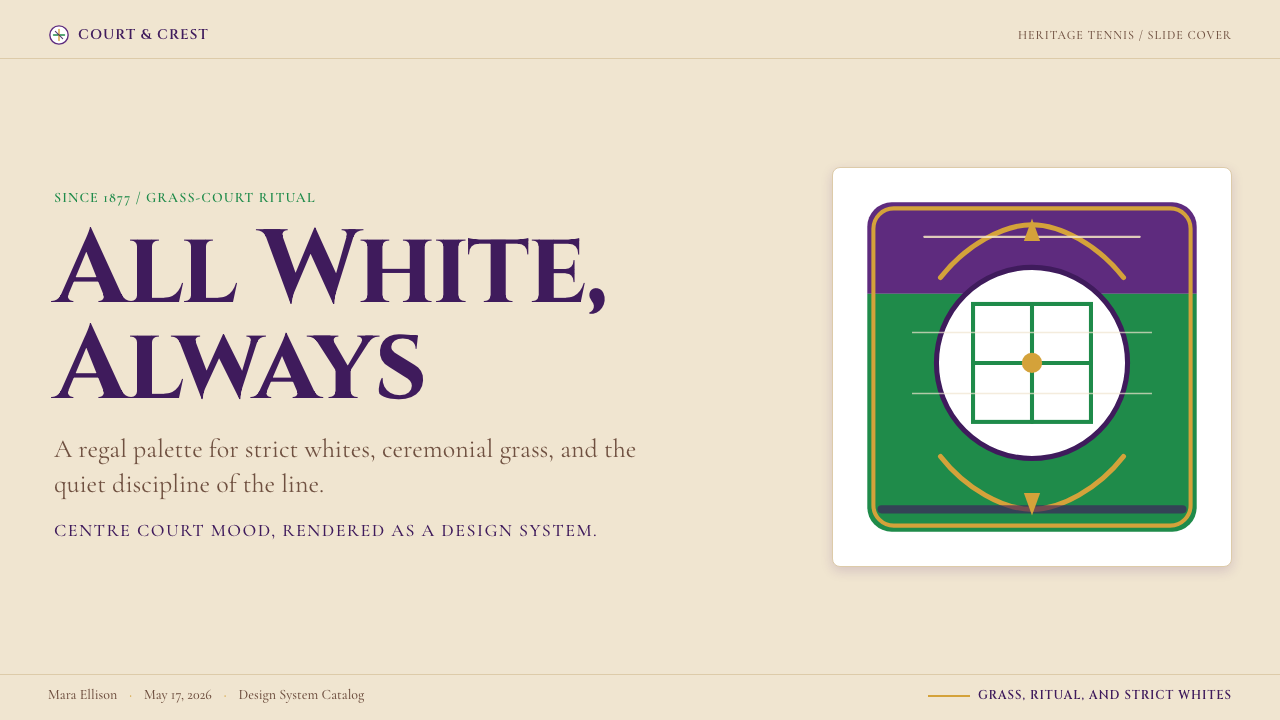
The palette is a strict three-color system: saturated regal purple, vivid grass-court green, and warm cream, with gold reserved for accent and black for type. The purple and green function as equals — neither dominates the other, and together they create the heraldic contrast that defines the visual identity. Cream grounds soften the collision and keep the overall register from feeling confrontational. Gold appears only in deliberate moments — dividers, rules, crests — never as a fill or background. The palette's restraint is its most defining quality: secondary or tertiary colors are essentially absent.色板是严格的三色系统:饱和的皇家紫、鲜明的草场绿和温暖的奶油色,金色保留为点缀,黑色用于文字。紫色和绿色地位对等——两者互不主导,共同构建纹章式对比,定义了这套视觉身份的核心气质。奶油色底面柔化了两者之间的碰撞,使整体基调不至于显得对抗性。金色只在刻意选定的时刻出现——分割线、细线、盾徽——从不作为填充或背景色。这套色板最决定性的品质是它的克制:间色和复色几乎完全缺席。
Typography字体排印
Serif type dominates at every scale. Display-level text calls for a letterform with inscriptional weight — the kind of roman serif associated with carved stone and engraved plate, which brings centuries of institutional authority to a tournament name or section heading. Body copy uses a refined editorial serif with generous proportions and strong stroke contrast — readable at small sizes but elegant at large ones. All-caps setting is used frequently for headlines and labels, reinforcing the formal register. Letter-spacing at display sizes is traditionally open, giving each character room to breathe like an engraved character on silver.衬线字体在所有层级占据主导地位。展示级别的文字需要带有铭文分量的字形——那种与石刻和银器雕刻相关联的罗马衬线体,为锦标赛名称或章节标题带来数百年的机构权威感。正文采用比例宽裕、笔画对比强烈的精炼编辑衬线体——在小号下可读,在大号下优雅。标题和标签大量使用全大写排印,强化正式感。展示尺寸下的字间距传统上保持宽松,让每个字符像银器上的雕刻字母一样有呼吸空间。
Ornament and Detail装饰与细节
Unlike the strict zero-ornament philosophies of modernist traditions, Wimbledon's visual language embraces deliberate, historically-grounded ornament. Gold filigree dividers, thin ruled borders, and crested panel headers are all part of the canonical vocabulary. These ornamental elements are always restrained in quantity — one ruled line suffices where a lesser system might use three — and always rooted in heraldic or classical British typographic tradition. The ornament earns its place by reinforcing the sense of ceremony; anything purely decorative without historical grounding is still absent.与现代主义传统的严格零装饰哲学不同,温布尔登的视觉语言拥抱经过审慎选择的、有历史依据的装饰。金色细线分割符、细边框和带盾徽的面板标题,都是其规范词汇的组成部分。这些装饰元素在数量上始终克制——一条细线足以起到一套较弱系统可能用三条线才能达到的效果——且始终根植于纹章或英国古典排印传统。装饰元素之所以得到认可,是因为它们强化了典礼感;任何缺乏历史依据的纯装饰仍然是缺席的。
Spacing and Proportion间距与比例
Layouts breathe. Generous white space — or cream space — surrounds every major element, reflecting the unhurried register of the tournament itself. Text columns are set at comfortable reading measures with ample leading; panels and cards give their contents room to settle. Margins are wide and intentional. Nothing is crowded. This spatial generosity is not inefficiency — it is the visual equivalent of the queue at Wimbledon: orderly, patient, deliberate. Compressed layouts feel immediately wrong in this system, regardless of color fidelity.版面有呼吸感。每个主要元素都被宽裕的留白——或奶油色空间——包围,映射出锦标赛本身从容不迫的节奏。文字栏以舒适的行宽设置,配以充裕的行距;面板和卡片为内容留有沉淀的空间。页边距宽阔而有意为之。没有任何拥挤的地方。这种空间上的慷慨不是低效,而是温布尔登排队传统的视觉等价物:有序、耐心、从容。无论色彩如何忠实,压缩的版面在这套系统中都会立刻感觉格格不入。
Texture and Ground质感与底面
Cream rather than pure white is the characteristic ground tone, introducing a warmth that pure digital white cannot replicate. The reference point is physical — linen, laid paper, the programme in your hand at Centre Court — rather than screen-native. In digital applications, this warmth is typically achieved through an off-white background that reads as cream in context. The green of the grass courts also carries texture associations: it is a saturated, living color rather than a flat corporate green, recalling close-cropped turf at its July peak.奶油色而非纯白色是这套风格的特征底色,带来一种纯数字白色无法复制的温暖感。参考点是物质性的——亚麻、棉纸、你在中央球场手中拿着的赛程手册——而非屏幕原生。在数字应用中,这种温暖感通常通过一个在语境中读作奶油色的近白背景来实现。草地球场的绿色也承载着质感联想:它是一种饱和的、有生命感的颜色,而非扁平的企业绿,让人联想到七月黄金时节低矮修剪的草坪。
Hierarchy and Formality层级与正式感
The visual hierarchy in Wimbledon's aesthetic is unambiguous and consistently formal. Titles are always clearly superior to subtitles; player names are set distinctly from match data; tier distinctions — member, debenture holder, public — are communicated through specific color and typographic registers rather than vague gradation. This clarity of hierarchy reflects the tournament's institutional structure, in which every role, every gate, and every seat has a precise designation. Ambiguity of rank is not a design value here.温布尔登美学中的视觉层级清晰而始终正式。标题永远明显优于副标题;球员姓名与比赛数据以鲜明区分呈现;会员、永久看台持有者、普通观众等不同等级通过特定色彩和排版体系而非模糊渐变来传达。这种层级清晰性反映了锦标赛的机构结构——每个角色、每道门、每个座位都有精确的名称。等级的模糊性在此不是设计价值。
Restraint and Absence克制与缺席
What Wimbledon's visual system does not contain is as defining as what it does. There are no loud photographic backgrounds, no animated transitions competing for attention, no gradients filling purple panels, no display of anything beyond what the occasion requires. This discipline of absence is how the aesthetic preserves its atmosphere across applications. A scoreboard, a courtside banner, a website — each restrains itself in the same way, so the cumulative effect is a consistent sense of ceremony rather than a fragmented collection of touchpoints.温布尔登视觉系统所不包含的,与它所包含的同等定义性。没有喧闹的摄影背景,没有争夺注意力的动态转场,没有填充紫色面板的渐变,没有任何超出场合所需之物的展示。这种缺席的纪律正是这套美学如何在各种应用中保持其氛围的方式。记分牌、场边横幅、网站——每一个都以同样的方式约束自身,因此累积的效果是始终如一的典礼感,而非碎片化的触点集合。
See the Wimbledon (Purple-Green) design system查看 Wimbledon (Purple-Green) 完整设计系统
Who shaped Wimbledon (Purple-Green)?谁塑造了 Wimbledon (Purple-Green)?
The AELTC's successive committees have been the stewards of Wimbledon's visual identity across nearly a century and a half. Their most consequential design decision is arguably one of conservation rather than creation: maintaining the purple and green palette and the all-white dress code through successive eras of sporting fashion when commercial pressure would have justified updates. By treating the visual identity as an institutional inheritance rather than a brand asset, the committee ensured that Wimbledon's aesthetic authority deepened rather than depreciated over time.AELTC历届委员会是温布尔登视觉身份近一个半世纪的守护者。他们最具决定性的设计抉择,或许是守护而非创造:在体育时尚的更迭中坚守紫绿色板和全白着装规定,即使商业压力本可为更新提供充分理由。通过将视觉身份视为机构传承而非品牌资产,委员会确保了温布尔登的美学权威随时间积累而非折旧。
Borg's five consecutive Wimbledon titles between 1976 and 1980 made him the tournament's defining modern icon during the era when televised sport began constructing global design languages around star athletes. His stoic, aristocratic court presence — floppy hair, headband, white Fila kit — became inseparable from the Wimbledon aesthetic in global public consciousness. The image of Borg on Centre Court is one of the clearest early examples of an athlete functioning as a living embodiment of a visual identity system.博格在1976至1980年间连续五次夺冠,使他成为电视体育开始围绕明星运动员构建全球设计语言时代的温布尔登决定性现代偶像。他沉静、贵族式的球场气质——飘逸长发、发带、白色飞乐运动服——在全球公众意识中与温布尔登美学密不可分。博格在中央球场的形象是运动员作为视觉身份系统活化身份的最早典型案例之一。
Federer's eight Wimbledon titles (2003–2017) span precisely the period in which global sports branding became a sophisticated design discipline. His association with the tournament did more than any marketing campaign to reinforce the values embedded in Wimbledon's visual identity — elegance, precision, historical self-awareness — at a moment when those values were under pressure from more aggressive, disruption-oriented sports aesthetics. His on-court comportment served as a kind of editorial standard for what the visual identity was communicating.费德勒的八次温布尔登冠军(2003—2017年)恰好横跨全球体育品牌成为成熟设计学科的时期。他与这项赛事的关联,比任何营销活动都更有力地强化了温布尔登视觉身份所承载的价值观——优雅、精准、历史自觉——而彼时这些价值观正受到更激进的颠覆导向体育美学的冲击。他在球场上的举止,充当了视觉身份所传达内容的某种编辑标准。
Williams's seven Wimbledon titles (2002–2016) demonstrate how Wimbledon's strict aesthetic framework functions as a counterpoint to individual expression rather than a suppressor of it. The all-white dress code and the formality of the grounds become, paradoxically, the stage that makes individual excellence more legible. Williams's presence on Centre Court showed that the visual system's restraint amplifies rather than constrains the figures it frames — a lesson applicable to any design context where a strong system and strong content must coexist.小威廉姆斯的七次温布尔登冠军(2002—2016年)说明了温布尔登严格的美学框架如何作为个性表达的衬托而非压制者发挥作用。全白着装规定和场地的正式感,反而矛盾地成为使个体卓越更易被感知的舞台。小威廉姆斯在中央球场的存在表明,视觉系统的克制放大而非约束了它所框定的人物——这是适用于任何强系统与强内容必须共存的设计语境的深刻启示。
As the winner of the inaugural 1877 Championship, Gore is the figure at the origin point of the Wimbledon visual tradition — not as a designer but as proof of the aesthetic's foundational continuity. The silver challenge cup he was awarded in 1877 established the gold-and-silver accent palette that persists in the visual identity today; the cream-white dress he wore established the ground color of the canonical palette. His presence anchors Wimbledon's design language to a specific historical moment rather than a later act of branding.作为1877年首届锦标赛的冠军,戈尔是温布尔登视觉传统的原点人物——不是作为设计师,而是作为这套美学基础延续性的证明。他1877年获颁的银质挑战杯确立了沿用至今的金银点缀色板;他所穿的奶油白球衣确立了规范色板的底色。他的存在将温布尔登的设计语言锚定于一个具体的历史时刻,而非后来某次品牌化行为。
How do you use Wimbledon (Purple-Green) today?今天怎么用 Wimbledon (Purple-Green)?
The Wimbledon aesthetic is one of the most context-specific historical design languages available to contemporary practitioners. Its authority derives from the specificity of its references — British ceremony, lawn tennis heritage, Victorian institutional formality — and applying it well means understanding which contexts legitimately share those associations and which are simply borrowing prestige without coherence. The style works where gravitas, tradition, and deliberate unhurriedness are genuine product values, not decorative claims.温布尔登美学是当代设计师所能运用的最具语境特异性的历史设计语言之一。它的权威感来自其参照的特殊性——英国典礼感、草地网球传统、维多利亚机构正式感——运用得当,意味着理解哪些语境与这些关联有真实共鸣,哪些只是在没有内在一致性的情况下借用声望。这种风格在庄重感、传统感和刻意的从容是真实产品价值而非装饰性主张的场合最为有效。
For presentation slides, the Wimbledon palette works best when treated as a full system rather than a color choice. A cover slide should establish the heraldic register immediately: purple panel with cream type and a gold ruled border, or a cream ground with purple and green as structural accents anchoring a tournament-style typographic composition. Content slides should be built on generous margins and clear hierarchy — a dominant heading in an inscriptional serif, body text at a comfortable reading size, and section markers indicated by a thin gold or green rule rather than a colored block. Data slides in this system become scoreboard-like: clean rows, tight labels, numbers in an authoritative serif. The system collapses if overcrowded; every slide should feel like it has room to breathe.在演示文稿中,温布尔登色板作为完整系统而非单纯色彩选择使用时效果最佳。封面幻灯片应当立即建立纹章式基调:紫色面板配奶油色字体和金色细边框,或以奶油色为底、紫色与绿色作为锚定锦标赛式排版构图的结构性色彩。内容幻灯片应建立在宽裕页边距和清晰层级之上——铭文衬线体的主导标题、舒适阅读尺寸的正文,以及用细金线或绿线而非色块来标示章节。在这套系统中,数据幻灯片呈现出记分牌式的特质:整洁的行列、紧凑的标签、权威衬线体的数字。系统在过度拥挤时会崩溃;每张幻灯片都应有呼吸的空间。
For web interfaces, the style suits contexts where prestige and trust are primary values: premium membership platforms, financial services with a heritage positioning, institutional or cultural organizations. The approach requires a cream or warm off-white background as the default ground, with purple and green reserved for interactive states, navigation highlights, and primary action elements. Typography should be consistently serif across both display and body scales. Dashboards in this system work well for data that benefits from a calm, authoritative presentation — analytics platforms, portfolio trackers, event management tools. Pricing pages should use the color hierarchy deliberately: the recommended tier highlighted in the darker purple, alternative tiers in green or cream, so the visual system does the persuasive work without aggressive contrast.对于网页界面,这种风格适合声望和信任是首要价值的语境:高端会员平台、具有传统定位的金融服务、机构或文化组织。这种方法要求以奶油色或温暖的近白色作为默认底面,紫色和绿色保留给交互状态、导航高亮和主要操作元素。排版在展示和正文两个层级上都应始终使用衬线体。这套系统中的仪表板适合受益于平静、权威呈现的数据——分析平台、投资组合追踪工具、活动管理系统。定价页面应有意地运用色彩层级:推荐方案以较深的紫色高亮,其他方案以绿色或奶油色呈现,让视觉系统承担说服工作,而无需依赖攻击性的对比度。
For editorial and marketing applications, the style's poster-like formality is an asset. Feature pages and article headers benefit from the full palette deployed boldly: a cream ground with a large purple header panel, green used for pull-quote emphasis or byline markers, and gold for the horizontal rules that separate major sections. Marketing materials — event invitations, programme covers, announcement graphics — should commit fully to the all-caps serif headline treatment and bordered-panel structure that give the aesthetic its distinctive ceremonial register. Resist the temptation to modernize with rounded elements or playful type; every informal gesture reads as an error of register in this system.对于编辑和营销应用,这种风格的海报式正式感是一项资产。特性页面和文章标题受益于全色板的大胆部署:奶油底面搭配大面积紫色标题面板,绿色用于引用强调或署名标记,金色用于分隔主要章节的水平细线。营销材料——活动邀请函、赛程手册封面、公告图形——应完整投入全大写衬线标题处理和带边框面板结构,这些元素赋予美学其独特的典礼感。克制以圆角元素或轻松字体实现现代化的冲动;在这套系统中,每一个非正式的姿态都会被读作基调上的错误。
A common mistake when applying this style is reaching for all three palette colors simultaneously at high intensity across a layout. The Wimbledon visual canon is disciplined about color relationships: purple and green appear together most powerfully when one is used as a ground and the other as a figure, never both as fills competing at the same visual weight. Similarly, the cream is not a passive neutral — it is the primary ground, and replacing it with pure white or a light grey undermines the warmth that makes the palette feel heirloom rather than corporate. The other persistent error is typographic: mixing a decorative serif with a sans-serif body defeats the system's logic entirely. Commit to one serif family at multiple weights, and let spacing and scale carry the hierarchy.应用这种风格时最常见的错误,是在一个版面中同时以高强度使用三种色板颜色。温布尔登视觉规范在色彩关系上有严格纪律:紫色和绿色同时出现时,当一个作为底色、另一个作为图形元素时效果最为有力,两者绝不应以相同视觉重量作为填充色相互竞争。同样,奶油色不是一个被动的中性色——它是主要底色,将其替换为纯白或浅灰会破坏使色板感觉像是传家宝而非企业色系的温暖感。另一个持续性错误是排版上的:将装饰性衬线体与无衬线正文体混合会完全瓦解系统逻辑。坚守一个衬线字体家族的多个字重,让间距和尺度承担层级工作。
See the Wimbledon (Purple-Green) design system查看 Wimbledon (Purple-Green) 完整设计系统
Wimbledon (Purple-Green) — FAQWimbledon (Purple-Green) · 常见问题
Can the Wimbledon palette work for technology products, or is it too heritage-specific?温布尔登色板能用于科技产品吗,还是它过于特定于传统品牌?
It can work, but the context must carry the weight. The palette's association with heritage and ceremony is an asset when the technology product is positioning around trust, longevity, or institutional credibility — financial data platforms, legal technology, premium membership services, archival tools. It becomes a liability when the product values disruption, accessibility, or youthful energy, because the aesthetic signals the opposite of those things. The key test is honest: does the visual heritage of this palette align with the actual values the product is trying to communicate? If the answer requires explanation, the palette is probably wrong for the application.可以,但语境必须能承载其分量。当科技产品围绕信任、持久性或机构公信力进行定位时,色板与传统和典礼感的关联是一种资产——金融数据平台、法律科技、高端会员服务、档案工具。当产品强调颠覆性、亲和力或年轻活力时,它就成了负担,因为这套美学发出的恰恰是相反的信号。关键测试是诚实的:这套色板的视觉传统是否与产品真正试图传达的价值观对齐?如果答案需要解释,这套色板对这个应用来说可能就是错误的选择。
How do I distinguish Wimbledon-style design from generic British heritage pastiche?如何区分温布尔登风格设计与普通的英式传统风格仿作?
The distinction is in specificity and discipline. Generic British heritage pastiche typically uses green and cream in softer, more desaturated tones, favors script typefaces or casual serif alternatives, and layers texture and illustration liberally. Wimbledon-derived design is precise in its colors — the purple is saturated and specific, the green vivid — and strict in its typography, insisting on a roman inscriptional serif rather than anything warmer or more approachable. The gold accent is deployed sparingly as a functional divider, not as decoration. When every ornamental decision can be traced to a specific heraldic or institutional precedent, the result reads as authentic; when ornament is applied for atmosphere alone, it reads as pastiche.区别在于特异性和纪律性。普通英式传统仿作通常使用更柔和、饱和度更低的绿色和奶油色,偏爱手写体或休闲衬线替代品,并自由地叠加质感和插图。温布尔登衍生设计在色彩上是精确的——紫色饱和而特定,绿色鲜明——在字体上是严格的,坚持使用罗马铭文衬线体,而非任何更温暖或更平易近人的选择。金色点缀作为功能性分割符被节制使用,而非装饰。当每一个装饰性决定都能追溯到特定的纹章或机构先例时,结果读来是真实的;当装饰仅为营造氛围而被应用时,它读来就是仿作。
Does Wimbledon's visual style work in dark mode?温布尔登的视觉风格能用于深色模式吗?
A dark inversion is possible but demands significant care. The canonical palette is light-ground — cream and white with color accents — and a straight inversion to a dark purple or near-black background inverts the hierarchy in ways that can feel funereal rather than regal. A better approach for dark-mode applications is to use the deepest purple as the primary background, introduce cream as the primary text color (which reads as warm against deep purple), and use the green and gold sparingly as accent and highlight. The result preserves the palette's heraldic associations while functioning credibly in dark contexts. Avoid reducing the purple to a grey-dark background that strips the color identity entirely.深色反转是可能的,但需要相当审慎。规范色板是浅色底面——以奶油色和白色加色彩点缀——直接反转为深紫或近黑背景会以一种感觉像丧仪而非皇室的方式颠覆层级。深色模式应用的更好方法是将最深的紫色用作主要背景,将奶油色引入为主要文字颜色(在深紫背景下读来温暖),将绿色和金色节制地用作点缀和高亮。结果在保留色板纹章关联的同时,在深色语境中可信地运作。避免将紫色降格为灰暗背景,那会完全剥离色彩身份。
How should photography and imagery be handled within this visual system?在这套视觉系统中,摄影和图像应该如何处理?
Photography works best when it is treated as a document of the occasion rather than an expressive element competing with the color system. Court-level photography — close-cropped, high-contrast, with the green of the grass and the white of the clothing as dominant tones — integrates naturally with the palette. Posed or studio photography should be handled carefully: highly retouched or stylized imagery tends to read as out of register. An effective approach is to apply a mild warm-toned treatment to photography that echoes the cream ground, unifying image and layout without heavy filtration. Imagery that introduces saturated colors outside the palette — particularly warm reds or blues — should be avoided, as they compete with the purple and green for visual priority.摄影最好被当作场合的记录而非与色彩系统竞争的表达元素来处理。球场水平的摄影——紧密裁切、高对比度、草地的绿色和服装的白色作为主导色调——能自然融入色板。摆拍或棚拍摄影应谨慎处理:高度修饰或风格化的图像往往读来基调不符。一种有效的方法是对摄影应用呼应奶油底色的温和暖色调处理,在不进行强烈滤镜处理的情况下统一图像与版面。引入色板之外饱和色——尤其是暖红或蓝色——的图像应当避免,因为它们会与紫色和绿色争夺视觉优先权。
What are the most common mistakes when trying to apply this style?尝试应用这种风格时最常见的错误有哪些?
The first and most common is using the purple and green at full saturation side by side at the same scale, which creates visual competition rather than heraldic contrast. The palette works through hierarchy: one color leads, the other supports. The second mistake is substituting a warm-toned sans-serif for the required roman serif, in the belief that the color palette alone carries the identity — it does not. Typography is roughly half the aesthetic. Third is crowding: this is a system that requires generous negative space to maintain its register, and dense layouts immediately read as inconsistent with the style's values. Finally, many practitioners add softness — rounded corners, drop shadows, gradients — in an attempt to modernize the system, which instead removes the very elements that give it its authority. The style is not harsh, but it is precise. Precision should not be confused with rigidity; it should be understood as care.第一个也是最常见的错误,是在同等尺寸下并排使用全饱和度的紫色和绿色,这会产生视觉竞争而非纹章式对比。色板通过层级发挥作用:一种颜色领导,另一种支持。第二个错误是用温暖色调的无衬线体替代所需的罗马衬线体,误以为色板本身就能承载身份感——它做不到。字体大约是这套美学的一半。第三是拥挤:这套系统需要宽裕的负空间来维持其基调,密集的版面会立刻读作与风格价值观不符。最后,许多设计师会添加柔化元素——圆角、投影、渐变——试图以此现代化系统,结果却去除了赋予其权威感的核心元素。这种风格不是强硬的,但它是精确的。精确不应与刻板混淆;它应被理解为用心。
Related design styles相关设计风格
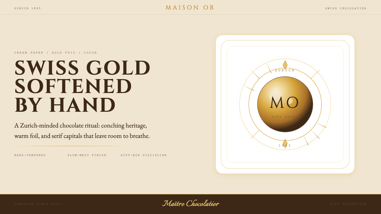 Lindt Swiss ChocolateOld-world luxury, softened. Gold foil, cocoa brown, and cream paper carry the…克制的瑞士奢华:暖金、可可棕与奶油纸,衬线字和细金线排版。
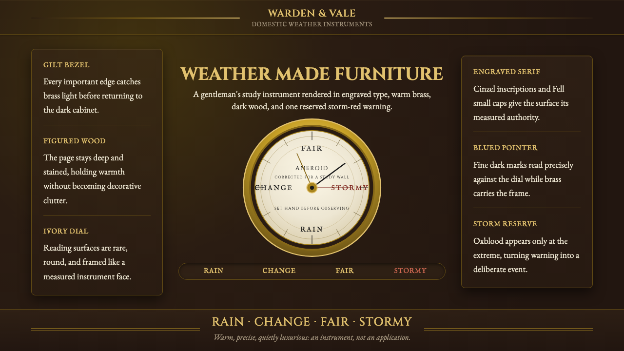 Aneroid BarometerMeasures weather as furniture. Gilt rings and Cinzel engraving glow on dark w…把天气量成家具:深木底、黄铜圈与Cinzel雕刻发光。
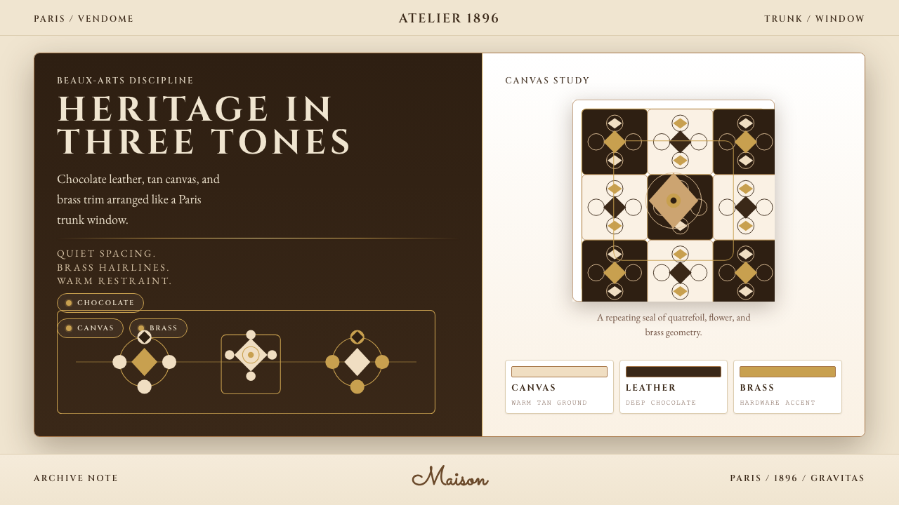 Louis Vuitton MonogramHeritage stays luminous. Chocolate, tan, and brass stage a Paris trunk window.优雅很有分量。巧克力棕、驼色与黄铜构成巴黎箱窗。
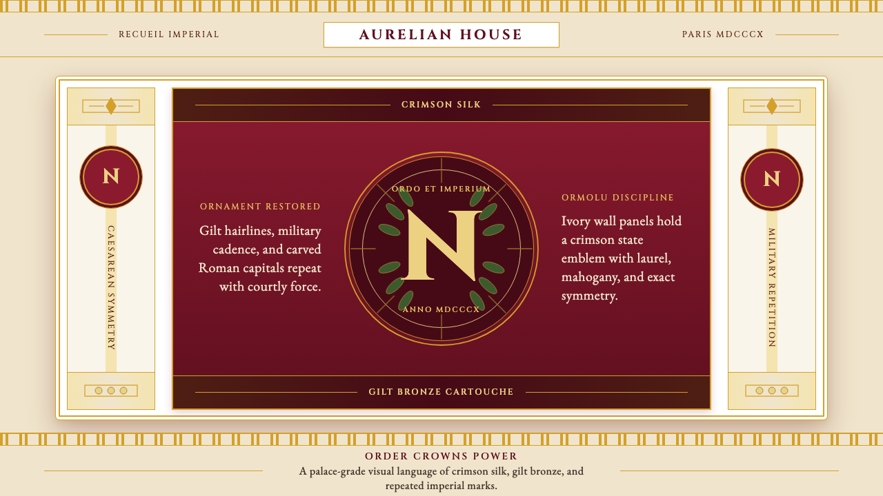 Napoleonic Empire StyleImperial order speaks. Crimson silk, gilt hairlines, and strict symmetry fram…帝国秩序发声:深红丝绸、鎏金细线与对称框架托起 N 印。
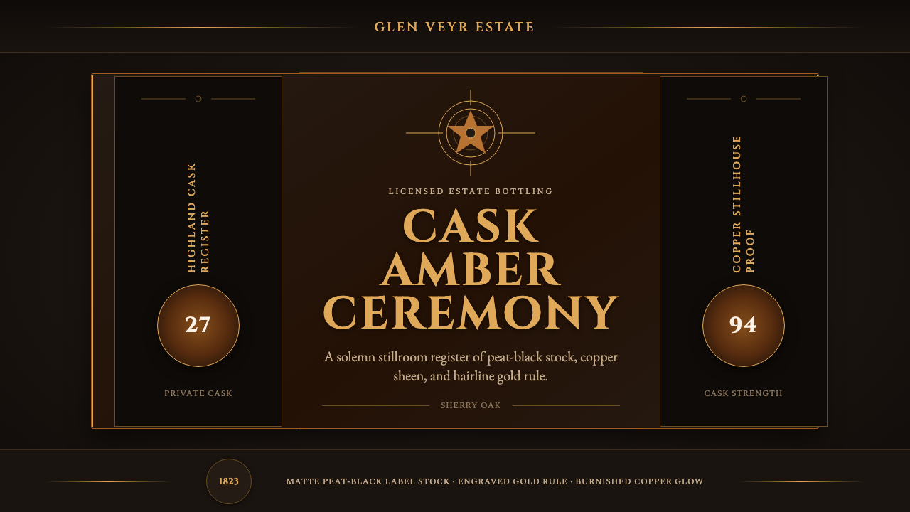 Single Malt ScotchSolemn amber gravity. Thin gold rules and Cinzel capitals glow on peat-black.庄重的琥珀引力。泥煤黑上金线与Cinzel大写发光。
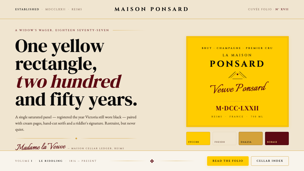 Veuve Clicquot (Yellow-Label)One audacious yellow rectangle, 250 years. Pantone yellow on cream, Cinzel se…1877 年那块大胆的明黄:饱和 Pantone 黄 + 暖奶油 + Cinz…