What is Lindt Swiss Chocolate?什么是 Lindt Swiss Chocolate?
A century and a half of Swiss chocolate mastery distilled into warm gold foil, deep cocoa brown, and the unhurried confidence of cream paper — Lindt's visual identity is luxury made legible.百五十年瑞士巧克力工艺,凝练为暖金箔、深可可棕与奶油纸的从容自信——瑞士莲的视觉语言,是让人一眼读懂的奢华。
Lindt Swiss Chocolate in briefLindt Swiss Chocolate 速览
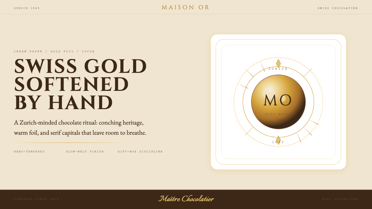
The Lindt Swiss Chocolate design style is a visual system built on restraint and pedigree. Its palette anchors around three inseparable companions — a warm, burnished gold drawn from Lindor foil wrappers, a deep cocoa brown that carries the weight and richness of aged chocolate, and a cream paper ground that gives every composition room to breathe. These three tones are not merely colors; they are the material memory of a Swiss confiserie — the foil, the ganache, the parchment lining the box.瑞士莲巧克力设计风格,是一套以克制与传承为基础的视觉系统。色板围绕三个相互依存的核心展开——取自 Lindor 金箔包装的暖金,承载着浓郁厚重巧克力质感的深可可棕,以及让每一幅构图得以喘息的奶油底色。这三种色调不仅仅是颜色,它们是瑞士巧克力精品店的物质记忆:金箔、甘纳许、衬于礼盒内的羊皮纸。
Typography in this aesthetic is classical and unhurried. Tall serif capitals set at generous letter-spacing evoke the engraved signage of an old Zurich shop front, signaling that what is being offered here is not a commodity but a craft. Hand-script flourishes appear as restrained ornamental gestures — a signature beneath a headline, a curl at the end of a product name — never overwhelming the composition but lending it the warmth of a master's handwriting on a recipe card. Thin gold filigree lines serve as section dividers, precise and delicate, the visual equivalent of the foil trim on a Lindor box.这套美学中的字体排印,是古典而从容的。舒展的衬线大写字母,配以慷慨的字距,唤起苏黎世老店橱窗雕刻铭牌的意象——传递出此处出售的并非商品,而是一门工艺。手写花体装饰点缀其间,如标题下方的一枚签名,或产品名末尾的一道回旋——从不压倒构图,却赋予其一份大师在食谱卡上亲笔落款的温度。纤细的金色细线充当段落分隔,精准而雅致,如同 Lindor 礼盒上的金箔镶边。
The overall temperament of the style is what might be called 'disciplined Swiss luxury': every element earns its place on the page through purpose rather than whim. There is space without emptiness, ornament without excess, warmth without sentimentality. It is a design language that speaks in measured tones — confident enough in the quality of what it represents that it never needs to shout.这种风格的整体气质,可被称为「克制的瑞士奢华」:每一个元素都以目的而非心血来潮在页面上赢得一席之地。有留白而无空洞,有装饰而不过度,有温度而无矫情。这是一套以平稳语调表达的设计语言——对自己所代表的品质足够自信,从不需要大声宣告。
See the Lindt Swiss Chocolate design system查看 Lindt Swiss Chocolate 完整设计系统
Where does Lindt Swiss Chocolate come from?Lindt Swiss Chocolate 从何而来?
The story begins in Zurich in 1845, when David Sprüngli-Schwarz and his son Rudolf Sprüngli-Ammann opened a small confiserie on the Marktgasse, in the old city center. Switzerland at mid-century was already establishing its reputation for precision craftsmanship — in watches, in engineering, in the refined pleasures of the table. The Sprüngli confiserie positioned itself within this tradition, offering hand-made chocolates to a clientele that expected quality as a given rather than a luxury exception. The visual language of the early shop would have drawn on the signage and packaging conventions of nineteenth-century Swiss commercial elegance: engraved serif lettering, restrained gold detailing, and the unspoken authority of good materials honestly presented.故事始于1845年的苏黎世。David Sprüngli-Schwarz 与其子 Rudolf Sprüngli-Ammann 在旧城中心的市场街开设了一家小型精品糖果店。十九世纪中叶的瑞士,已凭借制表、工程与精致饮食的传统建立起精密工艺的声誉。Sprüngli 糖果店将自身置于这一传统之中,为期待品质理所当然而非奢侈例外的顾客提供手工巧克力。早期店铺的视觉语言,想必汲取了十九世纪瑞士商业优雅的招牌与包装惯例:雕刻衬线字体、克制的金色细节,以及优质材料诚实呈现所带来的无声权威。
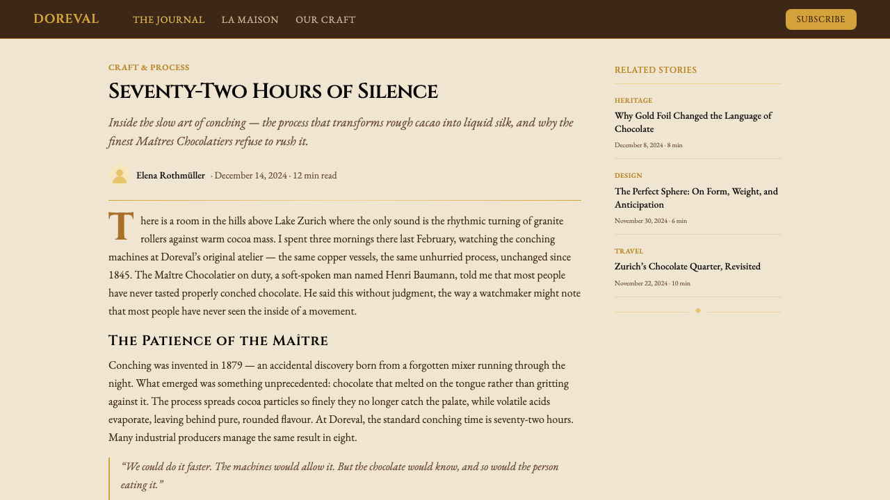
The defining technical event came in 1879, when Rodolphe Lindt, working in a small factory in Berne, accidentally discovered conching — a process of rolling and aerating chocolate over many hours that transforms a gritty, bitter mass into the smooth, melt-in-the-mouth texture that now defines premium chocolate worldwide. Lindt's conche, left running over a weekend by accident, had worked its slow alchemy on the chocolate inside. When the Sprüngli family acquired Rodolphe Lindt's factory and his conching patents in 1899, they did not merely buy a production method; they acquired the scientific foundation for a quality claim that would hold across generations. The merged company, Lindt & Sprüngli, was now in possession of both the heritage of a Zurich confiserie and the technical superiority of the conching master.关键的技术转折发生在1879年。Rodolphe Lindt 在伯尔尼的一间小工厂里,意外发现了研拌工艺——一种将巧克力滚压充气数小时的过程,能将粗粝苦涩的原料转化为如今定义全球高端巧克力的丝滑入口口感。Lindt 的研拌机因周末意外持续运转,在巧克力上完成了它缓慢的炼金术。1899年,Sprüngli 家族收购了 Rodolphe Lindt 的工厂与研拌专利,买到的不仅是一种生产工艺,更是一个能跨越世代成立的品质主张的科学根基。合并后的公司 Lindt & Sprüngli,同时拥有苏黎世精品店的传承与研拌工艺大师的技术优势。
Through the twentieth century, the brand refined its visual identity in parallel with the premiumization of the global chocolate market. The Lindor truffle line, introduced in 1949, gave the brand its most iconic physical artifact — the foil-wrapped sphere whose gold (and later, color-coded) wrapping became instantly recognizable on shelves from Geneva to Tokyo. Gold became the master signal of the Lindt visual system: warm rather than metallic, burnished rather than bright, associated with craftsmanship rather than ostentation. The cream paper ground that supports Lindt's printed communications carries the same historical association — it recalls the unbleached paper of old apothecary wrappings and confiserie boxes, a material choice that reads as authenticity rather than economy.整个二十世纪,品牌的视觉标识随全球巧克力市场的高端化进程同步精炼。1949年推出的 Lindor 松露巧克力,为品牌提供了其最具标志性的实物载体——金箔(后来演变为色彩编码)包裹的球形,在日内瓦到东京的货架上令人一眼即识。金色成为瑞士莲视觉系统的主旋律:暖调而非金属感,光泽而非刺眼,与工艺感相关而非与炫耀相连。支撑瑞士莲印刷传播物的奶油纸底色,承载着同样的历史联想——它让人想起旧时药剂师包装纸与糖果盒的未漂白纸张,这种材料选择传递的是真实性而非经济性。
The contemporary visual system — refined through roughly the 2020s — systematizes these historic associations into a coherent design language. Tall serif typefaces in the tradition of classical Swiss commercial lettering establish the typographic register. The gold, brown, and cream palette is held with unusual consistency across packaging, advertising, retail environments, and digital surfaces. The thin filigree rules and hand-script accents that appear as decorative gestures within this system trace directly to the engraved ornament of nineteenth-century European luxury packaging. What the contemporary system achieves is the difficult feat of keeping heritage legible without allowing it to calcify into pastiche — the Lindt aesthetic feels timeless rather than merely old.大约成形于2020年代的当代视觉系统,将这些历史联想系统化为一套连贯的设计语言。延续古典瑞士商业字体传统的高挑衬线字体,确立了排印的基调。金、棕、奶油三色在包装、广告、零售环境与数字界面间保持罕见的一致性。作为装饰姿态出现于系统中的纤细花纹线与手写强调,直接源自十九世纪欧洲奢侈包装的雕刻装饰。当代系统所实现的,是一项艰难的成就:让传承保持可读性,却不让其凝固成对自身的拙劣模仿——瑞士莲的美学给人的感觉是超越时间,而非仅仅年代久远。
What defines the Lindt Swiss Chocolate look?Lindt Swiss Chocolate 的视觉特征是什么?
Palette色板
The color system is anchored by three tones that function almost like a material specification rather than a chromatic choice. A warm, burnished gold — the visual memory of Lindor foil — holds the role that primary red holds in more assertive design systems: it signals value, draws attention, and anchors hierarchy. Deep cocoa brown provides gravitas and warmth, acting as a dark ground or heavy accent without the coldness of black. Cream paper — slightly off-white, with the warmth of aged parchment — serves as the default field, giving the composition space to breathe. Together, the three tones are self-sufficient: no additional colors are needed, and the introduction of unrelated hues would immediately dilute the system's coherence.色彩系统由三种色调锚定,其功能更接近材料规格而非色彩选择。暖金——Lindor 金箔的视觉记忆——在系统中扮演的角色,类似于更强势设计系统中的主色:它传递价值感,吸引注意力,并锚定层级。深可可棕提供厚重感与温度,充当深色底面或重强调,却不带黑色的冷感。奶油纸——略偏暖白,带着旧羊皮纸的温润——作为默认底色使用,给构图以呼吸空间。三种色调共同自给自足:无需额外颜色,引入无关色调会立即稀释系统的连贯性。
Serif Typography衬线字体排印
The typographic register is classical and formal, rooted in the engraved letterforms of nineteenth-century European luxury commerce. Tall serif capitals set at wide letter-spacing — a convention drawn directly from the signage and label tradition of old Swiss confiseries — communicate that the product being offered has a history and a craft behind it. Headlines are set large and with deliberate breathing room; body text is treated with similar care for legibility rather than density. The typefaces chosen tend toward the old-style or transitional serif traditions: letterforms with bracketed serifs, moderate contrast between thick and thin strokes, and a humanist warmth that prevents the composition from feeling austere.排印基调是古典而正式的,根植于十九世纪欧洲奢侈商业的雕刻字体传统。宽字距的高挑衬线大写字母——直接源自瑞士旧式精品店招牌与标签传统——传达出所提供的产品背后有历史与工艺的支撑。标题设置宽大,带有刻意的呼吸空间;正文同样以易读性而非密度为优先考量。所选字体倾向于旧式或过渡式衬线传统:带有括弧形衬脚的字形,粗细笔画间适度的对比,以及防止构图显得严苛的人文主义温度。
Hand-Script Accents手写花体点缀
Where most luxury systems rely entirely on printed formality, the Lindt aesthetic introduces hand-script elements as controlled warmth. A cursive flourish beneath a product name, a flowing signature-style logotype, a calligraphic accent on a section header — these gestures recall the handwritten recipe cards and master chocolatier's notes of the old confiserie tradition. They are used sparingly: one such accent per composition is a rule of thumb, because the moment script competes with serif for attention, both lose authority. The hand-script element humanizes what would otherwise be a purely formal arrangement, adding the sense that a skilled person — not merely a printing press — stands behind the product.大多数奢侈系统完全依赖印刷的正式感,而瑞士莲的美学则将手写花体元素引入为受控的温度。产品名下方的草书回旋、流动的签名式标志字、段落标题的书法强调——这些姿态让人想起旧式糖果店传统中的手写食谱卡与巧克力大师的亲笔注记。它们被克制地使用:每幅构图一处手写元素是经验法则,因为一旦草书与衬线争夺注意力,两者都将失去权威。手写元素为原本纯正式的排布注入了人情味,传达出一种感觉:产品背后站着一位技艺精湛的匠人,而不仅仅是一台印刷机。
Gold Filigree Lines金色细线
Thin ornamental lines in gold — single-stroke rules, delicate border frames, or filigree dividers — perform the structural role of separating content zones without interrupting the visual flow. In this system, the line is never a hard architectural boundary but rather a breath, a pause, a moment of precision between one thought and the next. These lines draw their lineage directly from the thin gold trim pressed into luxury chocolate box edges and the embossed borders of old European confectionery labels. Their thinness is as important as their presence: a line too heavy would impose rather than refine.金色纤细装饰线——单笔直线、精致边框或花纹分隔——承担着分隔内容区域而不中断视觉流动的结构性功能。在这套系统中,线条从不是硬性的建筑边界,而是一次呼吸,一个停顿,两个意念之间的精确时刻。这些线条的渊源,直接来自奢侈巧克力礼盒边缘压印的金色镶边,以及欧洲旧式糖果标签的浮雕边框。其纤细程度与其存在本身同等重要:过重的线条会产生强制感而非精炼感。
Generous Negative Space慷慨的负空间
One of the clearest markers of the Lindt aesthetic is the ratio of space to content. The system is not dense; it is unhurried. Headlines float with padding on all sides, paragraphs are set with leading that allows each line to be read without effort, and decorative elements are placed so they are experienced as accents rather than as pattern. This generosity of space is a confidence signal — it communicates that the brand does not need to crowd the composition with messages, that a single well-placed line of text is enough. In a marketplace full of visual noise, the discipline of leaving space is itself a form of luxury.瑞士莲美学最清晰的标志之一是空间与内容的比例关系。这套系统并不紧凑,它是从容的。标题四周留有充分的留白,段落以令每行无需费力阅读的行距排布,装饰元素的放置使其被感知为点睛之笔而非构成图案。这种空间的慷慨是一种自信信号——它传达出品牌无需以信息填满构图,一行位置恰当的文字已然足够。在充斥视觉噪音的市场中,克制留白的自律本身就是一种奢华形式。
Material Warmth Over Coldness材质温度感而非冷感
Unlike the cool precision of, say, Swiss International Style or the sharp metallics of contemporary tech luxury, the Lindt system deliberately maintains warmth at every level. The gold is burnished rather than chrome; the cream is parchment-warm rather than clinical white; the brown is the warmth of good chocolate rather than the severity of black. Even formal elements — the serif capitals, the ruled lines — are selected and treated to retain a sense of hand-crafted quality rather than machine precision. The result is a system that reads as expensive but approachable, authoritative but not cold — the visual equivalent of a well-tempered piece of fine chocolate.与瑞士国际主义风格的冷峻精密或当代科技奢华的锐利金属感不同,瑞士莲系统在每个层面都刻意保持温度感。金色是光泽而非镀铬;奶油色是羊皮纸的暖意而非临床白;棕色是好巧克力的温润而非黑色的严峻。即便是正式元素——衬线大写字母、直线——也被选择和处理为保留手工品质的感觉,而非机器精度。结果是一套读来既昂贵又可亲、权威而不冷漠的系统——如同一块回火得当的优质巧克力的视觉等效物。
Heritage Restraint传承式克制
Perhaps the most difficult quality to describe but the most important to understand: the Lindt visual system never overreaches. It does not attempt to be contemporary by borrowing current trends, and it does not attempt to signal heritage by layering on historical ornament. Instead, it holds a clear, consistent register that communicates confidence in its own continuity. The restraint is not minimalism — the gold lines and script accents make clear that decoration is not forbidden — but it is disciplined. Every element has a reason to be present, and every element knows its place in the hierarchy. This is the visual equivalent of the Maître Chocolatier Suisse tradition: mastery expressed through precision, not excess.或许是最难描述却最重要的理解点:瑞士莲视觉系统从不过度延伸。它不通过借用当下潮流来尝试显得当代,也不通过叠加历史装饰来尝试彰显传承。它保持着一个清晰、一致的基调,传达出对自身延续性的自信。这种克制不是极简主义——金色细线与手写花体清楚表明装饰并未被禁止——但它是有纪律的。每一个元素都有其出现的理由,每一个元素都知晓自己在层级中的位置。这是「瑞士巧克力大师」传统的视觉等效:通过精准而非过量表达精湛技艺。
See the Lindt Swiss Chocolate design system查看 Lindt Swiss Chocolate 完整设计系统
Who shaped Lindt Swiss Chocolate?谁塑造了 Lindt Swiss Chocolate?
David Sprüngli-Schwarz founded the original confiserie in Zurich in 1845 alongside his son Rudolf, establishing the company that would eventually bear the Lindt name. His decision to open a quality chocolate shop in Zurich's old city center positioned the brand from its very first day within Switzerland's tradition of refined commercial craft — a positioning that the visual language of the brand still communicates today. The Sprüngli family's instinct for quality and their mercantile acuity in recognizing and acquiring Rodolphe Lindt's patents in 1899 were the two founding acts on which the modern brand rests.David Sprüngli-Schwarz 于1845年与其子 Rudolf 在苏黎世共同创立了最初的精品糖果店,奠定了后来以 Lindt 名字著称的公司基础。他在苏黎世旧城中心开设优质巧克力店的决定,从品牌创立第一天起便将其置于瑞士精致商业工艺传统之内——品牌视觉语言至今仍传递着这一定位。Sprüngli 家族对品质的直觉,以及他们在1899年识别并收购 Rodolphe Lindt 专利的商业眼光,是现代品牌赖以建立的两个奠基行动。
Rodolphe Lindt is the technical genius behind the brand that carries his name. Working in Berne in 1879, Lindt discovered conching — the extended rolling and aeration process that gives fine chocolate its smooth, melt-in-the-mouth character — reportedly by leaving his conching machine running over a weekend by accident. The discovery was transformative: before conching, even the best chocolate had a gritty, rough texture; after, it became the refined confection that the word 'premium chocolate' now implies globally. When Lindt sold his factory and patents to the Sprüngli family in 1899, the combined entity acquired not just a production method but the scientific foundation for a quality claim that has sustained the brand for over a century.Rodolphe Lindt 是以其名字命名的品牌背后的技术天才。1879年在伯尔尼工作期间,Lindt 发现了研拌工艺——据报道是因为意外将研拌机运转了整个周末——这种长时间滚压充气的过程赋予了优质巧克力其丝滑入口的特质。这项发现具有变革性意义:研拌之前,即使最好的巧克力也有粗粝的质地;研拌之后,它成为了如今「高端巧克力」一词在全球范围内所暗示的精致甜食。1899年 Lindt 将工厂与专利出售给 Sprüngli 家族时,合并后的实体获得的不仅是一种生产方法,更是支撑品牌超过一个世纪的品质主张的科学根基。
Rudolf Sprüngli-Ammann co-founded the Zurich confiserie with his father David in 1845 and guided the business through its crucial early decades. His role was that of the capable commercial steward who translated his father's founding vision into a functioning and growing enterprise. It was under the watch of the Sprüngli family that the business developed the commercial instincts — the understanding of quality presentation, of the Swiss luxury market, of the relationship between material craft and visual communication — that would eventually make the Lindt & Sprüngli brand one of the most recognizable in global confectionery.Rudolf Sprüngli-Ammann 于1845年与其父 David 共同创立了苏黎世精品店,并引领企业度过了关键的早期数十年。他的角色是一位胜任的商业管理者,将父亲的创业愿景转化为一个运转良好且持续成长的企业。正是在 Sprüngli 家族的经营下,企业培养出了商业本能——对品质呈现的理解,对瑞士奢侈品市场的把握,对物质工艺与视觉传达之间关系的认知——这些最终使 Lindt & Sprüngli 成为全球糖果业中辨识度最高的品牌之一。
The Maître Chocolatier Suisse — the Swiss master chocolatier — is less a single figure than an institutional tradition that the Lindt brand has consistently invoked as its quality credential. The tradition holds that great chocolate is the product of sustained technical mastery: precise temperature control during tempering, the art of blending cacao origins, the patience of extended conching. Lindt's visual system implicitly references this tradition in its choice of formal serif typography, its use of hand-script accents resembling a master's signature, and its overall register of disciplined, unhurried quality. The tradition functions within the brand as a form of cultural authority — the visual equivalent of the appellation system in wine.「瑞士巧克力大师」(Maître Chocolatier Suisse)与其说是一个单一人物,不如说是瑞士莲品牌一贯援引为品质凭证的一种机构性传统。这一传统主张:伟大的巧克力是持续技术精湛的产物——调温过程中精准的温度控制,混合不同产地可可豆的艺术,以及长时间研拌的耐心。瑞士莲的视觉系统在其正式衬线字体的选择、类似大师签名的手写花体点缀,以及整体克制而从容的品质基调中,隐性地援引了这一传统。这一传统在品牌内部作为一种文化权威发挥作用——如同葡萄酒原产地命名制度的视觉等效物。
How do you use Lindt Swiss Chocolate today?今天怎么用 Lindt Swiss Chocolate?
The Lindt Swiss Chocolate style is one of the more technically precise luxury aesthetics to apply correctly, because its effect depends not on bold primary-color contrast but on the quality of restraint — the calibration of space, the consistency of the three-tone palette, and the judicious deployment of script and filigree as accents rather than as pattern. Understanding these subtleties before applying the style is the difference between a convincing execution and a fussy, over-decorated composition that reads as luxury pastiche.瑞士莲巧克力风格是技术上要求最精确的奢侈美学之一,因为其效果并不依赖大胆的主色对比,而是依赖克制的质量——空间的校准、三色色板的一致性,以及手写体与细线作为点睛而非图案的谨慎运用。在应用这种风格之前理解这些微妙之处,是令人信服的执行与显得繁琐、过度装饰的「奢侈仿品」之间的分界线。
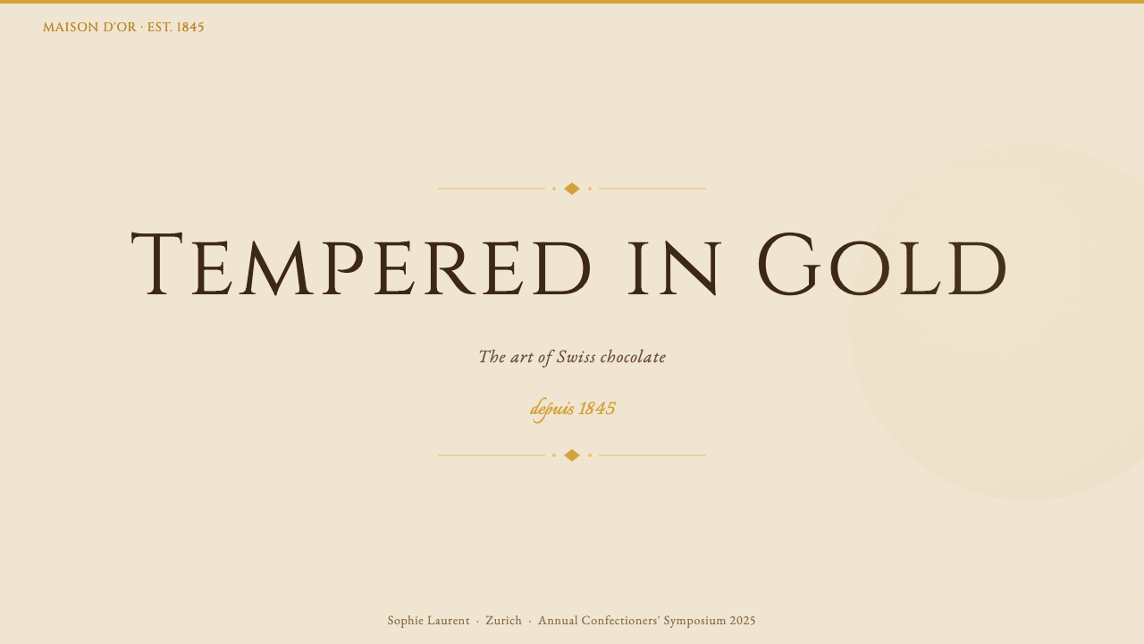
For presentation slides, the style works most effectively when it commits fully to the warm three-tone palette. A cover slide benefits from a single bold typographic statement in tall serif capitals set against a deep cocoa-brown ground, with the product or event name in cream or gold tones and a thin filigree rule as the sole decorative element. Content slides should be treated with similar restraint: wide margins, generous line spacing, section headers in serif caps at a clearly distinct size from body text. Data slides — charts, tables, timelines — should inherit the palette directly, with bars and segments rendered in the warm tones rather than in conventional charting colors. The result reads as a premium document that happens to contain data, rather than a data document with cosmetic surface treatment.在演示文稿中,这种风格最有效的做法是完全遵守暖三色色板。封面幻灯片适合以深可可棕底色衬托单一有力的高挑衬线大写字体声明,产品或活动名称以奶油色或金色调呈现,纤细的细线装饰作为唯一的装饰元素。内容幻灯片应以同样的克制处理:宽边距、慷慨的行距,段落标题以衬线大写字母设置,且与正文大小有清晰区别。数据幻灯片——图表、表格、时间线——应直接继承色板,以暖色调而非常规图表颜色呈现柱条与扇区。结果读来是一份恰好包含数据的高端文件,而不是表面施以化妆品处理的数据文件。
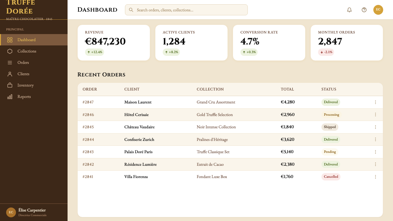
For web interfaces — particularly brand landing pages, premium e-commerce product pages, and editorial features — the style's cream ground, serif typography, and gold accent language translate directly into screen contexts. Navigation and header elements should be typographic and sparse, relying on well-set serif wordmarks and restrained gold rule accents rather than icon-heavy navigation bars. Pricing pages and feature comparison layouts benefit from the style's inherent hierarchy: a headline tier in tall serif caps, a supporting descriptive tier in smaller serif text, and a clear action element distinguished in warm gold. Dashboard and data-heavy interfaces are a less natural fit, but where the brand context demands them, maintaining the cream background and confining color only to the most critical interaction states will preserve the premium register.对于网页界面——特别是品牌落地页、高端电商产品页与编辑专题——奶油底色、衬线字体与金色强调语言可直接转译至屏幕语境。导航与标题元素应是字体性且简洁的,依赖排版精良的衬线标志字与克制的金色线条点缀,而非图标密集的导航栏。定价页与功能对比版面受益于这种风格内在的层级感:高挑衬线大写字母的标题层,较小衬线文字的辅助描述层,以及以暖金色区分的清晰行动召唤元素。仪表板与数据密集界面是较不自然的匹配,但若品牌背景有此需求,保持奶油底色并仅将颜色限定于最关键的交互状态,将保留高端基调。
For editorial and marketing work — print advertising, brand campaigns, packaging systems, event materials — the Lindt aesthetic is in its element. A brand campaign page using this system might alternate between cream-ground sections (where gold and brown type carry the content) and deep cocoa-brown sections (where cream and gold type reverse out), using the contrast between the two to create visual rhythm without introducing any additional hues. Packaging applications should maintain the three-tone discipline rigorously: the temptation to introduce product-differentiating colors must be managed through tone variation and filigree accent rather than chromatic expansion. Print advertising works especially well with wide negative space, a single large serif headline, and a small hand-script accent functioning as a visual signature.对于编辑与营销工作——印刷广告、品牌活动、包装系统、活动物料——瑞士莲美学如鱼得水。使用这套系统的品牌活动页,可以在奶油底色区块(金色与棕色字体承载内容)与深可可棕区块(奶油与金色字体反白呈现)之间交替,利用两者之间的对比制造视觉韵律,无需引入任何额外色调。包装应用应严格维持三色纪律:通过色调变化和细线点缀而非色彩扩展来管理产品差异化颜色的诱惑。印刷广告尤其适合宽阔的负空间、单一大号衬线标题,以及充当视觉签名的小号手写花体点缀。
A common mistake when applying this style is conflating luxury with ornamentation. The instinct when working with gold and script is to add more — more filigree, more flourishes, more decorative borders — until the composition tips from refined to cluttered. The Lindt aesthetic is specifically about luxury through discipline: each gold line, each script accent, each serif headline should be placed with the understanding that it is the only one of its kind in that composition. The filigree line divides once; the hand-script accent appears once; the gold tone is reserved for the most important element. Restraint is not the absence of decoration — it is the mastery of knowing when to stop.应用这种风格时最常见的错误,是将奢华与装饰混为一谈。在使用金色与手写体时,本能是不断添加——更多细线、更多花体、更多装饰边框——直到构图从精炼翻转为杂乱。瑞士莲美学特别讲求通过纪律实现奢华:每一条金色线条、每一处手写点缀、每一行衬线标题,都应以理解其在该构图中是同类中唯一的心态来放置。细线装饰分隔一次;手写花体点缀出现一次;金色色调留给最重要的元素。克制不是装饰的缺席——它是知道何时停手的精湛技艺。
See the Lindt Swiss Chocolate design system查看 Lindt Swiss Chocolate 完整设计系统
Lindt Swiss Chocolate — FAQLindt Swiss Chocolate · 常见问题
How does the Lindt style differ from other luxury chocolate brand aesthetics?瑞士莲风格与其他高端巧克力品牌美学有何不同?
The Lindt system is distinguished by its three-tone discipline — gold, cocoa brown, and cream — and by its commitment to classical serif typography and hand-script accents as the primary vehicles of warmth. Competitors such as Godiva have historically leaned into rich jewel-tone palettes and heraldic imagery; Valrhona uses a darker, more austere professional register aimed at pastry chefs rather than consumers. Lindt occupies the middle ground: warmer and more approachable than a professional chocolate house aesthetic, more restrained and classically grounded than a confectionery brand that celebrates indulgence through visual abundance. The filigree line and the script accent are particularly distinctive — they trace directly to nineteenth-century Swiss commercial engraving traditions in a way that competitors rarely replicate convincingly.瑞士莲系统的特点在于其三色纪律——金、可可棕与奶油——以及将古典衬线字体与手写花体点缀作为温度感主要载体的承诺。竞争对手如 Godiva 历史上倾向于丰富的珠宝色调与纹章图像;Valrhona 使用更深沉、更严峻的专业基调,针对糕点师而非普通消费者。瑞士莲占据中间地带:比专业巧克力屋美学更温暖可亲,比通过视觉丰盛庆祝享乐的糖果品牌更克制、更有古典根基。细线装饰与手写体点缀尤为独特——它们以竞争对手极少能令人信服地复制的方式,直接追溯至十九世纪瑞士商业雕刻传统。
Can this style work for non-food or non-luxury product categories?这种风格能用于非食品或非奢侈品类别吗?
Yes, but with important caveats. The warm three-tone palette and classical serif typography communicate heritage, craftsmanship, and premium quality — values that translate well into categories such as fine fragrances, premium skincare, financial services with a heritage positioning, boutique hospitality, and artisan goods of any kind. The style struggles in contexts that require technological credibility, youthful energy, or clinical precision — a fintech startup, a sportswear brand, or a medical device company would find the warm warmth and classical serif register working against their core positioning. The hand-script accents in particular are context-sensitive: in a fine fragrance campaign, they read as artisanal authenticity; in a software interface, they can undermine the credibility that digital tools depend on.可以,但有重要的前提条件。暖三色色板与古典衬线字体传达传承、工艺与高端品质——这些价值观可以良好转译至高端香水、优质护肤品、具有传承定位的金融服务、精品酒店以及任何类型的手工艺品等类别。这种风格在需要技术可信度、年轻活力或临床精准感的场景中则力不从心——一家金融科技初创公司、一个运动服装品牌或一家医疗器械公司,会发现这种温润感与古典衬线基调与其核心定位相悖。手写花体点缀尤其对语境敏感:在高端香水活动中,它们读来是手工正宗性;在软件界面中,它们可能破坏数字工具所依赖的可信度。
How should color be managed when product variants need visual differentiation?当产品系列需要视觉区分时,应如何管理色彩?
This is one of the genuine tensions in applying the Lindt aesthetic to multi-SKU product systems. The system's strength — its three-tone discipline — is also its constraint when differentiation is needed. The recommended approach is to manage differentiation through tone and warmth within the existing palette rather than through chromatic expansion. A milk chocolate variant reads warmer, leaning into the cocoa brown; a dark chocolate variant leans cooler and deeper within the brown-to-near-black range; a white chocolate variant emphasizes the cream and gold tones. Where a category genuinely requires a distinct hue — as Lindor has done with its color-coded foil truffle range — the introduced color should be warm-toned, restrained in saturation, and used as a foil accent only, never as the dominant field color. The gold and cream structure of the overall system should remain legible above any product-level color coding.这是将瑞士莲美学应用于多 SKU 产品系统时真实存在的张力之一。系统的优势——三色纪律——在需要差异化时同样是约束。推荐的方法是在现有色板内通过色调与温度变化来管理差异化,而非通过色彩扩展。牛奶巧克力变体读来更温润,偏向可可棕;黑巧克力变体在棕色到近黑色范围内偏向更冷、更深;白巧克力变体则强调奶油与金色调。在某个系列真正需要独特色调的情况下——如 Lindor 用色彩编码区分其松露巧克力系列——引入的颜色应是暖色调、饱和度克制,且仅用作箔纸点缀,绝不作为主导底色使用。整体系统的金色与奶油结构,应在任何产品层级的色彩编码之上保持清晰可读。
Is the style appropriate for digital interfaces, or is it primarily a print and packaging aesthetic?这种风格适合数字界面吗?还是它主要是印刷与包装美学?
The style originated in and is strongest in tactile media — packaging, print advertising, retail environments — where the warmth of cream paper, the luster of gold foil, and the physicality of embossed filigree lines can be experienced directly. Translating it to screen requires compensating for the absence of material tactility. On digital surfaces, the cream background should be warm enough to read as parchment rather than white; gold should be muted and warm rather than metallic or high-saturation; the serif typefaces need to be chosen for screen legibility as well as classical authority. The hand-script accents work best on screen as logotype elements and headline signatures rather than as body-text decoration. The style is entirely viable for digital brand touchpoints — landing pages, e-commerce, brand social content — but demands more careful calibration on screen than in print because the absence of physical texture means the warmth must be carried entirely by color and typographic choices.这种风格源于并在触觉媒介中最为强大——包装、印刷广告、零售环境——在那里,奶油纸的温度、金箔的光泽以及浮雕细线的物质性可以被直接体验。将其转译至屏幕需要补偿材质触感的缺失。在数字界面上,奶油底色应足够温润,读来像羊皮纸而非白色;金色应是柔和的暖调而非金属感或高饱和度;衬线字体需要兼顾屏幕易读性与古典权威感来选择。手写花体点缀在屏幕上最适合作为标志字元素与标题签名,而非正文装饰。这种风格完全可以用于数字品牌接触点——落地页、电商、品牌社交内容——但在屏幕上比在印刷品上需要更谨慎的校准,因为物质质感的缺失意味着温度感必须完全由色彩与字体选择承载。
What is the single most common error when designers first attempt this style?设计师初次尝试这种风格时最常见的单一错误是什么?
Over-scripting: using hand-lettered or cursive elements so liberally that the formal serif structure of the system is overwhelmed. The temptation is understandable — the hand-script accent is the most distinctive and expressive element of the visual system, and it is natural to want more of what is working. But the script derives its power entirely from contrast with the formal serif typography and the precise gold filigree. Use it twice on a composition and it becomes wallpaper; use it three times and the composition reads as a generic 'fancy food' aesthetic that has no particular association with Swiss chocolate heritage. The Lindt aesthetic is built on the interaction between the formal and the human, the precise and the warm, the classical and the personal — and that interaction requires that each element respect the other's space.过度使用手写体:如此大量地使用手写或草书元素,以至于压倒了系统的正式衬线字体结构。这种诱惑是可以理解的——手写花体点缀是视觉系统中最具特色、最富表现力的元素,想要更多有效的东西是自然的。但手写体的力量完全来自于与正式衬线字体和精准金色细线的对比。在一幅构图中使用两次,它就成了壁纸;使用三次,构图就读来是一种通用的「精致食品」美学,与瑞士巧克力传承毫无特定关联。瑞士莲美学建立在正式与人情味、精准与温度、古典与个人之间的互动上——而这种互动要求每一个元素尊重另一个的空间。
Related design styles相关设计风格
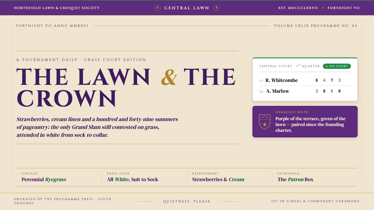 Wimbledon (Purple-Green)Centre Court in tokens. Regal purple and grass-green crest, cream linen, Cinz…中央球场的视觉语法:饱和紫与草场绿盾徽、奶油纸底、Cinzel 大写衬线加金色…
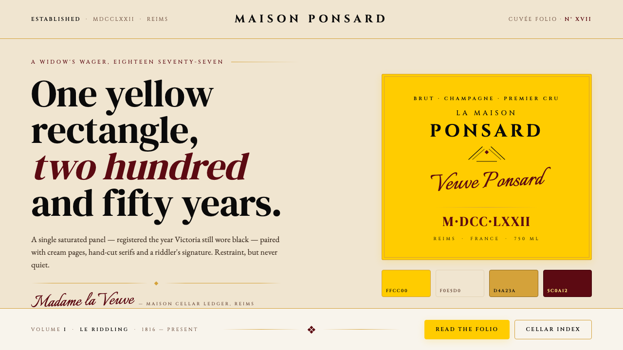 Veuve Clicquot (Yellow-Label)One audacious yellow rectangle, 250 years. Pantone yellow on cream, Cinzel se…1877 年那块大胆的明黄:饱和 Pantone 黄 + 暖奶油 + Cinz…
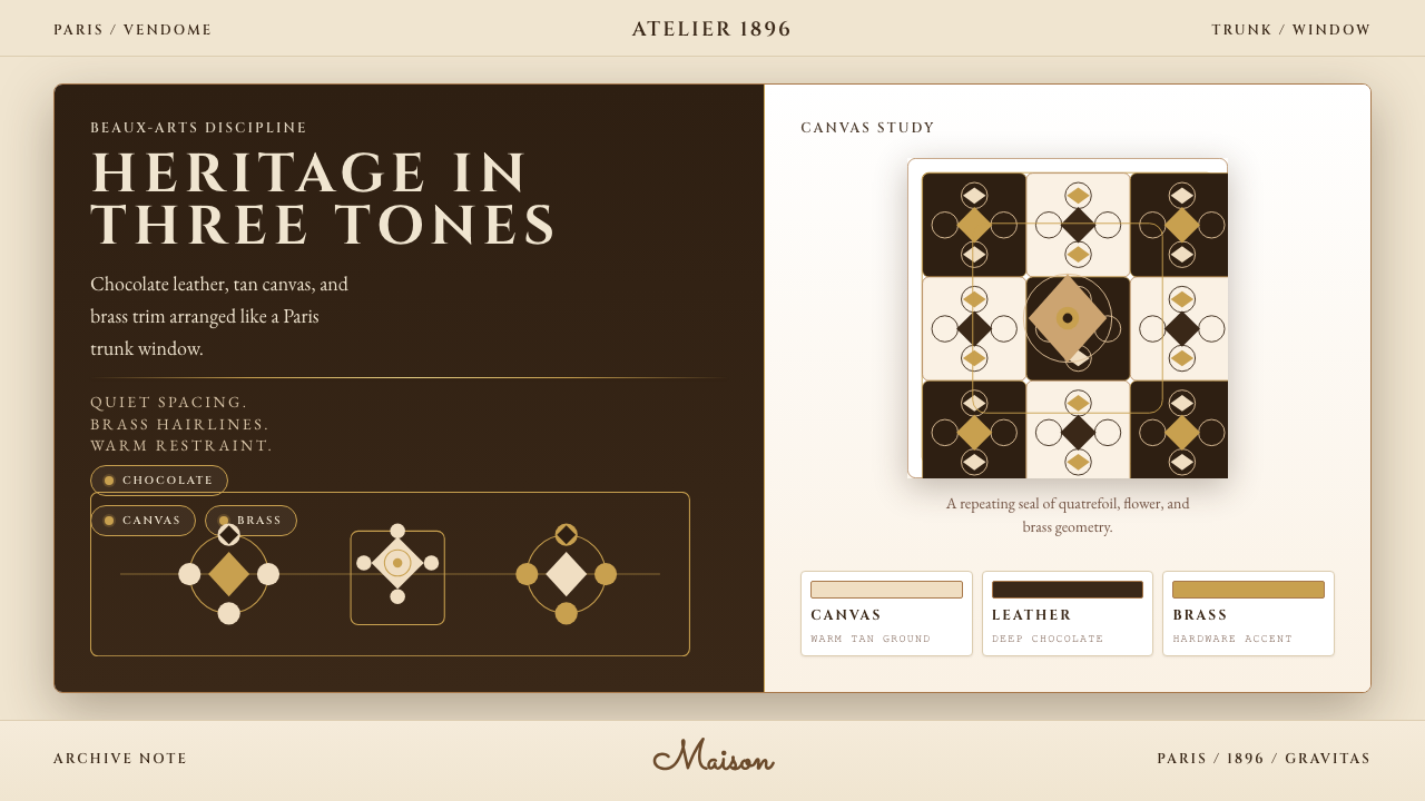 Louis Vuitton MonogramHeritage stays luminous. Chocolate, tan, and brass stage a Paris trunk window.优雅很有分量。巧克力棕、驼色与黄铜构成巴黎箱窗。
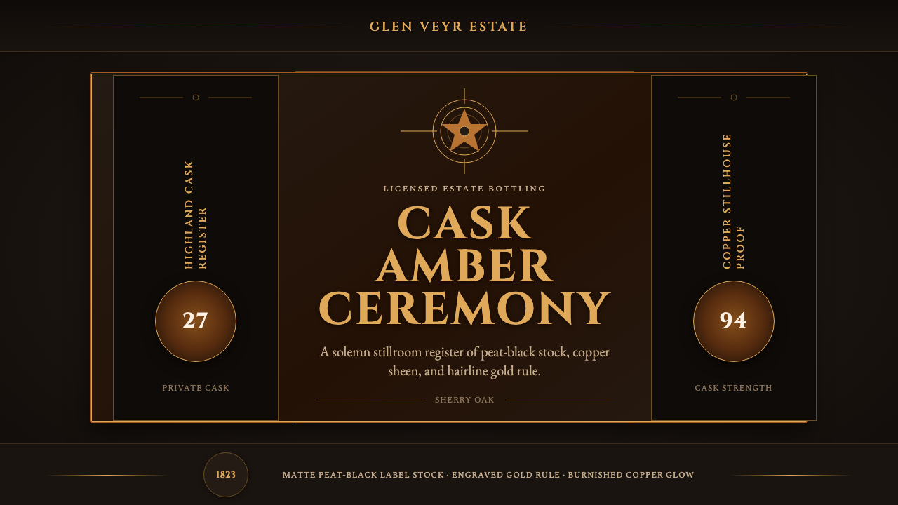 Single Malt ScotchSolemn amber gravity. Thin gold rules and Cinzel capitals glow on peat-black.庄重的琥珀引力。泥煤黑上金线与Cinzel大写发光。
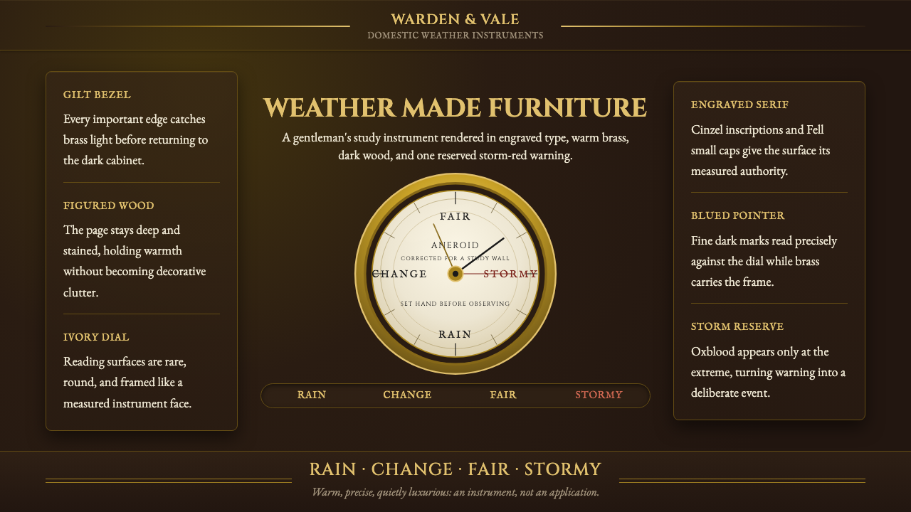 Aneroid BarometerMeasures weather as furniture. Gilt rings and Cinzel engraving glow on dark w…把天气量成家具:深木底、黄铜圈与Cinzel雕刻发光。
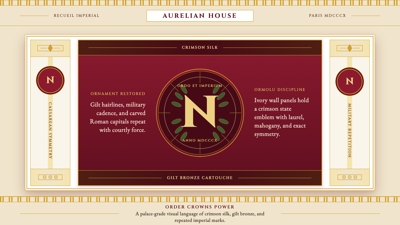 Napoleonic Empire StyleImperial order speaks. Crimson silk, gilt hairlines, and strict symmetry fram…帝国秩序发声:深红丝绸、鎏金细线与对称框架托起 N 印。