What is Veuve Clicquot (Yellow-Label)?什么是 Veuve Clicquot (Yellow-Label)?
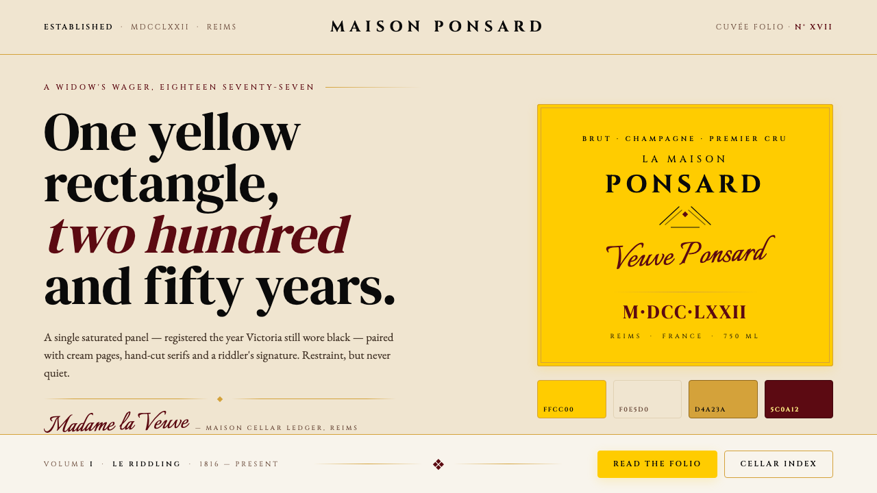
One audacious yellow rectangle anchored 250 years of Champagne royalty — Veuve Clicquot's Yellow Label is perhaps the most recognizable single color decision in luxury branding history.一块大胆的明黄矩形,撑起两百五十年的香槟王朝——凯歌香槟的黄牌,或许是奢侈品牌史上辨识度最高的单一色彩决定。
Veuve Clicquot (Yellow-Label) in briefVeuve Clicquot (Yellow-Label) 速览
Veuve Clicquot's visual identity rests on one of the boldest chromatic commitments in the history of luxury branding: a single saturated yellow, registered as the house's signature since the 1877 Yellow-Label release, that functions simultaneously as background, signature, and worldview. The system pairs that dominant yellow with warm cream, deep black, and occasional warm gold — a palette of four tones held in classical restraint. No brand in Champagne, and few in luxury at large, have staked so much on a single color's legibility across two and a half centuries.凯歌香槟的视觉身份,建立在奢侈品牌史上最大胆的色彩承诺之一之上:自1877年黄牌香槟面世起,一抹饱和的明黄便作为品牌的视觉签名,同时扮演着背景色、品牌标识与世界观的角色。这套体系以这块主导性的明黄为核心,辅以暖奶油、深黑与偶尔点缀的暖金——四种色调在古典克制中共存。在香槟世界里,乃至在整个奢侈品领域,几乎没有另一个品牌能在两个半世纪的跨度里,将如此多的品牌识别力押注于单一色彩的易读性之上。
The typographic voice of the house is unambiguously classical. The wordmark lives in an upright Roman serif — the kind of letterform that carries the authority of engraved stone and academic tradition. Body text follows in a humanist old-style serif that breathes warmth and readability into the formality. Set against these upright, authoritative forms, a flowing script flourish — evoking Madame Clicquot's own signature — appears as a counterpoint: it is the widow's handwriting in a house otherwise built from Roman capitals. This contrast between the institutional and the personal is the emotional core of the system.这个品牌的字体语言是毫不含糊的古典主义。字标采用直立罗马衬线体——那种承载着铭刻石碑与学术传统权威感的字形。正文则以人文主义旧式衬线体书写,在庄重的框架中注入温度与可读性。在这些挺拔、权威的字形之间,一笔流动的手写花体脚本作为对位出现——那是凯歌寡妇的手迹在一座以罗马大写字母构建的府邸里留下的个人印记。机构权威与私人温情之间的这种张力,正是这套视觉体系的情感内核。
Where most luxury fashion houses build identity around surface richness — embossed leather, gilded monograms, layered ornament — Veuve Clicquot builds identity around chromatic immediacy. The yellow label is not decoration; it is structure. Everything else on the bottle, the capsule, the shipping box, the advertising page is organized in relation to that rectangle. This approach gives the house an unusual visual clarity: it is recognizable at a distance, in thumbnail, in a crowded bar shelf, in a decade-old photograph. The identity does not depend on proximity or detail — it depends on one irreducible decision made in 1877 and honored ever since.大多数奢侈时尚品牌依靠表面富丽感构建身份——压花皮革、镀金字母组合、层叠装饰——凯歌香槟却依靠色彩的直接冲击力构建身份。黄色标签不是装饰,它是结构。酒瓶、帽膜、运输箱、广告页上的一切,都围绕着那块矩形来组织。这种方式赋予品牌非同寻常的视觉清晰度:在远处可辨,在缩略图中可辨,在拥挤的吧台货架上可辨,在数十年前的照片里同样可辨。这套视觉体系不依赖近距离的细节赏读——它依赖1877年做出的一个不可化简的决定,以及此后每一代人对这个决定的忠实传承。
See the Veuve Clicquot (Yellow-Label) design system查看 Veuve Clicquot (Yellow-Label) 完整设计系统
Where does Veuve Clicquot (Yellow-Label) come from?Veuve Clicquot (Yellow-Label) 从何而来?
The house of Veuve Clicquot traces its founding to 1772, when Philippe Clicquot-Muiron established a wine trading business in Reims, the cathedral city at the heart of France's Champagne region. The Clicquot family had prospered as textile merchants and wool traders; wine was a natural extension of their mercantile ambitions in a region whose chalky subsoils had produced sparkling wine of growing European renown. The early house was a trading concern as much as a production cellar, and Reims's position on the old Roman road made it a natural hub for distributing Champagne's prestige bottles to northern Europe.凯歌香槟的历史可追溯至1772年。彼时,菲利普·克里科-穆伊隆在兰斯创立了一家葡萄酒贸易商行。兰斯是法国香槟区腹地的大教堂城市,克里科家族以纺织品与羊毛贸易起家,葡萄酒贸易是他们在这片白垩土地上商业野心的自然延伸——这片土地出产的起泡酒在欧洲的声望与日俱增。早期的商行与其说是一座生产酒窖,不如说是一家贸易公司,而兰斯处于古罗马道路要冲的地理位置,使其自然成为向北欧分销香槟名酿的枢纽。
The transformation of the house into a dynasty belongs entirely to Barbe-Nicole Ponsardin, who married Philippe's son François Clicquot in 1798 and became a widow — veuve — just six years later, at the age of twenty-seven. Rather than retiring from the business, as convention would have demanded, she took control of the cellars in 1805 and began what would become the most consequential single career in Champagne history. Her commercial instincts were extraordinary: she famously smuggled the first post-Napoleonic shipment of Champagne into Russia in 1814, outmaneuvering a British naval blockade to capture the tsarist market before any competitor. She built distribution networks across Prussia, Austria, and the German states. By the time of her death in 1866, the house bore her title — Veuve, widow — as a mark of honor, and the brand was known in every court in Europe.将这个商行变为王朝的,完全是一个女人的功业——芭布-妮可·彭莎丹。她于1798年嫁给菲利普之子弗朗索瓦·克里科,却在六年后、年仅二十七岁时成了寡妇。她没有如世俗期待那般退出商界,而是在1805年接掌了酒窖,开始了香槟史上影响最为深远的个人事业。她的商业直觉惊人:1814年,她在英国海军封锁的夹缝里秘密将第一批后拿破仑时代的香槟运入俄罗斯,抢在所有竞争对手之前占领了沙皇市场。她在普鲁士、奥地利和德意志诸邦建立了分销网络。1866年她去世时,品牌已冠以她的称谓——「凯歌寡妇」(Veuve)——作为荣誉之名,并在欧洲每一个宫廷留下了名声。
Technically, Madame Clicquot's most lasting contribution was the invention of the riddling rack — the pupitre — a slanted wooden board pierced with holes that allowed sparkling wine bottles to be gradually tilted and rotated over weeks, causing the sediment from secondary fermentation to collect in the neck of the bottle for easy removal. Before riddling, Champagne was cloudy, sweetened to mask the sediment, and highly variable in quality. Her technique, developed in the cellars around 1816, made clear, consistent Champagne commercially viable at scale. The method remains standard practice — albeit now often mechanized — in houses across Reims and Épernay to this day.在技术层面,凯歌夫人最为深远的贡献是发明了「转瓶架」——pupitre——一块斜插木孔的木质架台,使香槟酒瓶能在数周内被缓缓倾斜旋转,令二次发酵产生的酵母沉淀逐渐汇集至瓶颈,以便轻松去除。转瓶法发明之前,香槟酒液浑浊,需以加糖掩盖沉淀,品质参差不齐。她约在1816年在酒窖中摸索出的这项技术,使清澈、稳定的香槟得以在规模化生产中商业落地。时至今日,这一工艺依然是兰斯与埃佩尔内各大香槟酒庄的标准操作——尽管现在已多有机械化实现。
The famous yellow label itself arrived in 1877, over a decade after Madame Clicquot's death, under the stewardship of Edouard Werlé, who had managed the house since 1821 and worked to codify and extend her legacy. The choice of a saturated yellow for the label was unusual — most Champagne houses favored cream, white, or pale gold, echoing the color of the wine itself or the restrained palette of aristocratic stationery. Veuve Clicquot's yellow declared itself immediately, loudly, and without apology. The label became legally registered as the house's brand color, and subsequent decades — through two World Wars, the Great Depression, and the eventual acquisition by LVMH in the late twentieth century — only deepened the association between that yellow and Champagne prestige. Under LVMH's creative direction, the current visual identity, refined around 2022 to 2024, modernized the typography and tightened the system while preserving the yellow's centrality absolutely.那块著名的黄色标签,出现在1877年——凯歌夫人去世逾十年之后,由自1821年起便主持酒庄事务的爱德华·韦勒主导推出。以饱和明黄作为标签底色,是一个异乎寻常的选择——大多数香槟酒庄偏爱奶油色、白色或淡金色,呼应酒液本身的色泽,或贵族信笺的克制色调。凯歌香槟的黄标毫不掩饰地直接宣示自身的存在。这枚标签后来被法律注册为品牌色,此后数十年——历经两次世界大战、大萧条,以及二十世纪末并入LVMH集团——只是进一步加深了明黄与香槟荣耀之间的关联。在LVMH创意总监团队的主导下,现行视觉识别系统于2022至2024年间经历了一次现代化更新:字体得到优化,整体系统更加精炼,但明黄色的核心地位从未动摇。
What defines the Veuve Clicquot (Yellow-Label) look?Veuve Clicquot (Yellow-Label) 的视觉特征是什么?
Signature Yellow标志性明黄
The defining characteristic of the Veuve Clicquot system is a single warm, saturated yellow — the same tone registered as the brand's legal color since the 1877 Yellow-Label launch. It reads as neither pale nor orange, but as a full-bodied, declarative yellow that sits confidently at the warm end of the spectrum. On packaging and print, it occupies large fields without any gradation, shadow, or texture. Its power comes not from variation but from repetition: the same tone, unchanged, across every surface, every decade, every market.凯歌香槟视觉体系的决定性特征,是一抹单一的暖调饱和明黄——自1877年黄牌面世以来,这个色调便作为品牌法定色被注册保护。它既非苍白,亦非橙调,而是一种充盈饱满、宣示性强烈的明黄,自信地栖居于色谱的暖端。在包装与印刷物上,它以大面积铺陈,毫无渐变、阴影或肌理。它的力量不来自变化,而来自重复:同一色调,始终如一,跨越每一个表面、每一个年代、每一个市场。
Classical Serif Wordmark古典衬线字标
The house name is set in an upright, high-contrast classical serif — the kind of letterform historically associated with Roman inscriptions, academic printing, and the engraved copper plates of eighteenth-century European luxury trade. The serifs are sharp and bracketed; the stroke contrast between thick and thin is pronounced. This typographic register conveys institutional gravity and historical legitimacy. It does not attempt modernity; it makes modernity irrelevant by standing entirely outside the contemporary moment.品牌名称采用直立、高对比的古典衬线体排印——这类字形历史上与罗马铭文、学术印刷以及十八世纪欧洲奢侈品贸易的铜版雕刻相关联。衬脚锋利而带弧形收束,粗细笔画之间的对比显著。这种字体语调传递出机构的庄重感与历史正统性,它不追求现代感,而是以完全游离于当代时间之外的姿态,令现代感的追问本身变得多余。
Script Flourish手写花体点题
Set against the upright authority of the Roman wordmark, a flowing italic or script element — evoking Madame Clicquot's personal hand — introduces warmth, humanity, and narrative. It functions as a counterpoint: where the Roman capitals say 'institution,' the script says 'person.' This duality of the formal and the personal is rare in luxury branding, and it is the reason the Veuve Clicquot identity reads as both authoritative and intimate. The script appears at controlled scale, never overwhelming the system, but always reminding the viewer of the widow at its origin.与直立罗马字标的权威气场形成对位,一笔流动的斜体或手写脚本元素——唤起凯歌夫人亲笔字迹的联想——为整体注入温度、人性与叙事感。它作为对立声部存在:若罗马大写字母代表「机构」,手写体则代表「个人」。这种正式与私人的双重性在奢侈品牌中实属罕见,正是它让凯歌香槟的视觉身份同时具备权威感与亲密感。手写体以受控的尺度出现,从不压倒整体系统,但始终提醒观者:这个品牌的起点,是一位寡妇。
Warm Cream Ground暖奶油底色
Where the yellow does not cover, warm cream functions as the system's second ground. It is not pure white — it carries a slight warmth that harmonizes with the yellow's own warmth and prevents the black typography from reading as harsh. Cream contextualizes the yellow as a luxury choice rather than a purely commercial signal. It also references the color of Champagne itself, the aged paper of historical documents, and the ivory of aristocratic stationery — all associations that reinforce the house's positioning at the intersection of history, agriculture, and refinement.在明黄色未覆盖之处,暖奶油色作为体系的第二底色出现。它不是纯白——它携带轻微的暖调,与明黄的暖意相互协调,防止黑色字体显得生硬刺目。奶油色将明黄置于奢侈语境而非纯商业信号的框架之中。它同时唤起香槟酒液本身的色泽、历史文献的老纸色调,以及贵族信笺的象牙白——所有这些联想都强化了品牌在历史、农业与精致文化交汇处的定位。
Deep Black for Structure深黑构建结构
Black in the Veuve Clicquot system is not a neutral; it is a deliberate contrast element that anchors the yellow and prevents the palette from reading as purely celebratory. Used for all primary typography, for ruled lines and dividers, and for the ink of official seals and legal text on labels, black introduces a gravity that keeps the warmth of the yellow from tipping into frivolity. The proportion matters: black is used sparingly, at typographic weight, never as large fields. The yellow must always dominate.在凯歌香槟的视觉体系中,黑色不是中性的存在,而是一个刻意的对比元素,用来锚定明黄并防止整套色板流于纯粹的欢庆气氛。黑色用于所有主要字体排印、横线与分隔符,以及标签上官方印记和法律文字的油墨色调,它引入的庄重感使明黄的温度不至于滑向轻浮。用量的把控至关重要:黑色以字体重量级别出现,保持克制,绝不大面积铺展。明黄必须始终主导全局。
Gold as Restrained Accent暖金作为克制点缀
A warm, muted gold — closer to antique brass than to bright metallic — appears at key moments as a tertiary accent: the cage wire on the bottle, the foil of the capsule, the occasional decorative stroke in premium communications. Gold is used sparingly precisely because the yellow already performs the role of warmth and prestige; gold overdone would compete with and dilute that yellow rather than reinforce it. Used at small scale and in physical materials where it catches light differently from the flat yellow, gold adds tactile dimension without disturbing the chromatic hierarchy.一抹暖调的、偏近古铜色而非明亮金属感的暖金,在关键时刻作为第三层强调色出现:酒瓶的铁丝网架、帽膜的烫金压印、高端传播物料中偶尔的装饰性笔触。暖金之所以用量极省,正是因为明黄本已承担了温度与尊贵感的表达;过度使用暖金只会与明黄形成竞争并稀释它,而非强化它。以小面积出现、并在实物材质中以不同于平涂明黄的方式捕捉光线,暖金在不干扰色彩层级的前提下,增添了一层触感维度。
Label as Architectural Object标签作为建筑性对象
Unlike brands that treat their bottle label as a framed picture to be viewed frontally, Veuve Clicquot treats the label as an architectural surface — a flat, bold plane of color that wraps and commands the bottle's form. The yellow field is typically left unadorned at its edges: no decorative border, no embossed frame, no ornamental surround. The label begins and ends precisely, with clean cuts. This architectural confidence — the color standing without apology, requiring no ornamental justification — is a key reason the identity has survived two centuries of changing tastes without requiring fundamental revision.不同于将瓶标视为一幅供正面欣赏的有框图画的品牌,凯歌香槟将标签作为建筑性表面来对待——一块平整、大胆的色彩平面,包裹并主导酒瓶的形体。明黄色块的边缘通常保持未经装饰的状态:无装饰性边框,无浮雕外框,无花饰环绕。标签干净利落地开始、干净利落地结束。这种建筑式的自信——色彩无需道歉地独立存在,无需任何装饰性辩护——是这套视觉身份历经两个世纪口味变迁而无需根本性修订的关键原因之一。
See the Veuve Clicquot (Yellow-Label) design system查看 Veuve Clicquot (Yellow-Label) 完整设计系统
Who shaped Veuve Clicquot (Yellow-Label)?谁塑造了 Veuve Clicquot (Yellow-Label)?
Widowed at twenty-seven, Madame Clicquot took control of the family Champagne cellars in 1805 and built what became the foremost Champagne house of the nineteenth century. Her commercial achievements were matched by her technical innovation: the riddling rack she developed around 1816 solved the central production problem of clear, stable sparkling wine and established the method that the entire industry adopted. Her personal story — the widow who refused convention and built an empire — became inseparable from the brand's identity, and the house's very name, Veuve Clicquot (Widow Clicquot), perpetuates her legacy as a founding gesture.年仅二十七岁便成寡妇的凯歌夫人,于1805年接掌家族香槟酒窖,将其建设成为十九世纪首屈一指的香槟世家。她的商业成就与技术创新同样卓著:她约于1816年发明的转瓶架,解决了清澈稳定起泡酒生产的核心难题,并确立了整个行业沿用至今的工艺方法。她的个人故事——一位拒绝世俗规范、凭一己之力建立商业帝国的寡妇——与品牌身份融为一体,不可分割,而品牌名称「凯歌寡妇」(Veuve Clicquot)本身,便是对这份传承最永久的纪念。
The founder of the house in 1772, Philippe Clicquot-Muiron established the mercantile and regional foundations that his daughter-in-law would transform into a Champagne dynasty. His background in textile and wool trading gave the early house its commercial orientation — it was always as much a trading business as a wine production operation — and his establishment in Reims placed the family at the geographic and logistical center of the Champagne region's export economy.菲利普·克里科-穆伊隆于1772年创立了这座酒庄,为日后他的儿媳将其转化为香槟王朝奠定了商业与地域基础。他在纺织品与羊毛贸易中积累的经验,使早期酒庄具有鲜明的商业导向——它从一开始便与其说是葡萄酒生产商,不如说是贸易商。他在兰斯的落户安家,也将这个家族置于香槟区出口经济的地理与物流中心。
Werlé joined the house as a partner in 1821, just fifteen years after Madame Clicquot took control, and served as its chief administrator for decades. It was under his stewardship that the famous yellow label was introduced in 1877, codifying what had been a house visual custom into a registered brand identity. Werlé's long tenure represented the transition from the widow's personal enterprise to a structured, institutionalized business — the moment at which the house began systematically managing its image as a luxury brand rather than merely selling wine.韦勒于1821年以合伙人身份加入酒庄,此时距凯歌夫人接掌酒窖不过十五年,此后数十年间他一直担任酒庄的首席管理者。正是在他的主持下,著名的黄色标签于1877年推出,将此前约定俗成的品牌视觉习惯正式注册为品牌身份。韦勒漫长的任期,代表着从凯歌夫人的个人事业向结构化、机构化商业的转型——也是这个酒庄开始系统性地以奢侈品牌自我经营、而非单纯以葡萄酒贸易为业的历史节点。
Veuve Clicquot was acquired by LVMH — Moët Hennessy Louis Vuitton — as part of the conglomerate's assembly of prestige Champagne houses. Under LVMH's brand architecture, the house has benefited from significant investment in global marketing, retail presence, and creative direction. The most recent significant evolution of the visual identity, undertaken in the 2022 to 2024 period, refined the typography and tightened the supporting graphic system while maintaining the yellow's absolute primacy. LVMH's stewardship illustrates both the opportunity and the constraint of luxury conglomerate ownership: the scale to invest globally, and the discipline to resist the temptation to over-refresh an identity whose power lies in its consistency.凯歌香槟作为路威酩轩集团(LVMH)旗下顶级香槟品牌矩阵的一部分,被并入这家奢侈品巨头。在LVMH的品牌架构下,凯歌香槟受益于集团在全球营销、零售终端与创意总监层面的大量投入。最近一次重要的视觉身份演进发生于2022至2024年间,对字体进行了精炼,并收紧了配套的图形体系,同时维护了明黄色的绝对核心地位。LVMH的管理,同时体现了奢侈品集团所有权的机遇与约束:既有全球规模投入的能力,也有克制过度更新品牌的自律——而凯歌香槟的力量,恰恰建立于其始终如一之上。
How do you use Veuve Clicquot (Yellow-Label) today?今天怎么用 Veuve Clicquot (Yellow-Label)?
The Veuve Clicquot Yellow-Label style is one of the most transferable prestige design systems for contemporary work because its logic is chromatic rather than ornamental. Applying it correctly means understanding what the yellow is actually doing: it is not accent or highlight — it is ground, structure, and primary signal simultaneously. Before placing a single element, establish whether the yellow will dominate the composition or serve as a contained block. The answer to that question determines everything else.凯歌香槟黄牌风格是当代设计实践中可移植性最强的顶级设计体系之一,原因在于其逻辑是色彩性的而非装饰性的。正确应用它,意味着理解明黄实际上在做什么:它不是强调色,不是高光——它同时扮演着底色、结构与主要信号的角色。在放置任何元素之前,先确立明黄是否将主导整体构图,还是以一块受控的色块形式出现。这个问题的答案,决定了此后的一切。
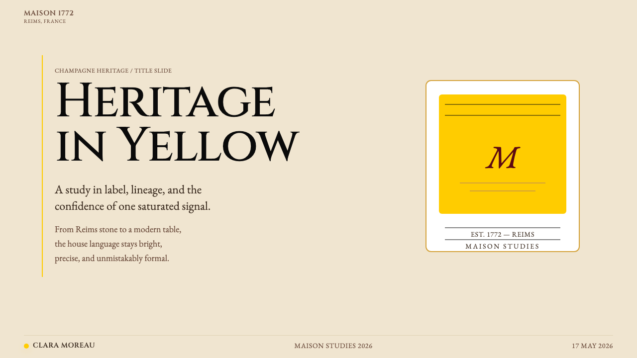
For presentation slides, the style works exceptionally well on cover pages conceived as large-format label compositions. A cover in this system functions like a Champagne label at room scale: the yellow occupies a dominant portion of the frame, the house name or presentation title sits in classical serif type at high contrast, and one line of script or italic subtext introduces the personal counterpoint. Content slides should be treated as typographic layouts on cream grounds: two or three scale-differentiated text hierarchies, black ruling lines as structural dividers, and data visualizations — bar charts, timelines, comparative tables — rendered with the same chromatic restraint as the palette: yellow for primary data, cream for background fields, black for labels and axes. The style supports premium and finance presentations, vintage and hospitality brands, and any context where the claim being made is one of authority and longevity.在演示文稿中,这种风格尤其适合被构思为大幅标签构图的封面页。在这套体系中,一张封面就像一枚放大至房间尺度的香槟标签:明黄占据画面的主导部分,品牌名称或演示标题以古典衬线体在高对比度下排印,一行斜体或手写脚本的副文本引入私人化的对位声部。内容页应被视为奶油底色上的字体排印版面:两到三级以尺度区分的文字层级,以黑色规则线作为结构性分隔,数据可视化——柱状图、时间轴、对比表格——以与色板相同的色彩克制来处理:明黄用于主要数据,奶油色用于背景字段,黑色用于标签与轴线。这种风格适合高端金融演示、葡萄酒与酒店品牌,以及任何所要传达的主张是权威性与历史纵深的场合。
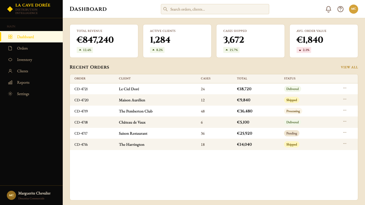
For web interfaces, the system translates well to dashboards, pricing pages, and editorial-style landing pages where hierarchy is absolute and scannability matters. The approach: define a strict typographic grid with generous margins, use cream or near-white as the default background tone, reserve deep black for all body text and navigation labels, and deploy yellow as the primary interactive and accent color — call-to-action buttons, active navigation states, tier highlights in pricing tables. Card components should carry hard-edged borders or subtle inset shadows rather than the diffuse soft shadows of contemporary material design, which would conflict with the system's classical gravity. In dark-mode contexts, the yellow must be handled with care: at full saturation against a very dark background it can overpower everything, and the system works better when the dark surface takes a very warm near-black tone to harmonize with the yellow's warmth rather than conflict with it.对于网页界面,这套体系在层级绝对分明、可扫描性至关重要的仪表板、定价页面与编辑风格落地页上表现良好。方法是:定义带有充裕边距的严格字体网格,以奶油色或接近白色的色调作为默认背景,将深黑保留给所有正文文字与导航标签,以明黄作为主要交互色与强调色——行动号召按钮、激活状态导航项、定价表中的等级高亮。卡片组件应带有硬边边框或微妙的内嵌阴影,而非当代材料设计中的漫射柔阴影——后者会与这套体系的古典气质相冲突。在暗色模式场景中,明黄必须谨慎处理:以全饱和度出现在极深的背景上,它会压倒一切;当暗色表面取用非常暖调的近黑色调时,整套体系的效果会更好,因为暖调的黑与明黄的暖意相互协调而非对抗。
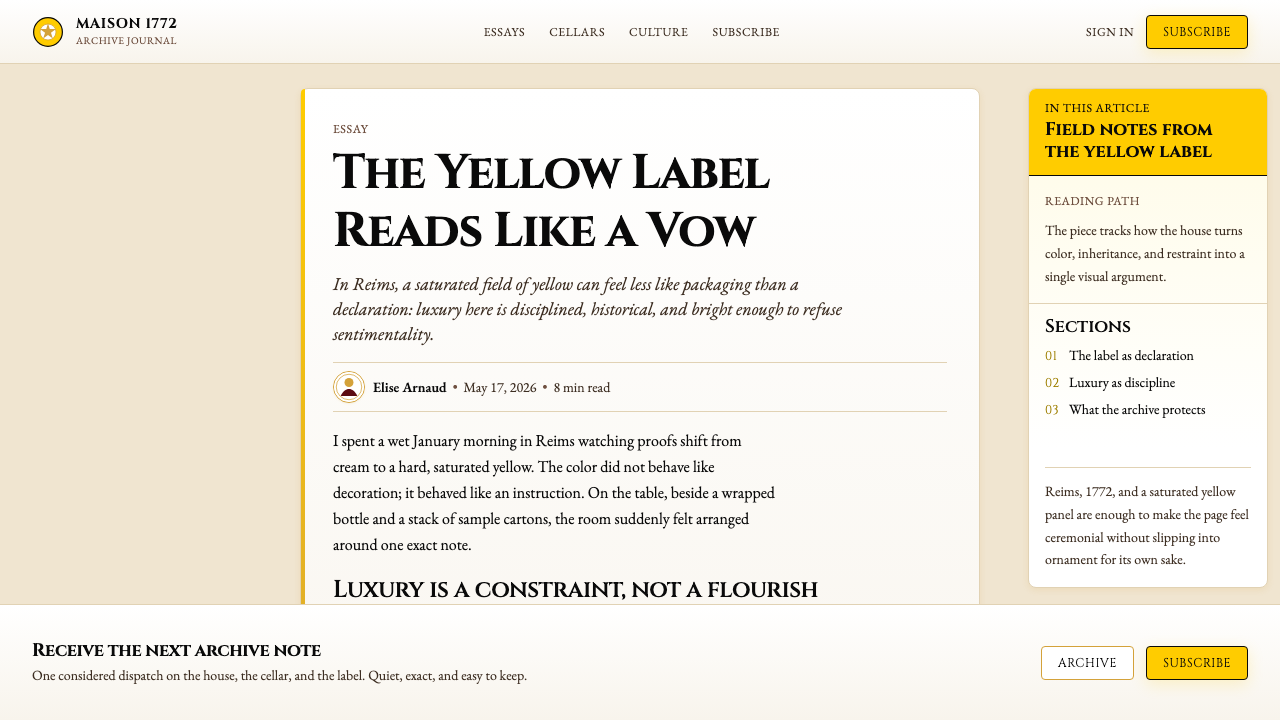
For editorial and marketing work — campaign pages, brand lookbooks, event invitations, email headers — the style operates at its most natural. The core move is the same as the Champagne label itself: a bold yellow field bearing classical serif type. A full-bleed yellow hero section with the brand name in deep black, followed by cream-ground body copy, is the canonical structure. Marketing materials can introduce the script accent for campaign headlines or event subheadings, bringing warmth and human narrative into what would otherwise be a purely institutional presentation. Print applications, where the yellow can be matched to a consistent Pantone spot color and the cream can be the physical paper stock itself, are an especially natural fit — the label was designed in the era of letterpress, and the system retains an affinity for physical, tactile production.对于编辑与营销工作——品牌推广页、形象画册、活动邀请函、邮件页眉——这种风格在最自然的状态下运作。核心动作与香槟标签本身相同:一块大胆的明黄色块,承载着古典衬线字体的排印。一个以深黑排印品牌名称的全幅明黄主视觉区块,随后接以奶油底色的正文区域,是这套体系的经典结构。营销物料可以引入手写体强调色,用于活动标题或子标题,将温度与人性叙事引入本来纯机构性的呈现。印刷应用——明黄可与固定的 Pantone 专色对应,奶油可直接是纸张的物理底色——是尤其自然的落地方式:这枚标签诞生于铅印活字时代,整套体系至今保留着对实物、触感类生产方式的天然亲和力。
A common mistake when applying this style is treating the yellow as one element among several equally weighted elements — as an accent rather than a dominant. Authentic Veuve Clicquot visual logic requires the yellow to be the largest, loudest, most spatially dominant element in any composition. When the yellow is reduced to buttons, small chips, or decorative borders, the system loses its identity and reads as generic luxury branding rather than a specific chromatic commitment. A second common mistake is introducing additional colors — blush, champagne gold used at large scale, or contemporary pastels — in an attempt to soften or modernize the palette. The power of the system comes from its constraint: yellow, cream, black, and a whisper of gold. Adding a fourth or fifth color dissolves the chromatic authority that two and a half centuries of repetition have built.应用这种风格时最常见的错误,是将明黄视为众多等权重元素之一——将其作为强调色而非主导色来使用。真正的凯歌香槟视觉逻辑要求明黄成为任何构图中面积最大、声量最高、空间上最具主导性的元素。当明黄被缩减为按钮、小色块或装饰性边框时,这套体系便失去了自身的身份,读起来像泛泛的奢侈品牌设计,而非一种特定的色彩承诺。第二个常见错误是引入额外的颜色——腮红色、大面积使用的香槟金,或当代流行的柔色调——试图柔化或现代化这套色板。这套体系的力量来自其约束:明黄、奶油、黑色,与一缕暖金的低语。加入第四或第五种色彩,会消解两个半世纪的重复所积累的色彩权威。
See the Veuve Clicquot (Yellow-Label) design system查看 Veuve Clicquot (Yellow-Label) 完整设计系统
Veuve Clicquot (Yellow-Label) — FAQVeuve Clicquot (Yellow-Label) · 常见问题
Is the Veuve Clicquot yellow a standard design color, or is it a legally protected brand color?凯歌香槟的明黄色是通用的设计色彩,还是受法律保护的品牌专属色?
It is a legally registered brand color, which makes it one of the relatively rare cases in design where a specific chromatic identity is protected by trademark law. The house registered the yellow associated with the Yellow-Label in the nineteenth century, and subsequent legal decisions in multiple jurisdictions have affirmed the house's exclusive right to use that yellow in the context of sparkling wine and luxury goods. For designers working in adjacent categories — lifestyle, hospitality, editorial — the color is freely usable, but in any context that touches sparkling wine, Champagne, or luxury food and beverage branding, using a close equivalent invites legal scrutiny. The practical design lesson is that the yellow's power in the system comes not from its specific technical coordinates but from two centuries of consistent use — a lesson about repetition that any design system can apply.它是一种经法律注册的品牌色,这使其成为设计领域中为数不多的、特定色彩身份受商标法保护的案例之一。酒庄在十九世纪便注册了与黄牌相关联的明黄色调,此后多个司法管辖区的法律判决确认了酒庄在起泡酒与奢侈品领域对该色调的专属使用权。对于在相邻类别中工作的设计师——生活方式、酒店、编辑设计——这个颜色可以自由使用,但在任何涉及起泡酒、香槟或奢侈食品饮料品牌的场景中,使用近似色调都将面临法律审查。这里有一个值得所有设计师领会的实践教训:这个黄色在体系中的力量,不来自其具体的技术参数,而来自两个世纪的持续使用——这是关于重复的力量,任何设计体系都可以从中汲取启示。
How does this style differ from general French luxury branding?这种风格与一般的法式奢侈品品牌设计有何不同?
Most French luxury branding — particularly in fashion, leather goods, and cosmetics — favors a palette of near-neutral tones: cream, ivory, warm grey, muted gold, and black. Color, when it appears, tends to be used for seasonal campaigns or special editions rather than as the permanent primary identity. Veuve Clicquot inverts this convention: the house's primary identity is not neutral but chromatic, and the yellow is not seasonal but permanent. This makes the Veuve Clicquot system more immediately graphic and internationally legible than most French luxury branding, which tends to rely on fine typographic detail and material quality — subtleties that require proximity and familiarity to read. The yellow works at a distance, across cultures, and in reproduction contexts where typographic refinement would be lost.大多数法式奢侈品牌设计——尤其是时装、皮具与化妆品领域——偏爱近中性色调的色板:奶油色、象牙色、暖灰色、哑光金以及黑色。色彩若出现,往往用于季节性推广或特别版,而非作为永久性的主要视觉身份。凯歌香槟颠覆了这一惯例:品牌的主要身份不是中性的,而是色彩性的,明黄不是季节性的,而是永久性的。这使得凯歌香槟体系比大多数法式奢侈品设计更具直接的图形冲击力和跨国际市场的易读性——后者往往依赖精细的字体细节与材质品质,这些微妙之处需要近距离和一定的品牌熟悉度才能被感知。明黄在远处有效,在跨文化的场景中有效,在字体精雕细琢早已流失的复制场景中同样有效。
Can this visual style be applied to categories outside wine and luxury?这套视觉风格可以应用于葡萄酒与奢侈品之外的类别吗?
Yes, and it is especially effective in categories that want to claim heritage, expertise, and premium positioning without the coldness of contemporary minimalism. Financial services, insurance, high-end hospitality, rare book publishing, classic auction houses, and professional services — law, architecture, private banking — all have natural affinities with this style. The classical serif, the cream and black palette, and the bold chromatic signature translate well to brand identities that need to signal long-term reliability and institutional authority. What does not translate well: categories built on freshness, accessibility, youth culture, or technological novelty. The style's very strengths — historical depth, chromatic confidence, typographic gravitas — become liabilities in contexts where those associations read as stuffy, inaccessible, or out of touch.可以,而且在那些希望宣示历史积淀、专业权威与高端定位、同时又不想借用当代极简主义冷感的类别中尤为有效。金融服务、保险、高端酒店、珍本出版、古典拍卖行,以及法律、建筑、私人银行等专业服务领域,都与这种风格有着天然的亲和力。古典衬线体、奶油与黑色的色板,以及大胆的色彩签名,在需要传递长期可信度与机构权威感的品牌身份中表现出色。不适合迁移的类别包括:以新鲜感、亲民性、青年文化或技术新颖性为核心的品牌。这种风格最突出的优势——历史深度、色彩自信、字体庄重——在那些将上述联想解读为刻板、难以接近或脱节的场景中,会反转为负资产。
Why does the style use both a serif wordmark and a script element rather than committing to one?为什么这套风格同时使用衬线字标与手写脚本,而非只选择其中一种?
Because the brand's founding story requires both registers. The Roman serif speaks to the institution — Reims, 1772, the Champagne grand cru tradition, the gravity of two hundred and fifty years. The script speaks to the founder — a specific woman, Barbe-Nicole, whose personal handwriting and individual courage are inseparable from why the house exists. Using only the Roman serif would produce a brand that reads as merely old and institutional, with no human story. Using only the script would sacrifice the authority and historical depth that distinguish Veuve Clicquot from a boutique or artisan producer. The combination is not an aesthetic accident — it is the visual expression of a brand built simultaneously on institutional achievement and personal legend.因为品牌的创立故事同时需要这两种语调。罗马衬线体代表机构:兰斯、1772年、香槟特级园的传统、两百五十年的历史重量。手写脚本代表创始人:一个具体的女人,芭布-妮可,她个人的笔迹与个人的勇气,和这个品牌之所以存在不可分离。只用罗马衬线体,品牌将读起来仅仅是古老与机构化,缺乏人性温度。只用手写脚本,则会牺牲权威感与历史纵深——而正是这些让凯歌香槟有别于一家精品或工匠生产商。这种组合不是美学上的偶然,而是一个同时建立于机构成就与个人传奇之上的品牌,以视觉语言所作的忠实表达。
How should this style handle photography and imagery?在摄影与图像的处理上,这套风格应当如何应对?
Photography in the Veuve Clicquot system is always subordinate to the chromatic identity — the yellow must remain the primary visual event. This means photography is typically used in controlled doses: either as a contained inset element within a yellow or cream field, or as a full-bleed image that has itself been art-directed to include strong yellow, cream, and black tones — golden afternoon light, white marble, dark shadow. Photographic color grading should warm toward the palette rather than introduce cool blues, greens, or highly saturated competing tones. Still-life and product photography of the bottle and label are natural anchors — the bottle and its yellow label become the primary image. Lifestyle photography works when it captures the specific social and sensory world of Champagne: celebration, elegance, intimacy, the moment of the pop. Abstract or conceptual photography that moves away from this world tends to dilute the system's specificity.在凯歌香槟的视觉体系中,摄影始终从属于色彩身份——明黄必须始终是最主要的视觉事件。这意味着摄影的使用量受到控制:或作为明黄、奶油色场域内的受限嵌入元素,或作为全幅图像出现——但这样的全幅图像本身必须经过艺术指导,包含强烈的明黄、奶油与黑色调:午后的金色斜光、白色大理石、深色阴影。摄影的色彩处理应向色板的暖调靠拢,而非引入冷蓝色、绿色或高饱和度的竞争性色调。酒瓶与标签的静物与产品摄影是天然的视觉锚点——酒瓶及其黄色标签本身即是主图。生活方式摄影在捕捉到香槟特定的社交与感官世界时才能奏效:庆典、优雅、亲密,以及开瓶那一瞬间。偏离这个世界的抽象或概念摄影,往往会稀释这套体系的特定性。
Related design styles相关设计风格
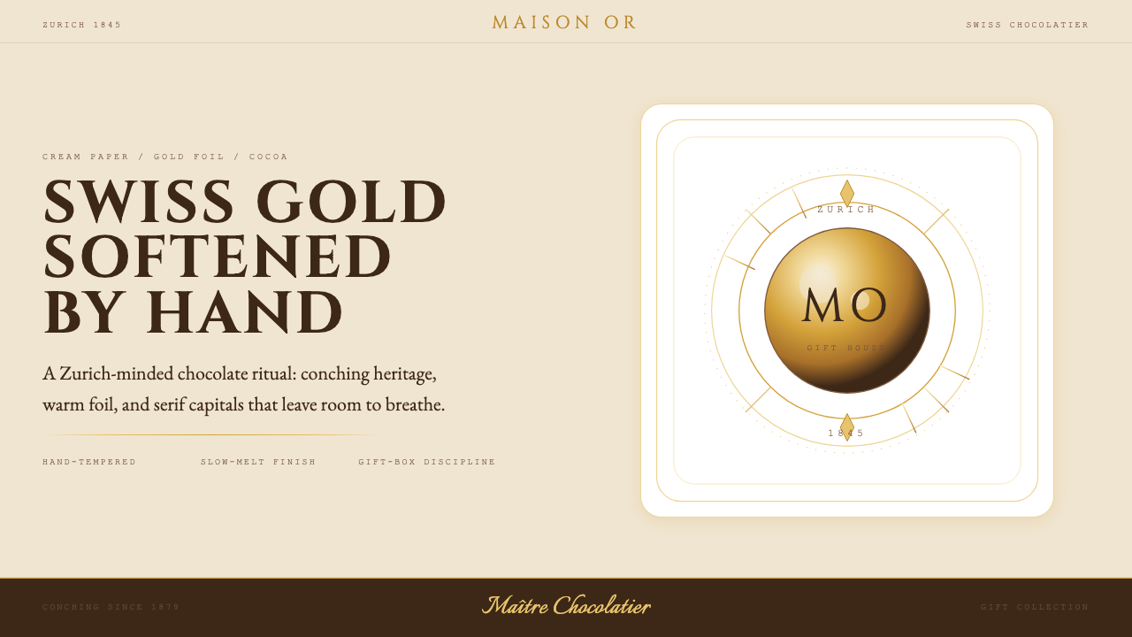 Lindt Swiss ChocolateOld-world luxury, softened. Gold foil, cocoa brown, and cream paper carry the…克制的瑞士奢华:暖金、可可棕与奶油纸,衬线字和细金线排版。
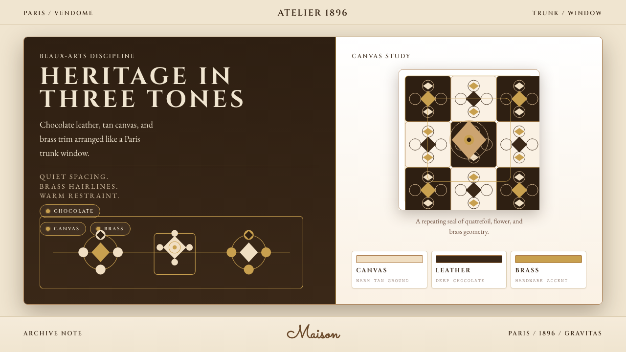 Louis Vuitton MonogramHeritage stays luminous. Chocolate, tan, and brass stage a Paris trunk window.优雅很有分量。巧克力棕、驼色与黄铜构成巴黎箱窗。
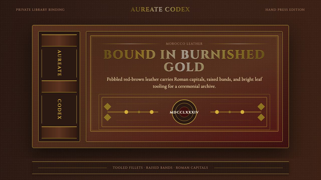 Gilt Leather BindingWeight without noise. Deep Morocco leather, Cinzel capitals, and burnished gi…厚重而克制。摩洛哥皮底、Cinzel 罗马大写与烫金线框。
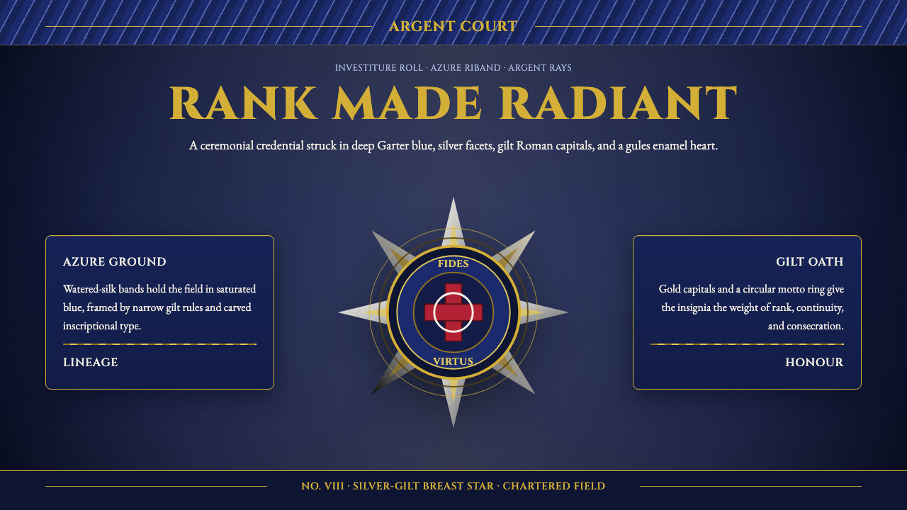 Order of Chivalry StarCeremony made metal. Garter blue, gilt Cinzel, and argent rays form a ranked…礼仪化为金属:嘉德蓝、鎏金Cinzel与银白星芒塑造等级。
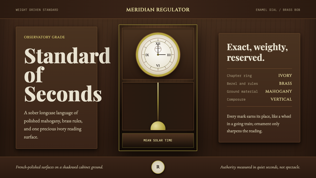 Regulator ClockSober authority. Brass rings and ivory dial lock mahogany into symmetry.沉稳权威。黄铜环与象牙表盘把桃花心木锁入对称。
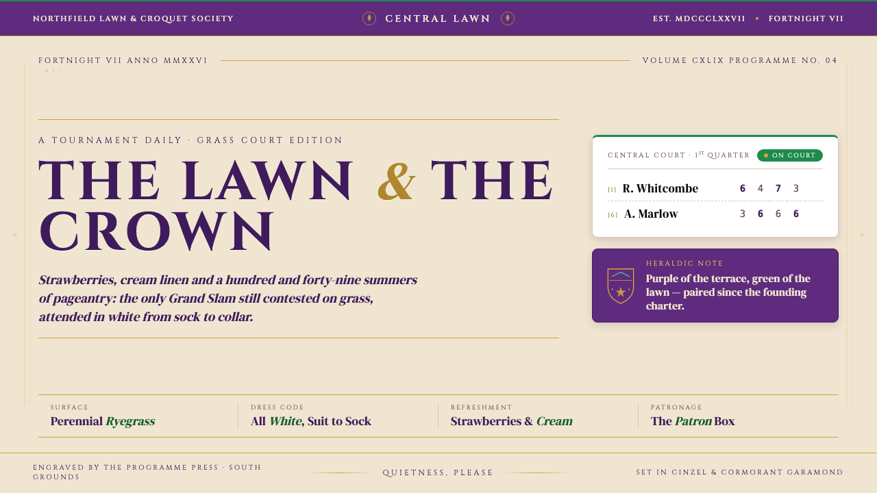 Wimbledon (Purple-Green)Centre Court in tokens. Regal purple and grass-green crest, cream linen, Cinz…中央球场的视觉语法:饱和紫与草场绿盾徽、奶油纸底、Cinzel 大写衬线加金色…