Design style guide设计风格指南
What is New Romantic Blitz (1980)?什么是 New Romantic Blitz (1980)?
Born in a velvet-dark London basement where the door policy demanded costume over cool, New Romantic Blitz is maximalist theatre translated into design — jewel-toned excess, gold-braid type, and the conviction that restraint is just cowardice with better PR.新浪漫闪电风格诞生于伦敦一间以戏服代替酷感的地下室,是极繁主义剧场转化为设计语言的产物——宝石色调的过剩、金饰衬线字体,以及「克制不过是高明的怯懦」这一毫不妥协的信念。
New Romantic Blitz (1980) in briefNew Romantic Blitz (1980) 速览
New Romantic Blitz (1980) is a design aesthetic rooted in the early-1980s British New Romantic subculture, distilled specifically from the visual atmosphere of Steve Strange's Blitz Club in London's Covent Garden. Where punk had weaponized ugliness, New Romantic armed itself with glamour — theatrical costume, historical pastiche, and an almost defiant celebration of beauty for its own sake. The design system that emerged from this moment is dark, opulent, and unapologetically excessive.新浪漫闪电风格(1980)是一套根植于英国1980年代初新浪漫主义亚文化的设计美学,具体提炼自史蒂夫·斯特兰奇在伦敦科文特花园经营的闪电俱乐部的视觉氛围。朋克曾以丑陋为武器,新浪漫主义则以魅力为甲——戏剧性服装、历史风格混搭,以及近乎对抗性的美学自足。从这一时刻涌现出的设计系统,是深邃、华美、毫不妥协的极繁之作。
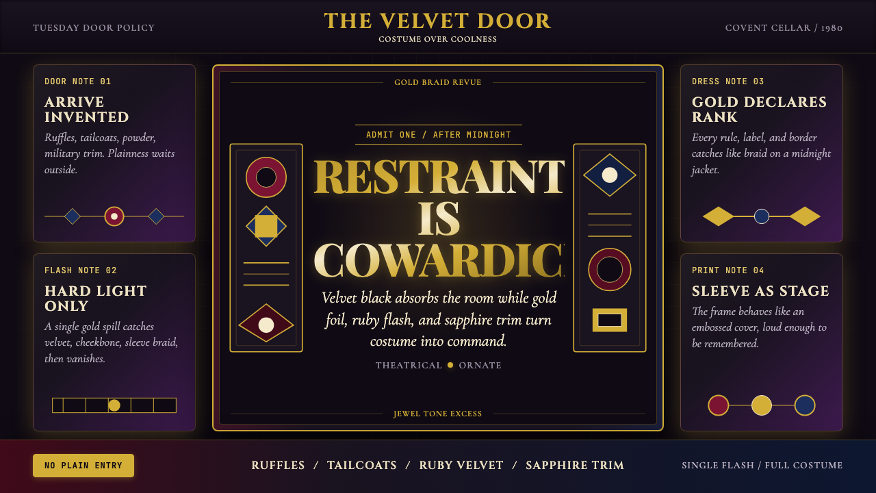
Visually, the style is built on a foundation of velvet-deep backgrounds — near-black with a richness that reads as saturated rather than flat — lit by the hard, directional quality of stage lighting rather than the even diffusion of daylight. Against this darkness, gold-accented serif typography functions like embossed lettering on an album sleeve: formal, weighty, and charged with a sense of occasion. Jewel-tone accents in ruby red and sapphire blue punctuate the composition with controlled bursts of colour, each one suggesting precious stone rather than surface pigment.在视觉上,这种风格建立于天鹅绒般深邃的底色之上——接近黑色却饱和而非平淡,以舞台灯光硬朗的方向性打亮,而非日光均匀的漫射。在这片黑暗之上,镀金衬线字体如烫金唱片封套上的浮雕文字——正式、厚重、充满仪式感。红宝石与蓝宝石色调的点缀在构图中制造出受控的色彩爆发,每一处都像是珍贵宝石而非表面颜料。
The aesthetic is maximalist in conviction but not chaotic in execution. It operates with the logic of costume and theatre: every element is deliberately chosen, every excess is intentional. The contrast is extreme — deep grounds against luminous type, muted textures against hard jewel accents — and the overall effect is one of calculated theatricality, the visual equivalent of arriving at a nightclub in full Weimar-era evening dress.这种美学在信念上是极繁主义的,但在执行上并非杂乱无章。它以服装与剧场的逻辑运作:每个元素都是刻意选择的,每处过剩都是有意为之的。对比极度强烈——幽深的底色对抗发光的字体,静默的质感对抗硬朗的宝石色点缀——整体效果是一种经过计算的戏剧性,如同身着完整魏玛晚礼服走进夜店的视觉版本。
See the New Romantic Blitz (1980) design system →查看 New Romantic Blitz (1980) 完整设计系统 →
Where does New Romantic Blitz (1980) come from?New Romantic Blitz (1980) 从何而来?
The story of New Romantic design begins on a Tuesday night in 1978, when Steve Strange and DJ Rusty Egan launched a club night at the Blitz wine bar on Great Queen Street in Covent Garden, London. Strange's door policy was unique and defining: admission required theatrical costume. Not fashionable clothing — costume. Patrons arrived in pirate ruffs, Weimar tuxedos, military frogging, and Bowie-Berlin makeup, and those deemed insufficiently theatrical were turned away, regardless of who they were. This selection mechanism meant that the Blitz's interior became a living gallery of competitive excess, a feedback loop of visual one-upmanship that set the aesthetic temperature for British pop culture well into the 1980s.新浪漫主义设计的故事始于1978年的一个周二夜晚——史蒂夫·斯特兰奇与DJ鲁斯提·伊根在伦敦科文特花园大皇后街的闪电葡萄酒吧开始了他们的俱乐部夜场。斯特兰奇的门槛政策独特而决定性:入场必须着戏剧性服装,不是时髦衣服,而是戏服。顾客们身穿海盗荷叶领、魏玛燕尾服、军装饰穗,或带着鲍伊式的柏林妆容前来,被认为不够戏剧性的人无论是谁都会被拒之门外。这种筛选机制使闪电俱乐部的内部成为一座竞争性过剩的活体画廊,一个视觉攀比的反馈循环,为整个1980年代的英国流行文化定下了美学温度。
The musical backdrop Rusty Egan spun — Bowie, Kraftwerk, Giorgio Moroder — was cold, electronic, and cinematic. The fashion response was its theatrical opposite: warm fabrics, historical silhouettes, ornate surface detail. This productive tension between cold machine music and warm theatrical costume is encoded in the design DNA of the style. The backgrounds are dark and almost technological in their depth; the type and accents are warm, handcrafted-feeling, historically resonant. The two poles never fully reconcile, and the friction between them is where the visual energy lives.鲁斯提·伊根播放的音乐背景——鲍伊、Kraftwerk、乔治·莫罗德——是冷峻的、电子的、电影感的。时装的回应则是其戏剧性对立面:温暖的织物、历史性的廓形、繁复的表面细节。冷机器音乐与温戏剧服装之间这种富有创造力的张力,被编码进了这种风格的设计基因。背景是深邃的、几乎带有科技感的黑暗;字体与点缀是温暖的、手工感的、充满历史共鸣的。两极从未完全调和,而它们之间的摩擦正是视觉能量的居所。
From the Blitz sprang a constellation of acts that gave the aesthetic its commercial reach: Visage, featuring Steve Strange himself, whose single 'Fade to Grey' became an international hit in 1980 and 1981; Spandau Ballet, managed from within the Blitz scene by Gary Kemp, whose debut album 'Journeys to Glory' cemented the look on a global stage; and Adam and the Ants, whose 'Kings of the Wild Frontier' fused pirate, Native American, and military imagery into a visual language that saturated pop media from 1980 to 1982. Boy George, who had been a Blitz regular and a Steve Strange door-picker, emerged as the movement's most visible face with Culture Club from 1982.从闪电俱乐部涌现了一系列给这种美学带来商业影响力的艺术家:史蒂夫·斯特兰奇本人参与的Visage乐队,其单曲《Fade to Grey》在1980至1981年间成为国际热曲;Spandau Ballet由加里·肯普从闪电场景内部经营,首张专辑《Journeys to Glory》将这种形象推上了全球舞台;Adam and the Ants的《Kings of the Wild Frontier》将海盗、印第安与军事意象融合成一套视觉语言,从1980年到1982年间彻底渗透了流行媒体。曾是闪电俱乐部常客、做过史蒂夫·斯特兰奇门卫的男孩乔治,则从1982年起以文化俱乐部成为这场运动最显眼的面孔。
The New Romantic moment was historically brief — the scene's commercial peak lasted roughly from 1980 to 1983 — but its influence on visual design, album sleeve art, music video aesthetics, and fashion photography proved durable. The album sleeves of this era, particularly the work commissioned by Spandau Ballet and Visage, developed a specific visual grammar: embossed gold lettering on dark velvet-weight stock, jewel-tone colour washes, dramatic chiaroscuro lighting. This grammar entered the design vocabulary of luxury branding, theatrical poster design, and editorial fashion work, where it has persisted as shorthand for a particular register of opulent, dramatically staged glamour.新浪漫时刻在历史上短暂——这个场景的商业巅峰大致从1980年延续到1983年——但它对视觉设计、唱片封套艺术、MV美学与时装摄影的影响却被证明是持久的。这个时代的唱片封套,尤其是受Spandau Ballet与Visage委托创作的作品,发展出了一套特定的视觉语法:深色天鹅绒质感纸张上的烫金字,宝石色调的色彩渲染,戏剧性的明暗对比光效。这套语法进入了奢侈品牌、戏剧海报设计与时装编辑作品的设计词汇,作为某种华美、戏剧性舞台魅力的速记符号延续至今。
What defines the New Romantic Blitz (1980) look?New Romantic Blitz (1980) 的视觉特征是什么?
Dark Ground深色底面
The base of every composition is a deep, near-black ground that carries richness rather than emptiness — the visual equivalent of velvet rather than matte board. This darkness is not neutral; it has weight and texture implied by the way light appears to barely break its surface. The dark ground creates the theatrical space into which all other elements emerge, functioning as the lighting rig of a stage rather than the blank canvas of a studio.每一个构图的底层都是深邃的近黑色,传递的是丰盛感而非空洞感——视觉上更接近天鹅绒而非哑光板。这种黑暗并非中性的;光线仿佛勉强才能破其表面,底色由此获得了重量与隐约的质感。深色底面创造出戏剧性的空间,所有其他元素都从中浮现,它的作用更像是舞台的灯光装置,而非工作室的空白画布。
Gold-Accented Serif Typography镀金衬线字体
Type in this style has the ceremonial weight of embossed album sleeves or gilded book spines. Serif letterforms with pronounced contrast between thick and thin strokes carry the visual richness; gold or warm-metallic coloring elevates them further, giving text the quality of precious inlay rather than ink on surface. Headlines are set with generous weight and scale, so the type itself becomes the primary decorative object — not a carrier of information wearing costume, but costume itself.这种风格中的字体拥有压纹唱片封套或烫金书脊式的礼仪重量。粗细笔画对比鲜明的衬线字形承载着视觉的丰盛感;金色或暖金属色泽的处理将其进一步升华,赋予文字珍贵镶嵌物而非纸面油墨的质感。标题以饱满的字重与尺寸排布,字体本身成为主要装饰对象——不是穿着戏服的信息载体,而是戏服本身。
Jewel-Tone Accents宝石色点缀
Ruby red and sapphire blue function as accent colours that feel less like surface pigment and more like light passing through a cut gemstone — deep, saturated, and internally luminous against the dark ground. These accents are used selectively, not liberally: a jewel tone deployed sparingly retains its sense of preciousness; spread across an entire composition, it would flatten into mere decoration. The placement of jewel accents guides the eye in the same way a single lit candelabra guides attention in a dark room.红宝石红与蓝宝石蓝作为点缀色,感觉上不像表面颜料,更像是光线穿过切割宝石——深邃、饱和,在深色底面上呈现内发光般的质感。这些点缀被选择性而非大量地使用:稀疏部署的宝石色保留着珍贵感;若铺满整个构图,则会沦为平庸的装饰。宝石色点缀的位置引导视线,如同一支燃亮的烛台在暗室中引导注意力。
Dramatic Chiaroscuro Lighting戏剧性明暗对比
The visual logic of stage and nightclub lighting — a single hard source cutting through deep shadow — defines how elements are treated. Highlights are crisp and directional; shadows are deep and unceremonious. There is no even ambient illumination softening the composition. This approach gives the style its characteristic sense of theatricality: everything appears to be caught in a moment of deliberate revelation, pulled from darkness into light for a reason.舞台与夜店灯光的视觉逻辑——单一硬光源切穿深重阴影——定义了元素的处理方式。高光清晰而具方向性;阴影深邃而毫不客套。没有任何均匀的环境光来柔化构图。这种处理方式赋予这种风格其标志性的戏剧感:一切事物似乎都被捕捉在刻意揭示的时刻,被有目的地从黑暗中拉入光明。
Theatrical Excess as Principle戏剧性过剩作为原则
Where many design systems treat restraint as a virtue, New Romantic Blitz treats it as a failure of imagination. Layering is encouraged: texture under type, type over accent, accent beside highlight. The goal is richness, not clutter — there is a difference between maximalism with internal logic and mere noise. The test is whether each element is doing something specific and deliberate, not whether there are few enough elements to look minimal. Reduction for its own sake would betray the movement's founding conviction.许多设计系统将克制视为美德,新浪漫闪电风格却将其视为想象力的失败。鼓励叠层:质感在字体之下,字体在点缀之上,点缀紧邻高光。目标是丰盛,而非杂乱——内有逻辑的极繁主义与纯粹的噪音之间有本质区别。检验标准是每个元素是否在做某件具体而刻意的事,而非元素数量是否少到看起来极简。为克制而克制,将背叛这场运动最初的信念。
Historical Pastiche and Costuming历史风格拼贴与戏装感
The New Romantic movement drew freely from Weimar-era cabaret, Regency-period silhouettes, Victorian ornament, pirate romanticism, and Bowie's theatrical personas — mixing historical references without archaeological accuracy. In design terms, this translates to an approach that borrows from historical typography, decorative motifs, and formal registers without reproducing any single period faithfully. The result is a sense of deliberate anachronism: things that feel simultaneously from another era and entirely contemporary in their self-aware theatricality.新浪漫主义运动自由地汲取魏玛时代卡巴莱、摄政时期廓形、维多利亚装饰、海盗浪漫主义以及鲍伊的戏剧人格,混合历史参照而不追求考古学精确性。在设计语言上,这转化为一种从历史排版、装饰母题与正式语域借鉴而不忠实再现任何单一时代的方式。结果是一种刻意的时代错置感:事物同时来自另一个时代,又在其自我意识的戏剧性中显得完全当代。
Hard-Flash Highlight硬闪高光
Borrowed directly from the nightclub photography aesthetic of the era — the stark, bleaching quality of a camera flash in a dark room — hard highlights appear as almost overexposed pockets of pure brightness against the deep ground. These are not soft glows or gradual luminosity; they are sudden, almost violent insertions of light that create immediate focal points and reinforce the sense that the composition is a staged, performative moment rather than a naturalistic scene.直接借鉴自那个时代夜店摄影的美学——暗室中相机闪光灯的那种刺眼、漂白质感——硬闪高光以几乎曝光过度的纯亮度小块的形式出现在深色底面上。这不是柔和的光晕或渐进的亮度;而是突然的、几乎带有暴力感的光线插入,制造出即时焦点,并强化了构图是一个被舞台化、表演性时刻而非自然主义场景的感受。
See the New Romantic Blitz (1980) design system →查看 New Romantic Blitz (1980) 完整设计系统 →
Who shaped New Romantic Blitz (1980)?谁塑造了 New Romantic Blitz (1980)?
Steve Strange was the co-founder and doorman of the Blitz Club, and frontman of Visage. His role as literal gatekeeper — enforcing the theatrical costume requirement and personally turning away those he deemed insufficiently spectacular — made him the aesthetic curator of the entire New Romantic movement. His own appearance, characterized by elaborate makeup and hybrid historical dress, set the visual standard. As vocalist on 'Fade to Grey' (1980), he brought the Blitz aesthetic to an international audience for the first time.史蒂夫·斯特兰奇是闪电俱乐部的联合创始人与门卫,也是Visage乐队的主唱。作为字面意义上的门槛把关者——强制执行戏服着装要求,亲自拒绝他认为不够精彩的人——他成为整个新浪漫主义运动的美学策展人。他本人的形象以精致妆容和混合历史感服装为特征,为这场运动定下了视觉标准。作为《Fade to Grey》(1980)的演唱者,他第一次将闪电俱乐部的美学带给了国际观众。
Rusty Egan was the DJ and co-founder of the Blitz Club night, responsible for the specific musical atmosphere — heavy on Bowie, Kraftwerk, and European electronic music — that defined the sonic side of the New Romantic aesthetic. His musical curation created the emotional temperature against which the theatrical costume competed and collaborated. As a producer, he shaped the recorded output of Visage and helped establish the cold, electronic-lush production style that characterizes the movement's music.鲁斯提·伊根是闪电俱乐部夜场的DJ与联合创始人,负责建立具体的音乐氛围——大量播放鲍伊、Kraftwerk与欧洲电子音乐——定义了新浪漫主义美学的声音维度。他的音乐策划创造了戏剧性服装与之竞争和协作的情感温度。作为制作人,他塑造了Visage的录音作品,并帮助确立了这场运动音乐中那种冷峻、电子丰盛的制作风格。
Gary Kemp was the guitarist and primary songwriter of Spandau Ballet, the act that most directly translated the Blitz Club aesthetic into mainstream commercial success. His management of the band's visual identity — working closely with designers and photographers to produce album artwork and promotional imagery that captured the movement's maximalist dark glamour — helped codify the New Romantic visual grammar for a global audience. The 'Journeys to Glory' sleeve and associated imagery became reference points for the style's mature form.加里·肯普是Spandau Ballet的吉他手与主要词曲创作者,这支乐队最直接地将闪电俱乐部的美学转化为主流商业成功。他对乐队视觉形象的管理——与设计师和摄影师密切合作,创作出捕捉这场运动极繁黑暗魅力的专辑封面与宣传图像——帮助将新浪漫主义视觉语法呈现给全球观众。《Journeys to Glory》封面及相关图像成为这种风格成熟形态的参照点。
Boy George arrived in the Blitz scene as a teenage regular and occasional wardrobe assistant to Steve Strange before emerging as the lead singer of Culture Club from 1982. His visual persona — combining elements drawn from mime, Victorian portraiture, Hasidic dress, and Caribbean styling — exemplified the movement's commitment to historical pastiche and gender-ambiguous theatricality. His mainstream success brought the Blitz aesthetic's approach to costumed identity to the largest possible audience, including through the early years of MTV.男孩乔治作为青少年常客出现在闪电场景,曾短暂担任史蒂夫·斯特兰奇的服装助理,后于1982年以文化俱乐部主唱身份崭露头角。他的视觉人格——融合哑剧、维多利亚肖像画、哈西德服饰与加勒比造型元素——示范了这场运动对历史风格拼贴与性别模糊戏剧性的承诺。他的主流成功将闪电美学对于服装身份认同的处理方式带给了尽可能广泛的观众,包括通过MTV的早年节目。
Adam Ant's visual identity during the 'Kings of the Wild Frontier' era (1980–1981) represented the movement's most extreme experiment in historical costuming: fusing highwayman, Native American warrior, and military uniform references into a distinctive visual language that proved enormously influential on music video aesthetics and fashion photography throughout the decade. His collaboration with Malcolm McLaren on developing the 'Antmusic' visual concept, and the subsequent massive commercial success of that concept, demonstrated how the Blitz aesthetic could scale from a Tuesday-night club scene to a global phenomenon.亚当·安特在《Kings of the Wild Frontier》时期(1980—1981年)的视觉形象代表了这场运动在历史服装拼贴方面最极端的实验:将公路强盗、印第安战士与军装制服的参照融合成一套独特的视觉语言,对整个十年的MV美学与时装摄影产生了巨大影响。他与马尔科姆·麦克拉伦在发展「蚂蚁音乐」视觉概念上的合作,以及随后这一概念获得的巨大商业成功,证明了闪电美学能够从周二夜晚的俱乐部场景扩展为全球现象。
How do you use New Romantic Blitz (1980) today?今天怎么用 New Romantic Blitz (1980)?
New Romantic Blitz works best in contexts where drama, occasion, and a sense of premium theatricality are desired values — luxury product launches, entertainment industry materials, album art, theatrical event promotion, high-end editorial fashion, and any designed artifact where the intent is to make the audience feel they are in the presence of something exceptional. The style is not suited to everyday utility contexts; it signals rarity and occasion by its very nature, so applying it to workaday interfaces or functional documentation will produce tonal mismatch.新浪漫闪电风格最适合戏剧性、仪式感与高端剧场感是期望价值的场景——奢侈品发布、娱乐行业素材、唱片封面、戏剧活动宣传、高端时装编辑,以及任何意图让观众感受到身处非凡之中的设计产物。这种风格不适合日常功能性场景;它的本质就是在传递稀有感与场合感,将其应用于日常界面或功能性文档将产生语调错位。
For presentation slides, the style rewards a specific approach: use a near-black ground consistently across the entire deck, not just the cover. Cover slides should feature the title in heavy gold-accented serif type at large scale, with a jewel-tone accent — a ruby horizontal rule, a sapphire geometric shape — providing compositional structure without competing with the title. Content slides should maintain the dark ground and reserve all typographic hierarchy for weight and scale differences within the same serif family. Data and chart slides work well when chart elements are coloured using the jewel palette — ruby bars, sapphire lines — against the dark background, which transforms functional data into something that reads as precious rather than merely informational.对于演示文稿,这种风格需要特定的处理方式:在整套幻灯片中始终使用近黑底色,而不仅限于封面页。封面页应以大尺寸、粗重的金色衬线字体展示标题,宝石色点缀——红宝石色横线、蓝宝石色几何形——提供构图结构而不与标题竞争。内容页应保持深色底面,所有字体层级仅通过同一衬线字体家族内的字重与尺寸差异来定义。数据与图表页在用宝石调色板为图表元素着色时效果出色——红宝石色柱条、蓝宝石色折线——在深色背景映衬下,功能性数据被转化为珍贵感而非仅仅是信息性的呈现。
For web interfaces, this style is most appropriate for landing pages, event sites, entertainment platforms, and premium product showcases where conversion depends on communicating exclusivity and atmosphere rather than functional clarity. Navigation should be typographic and minimal — the dark ground does the heavy atmospheric lifting; navigation elements that compete for visual attention will undermine it. Hero sections benefit from the hard-flash highlight treatment: a single area of near-overexposed brightness that draws the eye and implies stage lighting. Pricing pages can use jewel-tone tier differentiation effectively — a sapphire accent for one tier, ruby for another — giving each option a gemstone-like sense of deliberate value rather than a clinical comparison table.对于网页界面,这种风格最适合落地页、活动网站、娱乐平台与高端产品展示,这些场景的转化依赖于传达独特性与氛围而非功能清晰度。导航应以字体为主且简洁——深色底面已在承担繁重的氛围渲染;争夺视觉注意力的导航元素会破坏这种氛围。英雄区域适合采用硬闪高光处理:单一区域的近过曝亮度吸引视线并暗示舞台灯光。定价页面可以有效使用宝石色调进行等级区分——蓝宝石色强调某一等级,红宝石色另一等级——给每个选项以宝石般刻意定价的感受,而非临床式的对比表格。
For editorial and marketing work, New Romantic Blitz delivers its maximum impact in full-page or large-format compositions where the dark ground can breathe and the jewel accents have sufficient contrast space to register. Magazine spreads, event posters, and digital banners benefit from the style's theatrical poster logic: a single dominant image or typographic element, hard lighting, minimal copy, and the jewel accent doing the communicative work of colour. In marketing copy, the tone should match the visual register — formal without being stuffy, theatrical without being camp.对于编辑与营销工作,新浪漫闪电风格在整页或大幅构图中发挥最大冲击力,深色底面在此有足够空间呼吸,宝石色点缀也有充分的对比空间来显现。杂志跨页、活动海报与数字横幅受益于这种风格的戏剧性海报逻辑:单一主导图像或字体元素、硬朗光效、极少文案,宝石色点缀承担色彩的传达功能。在营销文案中,语调应与视觉语域匹配——正式而不沉闷,戏剧而不浮夸。
A common mistake is applying the jewel accent colours too liberally, which drains them of their preciousness. Ruby and sapphire work because they appear sparingly against a deep ground; used across large areas or as background fills, they lose their gemstone quality and become merely dark shades of red and blue. A related error is choosing a dark background that leans cool-grey or charcoal rather than near-black with warmth — the velvet quality of the original aesthetic requires depth, not just darkness. Finally, pairing the gold serif headline treatment with a sans-serif secondary typeface in a neutral weight will flatten the theatrical effect; if mixed type is necessary, the secondary face should maintain a sense of formality and weight to preserve the overall register.最常见的错误是过度使用宝石色调,这会耗尽其珍贵感。红宝石色与蓝宝石色之所以有效,是因为它们稀疏地出现在深色底面上;若用于大面积区域或作为背景填充,则失去宝石质感,沦为普通的深红与深蓝。相关错误是选择偏冷灰或炭灰的深色背景,而非带有温度的近黑色——原始美学的天鹅绒质感需要的是深邃,而不仅仅是黑暗。最后,将金色衬线标题与中性字重的无衬线辅助字体搭配,会拉平戏剧效果;若必须混用字体,辅助字体应保持一定的正式感与厚重感,以维护整体的语调格调。
See the New Romantic Blitz (1980) design system →查看 New Romantic Blitz (1980) 完整设计系统 →
New Romantic Blitz (1980) — FAQNew Romantic Blitz (1980) · 常见问题
Is New Romantic Blitz the same as gothic or dark glamour aesthetics?新浪漫闪电风格和哥特或暗色魅力美学是同一回事吗?
Related but distinct. Gothic aesthetics typically embrace death imagery, ecclesiastical references, and a tone of melancholy or foreboding. Dark glamour leans on noir conventions and cool detachment. New Romantic Blitz shares the dark ground with both but is fundamentally theatrical and celebratory rather than mournful or detached — it wants you to feel the thrill of a nightclub entrance, not the weight of mortality. The gold-braid type and jewel accents are specifically joyful in register, signalling precious occasion rather than darkness for its own sake. The movement's founding context — a nightclub where you had to perform to get in — is the essential key: this aesthetic is about display, not withdrawal.相关但截然不同。哥特美学通常拥抱死亡意象、教堂参照与忧郁或不祥的基调。暗色魅力倾向于黑色电影的惯例与冷漠的超然。新浪漫闪电风格与两者共享深色底面,但本质上是戏剧性的、欢庆的,而非哀悼或超然的——它希望你感受到踏入夜店的兴奋,而非死亡的重压。金饰字体与宝石色点缀在语调上是特定的愉悦感,传递的是珍贵场合而非为黑暗而黑暗。这场运动的创始语境——一个需要表演才能入场的夜店——是理解这种美学的关键:它关乎展示,而非退缩。
Can this style work in a light-background application?这种风格能用在浅色背景的应用场景中吗?
It is possible but requires significant adjustment. The style's visual logic depends on the contrast between deep dark ground and luminous accents — without the darkness, the jewel tones lose their preciousness and the gold typography loses its sense of emergence from shadow. A light-background version might work for accent elements (a gold-serif pull quote, a jewel-tone CTA button) within an otherwise conventional layout, but applying the full system to a cream or white background produces something that reads more as Art Nouveau or Edwardian revival than New Romantic. If a lighter treatment is needed, consider using a deep jewel tone — very dark ruby or sapphire — as the background rather than attempting a full inversion to light.可以实现,但需要大幅调整。这种风格的视觉逻辑依赖于深色底面与发光点缀之间的对比——没有黑暗,宝石色调就失去了珍贵感,金色字体也失去了从阴影中浮现的感受。浅色背景版本或许可用于某些点缀元素(金色衬线引用文字、宝石色调行动号召按钮),但将完整系统应用于奶油或白色背景,呈现的效果更接近新艺术主义或爱德华时代复兴,而非新浪漫主义。若确实需要更浅的处理,可以考虑将极深的宝石色调——非常深的红宝石色或蓝宝石色——用作背景,而非尝试完全反转为浅色。
How do I prevent this style from feeling dated or costumey?怎样避免这种风格显得过时或像舞台道具?
The risk of any historically-rooted aesthetic is that it collapses into pastiche — recognizable enough to read as period reference rather than deliberate design language. For New Romantic Blitz, the antidote is restraint in specific places: limit the number of historical typographic motifs to one per composition, keep the jewel accents to genuinely small areas, and ensure that the overall layout grid is contemporary and rational even if the surface treatment is ornate. The theatricality should feel like a deliberate choice, not a default setting. Pairing the style with clean, modern information architecture — clear hierarchy, functional navigation, unambiguous interactive states — signals that the designer is in control of the aesthetic rather than being consumed by it.任何根植于历史的美学都面临沦为拼贴的风险——辨识度高到被读作时代参照而非刻意的设计语言。对于新浪漫闪电风格,解药是在特定位置保持克制:每个构图中将历史排版母题限制在一个,将宝石色点缀保持在真正小面积的区域,并确保整体版面网格是当代的、理性的,即使表面处理是繁复的。戏剧性应该感觉像是一个刻意的选择,而非默认设置。将这种风格与简洁、现代的信息架构搭配——清晰层级、功能性导航、明确的交互状态——传递出设计师掌控美学而非被美学所吞没的信号。
What types of photography or imagery work within this style?哪类摄影或图像适合用于这种风格?
Photography within this aesthetic should embrace the hard-flash and dramatic-lighting logic of the style itself: high-contrast images with deep shadows and crisp highlights, shot in ways that emphasize theatricality and deliberate staging rather than naturalistic candour. The nightclub photography of the era — particularly the work documenting the Blitz scene itself — provides the clearest reference. Portraits where makeup, costume, or expression carries performative weight work better than candid documentary images. In digital contexts, duotone treatments using one jewel tone and near-black are effective — they integrate photography into the composition rather than leaving it as a window into a different visual world.这种美学中的摄影应拥抱风格本身的硬闪与戏剧性照明逻辑:深重阴影与清晰高光的高对比度图像,以强调戏剧性与刻意舞台感而非自然主义的坦率方式拍摄。那个时代的夜店摄影——尤其是记录闪电场景本身的作品——提供了最清晰的参照。妆容、服装或表情承载着表演重量的肖像,比随性的纪实图像更为合适。在数字场景中,使用一种宝石色调与近黑色的双色调处理是有效的——它将摄影整合进构图,而非将其留作通往另一个视觉世界的窗口。
Is this aesthetic appropriate for corporate or B2B contexts?这种美学适合企业或B2B场景吗?
Generally, no — but with a narrow exception. The style signals personal expression, theatrical occasion, and artisanal luxury; these are values that corporate and B2B contexts typically avoid in favour of rationality, trustworthiness, and scalability. The exception is luxury B2B: high-end event agencies, bespoke design consultancies, entertainment industry service providers, and similar businesses where the client relationship is personal and the work is genuinely premium-positioned. In these contexts, the style can signal that the provider is a connoisseur rather than a commodity — that they operate at the level of taste and occasion rather than at the level of specification and deliverable. Outside this narrow band, prefer a system whose values more directly match the corporate procurement context.通常不适合——但有一个狭窄的例外。这种风格传递的是个人表达、戏剧性场合与工匠式奢侈感;这些价值观通常是企业与B2B场景所回避的,后者更倾向理性、可信赖与可扩展性。例外是奢侈品B2B:高端活动代理、定制设计顾问、娱乐行业服务提供商,以及类似的客户关系是私人化、作品确实定位为高端的企业。在这些场景中,这种风格可以传递出供应商是鉴赏家而非商品、在品味与场合层面而非规格与交付物层面运作的信号。在这个狭窄区间之外,请优先选择价值观与企业采购语境更直接匹配的设计系统。
Related design styles相关设计风格
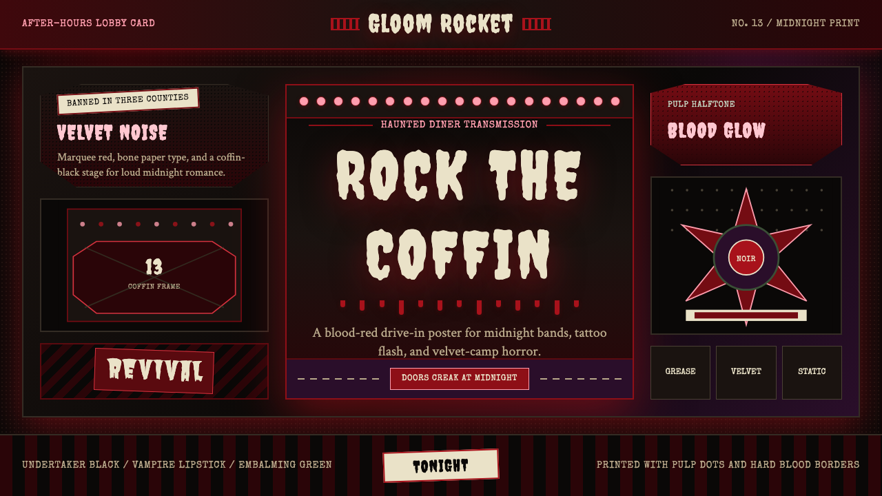 Gothabilly Horror RevivalHaunted swagger. Blood-red marquee type, coffin frames, and pulp halftone on…闹鬼的摇滚张扬:血红跑马灯字、棺材框与黑底半色调。
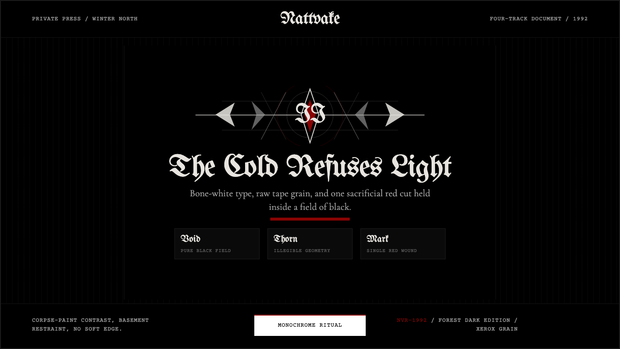 Norwegian Black Metal (1992)Ritual severity. Bone-white blackletter cuts through black grain with one blo…仪式般严酷。骨白哥特字切开黑色颗粒,只留一枚血红印记。
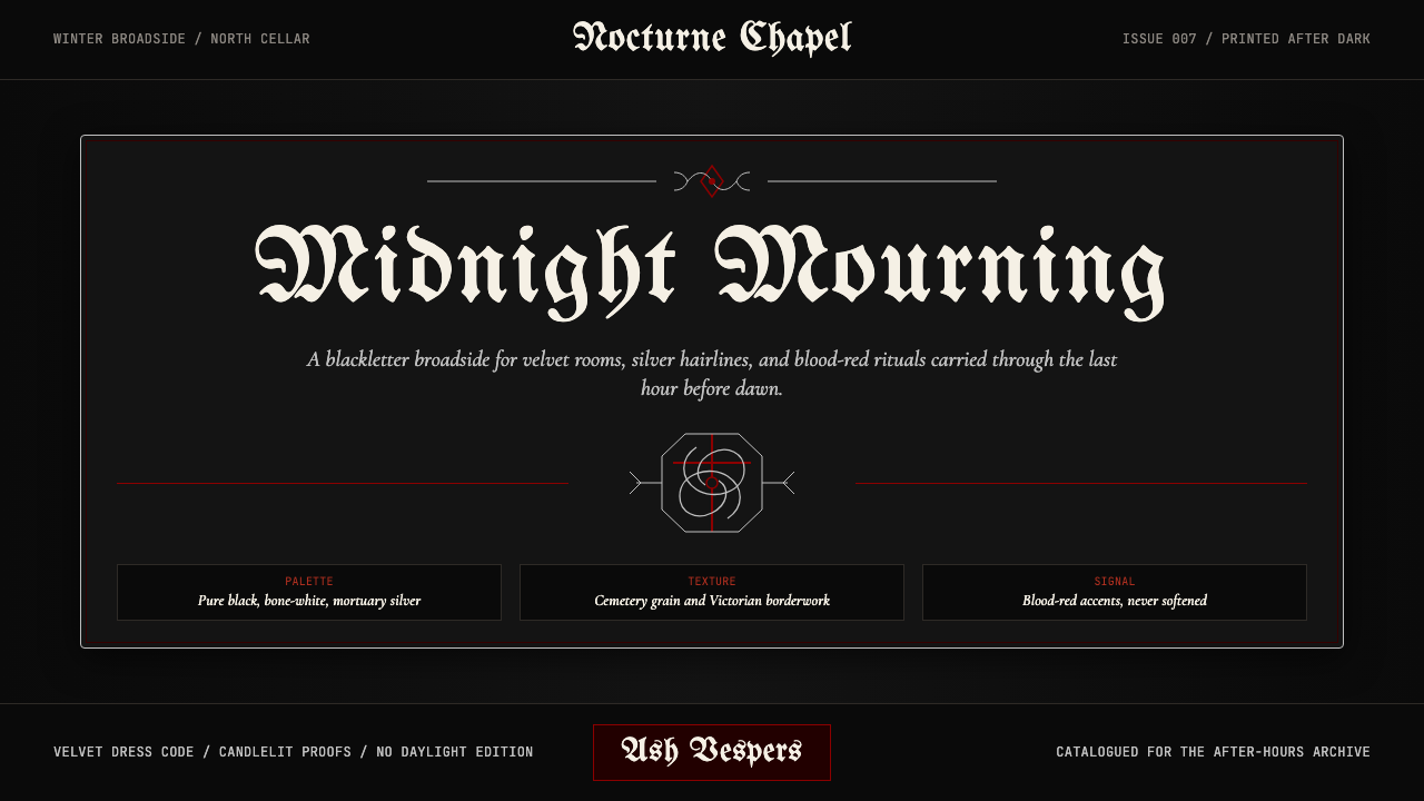 Traditional GothPost-punk in Victorian mourning. Black, blood red, bone white — Bauhaus album…1980 年代后朋克亚文化的视觉:纯黑、血红、骨白、太平间银——维多利亚丧葬美…
 Cartoon Network 90s BlocksKids-cable noise, squared. Black-white checkerboards crash into hot-yellow Bu…方块化的儿童有线电视噪音:黑白棋盘撞上热黄 Bungee 字块。
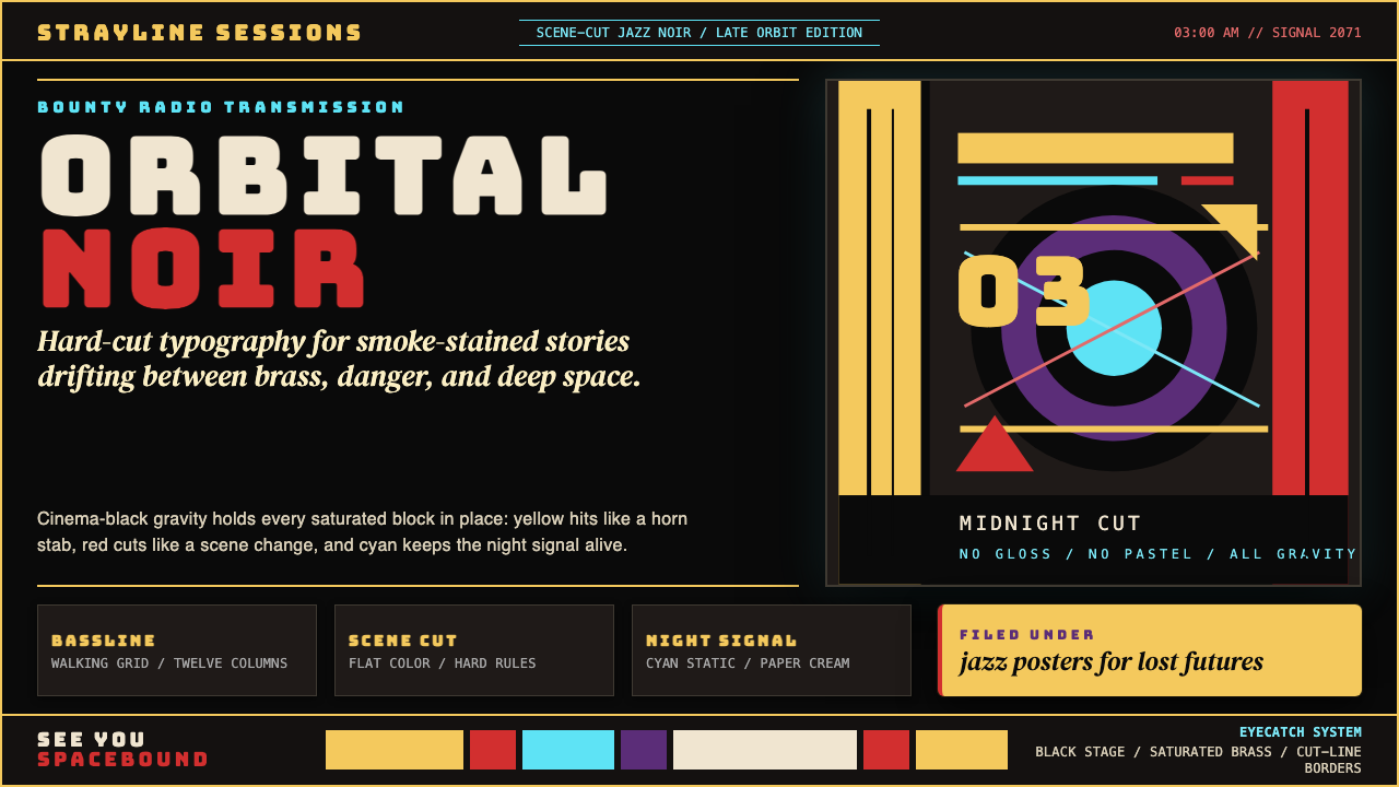 Cowboy Bebop Jazz-NoirCool at 3 AM. Bungee type, jazz yellow, red cuts, and cyan rules hit deep bla…凌晨三点的酷:黑底上 Bungee 字、爵士黄、红切线与青色规则。
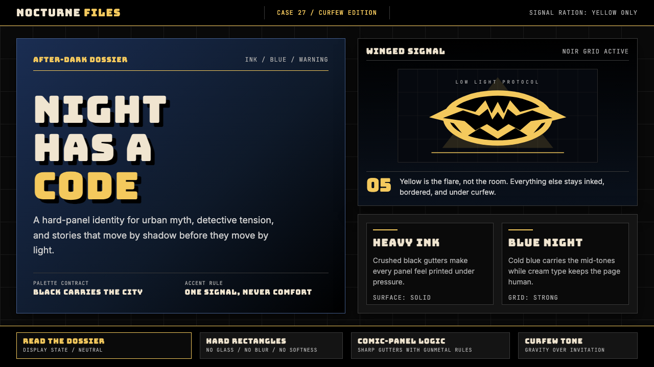 DC Comics Batman NoirGravity, not cheer. Black panels, Gotham blue, and one bat-yellow signal cut…重力而非欢愉:黑色分镜、哥谭蓝与一束蝙蝠黄切开夜色。