What is Dub Soundsystem?
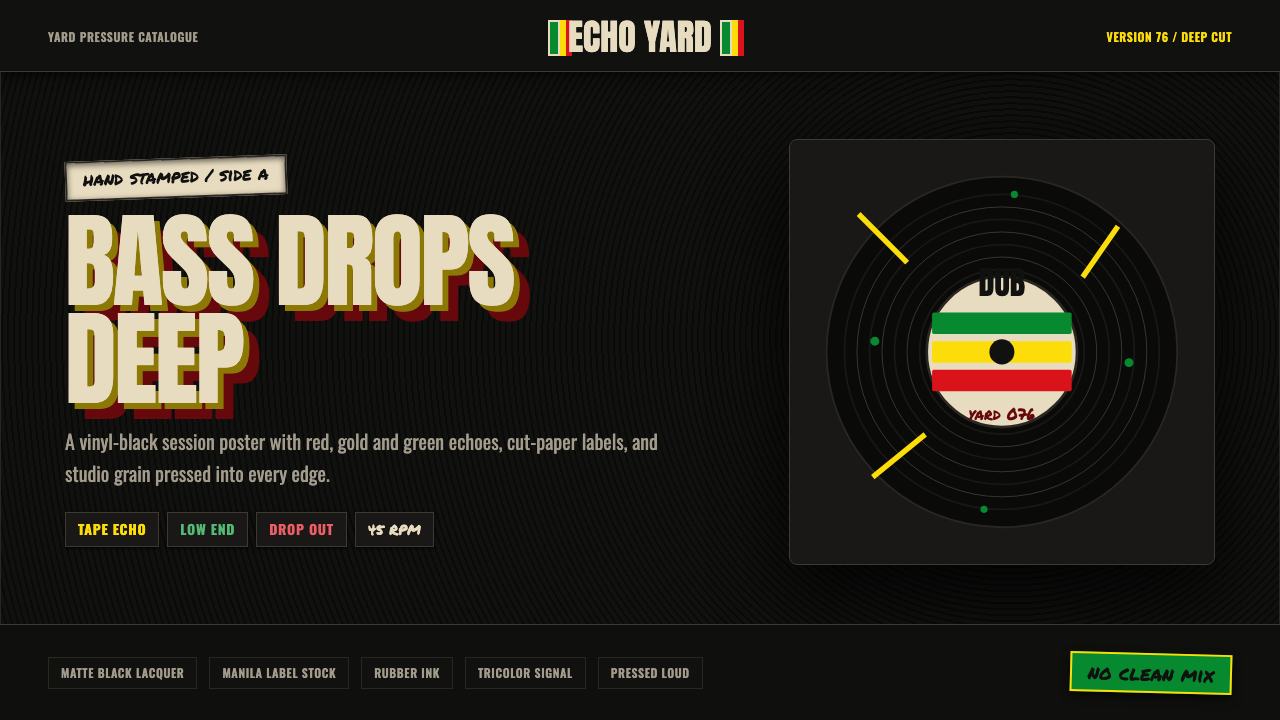
Dub Soundsystem is darkness pressed into grooves — Kingston 1976 rendered as a visual language of vinyl black, Rastafari tricolor, and the physical evidence of a recording studio: stamped labels, halftone grain, rubber-ink smear, concentric groove arcs echoing outward like delay repeats.
Dub Soundsystem in brief
Dub Soundsystem is a design aesthetic rooted in the material culture of 1976 Jamaican dub music — specifically Lee "Scratch" Perry's Black Ark studio, The Upsetters band, and the landmark album Super Ape. It translates the sonic and tactile world of that recording environment into a visual system: the deep black of a vinyl record as ground, the Rastafari tricolor (green, gold, red) as the only permitted light, and an accumulation of physical print artifacts — rubber-stamped type, aged manila record labels, halftone grain, and concentric groove arcs — layered together to suggest something pressed, stamped, and worn.
What distinguishes Dub Soundsystem from generic reggae-adjacent aesthetics is its specificity. It is not a tropical palette or a generic roots-music look. It is a precise evocation of one place, one year, and one method of record production — a small, improvised studio in Washington Gardens, Kingston, where Perry ran multiple tape machines simultaneously, stacking and echoing tracks until the original signal became a ghostly low-frequency architecture. The visual system preserves that logic: layering, echo, grain, and the impression of something that has been through a physical process rather than designed on a screen.
The style is inherently dark and heavy. Its ground is almost always near-black or black, and the tricolor palette — green leading, gold and red behind — operates like instrument separation in a mix: each color occupies its register without competing. The overall effect is intense but legible, like a hand-stamped label under a single overhead light.
Where does Dub Soundsystem come from?
Dub music emerged from Jamaica in the late 1960s and early 1970s as an engineering art form. Producers — chief among them King Tubby and Lee "Scratch" Perry — discovered that removing vocal tracks from existing reggae recordings and then manipulating the remaining instrumental elements through echo, reverb, equalization, and tape speed created a new kind of music. The result was skeletal and cavernous: basslines that seemed to shake the room, drum patterns with exaggerated reverb tails, ghost fragments of melody surfacing and disappearing. This approach, which came to be called dub, was inseparable from soundsystem culture — the outdoor dance events organized around enormous speaker stacks where selectors played dubplates (one-off acetate pressings made exclusively for a particular soundsystem), and MCs toasted over the tracks.
Lee "Scratch" Perry built his Black Ark studio in the yard behind his Kingston home around 1973 and used it for his most celebrated recordings through the mid-1970s. The studio was technically modest — a four-track Teac machine, a mixing board Perry modified himself, reverb springs, and a variety of delay units — but the productions that emerged from it had an environmental density no other studio of the era matched. Super Ape, recorded in 1976 and released under the name The Upsetters, is the most fully realized example: heavy, reverberant, and alive with found sound, animal calls, and studio manipulation. Perry's working method was deliberately improvisational, layering sounds against each other until the tape itself became saturated.
The visual culture of this world was equally specific. Jamaican record labels of the period were often hand-stamped or hand-lettered, printed on manila or cream stock that aged quickly in the humid climate. Sleeve art combined hand-drawn lettering with rubber-stamp text and photographic elements reproduced at low resolution through halftone printing. The Rastafari movement — which was the spiritual and political context for much of the music — supplied its own visual vocabulary: the Ethiopian imperial tricolor of green, gold, and red, the Lion of Judah, and a general visual grammar of layering and accumulation rather than clarity and reduction.
The 1976 moment is significant because it sits at the peak of Black Ark productivity and at a specific juncture in reggae's international spread. Island Records was distributing Jamaican music to European and American markets; sleeves and labels designed for export had to function in different printing contexts. Perry's own graphic sensibility — evident in handwritten studio notes, modified album covers, and the appearance of the Black Ark's exterior walls, which he painted and repainted over the years — was deeply improvisational and accumulative, adding layers rather than erasing them.
What defines the Dub Soundsystem look?
Ground and Darkness
The entire visual system rests on a near-black or true black ground — the darkness of a vinyl record surface. This is not the neutral black of a dark-mode interface; it carries the physical weight of pressed lacquer, something that absorbs light rather than simply omitting it. Everything else is placed on top of this ground as if printed or stamped onto it. The darkness is structural, not stylistic: it creates the contrast against which the tricolor registers at maximum intensity.
The Rastafari Tricolor
Green, gold, and red function as the sole color vocabulary beyond black and the aged off-whites of worn paper. Green leads — it is the most present, often used for key text, dominant graphic elements, or outlines. Gold occupies the middle register, used for secondary type, halos of light, or the body of geometric forms. Red appears sparingly as the deepest accent, often associated with urgency or emphasis. The three are never treated as decoration; they carry the iconographic weight of Rastafari — pan-African liberation, Ethiopian imperial heritage, and a specific countercultural politics rooted in 1970s Kingston.
Groove Arcs and Circular Motifs
Concentric arcs derived from vinyl record grooves recur throughout the system as background texture, framing devices, and compositional anchors. They are not purely decorative — they locate the aesthetic firmly in the physicality of the medium, insisting that this is music that exists as a pressed object. The arcs also carry a sonic metaphor: they read like the waveforms of echo or delay repeating outward from a central point, which mirrors the production logic of dub itself. Where used as framing, they give the composition a centered, radial quality that contrasts with the stampwork and linear type.
Halftone Grain and Studio Texture
A fine halftone grain overlays the entire composition, as if every element has been printed at the resolution of a late-1970s photocopy or offset-printed label. This grain is not a photographic noise filter or a digital aging effect — it evokes the specific texture of mass-produced Jamaican sleeves printed cheaply on newsprint-weight stock, where the halftone dots are visible to the naked eye. The effect softens hard edges slightly, pushes the color into the realm of pigment rather than light, and makes the composition read as a material artifact rather than a screen element.
Rubber Stamp and Manila Label Typography
Type in the Dub Soundsystem aesthetic is physical and imperfect. It recalls the rubber stamps used to mark boxes, label tape reels, and annotate studio gear — letterforms that are slightly uneven, with ink that bleeds at the edges or fades at the center of larger characters. Set alongside this are the hand-lettered or typewritten labels common on Jamaican pressings: all-caps, tightly packed, on aged cream or manila grounds. The combination reads as urgent and handmade — something produced in real time in a working studio, not typeset for print.
Echo and Layering Logic
Dub production is defined by repetition with variation — the same musical phrase echoing at decreasing volume and increasing distortion. The visual system translates this into compositional layering: type casting a shadow in a slightly offset, slightly lighter version of itself; graphic elements that repeat at reduced opacity behind primary ones; grain that sits above color but below type, creating genuine depth of field within a flat surface. This is not decorative texture — it is the structural logic of echo made visual.
Weight and Low End
The overall visual register is heavy — visually analogous to the prominent, room-filling basslines that define dub music. This heaviness is achieved through mass rather than decoration: large areas of deep black or near-black ground, type set at full weight, graphic forms that fill rather than float, and a compositional density that leaves little unoccupied space. The style does not seek lightness or airiness; it seeks the physical presence of sound made material.

Who shaped Dub Soundsystem?
Perry is the central figure — not just as the creator of Black Ark studio but as the inventor of a working method that treated the recording studio itself as an instrument. His productions of 1975–1977, including Super Ape, Heart of the Congos (with The Congos), and Police and Thieves (Junior Murvin), are the primary sonic and visual reference points for the Dub Soundsystem aesthetic. Perry's hand-decorated studio walls, annotated mixing boards, and improvised sleeve art established the visual grammar of accumulation and layering that the design system formalizes.
King Tubby (Osbourne Ruddock) was the engineer and producer who first systematized dub as a studio practice, working from his home studio in Kingston's Waterhouse neighbourhood from the early 1970s. His technique of stripping reggae recordings to their instrumental fundamentals and then selectively reintroducing elements — dropping the bass in and out, throwing the vocals into an echo chamber, eliminating the rhythm guitar entirely — created the structural template that Perry and others built on. His studio equipment, including heavily modified mixing boards, became objects of cultural significance in their own right.
The Upsetters were Perry's backing band and studio collective, the musicians whose performances formed the raw material for his dub experiments. The Super Ape sessions involved a rotating cast of Kingston's best session musicians — guitarists, drummers, and horn players who could hold a groove under Perry's increasingly abstract studio manipulations. The band name itself appears on the label art and sleeves of dozens of Black Ark productions, functioning as a brand mark for a particular sonic and visual approach.
Super Ape is not a person but an album — and within the Dub Soundsystem aesthetic, it functions as the canonical source text. Released in 1976 on Perry's Upsetter Records label and licensed to Island Records for international distribution, the album features Perry's most fully developed Black Ark production: dense basslines, reverberant percussion, found animal sounds woven through the mix, and an overall sonic environment that feels environmental rather than compositional. Its sleeve — featuring a painted ape in a jungle setting — and its label typography are direct visual references for the design system.
Rastafari is not a figure but a movement — and its visual grammar (the Ethiopian tricolor, the Lion of Judah, the imagery of Zion and Babylon) is inseparable from the visual world of Black Ark. Perry was a practicing Rastafarian, and the spiritual and political content of the music was encoded visually in the sleeve art and label design of the period. The green-gold-red tricolor functions in the Dub Soundsystem aesthetic not as decoration but as a direct continuation of this iconographic tradition — a statement of cultural identity compressed into three colors.
How do you use Dub Soundsystem today?
Dub Soundsystem is a highly specific aesthetic with a narrow but powerful range of applications. It is not a general-purpose dark theme or a generic reggae look; it is a precise evocation of a particular material world, and using it well means understanding what that world was and committing to its logic. The style works best for music-adjacent products, cultural institutions, and brands that have an authentic claim to the dub, reggae, or Afro-Caribbean tradition — or for projects where the emotional register of weight, depth, and underground authority is genuinely appropriate.
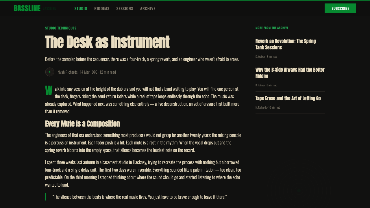
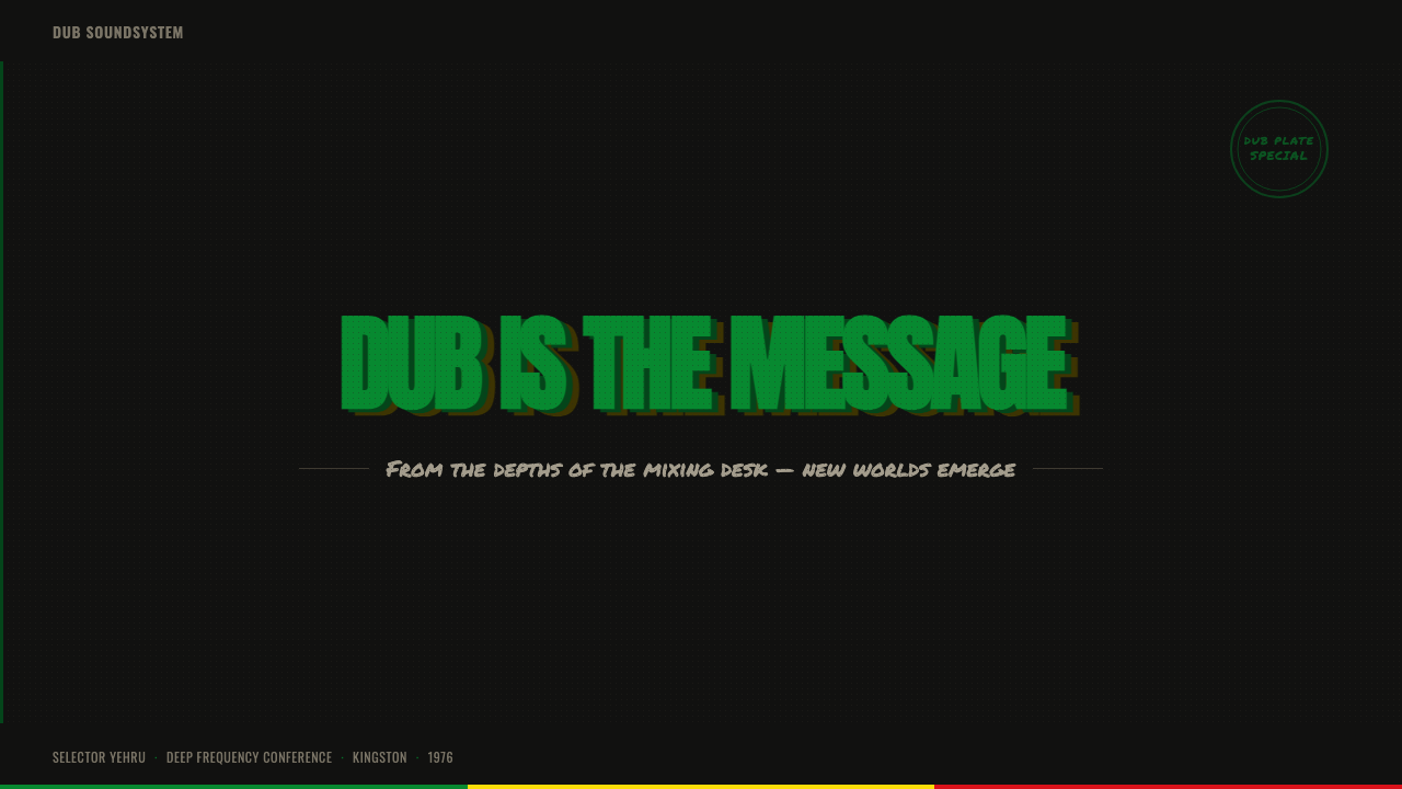
For presentation slides, the style is most effective on covers and section dividers rather than dense content pages. A cover should commit fully: near-black ground, tricolor type with the green element dominant, concentric groove arcs as the only background texture, and type set in a heavy all-caps style that suggests a stamped label. Content pages can retain the dark ground but should reduce the number of active colors to one — typically green for headings or key callouts — with body text in aged white or light cream. Data slides in this style work best when charts are treated as single-color objects against the dark ground, with the tricolor reserved for highlighting one key data point rather than coloring every series.
For web interfaces, Dub Soundsystem is well-suited to music streaming platforms, record shop sites, festival landing pages, and cultural archive projects. The approach: establish a true dark background, define a typographic hierarchy using weight and all-caps as the primary differentiators, and deploy the tricolor in a strict order of visual priority — green for interactive states and key labels, gold for hover states or secondary emphasis, red only for alerts or the most critical calls to action. Avoid using all three simultaneously at high opacity; the system degrades rapidly when all three tricolor values compete.
For editorial and marketing materials — posters, flyers, social graphics — the style has its strongest historical precedent. The authentic dub sleeve is a poster in miniature: a single dominant image or abstract graphic, a compact block of stamped type, and a label element that carries production credits. Apply this structure directly: one image (treated with halftone grain overlay), one headline in heavy all-caps with slight ink-bleed texture, a secondary credit line in smaller caps, and the tricolor used to assign visual hierarchy rather than fill areas. The result reads as authentic because it follows the actual production logic of the source material.
The most common mistake when applying Dub Soundsystem is treating it as a color palette rather than a material logic. Designers take the green-gold-red combination and apply it to a conventional layout with standard typography, clean edges, and smooth gradients — and the result looks like a reggae-themed anything rather than like Black Ark. The style requires the full stack: dark ground, grain overlay, physical type (rough edges, stamp or print quality), groove arcs or similar circular motifs, and color used as instrument separation rather than decoration. Omit any of these and the aesthetic collapses into costume.
Dub Soundsystem — FAQ
Is Dub Soundsystem just a dark reggae theme?
No — the distinction matters. A generic reggae theme typically applies the Rastafari tricolor to a light background with tropical or leaf motifs, drawing on the visual conventions of early reggae marketing rather than the specific world of dub production. Dub Soundsystem is narrower and more precise: it is about Black Ark studio, 1976, the physical artifacts of vinyl pressing and rubber-stamp printing, and a visual logic of layering and echo rather than decoration. The dark ground is not a stylistic choice — it is fundamental to the material system. Apply the tricolor to a white background and the aesthetic does not degrade — it becomes a different aesthetic entirely.
Can this style work for a brand that has nothing to do with music?
It can, but it requires justification. The Dub Soundsystem aesthetic carries strong cultural coding — anyone familiar with Jamaican music history will immediately read it as a specific claim. Used by a non-music brand without that context, it risks reading as appropriation or as an unexplained costume. That said, the underlying values the style communicates — underground authority, craft over commerce, physical weight, countercultural positioning — are portable. A brand that genuinely embodies those values and can articulate why it is reaching for this reference can use the style credibly. A brand that simply wants a striking dark palette with bright accents should look elsewhere.
How do you handle the tricolor without it looking clichéd?
The key is treating the colors as instrument voices rather than decoration. In a dub mix, bass, drums, and melody are never all at full volume simultaneously — one element drops out or recedes so the others can breathe. Apply the same principle: choose one color as the dominant voice for each composition. Green typically leads because it is the lightest value against black and has the most visual presence; gold is the body or warmth; red is the punctuation. Never use all three at equal weight in the same composition. Also critical: the colors should appear in the system at the right opacity and layering — aged and pressed rather than fresh and saturated. The grain overlay helps with this; without it, even the correct tricolor can read as a flat digital graphic rather than a physical artifact.
What typefaces work within this aesthetic?
The authentic visual reference is rubber-stamp type and hand-lettered label copy — condensed, all-caps, visually dense. Contemporary typefaces that approximate this should have strong vertical stems, minimal contrast between thick and thin strokes, and ideally some quality of physicality — a slight roughness or irregularity that suggests the letterform has been inked and pressed rather than rendered. Avoid geometric sans-serifs that are too clean and rational; they will conflict with the material logic of the system. Condensed display faces with historical or industrial associations work well. Monospaced types, as long as they feel mechanical rather than digital, are also compatible — they suggest the typewriter labels found on studio equipment. Whatever the typeface, set it large and heavy; small, delicate type is antithetical to the style's visual weight.
Does Dub Soundsystem work in a light or high-key version?
A genuine light-ground inversion is not really possible without abandoning the core of the aesthetic. The darkness is not a mood choice — it is the vinyl record surface, the pressed lacquer, the physical ground from which everything else is printed. Remove it and the remaining elements (tricolor, grain, groove arcs, stamp type) become reggae-themed graphics applied to a neutral background — which is a different and much less specific aesthetic. If a light-ground variant is needed for a particular application (a printed piece on white stock, for instance), the better approach is to treat the composition as a label element — a dark-ground block within a lighter surrounding field — rather than inverting the entire system.
Related design styles
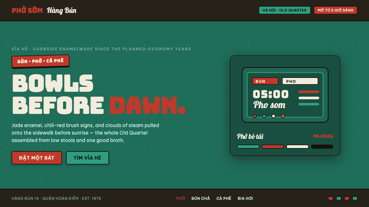 Phở Street-Stall EnamelHanoi's curbside noodle stall, systematized. Jade enamel ground, chili-red br…
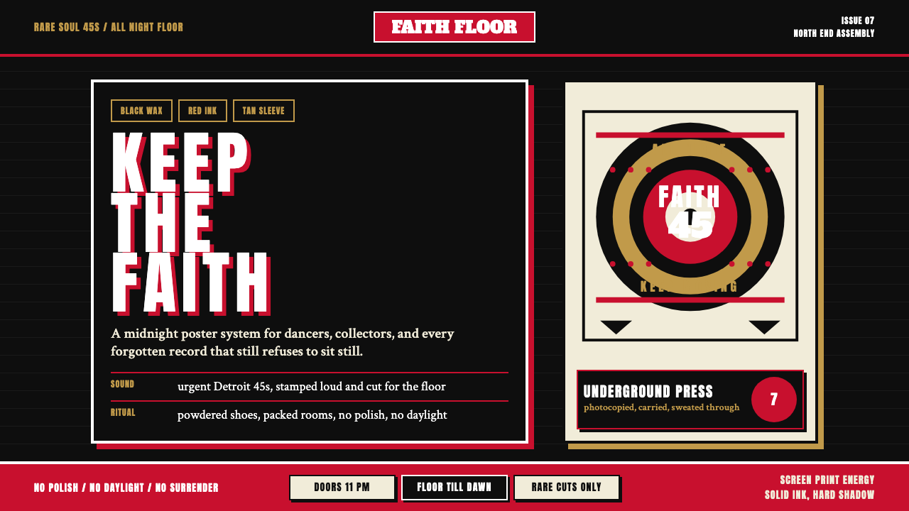 Northern Soul Wigan (1970)Underground urgency. Black ground, fist-red type, and tan vinyl rings hit lik…
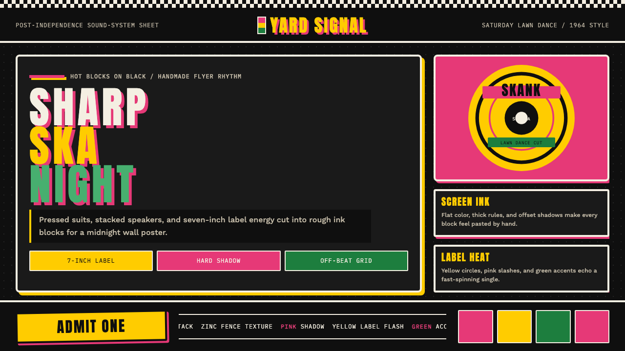 Rude Boy Jamaica Ska (1960)Street swagger hits hard. Hot pink and yellow blocks, checker trim, chunky ty…
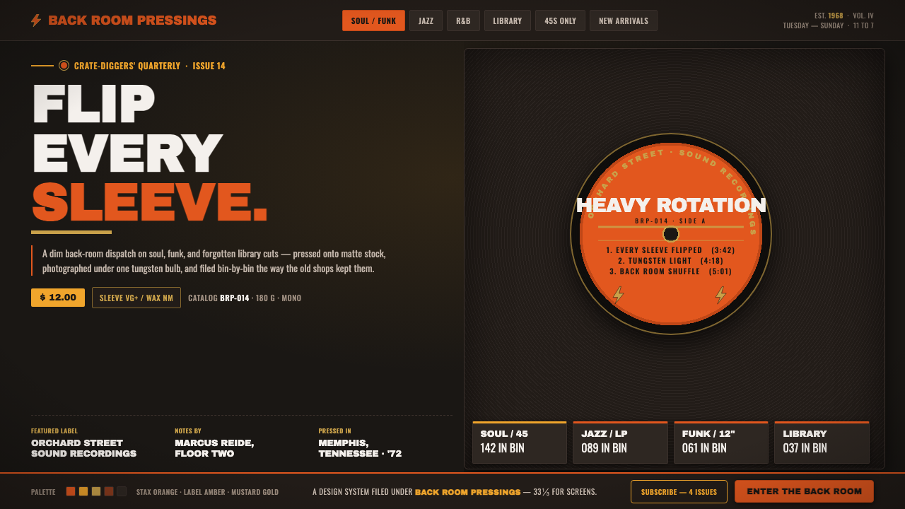 Vinyl Crate DiggingThe back room of a used record store. Stax-orange labels on near-black vinyl,…
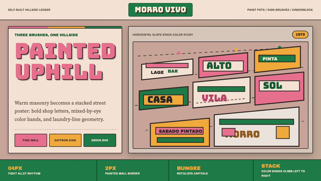 Brazilian Favela Rocinha 1970sHand-built warmth. Pink, saffron and green stripes climb cinderblock in rotul…
 Squadron PatchStitched swagger. Orange merrow rims and stencil type burn over seal-brown le…