What is Uruguayan Candombe Llamadas?
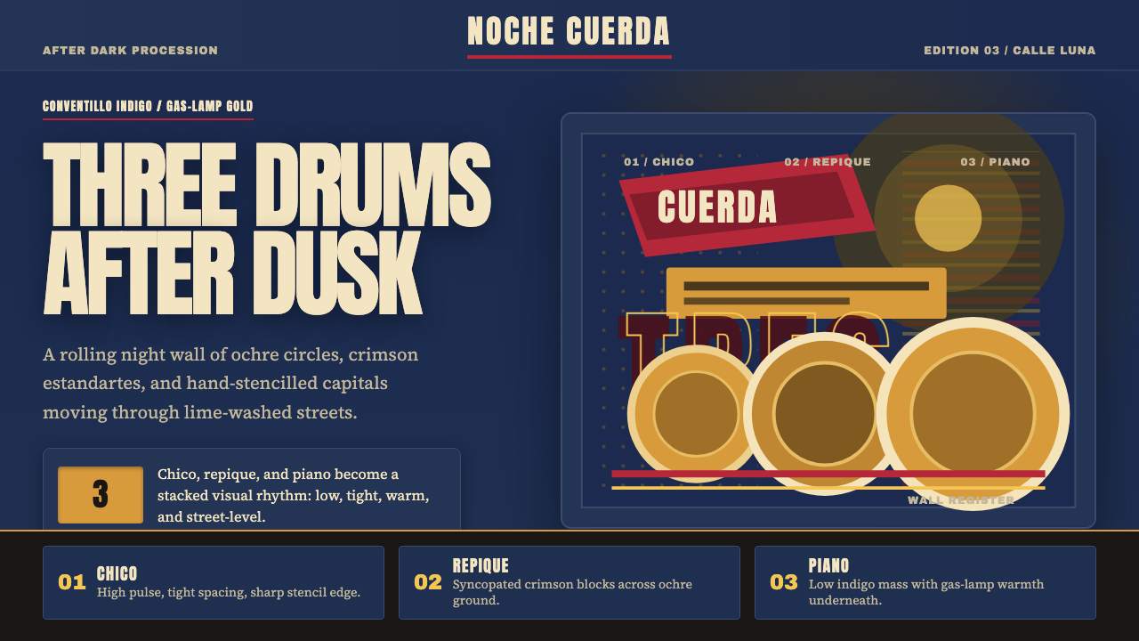
Candombe Llamadas is the visual language of Afro-Uruguayan parade culture — indigo night sky, drum-skin ochre, and the crimson of hand-stencilled neighbourhood banners, all felt through the rough grain of lime-washed tenement walls.
Uruguayan Candombe Llamadas in brief
Uruguayan Candombe Llamadas is a design system rooted in the Afro-Uruguayan drum tradition of Montevideo. Its visual logic emerges from a specific moment: the Llamadas parade rolling through Barrio Sur and Palermo after nightfall, where gas-lamp warmth cuts against an indigo overhead, and hand-painted estandartes — neighbourhood banners — announce each comparsas group in bold stencil lettering on crimson cloth.
The palette is emphatically nocturnal and warm. Deep indigo grounds stand in for the Montevideo night sky; ochre and amber recall drum membranes and the patina of colonial-era candlelight; crimson carries the charge of the estandartes that march at the parade's front. Against these, the coarse plaster texture of conventillo walls provides a surface that absorbs and scatters light rather than reflecting it cleanly — giving the aesthetic its characteristic roughness.
Typographically, the system draws from the hand-painted parade banner tradition. Lettering is broad, direct, and built for legibility at distance and in motion. There is no refinement for refinement's sake: brush strokes carry their own weight, letterforms sit wide, and words announce rather than whisper. The overall register is ceremonial without being formal — a language of community pride rather than institutional authority.
Where does Uruguayan Candombe Llamadas come from?
Candombe arrived in the Río de la Plata region with enslaved West and Central Africans from the late eighteenth century onward. In Montevideo, the colonial city set aside a district called the Barrio Sur for its African-descended population, and it was in the collective tenements — conventillos — of this neighbourhood and the adjacent Palermo that the drum tradition took root. Three drums, each with a distinct role, formed the core ensemble: the chico (small, high-pitched, keeping the clave-like rhythmic anchor), the repique (mid-size, responsible for improvised calls), and the piano (large, deep, carrying the harmonic bass). Together they produce a layered polyrhythm recognizable from blocks away, and their combined sound came to define the sonic identity of Afro-Montevideo.
The Llamadas — literally 'the callings' — began as neighbourhood drum circles in which one conventillo would call or challenge another through rhythm. By the early twentieth century they had evolved into a formalized procession through the streets of Barrio Sur and Palermo, typically held in the days leading up to Carnival. In 1956 the Municipality of Montevideo officially recognized the Llamadas as a civic event, institutionalizing what had been a community practice into the city's cultural calendar. In 2009, UNESCO added Uruguayan candombe to its Representative List of the Intangible Cultural Heritage of Humanity, acknowledging it as one of the few surviving direct continuities of African musical tradition in the Americas.
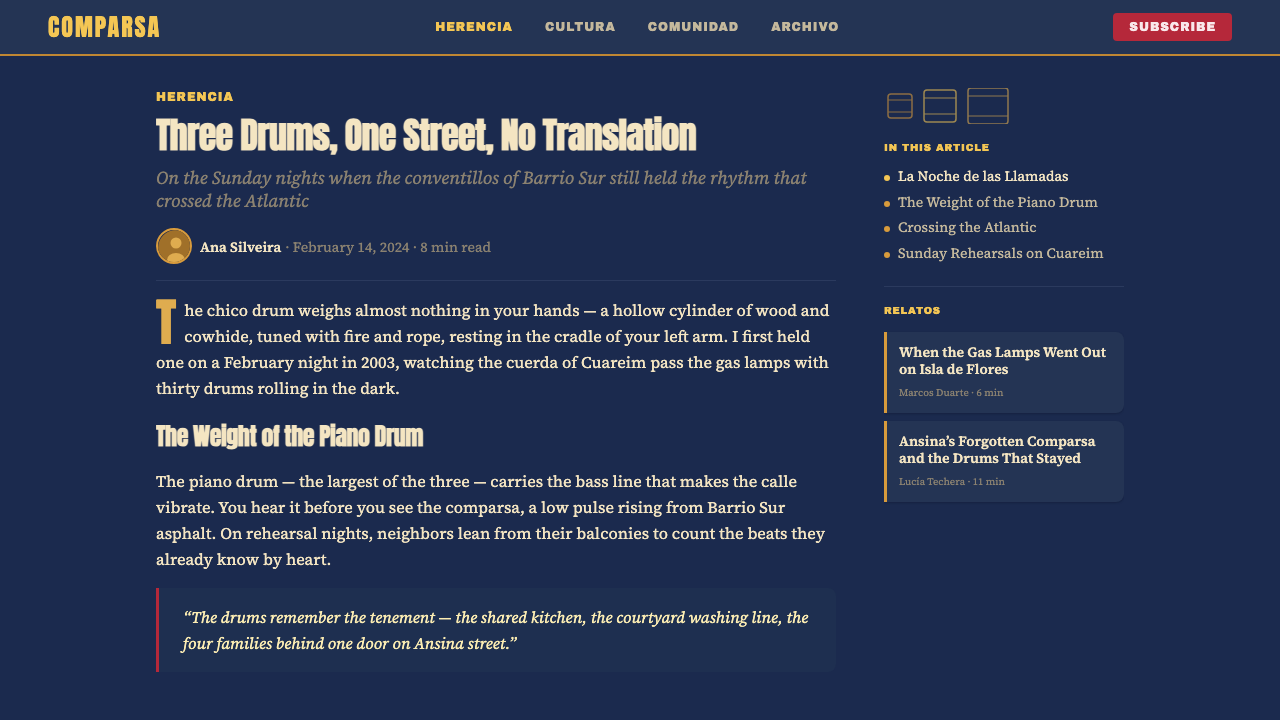
The visual culture of the Llamadas is inseparable from its material context. The conventillo walls were and are lime-washed plaster — a surface that takes paint unevenly, catches light obliquely, and ages into something that looks both worn and alive. The estandartes, or neighbourhood banners, were traditionally sewn and painted by the comparsas themselves, using the primary colours available cheaply in local markets: deep indigos and blues from textile dyes, ochres and umbers from natural earth pigments, and the intense red of dye-saturated cloth. The hand-stencilled lettering — broad sans-serif characters sprayed or brushed through cardboard cutouts — was not a stylistic choice so much as the fastest legible system for large-scale text in a pre-digital world.
After a long suppression during Uruguay's military dictatorship (1973–1985), candombe and the Llamadas experienced a powerful revival in the late 1980s and 1990s, spreading beyond the Barrio Sur and Palermo communities that had kept the tradition alive and finding new participants across Montevideo. This revival coincided with a broader reassertion of Afro-Uruguayan identity and the political recognition of a community that had often been rendered invisible in Uruguay's self-image as a European immigrant nation. The aesthetic vocabulary of the Llamadas — its night colours, its rough surfaces, its handmade lettering — became a symbol not just of a musical tradition but of cultural survival.
What defines the Uruguayan Candombe Llamadas look?
Color — Nocturnal Depth
The palette is built from night and firelight. A deep, saturated indigo functions as the dominant ground — not the flat navy of a corporate template, but a blue with warmth buried in it, the colour of the Montevideo sky above the gas-lamp glow. Against this, ochre and amber take the middle ground: drum-membrane warmth, candlelight caught in old plaster. Crimson appears as the high note — the color of the estandartes that march at the parade's head, demanding to be seen. Accents of near-black provide structural anchors. There is nothing neutral or pastel in the system; every hue carries the intensity of a dye or a pigment applied to cloth by hand.
Texture — Lime-Washed Plaster
The defining surface quality of the system is roughness: the uneven absorbency of lime-washed plaster, the slight variation in a brushstroke across coarse plaster, the way paint settles differently in high spots than in low ones. This is not digital noise or a filter effect — it is the visual memory of a specific material. Applied to backgrounds and large fields of color, this quality prevents flatness and gives the palette a physical presence. It is the difference between a color seen on a screen and a color felt on a wall.
Typography — Banner Lettering
Type in the Llamadas tradition is built for distance and movement. Letters are wide, strokes are generous, and spacing is open enough to remain legible when a banner is carried at speed through a crowd. The hand-stencilled character of the original lettering — slight ink bleed at the edges, variation in stroke weight from one spray pass to the next — means the system favors typefaces that carry some optical warmth even when set at size. Thin or highly refined letterforms undercut the vernacular energy; the style calls for type that announces, not type that whispers.
Contrast — Flame Against Dark
The system relies on high contrast between a dark ground and luminous foreground elements — not the clinical black-and-white contrast of modernist typography, but the warmer contrast of flame against indigo dark. Ochre on indigo, crimson on near-black, warm white on deep blue: these are the system's primary contrast moves. The effect reads as light emerging from darkness rather than ink printed on paper, which gives the aesthetic its characteristic sense of drama without requiring any theatrical effects beyond the palette itself.
Rhythm — Layered Repetition
Just as the three Candombe drums each hold their own rhythmic line while together producing a unified polyrhythm, the visual system favors layered repetition over singular focal points. Horizontal bands of color, repeating typographic elements, overlapping textures that each move at their own pace: the eye is invited to track multiple layers simultaneously rather than directed to one hero element. This compositional logic distinguishes the style from simpler poster traditions and aligns it with the actual sonic structure of the music it references.
Scale — Parade Presence
Objects in this visual language are sized for presence, not for intimacy. Type runs large; decorative elements occupy space confidently; margins are either generous or nearly absent — the system does not favor the cautious middle range. This scale logic comes directly from the parade context: a banner or drum circle has to assert itself in a street crowded with competing sounds and movements. Applied digitally, it produces compositions that feel occupying rather than decorative, that hold a screen rather than sit on it.
Handmade Mark — Human Origin
The system always retains some evidence of human making: the imperfect edge of a stencil, the variation in a painted line, the slight off-register of a two-color print. This is not a defect to be corrected but a quality to be preserved. In a tradition where the drums are built and maintained by the same community that plays them, and where the banners are sewn and painted collectively by the comparsas, the mark of the hand is a mark of authorship and belonging. Applied in design, it guards against the sterility of over-engineered precision.
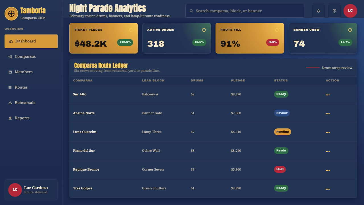
Who shaped Uruguayan Candombe Llamadas?
Rubén Rada is the most internationally recognized figure to emerge from Montevideo's candombe culture. As a musician, songwriter, and bandleader, he brought candombe rhythms into dialogue with rock, jazz, and Latin popular music, beginning in the late 1960s with the group Totem and continuing through a solo career spanning six decades. His work demonstrated that the drum tradition of the conventillos was not a museum artifact but a living rhythmic vocabulary capable of generating new music across changing contexts. For designers, Rada represents the principle of cultural translation without dilution.
Pedro Ferreira is considered one of the foundational figures of modern candombe scholarship and practice. His work documenting the drum's technical vocabulary, the structure of the three-drum ensemble, and the genealogy of the Montevideo comparsas provided the first systematic account of what had previously been transmitted only through direct practice and oral tradition. His documentation preserved not just the musical technique but the social architecture of the tradition — the neighborhood loyalties, the parade hierarchies, the function of the estandarte in marking group identity.
Tomás Olivera Chirimini is a musician, author, and cultural activist who dedicated much of his career to asserting the African roots of Uruguayan culture — a contribution that ran against the dominant national narrative that framed Uruguay as exclusively European in origin. His books and recordings on Afro-Uruguayan history, including the religious and ceremonial contexts in which candombe developed, made available to a broader public the cultural depth behind what non-insiders often reduced to a percussion style. His advocacy intersected with the post-dictatorship revival of candombe in the 1980s.
Eduardo Da Luz is a master drum-maker (lutierwho) and performer whose work preserves the craft tradition of building the three candombe drums by hand. The construction of each drum — selecting the hide, shaping the body, tuning the membrane — is itself a form of knowledge transmission that exists alongside the musical practice. Da Luz's instruments have been used by many of the leading candombe groups in Montevideo, and his role as a craftsman illustrates how the visual and material culture of the tradition (the drums as physical objects, with their characteristic proportions and construction) is as significant as the sonic tradition it produces.
The comparsas — the organized neighbourhood groups that participate in the Llamadas — are not individuals but collectives, and they function as the primary authors of the tradition's visual culture. Each comparsa maintains its own colors, its own estandarte design, and its own banner-making and costume traditions. Groups such as Lubolo, Morenada, and Cuareim 1080 have sustained multi-generational visual identities through the parade, demonstrating that collective authorship can produce visual systems as coherent and distinctive as those created by named designers.
How do you use Uruguayan Candombe Llamadas today?
Candombe Llamadas is a style that rewards specificity. Its night palette — indigo, ochre, crimson — is not interchangeable with generic 'warm dark' combinations; it carries a particular weight and temperature that requires intentional deployment. Begin any application by committing to the dark ground as primary: the backgrounds should feel like night, not like a dark gray in a brand color system. Foreground elements should have the luminosity of objects seen by firelight — warm whites, heated ochres — rather than the flat brightness of daylit contrast.
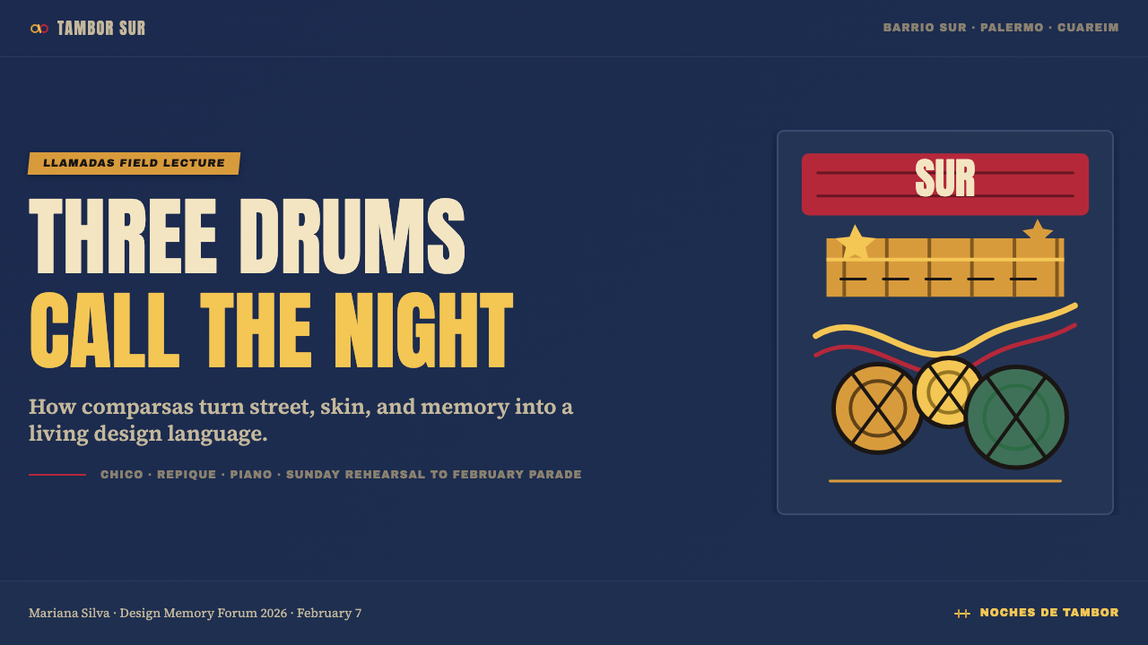
For presentation slides, this system works best on covers that need to announce rather than explain. A Llamadas-inflected cover uses the full indigo field for the ground, sets the title in wide, generous lettering at a scale that fills the frame, and introduces a single crimson or ochre element — a horizontal band, a large initial letter, a textured block — to establish the parade-banner register. Content slides should pull back to simpler contrast: near-white type on indigo, or indigo type on an ochre-tinted ground, with texture applied only to structural elements rather than to the entire background. Data slides in this system should avoid chart types that rely on many distinct hues; instead, use the ochre-to-crimson range as a sequential scale and let the indigo ground unify the composition.
For web interfaces, the system's strength is in products that benefit from a sense of cultural weight and celebration — event platforms, cultural institution sites, community-facing applications, and editorial products covering music, performance, or Afro-Latin subjects. Navigation and header areas take the indigo ground naturally; cards and content blocks can shift to ochre-tinted or near-black grounds to create the layered depth the drum ensemble implies. Avoid using the full crimson at large scale for interface chrome — it reads as error or alert in most web contexts. Reserve it for moments of genuine emphasis: a call-to-action button, a featured item tag, a section title.
For editorial and marketing contexts, the system's poster quality is its primary asset. Full-spread layouts can use the indigo-to-near-black gradient of a night sky as a photographic underlay, setting wide type in warm white or ochre. Marketing pieces for events, cultural programming, or music releases in this aesthetic should let the type scale do the structural work — one large element anchors the composition, everything else falls into place around it. Avoid overloading the layout with texture; the lime-washed plaster quality should appear in one or two zones, not everywhere simultaneously.
The most common mistake when working with Candombe Llamadas is mistaking the warmth for looseness. This is not a casual or organic style — it is a ceremonial one. The proportions of the estandartes, the hierarchy of the drum ensemble, the choreography of the parade: all of these are governed by deep convention. In design terms, this means the system requires structural discipline. The rough texture should be confined to backgrounds and large fields; type should be set with precision even when the letterforms feel handmade; the palette should be controlled to two or three hues per composition rather than introducing the full palette simultaneously. Warmth and ceremony coexist because the ceremony sets the frame.
Uruguayan Candombe Llamadas — FAQ
Is this style appropriate for brands with no connection to Afro-Uruguayan culture?
The question is worth taking seriously rather than dismissing. Candombe Llamadas is a living tradition rooted in a specific community's history of resistance and survival — not an anonymous vernacular aesthetic. That said, design history is full of visual languages that traveled far from their origins without becoming purely extractive; what distinguishes respectful adoption from appropriation is usually transparency and specificity. Using this system means being able to account for where the visual language comes from, not treating the palette as generic 'warm dark exotic.' The more directly a brand is connected to music, performance, cultural celebration, or Afro-Latin communities, the more naturally the style fits. For brands with no cultural adjacency, a more abstracted treatment — retaining the structural principles of layered rhythm and ceremonial scale without leaning on the specific iconography — is more defensible.
How does this dark palette perform in print versus screen?
On screen, the system behaves well — deep indigo backgrounds reproduce consistently on modern displays, and the ochre-to-crimson foreground range has enough saturation to hold contrast without needing precise color management. Print is more demanding. The deep indigo requires a rich black-build in CMYK to avoid a flat, printed-navy appearance; printers familiar with duotone or spot-color work will get better results than those working with standard four-color offset. The texture elements, which look organic on screen, may require careful halftone handling in print to avoid blocking up in shadow areas. For high-quality print applications — a festival program, a cultural institution catalog — the system rewards working with a print production specialist from the beginning of the design process.
Does the style work for light-background layouts, or is the dark ground essential?
The dark ground is close to essential. The system's color logic depends on the luminosity relationship between a deep indigo or near-black background and warm, light-catching foreground elements — a relationship that reverses rather than translates to a light-ground layout. A cream or white background with ochre and crimson reads more like a folk-art or artisan market aesthetic than like the nocturnal parade tradition the system references. That said, a light inversion is possible for secondary materials — a text-heavy document page, an invoice, a specification sheet — where the dark ground would be oppressive at length. In these cases, the texture, the letterform weight, and the crimson accent can carry the system's character without requiring the full night palette.
How closely should the letterforms reference actual hand-stencilled parade lettering?
Directly referencing the stencil aesthetic — using actual stencil-style typefaces, adding ink-bleed effects, introducing registration errors — is one option, but it carries the risk of becoming a costume rather than a system. The more durable approach is to extract the structural principles of the banner lettering: generous width, confident stroke weight, open spacing, letterforms built for legibility at scale. A contemporary grotesque or humanist sans-serif set at a confident weight will carry more of the banner tradition's authority than a novelty stencil font applied to fine text. The handmade quality should be present in the texture and the palette, not necessarily in the letterforms themselves.
Can this system work for digital products aimed at younger audiences unfamiliar with candombe?
Yes, with the caveat that the cultural referent should not be hidden or erased. The system's visual qualities — warm dark palette, textured grounds, ceremonial scale, layered rhythm in the composition — are strong enough to function as a design language for a wide range of digital products, from music apps to event platforms to cultural editorial. Younger audiences do not need to recognize the specific Llamadas tradition to respond to the aesthetic; what they will respond to is the warmth, the depth, and the sense of something at stake. The responsibility is on the designer to remain able to explain the system's origins — and ideally, to create entry points through which interested users can learn more about the tradition itself.
Related design styles
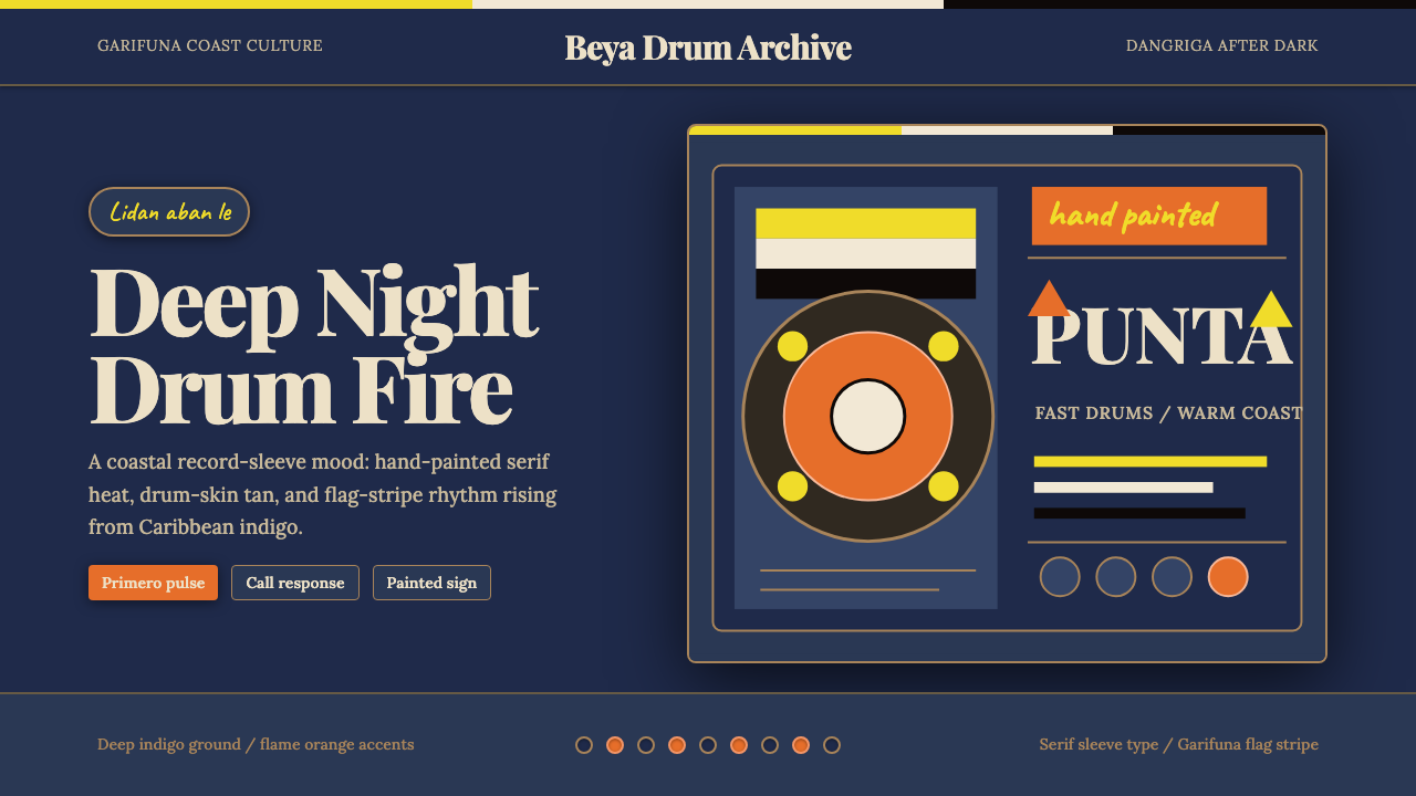 Belizean Garifuna PuntaNight rhythm burns. Indigo fields, flame-orange serif type, and flag stripes…
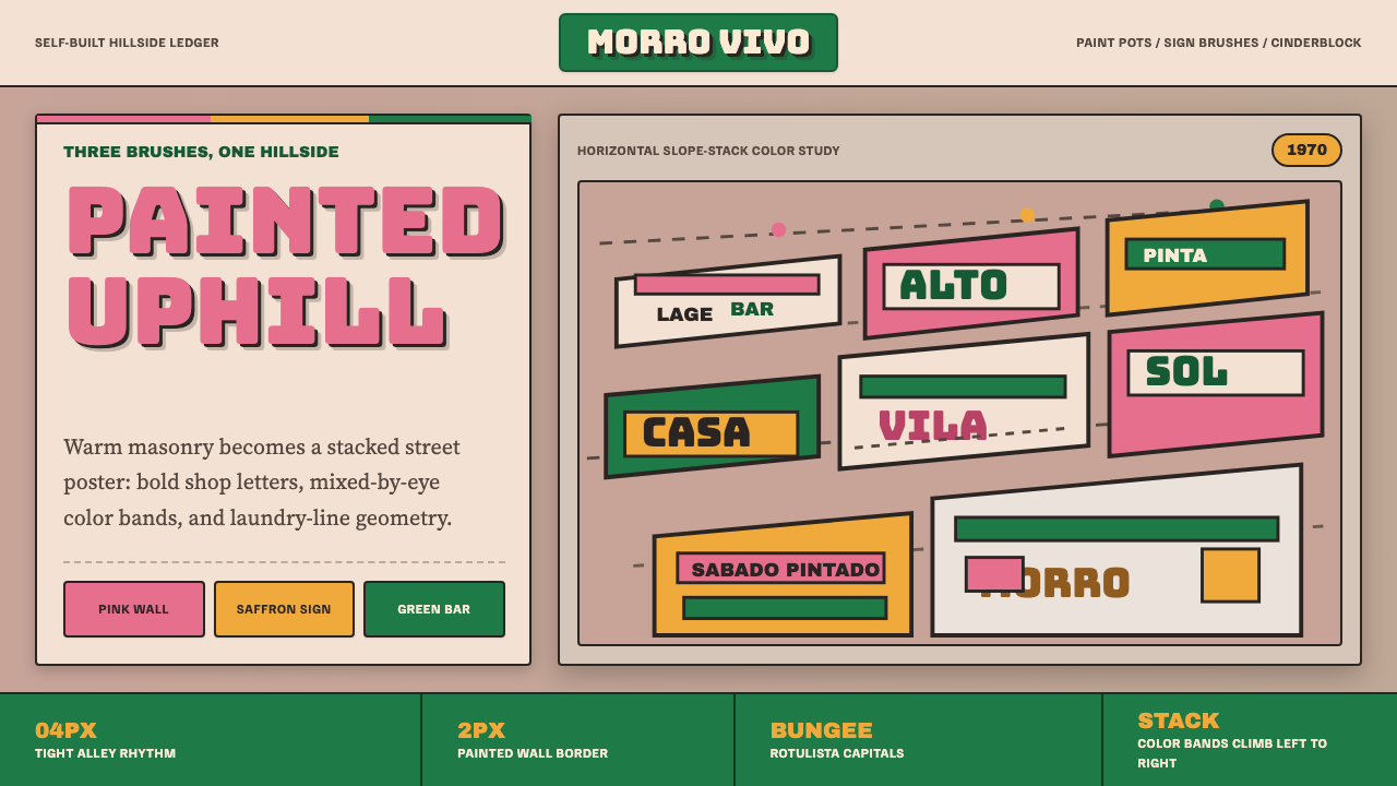 Brazilian Favela Rocinha 1970sHand-built warmth. Pink, saffron and green stripes climb cinderblock in rotul…
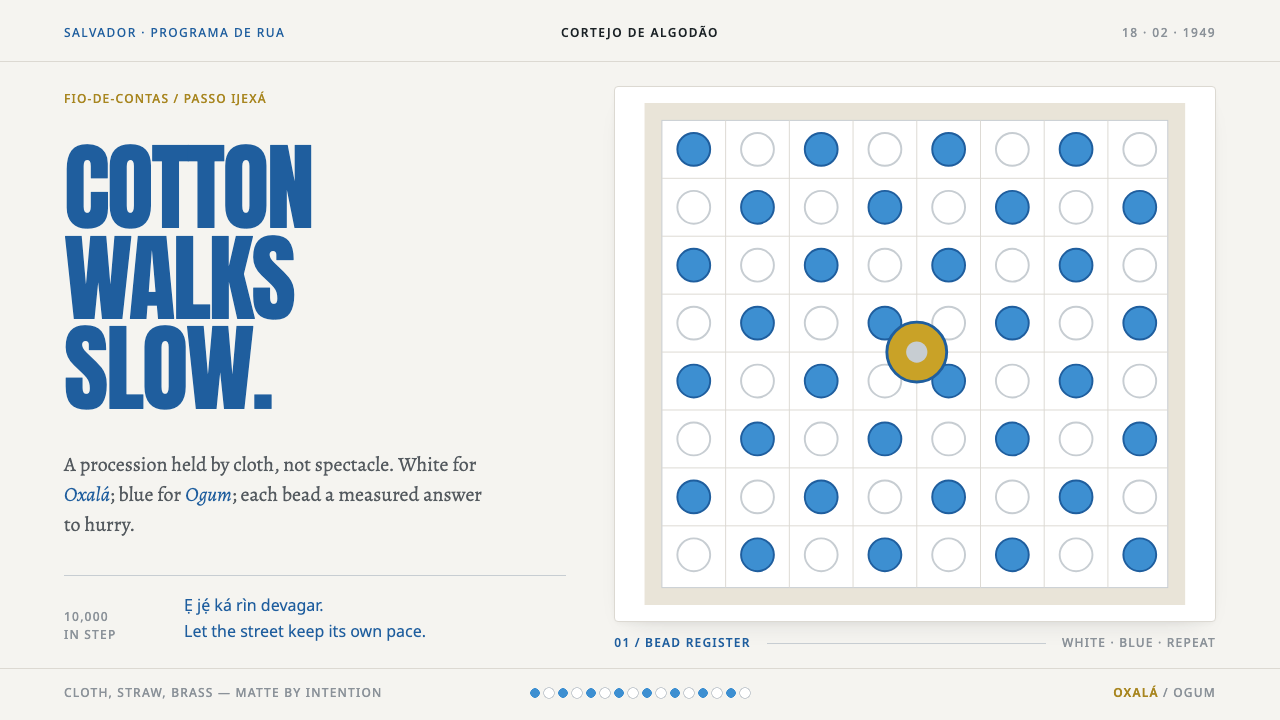 Afoxé Filhos de GandhyA procession that refuses to hurry. Cotton white and bead blue repeat in a me…
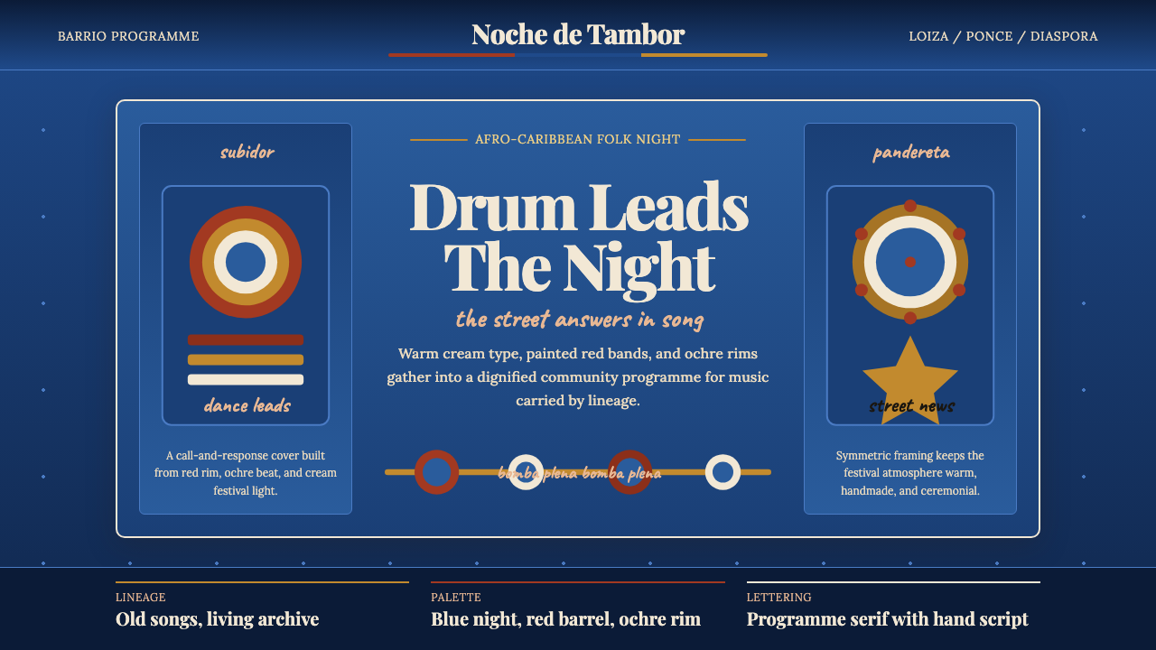 Puerto Rican Bomba & PlenaNight festival dignity. Drum-red stripes and cream Playfair type on deep trop…
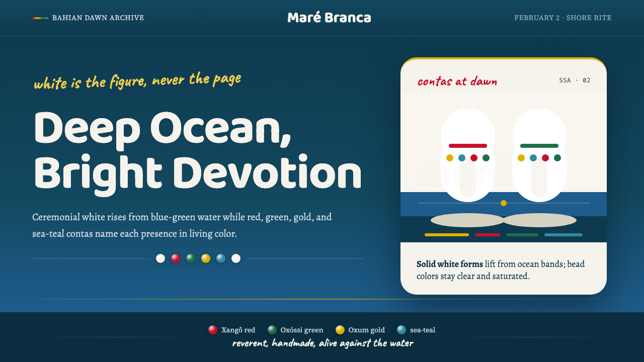 Candomblé OrixáReverent but alive. Ocean blue carries white figures and saturated bead-color…
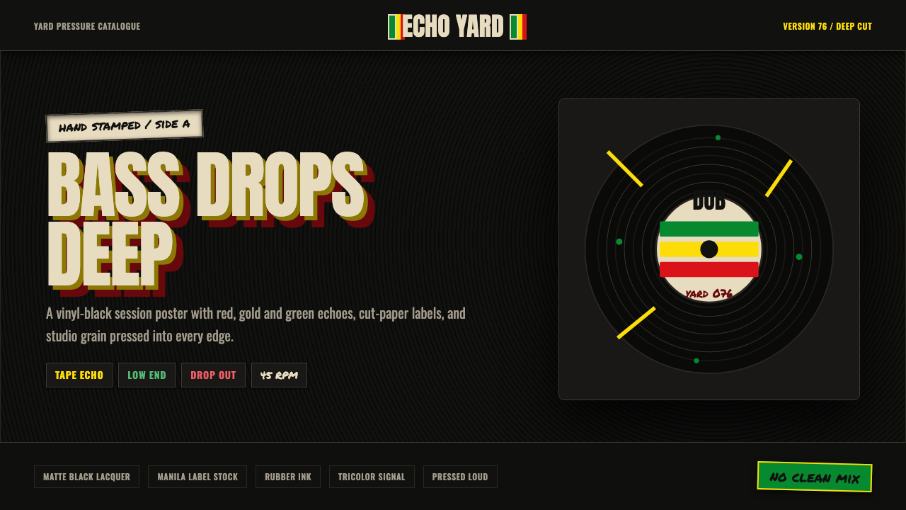 Dub SoundsystemStudio-dark and heavy. Vinyl grooves, manila stamp, green-gold-red echo type.