What is Candomblé Orixá?
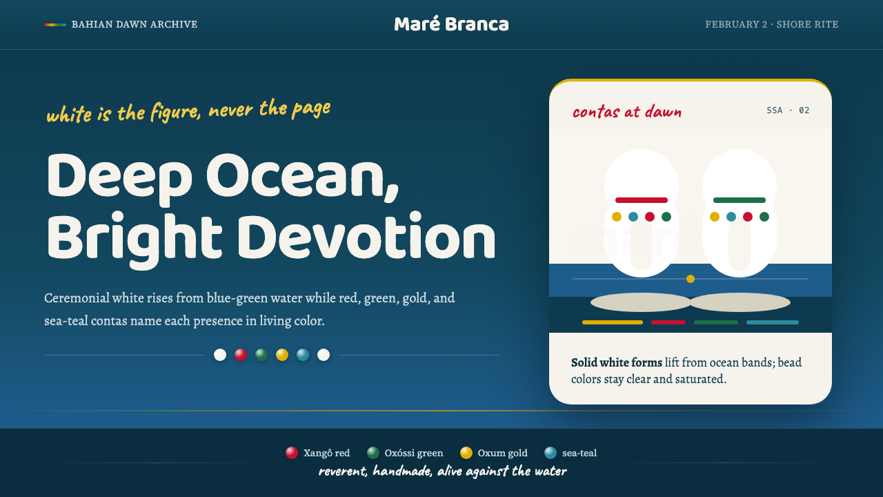
Candomblé Orixá is a design language drawn from Afro-Brazilian sacred ceremony — deep ocean as ground, white as figure, and the jewel-saturated bead colors of each orixá strung across the scene like a living legend. It is reverent without being solemn, handmade without being rough.
Candomblé Orixá in brief
Candomblé Orixá is a design system rooted in Afro-Brazilian religious ceremony — specifically the annual Festa de Iemanjá celebrated on February 2 along the shore of Salvador da Bahia, where devotees dressed in ceremonial white wade into the blue-green sea bearing gifts of white flowers. The visual language captures that single scene: a dark, luminous ground carries bright white figures and small strokes of saturated color, each tied to a specific orixá deity.
At the heart of the system is an inversion of conventional color logic. White is never the background — it is the figure, the human presence, the mark of sacred intention. The ground is oceanic: deep blue-green, neither flat nor uniform, but weighted and alive. Against this ground, the bead colors of individual orixás — reds, greens, golds, and indigos — appear as accent strands, never competing with the white figure but complementing it the way ornamental beads complement ceremonial dress.
The emotional register is warm and handmade. Unlike purely geometric or typographic systems, Candomblé Orixá draws on tactile sources — woven cloth, ceramic vessels, glazed tile, strung beads, embroidered cotton. Forms are organic but not casual; the warmth is earned through ritual repetition, not improvisation. This makes it one of the few design systems equally at home in devotional contexts and in contemporary cultural brands that want to signal depth, ancestry, and living tradition.
Where does Candomblé Orixá come from?
Candomblé emerged in nineteenth-century Bahia as West African religious traditions — primarily Yoruba, Fon, and Bantu — were carried across the Atlantic with enslaved people and reassembled on Brazilian soil under conditions of colonial suppression. The word 'candomblé' itself is of contested etymology, but the practice it names is specific: a liturgical system organized around the orixás, divine energies associated with natural forces, colors, days of the week, foods, and ritual objects. Each orixá has a distinct visual signature: Iemanjá governs the sea and wears blue and white; Oxalá, the eldest and most sacred, is clothed entirely in white; Xangô rules thunder and lightning and carries the deep reds of fire and blood; Oxóssi is the hunter, associated with forest greens; Oxum, goddess of rivers and love, wears gold.
The religion survived colonial suppression through syncretism — orixás were mapped onto Catholic saints, and ceremonies were held on feast days, in spaces that could plausibly pass as devotional without attracting persecution. This layering is visible in the visual culture of Bahia: church architecture and African symbolism coexist on the same street, sometimes in the same building. The result is not confusion but density — a visual environment where every color, every vessel, every flower carries plural meanings simultaneously.
The Festa de Iemanjá, celebrated on February 2 in Salvador, is the public face of this tradition that most directly inspired the design language. Before dawn, devotees gather on the beach at Rio Vermelho. Offerings — white flowers, mirrors, perfume, combs, candles — are loaded into small boats and sent out to sea as the sun rises. The scene has been documented in photography since at least the early twentieth century and is one of the most recognized Afro-diasporic visual events in the Americas: a dark sea, white-dressed figures, and small flames of saturated color against the pre-dawn blue.
The visual culture of Candomblé is not fixed or archival — it is a living practice. New terreiros (ceremonial houses) continue to be founded; initiations, feast days, and public processions maintain and renew the visual vocabulary. This liveness distinguishes Candomblé Orixá from design systems drawn from extinct or purely historical traditions. Its colors and forms are still worn, still offered, still woven — which gives the design language an authenticity that cannot be achieved through historical reconstruction alone.
What defines the Candomblé Orixá look?
Ground and Figure
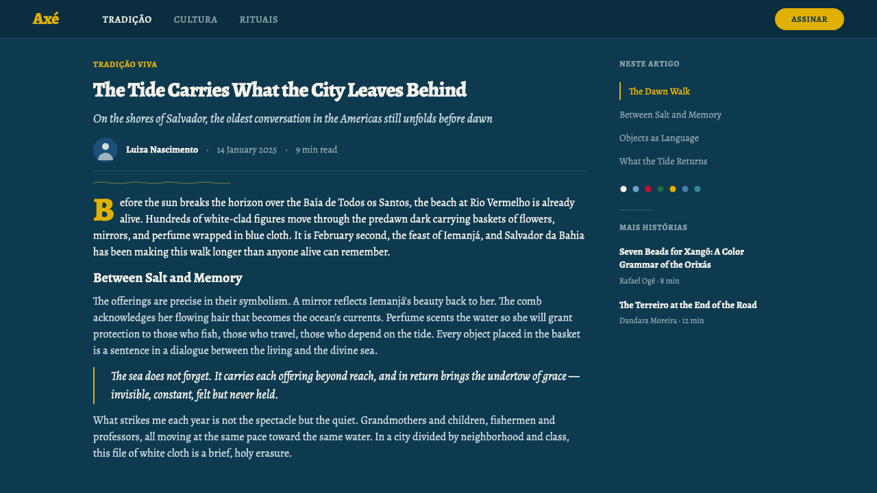
The defining inversion of this system: the deep ocean ground is not empty space but active presence — weighted, luminous, and directional. White serves as the figure, never the void. This reversal is not merely aesthetic; it mirrors the theology of Candomblé, in which the sea is Iemanjá's body and white signals sacred purity rather than absence. Applied in design, this means the dark background carries meaning and texture, while white marks human or intentional presence against it.
The Bead Palette
Color in this system is structured around the orixá bead colors — a set of saturated, jewel-like hues, each tied to a specific deity and ritual domain. These colors appear sparingly, as accents against the dark ground and white figures, never dominating the composition. Their role is identific and symbolic rather than atmospheric: a stroke of deep red says Xangô, a flicker of forest green says Oxóssi, a warm gold says Oxum. Using more than one or two simultaneously risks creating visual noise; the restraint mirrors how beaded necklaces (contas) are worn — one set per orixá, not all at once.
Tactile Texture
Unlike systems built from pure geometry, Candomblé Orixá draws on hand-crafted material culture: embroidered cotton, unglazed clay, woven raffia, glazed azulejo tile, knotted cord, and hammered metal. Surface texture is not decoration — it is memory, indicating which hands made the object and what tradition guided them. In digital contexts, this translates to visual weight and material suggestion: rough-edged shapes, surfaces that appear hand-painted or woven, letterforms with slight irregularities that speak of making rather than manufacturing.
Organic Form Over Geometry
Where Bauhaus or Swiss style builds from circles, squares, and triangles, Candomblé Orixá works with organic, flowing, and layered forms: waves, cloth folds, flower petals, flame shapes, the human figure in motion. Edges are not always crisp. Boundaries between elements can blur or overlap, the way sea meets sand. This does not mean the system is formless — it has strong compositional logic — but it locates that logic in natural movement and ritual gesture rather than in mathematical structure.
Ritual Warmth
The system's emotional register is warm and communal, not austere. The Candomblé ceremony is a collective event — drumming, singing, dance, shared offering — and the design language carries this social warmth. Colors are rich rather than cold, forms are inviting rather than confrontational, and the overall tone feels celebratory even in its reverence. This warmth is structural, not accidental: it comes from the choice of the oceanic ground (rather than black or grey), from the luminosity of white against it, and from the jewel quality of the accent colors.
Layered Symbolism
Every visual element in this system carries at least two registers of meaning simultaneously: aesthetic and ritual, sensory and theological. The color white is beautiful and it is Oxalá. The ocean blue-green is atmospheric and it is Iemanjá's domain. Beaded strands are decorative and they are liturgical identifiers. This double-coding is not a contrivance — it is the natural inheritance of a tradition where the sacred and the aesthetic were never separated. Designers working with this system can lean into that density: elements that carry aesthetic weight and symbolic resonance are more memorable than elements that carry only one.
Darkness as Depth, Not Absence
The dark oceanic ground of this system is not darkness in the Western sense of absence, threat, or emptiness. It is depth — the specific quality of deep water that is full rather than void, that holds and carries rather than swallows. This distinction matters for application: the dark backgrounds in this system should feel rich and enveloping, not stark or aggressive. The darkness is alive with subtle variation, the way the sea changes color at different depths. A flat, unmodulated dark background will miss the spirit of the system entirely.
Who shaped Candomblé Orixá?
The orisha of the sea and one of the most beloved deities in the Candomblé pantheon, Iemanjá is associated with the ocean's blue-green expanses, with feminine generativity, and with the moon. Her colors — blue and white — form the dominant ground of the design system. The Festa de Iemanjá on February 2 in Salvador is the single most influential visual event in the system's origin, and her iconography (white-robed figures wading into blue-green water bearing white flowers) is the direct source of its inversion of figure and ground.
The eldest and most sacred of the orixás, Oxalá is the creator deity associated with white — the color of purity, coolness, and age. His devotees dress entirely in white, abstain from red foods and beverages, and move slowly as an act of reverence. In the design system, Oxalá's influence is felt in the centrality of white as figure rather than ground, and in the concept that whiteness carries meaning and intention rather than absence. He is the reason white 'speaks' in this system rather than retreating.
Xangô is the orixá of thunder, lightning, and justice, associated with deep reds and the power of fire. His bead colors — variously described as red, burgundy, and white in combination — represent one of the most visually assertive accent tones in the system. When deep red appears in a Candomblé Orixá composition, it typically carries the symbolic weight of Xangô: authority, energy, and heat. His double-headed axe (oxé) is one of the most frequently reproduced sacred symbols in Bahian visual culture.
Oxum is the goddess of rivers, sweet water, love, and feminine beauty, associated with gold and yellow — the warmth of flowing water in sunlight, the shimmer of brass and amber. Her presence in the design system is felt in the warm, luminous accent tones that appear alongside the cooler ocean ground: gold against deep blue-green is one of the defining color relationships of the Candomblé Orixá palette. She represents the principle that beauty and devotion are not opposites — that the act of adorning is itself an act of offering.
More a living ritual event than an individual figure, the Festa de Iemanjá is the generative scene from which the entire Candomblé Orixá design language is drawn. Held on February 2 each year in Salvador da Bahia, the ceremony has been photographed, filmed, and reproduced since the early twentieth century, making it one of the most documented Afro-diasporic visual traditions in the world. Its visual logic — dark water, white figures, saturated accent colors of flowers and offerings — is the direct structural source of the system's color relationships, its figure-ground inversion, and its combination of solemnity and warmth.
How do you use Candomblé Orixá today?
Candomblé Orixá is one of the rare design systems where the dark background is not a dramatic departure from the tradition's logic — it is the tradition's logic. Applying it correctly means committing to the ground as active presence: the background should feel oceanic, rich, and slightly varied, not simply a dark panel. White is the mark of intentional human presence; it should appear in figures, in text, in focal elements — not as a background field. The bead-color accents (saturated reds, greens, golds) function as identifiers and signals, used with precision and restraint, not scattered decoratively.
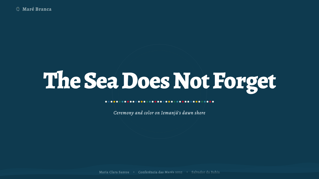
For presentation slides, this system is exceptionally well-suited to cover pages that announce a cultural, ceremonial, or emotionally weighted subject. A cover built on the oceanic ground with white title text and a single jewel-toned accent creates immediate visual authority. Content slides should use white or very light type on the dark ground for all primary text, with the saturated accent color used only for single key terms or data points that need to be called out. Avoid placing multiple accent colors on a single slide — the bead palette logic requires that each color speak individually.
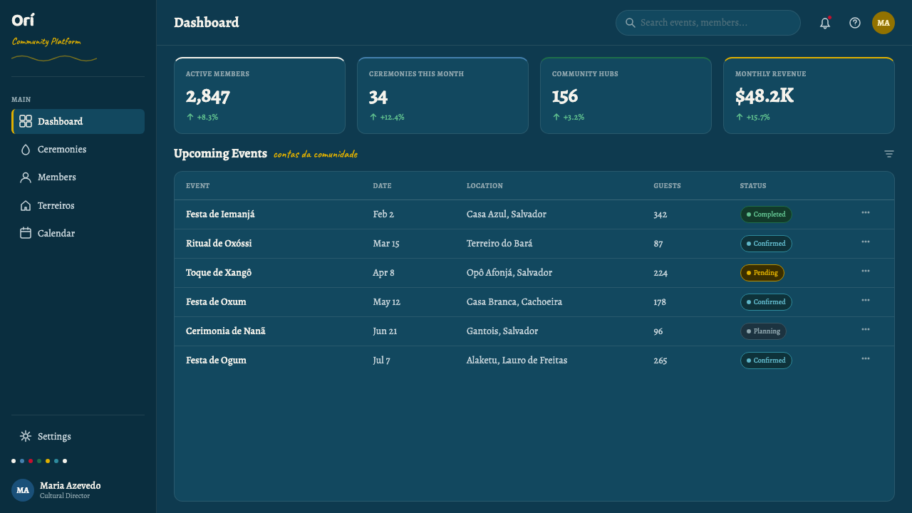
For web interfaces, this system suits applications with cultural depth: arts organizations, heritage institutions, music platforms, and brands rooted in specific geographic or spiritual traditions. The dark oceanic background works well for full-bleed hero sections, with white type and imagery providing the human presence. Dashboard or data contexts should use a lighter secondary palette derived from the oceanic hues — deep teals and near-blacks — reserving the saturated accent colors for status indicators or calls to action. Navigation should be clean, typographically restrained, with the system's warmth carried by the background rather than by decorative elements.
For editorial and marketing work, Candomblé Orixá produces powerful full-page spreads and poster-style compositions. The system's origin in ceremonial photography means it translates naturally to contexts where photographic imagery and typographic treatment must coexist on a dark ground. Images of people should appear in white or high-key tones against the dark background; supporting graphics (icons, dividers, frame elements) can carry the jewel accent colors. Marketing copy should be concise — this visual system carries enough weight that text does not need to work hard.
The most common mistake when applying this system is treating it as simply a dark-background style with colorful accents — importing the surface appearance without the underlying logic. The critical error is filling the background with flat, unmodulated darkness and then placing saturated colors liberally across the composition. This produces visual chaos rather than the system's characteristic depth and restraint. A second common error is using white as a background field rather than as figure: once white becomes the ground, the entire system collapses, and you are left with an ordinary light-background layout decorated with tropical colors. Preserve the inversion — dark ground, white figure, jewel accent — and the system's power will follow.
Candomblé Orixá — FAQ
Is this system appropriate to use in non-religious or commercial contexts?
Yes, with care and intention. Candomblé Orixá as a design system draws on the visual language of the tradition — its color relationships, figure-ground logic, and material culture — without requiring or implying religious practice from the designer or audience. Many Brazilian cultural institutions, arts organizations, and creative brands have long used this visual vocabulary in secular contexts. The important ethical consideration is attribution and respect: do not present the visual system as 'exotic decoration' stripped of its meaning, and do not use the names of individual orixás as purely decorative labels. The system works best when its cultural depth is acknowledged rather than erased.
How does this system differ from other Afro-diasporic visual traditions?
Candomblé Orixá is specific to the Yoruba-influenced Candomblé tradition of Bahia, Brazil — it is not a generic 'African aesthetic' and should not be conflated with West African visual traditions, Haitian Vodou, Cuban Santería, or Trinidadian Orisha worship, even though all share Yoruba roots. Each has distinct color systems, symbolic vocabularies, and visual cultures. The design system draws specifically on the Festa de Iemanjá in Salvador, the ceremonial visual culture of Bahian terreiros, and the photographic and artistic documentation of that specific tradition. Using it thoughtfully means understanding what makes it specifically Bahian, not generically 'African.'
Can the bead colors be used without the dark oceanic ground?
They can, but the result will be a very different system. The jewel saturation of the bead colors — deep reds, forest greens, warm golds — reads quite differently against a light or neutral ground than against the deep oceanic background. Against light, they become vivid accent tones in what would read as a broadly 'tropical' or 'vibrant' palette, losing the specific depth and gravity that the dark ground provides. If you must use a light background, consider pairing the bead colors with near-black or very deep teal as secondary tones rather than with pure white or cream, to preserve some of the system's characteristic density.
How should type be handled within this system?
Typography in Candomblé Orixá should support rather than compete with the system's visual warmth. On the dark oceanic ground, white or near-white type in a humanist sans-serif or a serif with warm proportions will feel most at home — cold grotesque typefaces tend to clash with the system's warmth. Display type can carry a bead accent color when emphasis is needed, but should not do so routinely. Avoid highly geometric typefaces, which pull the visual register toward Swiss or Bauhaus territory and undermine the organic quality of the system. Slightly calligraphic or hand-influenced letterforms — formal enough for the solemnity of the context but organic enough to carry warmth — are ideal.
Is this a good system for data visualization?
Yes, with appropriate adaptation. The Candomblé Orixá palette offers a natural qualitative color scheme for categorical data: each major bead color (the red of Xangô, the green of Oxóssi, the gold of Oxum, the blue of Iemanjá) can represent a distinct data category, while white handles totals or primary data series. The dark background provides excellent contrast for bright data marks. The key constraint is the number of categories: the bead palette supports four to six distinct hues before the logic breaks down and the colors begin to compete visually. It is not suited to continuous or diverging color scales, which require gradients — a design move at odds with the system's preference for rich, distinct, non-gradated color.
Related design styles
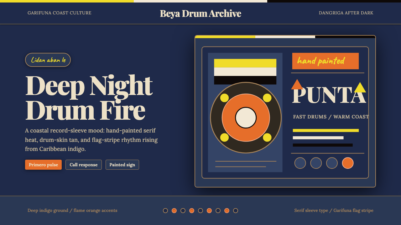 Belizean Garifuna PuntaNight rhythm burns. Indigo fields, flame-orange serif type, and flag stripes…
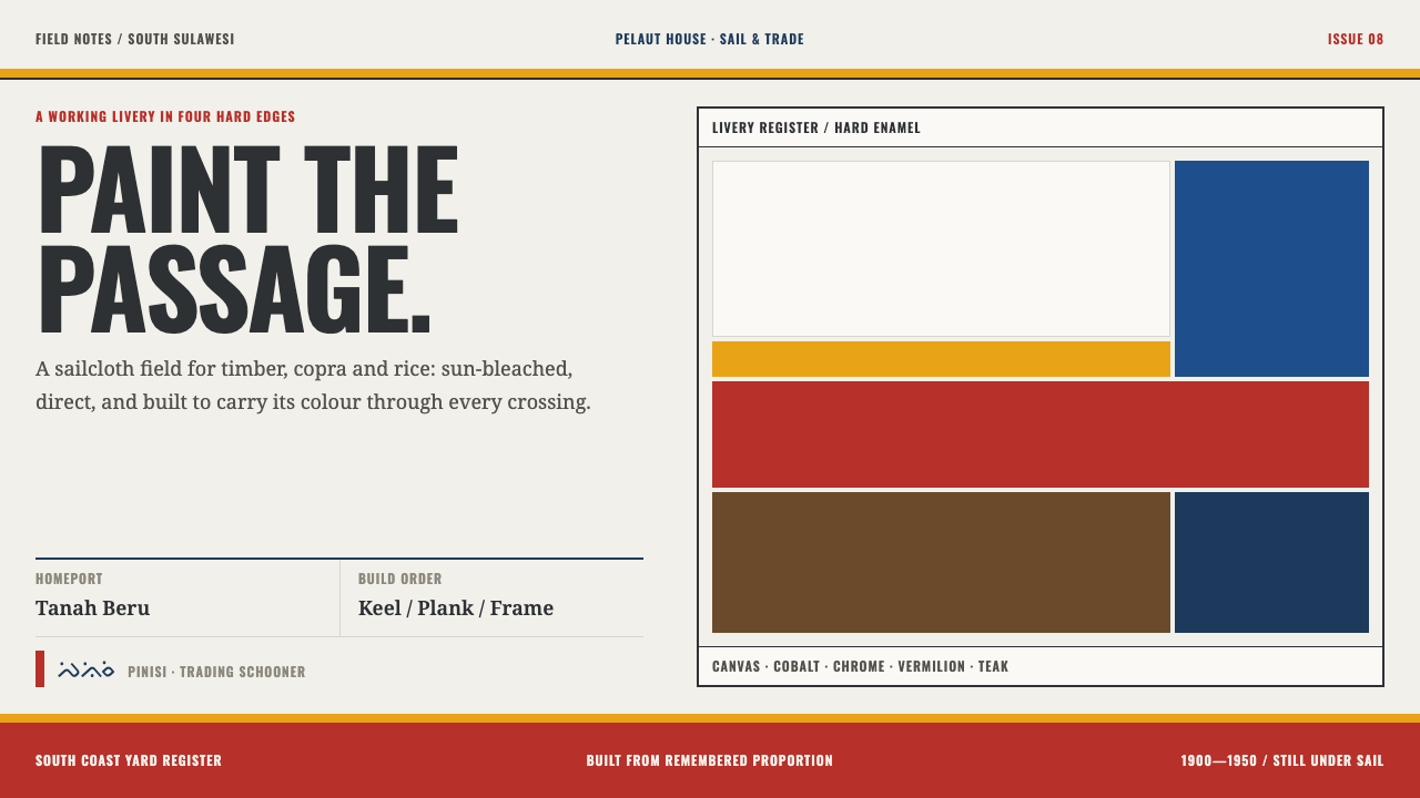 Bugis PinisiSailcloth made resolute. Vermilion, chrome and cobalt bands cut a warm white…
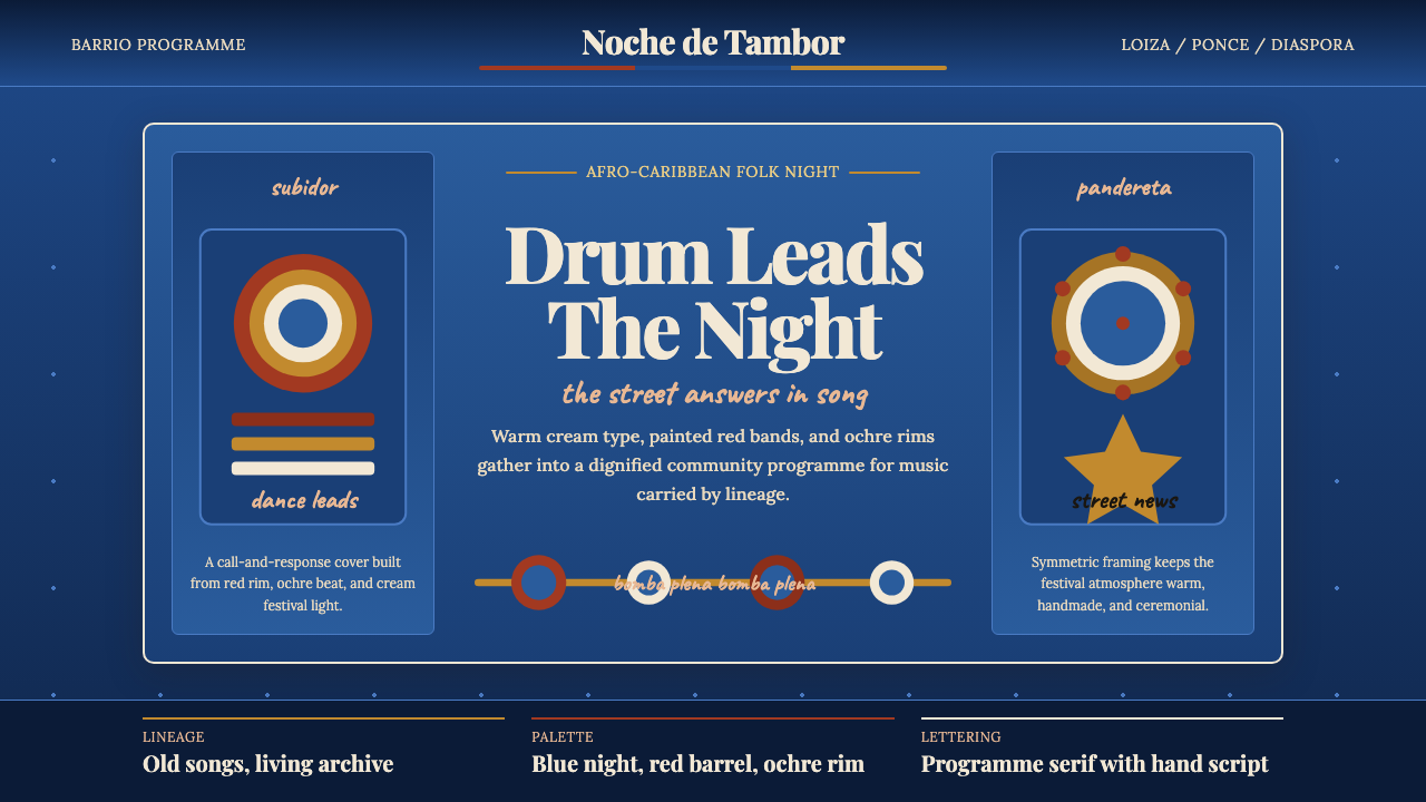 Puerto Rican Bomba & PlenaNight festival dignity. Drum-red stripes and cream Playfair type on deep trop…
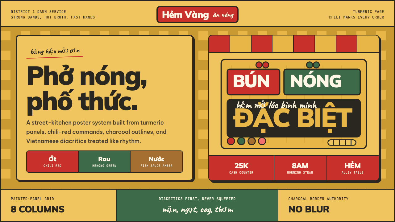 Saigon Street-Food BrandStreet-level warmth. Turmeric panels, chili red, and bold diacritics carry th…
 Uruguayan Candombe LlamadasCandombe after dark. Indigo ground, ochre drum circles, crimson banner type.
 Bolivian Pollera Fiesta MagentaChromatic defiance. Magenta ground, emerald bands and black outlines clash li…