Design style guide设计风格指南
What is Saigon Street-Food Brand?什么是 Saigon Street-Food Brand?
Saigon Street-Food Brand distills the sensory intensity of a District 1 dawn alley — turmeric steam, chili-red stools, and hand-painted Vietnamese diacritics — into a disciplined modern design language that is warm, bold, and unmistakably rooted in place.西贡街头美食品牌将第一郡清晨巷弄的感官强度——姜黄蒸汽、辣椒红矮凳、手绘越南声调符号——提炼为一套有节制的现代设计语言,温暖、大胆,且毫无疑问地扎根于土地。
Saigon Street-Food Brand in briefSaigon Street-Food Brand 速览
Saigon Street-Food Brand is a contemporary Vietnamese design aesthetic that emerged from Ho Chi Minh City's F&B branding renaissance between roughly 2018 and 2024. It translates the raw visual energy of the city's street-level food culture — makeshift banners, hand-lettered signage, the saturated warmth of market stalls lit by morning sun — into a coherent design system suitable for modern restaurants, packaging, and digital interfaces.西贡街头美食品牌是一种当代越南设计美学,兴起于胡志明市大约2018至2024年间的餐饮品牌复兴浪潮。它将城市街头饮食文化的原始视觉能量——临时横幅、手写招牌、清晨阳光照射下市场摊位的饱和暖色——转化为一套适用于现代餐厅、包装与数字界面的连贯设计系统。
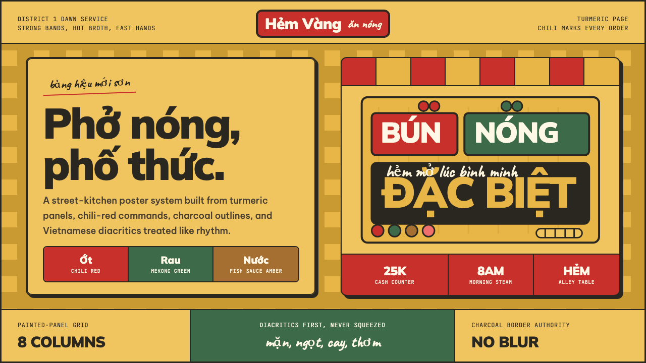
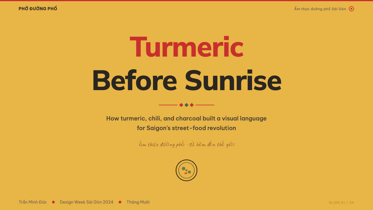
The style is defined by three dominant forces acting in concert. Saturated turmeric yellow serves as the primary ground — the color of pho broth, of tamarind paste, of the particular afternoon light filtering through corrugated awnings. Against that warmth, chili red appears as a signal color: urgent, appetitive, directional. Black-pepper charcoal anchors hierarchy, giving the system its street-authority and legibility. Together these three values replicate the chromatic experience of a Saigon market stall without resorting to nostalgia or pastiche.这种风格由三种主导力量协同界定:饱和的姜黄色充当主色调——那是河粉汤底的颜色,是罗望子酱的颜色,是午后阳光透过瓦楞遮棚过滤后的特殊光线;辣椒红作为信号色出现:急迫、勾人食欲、指示方向;黑胡椒炭色锚定层级,赋予整个系统以街头权威感与可读性。三者共同再现了西贡市场摊位的色彩体验,而不依赖怀旧情绪或风格模仿。
What distinguishes this aesthetic from generic 'tropical' or 'Southeast Asian' design is its specific engagement with Vietnamese typography. The Vietnamese writing system, with its elaborate system of tonal diacritics stacked above and below base vowels, creates a visual rhythm unlike any other Latin-derived script. Saigon Street-Food Brand treats these diacritics not as a technical constraint to be managed but as a primary visual asset — marks whose density and verticality give headlines a musicality and weight that plain Latin text cannot achieve.将这种美学与泛泛的「热带」或「东南亚」设计区别开来的,是它对越南语排版的具体介入。越南文字系统拥有一套叠加在基础元音上下的复杂声调符号,形成了有别于任何其他拉丁衍生文字的视觉节奏。西贡街头美食品牌将这些声调符号不视为需要管理的技术约束,而是当作首要视觉资产——这些符号的密度与纵向延伸赋予标题以朴素拉丁文字无法实现的音乐感与重量。
See the Saigon Street-Food Brand design system →查看 Saigon Street-Food Brand 完整设计系统 →
Where does Saigon Street-Food Brand come from?Saigon Street-Food Brand 从何而来?
The roots of this aesthetic reach back to French colonial Saigon, where the administration built covered markets — the Bến Thành, the Bình Tây — that became permanent fixtures of the city's food culture. French colonial signage mixed Latin letterforms with Vietnamese diacritics in ways that were initially awkward but over generations produced a hybrid visual language: bold, compressed, layered with chromatic contrast. Mid-century Vietnamese propaganda poster design, which emphasized flat color fields and stark typographic hierarchy for mass legibility, further codified the chromatic authority that contemporary practitioners would later draw on.这种美学的根源可追溯至法属殖民地时期的西贡:殖民政府建造了滨城市场、平西市场等有顶大市场,它们成为城市饮食文化的永久标志。法国殖民招牌将拉丁字体与越南声调符号混合,起初显得生硬,但经过几代人的积累,形成了一种混合视觉语言:粗犷、紧缩、以色彩对比层层叠加。二十世纪中叶的越南宣传海报设计强调平涂色块与鲜明的排印层级以追求大众可读性,进一步固化了当代从业者后来借鉴的色彩权威感。
The immediate context for the style's emergence was the rapid expansion of Ho Chi Minh City's middle class and tourism economy from the 2010s onward. As international visitors flooded the city and a generation of Vietnamese consumers with global design awareness came of age, demand surged for F&B brands that could project authenticity without looking unreconstructed. Shophouses in Bình Thạnh and District 3 became home to independent studios seeking a visual language that was distinctly Vietnamese rather than a regional variant of Scandinavian minimalism or generic Asian modernism.这种风格兴起的直接背景是2010年代起胡志明市中产阶级与旅游经济的快速扩张。随着国际游客涌入城市,具有全球设计意识的越南消费者一代成长起来,对能展示真实感而又不显得守旧的餐饮品牌需求激增。平盛郡与第三郡的联排店屋成为独立工作室的聚集地,这些工作室寻求一种distinctly越南的视觉语言,而非斯堪的纳维亚极简主义或泛亚现代主义的地区变体。
The Saigon studio ecosystem was central to codifying the style. Rice Creative, founded by Joshua Breidenbach and Quinta Cohn, brought a rigorous craft sensibility to Vietnamese clients beginning in the mid-2000s, establishing standards for typography, print finish, and material weight that rippled through the broader scene. Bratus, the studio of Đinh Anh Huân, pushed a more maximalist and playfully layered version of Vietnamese graphic language, one that embraced the graphic noise of market signage rather than editing it away. Yosuke Masuko, working across Ho Chi Minh City and Tokyo, contributed a perspective that treated the city's visual density as a resource rather than a problem to solve.西贡设计工作室生态对这种风格的固化至关重要。由Joshua Breidenbach与Quinta Cohn创立的Rice Creative从2000年代中期起为越南客户带来严谨的工艺美学,在排版、印刷工艺与材质厚重感方面树立了标准,影响波及整个行业。Đinh Anh Huân主理的Bratus工作室则推动了越南图形语言更为极繁、更具游戏感的分层版本——它拥抱而非删减市场招牌的图形噪音。在胡志明市与东京两地工作的Yosuke Masuko提供了一个将城市视觉密度视为资源而非待解问题的视角。
By approximately 2020, enough work had accumulated — in restaurant identities, craft-beer labels, hospitality packaging, and boutique hotel graphics — that a legible house style had crystallized. The 2018–2024 window represents not the invention of Vietnamese graphic design but a specific moment when international visibility, local craft infrastructure, and a shared set of aesthetic commitments converged into something replicable and teachable. Digital platforms, particularly Instagram and Behance, accelerated the crystallization by giving studios access to a global audience and giving that audience access to a coherent body of work.大约到2020年,餐厅视觉识别、精酿啤酒标签、酒店包装与精品设计中积累的作品已足够丰富,一种清晰可辨的风格已然结晶。2018至2024年的这段时期并非越南平面设计的发明时刻,而是国际曝光度、本地工艺基础设施与一套共同美学承诺汇聚成可复制、可传授之物的特定历史节点。数字平台——尤其是Instagram与Behance——通过赋予工作室全球受众、赋予受众连贯作品体验,加速了这一结晶过程。
What defines the Saigon Street-Food Brand look?Saigon Street-Food Brand 的视觉特征是什么?
Color: Turmeric, Chili, Charcoal色彩:姜黄、辣椒、炭黑
The palette is anchored by three values that map directly onto the sensory vocabulary of Vietnamese street food. Turmeric yellow — warm, slightly orange-shifted, intensely saturated — dominates as the primary ground and background, evoking the color of broth, spice paste, and market-stall lighting. Chili red appears as the action and accent color: vivid, appetitive, carrying the urgency of a freshly painted restaurant sign. Black-pepper charcoal — a deep, dense dark that is not quite neutral black — grounds type and structural elements. These three are used in high-contrast combinations; they are never dulled to pastels or neutralized to earth tones. The system reads as warm without being soft.这套色板由三个直接映射越南街头饮食感官词汇的色值锚定。姜黄色——温暖、略带橙色偏向、高度饱和——作为主色调主导背景,唤起汤底、香料酱与市场摊位灯光的颜色。辣椒红作为行动与强调色出现:鲜艳、勾人食欲,带有一块刚刷新的餐厅招牌的紧迫感。黑胡椒炭色——一种深沉致密、不全然中性的深色——锚定文字与结构性元素。三者以高对比度组合使用,从不调淡为粉彩或中和为大地色。整个系统读起来温暖而不柔软。
Vietnamese Diacritics as Visual Rhythm越南声调符号作为视觉节奏
Vietnamese orthography uses six tonal diacritics that appear above and below vowel characters, creating vertical complexity that is entirely absent from unaccented Latin text. In Saigon Street-Food Brand, this complexity is embraced as a primary design asset rather than accommodated as a constraint. Headlines set in Vietnamese have a natural density and visual musicality — the stacked marks create a rhythm across the top of a word that Latin headlines cannot replicate. Large-scale display type exploits this density deliberately, treating the mark-rich upper zone of the letterforms as a textural field.越南语正字法使用六个出现在元音字符上下的声调符号,形成在无附标拉丁文中完全缺席的纵向复杂性。在西贡街头美食品牌中,这种复杂性被作为首要设计资产拥抱,而非作为约束加以迁就。以越南语排版的标题具有天然的密度与视觉音乐感——叠加的附标在词语顶部形成拉丁文标题无法复制的节奏。大尺度展示字体有意利用这种密度,将字母上部富含附标的区域当作肌理场。
Hand-Painted Signage Influence手绘招牌影响
The style carries a deliberate reference to the hand-painted market signs that characterize Ho Chi Minh City's commercial streetscape. This influence manifests as a controlled imprecision: letterforms that acknowledge human gesture rather than demanding geometric perfection, layouts where overlapping elements and tight spacing evoke the compressed energy of a stall banner rather than the ordered white space of a European editorial. The imprecision is never sloppiness — it is a specific visual register that communicates immediacy and authenticity, the sense that this brand exists in real physical space rather than in a design system.这种风格带有对胡志明市商业街景中手绘市场招牌的刻意引用。这种影响体现为一种受控的不精确:字母形态承认人手的姿势而非要求几何完美,版面中元素的叠压与紧密间距唤起摊位横幅的紧凑能量,而非欧洲编辑排版的有序留白。这种不精确绝非粗糙——它是一种特定的视觉语域,传递即时感与真实感:这个品牌存在于真实的物理空间中,而非存在于设计系统里。
Material Weight and Tactility材质厚重感与触感
Saigon Street-Food Brand is intimately connected to print and physical materials. The style developed in an environment of restaurant menus, paper bags, tissue wrapping, and ceramic tableware — objects that are handled rather than merely viewed. This origin shapes the aesthetic's relationship to texture: uncoated paper stocks, slight ink spread at the edges of large type, the bleed and imperfection of flexographic printing on kraft — all read as authentic rather than as errors to be corrected. On screen, the style references this physicality through deliberate choices: no smooth gradients, no sterile white backgrounds, slight tonal warmth in what might otherwise be neutral grounds.西贡街头美食品牌与印刷品及实体材料有着亲密联系。这种风格在餐厅菜单、纸袋、纸巾包装与陶瓷餐具的环境中发展——这些对象是被触摸的,而非仅仅被观看的。这一起源塑造了这种美学对质感的态度:无涂层纸张、大字体边缘轻微的墨水扩散、牛皮纸上柔版印刷的渗透与不完美——这些都被读作真实,而非需要纠正的错误。在屏幕上,这种风格通过刻意选择来引用这种物质性:无平滑渐变,无无菌白色背景,在否则会是中性的底面上带有轻微的色调温暖。
Bold Hierarchy Without Formalism大胆层级而不失活性
The typographic and compositional hierarchy in Saigon Street-Food Brand is strong — there is never ambiguity about what is the headline, what is the price, what is the supporting information. But this hierarchy is achieved through energy and contrast rather than through rigid formal systems. Section breaks are marked by dense rules, decorative devices borrowed from Vietnamese printing traditions, or chromatic shifts rather than by the mathematical grid logic of Swiss design. The composition breathes through dynamic tension rather than through generous margin. The result feels organized but not sterile — legible but alive.西贡街头美食品牌的排印与构图层级是清晰的——关于什么是标题、什么是价格、什么是辅助信息,从不存在歧义。但这种层级是通过能量与对比实现的,而非通过严格的形式系统。段落分隔以密集横线、借自越南印刷传统的装饰元素或色调转换来标记,而非依靠瑞士设计的数学网格逻辑。构图通过动态张力而非宽裕页边距来呼吸。结果让人感觉有序但不无菌——清晰可读但充满生命力。
Cultural Specificity as Brand Equity文化特殊性作为品牌资产
A defining characteristic of the style — and the value proposition of the studios that developed it — is the conviction that cultural specificity is an asset rather than a limitation. Where global F&B design often moves toward universalism (clean sans-serifs, neutral palettes, geometry that could read as anything from Seoul to São Paulo), Saigon Street-Food Brand moves in the opposite direction, deepening its Vietnamese-ness: referencing specific regional color traditions, engaging with the particularities of the Vietnamese script, and drawing on imagery and material references that cannot be extracted from their geographic origin without losing their meaning.这种风格的一个决定性特征——也是发展它的工作室的价值主张——是坚信文化特殊性是资产而非局限。当全球餐饮设计往往走向普世主义(干净的无衬线字体、中性色板、从首尔到圣保罗都能通用的几何语言),西贡街头美食品牌反其道而行,深化其越南性:引用特定的地区色彩传统,介入越南文字的特殊性,借鉴脱离其地理起源便失去意义的图像与材料参照。
Layering and Density叠层与密度
Rather than the generous white space and single-focal-point composition favored by much contemporary premium design, Saigon Street-Food Brand embraces a layered density that mirrors the visual environment it references. Multiple information elements coexist on the page — a background texture, a bold typographic field, a price callout, a decorative rule — without canceling each other out. The discipline lies not in reduction but in calibration: each layer is assigned a clear chromatic or tonal register that prevents the composition from collapsing into visual noise. The density reads as abundance rather than clutter.西贡街头美食品牌不追求当代高端设计惯用的宽裕留白与单焦点构图,而是拥抱一种镜像其所引用视觉环境的叠层密度。多个信息元素在页面上共存——背景肌理、粗重排印场、价格标注、装饰横线——而不相互抵消。其纪律不在于削减而在于校准:每一层被赋予清晰的色彩或色调语域,防止构图崩溃为视觉噪音。这种密度读起来是丰盛,而非杂乱。
See the Saigon Street-Food Brand design system →查看 Saigon Street-Food Brand 完整设计系统 →
Who shaped Saigon Street-Food Brand?谁塑造了 Saigon Street-Food Brand?
Rice Creative, founded in Ho Chi Minh City by Joshua Breidenbach and Quinta Cohn, became one of the most internationally recognized Vietnamese design studios of its generation. Their work — for clients spanning craft spirits, hospitality, and cultural institutions — established a standard for typographic rigor and material craft in Vietnamese F&B branding that the broader studio ecosystem oriented itself against. Rice's characteristic approach combined European modernist discipline with Vietnamese cultural references, producing work legible both to international design audiences and to local consumers for whom the references carried genuine weight.由Joshua Breidenbach与Quinta Cohn在胡志明市创立的Rice Creative成为同代最具国际认知度的越南设计工作室之一。他们为精酿烈酒、酒店业与文化机构客户完成的作品,在越南餐饮品牌设计中建立了排印严谨性与工艺材质的标准,整个工作室生态都以此为参照。Rice的典型方法将欧洲现代主义纪律与越南文化参照相结合,产出的作品对国际设计受众与本地消费者同样清晰可读——后者对其中的文化指涉有着真实的共鸣。
Đinh Anh Huân founded Bratus as a creative studio that occupied a different pole from Rice Creative's restrained modernism. Bratus work is characteristically maximalist, layered, and energetically referential to the graphic noise of Vietnamese street culture — hand lettering, overlapping information, dense color, the compressed visual field of a market stall. Where Rice tends toward refinement, Bratus tends toward exuberance. Together the two studios defined a productive range within the Vietnamese contemporary graphic design scene, demonstrating that the aesthetic could sustain both registers.Đinh Anh Huân创立的Bratus工作室在风格上与Rice Creative的克制现代主义占据不同极点。Bratus的作品具有典型的极繁主义特征,层次丰富,精力充沛地引用越南街头文化的图形噪音——手写字体、信息叠压、浓烈色彩、市场摊位的紧凑视觉场。Rice趋向精炼,Bratus趋向奔放。两个工作室共同界定了越南当代平面设计中一个富有成效的范围,证明这种美学能够支撑两种语域。
Yosuke Masuko worked across Ho Chi Minh City and Tokyo, bringing a cross-cultural perspective that treated the visual density of Vietnamese cities as a resource to be organized rather than noise to be suppressed. His contribution to the emerging style was partly methodological: he developed visual systems that could hold the density, layering, and chromatic intensity of Vietnamese street culture within structured design frameworks capable of scaling to digital interfaces and international brand contexts. His Tokyo background gave him fluency in Asian design systems that neither Europeanize their source material nor reduce it to folkloric surface.Yosuke Masuko在胡志明市与东京两地工作,带来了跨文化视角——将越南城市的视觉密度视为需要组织的资源,而非需要压制的噪音。他对这种新兴风格的贡献部分是方法论上的:他发展出的视觉系统能够在结构化设计框架内承载越南街头文化的密度、叠层与色彩强度,同时可扩展至数字界面与国际品牌语境。他的东京背景赋予他对亚洲设计系统的语感——这些系统既不欧洲化其素材,也不将其简化为民俗表面。
Beyond individual studios, the emergence of Saigon Street-Food Brand as a legible style was a collective achievement of a dense urban design ecosystem. The proliferation of independent restaurants, craft-beer bars, boutique hotels, and coffee-third-place culture in Ho Chi Minh City during the 2010s created unprecedented local demand for original brand identities rather than generic signage. This demand funded a generation of Vietnamese designers trained partly abroad and partly through the city's own expanding design education infrastructure, whose work appeared simultaneously on Instagram, on Behance, and on the walls of District 1 shophouses.超越个别工作室,西贡街头美食品牌作为一种清晰可辨风格的涌现,是一个密集城市设计生态系统的集体成就。2010年代胡志明市独立餐厅、精酿啤酒吧、精品酒店与第三空间咖啡馆的爆发式增长,为原创品牌视觉识别而非通用招牌创造了前所未有的本地需求。这一需求资助了一代越南设计师——部分在海外接受培训,部分通过城市自身不断扩展的设计教育基础设施成长——他们的作品同时出现在Instagram上、Behance上,以及第一郡联排店屋的墙面上。
The anonymous tradition of Vietnamese colonial-era print culture — the market signmakers, the handbill printers, the shop-front calligraphers of French Indochina — functions as a collective historical figure behind the contemporary style. These practitioners developed the hybrid Latin-Vietnamese typographic register over generations, finding solutions to the problem of rendering a tonal diacritic-rich script in condensed commercial contexts. The bold, compressed, high-contrast visual language they produced was not designed as style but as practical adaptation. Contemporary practitioners consciously reference and recontextualize this inheritance rather than treating it as historical raw material to be upgraded.越南殖民时期印刷文化的无名传统——法属印度支那时期的市场招牌绘制者、传单印刷者、店面书法家——作为当代风格背后的集体历史人物发挥作用。这些从业者历经数代发展出混合拉丁-越南排印语域,为在紧凑商业语境中呈现富含声调符号的文字找到了解决方案。他们创造的粗犷、紧缩、高对比度视觉语言不是作为风格设计的,而是实用性适应的产物。当代从业者有意识地引用并重新语境化这一遗产,而非将其视为待升级的历史原材料。
How do you use Saigon Street-Food Brand today?今天怎么用 Saigon Street-Food Brand?
Saigon Street-Food Brand is one of the most directionally clear design systems for food, hospitality, and culture-forward consumer brands because its aesthetic values are not merely decorative but structurally motivated. Applying it correctly requires understanding the system's internal logic: the palette communicates warmth and intensity, the typography treats diacritics as a rhythmic asset, and the layered density signals abundance and authenticity rather than complexity for its own sake.西贡街头美食品牌是饮食、酒店与文化导向消费品牌最具方向感的设计系统之一,因为它的美学价值不仅仅是装饰性的,而是有结构动机的。正确应用它需要理解系统的内在逻辑:色板传递温暖与强度,排版将声调符号视为节奏资产,叠层密度信号的是丰盛与真实,而非为复杂而复杂。
For presentation slides, the style works best when the cover commits fully to the palette: a deep turmeric ground with a bold Vietnamese or bilingual headline, the diacritics given space to read at scale. Content slides benefit from treating each slide as a restaurant menu section — strong typographic hierarchy with one organizing element per slide (a price, a percentage, a claim), and a chili-red accent reserved for the most important number or call to action. Data slides can take on the diagrammatic energy of market signage: bars and segments in turmeric and charcoal, red reserved for the outlier or the target. Resist the temptation to add photographic texture — the palette is already doing the sensory work.在演示文稿中,这种风格在封面完全沉浸于色板时效果最佳:深姜黄底面配以粗重的越南语或双语标题,声调符号获得在大尺度下可读的空间。内容页受益于将每张幻灯片当作餐厅菜单版块对待——每张幻灯片一个强排印层级与一个组织元素(价格、百分比、主张),辣椒红保留给最重要的数字或行动号召。数据页可以承接市场招牌的示意图能量:姜黄与炭色的柱条与扇区,红色保留给异常值或目标值。克制叠加摄影肌理的冲动——色板已在完成感官工作。
For web interfaces, Saigon Street-Food Brand translates well to restaurant booking flows, delivery platforms, and food-media editorial contexts. Dashboards benefit from the strong color-hierarchy: turmeric as the primary brand field in headers and key metric tiles, charcoal for body and navigation, red for alerts and action buttons. Pricing pages carry the style's poster-energy well, with full-width tier cards alternating between turmeric-on-charcoal and charcoal-on-cream, red reserved for the recommended tier. The style is less suited to contexts requiring neutrality — analytics platforms, enterprise software, or any interface where the warm saturated palette would create cognitive friction in extended use.对于网页界面,西贡街头美食品牌在餐厅预订流程、外卖平台与饮食媒体编辑语境中转化良好。仪表板受益于强色彩层级:姜黄作为页眉与关键指标卡片的主品牌场,炭色用于正文与导航,红色用于警示与行动按钮。定价页承载着这种风格的海报能量,全宽等级卡片在姜黄底炭色字与炭色底奶油字之间交替,红色保留给推荐等级。这种风格不太适合需要中性的语境——分析平台、企业软件,或任何温暖饱和色板在长时间使用中会产生认知摩擦的界面。
For editorial and marketing work, the style has natural affinity with food journalism, travel content, cultural coverage, and brand identity projects for restaurants and markets. Editorial layouts benefit from using the diacritic-rich headline as a primary visual element, leading the page with scale and texture before the body copy begins. Marketing pages for restaurants can use the compressed layering of the style to pack value into a small space: hours, signature dishes, a location call-out, and a reservation prompt can coexist on a single block if organized by the system's clear chromatic hierarchy.对于编辑与营销内容,这种风格与饮食报道、旅行内容、文化报道,以及餐厅与市场的品牌视觉识别项目有天然亲和力。编辑版面受益于将富含声调符号的标题作为主要视觉元素,以尺度与肌理领起页面,然后正文开始。餐厅营销页面可以利用这种风格的紧凑叠层在小空间里塞入大量价值:营业时间、招牌菜品、位置呼出与预约入口可以在一个区块内共存,只要由系统清晰的色彩层级来组织。
A common mistake is applying the palette without understanding its temperature logic. Turmeric and chili red are both warm, and when used at high saturation in equal proportion they flatten into undifferentiated heat — the system loses its hierarchy. The correct approach is to treat turmeric as the ambient temperature (the background condition) and chili as the spike (the exception that reads against the field). Similarly, reproducing the visual density of the style without the underlying organizational logic produces clutter rather than abundance. Layering works when each layer has a clear register — background, mid-field, foreground — and occupies it consistently.一个常见错误是应用色板时不理解其温度逻辑。姜黄与辣椒红都是暖色,当两者以高饱和度等比例使用时,会扁平化为无差别的热度——系统失去层级。正确方法是将姜黄当作环境温度(背景条件),将辣椒红当作峰值(对抗场域而显现的例外)。同样,在没有底层组织逻辑的情况下复制这种风格的视觉密度,产生的是杂乱而非丰盛。叠层在每一层有清晰语域时有效——背景层、中间层、前景层——并且始终如一地占据各自位置。
See the Saigon Street-Food Brand design system →查看 Saigon Street-Food Brand 完整设计系统 →
Saigon Street-Food Brand — FAQSaigon Street-Food Brand · 常见问题
Is Saigon Street-Food Brand appropriate for non-food brands?西贡街头美食品牌适合非餐饮品牌使用吗?
The style can extend beyond food contexts, but it requires careful judgment. The chromatic warmth and material density of the aesthetic work well for any brand where sensory abundance and cultural rootedness are desired values — travel, music, cultural events, artisan goods, lifestyle retail. It is less suited to categories where the palette's appetitive warmth would create tonal friction: financial services, healthcare, professional services, or enterprise software. The key question is whether the warmth and density serve the brand's communication goals or work against them. A craft-beer brand benefits from the same visual register as a pho restaurant; a legal firm or a data platform typically does not.这种风格可以延伸到饮食语境之外,但需要审慎判断。这种美学的色调温暖与材质密度在任何以感官丰盛与文化根植性为期望价值的品牌中都表现良好——旅行、音乐、文化活动、手工艺品、生活方式零售。它不太适合色板的食欲暖感会造成调性摩擦的品类:金融服务、医疗、专业服务或企业软件。关键问题是温暖感与密度是否服务于品牌的传播目标,还是与之相悖。精酿啤酒品牌受益于与河粉餐厅相同的视觉语域;律所或数据平台通常不是这样。
How do I use this style if my text is in English or another non-diacritic-heavy language?如果我的文字是英语或其他声调符号较少的语言,如何使用这种风格?
The diacritic-rhythm quality is the most culturally specific element of the style, and it cannot be fully replicated in English. However, the other characteristics — the chromatic warmth, the layered density, the material texture, the bold hierarchy — transfer cleanly to any language. English-language work in this style should compensate for the loss of diacritic texture by leaning into scale contrast and weight: larger, bolder headlines set more tightly than convention would suggest, complemented by the strong chromatic field. The decorative elements drawn from Vietnamese printing traditions — dense rules, layered frames, typographic ornaments — provide visual rhythm independent of the script.声调符号节奏是这种风格文化特殊性最强的元素,无法在英语中完全复制。然而,其他特征——色调温暖感、叠层密度、材质肌理、大胆层级——可以清晰地转移到任何语言。以这种风格呈现英语内容时,应通过强化尺度对比与字重来补偿声调符号肌理的缺失:标题比惯例更大、更粗、排列更紧密,配合强烈的色彩场。源自越南印刷传统的装饰元素——密集横线、叠层框架、排印装饰——提供独立于文字的视觉节奏。
Does the style work on light backgrounds as well as dark?这种风格在浅色背景上和深色背景上都有效吗?
The canonical Saigon Street-Food Brand is warm-ground: turmeric or cream as the primary background, with charcoal and chili as foreground. An inversion to a dark ground — charcoal as background, turmeric or cream as type — is possible and works well for evening contexts, premium packaging, or occasions where the brand wants to project authority rather than warmth. On a dark ground, turmeric functions almost as a light source: warm, glowing, high-contrast against the charcoal. Chili red on dark grounds should be used sparingly — it can read as aggressive at high saturation against dark. The key is that the inverted version should feel like a deliberate nighttime interpretation of the same palette, not a different visual system altogether.标准的西贡街头美食品牌以暖色为底:姜黄或奶油色作为主背景,炭色与辣椒红作为前景。深色底面的反转版本——炭色为背景,姜黄或奶油色为文字——是可能的,在夜晚语境、高端包装或品牌希望投射权威感而非温暖感的场合效果良好。在深色底面上,姜黄几乎发挥光源的功能:温暖、发光、与炭色形成高对比。辣椒红在深色底面上应节制使用——高饱和度搭配深色可能显得攻击性。关键是反转版本应感觉像同一色板的深夜诠释,而非一套完全不同的视觉系统。
How does Saigon Street-Food Brand relate to other Southeast Asian design styles?西贡街头美食品牌与其他东南亚设计风格有何关系?
Southeast Asian design is enormously varied, and Saigon Street-Food Brand is a specifically Vietnamese aesthetic rather than a regional generalisation. It shares with Thai, Indonesian, and Malaysian contemporary F&B design a preference for warm saturated palettes and cultural specificity, but it differs in the role of script: the Vietnamese Latin alphabet with diacritics creates fundamentally different typographic possibilities than Thai, Burmese, or Javanese scripts, which have their own visual rhythms. Designers working across Southeast Asia often note that the Vietnamese style is uniquely accessible to non-Vietnamese designers precisely because it uses a Latin-derived alphabet — the typographic mechanics are familiar even as the cultural referents are specific.东南亚设计多样性极强,西贡街头美食品牌是一种特定的越南美学,而非地区泛化。它与泰国、印度尼西亚和马来西亚当代餐饮设计共享对温暖饱和色板与文化特殊性的偏好,但在文字的角色上有所不同:带有声调符号的越南拉丁字母与泰文、缅文或爪哇文字创造的排版可能性根本不同,这些文字有各自的视觉节奏。在东南亚跨地区工作的设计师经常指出,越南风格之所以对非越南设计师有独特的可及性,恰恰是因为它使用拉丁衍生字母——排版机制是熟悉的,即使文化指涉是特定的。
Is this style suitable for digital-first brands, or is it primarily a print and physical-packaging aesthetic?这种风格适合数字优先品牌吗,还是主要是一种印刷与实体包装美学?
The style originated in print and physical materials, and its relationship to tactility — uncoated stocks, ink spread, material warmth — is genuine. However, it has transferred successfully to digital contexts, particularly in restaurant apps, food-delivery platforms, and food-media editorial sites, where the warm palette and visual density create a strong sensory impression on screen. The main adaptation required for digital use is restraint in the use of literal texture: the physicality that in print comes from uncoated paper must on screen be suggested through chromatic warmth and tonal variation rather than through photographic texture overlays. The style also rewards responsive design that scales the hierarchy rather than shrinking it — at mobile sizes, the bold typographic elements remain legible and the chromatic fields remain impactful.这种风格起源于印刷品与实体材料,它与触感的关系——无涂层纸张、墨水扩散、材质温度——是真实的。然而,它已成功迁移到数字语境中,特别是在餐厅应用、外卖平台与饮食媒体编辑网站中,温暖色板与视觉密度在屏幕上创造出强烈的感官印象。数字使用所需的主要适配是在字面肌理使用上保持克制:在印刷中来自无涂层纸张的物质性,在屏幕上必须通过色调温暖感与明暗变化来暗示,而非通过摄影肌理叠加层。这种风格也奖励缩放层级而非缩小它的响应式设计——在移动端尺寸下,粗重排印元素保持可读性,色彩场保持冲击力。
Related design styles相关设计风格
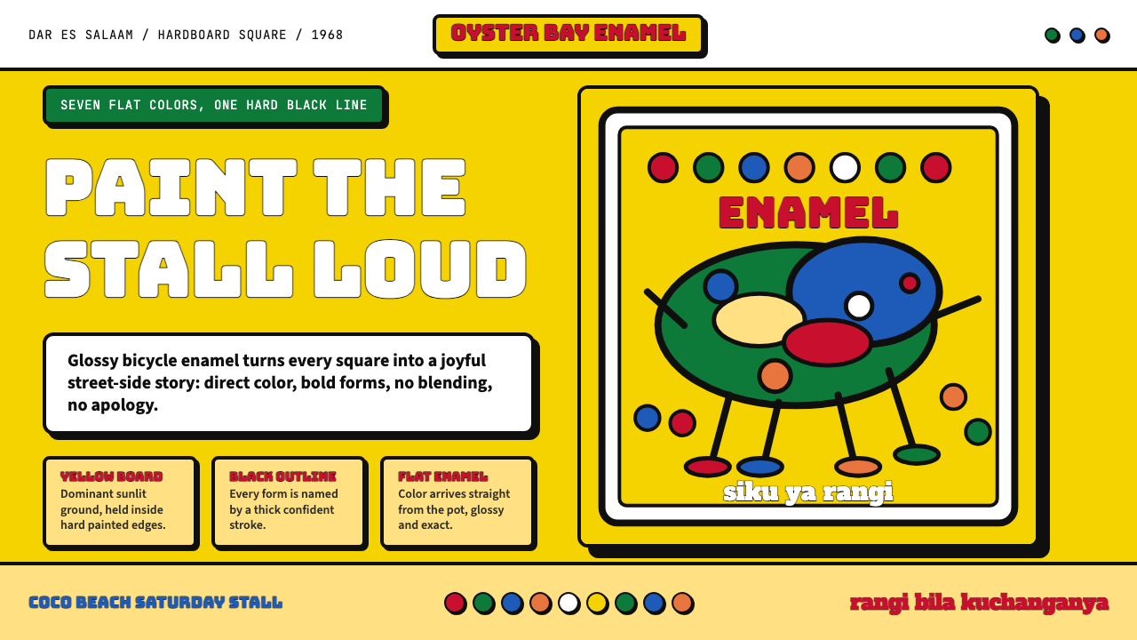 Tingatinga PaintingJoy refuses blending. Enamel yellow, Bungee strokes, and black-outlined flat…快乐拒绝调色:搪瓷黄、Bungee粗字与黑描边平涂。
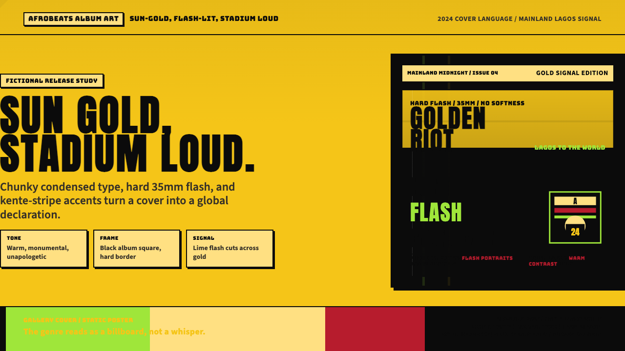 Afrobeats Album Art 2024Sun-gold and stadium loud. Anton type, kente stripes, and hard flash drive th…太阳金和体育场级大字。肯特条纹与硬闪光撑起封面。
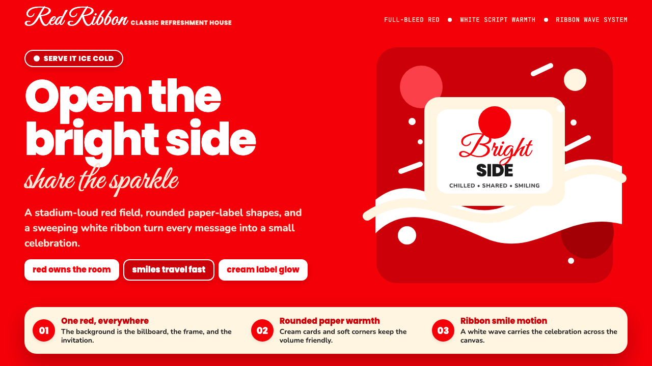 Coca-Cola ClassicHappiness goes full-bleed. Signature red, white ribbon waves, and warm rounde…快乐铺满全屏:标志性红、白色缎带波浪与圆润字体。
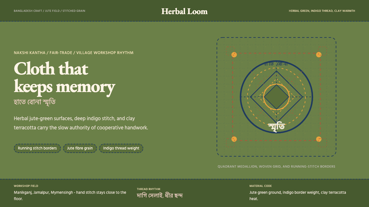 Bangladeshi Jute CraftMemory stays stitched. Jute green, indigo borders, terracotta warmth.记忆被缝进画面。黄麻绿、靛蓝虚线、陶土暖调。
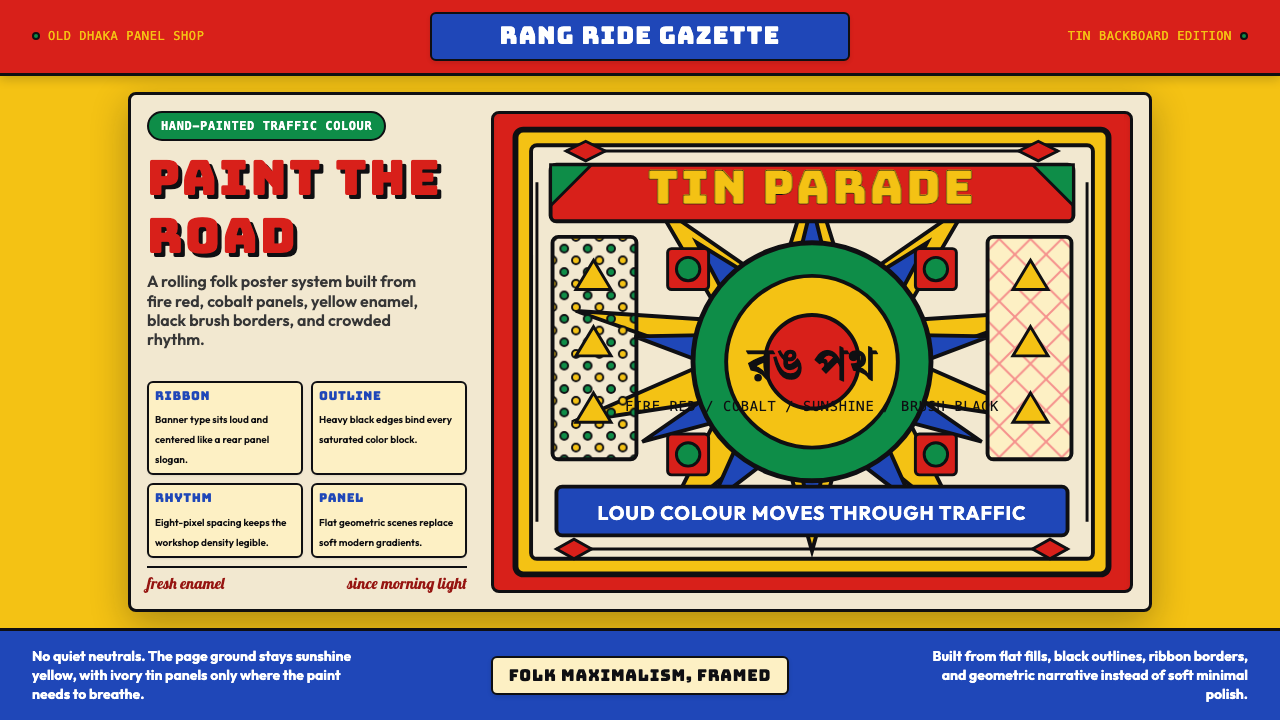 Bangladeshi Rickshaw Painting (Dhaka)Traffic shouts in color. Fire red, cobalt blue, and yellow panels lock into b…交通用色彩呐喊:火红、钴蓝与日光黄被黑边框锁住。
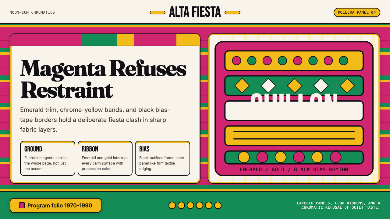 Bolivian Pollera Fiesta MagentaChromatic defiance. Magenta ground, emerald bands and black outlines clash li…色彩拒绝克制:品红底、翡翠带、黑滚边制造节庆撞色。