What is Tingatinga Painting?
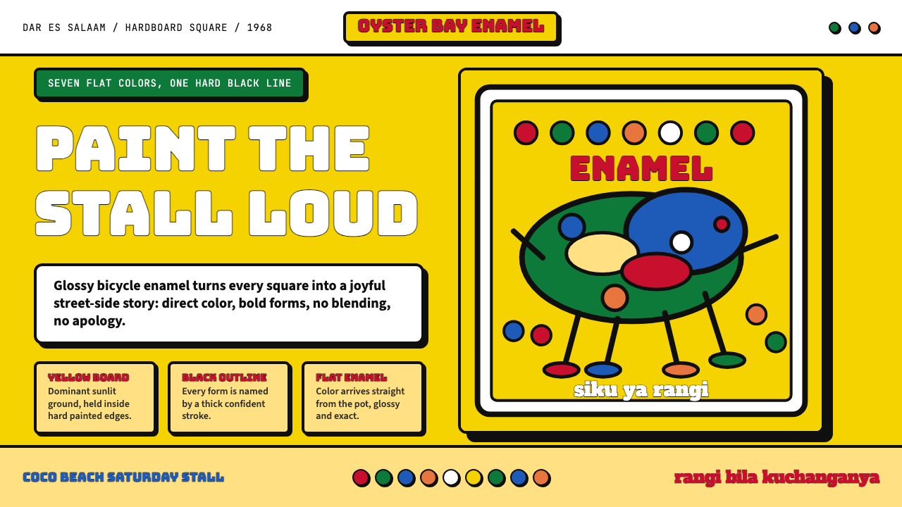
Born from bicycle enamel and bold outlines on a Dar es Salaam street corner, Tingatinga Painting is East Africa's most joyful visual declaration — flat, vivid, and completely unashamed.
Tingatinga Painting in brief
Tingatinga Painting is a Tanzanian folk-pop art tradition defined by a set of choices that look simple but are in fact deeply disciplined: thick black outlines enclosing fields of flat, undiluted color, applied in bicycle enamel onto hardboard squares, depicting animals, village life, and spirit figures against richly patterned grounds. No gradients. No blended tones. No academic perspective. Every form reads at once — even across a busy market stall.
The style sits at the intersection of several forces: the decorative traditions of the East African coast, the commercial pragmatism of painting for a tourist and export market, and the particular physical properties of bicycle enamel as a medium. Enamel dries quickly, resists moisture, and produces a glassy surface that amplifies color saturation to something close to stained glass. These material constraints became aesthetic virtues. The flatness was not a limitation; it was the point.
What separates Tingatinga from generic naïve or folk styles is its internal rigor. The black outline is not decorative filler — it is a load-bearing structural element that holds each color field in place and creates visual tension between adjacent hues that would otherwise bleed into chaos. Within those boundaries, color is applied with tremendous confidence and economy: seven canonical hues, deployed without mixing, creating compositions that read as both energetic and composed.
Where does Tingatinga Painting come from?
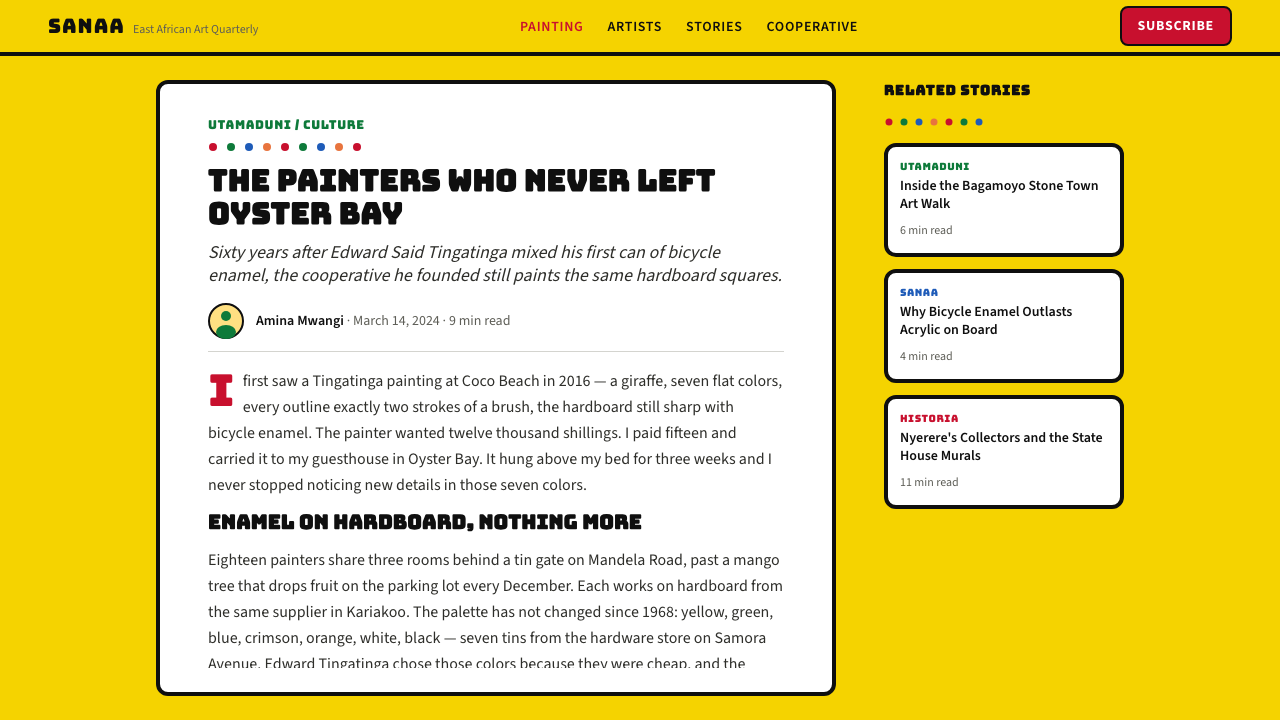
The style takes its name from its founder, Edward Said Tingatinga, born around 1932 in the Mindu region of southern Tanzania near the Mozambique border. He moved to Dar es Salaam as a young man, working various odd jobs before turning to painting around 1968. The setting was the Oyster Bay neighborhood, then a predominantly expatriate enclave on the city's northern coast, where there was a ready market among diplomats, aid workers, and tourists looking for authentic East African art to take home.
Tingatinga's material innovation was decisive. Where other painters of the period worked in oils or watercolors on canvas or paper — materials that implied European training and European markets — he reached for what was cheapest and most available: bicycle enamel in its standard commercial colors, applied onto the hardboard squares used for ceiling tiles. The format was deliberately portable, the materials were vernacular, and the result was something that had never quite existed before: a painting that looked like nothing so much as itself.
His subject matter drew on the visual world of the Zaramo people of the Dar es Salaam region, on the coastal Swahili decorative tradition, and on the animal iconography that dominated the tourist imagination of East Africa. Lions, elephants, peacocks, and zebras appeared outlined in black against grounds that were as much about pattern as about representation. Figures were flattened and stylized in ways that echoed both traditional body-painting motifs and the bold commercial signage that covered Dar es Salaam's shop fronts and vehicle bodies.
The Tingatinga Cooperative, formed in the early 1970s shortly after Edward Said Tingatinga's death in 1972, transformed the style from the work of one man into a living collective practice. His cousins — among them Salum Mussa and Hashim Mruta — became the core of the cooperative and trained successive generations of painters in the technique. The cooperative formalized what had been intuitive: the canonical palette, the black outline rule, the hardboard square as standard format. Today, hundreds of painters working in and around Dar es Salaam and beyond continue the tradition, each inflecting it with personal subject matter while adhering to the structural conventions that make the style immediately recognizable.
What defines the Tingatinga Painting look?
The Black Outline
The defining structural device of Tingatinga is a confident, thick black border that traces every form — animal, leaf, body part, decorative motif — and separates it from its neighbors. This outline is not a sketch; it is a completed element in its own right, often as visually dominant as the color it contains. The line does double duty: it stabilizes compositions that would otherwise vibrate into incoherence and creates a visual rhythm across the surface that reads almost like cloisonné metalwork. The thickness of the line is non-negotiable — thinner outlines immediately lose the style's characteristic weight and authority.
Flat Unblended Color
Within the black outlines, each enclosed region is filled with a single, undiluted hue applied directly and evenly. There is no shading, no blending, no attempt to model form through tonal variation. A zebra's body is white — not cream, not off-white, but the white of the enamel as it comes from the can. A tropical bird's chest is yellow — pure, commercial, unapologetic yellow. This commitment to flatness means that depth and spatial relationships are communicated entirely through arrangement, overlap, and the contrast between adjacent hues, never through tonal gradation.
The Seven-Color Canonical Palette
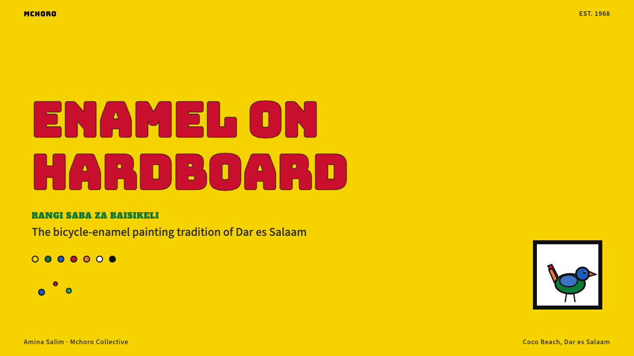
The traditional Tingatinga palette numbers seven: a warm black for outlines, white, a vivid yellow, a saturated red, a bright blue, a strong green, and a rich brown or earthy orange. These are not mixed but juxtaposed, and the effect is cumulative — each hue reads more intensely because of its neighbors. The palette is explicitly keyed to the commercial colors available in bicycle enamel, which means it is both historically grounded and materially specific. Expanding the palette risks diluting the style's compressed energy; reducing it produces a recognizable subset that still reads as Tingatinga.
Patterned Grounds
Unlike folk traditions that place figures against plain or neutral backgrounds, Tingatinga fills every available surface. The ground behind an elephant may be an all-over tiling of small flowers, geometric diamonds, wavy lines, or abstracted leaf forms — all in the same flat enamel technique. This horror vacui quality means that the picture plane is uniformly active, with no area of visual rest. Foreground figures emerge not through contrast of figure against void but through the stronger weight of their black outlines and the local intensity of their color against the finer pattern of the ground.
Animism and the Animal Kingdom
Animals are the dominant subject matter — lions, snakes, peacocks, fish, elephants, and hybrid creatures that merge naturalistic observation with spirit-world symbolism. The animals are not depicted as scientific specimens; they are presented as presences, often frontally posed and given a directness of gaze that feels intentional rather than incidental. This reflects both the Zaramo and wider coastal Tanzanian tradition of attributing spiritual agency to the natural world and the practical reality that animal subjects were most attractive to the tourist market. The result is images that read simultaneously as decorative, narrative, and iconic.
Symmetric and Centralized Composition
In contrast to Bauhaus asymmetry or Western editorial design's dynamic tension, Tingatinga compositions are typically centered and often near-symmetrical. The principal figure is placed at the heart of the square format, with the ground pattern radiating outward around it. When multiple animals appear, they are frequently arranged in concentric rings or mirrored pairs around a central element. This centrality gives compositions a still, ceremonial quality — the figures are not moving through space but presiding over it.
The Hardboard Square as Sacred Format
The standard Tingatinga support — a square of hardboard — is not incidental. The square format enforces a visual equality between horizontal and vertical readings and supports the centered, symmetric compositional logic the style favors. It also has practical implications: hardboard is rigid enough to support enamel without warping, inexpensive enough to make the work commercially viable, and light enough to be transported easily. The format has remained standard across the cooperative's history, making it a marker of authenticity as much as a production convenience.

Who shaped Tingatinga Painting?
The founder of the style, Tingatinga painted prolifically from around 1968 until his accidental death in 1972, when he was shot by police who mistook him for a criminal during an operation in Dar es Salaam. In four years, he established a complete and coherent visual language — palette, technique, subject matter, format — that proved robust enough to survive his absence and grow into a collective tradition. He never gave formal instruction; the transfer of knowledge happened through close observation and apprenticeship within his family circle. His work is held in collections across Europe and East Africa, and prices for works attributed directly to him have risen steadily as the style's art-historical recognition has grown.
One of the original members of the Tingatinga Cooperative formed after Edward Said Tingatinga's death, Salum Mussa was among the cousins who preserved and formalized the technique. His role in the cooperative was both practical and pedagogical — he painted prolifically while training younger artists in the characteristic outline-and-fill method. His work is credited with helping to fix the canonical palette and compositional conventions that gave the style its durability and recognizability across generations of practitioners.
Another founding cooperative member, Hashim Mruta is known for developing some of the more intricate patterned-ground compositions that became a hallmark of mature Tingatinga work. Where earlier paintings sometimes used simpler backgrounds, Mruta's pieces layered multiple geometric and organic motifs into grounds that compete in visual richness with the foreground figures. This development — the ground as equally active as the figure — became central to how the style is recognized internationally and helped distinguish Tingatinga from other African folk-art traditions working in a similar naive register.
A researcher and gallerist who has worked extensively to document and promote Tingatinga Painting in international art contexts, Sarah Hermez represents the scholarly and market infrastructure that has been essential to the style's recognition beyond East Africa. Her work has helped to frame Tingatinga not as tourist craft but as a coherent artistic tradition worthy of serious critical attention, contributing to its inclusion in international exhibitions and art-historical discussions of post-independence African visual culture.
How do you use Tingatinga Painting today?
Applying Tingatinga Painting in contemporary design contexts is a question of understanding which of its principles are portable and which are tied to its specific material origins. The underlying logic — bold outline, flat color, pattern-as-ground, centered composition — transfers well. The specific material associations — enamel, hardboard, tourist trade — do not need to travel with it. What you are borrowing is a visual attitude: confidence, flatness, and an embrace of color at full intensity without apology.
For presentation slides, the style works best when treated as a controlled burst of energy rather than a whole-slide wallpaper. A cover slide benefits from a single Tingatinga-derived illustration element — a stylized animal or botanical form with thick outline and flat color fills — set against a ground that uses the pattern logic sparingly. Content slides should dial back the pattern density sharply: use the black outline as a dividing structural device between content blocks, keep backgrounds plain or lightly patterned, and use one or two accent colors from the canonical palette for section headers and key data points. Data visualizations can adopt the flat-color and thick-outline approach to make charts feel hand-crafted and culturally grounded rather than generic.
For web and digital interfaces, Tingatinga's energy suits marketing pages, landing pages, and cultural or community-oriented products far better than it suits enterprise dashboards or analytical tools. On a landing page, a wide hero section using a Tingatinga-inspired illustrated scene — centered, richly patterned, with forms delineated by strong black lines — immediately establishes a visual identity that is warm, bold, and culturally specific. Navigation and body copy should be kept typographically clean and neutral to let the illustrative elements breathe. Avoid carrying the dense pattern logic into UI components like buttons, inputs, or data tables — the contrast between flat, clean UI elements and richly patterned illustrative zones is part of what makes the application feel considered rather than overwhelming.
For editorial and marketing work — posters, packaging, social media graphics — the style is highly effective for campaigns that want to signal joy, vitality, community, or cultural celebration. Centered compositions work naturally for square social formats. The palette's intensity means that even a simple composition of two or three forms against a patterned ground will read strongly at thumbnail scale. For packaging, the black outline technique renders well across printing methods, including those with limited color registration precision, because the outline itself functions as a visual containment system that holds loose color registration in check.
A common mistake is treating Tingatinga as license for unstructured color exuberance — piling up many hues without the organizing discipline of the black outline and the centered composition. The style's joy is not random; it is joyful within a very clear set of structural rules. Remove those rules and what remains is visual noise rather than visual celebration. The black outline is non-negotiable: it is the element that transforms a collection of bright patches into a coherent image. Similarly, the patterned ground should be treated as a single visual layer at a finer scale than the foreground, not as a second composition competing for primacy.
Tingatinga Painting — FAQ
Is Tingatinga Painting only produced in Tanzania, or has it spread internationally?
The style originated in Dar es Salaam and its primary living tradition remains there, concentrated in the workshops and market stalls of the Tingatinga Cooperative and its successors. However, the export nature of the work from the very beginning — it was always made partly for sale to visitors and international buyers — meant that examples dispersed widely and that some artists working in neighboring countries, particularly Kenya, adopted elements of the style. Today, Tingatinga-inspired work is produced by artists in several East African countries, though purists tend to reserve the name for work produced within the direct lineage of the original cooperative and using its material conventions.
How does Tingatinga relate to other African art traditions?
Tingatinga is often grouped with other post-independence African popular art traditions — such as the Congolese Kinshasa painting scene or the popular painting traditions of Côte d'Ivoire — that emerged in the mid-twentieth century as urban vernacular forms, addressed to both local and export audiences, and not derived from Western academic training. What distinguishes Tingatinga within this group is its unusually coherent visual grammar — the combination of enamel medium, black outline, flat color, and the hardboard square format is more codified than most comparable traditions — and its successful formalization through the cooperative model, which gave it a degree of institutional continuity rare among folk-pop art movements.
Can the style work for dark-background or night-themed designs?
Tingatinga's canonical palette is tuned for light grounds — the vivid hues read most powerfully against white or cream. A dark-ground variant is possible but requires adjustment. On a dark ground, the black outline — so essential to the style's structure — loses contrast and tends to disappear. Replacing it with a very dark brown or a near-black deep blue preserves the containment function while allowing the form to read against a dark background. The color palette also shifts in character on dark grounds: yellows and whites advance dramatically while blues and greens recede, which can unbalance the original centered, equalized composition. Dark-ground Tingatinga works best for night-specific subjects — nocturnal animals, starry sky scenes — where the tonal inversion has a thematic rationale rather than being purely stylistic.
What is the difference between authentic Tingatinga work and imitations?
Authentic Tingatinga work is produced by artists with direct lineage to the original cooperative, using enamel on hardboard, and adhering to the black-outline and flat-color conventions. Imitations and adaptations — which are widespread in souvenir markets across East Africa and beyond — frequently relax these constraints in ways that reveal themselves to an informed eye: softer outlines applied with less confidence, mixed or blended colors that introduce gradation, canvas or paper replacing hardboard (which changes the surface texture and the way enamel sits), or palette extensions that include pastel or muted tones. These adaptations are not without merit — some produce interesting hybrid forms — but they represent departures from rather than expressions of the core Tingatinga grammar. For design applications, these distinctions matter less than understanding the underlying structural principles.
Is the style appropriate for children's content or educational materials?
Tingatinga is particularly well-suited to children's content and educational materials, for reasons that go beyond the obvious visual energy. The style's combination of strong outline, flat color, and animal subjects is highly legible to young readers across a wide range of developmental stages — the forms read clearly even at small sizes, the colors attract attention without creating anxiety, and the centered compositions focus the eye naturally. The style's cultural specificity also makes it a valuable tool for educational materials about East Africa or for projects that want to introduce children to non-Western visual traditions in a form that feels accessible rather than exotic. Care should be taken not to reduce the style to a gimmick or a simplified caricature of African art — the goal is to use its visual conventions authentically, not to deploy them as surface decoration.
Related design styles
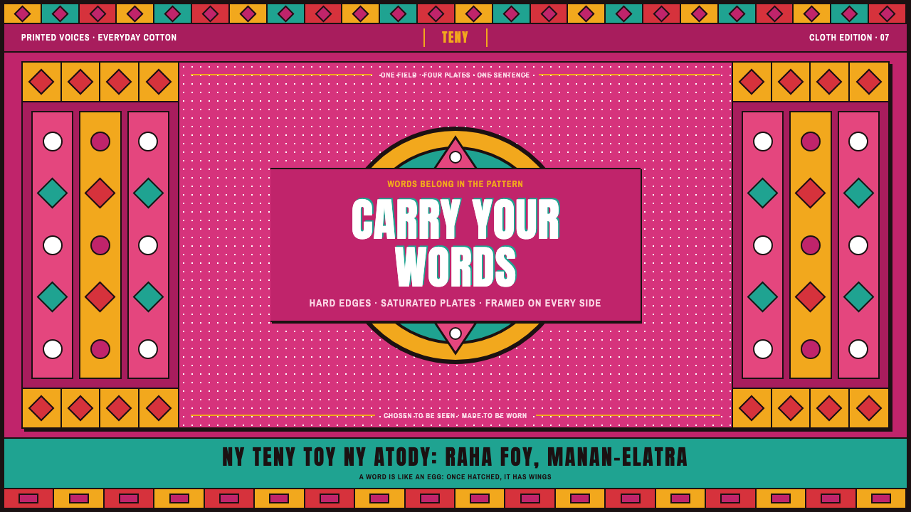 Malagasy Lamba HoanyWords become ornament. Hot fuchsia, saturated print plates and a border that…
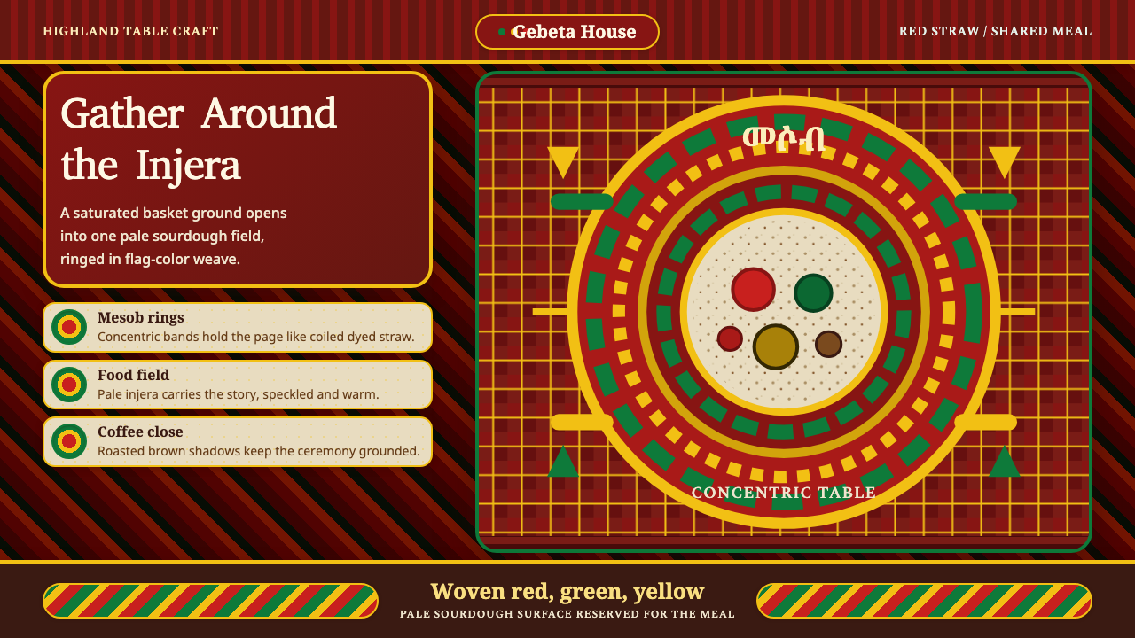 Ethiopian Injera Mesob SpreadHospitality is woven in. Berbere red, flag bands, and an injera field hold th…
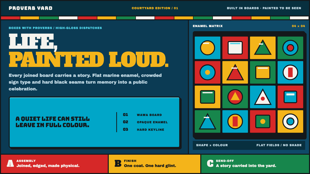 Ga Fantasy CoffinMemory refuses to whisper. Marine enamel, fat sign type and hard black seams…
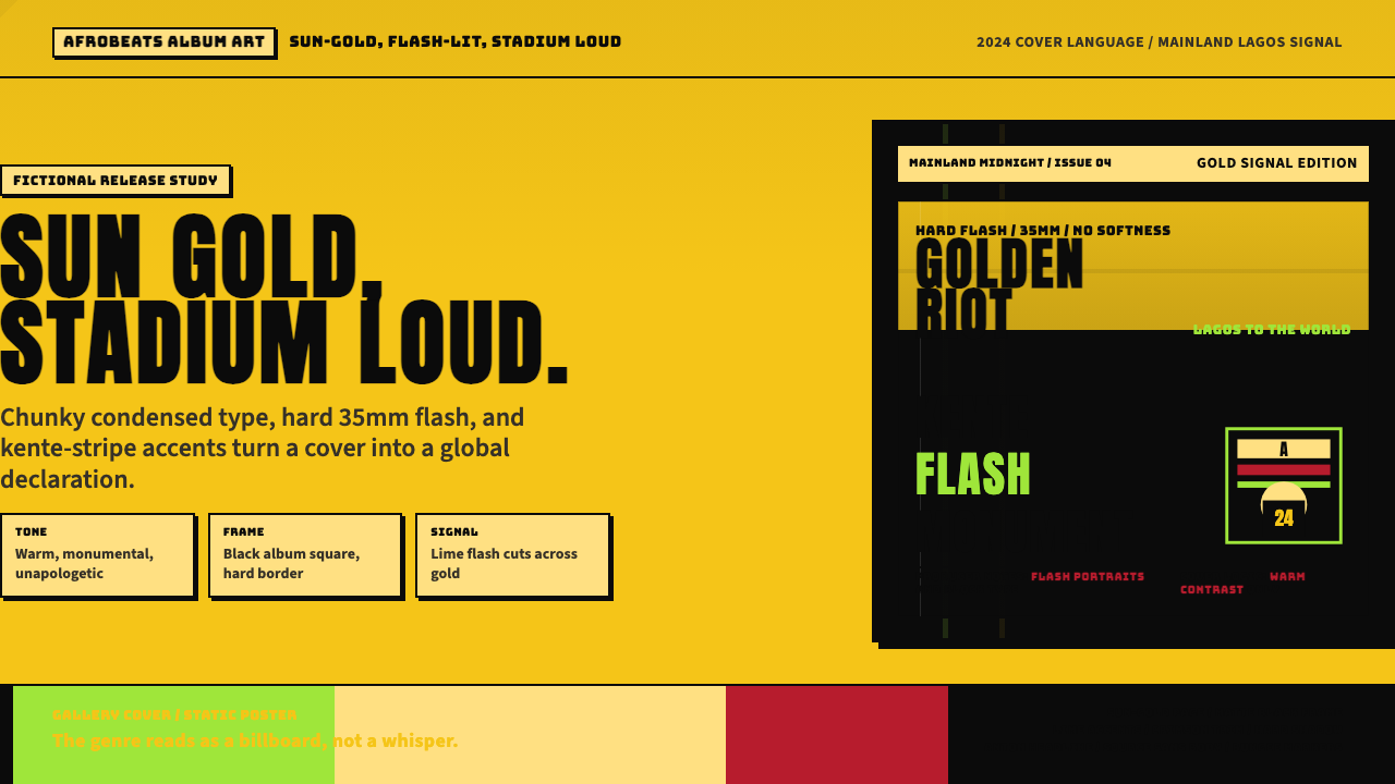 Afrobeats Album Art 2024Sun-gold and stadium loud. Anton type, kente stripes, and hard flash drive th…
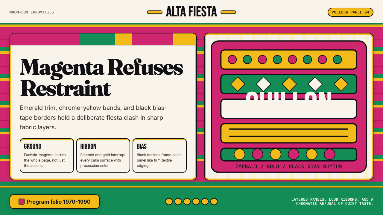 Bolivian Pollera Fiesta MagentaChromatic defiance. Magenta ground, emerald bands and black outlines clash li…
 Filipino JeepneyLoud steel, made personal. Chrome gradients carry neon stripes and hand-lette…