What is Scout Merit Badges?
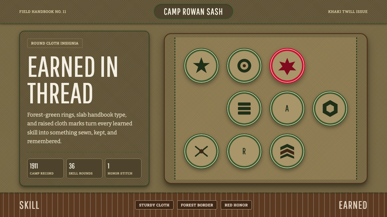
Scout Merit Badges turn achievement into cloth — a forest-green ring and a single stitched icon, worn on khaki twill as proof that a skill was actually earned.
Scout Merit Badges in brief
Scout Merit Badges is a design language built from the embroidered insignia of the early Boy Scouts of America: round cloth discs, each carrying one plain skill icon, ringed in forest green and stitched onto a khaki or olive-drab sash. It is a 1910s summer-camp aesthetic, born the same decade the organization itself was founded, and it carries the visual DNA of military surplus uniforms repurposed for boys learning to tie knots and build fires.
The style's central idea is that every mark of status must look handmade and earned, never printed or granted. A badge is a small circle of thread work, not a flat vector icon; a khaki ground is woven twill, not a flat tint; a border is a ring of stitching, not a drawn line. Nothing in the system is permitted to look mass-produced or effortless, because the underlying culture it depicts — merit badges awarded one skill at a time, sash by sash — was built entirely around the idea that recognition must be worked for.
Visually, the palette stays close to the ground: khaki and mid-tan twill dominate, olive drab supplies structure, forest green rings every badge, and a leather-brown appears wherever buckles, woggles, or straps would sit on an actual uniform. A single embroidery red is held in reserve, spent only on the rare badge or rank marking that needs to stand out from the field. Typography borrows from the handbook page rather than the parade ground: heavy slab-serif display type, built for durability and legibility on cheap paper, sets titles and section heads, while the body text stays plain and utilitarian.
Where does Scout Merit Badges come from?
The Boy Scouts of America was founded in 1910 by the publisher William D. Boyce, after an encounter that has become organizational legend: lost in a London fog, Boyce was guided to his destination by an anonymous boy scout who then refused a tip, explaining he was simply doing his daily Good Turn. Boyce returned to the United States carrying a copy of Robert Baden-Powell's 1908 handbook Scouting for Boys and incorporated the BSA within the year, importing wholesale the British movement's structure of ranks, patrols, and proficiency badges.
Baden-Powell's own model drew directly on his career as a British Army officer during the Boer War in South Africa, where khaki fatigues, campaign hats, and the improvisational bushcraft of colonial scouting units first proved themselves. That military inheritance is why the aesthetic reads as surplus-store rather than boutique: the color story — khaki, olive drab, leather brown — is a uniform palette before it is a design palette, chosen originally for camouflage and durability in the field rather than visual appeal.
The BSA's early leadership was a merger of rival visions. Ernest Thompson Seton, a naturalist and illustrator who had already built his own youth organization, the Woodcraft Indians, became the BSA's first Chief Scout and brought with him a hand-drawn, woodcut-adjacent illustration style that shaped the look of the first handbooks and badge artwork. Daniel Carter Beard, founder of the rival Sons of Daniel Boone, folded his organization into the BSA and became National Scout Commissioner, contributing a frontier-craft sensibility. The professional administrator James E. West, hired as the first Chief Scout Executive in 1911, is credited with standardizing the badge system into the disciplined, cataloged form it took by the time the first 57 merit badges were issued that same year.
The merit badge itself — a round embroidered patch awarded for demonstrated proficiency in a single skill, from First Aid to Pathfinding to Cooking — was a deliberate departure from military rank insignia, which mark hierarchy rather than competence. Each badge required a scout to be examined by an adult counselor and to perform the skill, not merely study it. That one-skill-one-badge structure is why the visual system reads as a grid of discrete achievements rather than a single continuous emblem: every badge is its own small, complete, earned object, meant to be added to a sash one at a time over years of active scouting.
What defines the Scout Merit Badges look?
Color
The palette stays low and earthbound: khaki and mid-tan twill for grounds, olive drab for structural elements, forest green reserved specifically for badge rings and section framing, and leather brown for anything that reads as strap, buckle, or woggle. A single embroidery red is held back as the one saturated accent, spent sparingly on the badges or markers that need to command attention against the field of neutral tones.
Material and Texture
Every surface is woven or stitched rather than flat and printed. Grounds carry the visible weave of twill cloth; badges are built from discrete embroidery stitches rather than smooth vector fills; borders read as a ring of thread rather than a drawn stroke. Nothing is glossy or polished — the aesthetic actively resists the sheen of plastic or laminate, because the culture it represents prized durable, hand-finished cloth goods over anything disposable.
Iconography
Each badge carries exactly one skill icon — a knot, a canoe paddle, a campfire, a compass — rendered as a simple, flattened silhouette rather than a detailed illustration. The restraint is functional: a badge must be legible as embroidery at small scale, so icons are reduced to their most recognizable single shape, with no fine internal detail or shading that thread work cannot reproduce.
Composition and Grid
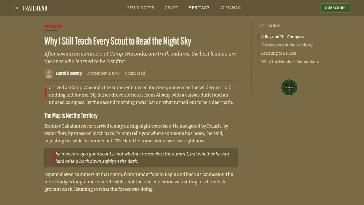
Badges are circular or shield-shaped units arranged in a loose, hand-placed grid across a sash or field — not a mathematically precise layout, but one that mimics the slightly imperfect spacing of badges actually sewn on by hand over years. Section headers and dividers on the page borrow the same logic: a heavy rule or a stitched-looking border frames a block of content the way a badge ring frames an icon.
Typography
Display type is a heavy slab-serif, the kind built for durability on cheap handbook paper rather than elegance on a printed page — thick, sturdy strokes with minimal contrast between thick and thin. Body text stays plain, utilitarian, and unadorned, closer to a field manual than a magazine, reinforcing the sense that this is instructional material meant to survive handling, not a polished commercial product.
Borders and Framing
Where a modern interface would use a drop shadow or a soft rounded corner, this system uses a ring of stitching — a visible line of embroidery that reads as sewn rather than drawn. Section dividers on a page or slide take the same form: a stitched-look rule rather than a thin gray hairline, keeping the framing consistent with the cloth-and-thread logic of the badges themselves.
Weathering
A faint, uneven quality is welcome rather than corrected: slightly frayed edges, a khaki ground that is not perfectly uniform in tone, a badge that looks like it has been through a summer of camp rather than fresh off a factory line. This is the opposite of the crisp, flawless finish that most contemporary digital design pursues, and it is precisely what gives the style its earned, lived-in credibility.

Who shaped Scout Merit Badges?
A Chicago publisher who founded the Boy Scouts of America in 1910 after being guided through a London fog by an unnamed boy scout who declined a tip, Boyce imported the British movement's rank and badge structure wholesale into the new American organization, giving it its initial legal and administrative form.
The British Army officer whose 1908 handbook Scouting for Boys, drawn from his Boer War experience of khaki fatigues, campaign hats, and bushcraft, supplied the template — including proficiency badges — that Boyce carried back to the United States and that the BSA adapted almost unchanged.
A naturalist, illustrator, and founder of the rival Woodcraft Indians youth organization, Seton became the BSA's first Chief Scout and lent his hand-drawn, nature-study illustration style to the earliest handbooks and badge artwork, embedding a craft sensibility into the program from its founding year.
Founder of the Sons of Daniel Boone, a rival frontier-skills organization that folded into the BSA at its founding, Beard served as National Scout Commissioner and contributed a pioneer-craft, frontier-woodsman sensibility that reinforced the movement's khaki-and-leather visual vocabulary.
Hired in 1911 as the BSA's first Chief Scout Executive, West is credited with professionalizing and standardizing the merit badge system into its disciplined, cataloged form, overseeing the issuance of the first 57 merit badges the same year he took the post.
How do you use Scout Merit Badges today?
This style rewards restraint, because its entire premise is that recognition must look worked for rather than granted. Applying it means treating every visual mark of status — a badge, a stamp, a tier label — as a small, discrete, textured object rather than a flat colored shape, and resisting the urge to make the palette brighter or the surfaces glossier than a real uniform ever was.
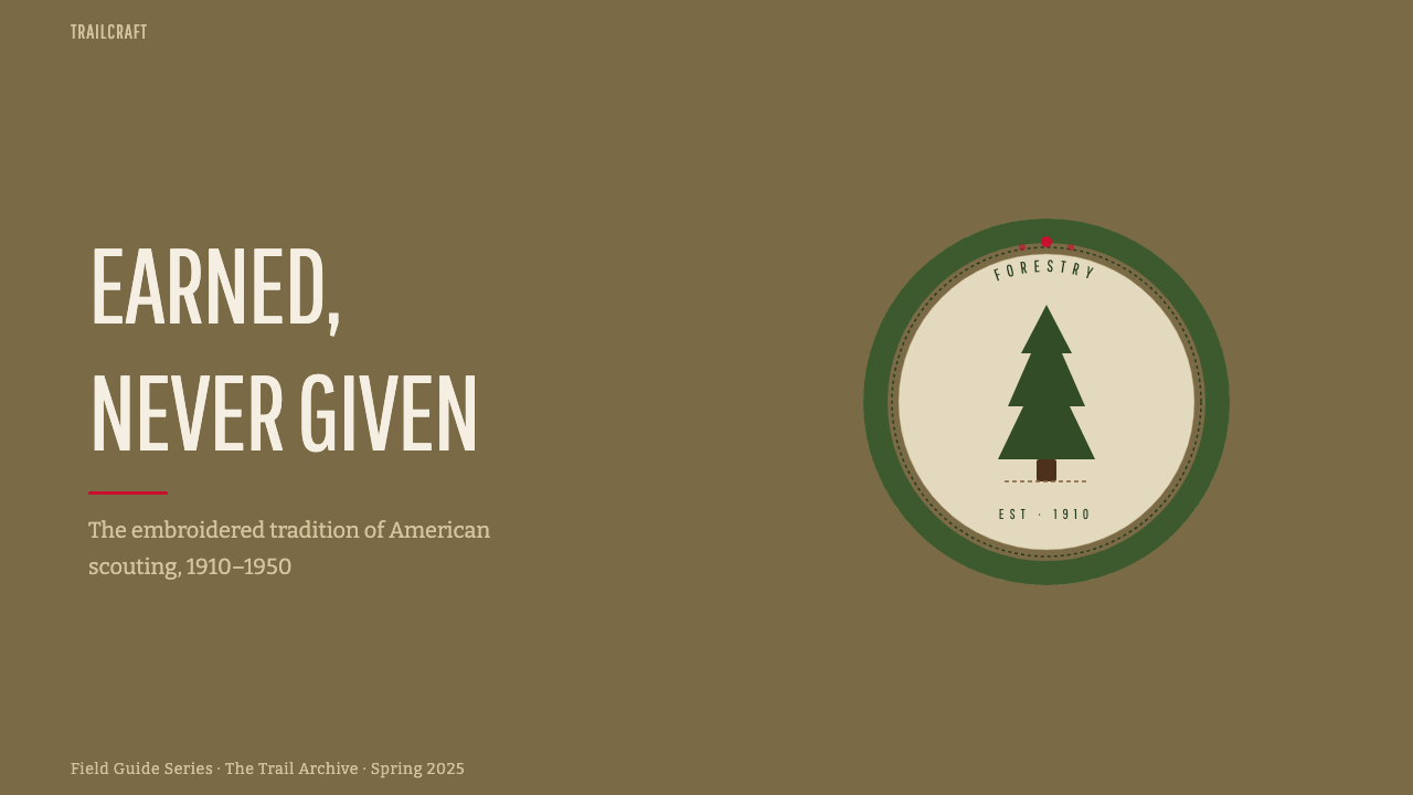
For presentation slides, this aesthetic gives cover pages a khaki-twill ground with a single ringed emblem anchored in a corner, title type set in the heavy slab-serif at generous scale. Content slides work well as an achievement grid: each key point or milestone rendered as its own small ringed badge with a single icon, rather than a bulleted list, so that a roadmap or program overview reads like a sash of earned accomplishments. Data slides can borrow the ledger quality of a handbook page — plain tables, sturdy rules, no decorative chart gradients.
For web interfaces, the style suits dashboards or membership products built around progression, levels, or earned status — the visual logic maps directly onto badges, streaks, or achievement systems. A khaki or tan background, olive-drab section dividers, and a forest-green ring around any completed-status indicator communicate earned progress far more convincingly than a bright gamified sticker would. Pricing tiers can be framed as ranks rather than plans, with the reserved embroidery red marking only the top or currently-active tier.
For editorial and marketing content, the style fits stories about craft, scouting, outdoor life, heritage brands, or any narrative built around earned expertise. A magazine-style layout can use the stitched-border motif to frame pull quotes or sidebars, and a marketing page selling a course or certification can use the badge-and-ring motif literally, presenting each completed module as its own small earned emblem.
The most common mistake is treating the palette as merely a color scheme — swapping in khaki and forest green while keeping flat, glossy, vector-perfect surfaces underneath. That produces a costume rather than the real thing. The style only works when the texture logic is honored too: woven grounds, stitched borders, single-icon badges, and a willingness to let things look slightly imperfect rather than factory-fresh.
Scout Merit Badges — FAQ
Is this style specific to the Boy Scouts, or can it work for any achievement-based product?
The visual vocabulary comes specifically from early Boy Scouts of America insignia, but the underlying logic — one badge per earned skill, textured rather than flat, ringed rather than bordered — transfers cleanly to any product built around progression: certifications, fitness streaks, learning platforms, loyalty tiers. The key is keeping the earned, handmade texture intact rather than only borrowing the color palette.
Why does the palette avoid bright, saturated colors?
The colors are inherited from a military-surplus uniform palette — khaki, olive drab, leather brown — chosen originally for field durability and camouflage rather than visual appeal. Keeping the palette muted preserves that authenticity; a single saturated red is held in reserve precisely so it retains impact when it does appear, rather than competing with several other bright hues.
How does this style handle icons and illustration?
Icons are reduced to single, flattened silhouettes — a knot, a compass, a canoe paddle — because embroidery cannot reproduce fine internal detail at small scale. This constraint should be treated as a design rule even in digital contexts: one clear shape per badge, no shading, no gradient fill, so that every icon would still read correctly if it had to be stitched by hand.
Does the style suit dark-mode or bright, cheerful interfaces?
It can work in a darker register — the source material itself skews toward olive-drab and khaki rather than pure white — but it resists the cheerful, high-key brightness of casual consumer apps. Its emotional register is earnest and a little serious, closer to a field manual than a game, so it suits products that want to feel substantial and earned rather than playful.
What is the most common way this aesthetic gets misapplied?
Designers frequently apply only the color palette — khaki backgrounds and forest-green accents — while keeping flat vector shapes, drop shadows, and glossy gradients underneath. This produces something that looks tinted rather than genuinely earned. The texture logic (woven grounds, stitched borders, single-icon badges, deliberate slight imperfection) is what actually carries the aesthetic; the color palette alone is not enough.
Related design styles
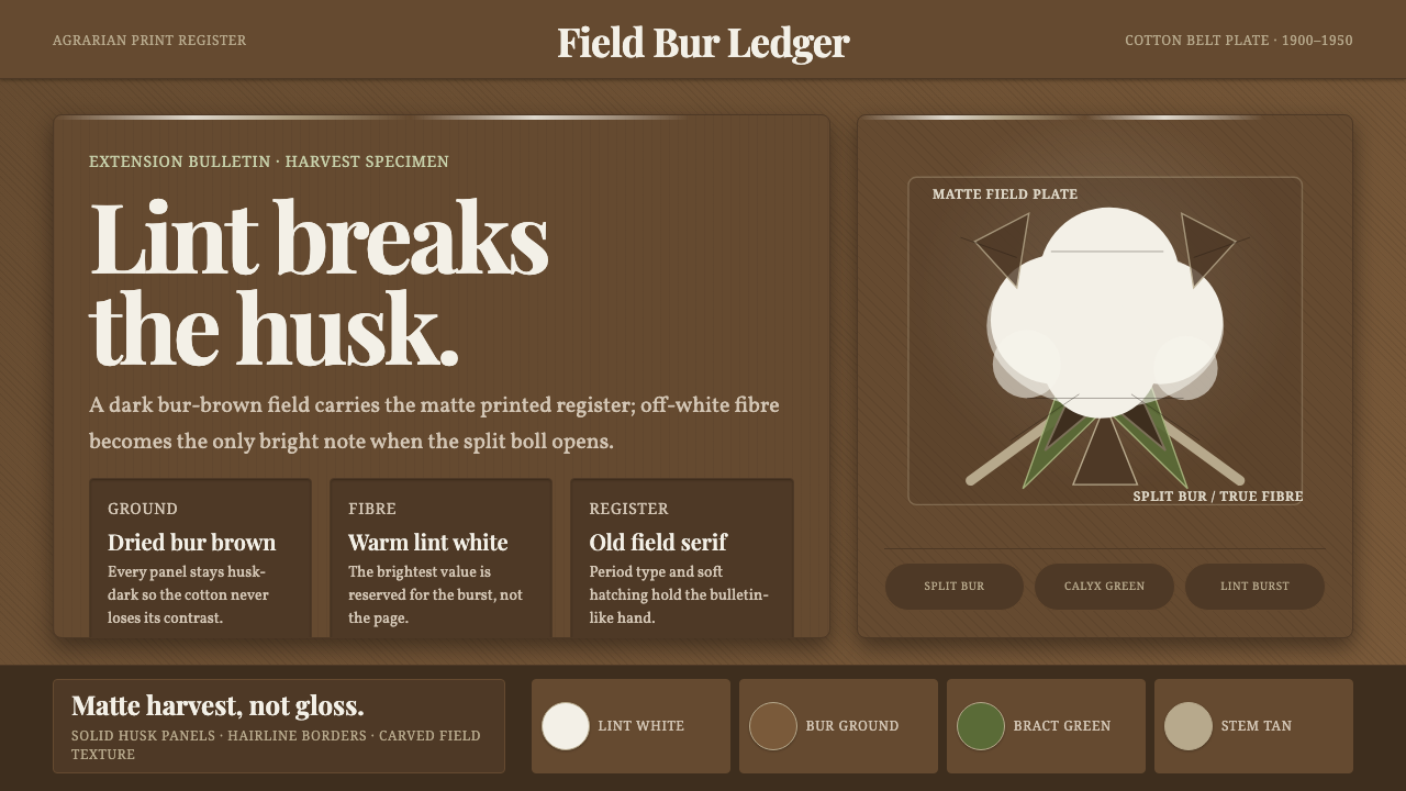 Cotton Boll HarvestHarvest contrast made matte. Off-white lint bursts from husk brown with field…
 Hershey's Chocolate Brown (1894)Plain, enduring, warm. Cocoa brown meets silver foil on cream paper.
 Québec Maple Sugar ShackWarmth boils in the dark. Amber serif type, brass borders, and gingham checks…
 Bugis PinisiSailcloth made resolute. Vermilion, chrome and cobalt bands cut a warm white…
 Dungan Settlement CraftCarpentry holds its ground. Teal eaves and crimson posts frame sunlit plaster…
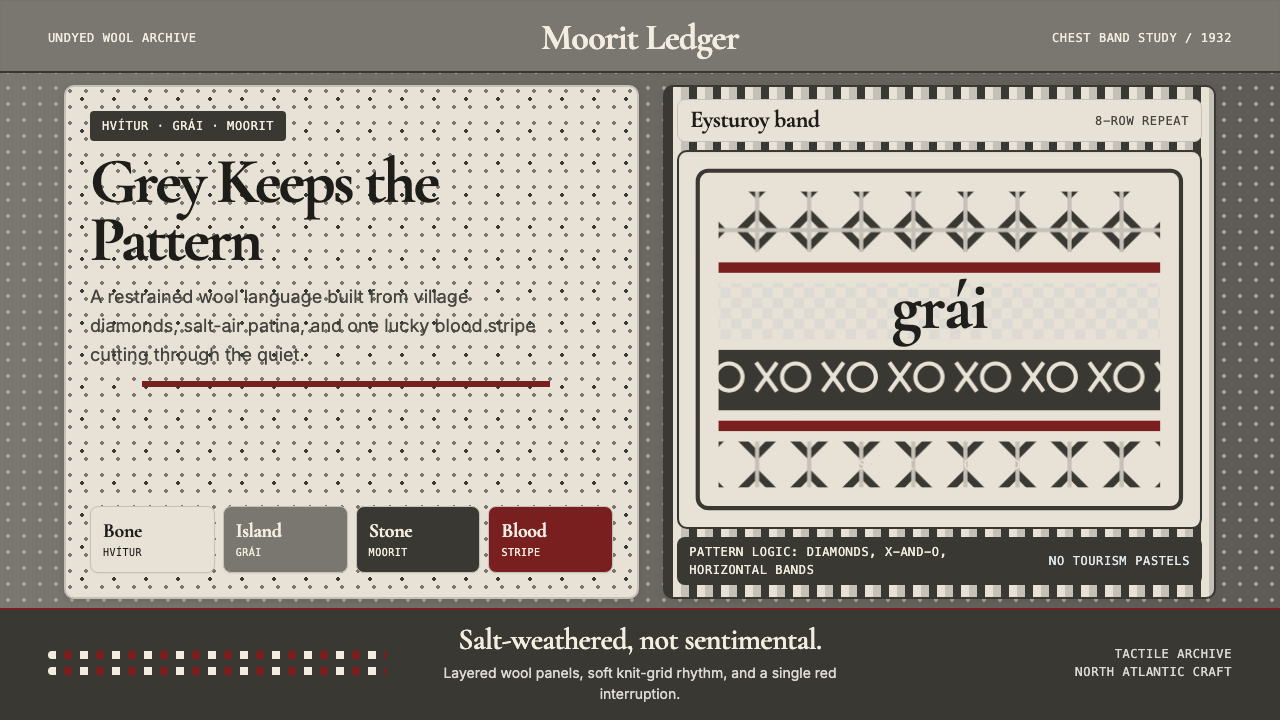 Faroese Knit Pattern Island GreyWeathered wool, not cozy kitsch. Island greys, Cormorant serif, one blood-red…