What is Rattan & Wicker?
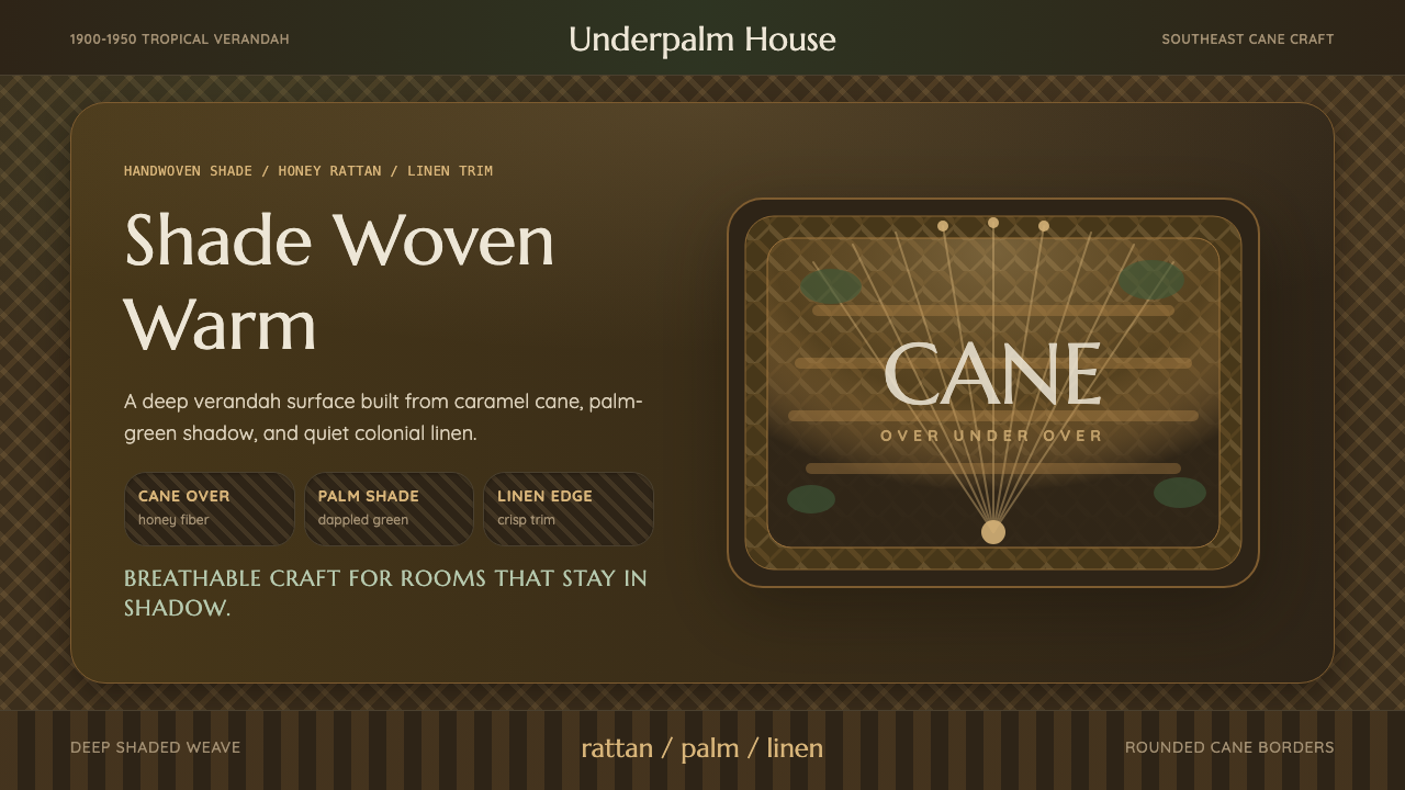
Rattan & Wicker weaves the shaded verandahs of the colonial tropics into a digital surface — honey-toned cane, palm green, and crisp linen trim laid over a dark, breathable ground.
Rattan & Wicker in brief
Rattan & Wicker takes its visual identity from the shaded porches and verandahs of colonial Southeast Asia in the first half of the twentieth century, where cane furniture — chairs, settees, screens, the famous fan-backed peacock chair among them — was woven by hand from rattan, a climbing palm whose flexible stems could be bent, coiled, and interlaced without breaking. The style treats that weave itself as the primary surface, not as a texture applied over something else.
The defining color choice is a dark, shade-dappled ground rather than a pale, sun-bleached one. This is a deliberate departure from how tropical colonial style is often pictured — as bright white linen in full sun — and instead captures the specific experience of sitting beneath a deep porch roof, where light filters through in patches of green shadow rather than falling directly. The honey-gold of the cane itself is the warmest, brightest element in the system precisely because it is meant to glow against that shade, the way real rattan catches available light on a shadowed porch.
Tropical palm greens and crisp, starched colonial linen trim complete the palette, giving the system a sense of handmade craft, breathability, and quiet elegance rather than plantation-era opulence. The overall effect should read as light furniture translated into a dark, woven surface — tactile and warm, never glossy or hard-edged.
Where does Rattan & Wicker come from?
Rattan is a climbing palm native to the tropical forests of Southeast Asia, particularly the Malay archipelago, the Philippines, and Indonesia, where it has been harvested and woven into furniture, baskets, and structural elements for centuries by local craftsmen. Its stems are solid, flexible, and can be split, bent into curves, and interlaced tightly without splintering, which made it ideally suited to hand-weaving techniques passed down through generations of Southeast Asian artisans well before European colonization.
European colonial administrations in the region, particularly the Dutch in the East Indies, the British in Malaya, and the Americans in the Philippines, adopted rattan furniture widely for verandah and porch use between roughly 1900 and 1950, drawn to its lightness, its suitability for humid tropical climates, and its ability to be produced locally at relatively low cost compared to imported hardwood furniture. Cane furniture became a fixture of the colonial domestic interior — planter's chairs, settees, and screens arranged on shaded verandahs designed to catch cross-breezes while blocking direct tropical sun.
The peacock chair, with its dramatic fan-shaped woven back, became perhaps the most recognizable single object of this tradition, though the broader repertoire included simpler slat-backed chairs, chaise longues, and woven screens used to partition open-air rooms. These pieces were typically produced by local Southeast Asian cane craftsmen working within colonial commercial networks, meaning the objects sit at an intersection of indigenous craft technique and colonial-era commercial demand — a tension that is part of the honest historical context behind the style.
The verandah itself, as an architectural feature, was a colonial adaptation to tropical climate: a covered, open-sided porch that provided shade, encouraged airflow, and served as a transitional social space between the enclosed house and the outdoors. It was here, under deep eaves and dappled light filtered through surrounding foliage, that rattan furniture found its defining setting — which is why this style's dark, green-shadowed palette is drawn from the verandah's actual lighting conditions rather than from an idealized sunlit image of the tropics.
What defines the Rattan & Wicker look?
Color
A dark, green-dappled ground carries a honey-gold rattan tone as the warmest highlight, with crisp linen trim used sparingly for contrast. The darkness of the base is deliberate — it represents shade, not absence of light, and every lighter tone in the system should feel like it is catching filtered light rather than sitting under direct sun.
Weave texture
The woven cane pattern is treated as a foundational visual texture rather than a decorative overlay — interlaced over-under rhythms appear across panels and borders the way they would across the back of an actual peacock chair, giving surfaces a tactile, handmade quality.
Typography
Type should carry the crispness of starched colonial linen — clean, legible letterforms that feel pressed and orderly against the organic irregularity of the woven ground, providing a structural counterpoint to the cane's natural texture rather than competing with it decoratively.
Shade and dapple
Light in this system is filtered and patchy rather than even or direct, echoing sunlight breaking through verandah foliage and lattice screens. Soft, irregular patches of lighter tone across a dark ground evoke this dappled quality more effectively than a uniform gradient would.
Craft irregularity
Because rattan weaving is done by hand, authentic surfaces carry small, natural irregularities in the weave rather than perfectly uniform machine repetition. This slight imperfection is part of what signals handmade craft rather than mass-produced pattern, and should be preserved rather than smoothed into a flawless repeat.
Material breathability
The open, interlaced structure of woven cane naturally implies air passing through it — a quality worth preserving even in flat digital rendering, where negative space within the weave pattern should read as gaps for airflow, not as unfinished detail.
Composition
Layouts favor an unhurried, porch-like openness — generous space between elements evoking the loose arrangement of furniture across a shaded verandah, rather than a tightly packed grid. Compositions should feel like a place to sit and linger, not a dense control panel.
Who shaped Rattan & Wicker?
The uncredited generations of local craftsmen across the Malay archipelago, Philippines, and Indonesia who developed and refined rattan-weaving technique long before European colonization, and who produced the actual cane furniture — including the iconic peacock chair — that European colonial households later adopted for verandah use.
Specialist artisans working within colonial-era commercial networks who supplied woven cane furniture — chairs, settees, screens — to colonial households and export markets between roughly 1900 and 1950, adapting traditional weaving technique to the scale and forms demanded by colonial domestic interiors.
How do you use Rattan & Wicker today?
Rattan & Wicker is a texture-and-warmth style — applying it well means treating the weave as structural, not decorative, and preserving the dark, shaded lighting logic that distinguishes it from a generic 'tropical resort' aesthetic.
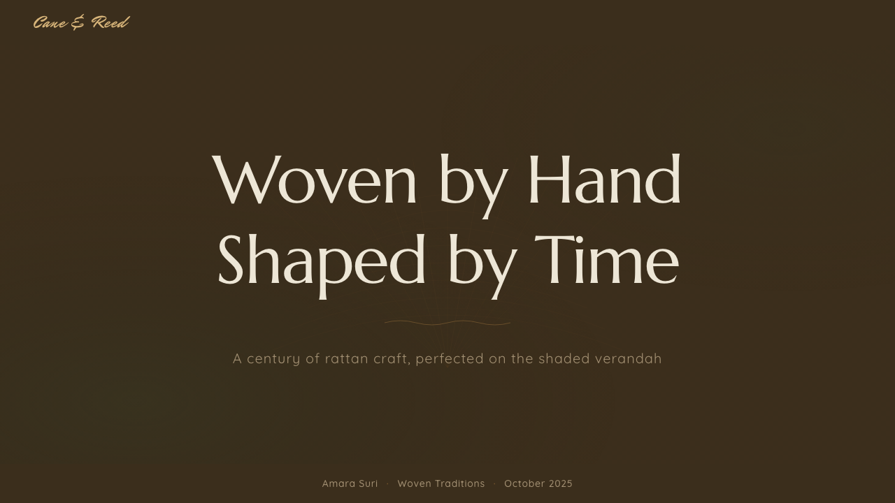
For presentation slides, the style makes an inviting cover treatment for hospitality, wellness, or lifestyle content: a dark green-shadowed ground with a woven texture panel framing the title, and honey-gold accent used sparingly for emphasis rather than throughout. Content slides should keep the weave texture to borders or background panels rather than behind body text, where it would compete with legibility.
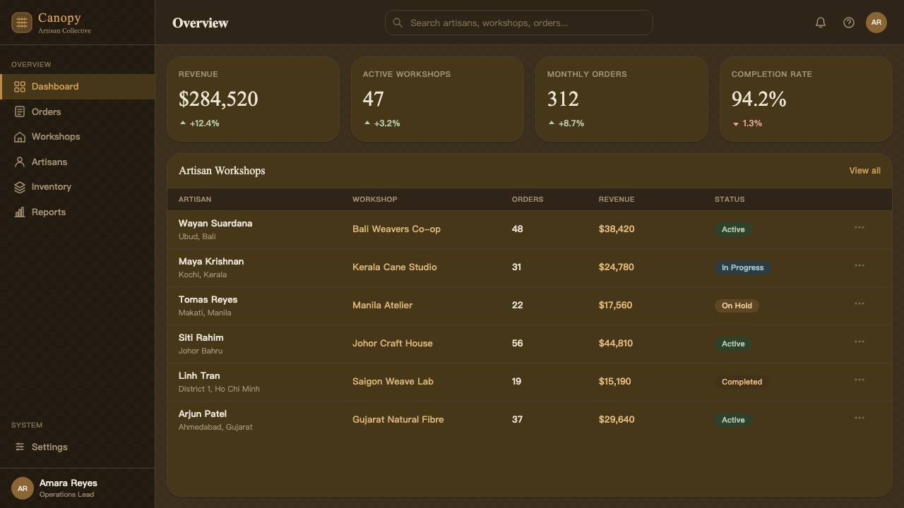
For web interfaces, this style suits hospitality booking platforms, wellness and retreat products, home and lifestyle e-commerce, and any product wanting to evoke a slower, handmade, breathable feeling. Dashboards with dense data are a weaker fit — the organic irregularity of woven texture works against the crisp scanning a data-heavy interface needs, so numeric-heavy screens should keep the weave motif to framing elements only.
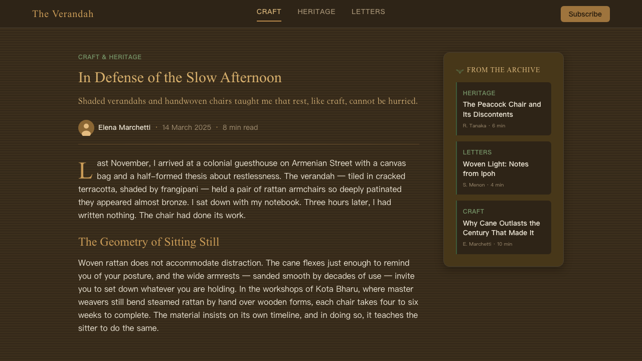
For editorial and marketing work, the style is strong for travel writing, craft and design features, and product pages for natural-material goods — furniture, home textiles, artisan crafts. A landing page hero benefits from the dappled-light treatment across a full-width image or panel, evoking the verandah setting directly, with linen-crisp typography set confidently against it.
A common mistake is defaulting to a bright, sun-bleached white-and-tan palette because it feels more conventionally 'tropical' — this flattens the style's most distinctive trait, which is precisely its commitment to shade and dappled darkness rather than direct sun. Another mistake is rendering the weave as a flawless, perfectly repeating machine pattern, which loses the handmade irregularity that gives the style its craft authenticity.
Rattan & Wicker — FAQ
Why is the background dark rather than the bright white typically associated with tropical colonial style?
The style is drawn specifically from the experience of sitting on a shaded verandah, under deep eaves and surrounding foliage, rather than from an idealized sunlit postcard image of the tropics. Rattan furniture was placed on porches precisely to escape direct sun, so a faithful rendering of that setting uses a dark, green-dappled ground with the cane's honey tone as the brightest element — the same way real rattan glows warmly against surrounding shade rather than washing out in direct light.
What is the peacock chair, and why is it so central to this style's reference?
The peacock chair is a rattan armchair with a dramatic, oversized fan-shaped woven back, resembling a peacock's displayed tail. It became one of the most visually iconic pieces of Southeast Asian cane furniture during the colonial-era verandah tradition, and its bold woven silhouette is a useful visual shorthand for the broader weaving technique and craft culture the style draws from, even where a specific chair shape is not directly depicted.
Is this style tied to a specific country, or is it pan-regional?
It draws from a shared material culture across colonial Southeast Asia broadly — Indonesia, the Philippines, and Malaya (present-day Malaysia and Singapore) all developed rattan-weaving traditions and adopted similar verandah furniture conventions under different colonial administrations during roughly the same period. The style is best understood as regional rather than nation-specific, reflecting a shared response to climate and available material across the archipelago rather than one country's distinct visual identity.
Does this style require literal basket-weave imagery everywhere, or can it be applied more subtly?
The weave should function as the system's defining texture, but it does not need to appear literally on every surface. It works well concentrated in borders, background panels, or framing devices, while flatter interior surfaces carry the palette and lighting logic without a literal woven pattern — much as a real verandah room has woven furniture as accent pieces within a plainer architectural shell, rather than weave covering every wall.
How does this style differ from a generic 'boho' or 'natural fiber' aesthetic?
Generic boho styling tends to mix many natural-fiber textures loosely — macrame, jute, rattan, linen — from varied, often ahistorical sources for a general 'earthy' effect. Rattan & Wicker is anchored to a specific historical setting: colonial Southeast Asian verandah furniture of roughly 1900–1950, with a specific lighting logic (shade, not sun) and a specific object reference (the peacock chair and its relatives). That specificity is what keeps the style from collapsing into a vague natural-materials mood board.
Related design styles
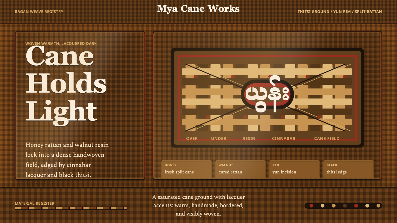 Burmese Cane RattanWoven warmth holds the page. Walnut cane lattice glows with cinnabar rim line…
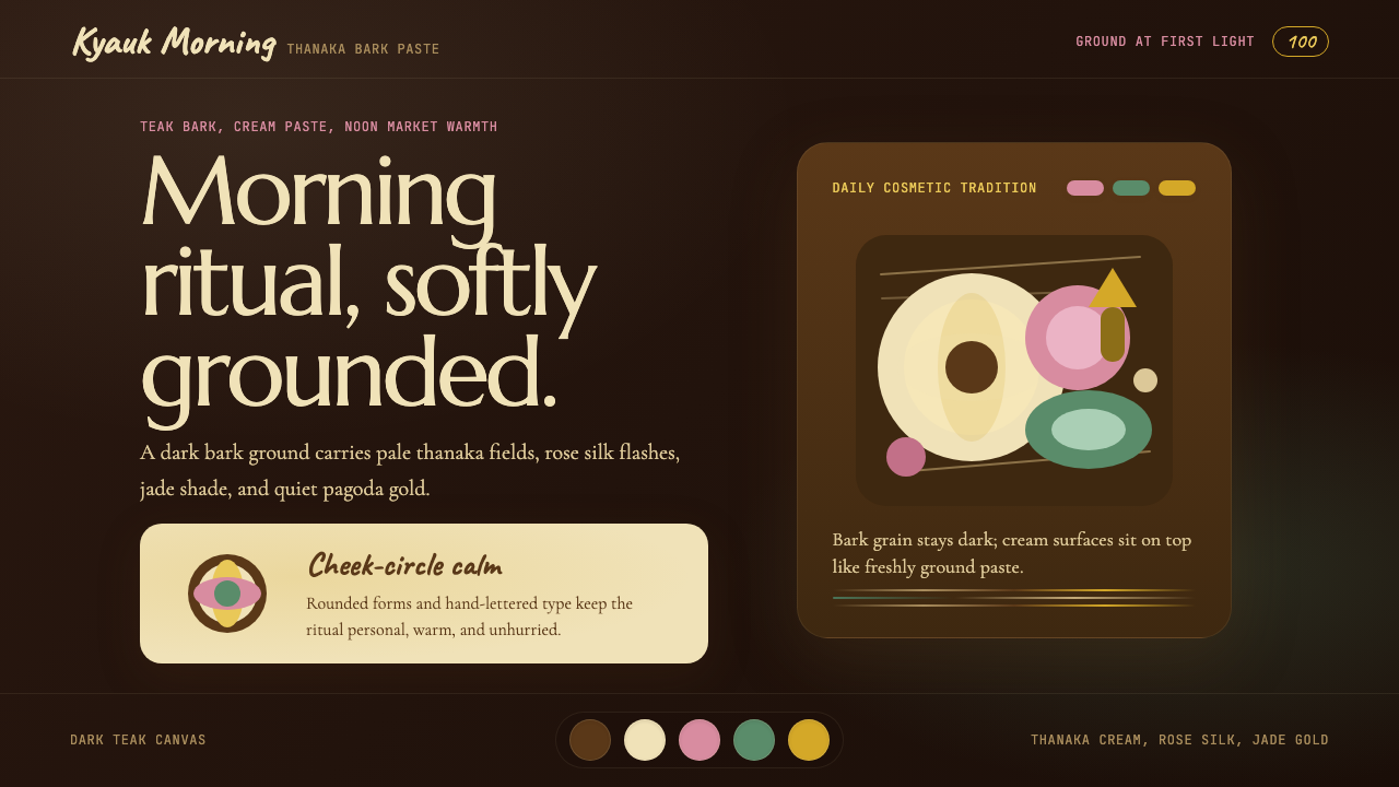 Burmese Shan Thanaka (Bark Paste)Handmade warmth on dark bark. Thanaka cream roundels soften rose, jade, and g…
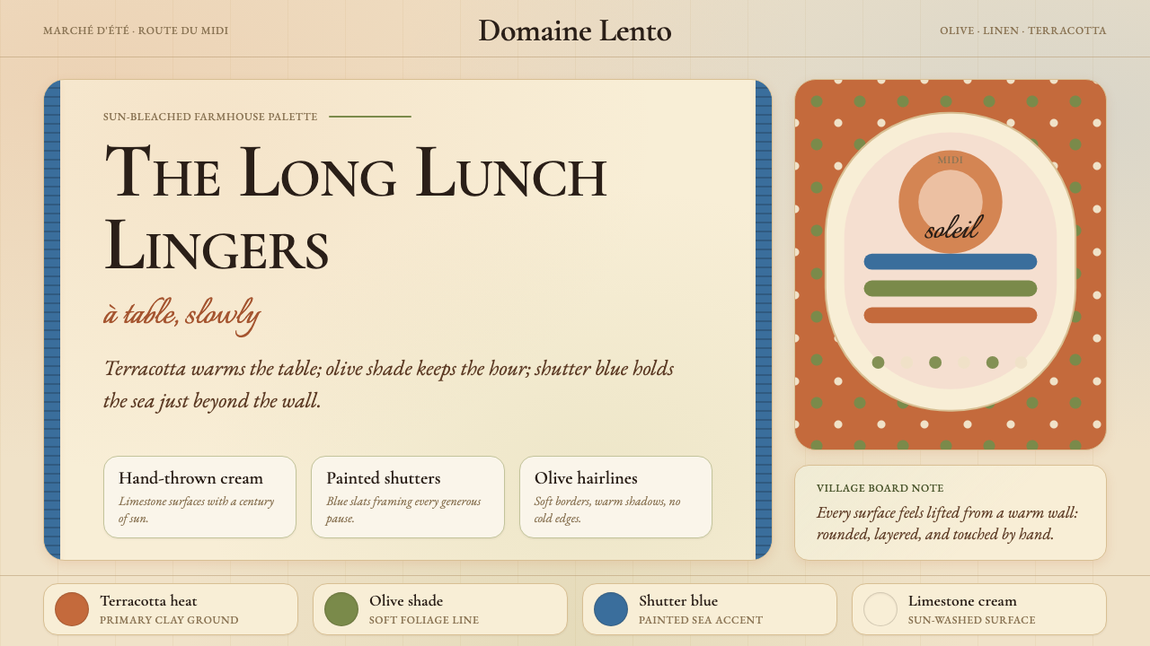 Provençal MediterraneanWarmth refuses the clock. Terracotta, olive lines, and shutter blue frame slo…
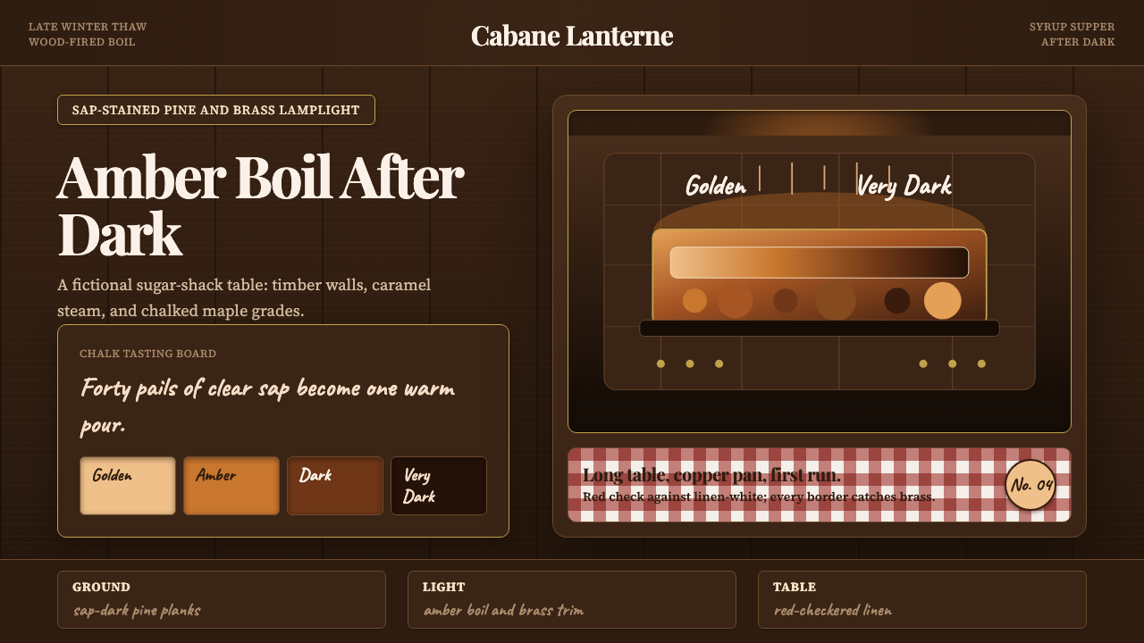 Québec Maple Sugar ShackWarmth boils in the dark. Amber serif type, brass borders, and gingham checks…
 Undyed Khadi WhiteModest, never cream. Greige homespun cotton with gray slub flecks and plain h…
 Cotton Boll HarvestHarvest contrast made matte. Off-white lint bursts from husk brown with field…