What is Venezuelan Cuatro Llanera (Plains Music)?
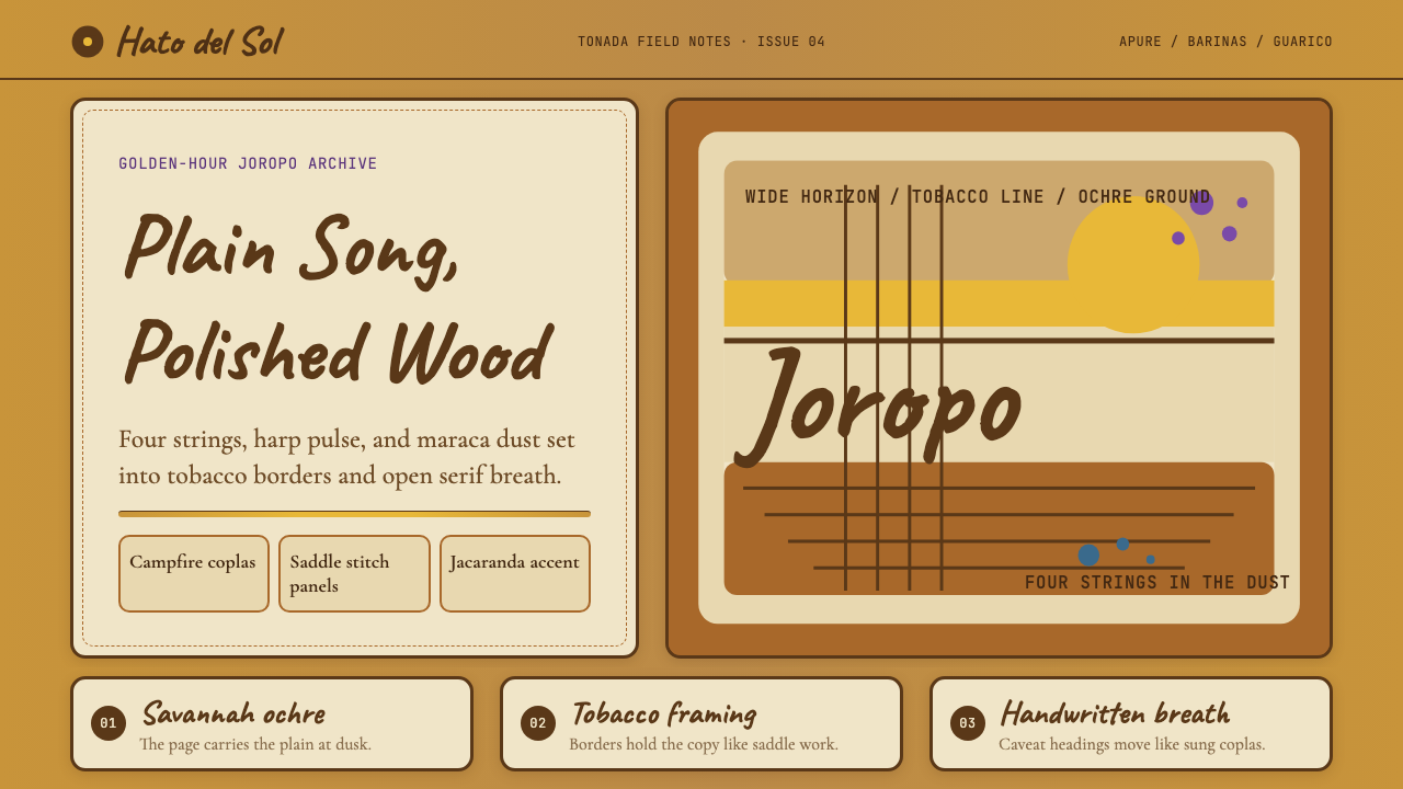
Venezuelan música llanera does not ask for quiet — it commands the whole horizon. Sun-baked savannah ochre, tobacco-leather panels, and the raw warmth of cuatro wood varnish translate a cattle-driving culture into an interface language that is generous, grounded, and unmistakably of the plains.
Venezuelan Cuatro Llanera (Plains Music) in brief
Venezuelan Cuatro Llanera is a design system rooted in the música llanera tradition of the Orinoco basin — the vast cattle-ranching plains (los Llanos) stretching across Venezuela and eastern Colombia. The visual language draws from that world's materials and light: ochre savannah ground, dark tobacco-leather panels stitched with visible seams, the amber and varnished-wood warmth of the four-string cuatro, and the rare violet of jacaranda trees in bloom along slow river bends.
The aesthetic is not decorative nostalgia. It is an attempt to capture a specific quality of light and material culture: the flatness of an endless horizon, the honest weight of hand-stitched leather, the warmth of firelight at a cattle camp. Typography breathes wide and unhurried — hand-lettered script headings echo the corrido lyrics scratched on barn doors, while warm serif body text brings a dignified legibility suited to long reading in difficult conditions.
As a design system, it works through contrast of warmth: ochre and cream hold the majority of the canvas, tobacco brown defines structure and boundary, cuatro-varnish amber provides accent, and the jacaranda purple appears rarely as a surprise — the way those flowering trees appear unexpectedly in an otherwise arid landscape. The result is an interface that feels sun-warmed, artisanal, and deeply rooted without falling into cliché.
See the Venezuelan Cuatro Llanera (Plains Music) design system
Where does Venezuelan Cuatro Llanera (Plains Music) come from?
The Llanos — from the Spanish word for 'plains' — form one of the largest tropical grassland systems in the world, covering roughly 300,000 square kilometers across western Venezuela and eastern Colombia. The landscape is defined by seasonal extremes: a brutal dry season when the savannah turns the color of burnt ochre and cattle must be driven hundreds of kilometers to water, and a wet season when the plains flood entirely and the cattle are moved to higher ground. This cycle of migration and endurance shaped everything about llanero culture, including its music.
Música llanera emerged from the colonial encounter between Spanish settlers, indigenous Llanos peoples, and enslaved Africans brought to work the colonial cattle ranches (hatos). The joropo — the defining musical form — is generally traced to 18th-century Creole synthesis, though its exact origins are disputed. The cuatro, a four-string guitar adapted from the Spanish vihuela and guitar family, became the harmonic engine of the tradition; the arpa llanera (plains harp) provided melodic leadership; and the maracas provided rhythmic drive. The joropo's characteristic fast triple meter and rapid hemiola cross-rhythms reflect the energy of the cattle drives and the physical vocabulary of the llanero lifestyle.
The tradition was codified as Venezuelan national patrimony largely through 20th-century figures. Simón Díaz (1928–2014), known affectionately as Tío Simón, transformed the raw tonadas and coplas of the Llanos into polished popular repertoire, recording them with orchestral arrangements for Venezuelan radio and television audiences. His work made llanera music legible to urban listeners without stripping its rural authenticity. Juan Vicente Torrealba was equally central — his compositions for cuatro and arpa established the melodic canon that subsequent generations built on. Soledad Bravo carried the tradition internationally, performing joropo in concert halls from Caracas to Paris.
In the 21st century, musicians like Cheo Hurtado have pushed the cuatro's technical horizons, performing classical and jazz repertoire on the instrument while insisting on its llanero roots. This duality — the meeting of sophisticated musicianship and humble cattle-camp origins — is precisely the tension that gives the design system its character: the warmth and texture of a hand-stitched saddle, the precision and dignity of a polished instrument.
What defines the Venezuelan Cuatro Llanera (Plains Music) look?
Color
The palette is built around savannah ochre — a sun-baked, dusty warm yellow-gold — as the dominant ground, paired with cream and off-white for breathing room. Tobacco brown defines structural elements: borders, panels, and dividers that read like stitched leather. Cuatro-varnish amber appears as a warm highlight color, the tone of well-oiled wood. Jacaranda violet is the accent: used sparingly, it carries the same visual surprise as those flowering trees appearing against an otherwise dry and golden landscape. The palette reads warm and terrestrial — nothing cool, nothing synthetic.
Typography
Headings are set in expressive hand-lettered script that echoes the corrido tradition — lyrics written by hand on barn walls and notebook pages. The script conveys informality and oral culture without sacrificing legibility. Body text uses warm serif letterforms that bring a quality of quiet dignity and readability suited to longer passages. The two typeface registers play against each other deliberately: the handwritten heading announces location and emotion, while the serif body carries information with steady authority. Line spacing is generous throughout — the page breathes like an open plain.
Texture and Surface
Where most digital design systems use completely flat surfaces, this system introduces controlled texture references: stitched borders on cards and panels that recall saddlework, subtle grain in background areas that evoke sun-dried earth, and the slight unevenness of hand-applied pigment. These textures are rendered graphically rather than photographically — they suggest material culture without becoming literal. The effect is warmth without nostalgia, craft without rusticity.
Layout and Spacing
The layout borrows from the geography it references: wide and horizontal. Content areas favor landscape orientation with generous margins that suggest the open horizon. Elements are never cramped; white space (or ochre space) is an active compositional element. Structural divisions are marked by warm, earthy tones rather than hard rules, maintaining the sense of continuous openness even across complex information architectures. The grid is present but unpressured — things sit comfortably rather than snapping to rigid columns.
Imagery and Ornament
Illustrative elements draw from the material inventory of the Llanos: the silhouette of a cuatro or arpa llanera, stitched border patterns derived from saddlework geometry, the organic forms of savannah grasses, or the branching canopy of the moriche palm. These are used sparingly and graphically — line drawings or flat silhouettes rather than detailed illustration. The decorative vocabulary is restrained; it gestures toward cultural specificity without becoming costume or illustration.
Mood and Register
The overall emotional register is warmth grounded in durability. This is not a festive palette or a nostalgic one — it is the aesthetic of something that has survived heat and distance and time. The style suits contexts where trust, endurance, and human warmth are primary values. It resists the clinical and the cold, the hyper-modern and the anonymous. Used well, it produces interfaces that feel like something worth returning to — a favorite book, a place that knows you.
See the Venezuelan Cuatro Llanera (Plains Music) design system
Who shaped Venezuelan Cuatro Llanera (Plains Music)?
Known as Tío Simón, Díaz (1928–2014) was the central figure in the popularization of llanera music. A singer, composer, and television personality, he transformed raw llanero tonadas and coplas into accessible popular repertoire without sanitizing their emotional honesty. His recordings brought the music to generations of Venezuelans who had no direct connection to the Llanos, and his international profile made joropo legible to foreign audiences. His work represents the design challenge at the heart of this system: how to translate a rural material culture into a form that urban and global audiences can receive.
Composer and arpa llanera player, Torrealba (1917–2019) created the melodic canon that defines llanera music's harmonic and emotional character. His compositions — lyrical, expansive, unhurried — established the standard against which subsequent generations of musicians measured themselves. In the design context, his work represents the quality of the layout system's breathing room: melodies that never rush, that allow silence to serve the music. His longevity (he performed into his late nineties) is itself a testament to the durability that the aesthetic projects.
Contemporary cuatro virtuoso and composer, Hurtado represents the instrument's capacity to carry sophisticated harmonic and technical demands beyond folk music boundaries. His recordings demonstrate that the cuatro — a small, four-string instrument associated with cattle camps and rural festivities — can hold its own alongside concert guitar and classical chamber music. For the design system, his work is the analog of typographic precision within a warm vernacular register: technical refinement that does not betray its cultural roots.
Venezuelan singer of Spanish origin, Bravo (b. 1943) extended the reach of llanera music and broader Latin American folk traditions to international concert audiences without performing them as ethnographic curiosity. Her approach — dignified, musically rigorous, emotionally direct — carried the music into spaces where it might easily have been condescended to. In the context of this design system, she represents the ambassadorial quality: how a deeply local aesthetic gains international legibility through restraint rather than exoticism.
The great cattle ranches of the Llanos — some of them sprawling across hundreds of thousands of hectares — are not individual figures but a foundational institution. The hato shaped everything about llanero culture: the social hierarchy of ranch owners, foremen, and peones; the aesthetic of saddle, leather, and working gear; the music played around campfires after long drives. The visual language of this design system is hato material culture translated into interface: the stitched border is a saddle seam, the ochre ground is the dry-season plain, the leather panel is the wall of the ranch house.
How do you use Venezuelan Cuatro Llanera (Plains Music) today?
Applying the Venezuelan Cuatro Llanera system well requires understanding what it does emotionally before worrying about which specific visual elements to deploy. The palette and texture vocabulary communicate warmth, endurance, and authenticity — qualities associated with craft, trust, and the genuinely handmade. This means the style works in contexts where those values are genuine, not merely aspirational: heritage food brands, independent publishing, artisan craft marketplaces, cultural organizations, music and arts platforms, and any product that wants to feel like it has been around long enough to be trusted.
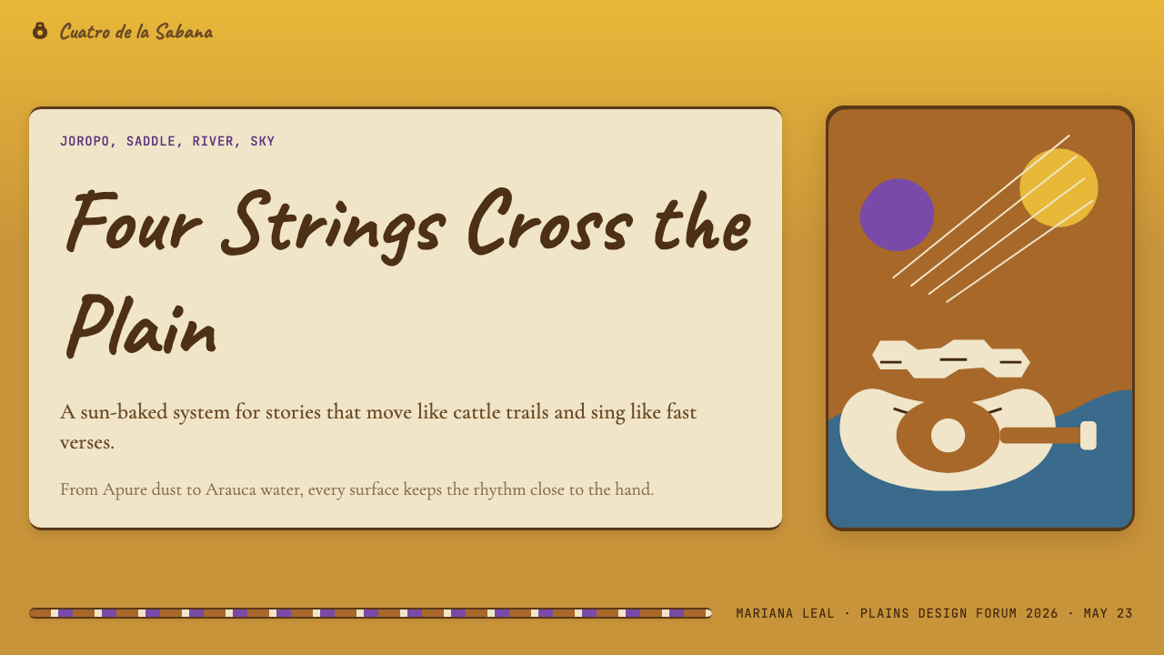
For presentation slides, the system rewards a horizontal, expansive composition. A cover slide uses the full ochre-to-cream gradient of the savannah: ochre or tobacco-brown at one edge, drifting toward cream. The title should be set in the hand-lettered script register at a scale that fills the space without cramping it — the way a corrido lyric fills a barn door. Content slides work best with a single warm background tone, generous margin, and the text hierarchy established purely through scale and weight. Avoid putting too many elements on a single slide; the aesthetic requires breathing room.
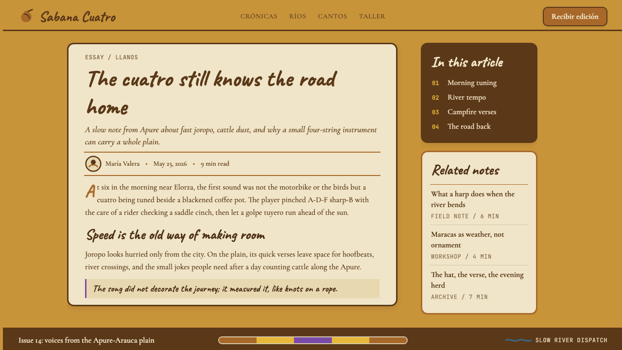
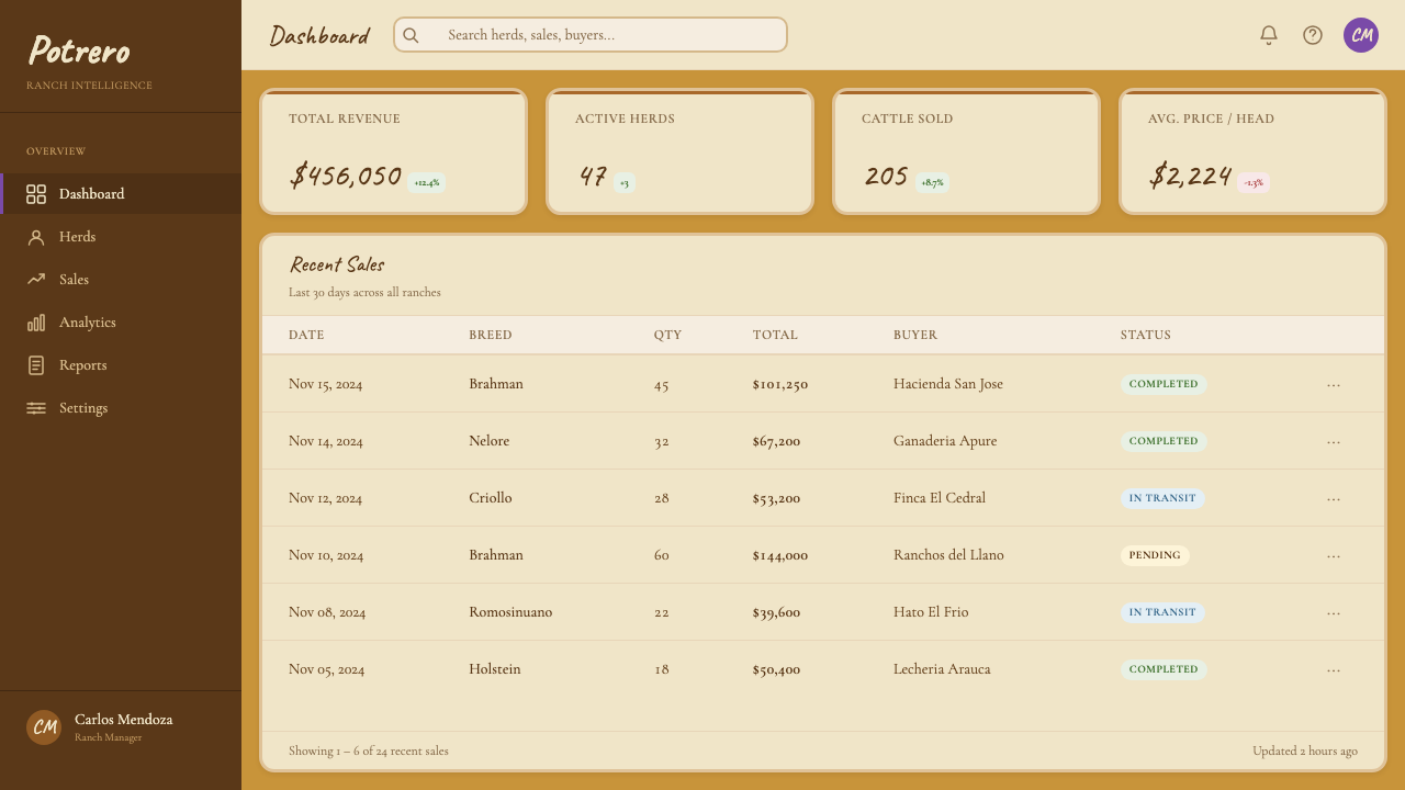
For web interfaces, the system suits editorial contexts, cultural institution sites, music and arts organizations, portfolio pages, and any application where atmosphere matters as much as efficiency. A dashboard built in this system would feel unusual — and that is intentional: the aesthetic resists the clinical. Navigation should use warm type on the ochre or cream ground; buttons in tobacco brown with cream text rather than generic grey or blue. Card components work well with the stitched border treatment, particularly for product listings or editorial cards where the frame reinforces the artisanal quality of the content.
For marketing and editorial work, the system's poster quality emerges most clearly. Full-width section breaks in ochre with cream text, punctuated by the amber accent, create a visual rhythm that is warm and unhurried. Pull-quotes set in the hand-lettered script face feel like lyrics. The jacaranda violet appears only at moments of genuine emphasis — a single tag, a highlighted statistic, a feature callout — never as a general decoration.
The most common mistake is mistaking warmth for casualness and adding too many decorative elements. The stitched borders, the textured grounds, and the handwritten headings are each doing specific cultural work; when all three appear simultaneously in every component, the effect becomes busy and the underlying elegance is lost. Apply the warmest and most textured elements where you need the most emotional emphasis, and let the rest of the interface breathe in the simpler ochre-and-cream register.
See the Venezuelan Cuatro Llanera (Plains Music) design system
Venezuelan Cuatro Llanera (Plains Music) — FAQ
Is this style only appropriate for Latin American brands or cultural contexts?
No — though cultural specificity is part of its strength, the system's values translate broadly. Warmth, craft, and durability are universal aspirations; the Llanos material vocabulary is simply a particularly vivid and coherent way to express them. The risk is not cultural inauthenticity but cultural shallowness: using the saddle-stitch border as pure decoration without understanding that it carries the weight of a whole working tradition. Used with genuine respect for its origins, the system works for any brand or product that wants to project grounded warmth — heritage food, independent publishing, artisan marketplaces, and arts organizations across many cultures.
How does this system handle dark-mode or high-contrast requirements?
The native register of this system is light and warm — it was not designed for dark environments. A dark inversion is possible but requires significant adaptation: the tobacco brown becomes the dominant background, ochre shifts to a lighter amber for legibility, and cream text provides contrast. The jacaranda violet and the amber accent both tend to perform well on dark grounds. The texture vocabulary — stitched borders, grain — still works in a dark version, but the overall mood shifts from sun-warmed to night-fire, which may or may not align with the product's intentions. High-contrast accessibility requirements should be tested carefully, as the ochre-and-cream pairing can struggle at text-on-background contrast thresholds.
What is joropo, and why does the musical form matter for the design system?
Joropo is the defining musical form of the Venezuelan and Colombian Llanos — a fast-moving triple-meter form with complex cross-rhythms between the cuatro, arpa llanera, and maracas. It has been declared UNESCO Intangible Cultural Heritage. For the design system, joropo matters because it captures the paradox at the heart of the aesthetic: something that moves fast and sounds complex but feels natural and unforced. A well-executed joropo sounds inevitable, like the landscape itself. That quality — complexity worn lightly, ornament earned through structure rather than added onto it — is what the design system aspires to. The hand-lettered typography should feel fluent, not labored; the stitched borders should feel like they hold something together, not like decoration for its own sake.
Can this system coexist with modern, minimal design conventions?
Yes, with discipline. The system's warmth and texture vocabulary are not incompatible with clean grid structures and restrained element counts — in fact, the textured elements land better when surrounded by generous empty space. The key is treating the textural and illustrative elements as accents rather than as the base register. A product that is fundamentally minimal in layout but uses the ochre ground color and stitched card borders will feel warm and distinctive without feeling busy. The system fails when every surface gets decorated — it succeeds when the decoration is reserved for the moments that need it.
Where does this style struggle most?
The system struggles in contexts that demand clinical precision, cool authority, or technological neutrality. A cybersecurity dashboard, a medical records application, a legal platform, or a fintech product will find the ochre warmth and stitched textures working against the aesthetic expectations of those domains. The style also becomes difficult at very small scales — the stitched border and textured ground need enough space to read as intentional rather than as noise. Mobile-first designs require careful simplification: the full vocabulary of the desktop system cannot compress into a small screen without losing the breathing room that makes it work.
Related design styles
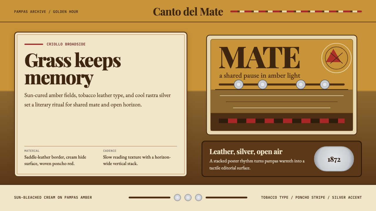 Argentine Gaucho (Pampas Mate Culture)Open grassland, printed warm. Amber fields, Playfair serif, and silver rastra…
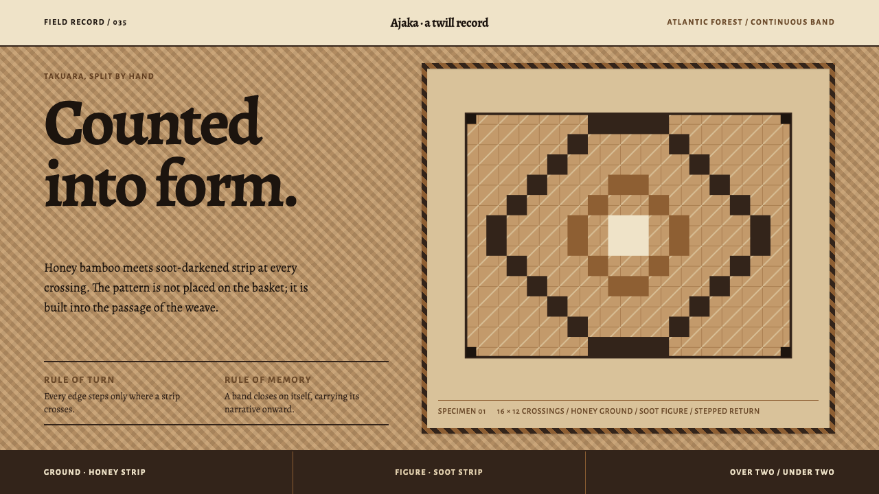 Guaraní Takuara BasketPattern is a record, not garnish. Honey bamboo and soot strips lock into a co…
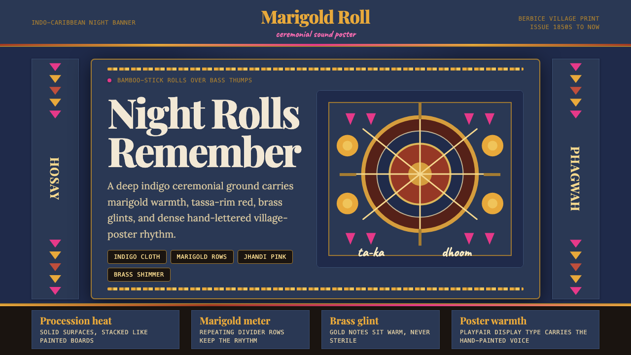 Guyanese Tassa DrumCeremony carries the beat. Indigo banners, Playfair type, and marigold rows g…
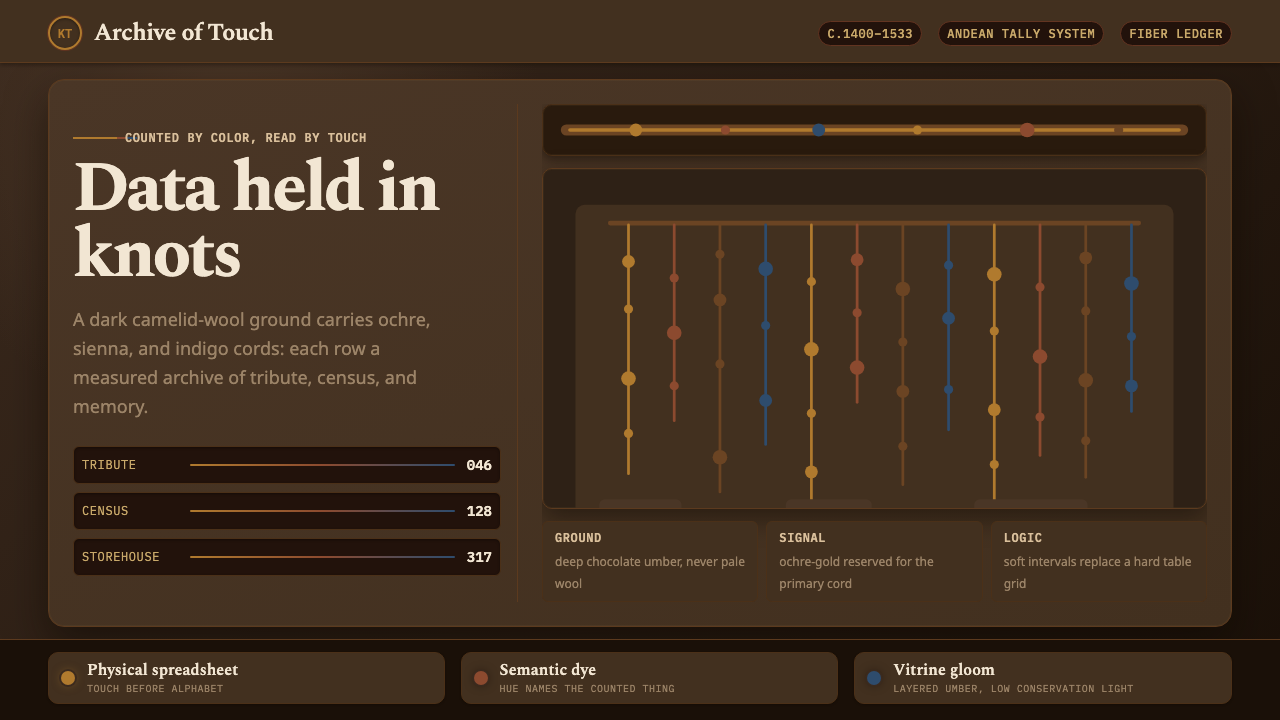 Inca Quipu Knot-CordData you can touch. Ochre cords and knots hang in chocolate-umber vitrine glo…
 Marajoara Amazon CeramicClay holds memory. Terracotta ground, pale engobe relief, and black slip lock…
 Moche Portrait VesselClay carries the likeness. Terracotta ground, red-brown slip, cream accents,…