What is Café Racer Ton-Up?
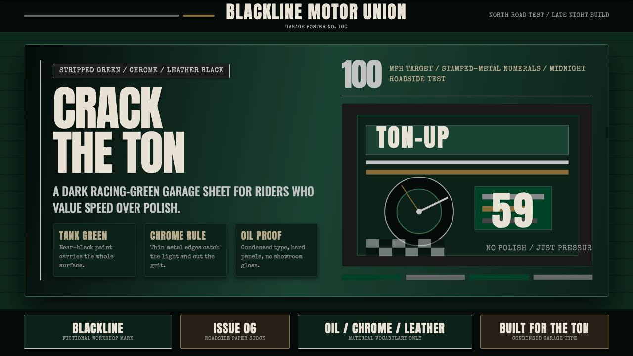
Café Racer Ton-Up is the visual grammar of Britain's rocker subculture — stripped motorcycles, near-black racing green, polished chrome, and condensed signpainter type distilled into a design system that tastes of engine oil and open road.
Café Racer Ton-Up in brief
Café Racer Ton-Up is a design style rooted in the late-1950s British rocker subculture, when young motorcyclists gathered at roadside cafés — most famously the Ace Cafe on London's North Circular Road — to race stripped, home-modified Nortons, Triumphs, and Tritons to the "ton": a hundred miles per hour. The aesthetic that emerged from this culture is radically functional and unselfconsciously masculine: deep petroleum greens and near-blacks, polished chrome accents, bare aluminium surfaces, the high contrast of riding leathers against pale road dust.
The visual system is defined by its materials rather than its colors alone. It is a garage aesthetic — raw, purposeful, stripped of anything that adds weight without adding performance. Typefaces are condensed and muscular, drawn from the tradition of hand-lettered workshop signage and motorcycle race programs. Surfaces feel worn and burnished rather than pristine. The overall effect is one of authentic use: things that have been ridden hard, maintained carefully, and improved incrementally.
As a design vocabulary, Café Racer Ton-Up occupies a specific register between industrial brutalism and heritage craft. It is darker and more tactile than Americana motorcycle culture, more subcultural and less commercial than classic British heritage branding, and far more grounded in mechanical reality than steampunk or retro-futurist aesthetics. Its emotional pitch is focused and unsentimental: the satisfaction of something engineered to work.
Where does Café Racer Ton-Up come from?
The café racer movement crystallized in the years immediately following the Second World War, when Britain's arterial road network — pre-motorway, lightly policed, and wide open on weekend nights — offered a testing ground for young men who had grown up around military machinery and had neither the money for sportscars nor the patience for genteel motoring clubs. The Ace Cafe, a 24-hour roadside diner on the North Circular Road in Stonebridge, northwest London, opened in 1938, survived wartime damage, and by the mid-1950s had become the unofficial headquarters of a subculture that would come to define an entire visual idiom.
The machines themselves were the primary aesthetic object. A true café racer was a standard British production motorcycle — most often a Norton Dominator, a Triumph Bonneville, or the hybrid Triton (Triumph engine, Norton Featherbed frame) — systematically lightened and tuned for straight-line speed. Fairings were removed or replaced with tiny fly screens; silencers were stripped; headlamps were taped with a single cross of insulating tape (so the glass would not shatter at high speed without the rider losing the lamp entirely). Paintwork was kept to a minimum: the British Racing Green of the fuel tank, often darkened almost to black, contrasted with unpainted aluminium and the dull gleam of exhaust pipes.
The "ton-up boys" — the subculture's own name for themselves — dressed to match their machines: black leather jackets, drainpipe jeans or leather trousers, engineer boots, and helmets worn low. The visual grammar of the subculture was established not by designers but by necessity and peer pressure. A café racer that looked wrong was one that weighed too much or was too slow. Everything decorative that remained served a purpose: chrome was functional (corrosion resistance, weight indication), pin-striping was a craftsman's signature, lettering on tanks and fairings was functional identification at speed.
The Ace Cafe closed in 1969 as motorway construction and changing youth culture drew the crowd elsewhere, but the visual vocabulary it had produced proved remarkably durable. The café racer aesthetic was revived in the 1990s by a new generation of custom builders, spread globally through enthusiast publications and later the internet, and has since been adopted by fashion, advertising, and branding in contexts far removed from motorcycles — wherever a brand wants to communicate focused performance, working-class authenticity, and the specific dignity of things built to be used.
What defines the Café Racer Ton-Up look?
Color
The palette is built around a deep, petroleum-tinged green that reads almost black in most lighting conditions — historically the British Racing Green of competition fuel tanks, darkened further by the pragmatics of garage culture. Against this ground: the cold brightness of polished chrome, the warm grey of bare aluminium, and the dead black of rubber and riding leather. Accent color is rare and purposeful — a stripe of cream or ivory on a tank, a red detail on a race number plate. The palette never feels chosen; it feels accumulated through use.
Typography
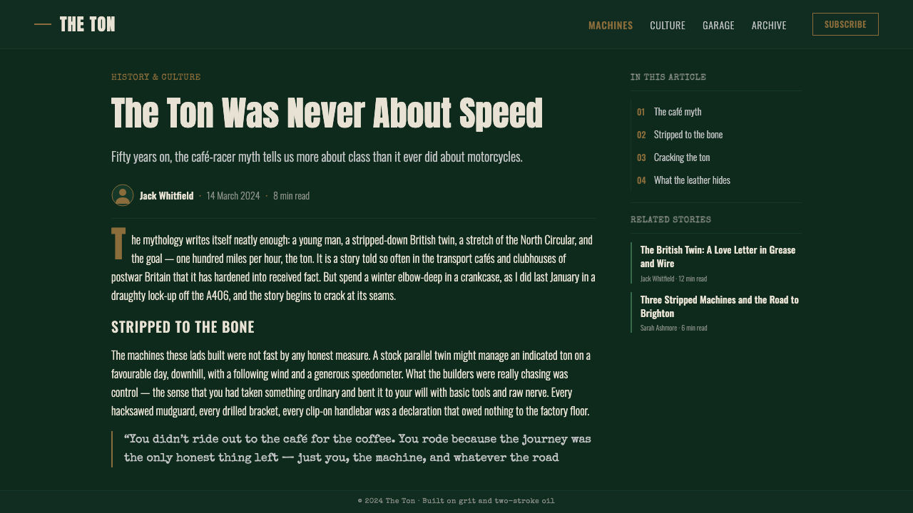
Lettering in café racer design comes from two traditions: the condensed, sign-painted display type of workshop boards and race programs, and the stencil or transfer lettering of factory identification. Both traditions favor tall, narrow letterforms that read quickly at speed and fit within the constrained horizontal space of a fuel tank or fairing panel. The result is type that feels mechanical and purposeful — not delicate, not expressive in the conventional sense, but legible from a distance and cut cleanly from its background.
Texture and Surface
Surface quality is central to the café racer aesthetic in a way that separates it from most design movements. Worn leather, brushed aluminium, engine-turned metal, knurled grips, aged rubber — these textures communicate history and use. In two-dimensional design, this translates to treatments that suggest material reality: grain, scuff, patina. A fully pristine application of this style reads as inauthentic; some controlled degradation signals that the thing being designed has been tested against the world.
Line Weight and Chrome Detail
Chrome was the primary decorative material on a café racer, but it was always structural chrome: the fork legs, the exhaust headers, the handlebars, the rim strips. In design terms this translates to a specific use of thin, high-contrast rules and outlines — fine metallic lines that define edges without filling them, separating dark grounds from darker elements. The line is never decorative in isolation; it always performs an edge, a boundary, a speed stripe.
Composition and Speed Direction
Café racer visual culture inherited from race programs and motorcycle advertising a strong horizontal bias. Speed communicates in the horizontal axis; a composition that leans right or streams leftward from a central anchor reads as motion. Diagonal elements and low sight lines — borrowed from the visual perspective of a rider tucked behind a fairing — also appear frequently. The composition feels aerodynamic: things that resist the direction of travel are removed.
Restraint in Ornament
Like Bauhaus, café racer design operates under a principle of radical reduction — but the motivation is mechanical rather than ideological. On a café racer, weight is the enemy of performance; ornament that adds weight without adding speed is removed. In design, this principle produces a visual austerity that is specific in its sparseness: there is always exactly the amount of visual information needed to identify, to instruct, or to signal provenance. Nothing more.
Mood and Atmosphere
The overall atmosphere of the style is nocturnal and focused. The deep, dark grounds evoke late-night road runs; the chrome and pale accents read as light picking out detail in darkness. There is no softness, no warmth in the conventional decorative sense, and no invitation to linger. The visual pitch is: ready to go. This mood makes the style immediately legible in contexts that want to signal readiness, capability, and the particular appeal of things that work without needing to announce themselves.
Who shaped Café Racer Ton-Up?
The ton-up boys were not a formal organization but a recognizable social type — young working-class British men who customized production motorcycles for straight-line speed and gathered at roadside cafés to race and socialize. As a collective, they established the visual standards of the café racer: what a properly prepared machine should look like, how a rider should dress, what the lettering on a tank should say. The aesthetic emerged from peer-to-peer evaluation rather than professional design, which is why it has the particular authenticity that brand-designed subcultural aesthetics rarely achieve.
The Ace Cafe on Stonebridge's North Circular Road was the spiritual home of the café racer movement. Open continuously from 1938 through 1969, it was a 24-hour truck stop and diner that became, by accident of location and era, the primary gathering point for London's motorcycle subculture. The café's own visual identity — hand-lettered signage, utilitarian fittings, the juxtaposition of commercial catering and high-speed machines — contributed directly to the aesthetic language of the style. The Ace reopened as a motorcycle venue in 1997 and has since become a pilgrimage site, demonstrating how strongly physical places can anchor a design tradition.
Norton was the British manufacturer most closely associated with the café racer aesthetic, both because of the handling qualities of its Featherbed frame — considered the finest production motorcycle chassis of its era — and because of the company's racing heritage at events like the Isle of Man TT. The visual language of Norton's competition machines — deep green, chrome, minimal lettering — became the template against which café racer builders measured their own machines. Norton's factory graphics, race team colors, and the functional design of its components were the original reference material for the style.
Triumph was the other dominant machine in café racer culture, and its Bonneville T120 became the iconic production base for café racer customization. Triumph's visual identity — the distinctive logo, the tank striping, the chrome-and-black engine finish — contributed a second register to the café racer palette: where Norton was austere and dark, Triumph allowed slightly more ornament, the thin cream or silver stripe across the tank adding a graphic precision that influenced how custom builders thought about line and proportion. The tension between Norton's severity and Triumph's relative elegance maps onto a persistent visual dialogue within the style.
The Triton — a motorcycle combining a Triumph engine with a Norton Featherbed frame — was the apotheosis of café racer philosophy: take the best available components, discard the rest, build the result to be faster and lighter than anything you can buy. As an object, the Triton had no manufacturer, no factory finish, and no official visual identity; its appearance was determined entirely by the builder's judgment. This made it the purest expression of the style's values, and the closest thing the café racer movement had to a canonical form. The Triton's visual logic — the dark tank, the bright engine cases, the minimal chrome — set the vocabulary that later design applications would borrow.
How do you use Café Racer Ton-Up today?
Café Racer Ton-Up is a style that depends on tonal range and material suggestion more than color variety. The primary challenge in applying it is maintaining the dark, weighted atmosphere of the original while keeping the composition legible and the hierarchy clear. Get the deep ground right first — a very dark, slightly green-shifted near-black that reads as rich rather than flat — and everything else will work against it naturally.
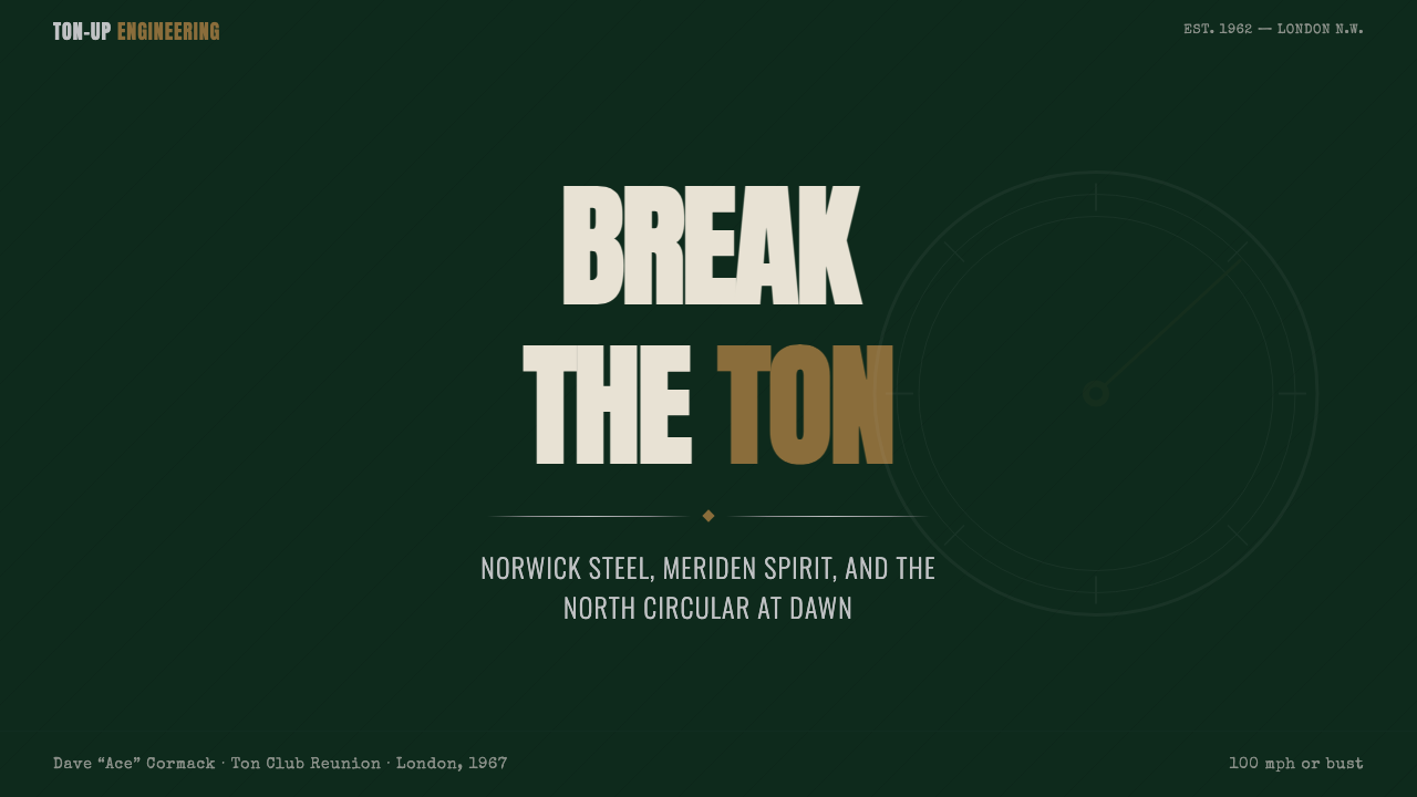
For presentation slides, this style excels on covers that need to communicate authority and precision without formality. A cover built in this register uses a dark ground, a single bold condensed typeface for the main title, and one high-contrast horizontal stripe or rule to ground the composition — evoking the speed stripe of a racing tank. Content slides should be minimal: white or very pale type on dark grounds, strong typographic hierarchy using a condensed display face for section heads and a clean body face for supporting text. Avoid the temptation to add chrome effects digitally; the material quality should come from restraint and contrast, not simulation.
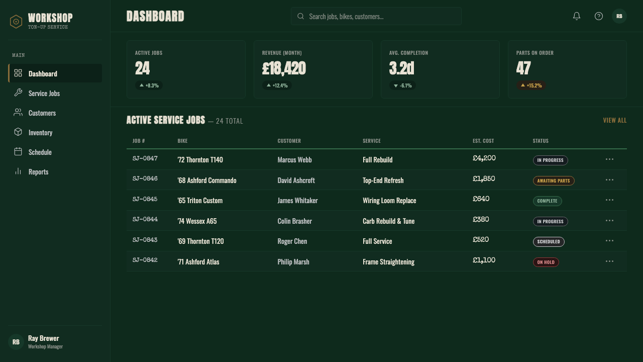
For web UI, the style is well-suited to dark-mode dashboards, product pages for hardware or tools, and any interface where the user base identifies with craft, performance, or mechanical skill. The implementation: a very dark ground, pale or white primary text, chrome-influenced thin rules as dividers, condensed type in headings, and a near-absence of decorative elements. Navigation should be sparse and typographic. Interactive states can use a subtle warm highlight — the pale amber of instrument lighting — as a single accent against the predominantly cool-dark ground.
For editorial and marketing work, the style supports full-bleed dark layouts with high-contrast typography. A marketing page in this register alternates between near-black sections with pale type and pale sections with dark type, using a single thin rule or speed stripe to carry the eye. Photography, where used, should feel like documentation rather than staging: candid, high-contrast, with hard shadows and no retouching softness. Illustration should tend toward technical drawing or stencil work rather than anything painterly.
The most common mistake when applying this style is adding false patina digitally — grunge textures, spray-paint effects, artificial lens flare — in an attempt to manufacture authenticity. Real café racer design is austere and precise; its authenticity comes from the discipline of removing, not from adding visual noise. A second common error is extending the chrome accent too broadly, turning it from a functional highlight into a dominant visual motif that reads as kitsch rather than mechanical. The chrome should be spare: one or two fine bright lines, not a palette of metallic fills.
Café Racer Ton-Up — FAQ
How is Café Racer Ton-Up different from general motorcycle or Americana biker aesthetics?
The most important distinction is geographic and class-based. American biker culture — Harley-Davidson, chopper aesthetics, Route 66 imagery — tends toward large-displacement chrome excess, patriotic color, and a certain theatrical quality. Café racer culture is specifically British, specifically working-class, and specifically anti-theatrical. The machines are smaller, lighter, and built for speed rather than show; the color is darker and less celebratory; the typography is workshop-functional rather than Wild West display. Where American biker design shouts, British café racer design communicates through controlled restraint.
Can this style work in a light or white-ground application?
It can, but it requires significant adaptation and loses some of what makes it distinctive. The nocturnal, focused quality of the style depends heavily on the deep ground. On a light background, the style reduces to its typographic and compositional elements: condensed type, horizontal speed orientation, minimal decoration, thin rules. The result is still functional and has a clean graphic quality, but it reads more as a heritage-industrial or modernist style than as a specifically café racer aesthetic. If you need a light application, keep the deep green-black as a dominant accent block — a header bar, a band across the composition — to anchor the palette.
How should photography be treated in this style?
Photography in café racer design should feel documentary and immediate rather than staged or polished. The reference is the snapshot aesthetic of enthusiast photographs: shot in available light, often from low angles or with the horizon tilted, with hard shadows and direct flash common. In applied design, this translates to high-contrast treatment — shadows crushed toward black, highlights kept bright, no softening filters. Images work best cropped tightly and bleed off the edge rather than sitting centered in frames. Color photography can be desaturated toward a warm or cool monochrome to keep it within the palette; full-color photography that reads as lush or saturated will fight the style's austerity.
What contexts is this style poorly suited to?
The style is poorly suited to contexts that require warmth, approachability, or inclusivity as primary values. Its emotional register is cool, focused, and masculine in a specific historical sense — these qualities work for products and brands that want to signal precision, mechanical competence, and a certain earned toughness, but they actively work against applications in consumer wellness, children's products, hospitality, lifestyle brands aimed at broad demographics, or anything that should feel inviting and soft. The style also struggles in very formal or corporate contexts, where its working-class subcultural roots read as edgy rather than authoritative.
How do I keep the style from feeling like costume or retro pastiche?
The distinction between authentic application and costume lies in whether the style's logic is doing real work or just providing visual flavor. A café racer design is authentic when the typography is condensed because condensed type serves the composition, not because condensed type looks retro; when the surface feels worn because a sense of material history supports the brand's positioning, not because grungy textures signal edginess. Ask, for each element you reach for from the vocabulary: what function is this performing beyond its historical reference? If the honest answer is 'none,' the element is costume. Rigorous selection and restraint — the same principles that produced the original style — are the surest path to using it without parody.
Related design styles
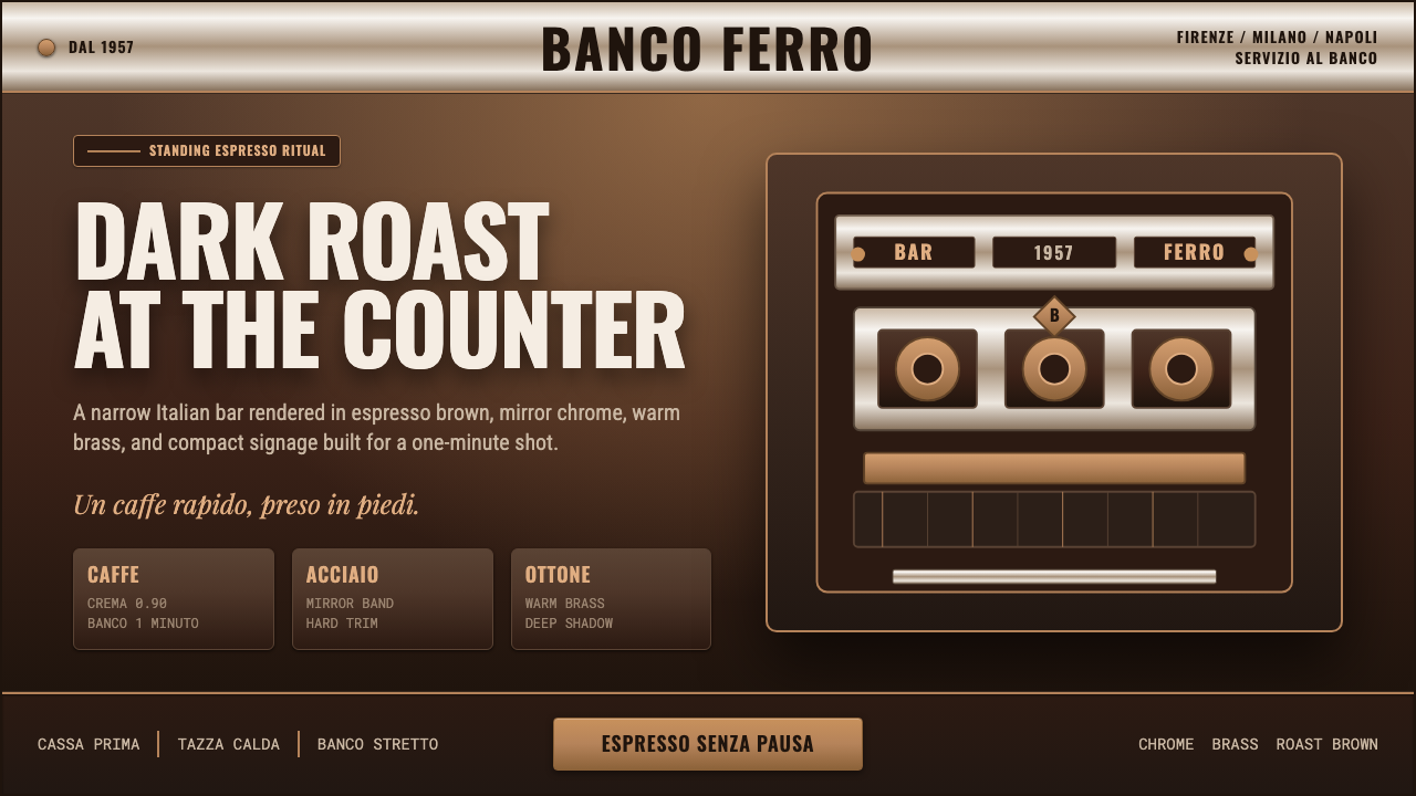 Italian Espresso BarDark roast, hard metal. Brass lines and Oswald signage slice a deep espresso…
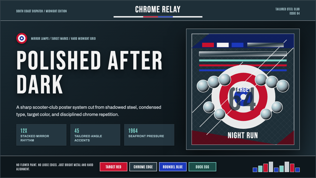 Mod Scooter ChromeSharp chrome discipline. Steel ground, roundel targets, condensed type, mirro…
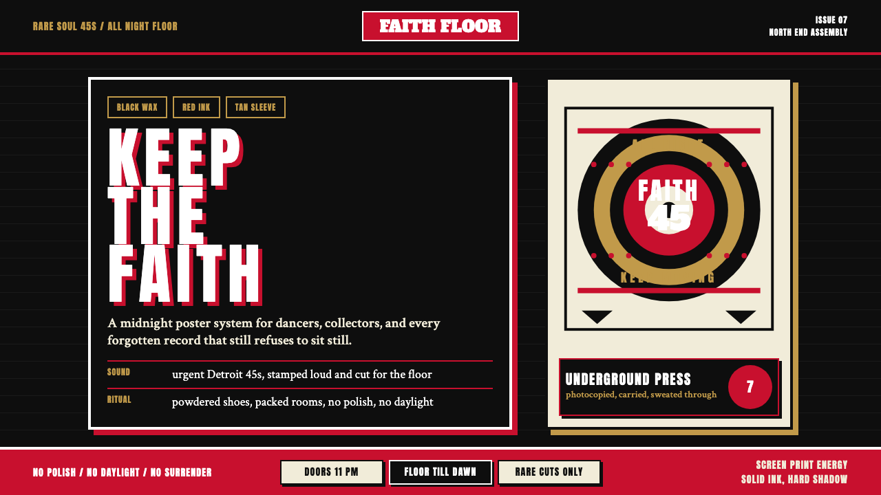 Northern Soul Wigan (1970)Underground urgency. Black ground, fist-red type, and tan vinyl rings hit lik…
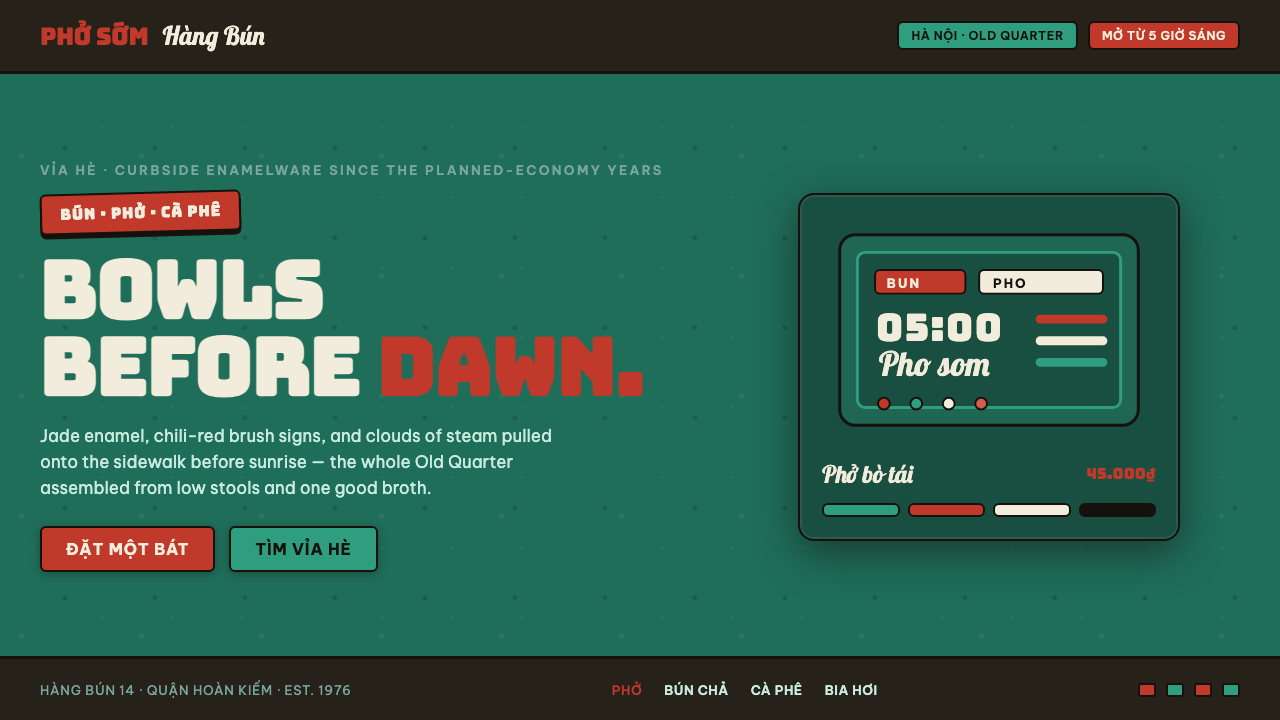 Phở Street-Stall EnamelHanoi's curbside noodle stall, systematized. Jade enamel ground, chili-red br…
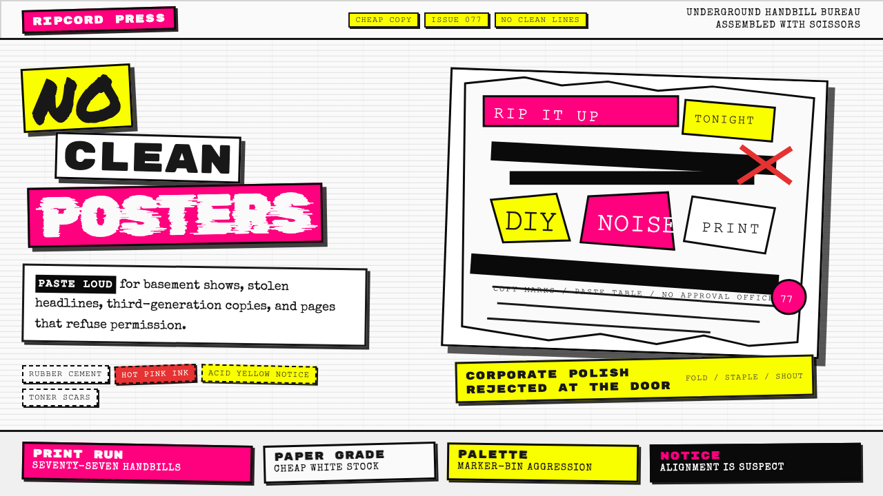 Punk Xerox 1977Anti-design shouts. Hot pink and acid yellow collide with ransom type on Xero…
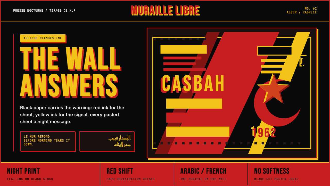 Algerian Casbah Poster (1954–1962)Every surface is a manifesto. Blood red, warning yellow, and stencil type hit…