What is Squadron Patch?
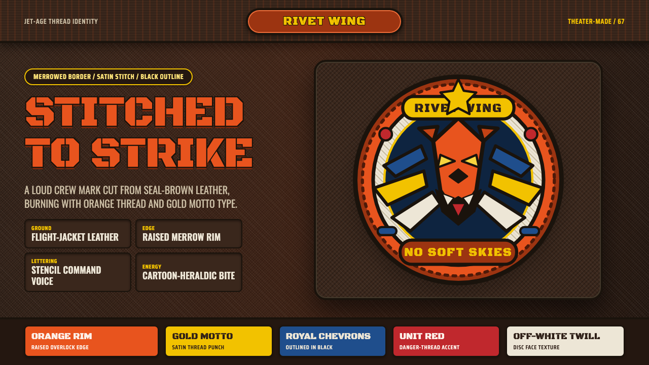
The USAF squadron patch is not a logo — it is a battle flag shrunk to a jacket sleeve: embroidered swagger stitched into twill, snarling mascots, and saturated color that could be read across a flight-line.
Squadron Patch in brief
The squadron patch aesthetic is rooted in embroidered military insignia: circular twill discs with merrowed overlock borders, bearing cartoon predators, spread wings, or grinning demons, stitched in satin-stitch thread onto the leather of A-2 horsehide bombers or sage MA-1 flight jackets. Every element is hand-crafted in character — irregular thread texture, bold black outline, and rich saturated fills that no flat digital vector could replicate.
Where corporate heraldry aims for permanence and gravitas, the squadron patch tradition celebrates personality and unit pride with deliberate swagger. Mascots snarl, wink, or breathe fire. Lettering arcs around the border in chunky block type or tight stencil capitals. The overall composition is dense, icon-like, and designed for a single reading at arm's length — not a branding exercise, but a declaration of tribal identity.
The visual system rests on three craft materials: leather ground (warm, tactile, aging gracefully), thread (textured, slightly raised, catching light differently than print), and the merrowed edge (a looped overlock border that defines the patch as a distinct object sewn onto a larger surface). Digital interpretations of this style honor these craft origins by simulating thread texture, imperfect stitch lines, and the slight dimensional quality of embroidered lettering against a leather-toned background.
Where does Squadron Patch come from?
Squadron insignia in the American military trace their roots to the First World War, when French and American aviators began painting cartoon mascots on their aircraft as a form of psychological armor and unit solidarity. The tradition intensified in the Second World War, when the sheer scale of aviation expansion — hundreds of new squadrons activated in months — created demand for distinctive unit identity. Walt Disney Studios contributed designs for over 1,200 military insignia during the war years, lending professional cartoon craft to a tradition that had previously relied on improvised unit artists. Disney's work for units including the Flying Tigers and various bomber groups established the visual grammar: bold outlines, snarling expressions, primary and secondary hues applied in flat satin-stitch fills.
The physical medium of the embroidered patch on flight-jacket leather emerged in parallel with the A-2 leather flight jacket itself, which became standard USAAF issue in the 1930s and remained iconic through the Second World War and into the Korean and Vietnam eras. The combination of dark seal-brown horsehide and the circular embroidered disc created a visual contrast that became iconic: the patch as a jewel on leather. Theater-made patches — produced by local craftspeople in Japan, the Philippines, Thailand, and other countries where American units were stationed — introduced regional embroidery techniques and hand-sewn charm that machine-produced stateside patches rarely matched. These overseas pieces often feature slightly irregular proportions, hand-drawn lettering, and silk thread colorways specific to local suppliers.
The jet age of the 1950s and Cold War 1960s refined and intensified the tradition. As squadrons acquired individual aircraft identities — the F-86 Sabre, F-100 Super Sabre, F-4 Phantom — their patches became equally specific, often incorporating the aircraft's silhouette into the mascot composition. Vietnam-era patches pushed the tradition toward its most expressive extreme: ultra-saturated colors, elaborate multi-element compositions, and an unapologetic irreverence that reflected the cultural tensions of the period. Patches from this era are the most collected today and represent the aesthetic pinnacle of the tradition.
After the transition from leather A-2 jackets to nylon MA-1 flight jackets and later softshell variants, the patch tradition adapted without losing its essential character. Contemporary collectors and designers return to the 1950s–1970s peak era as the canonical reference, and the aesthetic has influenced streetwear, varsity design, workwear branding, and digital illustration styles far beyond its military origins.
What defines the Squadron Patch look?
Shape and Boundary
The canonical patch is circular — a deliberate choice that differentiates it from rectangular rank insignia and gives it the quality of a seal or medallion. The merrowed border, a tightly looped overlock stitch in a contrasting color, defines the edge with physical authority: not a printed line but a raised thread boundary. Oval and shield variations exist, but the circle dominates because it reads as complete and iconic at small scale.
Color Saturation and Contrast
Patch color is maximally saturated and high-contrast by craft necessity: thread dyes in the mid-twentieth century were vivid, and the embroidered medium — with its slight texture — absorbs more light than flat print, requiring stronger hues to read clearly at a distance. The typical palette combines a deep background (navy, black, forest green, or seal brown) with bright fills for the mascot and border elements. Black thread outlines everything, ensuring legibility regardless of the complexity of the mascot composition.
The Mascot
The mascot is the soul of the patch and its most variable element. Panthers, tigers, eagles, demons, sharks, and anthropomorphic weapons all appear, rendered in a cartoon style that borrows from 1940s animation — exaggerated expressions, thick outlines, dynamic poses. The mascot is never naturalistic: it snarls, lunges, or grins. This cartoon irreverence is not accidental; it was a psychological tool for transforming fear and danger into something owned and controllable by the unit.
Typography and Lettering
Patch lettering is bold, arched along the top and bottom borders, and set in block capitals or stencil-style faces with minimal kerning variation. The letterforms are designed for legibility in thread — simplified, with generous stroke weight — and the all-caps convention is both traditional and practical. Unit names and nicknames appear in the border arc; mission mottos, when included, often run across the lower arc in a contrasting color. Condensed display lettering fits more characters into the arc without losing clarity.
Thread Texture and Material Ground
The defining physical quality of the patch aesthetic is thread texture: every filled area shows the direction of the satin stitch, creating a subtle sheen and directional grain that flat color can never replicate. In digital applications that draw from this tradition, this texture is the most critical detail to honor — whether through actual textile scan overlays, procedural noise that mimics thread direction, or hand-drawn stroke fills. The leather ground adds warmth and age, and its grain reads as an organic counterpoint to the embroidery's regularity.
Composition Density
A well-designed patch is dense without being cluttered — every part of the circular field is used, but the eye still lands on the mascot first. Foreground, middle ground, and background layers are stacked: the leather or colored background ground, a secondary environmental element (clouds, stars, lightning bolts), the mascot in the focal plane, and the border lettering as the outermost frame. This layering is managed through scale contrast and outline weight rather than spatial depth or perspective.
Imperfection as Authenticity
Hand-embroidered patches carry visible imperfection — slightly uneven letter spacing, thread pulls at curves, minor color bleeds at boundaries — and this imperfection is not a flaw but a quality mark. Theater-made patches from Japan or the Philippines, often regarded as the most desirable by collectors, are characterized precisely by this hand-made character: proportions that drift slightly, mascots with more expressive line quality than their stateside machine-stitched equivalents. Any digital application of this style should lean into controlled imperfection rather than polished perfection.

Who shaped Squadron Patch?
Between 1941 and 1945, Disney's commercial art department produced insignia designs for over 1,200 military units at no charge, contributing work for the Army, Navy, Marine Corps, Coast Guard, and Allied forces. Disney artists translated unit nicknames and mission characteristics into cartoon mascots with the same animation craft used in theatrical shorts, establishing the visual standard — bold outlines, expressive faces, dynamic poses — that military embroidery shops then reproduced in thread. The legacy of this wartime work is visible in every snarling panther and grinning demon that followed.
The American Volunteer Group — the Flying Tigers — active in China from 1941, developed some of the most iconic early squadron patches. The famous shark-mouth nose art on their P-40s and the Bengal tiger patch design became templates for the fierce-mascot tradition. Unit artists within the group, working without formal design training, produced imagery that was rawer and more expressive than anything a commercial studio would sanction — establishing that authenticity in this tradition came from personality rather than polish.
During the Korean War and especially the Vietnam era, American airmen stationed in Japan had their patches made by local embroidery workshops in cities like Yokosuka and Yokota. These shops developed a distinctive style — slightly exaggerated proportions, silk thread with a richer sheen than American wool, and hand-drawn mascot interpretations that differed subtly from the original designs. 'Yokosuka-made' patches are a recognized collector category, prized for their particular craft character and the way regional craft tradition inflected American military heraldry.
Not a person but an object: the USAAF's official leather flight jacket, issued from 1931 and phased out of issue in 1943 but worn informally throughout the war and beyond. The A-2's seal-brown horsehide provided the canonical ground for squadron patches, and the combination of dark leather and embroidered disc became so identified with American military aviation that it remains the first visual association for the entire patch tradition. Its continued production by specialty manufacturers and its presence in uniform collections worldwide ensure that the leather-and-embroidery aesthetic maintains its cultural legibility.
The patch tradition reached its most expressive peak during the Vietnam War, partly because the conflict's cultural tensions encouraged irreverence and dark humor in unit culture. Individual squadron members with artistic talent produced patch designs that pushed beyond the established conventions — more elaborate compositions, more explicit references to the mission environment (Southeast Asian imagery, aircraft types, anti-aircraft threats), and a graphic boldness that reflected the era's broader visual culture. These pieces are the most collected in the tradition and set the aesthetic ceiling that later designers reference.
How do you use Squadron Patch today?
The squadron patch aesthetic is most directly applicable where you need to communicate unit identity, earned membership, or craft authenticity. It is a style that says 'this was made by people who do this together' — which makes it powerful for sports teams, clubs, trade organizations, product lines with heritage stories, and event branding that wants to feel like a reunion rather than a launch.
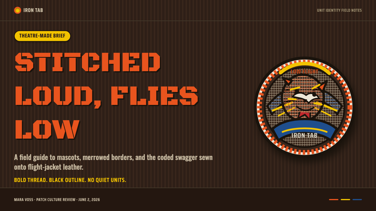
For presentation slides, the patch style works best on title and section-break slides rather than data-heavy content slides. A title slide might feature a large central mascot illustration on a dark leather-textured background with arced lettering above and below — functioning like a patch writ large. Section dividers can use smaller patch-format icons. Data slides should pull back from the full treatment: a dark background with saturated accent color for chart highlights, keeping the decorative texture for framing elements only, ensures that information remains readable without competing against the illustration complexity.
For web and app UI, the style is best deployed as accent and identity rather than as a full-page system. A product or brand that has adopted the patch aesthetic might use it in profile badge components, achievement unlocks, team or tier identifiers, and hero banners — while keeping core UI (forms, navigation, body text) in a neutral system that does not fight the patch's visual density. Dashboards with this aesthetic work well when the dark background and saturated accent color are used structurally, and the mascot or patch element appears as a trophy or achievement marker.
For editorial and marketing applications, the style excels at event posters, merchandise graphics, and brand heritage storytelling. A heritage campaign for a craft brand, a festival identity, or a limited-edition product line benefits from the patch's combination of human hand quality, bold color, and dense composition. The circular format works exceptionally well for sticker, pin, and physical merch applications, where the patch's original function as a sewn object translates naturally to these close analog formats.
The most common mistake with this style is applying it without its defining craft quality — treating it as flat vector illustration with a circular frame and calling it a patch. The essential character comes from simulated or actual thread texture, the slightly irregular quality of the mascot's line, and the warm ground color. A patch-style design that is too clean, too geometrically precise, or too symmetrical loses the hand-made authenticity that gives the tradition its emotional weight. Equally, over-distressing the texture into illegibility destroys the primary communication function. The balance point is: clearly made, clearly imperfect.
Squadron Patch — FAQ
Is this style only appropriate for military or aviation contexts?
Not at all. The patch tradition has migrated broadly into streetwear, varsity culture, craft brewing, music festivals, motorcycle clubs, and sports branding. What it communicates — earned membership, craft pride, unit solidarity — transfers readily to any context where belonging and shared identity are values. The military origin is the ancestry, not the constraint. A craft coffee roaster, a running crew, or an indie game studio can all use the patch aesthetic without any military reference in the content.
How do I distinguish authentic patch aesthetic from generic badge design?
The critical differentiators are craft texture and mascot character. Generic badge design uses flat fills, clean vector outlines, and a symmetrical composition with a simple icon. Authentic patch aesthetic has simulated or actual thread texture in the fills, a mascot with expressive personality (not a neutral icon), a merrowed border rather than a simple outline, and a composition that is dense but not symmetrical. The typography also distinguishes: patch lettering is arced, bold, all-caps, and usually in a condensed block or stencil face — not a clean geometric sans or a script.
Can this style work in a light or white background context?
With care. The patch tradition is fundamentally a dark-ground aesthetic — the deep leather or navy background is what makes the saturated colors pop and the merrowed border read as a distinct edge. On a white background, the circular patch element can work as a contained component (think a sticker or a stamp-like element within a clean editorial layout), but the surrounding context should be clean and spare so the patch carries all the visual weight. Full-page white-background layouts in this style tend to flatten the dimensionality that defines it. If light ground is required, a warm off-white or parchment tone that evokes aged paper or linen does more to honor the tradition than pure white.
How should I handle mascots in this style if I am not an illustrator?
The mascot is the hardest element to fake in this style — you cannot substitute a stock icon or a clean geometric shape and retain the tradition's character. Practical options: commission a hand-drawn mascot from an illustrator with animation or cartoon art experience; use vintage or public-domain military insignia as reference or direct inspiration (the visual style of wartime patches is well-documented); or lean into abstraction — a bold typography-only composition with the patch's circular frame and border lettering can carry the aesthetic without requiring a figurative mascot at all. Many streetwear and craft brands succeed with typographic patches.
What makes theater-made patches more valuable to collectors than machine-produced ones?
Primarily because of what imperfection signals in this tradition. Machine-produced patches from stateside manufacturers in the 1950s and 1960s were technically more consistent — regular stitch density, standardized proportions, predictable color reproduction. Theater-made pieces from Japan, the Philippines, and Thailand were produced by local workshops using local materials, local interpretations of the design brief, and hand-guided machines or fully hand-embroidered techniques. The slight irregularities that result — a mascot whose eye sits slightly off-center, thread colors that differ from the original specification, letters that space unevenly — are evidence of human craft at a specific place and time. This unrepeatable particularity is what collectors prize, and it is exactly what makes the tradition's aesthetic so resistant to clean digital reproduction.
Related design styles
 Las Vegas Neon (1960)Night refuses to dim. Hot-pink tubes, cyan bloom and amber bulbs turn black i…
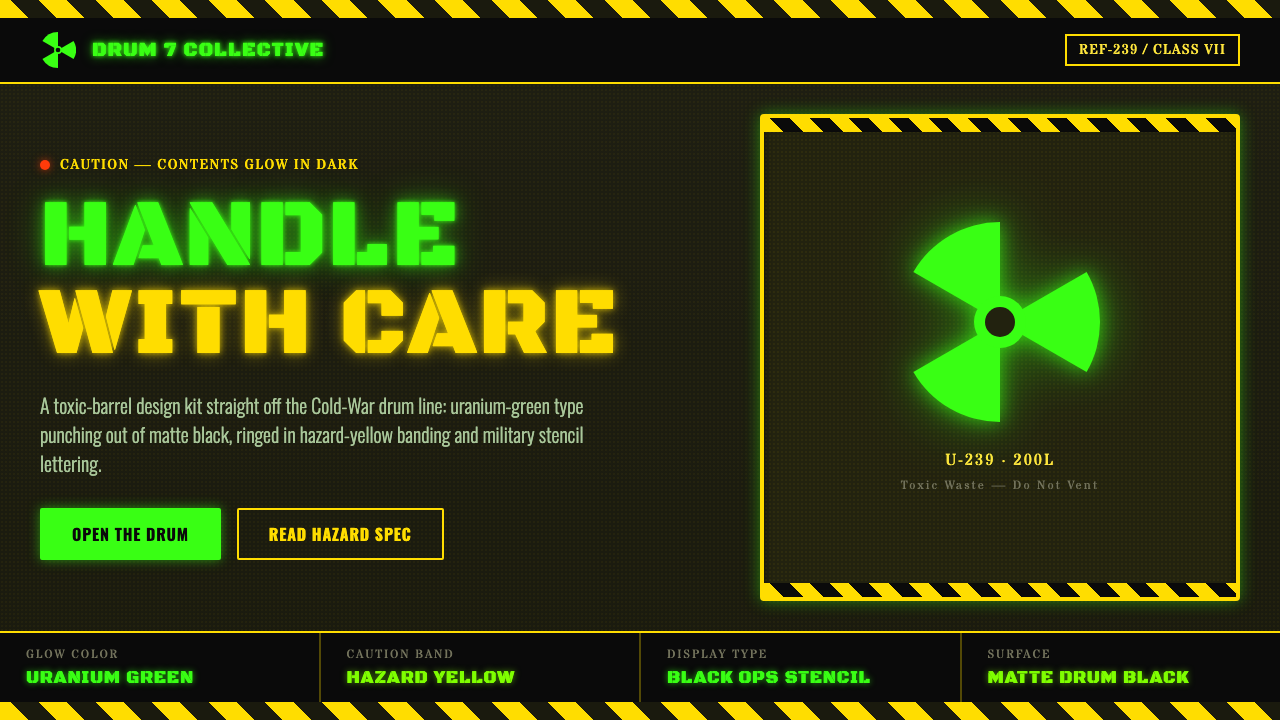 Radioactive Trefoil SignToxic-barrel glow, not the official sign. Neon-green trefoils on matte-black…
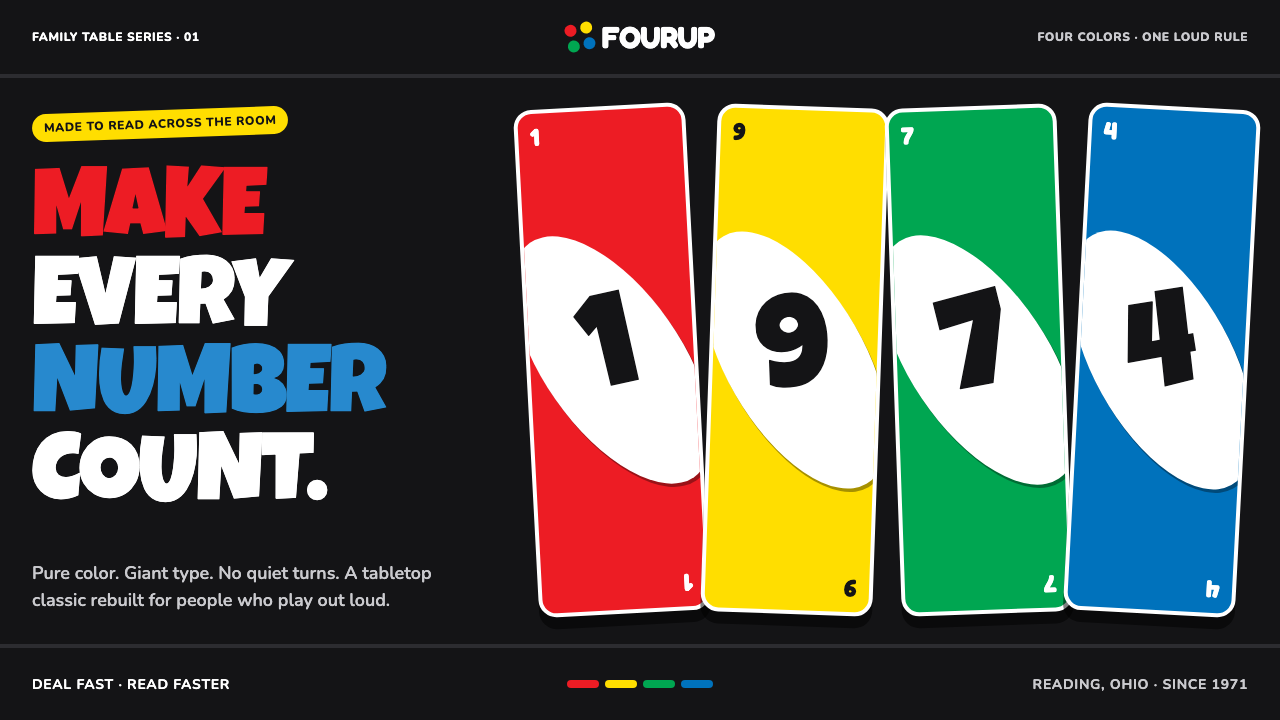 UNO (1971)Every number shouts. Four pure primaries punch through black with tilted whit…
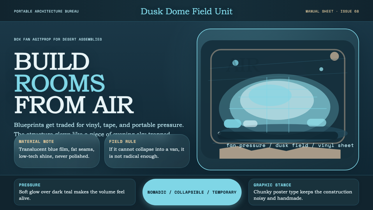 Ant Farm InflatablesTemporary architecture glows. Vinyl-blue domes swell over dark desert teal.
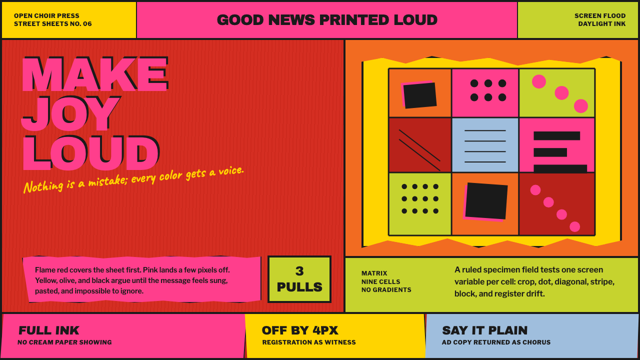 Corita Kent SerigraphJoy printed at full volume. Flame red, hot pink, and misregistered type flood…
 Crayola (1903)Color never whispers. Golden yellow, a green slash, and waxy swatches make ev…