Design style guide设计风格指南
What is Rude Boy Jamaica Ska (1960)?什么是 Rude Boy Jamaica Ska (1960)?
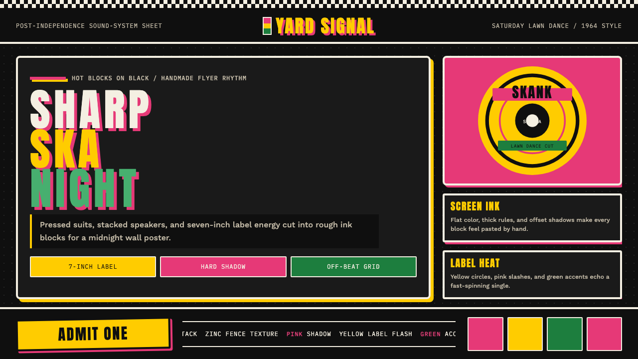
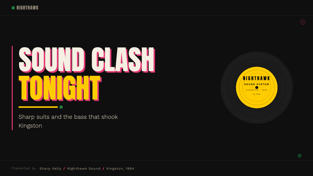
Rude Boy style is Kingston street energy turned graphic — black grounds, tropical color blocks, checker trim, and hand-lettered type that feel wheat-pasted to a Trench Town wall at midnight.无赖少年风格是金斯敦街头能量的视觉转化——黑色底色、热带色块、棋盘饰边,以及仿佛午夜贴上特伦奇敦墙头的手绘大字。
Rude Boy Jamaica Ska (1960) in briefRude Boy Jamaica Ska (1960) 速览
Rude Boy Jamaica Ska (1960) is a design aesthetic rooted in the visual culture of post-independence Kingston, Jamaica. It draws directly from the hand-painted sound-system signage, riso-printed dance-hall flyers, and seven-inch record labels that defined the street life of Trench Town and Orange Street in the early 1960s. The style pairs a deep black field with punchy color blocks — tropical yellow, hot pink, and occasionally orange — applied with the blunt confidence of someone who has a spray can and something to say.牙买加无赖少年斯卡风(1960)是一种深植于独立后金斯敦视觉文化的设计美学。它直接取材于特伦奇敦与橘子街1960年代初期街头生活的手绘音响系统招牌、riso印刷舞厅传单和七寸黑胶标签。这种风格将深沉的黑色底面与热带黄、火热粉、偶尔点缀的橙色色块配对,以一种手持喷漆罐、有话要说的人特有的直白自信施展。
The graphic vocabulary is deliberately rough and working-class in origin. Halftone dot patterns, ink mottle, hard-offset drop shadows, and chunky hand-lettered headline type are not errors to be corrected but marks of authenticity to be preserved. Circular label graphics echo the Studio One and Treasure Isle 45s that powered the ska sound-system parties, and checker patterns — borrowed from the sharp two-tone suits worn by the original Rude Boys — appear as borders, dividers, and decorative trim.其图形词汇刻意保留了粗粝的工人阶级起源感:半调网点、油墨斑驳、硬偏移投影和厚实的手绘标题大字,不是需要修正的错误,而是需要珍视的真实性印记。圆形标签图形呼应了驱动斯卡音响派对的Studio One与Treasure Isle七寸黑胶唱片,棋盘图案——借自原版无赖少年身着的那种干净双色西装——则作为边框、分割线和装饰点缀出现。
In the early 1980s, the UK 2-Tone movement led by Jerry Dammers and The Specials revived and codified this aesthetic for a new audience, tightening the black-and-white checker graphic into a globally recognized symbol of multi-racial youth solidarity. The 2-Tone chapter stripped some of the tropical warmth from the palette but preserved the hard-contrast energy, giving the style a second canonical form alongside the original Jamaican ska era.1980年代初期,由杰里·达默斯与The Specials主导的英国双色调运动为新一代受众复活并整理了这种美学,将黑白棋盘图形凝结为一个全球公认的多元族裔青年团结符号。双色调章节从色板中剥去了部分热带暖意,但保留了强硬的高对比能量,为这种风格在牙买加原版斯卡时代之外确立了第二种经典形态。
See the Rude Boy Jamaica Ska (1960) design system →查看 Rude Boy Jamaica Ska (1960) 完整设计系统 →
Where does Rude Boy Jamaica Ska (1960) come from?Rude Boy Jamaica Ska (1960) 从何而来?
Jamaica gained independence from Britain in August 1962, and the cultural energy that had been building in the Kingston yards and tenement yards of Trench Town finally had a national context to define itself against. The Rude Boy was a figure who emerged from this charged moment: young, male, poorly employed or unemployed, and intensely invested in style as a mode of self-assertion. The sharp suit — narrow lapels, high-waisted trousers, pointed shoes — was not an affectation but a statement of dignity in the face of structural exclusion. The sound system was the social institution around which this culture organized, and its visual apparatus — hand-lettered banners, printed flyers, record labels — was the first graphic medium of the movement.牙买加于1962年8月从英国独立,一直在金斯敦庭院和特伦奇敦大杂院中蓄积的文化能量,终于有了一个可以与之碰撞、借以定义自身的民族语境。无赖少年是从这一紧张时刻中浮现的人物:年轻、男性、就业困难或失业,并将风格高度投资为一种自我主张的方式。利落的西装——窄翻领、高腰长裤、尖头皮鞋——不是故作姿态,而是在结构性排斥面前的一种尊严表态。音响系统是这种文化据以组织的社会机构,而它的视觉装置——手绘横幅、印刷传单、唱片标签——是这场运动最早的图形媒介。
The sound systems operated by Clement 'Coxsone' Dodd (Studio One) and Duke Reid (Treasure Isle) were competitive enterprises, and their competition drove visual innovation as much as musical innovation. Each operator needed signage that was readable at distance and in low light, that communicated authority and excitement, and that could be produced cheaply and quickly. The result was a vernacular graphic language of high-contrast color, bold letterforms, and dynamic composition — not because anyone had studied design theory, but because those qualities worked in the actual environment where the signs would be seen.由克莱门特·"科克森"·多德(Studio One)和杜克·里德(Treasure Isle)运营的音响系统是相互竞争的事业,这种竞争驱动了视觉创新,程度不亚于音乐创新。每位运营者都需要在远处和弱光下可读、能传达权威与兴奋感、并能廉价快速生产的招牌。结果诞生了一种高对比色彩、粗犷字形和动态构图的本土图形语言——不是因为任何人研究过设计理论,而是因为这些品质在招牌实际被观看的环境中确实奏效。
Prince Buster, another key figure in the ska era, operated his own sound system (Voice of the People) and record label, producing sleeve art and promotional materials that showed how the circular format of the record label — a natural constraint — became a compositional motif replicated across posters, flyers, and signage. The label graphic, with its concentric bands of text, its central hole, and its bold typographic hierarchy, gave the style one of its most distinctive structural elements.斯卡时代的另一位关键人物"王子巴斯特"运营着自己的音响系统("人民之声")和唱片厂牌,制作的封套艺术和宣传材料展示了唱片标签的圆形格式——一种自然的制约条件——如何成为一种被复制到海报、传单和招牌上的构图母题。这种标签图形,以其同心文字环带、中央孔洞和粗犷的字体层级,赋予这种风格最具辨识度的结构元素之一。
The UK 2-Tone moment of 1979 to 1981 was a deliberate retrieval act. Jerry Dammers of The Specials recognized in Jamaican ska a visual and musical language of defiant working-class style that had direct resonance in Thatcher-era Britain. He codified the black-and-white checker as the 2-Tone emblem, introduced the cartoon figure of Walt Jabsco — based on a Peter Tosh promotional photograph — as a mascot, and through the artwork of albums and singles released on the 2-Tone label created a second canonical body of work that extended and formalized the original aesthetic for screen printing and mechanical reproduction.1979至1981年间的英国双色调时刻是一次蓄意的追溯行动。The Specials的杰里·达默斯在牙买加斯卡中辨认出一种无惧的工人阶级风格的视觉与音乐语言,对撒切尔时代的英国有着直接共鸣。他将黑白棋盘格整理为双色调的标志符号,以彼得·托什宣传照片为蓝本引入了卡通人物沃尔特·贾伯斯科作为吉祥物,并通过双色调厂牌发行的专辑和单曲封面艺术,创造出第二批经典作品,将原版美学为丝网印刷和机械复制进行了延伸与系统化。
What defines the Rude Boy Jamaica Ska (1960) look?Rude Boy Jamaica Ska (1960) 的视觉特征是什么?
Color色彩
The palette is anchored by pure black as the dominant ground, against which tropical yellow and hot pink are deployed as high-voltage color blocks. Orange appears occasionally as a third accent. The color logic is not symbolic in the Bauhaus sense — it is visceral, designed to be seen from across a dark yard at a Saturday night lawn dance. Colors are applied in solid, flat fills without gradient or transition, and they hit the black ground with maximum contrast. White is used sparingly for text or thin trim lines; the background never relaxes to grey.色板以纯黑作为主导底色,热带黄和火热粉作为高压色块在黑底上冲击。橙色偶尔作为第三种强调色出现。色彩逻辑不是包豪斯式的象征意义——它是本能的、为了在周六晚间草坪舞会上从漆黑的庭院另一头就能被看见而设计。颜色以实心平涂施加,无渐变或过渡,与黑色底面形成最大对比。白色少量用于文字或细条饰边;背景从不放松为灰色。
Typography字体排印
Headlines are chunky, condensed, and visually aggressive — letterforms that read like they were drawn with a wide brush or a thick marker in a single confident pass. The weight is heavy and the spacing is tight, almost to the point of letters touching. Lowercase is often avoided in display settings in favor of all-caps compositions that fill the available space with authority. Body text, where it appears, is set small and dense, treated as a block of texture rather than something meant to be read word by word. The typeface personality is vernacular and hand-influenced rather than refined or geometric.标题粗壮、紧缩、视觉上充满攻击性——字形仿佛用宽头刷子或粗马克笔一笔自信地画就。字重极重,字距极紧,几近于字母相触。展示性排版常舍弃小写字母,转而以全大写填满可用空间、彰显气势。正文(若出现)字号小、排列密,被当作一块质感纹理而非逐字阅读的内容。字体个性是本土的、手绘影响的,而非精致或几何化的。
Checker and Stripe Trim棋盘与条纹饰边
The two-tone checker — alternating black and white squares — is the single most recognizable motif of the style and carries its deepest cultural weight. Used as a border band, it frames compositions the way a sharp suit frame the body. Horizontal stripe sequences, often in the same high-contrast color pairs, appear as section dividers and background fills. The checker is never decorative in a frivolous sense — it announces cultural allegiance, the same way the original Rude Boys wore their suits to declare where they stood.双色调棋盘格——黑白方块交替——是这种风格最具辨识度的单一母题,承载着最深厚的文化重量。用作边框带时,它框定构图,一如利落的西装框定身体。高对比色对的水平条纹序列作为段落分隔线和背景填充出现。棋盘格从不是轻浮意义上的装饰——它宣告文化归属,一如原版无赖少年穿上西装来表明自己站在哪一边。
Record Label Circle唱片标签圆形
The circular format of the seven-inch single label is a recurring structural motif — used as a container for portraits, logo marks, and typographic compositions. Text arranged in concentric arcs around a central point, with a bold central element, mirrors the physical label of a Studio One or Treasure Isle pressing. The circle also appears as a pure graphic shape: a color disc punched against the black ground, used as a focal point or a crop mask for imagery.七寸单曲唱片标签的圆形格式是反复出现的结构母题——用作肖像、标志和字体构图的容器。以弧形同心环绕中心点排列的文字,配合粗犷的中央主体,呼应Studio One或Treasure Isle唱片的实体标签。圆形也作为纯粹的图形形状出现:一块冲击黑色底面的色盘,用作焦点或图像裁切遮罩。
Texture and Print Distress质感与印刷磨损
The aesthetic actively reproduces the marks of cheap, fast reproduction: halftone dot patterns visible to the naked eye, ink coverage that bleeds or thins at the edges, slight mis-registration between color layers, and grain that suggests a newsprint or riso-printed surface. These are not glitches — they are the style's way of keeping faith with its origins. A version of this aesthetic that is too clean, too vector-precise, loses the street credibility that makes it legible as Rude Boy rather than as a corporate approximation of Rude Boy.这种美学主动再现廉价快速复制的印记:肉眼可见的半调网点、边缘渗墨或减薄的油墨覆盖、色层间轻微的套印偏差,以及暗示新闻纸或riso印刷表面的颗粒感。这些不是瑕疵——它们是这种风格与自身起源保持诚信的方式。过于干净、过于矢量精准的版本会失去街头信誉,令它看起来像企业对无赖少年的模仿,而非无赖少年本身。
Hard-Offset Shadow硬偏移投影
Drop shadows, where used, are rendered as solid flat shapes offset at a sharp angle — never soft, never blurred, never graduated. The shadow color is typically a darker version of the surface color or a contrasting color from the palette, reinforcing the multi-layered, printed-feel of the composition. This hard shadow treatment gives type and graphic shapes a dimensional quality without introducing any illusion of realistic lighting; it reads as a printing registration effect rather than a lighting effect.投影(若使用)以实心平面形在锐角方向偏移呈现——从不柔和,从不模糊,从不渐变。投影颜色通常是表面色的深化版本或色板中的对比色,强化构图多层叠印的质感。这种硬边投影处理赋予文字和图形形状一种立体感,同时不引入任何写实光照的幻觉;它读起来像印刷套准效果而非光影效果。
Iconography and Silhouette图像与剪影
Human figures appear in the style as high-contrast silhouettes or bold two-tone portraits — the sort of image achievable by photocopier or screen print without a full halftone range. Sharply dressed figures, raised fists, and dancing poses are common subjects. Instruments — particularly the upright bass, trombone, and trumpet associated with ska — appear as iconic graphic elements. The imagery is bold enough to read on a flyer seen through a car window at speed.人物形象在这种风格中以高对比度剪影或粗犷双色调肖像呈现——那种无需完整半调层次、用复印机或丝网印就能实现的图像。穿着利落的人物、举起的拳头和舞蹈姿势是常见主题。乐器——尤其是与斯卡相关的竖贝斯、长号和小号——作为标志性图形元素出现。图像足够粗犷,从车窗外飞速掠过一张传单也能读懂。
See the Rude Boy Jamaica Ska (1960) design system →查看 Rude Boy Jamaica Ska (1960) 完整设计系统 →
Who shaped Rude Boy Jamaica Ska (1960)?谁塑造了 Rude Boy Jamaica Ska (1960)?
Dodd founded Studio One in Kingston in 1963 — the label and recording studio that became the incubator of ska, rocksteady, and early reggae. His sound system, Downbeat, was one of the dominant forces in Kingston's outdoor dance culture through the late 1950s, and the graphic identity of Studio One — circular labels, bold typography, high-contrast sleeve designs — defined the visual language that the broader Rude Boy aesthetic drew from. Dodd recorded virtually every significant Jamaican musician of the era, and his studio's output gave the style its canonical reference point.多德于1963年在金斯敦创立Studio One——这家唱片公司与录音室成为斯卡、摇滚稳步和早期雷鬼的孵化器。他的音响系统"Downbeat"在1950年代末期是金斯敦户外舞蹈文化的主导力量之一,而Studio One的视觉标识——圆形标签、粗犷字体、高对比封套设计——定义了无赖少年整体美学所汲取的视觉语言。多德录制了那个时代几乎每一位重要的牙买加音乐人,他的录音室产出为这种风格提供了经典参照。
Arthur 'Duke' Reid ran the Treasure Isle label and the Trojan sound system — Coxsone Dodd's principal rival and the source of the 'Trojan yellow' color association that became part of the aesthetic. Reid's persona — he was known to appear at dances dressed in regal attire and carrying firearms — embodied the theatrical self-presentation that the Rude Boy subculture translated into graphic terms. Treasure Isle's recording and visual output ran parallel to Studio One and together they defined the golden age of ska's graphic identity.亚瑟·"杜克"·里德经营着Treasure Isle厂牌和特洛伊音响系统——科克森·多德的主要对手,也是后来成为这种美学组成部分的"特洛伊黄"色彩关联的来源。里德的个人形象——他以身着皇家服装携带武器出现在舞会而闻名——体现了无赖少年亚文化转化为图形语言的那种戏剧性自我展示。Treasure Isle的录音与视觉产出与Studio One并驾齐驱,两者共同定义了斯卡图形标识的黄金时代。
Cecil Bustamente Campbell, known as Prince Buster, was a vocalist, producer, and sound-system operator who ran the Voice of the People system and his own record label. He is credited with helping to coin the term 'rude boy' and with producing some of the era's most visually distinctive single sleeves and promotional materials. His music and persona — aggressive, sharp, self-created — were a direct template for the style's attitude. When the UK 2-Tone movement named its record label Madness after a Prince Buster song, it acknowledged how central his contribution was to the entire aesthetic lineage.塞西尔·巴斯塔门特·坎贝尔,即"王子巴斯特",是一位歌手、制作人和音响系统运营者,经营着"人民之声"音响系统和他自己的唱片厂牌。他被认为协助创造了"无赖少年"这个称谓,并制作了那个时代视觉上最具特色的部分单曲封套和宣传材料。他的音乐与个人形象——强悍、利落、自我塑造——是这种风格气质的直接模板。当英国双色调运动的乐队Madness以王子巴斯特的一首歌命名时,便承认了他的贡献对整个美学脉络的核心地位。
Dekker was the first Jamaican artist to achieve significant UK chart success, with '007 (Shanty Town)' in 1967 and 'Israelites' in 1969. His promotional photographs and record packaging crossed from Jamaican vernacular design into UK commercial print production, and in doing so they served as one of the first bridges between the grassroots visual language of Kingston and wider international audiences. The way his image was presented — sharp-suited, confident, photographed in high contrast — became a visual template repeated across the ska and early reggae era.德克尔是第一位在英国排行榜上取得重大成功的牙买加艺人,以1967年的《007(贫民窟)》和1969年的《以色列人》为代表。他的宣传照片和唱片包装从牙买加本土设计跨入英国商业印刷生产,由此成为金斯敦草根视觉语言与更广泛国际受众之间最早的桥梁之一。他的形象呈现方式——利落西装、自信姿态、高对比度摄影——成为斯卡和早期雷鬼时代反复复制的视觉模板。
Dammers founded The Specials and the 2-Tone record label in Coventry in 1979, and in doing so he became the principal designer of the style's second canonical phase. He commissioned the Walt Jabsco figure — a cartoon Rude Boy based on a Peter Tosh photograph — as the label's mascot, established the black-and-white checker as the movement's unifying graphic element, and oversaw the design of covers, posters, and promotional materials that brought the original Jamaican visual language into 1980s British graphic production. His work as a design orchestrator, not just a musician, is inseparable from the style's global legibility.达默斯于1979年在考文垂创立了The Specials和双色调唱片厂牌,由此成为这种风格第二个经典阶段的主要设计者。他委托以彼得·托什照片为蓝本的卡通无赖少年沃尔特·贾伯斯科作为厂牌吉祥物,确立黑白棋盘格作为运动的统一图形元素,并监督封套、海报和宣传材料的设计,将原版牙买加视觉语言引入1980年代英国图形制作。他作为设计协调者而非仅仅是音乐人的工作,与这种风格的全球可读性密不可分。
How do you use Rude Boy Jamaica Ska (1960) today?今天怎么用 Rude Boy Jamaica Ska (1960)?
Rude Boy Jamaica Ska is a style with a strong social and cultural identity, which means it communicates most effectively when the content it frames has genuine energy and attitude behind it. It is not a neutral container — applying it to something timid or corporate-cautious produces a tonal mismatch that reads as costume rather than character. Used correctly, it brings urgency, confidence, and a deliberately rough authenticity that cuts through polished digital surfaces.牙买加无赖少年斯卡是一种带有强烈社会与文化身份的风格,这意味着它在其所框定的内容背后具有真正的能量与态度时,才能最有效地传达。它不是中性容器——将它用于胆怯或小心翼翼的企业内容,会产生一种调性错配,读起来像戏服而非性格。正确使用时,它带来紧迫感、自信和刻意粗糙的真实性,能穿透抛光的数字表面。
For presentation slides, this style works best as a full-commitment approach: a cover built like a concert poster, with a large color block occupying one zone of the slide, a bold all-caps title set in heavy condensed letterforms, and a checker border band running along one edge. Content slides should maintain the black ground and use color sparingly — one accent block to anchor a key point, the rest handled through type size and weight hierarchy. Data slides benefit from treating charts as graphic objects in their own right, with bars and segments rendered in the flat primary palette against the black field. Avoid softening the aesthetic with rounded corners, drop shadows that blur, or any element that introduces a corporate-clean quality the style is working against.在演示文稿中,这种风格最适合作为全力投入的方案:封面建造得像一张演唱会海报——一块大色域占据幻灯片的某个区域,粗犷全大写标题以厚重紧缩字形设置,棋盘边框带沿一条边延伸。内容页应维持黑色底面,少量使用颜色——一块强调色块锚定关键要点,其余通过字号和字重层级处理。数据页面适合将图表本身视为图形对象,柱条与扇区以平涂主色板呈现于黑色底面之上。避免用圆角、模糊投影或任何引入企业洁净感的元素来软化这种美学——那正是这种风格所对抗的东西。
For web interfaces, this style is well-suited to music platforms, event listings, cultural brands, and any product with a subcultural or youth-facing positioning. Dashboard and utility interfaces are less natural territory — the style's rough texture and high contrast can work against legibility at small type sizes and dense information densities. Where it does work in UI, the approach is to treat the black ground as the default state, use the accent color palette for interactive and highlighted elements only, and build navigation as a typographic exercise in the same condensed heavy register as the headline type. The checker trim translates well as a tab indicator or a progress bar rather than as a full background pattern.在网页界面中,这种风格最适合音乐平台、活动列表、文化品牌,以及任何具有亚文化或面向年轻人定位的产品。仪表板和功能性界面则不那么自然——粗糙质感和高对比度在小字号和密集信息密度下可能伤害可读性。在UI中确实可以运用的地方,方法是将黑色底面作为默认状态,仅将强调色板用于交互和高亮元素,并以与标题字相同的紧缩粗重风格构建字体性导航。棋盘装饰更适合用作标签指示符或进度条,而非完整的背景图案。
For editorial and marketing work, the style is most powerful in full-page or large-format contexts — event posters, magazine spreads, social media cards — where the high contrast and color block approach can operate at the scale it was designed for. A single large color field, a bold headline, a record-label circle used as a photo crop or logo container, and a checker trim band is a complete composition. Copy should be kept short and punchy; long paragraphs are aesthetically at odds with the style's graphic directness. The texture and distress elements — halftone grain, ink bleed — are best added as a layer over the entire composition rather than applied selectively to individual elements.在编辑和营销作品中,这种风格在整版或大幅面场景中最有力量——活动海报、杂志跨页、社交媒体卡片——在那些场合,高对比度和色块手法可以在为其设计的尺度上运作。一块大色域、一行粗犷标题、一个用作照片裁切或标志容器的唱片标签圆形,加上一条棋盘饰边,就是一个完整的构图。文案应短促有力;长段落在美学上与这种风格的图形直接性相悖。质感与磨损元素——半调颗粒感、油墨渗边——最好作为一层整体叠加在整个构图上,而非选择性地应用于单个元素。
A common mistake when applying this style is treating it as purely a color and pattern system — deploying the yellow and pink and checker mark on an otherwise clean, geometric digital layout and expecting the result to read as Rude Boy. The style's identity depends as much on its texture, its typography weight, and its deliberate roughness as on its color palette. A version that uses the right colors but in clean vector fills, with refined typefaces and smooth shadows, produces something that looks like a brand inspired by Rude Boy culture rather than something that feels like it. The texture is not decoration — it is the cultural signal.应用这种风格时最常见的错误是将它纯粹视为一套色彩与图案系统——把黄色、粉色和棋盘格标记放到一个在其他方面干净几何的数字版面上,期待结果能读作无赖少年风格。这种风格的身份认同与其说依赖色板,不如说同样依赖质感、字重和刻意的粗糙感。使用正确颜色但以干净矢量平涂、精致字体和平滑阴影呈现的版本,产出的是一个受无赖少年文化启发的品牌,而非一件感觉像无赖少年的作品。质感不是装饰——它是文化信号。
See the Rude Boy Jamaica Ska (1960) design system →查看 Rude Boy Jamaica Ska (1960) 完整设计系统 →
Rude Boy Jamaica Ska (1960) — FAQRude Boy Jamaica Ska (1960) · 常见问题
Is this the same as reggae visual style?这和雷鬼视觉风格是同一回事吗?
Related but distinct. Rude Boy Jamaica Ska style is rooted in the early 1960s ska era and its UK 2-Tone revival, before reggae developed as a separate genre. Reggae visual culture — associated with Rastafari, the red, gold, and green palette, and artists like Bob Marley — has a different set of references and a warmer, more spiritual tonality. Ska and Rude Boy imagery are sharper, more urban, and harder in contrast; the suit is the emblem rather than the ital garment. There is lineage connecting them, but treating them as interchangeable flattens the distinct cultural identities of each.相关但截然不同。牙买加无赖少年斯卡风格根植于1960年代初期的斯卡时代及其英国双色调复兴,早于雷鬼作为独立流派发展起来之前。雷鬼视觉文化——与拉斯塔法里主义、红金绿色板以及鲍勃·马利等艺人相关联——有着不同的参照系和更温暖、更具精神性的调性。斯卡与无赖少年图像更锋利、更都市化、对比更硬;西装是其标志,而非自然麻布衣。两者之间有传承脉络,但将它们视为可互换,会抹平各自鲜明的文化身份。
How should checker patterns be used without overwhelming the layout?如何使用棋盘格图案而不压垮整体版面?
The checker works best as a border or trim element rather than as a full background. Used as a band along one edge of a composition — the bottom of a poster, the top of a slide, the side of a card — it frames and activates the design without competing with the primary content. When used at full scale as a background, the pattern dominates and makes text difficult to read; the historical sources used it at this scale only in situations where the text was large and widely spaced. Scale the check squares to the context: smaller checks at finer trim scale, larger checks only when the checker itself is the hero element.棋盘格最好用作边框或饰边元素,而非整体背景。沿构图一条边延伸作为条带——海报底部、幻灯片顶部、卡片侧边——它框定并激活设计,而不与主要内容竞争。当作全幅背景使用时,图案会主导一切,使文字难以阅读;历史来源只在文字巨大且间距宽松的场合才以这种尺度使用。根据情境调整棋格大小:精细饰边用更小的棋格,只有当棋盘格本身是主角时才使用较大棋格。
Can this style work on a light or white background?这种风格能用在浅色或白色背景上吗?
It can, but with significant trade-offs. The black ground is not arbitrary — it is what makes the tropical accent colors punch at the intensity the style depends on. On a white or cream ground, the same colors at the same saturation read as playful or retro rather than as street-urgent. If a light ground is necessary, one approach is to treat individual compositional zones as deep-black fields within a lighter surround, preserving the high-contrast interior while working within a lighter overall frame. Full inversion — white text on a black field alongside a white-ground layout — can bridge the two modes. Avoid light-ground interpretations that also soften the texture and lighten the type weight; those decisions compound to produce something that looks like a nostalgia brand rather than the original aesthetic.可以,但需要做出重大权衡。黑色底面不是随意的——正是它使热带强调色以这种风格所依赖的强度冲击。在白色或奶油色底面上,相同颜色以相同饱和度会读作活泼或复古,而非街头紧迫感。如果必须使用浅色底面,一种方法是将构图中的各个区域作为浅色周边中的深黑色块来处理,在更轻盈的整体框架内保留高对比度的内部。完全反转——黑底白字与浅底版面并置——可以衔接两种模式。避免浅底诠释同时软化质感并减轻字重;这些决定叠加会产生一种看起来像怀旧品牌而非原版美学的结果。
How does the 2-Tone revival differ visually from the original Jamaican ska era?双色调复兴在视觉上与牙买加斯卡原版时代有何不同?
The 2-Tone era tightened and systematized what was looser and more vernacular in the original ska period. Jamaican ska-era graphics were made by hand under production constraints — cheap inks, limited color registration, hand-lettered type — and those constraints produced organic irregularity. The 2-Tone revival had access to UK commercial print production, which meant cleaner registration, more consistent color, and more deliberately controlled graphic design. The checker became more geometrically precise, the Walt Jabsco figure introduced a cartoon character that the original era did not have, and the overall palette shifted to a starker black-and-white emphasis with less of the tropical yellow and pink warmth. Both phases are canonical; using them together produces a hybrid that is richer than either alone.双色调时代将原版斯卡时期较为松散和本土的东西收紧并系统化。牙买加斯卡时代的图形在生产制约下由手工制作——廉价油墨、有限套印精度、手绘字体——这些制约产生了有机的不规则感。双色调复兴拥有英国商业印刷生产条件,这意味着更精准的套印、更一致的色彩,以及更刻意控制的图形设计。棋盘格变得更几何精准,沃尔特·贾伯斯科卡通人物引入了原版时代所没有的漫画角色,整体色板向更纯粹的黑白强调转移,热带黄与粉色的暖意减少。两个阶段都是经典;将它们结合使用产生的混合体比任何一方单独都更丰富。
Is it appropriate to use this style for a brand or project without Jamaican cultural roots?没有牙买加文化根基的品牌或项目使用这种风格合适吗?
The style has crossed cultural contexts multiple times in its history — the 2-Tone revival was a British appropriation that became canonical, and since then the aesthetic has been used by brands, musicians, and designers worldwide with varying degrees of cultural awareness. The honest answer is that the appropriateness depends on how it is used and what is acknowledged. Using the visual system as pure form — pattern, color, type — without any engagement with the cultural context that produced it can read as hollow. Using it with genuine understanding of its origins, or in contexts where that history is part of the story, produces more honest work. Citing the sources — in project notes, in press, in how you talk about the design — is the minimum form of acknowledgment that separates informed use from extraction.这种风格在历史上已多次跨越文化语境——双色调复兴本身就是一次英国挪用,最终成为经典,此后全球各地的品牌、音乐人和设计师以不同程度的文化意识使用了这种美学。诚实的回答是:合适与否取决于如何使用以及承认了什么。纯粹作为形式——图案、色彩、字体——使用这套视觉系统,而不与产生它的文化语境有任何接触,可能会读起来空洞。以对其起源的真正理解使用它,或在那段历史是故事一部分的语境中使用它,产出的是更诚实的作品。引用来源——在项目注记、媒体发布、谈论设计的方式中——是将有知觉的使用与提取区分开来的最低限度的承认。
Related design styles相关设计风格
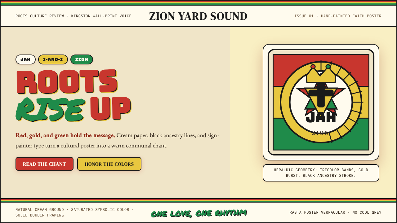 Caribbean Rastafarian (Jamaica)Warm faith, loud color. Red-gold-green bands and black poster type carry the…温暖信仰,高饱和发声:红金绿横带与黑色海报字承载吟唱。
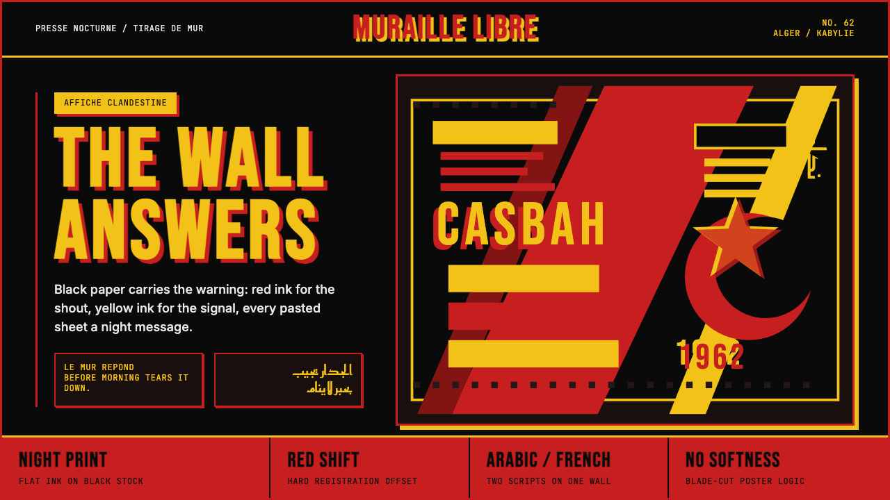 Algerian Casbah Poster (1954–1962)Every surface is a manifesto. Blood red, warning yellow, and stencil type hit…每个表面都是宣言:血红、警示黄与模板字撞上黑色新闻纸。
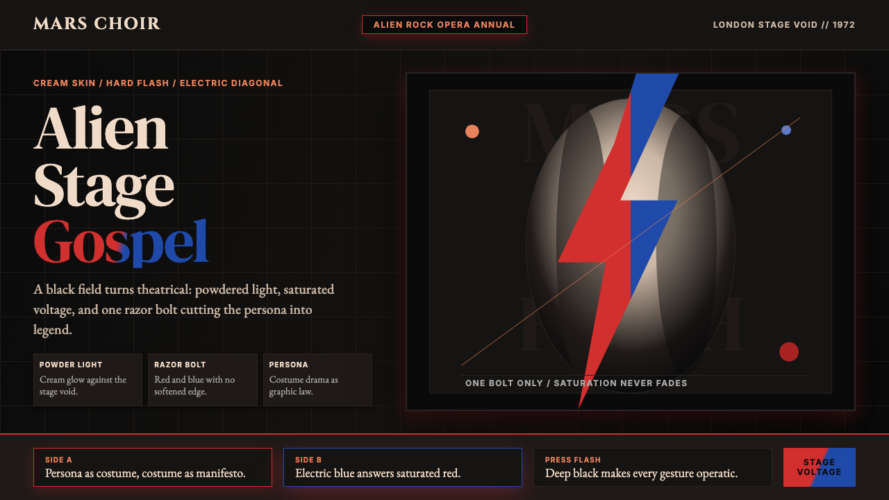 Bowie — Ziggy StardustTheater at full voltage. Cream-on-black portrait cut by one red and electric-…满电压的剧场感:黑底奶油肖像,被红与电蓝闪电劈开。
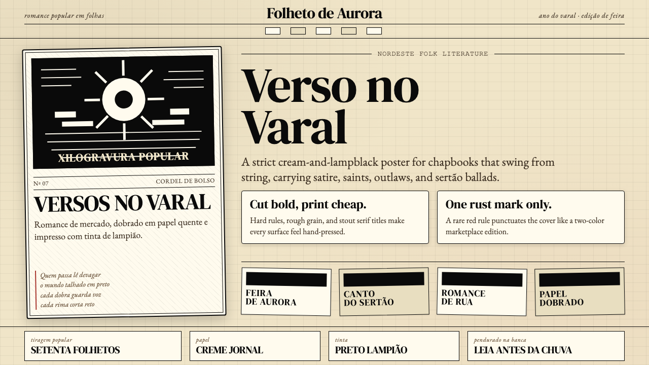 Brazilian Cordel (Northeast Folk Literature)Folk poetry, cut in lampblack. Cream newsprint, bordered chapbooks, one rust-…民间诗被灯黑刻出:奶油新闻纸、黑框小册与一笔锈红。
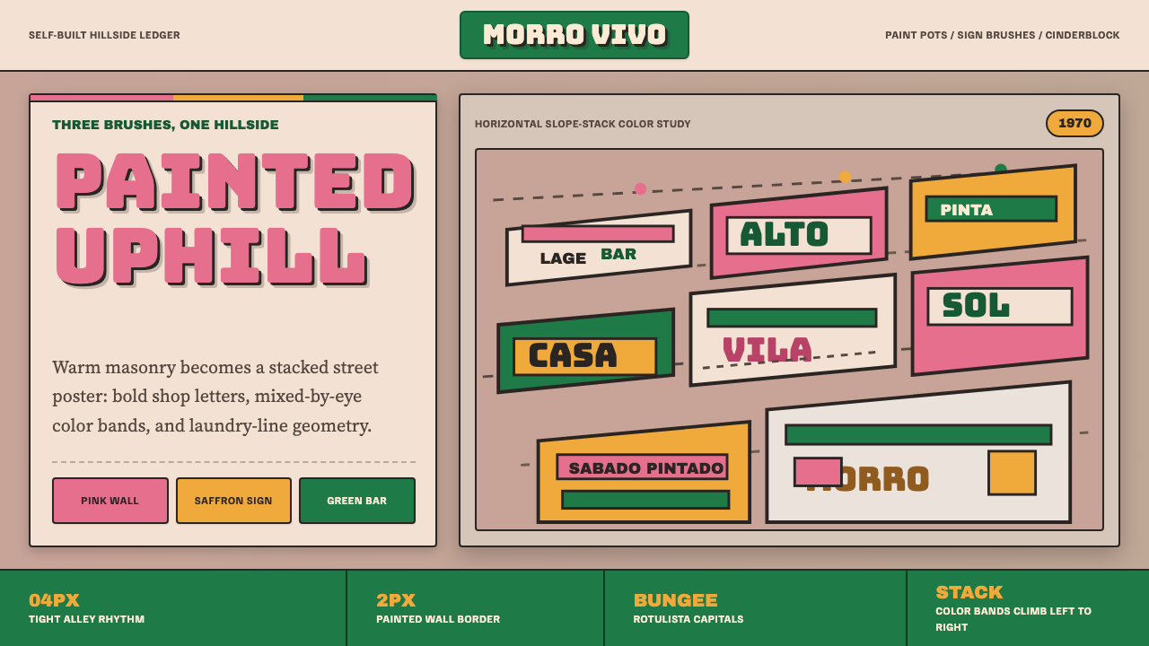 Brazilian Favela Rocinha 1970sHand-built warmth. Pink, saffron and green stripes climb cinderblock in rotul…手建的温热:粉红、藏红花黄与绿色条带沿空心砖攀升,配招牌字。
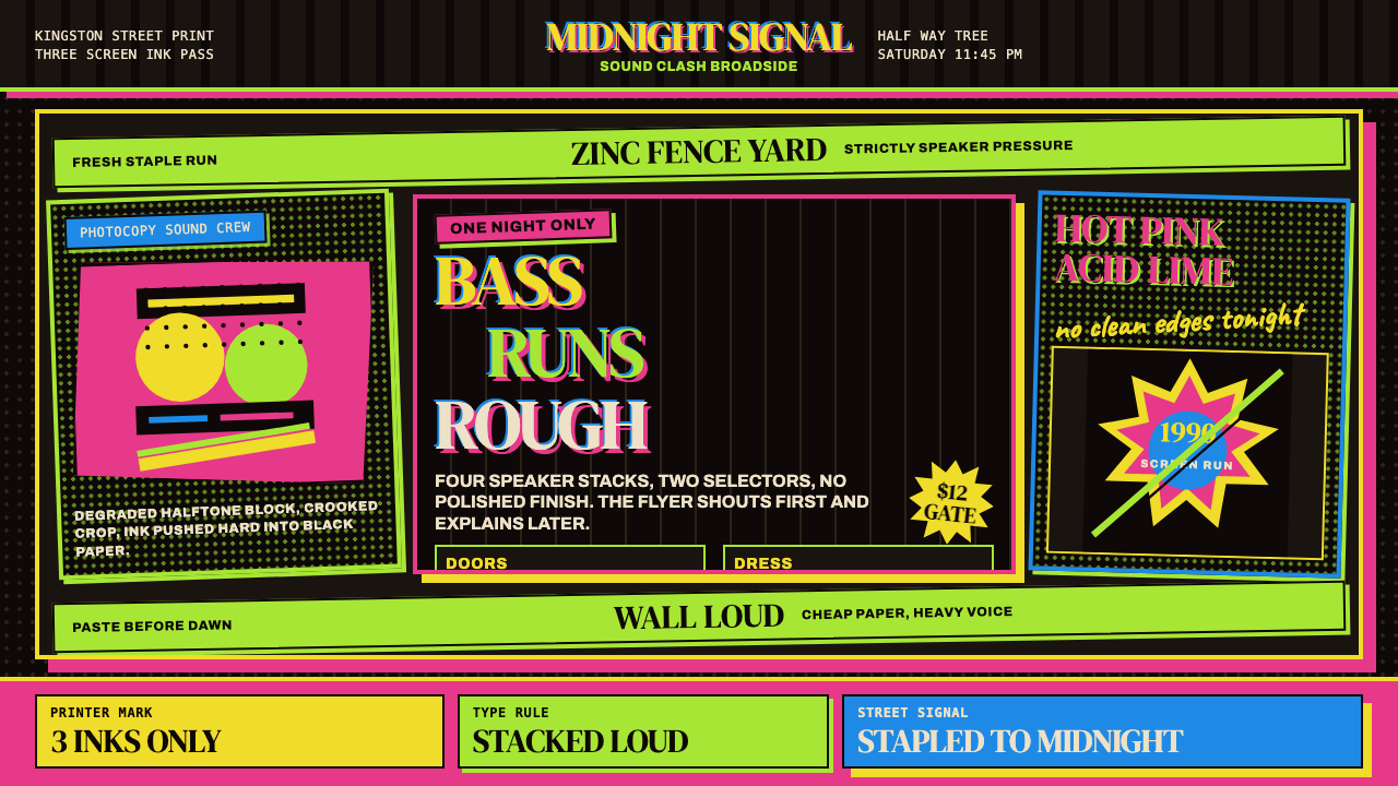 Jamaican Dancehall 1990 PosterMidnight volume. Acid lime and hot pink type stack like screenprint ink on bl…午夜音量:酸绿与热粉粗字叠在黑新闻纸上,如丝印错位。