What is NASCAR Stock Car?
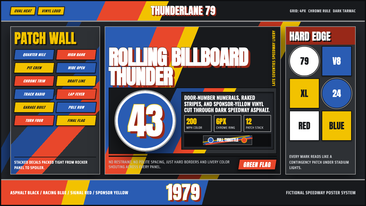
NASCAR Stock Car takes the loudest object in American motorsport — a door-numbered, sponsor-plastered 1970s racecar — and turns its livery into a design system: oversized numerals, speed-raked stripes, and a wall of decal color with zero interest in restraint.
NASCAR Stock Car in brief
NASCAR Stock Car is a design system built around the livery of a late-1970s American stock car: the painted and decaled skin that turned a mass-production sedan into a rolling advertisement built to be read at 150 miles an hour from a grandstand a quarter-mile away. Everything about the visual language exists to solve a legibility problem first and a beauty problem second — door numbers were sized so spotters and fans could identify a car mid-race, sponsor logos were stacked in whatever space was left, and the paint itself had to survive tire smoke, gasoline spray, and metal-on-metal contact.
The result reads as maximalist by design, not by accident. Where a luxury or editorial system earns attention through restraint, stock car livery earns attention through density and contrast — a blue quarter panel butting against a yellow decal butting against a red contingency patch, held together only by heavy black outlines and a shared glossy vinyl sheen. There is no neutral background in this system the way there is cream in Bauhaus or void in a minimal tech brand; the 'background' is already a saturated body color, and everything layered on top of it has to fight for legibility using scale and outline rather than open space.
This is also, distinctly, a system about identity through sponsorship. A car's colors were rarely chosen by an aesthetic committee — they were dictated by whichever motor-oil, cigarette, or soft-drink company was paying for the season, and the driver's number and personal color scheme became a brand in its own right, recognized by fans the way a sports jersey number is recognized today. The visual system inherits that logic: bold, assigned color fields; big identifying numerals; and small badge-like marks scattered wherever a spot was open.
Where does NASCAR Stock Car come from?
Stock car racing grew out of Prohibition-era bootlegging in the American South. Drivers who ran moonshine through the back roads of Georgia, North Carolina, and Tennessee modified ordinary production sedans for speed and handling so they could outrun revenue agents, then raced each other informally once the whiskey runs were done. That outlaw pedigree is baked into the culture: several early NASCAR stars, most famously Junior Johnson, had literally learned to drive fast while evading the law before the sport had formal rules at all.
NASCAR itself was organized in 1948 by Bill France Sr. in Daytona Beach, Florida, to bring order — and a single set of rules and a single champion — to a patchwork of regional stock car races. Crucially, the cars raced were meant to be 'stock,' meaning recognizably related to what a customer could buy from a dealership, which is why manufacturer identity and sponsor identity became so central to how a car was read visually. A fan in the stands wasn't just watching a race; they were watching a rolling proxy war between Ford, Chevrolet, Oldsmobile, and Dodge.
By the late 1970s the sport had matured into its golden commercial era. Sponsorship money from petroleum and consumer-product companies paid for cars, and livery became a full-body billboard: door numbers stretched to be legible from the cheap seats, hoods and deck lids carried primary sponsor logos, and every remaining inch of sheet metal carried 'contingency' decals from parts suppliers who paid bonus money to any winning car displaying their sticker. Richard Petty's Petty blue and STP's day-glo red became two of the most recognized color combinations in American sport, run by a driver — 'The King' — who won more races than anyone else in the sport's history.
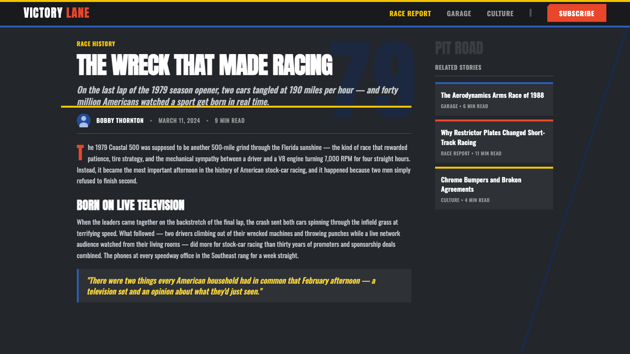
The style's defining cultural moment arrived at the 1979 Daytona 500, the first 500-mile race broadcast live, flag to flag, on national television. A snowstorm blanketing much of the country had trapped huge numbers of viewers indoors, and they watched leaders Cale Yarborough and Donnie Allison crash while battling for the lead on the final lap, followed by a televised fistfight involving Yarborough and Bobby Allison in the infield grass. The broadcast made NASCAR a mainstream national phenomenon overnight, and the loud, sponsor-saturated livery of that era became the visual shorthand for stock car racing that persists in design references today.
What defines the NASCAR Stock Car look?
Color
The palette runs hot and saturated: a dominant body color — often a deep racing blue or a bright competition red — collides directly with sponsor-mandated yellow, white, and orange rather than blending toward them. Colors are assigned by panel, not gradiated across the surface, so a fender may be one flat hue and the door directly beside it another, separated only by a hard outline. Day-glo orange-red, associated with period motor-oil sponsorship, appears as an accent that reads as urgent and synthetic rather than natural.
Numerals
Door and roof numbers are the single largest element in the system, often outsizing the sponsor logos around them. They are drawn in heavy, blocky forms with thick outline strokes designed to stay legible at a distance and under motion blur — closer to hand-painted grandstand signage than to a refined typeface. Treating a numeral as hero furniture, rather than as incidental labeling, is the single most important move when adapting this style.
Diagonal Speed Lines
Stripes and swooshes are raked diagonally, almost always left to right, to imply forward motion even on a static graphic. These lines cut across panel boundaries rather than following them, creating a sense of the whole surface being pulled forward. They are used sparingly relative to the color blocks and decals — usually one or two dominant sweeps rather than a repeating pattern — so the eye reads speed as a single gesture, not decoration.
Sponsor Decal Density
Every open surface carries a mark: a primary sponsor logo commanding the hood or quarter panel, secondary sponsors on smaller real estate, and a scatter of tiny contingency-associate patches wherever space remains. The composition principle is coverage, not hierarchy through emptiness — a panel with visible bare paint reads as unfinished rather than clean. Marks vary wildly in scale and typeface within the same surface, which is itself part of the authentic texture.
Glossy Vinyl Finish
Surfaces carry a wet, reflective sheen consistent with vinyl decal material and fresh enamel paint under speedway lights, rather than a matte or textured finish. Highlights are treated as hard specular streaks rather than soft glows, reinforcing that every surface is a manufactured, applied skin rather than a painted illusion of depth.
Heavy Black Outlines
Because so many colors and marks sit adjacent to one another without transition, a heavy black keyline does the structural work of keeping each element legible. Numerals, panel color boundaries, and decal edges are all reinforced with a firm outline, which is what allows the system to stay readable despite its density — the outline is doing the job that whitespace does in a quieter system.
Grid-Like Panel Layout
Despite its apparent chaos, decal placement follows an implicit grid inherited from the car's own panel structure — door, quarter panel, hood, roof, rear deck each function as a discrete zone with its own dominant element. Reading the livery means scanning zone by zone rather than as one continuous image, which is what allows dozens of competing marks to coexist without collapsing into visual noise.
Who shaped NASCAR Stock Car?
Petty won more NASCAR races and championships than any driver in the sport's history, racing under a signature Petty blue livery that became synonymous with the number 43 and his family's racing operation. His long partnership with STP, whose day-glo red and orange branding covered his car through the 1970s and beyond, made the Petty-blue-and-STP-red pairing one of the most recognized color combinations in American motorsport.
Yarborough was one of the sport's most successful drivers of the 1970s and the central figure in the crash and post-race fight at the 1979 Daytona 500 that turned national television attention toward NASCAR for the first time. His on-track rivalry with the Allison brothers is remembered as the moment stock car racing crossed from a regional sport into mainstream American culture.
Allison, alongside his brother Donnie, was one half of the rivalry that defined the 1979 Daytona 500 broadcast. A championship-winning driver in his own right, his involvement in the televised infield confrontation cemented the image of stock car racing as a sport of raw, unscripted personality carried on brightly liveried machines.
Johnson learned to drive at speed running moonshine through the back roads of North Carolina before Prohibition-era enforcement pressure pushed bootleggers' informal races into an organized sport. As both a champion driver and later a team owner, he personally bridged stock car racing's outlaw origins and its commercial, sponsor-driven future.
France founded NASCAR in 1948 in Daytona Beach, Florida, unifying a patchwork of regional stock car races under a single rulebook and championship. His insistence that raced cars remain recognizably 'stock' — tied to what a manufacturer actually sold — is the structural reason sponsor and manufacturer identity became so central to how these cars were designed to be seen.
How do you use NASCAR Stock Car today?
NASCAR Stock Car works best wherever a brand wants to project raw energy, competitive intensity, or unpretentious American vernacular rather than polish. It is a deliberately loud, maximal system, and applying it well means committing to that loudness rather than softening it into a tasteful accent.
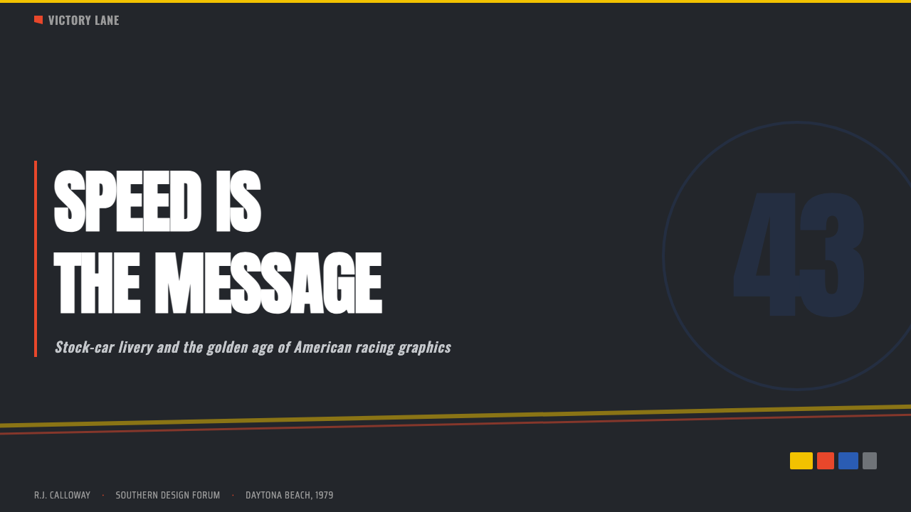
On presentation slides, the style suits a cover page built around one oversized numeral or word treated the way a door number is treated — enormous, outlined, dead center. Content slides should keep one dominant panel color per slide rather than mixing several, using a single diagonal sweep to carry the eye toward the key takeaway, and reserving smaller decal-style badges for supporting logos, partner credits, or footnotes. Data slides can borrow the contingency-patch idea directly: individual data points or KPIs rendered as small badge shapes scattered around one big headline number.
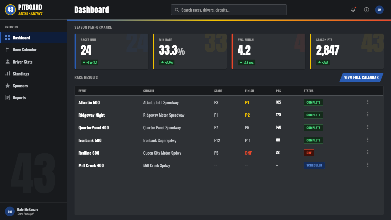
For web interfaces, this system is a strong fit for anything with a competitive or event-driven feel — sports platforms, gaming leaderboards, fantasy-league dashboards, ticketing and event pages. Dashboards should assign one saturated color per data zone rather than a unified neutral background, use oversized numerals for hero metrics, and let secondary badges (status tags, partner logos) sit dense in the margins rather than tucked away. Pricing pages benefit from the numeral treatment applied to the price itself — big, outlined, centered — surrounded by badge-like feature tags.
In editorial and marketing contexts, the style reads as high-energy Americana: think event posters, motorsport or automotive marketing, back-to-school or tailgate-season campaigns, and anything that wants to feel like a stadium rather than a boutique. A magazine spread can use the diagonal sweep as a section divider and stack sponsor-style credit badges along a margin the way a car's rear quarter panel stacks contingency decals.
The most common mistake is applying the color and numeral treatment while quietly cleaning up the density — removing the badges, spacing things out, adding whitespace. That produces a generic 'racing stripe' look rather than authentic stock car livery. The system's identity depends on visible density and a hard black outline doing the organizing work that negative space usually does; strip those away and the reference disappears.
NASCAR Stock Car — FAQ
Why are the numbers so large in this style?
Door and roof numbers had to be read by fans in distant grandstands and by television cameras at racing speed, so legibility at a distance and under motion was the design brief, not aesthetic preference. That functional origin is why treating a numeral as the single largest, most central element on a page — rather than a small label — is essential to reading as authentic stock car livery rather than a generic 'racing' theme.
Is the dense sponsor-decal look just clutter, or is there a structure to it?
There is a structure, even if it isn't obvious at first glance: placement follows the car's own panel boundaries, with each door, quarter panel, and hood functioning as its own zone carrying one dominant mark plus smaller supporting ones. The apparent chaos is really a grid inherited from the object itself, which is why recreating the style well means organizing by zone rather than scattering marks randomly across a single continuous surface.
Where does the diagonal stripe motif come from?
The raked diagonal sweep is a visual shorthand for forward motion, a convention long used in period racing and automotive graphics to make a stationary object read as fast. In this system it is used as a single dominant gesture rather than a repeating pattern, cutting across panel boundaries so the eye reads the whole surface as being pulled in one direction.
Does this style only work for motorsport-related brands?
No — the underlying logic of oversized identifying numerals, saturated assigned color per zone, and dense supporting badges transfers well to anything competitive or event-driven: sports, gaming, ticketing, fantasy leagues, and campaigns built around a specific date or match-up. What matters is whether the brand wants to feel loud, immediate, and stadium-scale; if it wants to feel quiet or refined, this is the wrong system entirely.
What is the 1979 Daytona 500 connection to this visual style?
The 1979 Daytona 500 was the first 500-mile NASCAR race broadcast live from start to finish on national television, and a snowstorm kept an unusually large audience indoors watching. The dramatic final-lap crash and post-race fight it produced turned stock car racing into a mainstream American phenomenon almost overnight, and the loud, sponsor-covered livery of that exact period became the visual reference point the design world now associates with the sport.
Related design styles
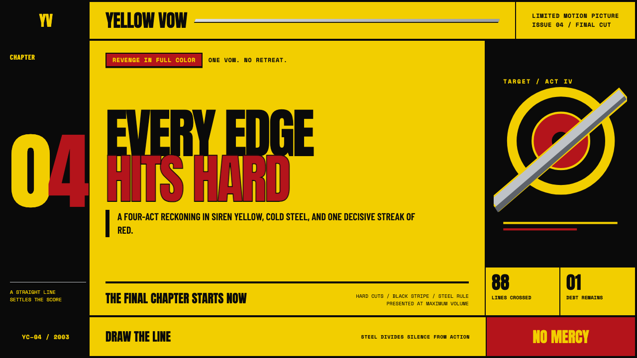 Kill Bill (2003)Revenge lands at full volume. Chrome yellow, slab type, and steel rules cut t…
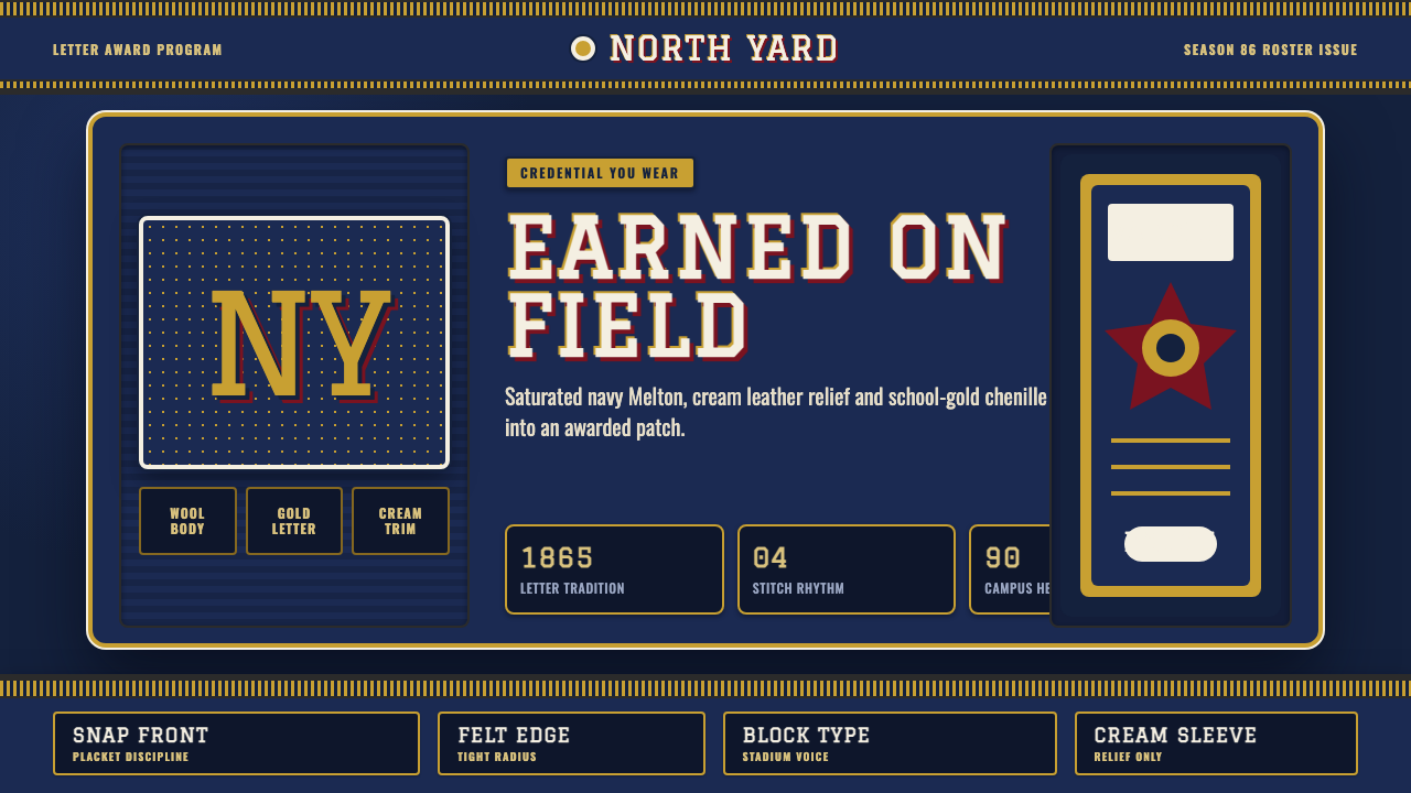 Varsity LettermanEarned, not printed. Navy wool ground, school-gold chenille and block varsity…
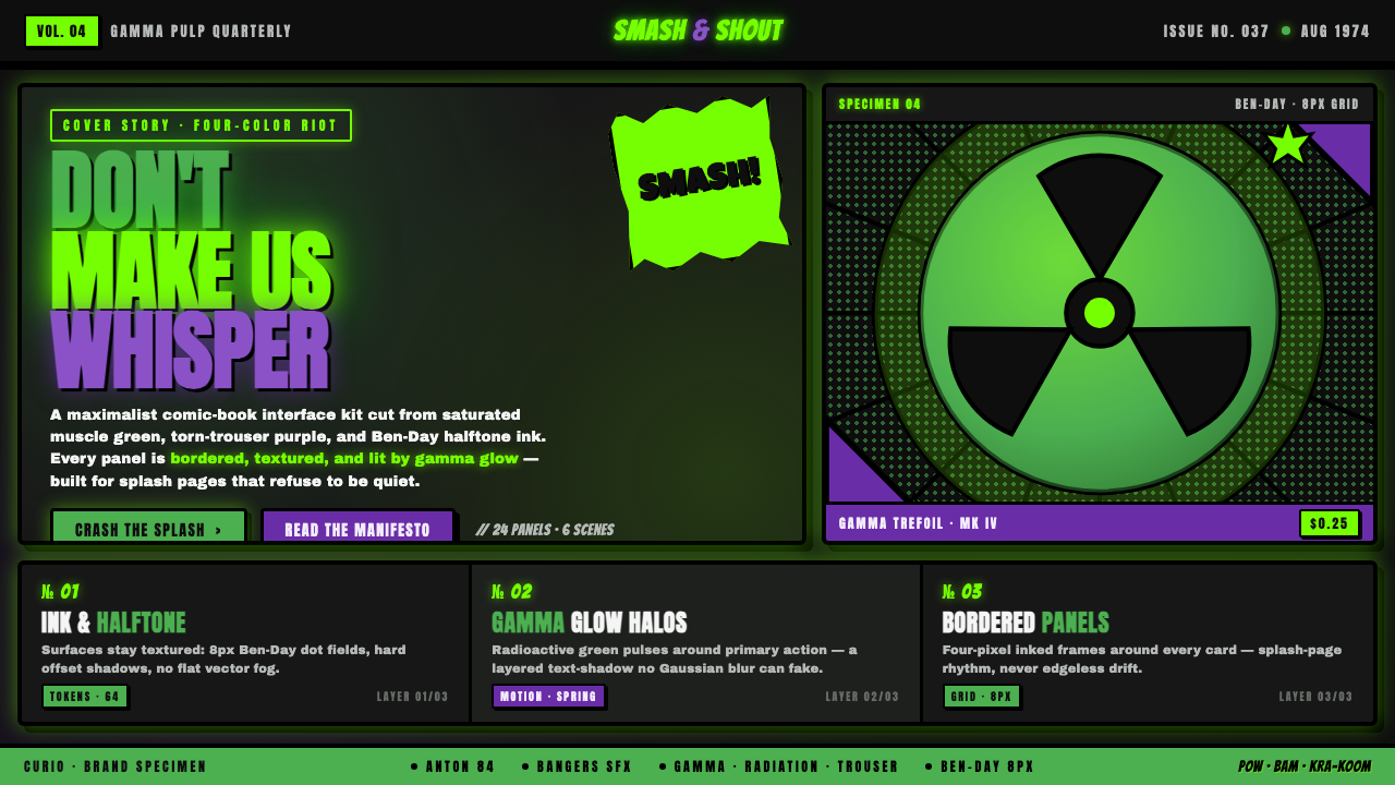 Hulk Gamma GreenDon't make us whisper. Muscle green, trouser purple, inked panels, Ben-Day ha…
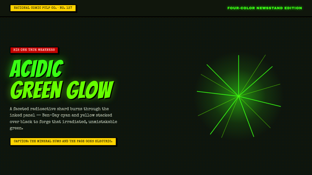 Kryptonite GreenRadioactive pulp glows hard. Neon green shard, black gutters, Ben-Day grit.
 Pinball BackglassGlows like paid light. Monoton type, black outlines, orange-red halftones cro…
 Radioactive Trefoil SignToxic-barrel glow, not the official sign. Neon-green trefoils on matte-black…