What is Seismograph Trace?
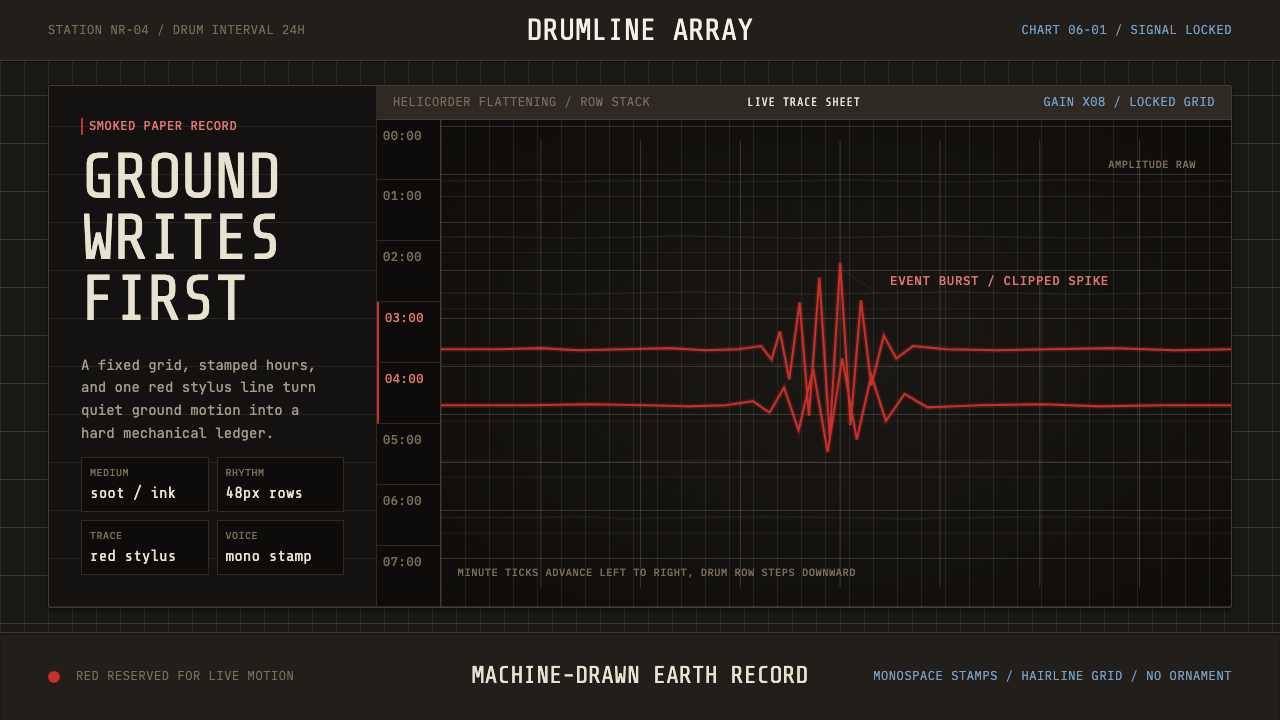
Seismograph Trace is cold, instrument-honest truth rendered in one red line — a smoked-black grid, monospace timestamps, and the sharp stacked traces of a machine that only wants to record what the ground is doing.
Seismograph Trace in brief
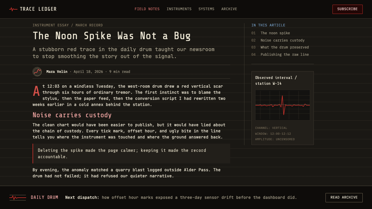
Seismograph Trace is the visual language of the helicorder drum — a rotating cylinder that drags a stylus across soot-blackened or waxed paper, leaving a continuous helical record that unwinds, line by line, into a stack of horizontal traces. Hour marks stamp the margins, minute tic marks run at fixed, even intervals, and a calm, nearly flat baseline erupts into sharp, jagged spikes the instant the ground begins to move.
The entire aesthetic is a byproduct of scientific necessity rather than decorative intent, which is precisely what gives it its authority. A seismograph exists to produce an unambiguous, unmanipulated record of ground motion, so every visual choice — the grid, the monospace numerals, the restraint to a single accent color — serves legibility and provenance rather than appeal. Nothing is stylized for its own sake; the drama in the design comes entirely from the data itself.
Visually, the system is stark: a deep, smoked-black or charcoal ground carries a fine grid of horizontal ruled lines, over which a single trace runs in an even, resting state until an event pushes it into a burst of sharp red peaks. Typography is monospace throughout, the kind used for machine-printed timestamps and station codes rather than any display face, because the numbers on a seismograph record are metadata that must be read exactly, not admired.
Where does Seismograph Trace come from?
The lineage of the smoked-paper seismograph stretches back to the late 19th century, when scientists first began building instruments that could translate imperceptible ground tremors into a permanent visual record. The British seismologist John Milne, working in Japan in the 1880s where earthquakes were a constant hazard and a rich source of data, helped pioneer the horizontal-pendulum seismograph and later established a global network of recording stations — his instruments used exactly this smoked-paper-and-stylus principle, since it was the most reliable way to render a continuous, tamper-evident trace using the mechanical and chemical technology available at the time.
The core mechanism is elegantly simple and explains everything about the resulting look: a heavy pendulum or mass, isolated from the shaking ground by inertia, stays nearly still while the drum and paper — physically bolted to the earth — move beneath it. A stylus attached to the mass then draws the ground's motion relative to its own stillness. Smoked paper, prepared by passing it through a sooty flame, was chosen because the stylus could cleanly scratch away the soot to reveal a crisp white line beneath, producing a trace with no ink to smear or fade — durability and evidentiary integrity mattered more than any aesthetic consideration.
The style's visual identity was carried forward into the modern instrumentation era by American seismic monitoring institutions, chiefly the United States Geological Survey (USGS) and regional networks such as the Pacific Northwest Seismic Network (PNSN), which operate dense arrays of monitoring stations across earthquake-prone regions of North America. From roughly the 1950s through the 1990s, the helicorder — a motor-driven drum recorder producing exactly the stacked-line format this system depicts — was the standard instrument in seismic observatories worldwide, mounted in station rooms where technicians would check the unspooling paper each day for signs of activity.
Even after digital seismometers and computer displays largely replaced physical drum recorders, the helicorder trace remained the canonical visual signature of seismology — reproduced in textbooks, museum displays, and public-facing earthquake monitoring websites precisely because its stark, grid-locked honesty communicates scientific credibility better than any smoother, more polished chart could. The aesthetic survives today less as an operational necessity and more as a recognized visual shorthand for rigorous, real-time measurement of natural forces.
What defines the Seismograph Trace look?
Color
The ground is a deep, smoked black or charcoal, evoking the soot-covered paper of the original instruments. A single accent color — a sharp, saturated red — is reserved exclusively for the trace itself at the moment of an event; the resting baseline stays a cooler, muted tone against the black, making the red spikes the only warm note in the entire system.
Grid
A fine, evenly spaced horizontal grid runs beneath every trace, ruled with the mechanical regularity of a drum that rotates and advances at a fixed rate. The grid is a ledger, not a decoration — every line corresponds to a real interval of elapsed time, and its consistency is what makes the trace above it readable as measurement rather than illustration.
Typography
All numerals and labels — hour stamps, minute tics, station codes — are set in monospace type, the kind produced by mechanical or early digital printers rather than any display face chosen for character. Monospace is functional here, not aesthetic: every digit occupies the same width so that timestamps remain precisely aligned down the margin of the record.
The Trace
The single most important visual element is the line itself: flat and nearly imperceptible at rest, then abruptly sharp, jagged, and dense with peaks the instant seismic activity begins. There is no smoothing, no gradient fill beneath the curve, no softened corners — the trace is drawn exactly as the pen recorded it, spikes and all.
Stacked Layout
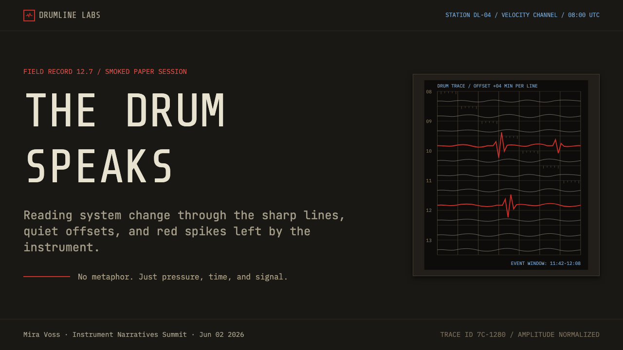
Because the physical drum record is a single continuous spiral, the visual convention flattens it into a stack of horizontal lines, one per rotation, read top to bottom like the hours of a day. This stacking is itself a design signature — content organized as discrete horizontal bands rather than a single continuous chart conveys the same instrument-log character even outside a literal seismogram.
Restraint and Flatness
Nothing is soft, glowing, or decorative. There are no drop shadows, no rounded corners softening the grid, no gradient backgrounds simulating depth. Every element is drawn flat and linear, precisely because the instrument this system depicts has no concept of ornament — it is a machine transcribing a physical fact.
Metadata Density
Beyond the trace, the margins carry a dense, precise apparatus of labeling — station identifiers, timestamps, scale markers — set small and consistent, never competing visually with the trace itself. This density of exact, small-scale annotation is what separates a genuine instrument-record aesthetic from a merely dark, moody chart.

Who shaped Seismograph Trace?
A British seismologist working in Japan during the 1880s, Milne helped pioneer the horizontal-pendulum seismograph and later established one of the first global networks of seismic recording stations, establishing the smoked-paper-and-stylus recording principle that defines this entire visual language.
As the primary American federal agency for earthquake monitoring, the USGS operated and maintained networks of helicorder drum recorders throughout the 20th century and continues to publish seismic data in formats that visually echo the original stacked-trace record.
A regional monitoring network covering the earthquake-prone Pacific Northwest of North America, PNSN operates dense arrays of seismic stations and has long maintained public-facing helicorder-style displays, keeping the stacked-line drum aesthetic visible to the public well into the digital era.
How do you use Seismograph Trace today?
This style communicates measured, unembellished authority, and it works best whenever a product needs to project the credibility of raw, tamper-evident data rather than a polished editorial narrative.
For presentation slides, the aesthetic gives cover pages real gravity: a smoked-black ground with a single red trace line running across it, monospace timestamp labels along the bottom edge. Content slides work well when a key metric is treated as a live trace — a flat baseline that spikes at the moment of a notable event, framed by the same fine grid used throughout. Data slides are a natural fit: any time-series chart can borrow the stacked-band layout directly, presenting multiple periods as parallel horizontal traces rather than a single continuous line graph.
For web interfaces, this system suits monitoring dashboards, security consoles, infrastructure status pages, and any product where real-time, unembellished truth is the value proposition. A dark, gridded background with monospace metadata and a single red accent for alerts or anomalies reads immediately as serious instrumentation rather than casual analytics. Status indicators should stay flat and linear rather than glowing or animated with soft pulses, preserving the instrument-honest restraint.
For editorial and marketing content, the style suits science journalism, infrastructure and disaster-preparedness communication, and technical case studies where the goal is to convey rigor. Pull quotes or key statistics can be framed against the smoked-grid background with a trace-line motif running behind the text, and section breaks can use a flat horizontal rule rather than any decorative divider.
The most common mistake is softening the aesthetic to make it feel more approachable — rounding the grid corners, adding a soft glow to the red trace, or smoothing the spikes into gentle curves. Any of these choices undoes the instrument-honesty that is the entire point of the style; the sharpness and rigidity of the trace is what signals that the data is real and unaltered, not a stylistic flourish to be softened for comfort.
Seismograph Trace — FAQ
Why does the design use only one accent color instead of a broader palette?
The single red trace against the smoked-black ground mirrors the actual instrument, which produced exactly one line per record. Introducing a broader palette would undercut the core premise of the style — that this is an honest, unembellished record of a single physical measurement, not a designed illustration with room for decorative variety.
Can the grid be looser or the lines thicker for better legibility on screens?
Some adjustment for screen legibility is reasonable, but the grid should stay fine and even rather than loose — its density is what signals mechanical precision. If the grid is widened too far, the aesthetic starts to read as a generic dark dashboard rather than a genuine instrument-log record, losing the specific credibility this style is meant to convey.
Is this style only appropriate for scientific or technical products?
It is strongest in technical, monitoring, or data-integrity contexts, but its underlying value — unembellished, credible measurement — can transfer to any product that wants to signal rigor over polish, such as security tools, financial risk dashboards, or infrastructure status pages. It is a poor fit for consumer products where warmth or approachability is the priority.
How should the stacked-band layout be adapted for non-seismic data?
Treat each band as a fixed time period — a day, an hour, a session — and stack them chronologically top to bottom, exactly as drum rotations stack in the original instrument. The key is keeping every band the same height and grid density so the stack itself communicates regularity, with anomalies standing out precisely because the surrounding structure is so consistent.
Why monospace type instead of a more expressive display typeface?
Monospace type is functionally tied to the source material — mechanical and early digital instruments printed timestamps and station codes in fixed-width characters because it guaranteed consistent alignment down a printed margin. Any expressive display face would immediately signal editorial design rather than instrument output, breaking the illusion that the viewer is looking at a genuine scientific record.
Related design styles
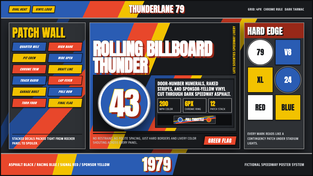 NASCAR Stock CarLoud as a rolling billboard. Blue, red, and sponsor yellow collide in a hard-…
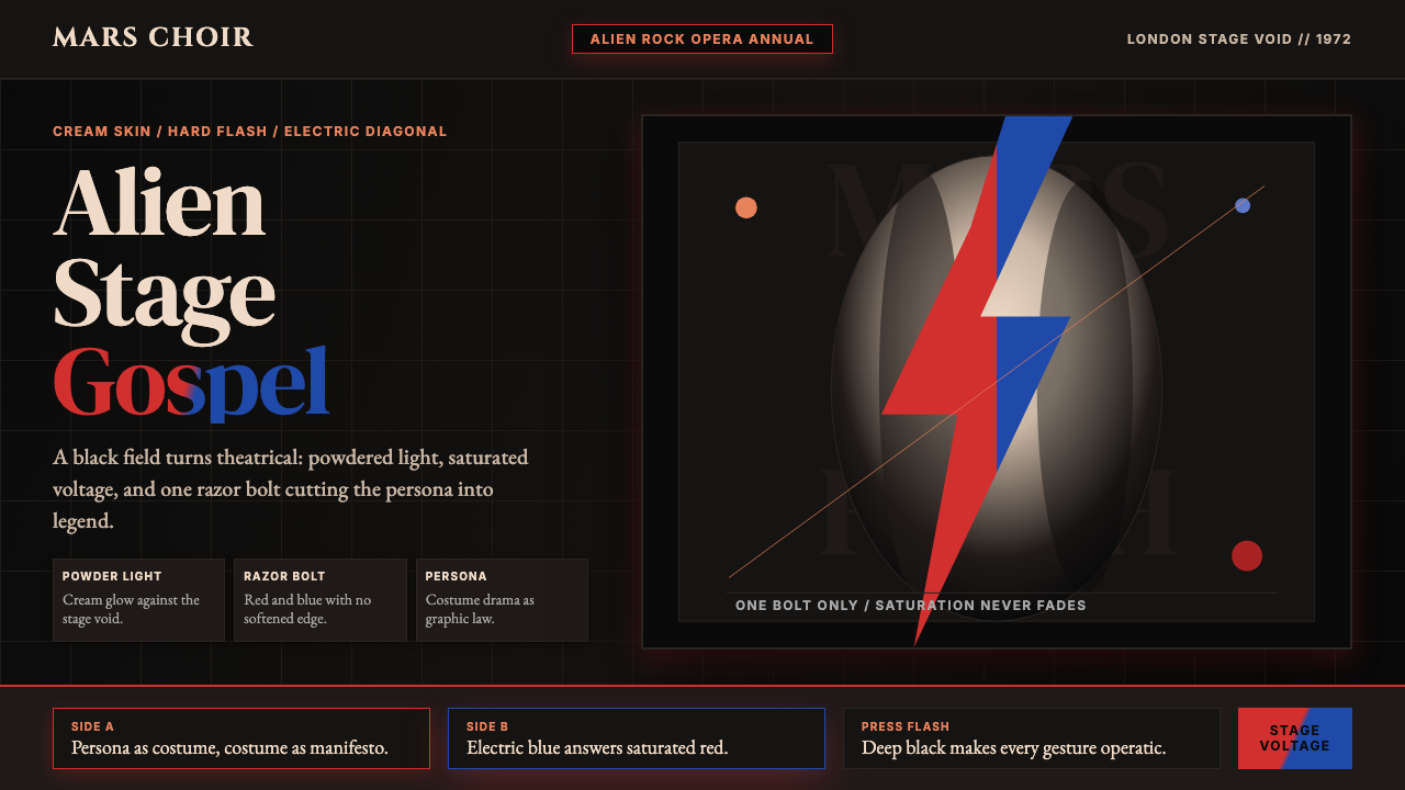 Bowie — Ziggy StardustTheater at full voltage. Cream-on-black portrait cut by one red and electric-…
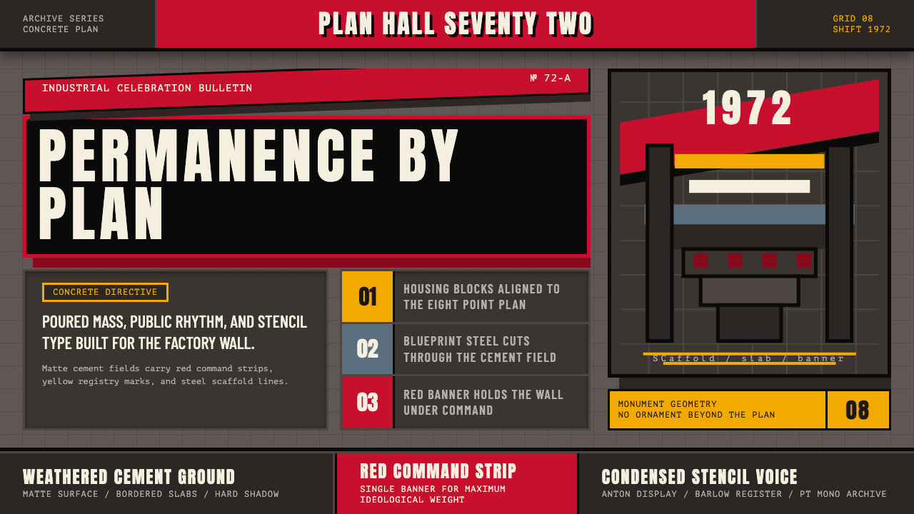 Soviet Brutalism (1972)Concrete refuses to breathe. Cement gray, Soviet red banners, and Anton stenc…
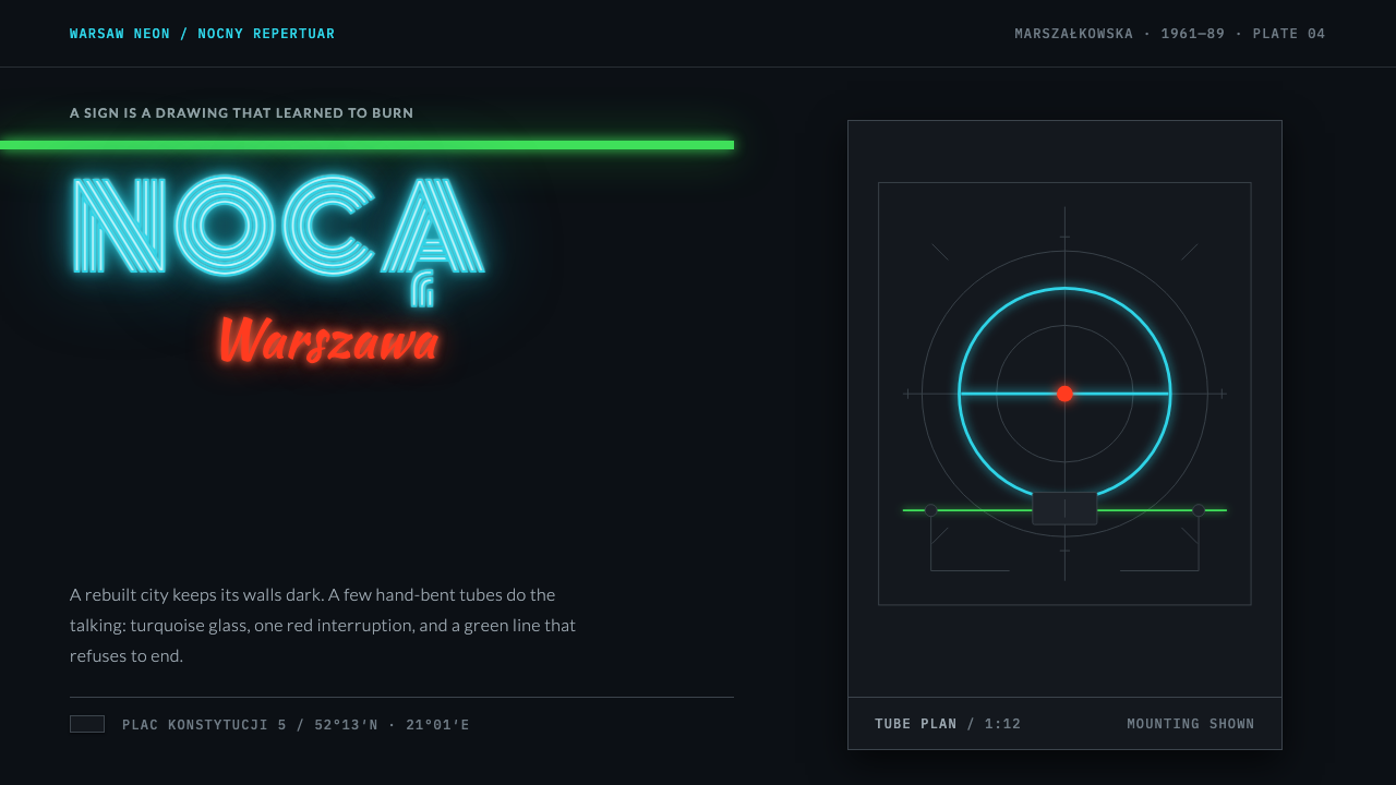 Warsaw NeonNight belongs to the handmade sign. Turquoise tube type rides a green facade…
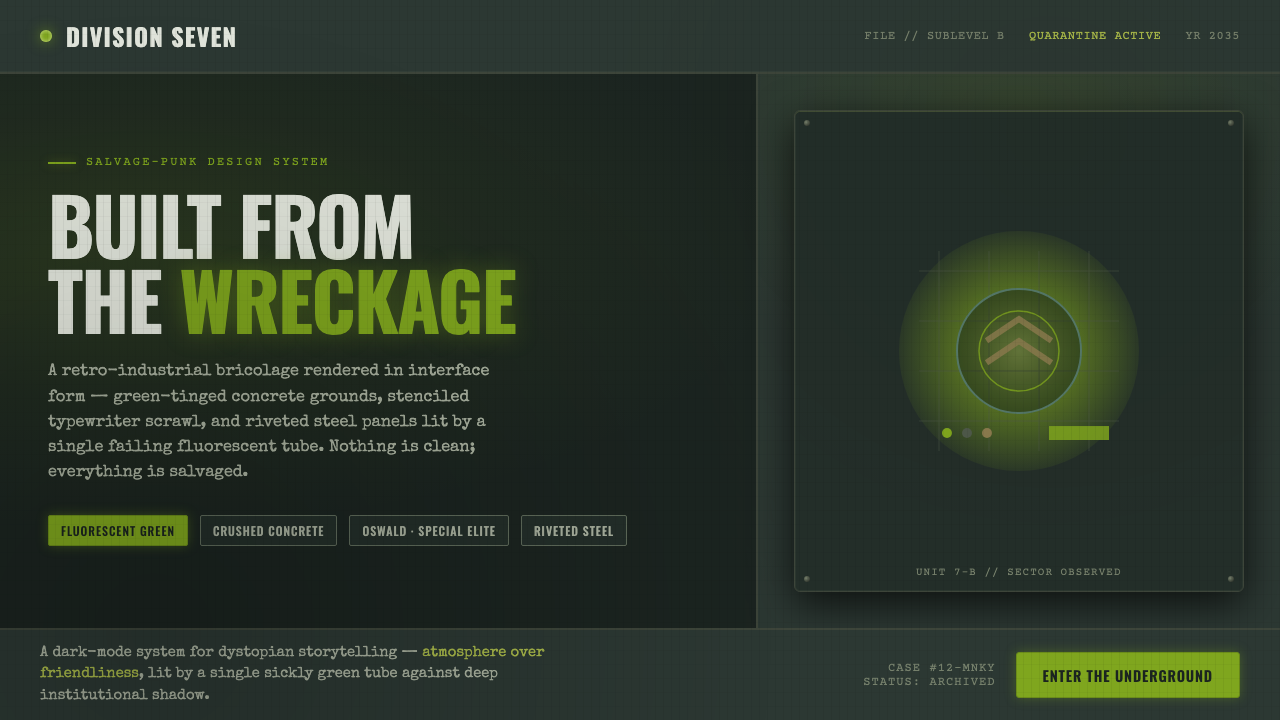 12 MonkeysBuilt from the wreckage. Sickly fluorescent green on crushed-black concrete,…
 Aeronautical ChartReads like cockpit data. Magenta-blue airspace rings cut through dense dark-c…