What is ASCII Art BBS (1992)?什么是 ASCII Art BBS (1992)?
Before the web existed, underground artists turned the humble terminal grid into a neon-soaked canvas — one character cell at a time.在互联网诞生之前,地下艺术家已将朴素的终端字符格化作霓虹浸染的画布——一次一个字符。
ASCII Art BBS (1992) in briefASCII Art BBS (1992) 速览
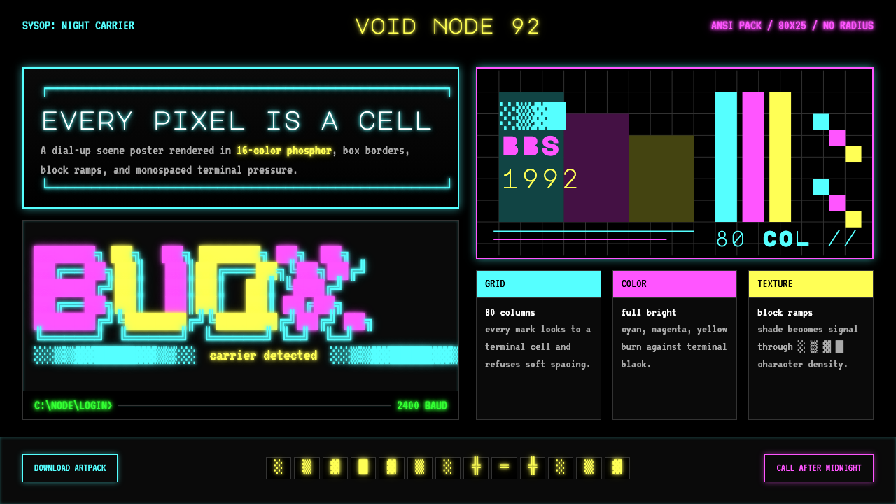
ASCII Art BBS (1992) is a design aesthetic distilled from the ANSI/ASCII art scene that flourished on dial-up bulletin board systems between roughly 1987 and 1996. The style encodes the visual language of that era: pure terminal black as the only background, saturated neon cyan, magenta, and yellow as primary expressive colors, monospaced letterforms at every scale, box-drawing characters used as structural frames, and the characteristic glow of phosphor-on-glass rendered as a scanline shimmer across every surface.ASCII Art BBS(1992)是一套从ANSI/ASCII艺术场景中提炼出来的设计美学,这一场景在约1987至1996年间于拨号电子布告栏系统(BBS)上蓬勃生长。这种风格编码了那个年代的视觉语言:纯终端黑作为唯一背景,饱和霓虹青、品红与黄作为主要表现色,全尺寸等宽字体,以制表符作为结构框架,以及磷光映玻璃的特有辉光——以扫描线闪烁的形式弥漫在每一个表面。
What sets this aesthetic apart is its constraint-born creativity. Artists worked within a fixed grid of eighty columns by twenty-five rows, a palette of sixteen colors drawn from the CGA and VGA standards, and a character set of two hundred fifty-six code points — including the block-shade ramp of characters that produce graduated density from solid fill to near-transparency. Within those limits, crews produced intricate logos, menu screens, and illustrated headers that read as bold graphic design, not primitive workarounds. The block-shade technique, in particular, generates smooth-seeming gradients and dimensional forms without a single pixel of actual bitmap data.这套美学的与众不同之处在于约束催生的创造力。艺术家在固定的八十列乘二十五行网格、十六色CGA/VGA调色板,以及包含二百五十六个码位的字符集内进行创作——其中包括从实心填充到近乎透明的方块渐变字符序列。在这些限制之内,各创作团队制作出错综复杂的标志、菜单画面和插图刊头,读来犹如大胆的平面设计,而非原始的临时变通。方块渐变技法尤为特别:它无需任何位图数据,仅凭字符便模拟出看似平滑的渐变与立体形态。
Visually, authentic BBS-era work is instantly legible by its density and its darkness. There is no whitespace in the modernist sense — negative space is terminal black, and it reads as void rather than breathing room. Color is saturated to the edge of its technical limit, because the palette offered no midtones and no transparency. Type is always monospaced, always grid-aligned, and often built character by character rather than set from a font menu. The result is an aesthetic that feels simultaneously raw, precise, and paradoxically luminous.在视觉上,正宗的BBS时代作品以其密度与黑暗感令人一眼辨认。这里没有现代主义意义上的留白——负空间是终端黑,读来是虚空,而非呼吸余地。色彩饱和至技术上限,因为调色板不提供中间色调,也没有透明度。字体永远等宽、永远对齐网格,并且往往是逐字符手工搭建,而非从字体菜单中调取。结果是一种同时兼具原始、精确与——矛盾地——发光感的美学。
See the ASCII Art BBS (1992) design system查看 ASCII Art BBS (1992) 完整设计系统
Where does ASCII Art BBS (1992) come from?ASCII Art BBS (1992) 从何而来?
The story begins not with art but with infrastructure. ANSI escape codes — control sequences defined by the American National Standards Institute in 1979 — gave terminal emulators the ability to position the cursor anywhere on the screen, change foreground and background colors, and move the cursor without clearing the screen. When the IBM PC popularized the personal computer in the early 1980s, terminal software like ANSI.SYS on DOS systems brought this capability to millions of home users. The character set encoded in the original IBM PC firmware included, alongside alphanumerics and punctuation, a suite of box-drawing characters and block-shade glyphs that would become the raw material of an entire art form.这个故事的起点不是艺术,而是基础设施。ANSI转义码——由美国国家标准学会于1979年定义的控制序列——赋予终端模拟器在屏幕任意位置定位光标、更改前景色与背景色、以及不清屏移动光标的能力。1980年代初IBM PC普及个人计算机后,DOS系统上的ANSI.SYS等终端软件将这一能力带给了数以百万计的家庭用户。原始IBM PC固件中编码的字符集除字母、数字与标点外,还包含一套制表符与方块渐变字形——这将成为一种完整艺术形式的原始材料。
Bulletin board systems — software running on home computers connected to the public telephone network via modem — became the social infrastructure of the pre-Internet computing underground. By the late 1980s, major metropolitan areas in the United States supported dozens or hundreds of BBSes, each with its own culture, user base, and aesthetic identity. Sysops (system operators) commissioned artists to create elaborate ANSI welcome screens, menu interfaces, and file-area headers that would greet callers over connections as slow as two thousand, four hundred, or nine thousand, six hundred bits per second. The art had to work at those speeds — downloading character by character, revealing itself line by line.电子布告栏系统——运行在通过调制解调器接入公共电话网络的家用电脑上的软件——成为前互联网时代计算机地下社群的社交基础设施。到1980年代末,美国各大都市区已支撑着数十乃至数百个BBS,各有其文化、用户群体与美学身份。BBS站长(sysop)委托艺术家创作精致的ANSI欢迎界面、菜单界面和文件区标题,迎接以每秒两千四百比特或九千六百比特等低速连接拨入的用户。这些艺术作品必须适应那样的速度——逐字符下载,逐行显现。
Organized crews emerged to meet this demand. ACiD Productions, founded in 1990 in the United States, became the most prominent: it issued monthly artpacks — ZIP archives distributed across the BBS network — that collected the work of dozens of affiliated artists. iCE Advertisements formed as a rival group in 1990, followed by the ANSI Outlaws, Oderus Urungus's group Dark, and many others. These crews operated across national lines: ACiD and iCE had members in the United States, Canada, and across northern Europe, with particularly active nodes in Sweden, the Netherlands, and Germany. The scene's geography followed the modem infrastructure and the cultural overlap between the American hacker underground and the European demoscene.有组织的创作团队应运而生。ACiD Productions于1990年在美国成立,成为最具影响力的团队:它每月发布艺术包——在BBS网络上分发的ZIP压缩档——汇集数十位签约艺术家的作品。iCE Advertisements于同年作为竞争团队成立,随后是ANSI Outlaws、Dark及其他众多团队。这些团队跨越国界运作:ACiD和iCE的成员遍布美国、加拿大及北欧,以瑞典、荷兰和德国为主要活跃节点。场景的地理分布追随调制解调器基础设施,以及美国黑客地下文化与欧洲演示场景之间的文化交汇。
The peak years ran from roughly 1991 to 1995. Monthly artpack releases were anticipated events; ANSI art was reviewed in text-format zines distributed on the same BBS networks that hosted the art. As Internet access became broadly available from 1994 onward, the BBS model declined — graphical web browsers rendered the terminal aesthetic obsolete for most users. Many scene artists migrated to early web graphics and later to pixel art. But the aesthetic never entirely disappeared: Jason Scott's archival project at textfiles.com preserved tens of thousands of ANSI files beginning in the early 2000s, and the archive at 16colo.rs maintains an ongoing collection of both historical and contemporary ANSI art. A small but committed revival community continues to produce new work in the classic style using modern tools that emulate the original terminal environment precisely.全盛时期大约从1991年延续至1995年。每月艺术包的发布是令人期待的事件;ANSI艺术在以文本格式发行的场景杂志(zine)中受到评论,这些杂志也通过同一BBS网络传播。随着互联网接入从1994年起广泛普及,BBS模式逐渐衰落——图形化网页浏览器令终端美学对大多数用户而言成为历史。许多场景艺术家转向早期网页图形,后来又转向像素艺术。但这种美学从未彻底消失:Jason Scott在textfiles.com的档案项目从2000年代初起保存了数以万计的ANSI文件,16colo.rs档案馆则持续收录历史与当代ANSI艺术。一个规模不大但热情坚定的复兴社群至今仍在使用精确模拟原始终端环境的现代工具,创作新的经典风格作品。
What defines the ASCII Art BBS (1992) look?ASCII Art BBS (1992) 的视觉特征是什么?
Color色彩
The palette is hardcoded by hardware: sixteen colors drawn from the CGA and VGA standards, ranging from the eight base colors — black, blue, green, cyan, red, magenta, brown/dark yellow, and light gray — to their eight brightened variants. In practice, BBS artists built a vocabulary around the most visually striking combinations: bright cyan and bright magenta against pure black produce the characteristic phosphor glow; bright yellow functions as the sharpest highlight; dark blue or dark green become structural shadows. No custom color mixing is possible — every hue is one of sixteen fixed positions, and the aesthetic gains its coherence from working that constraint consciously rather than fighting it.调色板由硬件固化:十六种颜色来自CGA和VGA标准,涵盖八种基础色——黑、蓝、绿、青、红、品红、棕(暗黄)与浅灰——以及对应的八种亮色变体。在实践中,BBS艺术家围绕视觉冲击力最强的色彩组合建立了自己的词汇体系:亮青与亮品红映衬纯黑,产生特有的磷光辉光;亮黄是最锐利的高光;暗蓝或暗绿充当结构性阴影。不存在自定义混色——每一种色调都是十六个固定位置之一,这套美学的连贯性来自有意识地运用这一约束,而非与之对抗。
Typography字体排印
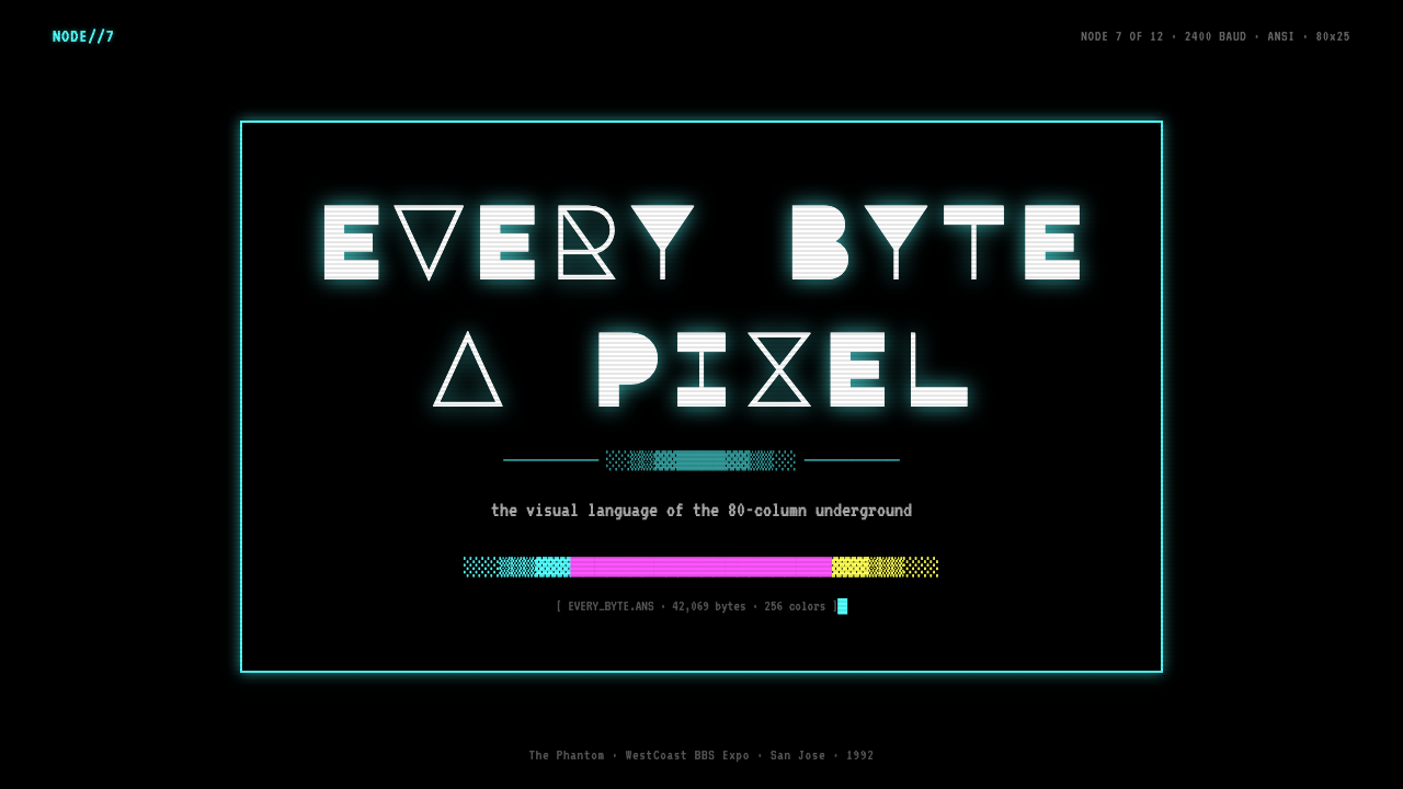
All text is monospaced by definition — the terminal renders every character in an identical cell, so proportional spacing is architecturally impossible. BBS artists exploited this constraint rather than working around it: large display lettering was built by filling character cells with block shapes to form oversized letterforms many rows tall, while body text ran in the standard terminal font at its natural size. The effect produces a radical scale contrast between headline and body that no proportional typeface system could replicate exactly. Character choice extends beyond alphanumerics: ANSI art headlines frequently incorporate box-drawing corners, half-blocks, and shade characters as structural elements within the letterforms themselves.所有文字天然等宽——终端将每个字符渲染在完全相同的字符格中,比例间距在架构层面根本不可能实现。BBS艺术家将这一约束化为优势而非绕开它:大型展示字母通过用方块形填充字符格来构建数行高的超大字形,而正文则以标准终端字体的自然大小排列。这产生了标题与正文之间的极端尺寸对比——这是任何比例字体系统都无法精确复制的效果。字符选择超越了字母和数字的范围:ANSI艺术标题常常将制表符边角、半块字符与渐变字符作为字形本身的结构元素融入其中。
Block-Shade Ramps方块渐变序列
The block-shade characters — full block, dark shade, medium shade, light shade, and space — form a density ramp that BBS artists used to simulate gradients, model three-dimensional surfaces, and create the illusion of anti-aliased edges between color regions. A skilled artist could produce forms that appear to curve or recede in space using nothing but these four density values arranged across color transitions. This technique is the most technically distinctive feature of the style, and its mastery separates accomplished ANSI artists from beginners. When applied to backgrounds, the shade ramp produces the characteristic nebula-like depth fields that appear behind logos and title screens.方块渐变字符——实心方块、深渐变、中渐变、浅渐变与空格——构成一条密度序列,BBS艺术家用它模拟渐变、建模三维表面,并制造出色彩区域之间反锯齿边缘的幻觉。技艺娴熟的艺术家仅凭这四个密度值在色彩过渡处的排布,便能创作出看似在空间中弯曲或后退的形态。这一技法是该风格最具技术特色的标志,对它的掌握程度区分了成熟的ANSI艺术家与初学者。应用于背景时,渐变序列产生出特有的星云状深度背景场——常见于标志和标题屏幕之后。
Grid Discipline网格纪律
Every element in a BBS composition is locked to the eighty-column, twenty-five-row character grid — there is no sub-cell positioning. This produces a visual rhythm that is simultaneously rigid and expressive: shapes align in ways that feel architectural rather than freehand. Artists developed conventions for how to handle diagonals (using alternating half-blocks at shallow angles), curves (approximated through step-wise transitions between shade values), and compositional balance (filling edge zones with low-density shade to create perceived margins within the fixed frame). The grid does not constrain the composition — it is the composition.BBS构图中的每一个元素都锁定在八十列乘二十五行的字符网格上——没有任何子格定位。这产生出一种同时具有刚性与表现力的视觉节奏:形状的对齐方式感觉更像建筑而非徒手绘制。艺术家发展出处理斜线(在浅角度使用交替半块字符)、曲线(通过渐变值之间的阶梯式过渡近似表达)以及构图平衡(用低密度渐变填充边缘区域,在固定框架内创造感知上的边距)的约定俗成。网格不是对构图的约束——它本身就是构图。
Phosphor Glow and CRT Reference磷光辉光与CRT参照
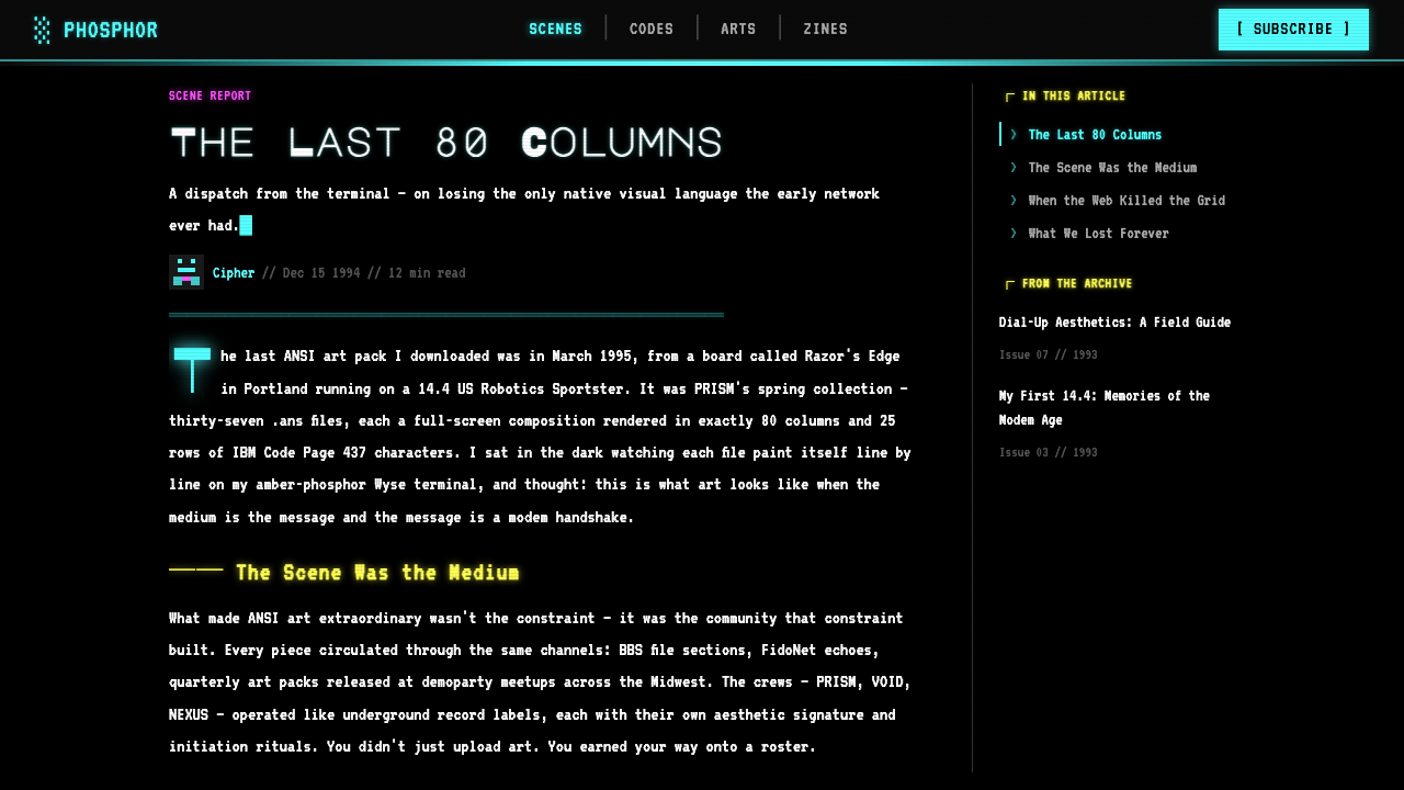
The aesthetic carries an implicit reference to the physical display technology that originally rendered it: the cathode-ray tube monitor with its characteristic scanlines, slight bloom around bright elements, and the slight fuzziness where high-contrast edges meet. Contemporary applications of the style often make this reference explicit through a faint horizontal scanline overlay and a subtle bloom or outer-glow treatment on the brightest color regions — particularly cyan and yellow, which on actual phosphor monitors produced the most visible halation. The CRT reference grounds the aesthetic in a specific technological moment and distinguishes it from generic dark-mode design.这套美学携带着对最初渲染它的物理显示技术的隐性参照:阴极射线管显示器——伴随其特有的扫描线、亮色元素周围的轻微光晕,以及高对比度边缘相遇处的轻微模糊感。当代的风格应用常常通过一层淡淡的水平扫描线叠加,以及最亮色彩区域(尤其是青色和黄色,在真实磷光显示器上产生最显著的光晕)上的微妙外发光处理,使这一参照变得明确。CRT参照将这套美学锚定在特定的技术时刻,使其有别于泛化的深色模式设计。
Absence of Border Radius零圆角
Every shape in a character-cell grid is rectilinear by default. Curves require explicit approximation through the block-shade step technique, and even the most skillful approximation retains visible stairstepping at close range. Contemporary design applications derived from this aesthetic treat zero border-radius as a philosophical commitment, not a limitation: all containers, cards, buttons, and frames carry perfectly square corners. This rectilinear absolute distinguishes the style from both generic flat design (which freely uses moderate rounding) and neobrutalist design (which may use sharp corners but does not share the terminal color vocabulary or the monospaced type system).字符格网格中的每一个形状默认都是直角矩形的。曲线需要通过方块渐变阶梯技法进行明确近似,即便是最娴熟的近似,近距离观看时也保留着可见的锯齿感。当代以这套美学为基础的设计应用将零圆角视为一种哲学承诺,而非局限:所有容器、卡片、按钮与边框均保持完全直角。这种直角绝对性使该风格有别于通用的扁平设计(后者自由使用适度圆角)以及新野兽派设计(后者虽可能使用直角,但不共享终端色彩词汇或等宽字体系统)。
Dense Composition密集构图
BBS art fills the screen. Practical necessity drove this — a welcome screen that left large areas empty wasted the caller's download time and failed to signal the system operator's investment in the BBS's identity. Contemporary applications of the style inherit this density: information hierarchies are compressed, contrast is high, and the overall impression is one of controlled abundance rather than curated restraint. This makes the style unusually well-suited to data-heavy interfaces where the modernist prescription of aggressive whitespace would waste screen real estate. The density is not clutter — it is a deliberate signal that every character cell is accounted for.BBS艺术填满屏幕。实际需求驱动了这一点——留下大面积空白的欢迎界面不仅浪费拨入用户的下载时间,也无法彰显站长对BBS身份认同的投入。当代的风格应用继承了这种密度:信息层级被压缩,对比度极高,整体印象是受控的丰盛感,而非精心筛选的克制。这使该风格对数据密集型界面格外适用——在那些场景中,现代主义式积极留白的处方只会浪费屏幕空间。密度不是杂乱——它是一种有意的信号:每一个字符格都已被纳入考量。
See the ASCII Art BBS (1992) design system查看 ASCII Art BBS (1992) 完整设计系统
Who shaped ASCII Art BBS (1992)?谁塑造了 ASCII Art BBS (1992)?
RaD Man was a founding member and the primary organizational force behind ACiD Productions, the group that effectively defined the institutional structure of the ANSI art scene. Under his coordination, ACiD issued monthly artpacks from 1990 onward, establishing the pack release as the scene's primary distribution and quality-control mechanism. His own art set a benchmark for technically complex compositions that combined logographic letterforms with elaborate background fields, and his networking across the BBS community created the competitive but collaborative culture that drove the scene's output to its highest levels.RaD Man是ACiD Productions的创始成员,也是实际上确立了ANSI艺术场景机构结构的核心组织者。在他的协调下,ACiD从1990年起每月发布艺术包,将艺术包发行确立为场景的主要分发与质量控制机制。他本人的作品为将标志性字母形态与精心设计的背景场域相结合的技术复杂构图树立了标杆,他在BBS社群中的广泛联结则创造了推动场景产出达到最高水准的竞争性合作文化。
Force Ten was a co-founder of iCE Advertisements, the group that formed in 1990 as ACiD's principal rival and maintained a comparable standard of technical and artistic quality throughout the scene's peak years. iCE distinguished itself from ACiD partly through aesthetic temperament: iCE artists tended toward a denser, more illustrative approach with more emphasis on shaded figure work, while ACiD's style leaned toward bold logographic design. The rivalry between the two groups drove competitive improvement across the scene and established the artpack release cycle as the primary measure of a crew's standing.Force Ten是iCE Advertisements的联合创始人。该团队于1990年作为ACiD的主要竞争对手成立,在场景全盛时期始终保持着相当水准的技术与艺术质量。iCE以部分美学气质与ACiD相区分:iCE艺术家倾向于更密集、更具插图感的手法,更注重阴影人物刻画;而ACiD的风格则偏向大胆的标志设计。两个团队之间的竞争推动了整个场景的进步,也将艺术包发行周期确立为衡量一个团队地位的主要标准。
Spear founded and led the ANSI Outlaws, one of the smaller but critically regarded crews of the peak scene era. Where ACiD and iCE operated as large multi-artist collectives, the Outlaws maintained a tighter roster and a more consistent individual voice across releases. Spear's own work was noted for its compositional economy — achieving complex illusionistic depth with fewer shade transitions than comparable work by larger crews — and for typographic innovation in display lettering, particularly in the construction of three-dimensional-appearing block letterforms.Spear创立并领导了ANSI Outlaws——全盛时期场景中规模较小但备受推崇的团队之一。ACiD和iCE作为大型多艺术家集体运作,而ANSI Outlaws则保持了更精简的阵容,各期发布中也呈现出更为一贯的个人风格。Spear本人的作品以构图上的经济性著称——用比大型团队同类作品更少的渐变过渡实现复杂的幻觉深度感——以及在展示字体排印方面的创新,尤其是在三维视觉效果方块字形的构建上。
Jason Scott is not a scene artist but an archivist and historian whose work ensured the scene's survival. Beginning in the late 1990s, he systematically collected and published thousands of textfiles, artpacks, and BBS-related documents at textfiles.com, then produced the documentary film BBS: The Documentary (2005), which remains the definitive historical account of the bulletin board era. His archival practice rescued materials that would otherwise have been lost to bit rot and hardware obsolescence, and his public advocacy established the ANSI art scene as a culturally significant episode in computing history rather than a curiosity.Jason Scott并非场景艺术家,而是一位档案员与历史学家,正是他的工作确保了场景的存续。从1990年代末开始,他在textfiles.com系统性地收集并发布了数以千计的文本文件、艺术包和BBS相关文件,随后制作了纪录片《BBS:纪录片》(2005年)——该片至今仍是BBS时代最权威的历史记录。他的档案实践抢救了原本会因比特腐烂和硬件淘汰而消失的材料,他的公共倡导则将ANSI艺术场景确立为计算机历史上具有文化意义的篇章,而非一种猎奇存在。
The European demoscene — centered in Sweden, Finland, Norway, the Netherlands, and Germany — formed a parallel and partially overlapping community to the North American BBS art scene. While the demoscene focused primarily on real-time procedural graphics in executable files rather than static ANSI compositions, its aesthetic values — technical virtuosity within extreme hardware constraints, competitive display through organized party events, and the elevation of the program or composition as an artistic statement — were deeply congruent with BBS art culture. Many European ANSI artists participated in both scenes, and the stylistic cross-pollination is visible in the more elaborate background rendering and the tighter integration of typographic and illustrative elements that characterizes European-affiliated artpacks of the mid-1990s.以瑞典、芬兰、挪威、荷兰和德国为中心的欧洲演示场景,与北美BBS艺术场景形成了一个平行且部分交叠的社群。演示场景主要聚焦于可执行文件中的实时程序性图形,而非静态ANSI构图,但其美学价值观——在极端硬件约束内的技术精湛性、通过有组织的聚会活动进行竞争性展示,以及将程序或构图提升为艺术表达——与BBS艺术文化高度契合。许多欧洲ANSI艺术家同时参与两个场景,风格上的交叉影响在1990年代中期欧洲系艺术包中清晰可见:更精心的背景渲染,以及字体排印元素与插图元素更紧密的整合。
How do you use ASCII Art BBS (1992) today?今天怎么用 ASCII Art BBS (1992)?
ASCII Art BBS (1992) is among the most immediately recognizable revival aesthetics in contemporary design, but its distinctiveness comes with a corresponding risk of caricature. Applying it well requires understanding which features are structurally generative — the constraint-driven density, the hardcoded palette, the monospaced grid — and which are merely surface signals. Surface-only application produces costume rather than coherent design: a terminal font and a scanline overlay do not constitute the style if the underlying compositional logic is not present.ASCII Art BBS(1992)是当代设计中辨识度最高的复兴美学之一,但其鲜明特色也带来了相应的漫画化风险。正确应用它需要理解哪些特征具有结构性生成力——约束驱动的密度、固化的调色板、等宽网格——哪些只是表面符号。只做表面应用产生的是戏服,而非连贯的设计:如果底层的构图逻辑不在场,一套终端字体加一层扫描线叠加并不构成这种风格。
For presentation slides, the style works exceptionally well on cover and section-break pages, where the full-bleed dark background and phosphor-glow headline treatment create an immediate visual statement. Cover compositions should treat the title as a constructed ANSI logotype — oversized, built from block characters, positioned in the upper or lower third of the frame — with a secondary tagline in standard monospaced terminal type at much smaller scale. Content slides should preserve the grid logic: information is organized in columns that respect the implied character-cell structure, and data visualizations — bar charts, progress indicators, tables — are styled as if rendered in a terminal environment. Avoid proportional typefaces on content slides; they break the monospaced contract that holds the style together.对于演示文稿,该风格在封面页和章节过渡页上表现极为出色——全出血深色背景与磷光辉光标题处理立刻制造出强烈的视觉宣言。封面构图应将标题视为构建出来的ANSI标志字体——超大尺寸,用方块字符搭建,置于画面上三分之一或下三分之一处——配以小得多的副标题,以标准等宽终端字体排列。内容页应保留网格逻辑:信息按遵循隐含字符格结构的列组织,数据可视化——柱状图、进度指示器、表格——按终端环境中渲染的样式处理。内容页应避免使用比例字体;它们会打破维系整个风格的等宽契约。
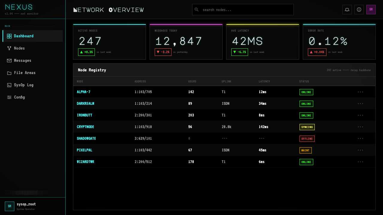
For web interfaces, the aesthetic is particularly well-suited to dashboards, developer tools, pricing pages, and any product that communicates technical authority. The approach establishes a near-black or pure-black background as the base, uses a bright accent color — typically cyan or a vivid green reminiscent of classic monochrome phosphor — for interactive states and primary calls to action, and restricts all container shapes to right-angle forms with no rounding. Borders should be visible and structural: a single-pixel or two-pixel border in a muted version of the accent color around cards and input fields reads as a terminal-frame reference. Navigation bars work best as horizontal sequences of monospaced label text; icon-only navigation breaks the text-primary logic of the style.对于网页界面,这套美学尤其适合仪表板、开发者工具、定价页面,以及任何传达技术权威性的产品。方法是以近黑或纯黑背景为基础,以亮强调色——通常是青色或让人联想到经典单色磷光屏的鲜绿——用于交互状态和主要行动号召,并将所有容器形状限制为无圆角的直角形态。边框应当可见且具有结构性:卡片与输入框周围以强调色的低饱和版本绘制的单像素或双像素边框,读来是一种终端框架参照。导航栏以水平排列的等宽标签文字效果最佳;纯图标导航打破了该风格文字优先的逻辑。
For editorial and marketing work, the style provides strong visual distinctiveness in contexts where surrounding materials tend toward soft gradients and rounded shapes. A marketing page built on this aesthetic uses alternating full-bleed sections — dark background with bright type, then bright background (typically a near-white or pale cyan) with dark type — with section breaks marked by a horizontal rule styled as a box-drawing character sequence. Pull quotes and callouts gain maximum impact when set in oversized monospaced type with a block-shade character used as a decorative prefix rather than a conventional quotation mark. Email designs can use the style effectively in header sections while defaulting to readable light-background layouts for body content.对于编辑与营销内容,该风格在周围材料普遍倾向柔和渐变和圆角形状的环境中,提供了强烈的视觉辨识度。基于这套美学构建的营销页面使用交替的全出血区块——深色背景配亮色文字,然后是亮色背景(通常是近白或浅青)配深色文字——区块分隔以制表符风格的水平线标记。大引用与标注以超大等宽字体排列时效果最为突出,用一个方块渐变字符作为装饰性前缀,而非传统引号。邮件设计可在标题区块有效运用该风格,正文内容则回归可读的浅色背景布局。
The most common failure mode when applying this style is confusing darkness with authenticity. A layout that uses a dark background and a monospaced font but applies rounded corners, soft drop shadows, smooth gradients, and proportional spacing between elements has borrowed the surface signal while abandoning the structural principles. Authentic application means committing to the hard constraints: right angles everywhere, no smooth gradients (shade transitions must step through discrete values as in the original block-shade technique), borders that are visible rather than decorative, and monospaced type throughout — not only in code blocks. A second common mistake is overloading color: using cyan, magenta, yellow, and multiple bright accents simultaneously at full saturation produces visual noise rather than the controlled neon luminosity of genuine BBS work. The original sixteen-color palette achieved its effects by choosing one or two dominant hues per composition and using the rest sparingly as structural contrast.应用这种风格时最常见的失败模式,是将黑暗感与真实性混为一谈。一个使用深色背景和等宽字体,但同时应用圆角、柔和投影、平滑渐变以及元素间比例间距的版面,借用了表面符号,却抛弃了结构原则。真实应用意味着对硬性约束的承诺:随处直角,没有平滑渐变(渐变过渡必须如原始方块渐变技法那样以离散值阶梯式推进),边框是可见的而非装饰性的,通篇使用等宽字体——不仅仅在代码块中。第二个常见错误是色彩过载:同时以全饱和度使用青、品红、黄和多种亮强调色,产生的是视觉噪音,而非真正BBS作品受控的霓虹光感。原始十六色调色板的效果,在于每件构图中选择一两种主导色,其余颜色节制地用作结构性对比。
See the ASCII Art BBS (1992) design system查看 ASCII Art BBS (1992) 完整设计系统
ASCII Art BBS (1992) — FAQASCII Art BBS (1992) · 常见问题
Is this style the same as pixel art?这种风格与像素艺术是同一回事吗?
They are related but distinct. Pixel art works at the level of individual bitmap pixels and can use any color from a chosen palette at any screen position. ANSI/ASCII art is constrained to the character cell: each position on the grid displays one of two hundred fifty-six characters in one of sixteen foreground colors on one of eight background colors. The block-shade technique produces effects that superficially resemble pixel art, but the underlying encoding is entirely different — you are specifying characters and color attributes, not pixel values. Contemporary designers sometimes treat them interchangeably, but the constraint systems are genuinely different, and work produced under the character-cell constraint has a visual character — particularly the stepped diagonal and the density of the shade ramp — that pixel art in arbitrary resolutions does not share.两者相关但截然不同。像素艺术在单个位图像素层面进行创作,可以在屏幕上的任意位置使用所选调色板中的任意颜色。ANSI/ASCII艺术则被约束在字符格层面:网格上的每个位置显示二百五十六个字符之一,前景色为十六色之一,背景色为八色之一。方块渐变技法产生的效果表面上类似像素艺术,但底层编码完全不同——你指定的是字符与颜色属性,而非像素值。当代设计师有时将两者混为一谈,但约束体系确实不同:在字符格约束下产生的作品具有一种视觉特质——尤其是阶梯式斜线和渐变序列的密度——这是任意分辨率的像素艺术所不共有的。
Can this style work on a light background?这种风格能用在浅色背景上吗?
Historically, no — the BBS aesthetic was defined by the terminal's default black background, and the palette's saturated colors were calibrated to glow against that void. A light-background inversion is technically possible in contemporary applications, but it requires significant adaptation. The bright cyan and yellow that produce phosphor glow against black become garish or illegible against cream or white. A practical light-mode variant might restrict the accent palette to darker, more saturated versions of the core hues, drop the scanline and bloom effects entirely, and treat the box-drawing structural frames as the primary visual anchor. The result will be readable and recognizably related to the source aesthetic, but it will not carry the luminous intensity that makes the style distinctive — that quality is inseparable from the dark ground.从历史上看,不可以——BBS美学由终端默认的黑色背景所定义,调色板中的饱和色彩是针对映衬那片虚空而校准的。浅色背景的反转在当代应用中技术上可行,但需要大幅适应。对黑色背景产生磷光辉光的亮青与亮黄,在奶油色或白色背景上会变得刺目或难以辨认。一个实用的浅色模式变体可能需要:将强调色调色板限制为核心色调更暗、更饱和的版本,完全去除扫描线和光晕效果,并将制表符结构框架作为主要视觉锚点。结果将是可读的,且与源美学明显相关,但不会携带使这种风格独树一帜的那种发光强度——那种质感与深色底面密不可分。
How does this style differ from cyberpunk or vaporwave aesthetics?这种风格与赛博朋克或蒸汽波美学有何区别?
All three share a dark background, neon color palette, and retro-technological reference, which causes them to be confused in casual usage. The distinctions are meaningful. Cyberpunk aesthetic typically incorporates photographic or illustrative imagery, references to corporate dystopia, and a color vocabulary weighted toward red and acid green alongside blue; it is not constrained to monospaced type or character-cell grids. Vaporwave foregrounds pastel midtones — particularly pink, lavender, and seafoam — against white or gradient backgrounds, incorporates marble textures and classical sculpture, and has a dreamy, slow quality antithetical to the BBS scene's tightly-wound technical competitive energy. ASCII Art BBS is more austere, more typographic, more rigorously grid-constrained, and more historically specific — it references a real technical artifact and a real subculture, not a generalized fantasy of technological nostalgia.三者均以深色背景、霓虹色调和复古技术参照为共同特征,这导致在日常使用中容易混淆。但区别是实质性的。赛博朋克美学通常包含摄影或插图图像、对企业反乌托邦的参照,以及以红色与酸绿色为主(辅以蓝色)的色彩词汇;它不受限于等宽字体或字符格网格。蒸汽波在白色或渐变背景上突出粉彩中间色调——尤其是粉红、薰衣草紫和海泡沫绿——融入大理石纹理与古典雕塑,呈现一种与BBS场景紧绷的技术竞争能量截然相反的梦幻、迟缓感。ASCII Art BBS更为朴素、更重字体排印、更严格地受网格约束,历史指向也更为具体——它参照的是真实的技术工艺与真实的亚文化,而非对技术怀旧的泛化幻想。
Why does the style use such saturated colors if the original hardware had a limited palette?既然原始硬件调色板有限,为什么这种风格使用如此饱和的色彩?
Because the sixteen-color CGA and VGA palettes contained no midtones and no pastels — only fully saturated versions of each hue at two brightness levels. The artists had no choice about saturation; it was an immutable property of the hardware. This forced constraint turned out to produce an aesthetic effect that is now recognized as the style's most distinctive quality: the phosphor-glow intensity that makes BBS art look like it is lit from within. When contemporary designers apply the style, preserving that full saturation is not maximalism — it is fidelity to the original constraint. Desaturating the palette to make it more conventionally tasteful produces something that resembles the style superficially but loses the core visual energy.因为十六色CGA和VGA调色板不含任何中间色调,也没有粉彩——只有每种色调在两个亮度级别上的完全饱和版本。艺术家对饱和度没有选择权;这是硬件的不可更改属性。这种被迫的约束最终产生了一种现在被认为是该风格最鲜明特质的美学效果:让BBS艺术看起来像从内部发光的磷光辉光强度。当代设计师应用这种风格时,保留那种完全饱和度并非极大主义——而是对原始约束的忠实。将调色板降低饱和度以使其更符合传统审美品位,产生的东西表面上类似这种风格,却失去了核心视觉能量。
Is there a contemporary community still making ANSI art in the original format?现在还有当代社群在制作原始格式的ANSI艺术吗?
Yes, though it is small and specialized. The 16colo.rs archive serves as the primary hub for contemporary ANSI art production, hosting both historical packs and new work submitted by active artists. Tools like PabloDraw and Moebius allow artists to work in the original character-cell format with accurate color rendering, and active crews continue to release packs through the archive. Annual events — particularly blocktronics releases and the ongoing contributions of groups like Mistigris — maintain the pack-release tradition. The scene has also developed a community around the Summer of ANSI and similar themed events. The contemporary revival is notable for including artists who never experienced the original BBS era, working in the historical format purely for its aesthetic and technical interest rather than its original functional context.有,尽管规模较小且专业化程度很高。16colo.rs档案馆作为当代ANSI艺术创作的主要枢纽,同时收录历史艺术包和活跃艺术家提交的新作品。PabloDraw和Moebius等工具允许艺术家以原始字符格格式进行创作,同时提供精确的色彩渲染,活跃团队通过该档案馆继续发布艺术包。年度活动——尤其是blocktronics的发布,以及Mistigris等团队的持续贡献——维系着艺术包发行的传统。这个场景还围绕「ANSI之夏」等主题活动发展出了一个社群。当代复兴的显著之处在于,其中包括许多从未亲历原始BBS时代的艺术家——他们纯粹出于对这种格式的美学与技术兴趣,而非其原始功能背景,在历史格式中进行创作。
Related design styles相关设计风格
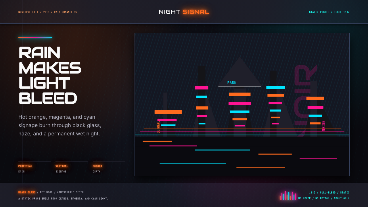 Blade Runner 1982 Neon NoirRain-soaked noir. Orange, magenta, and cyan neon cut black glass.雨夜黑色电影。橙洋红青霓虹切开黑玻璃。
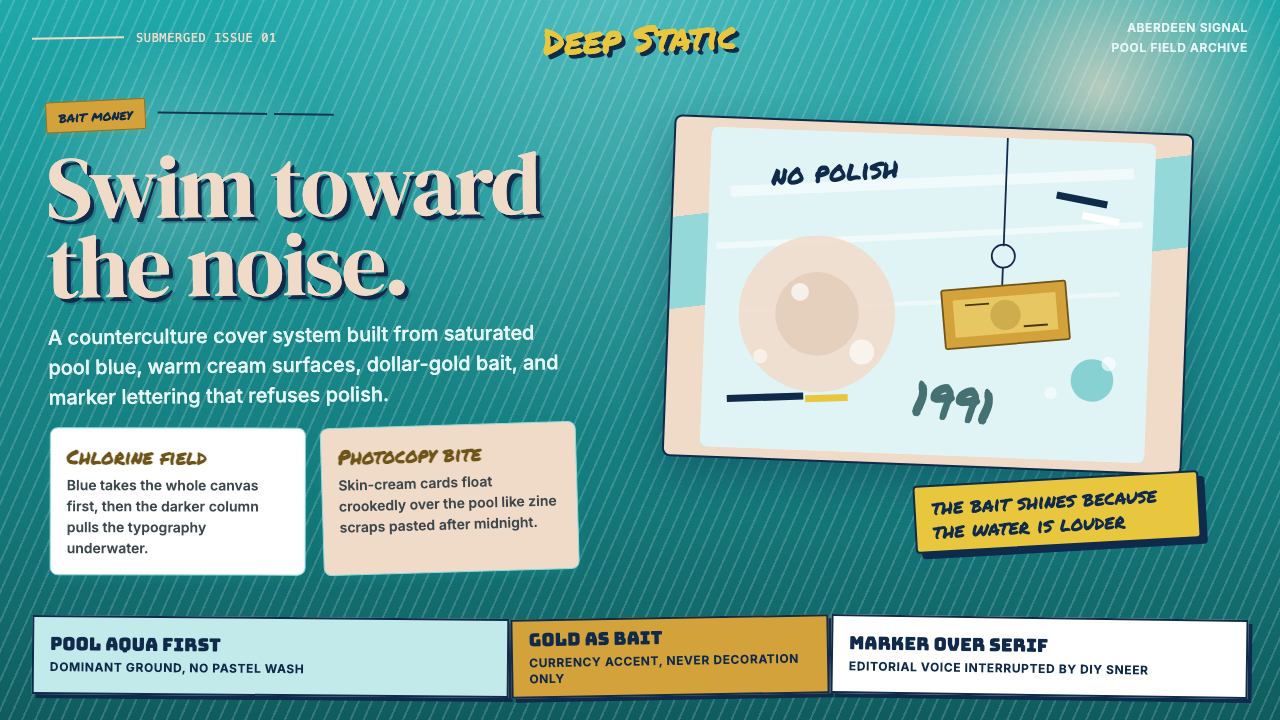 Nirvana — NevermindAnti-pop in pool blue. Cream cards, dollar-gold accents, and marker type roug…泳池蓝里的反主流:乳白卡片、美元金点缀与马克笔字打乱网格。
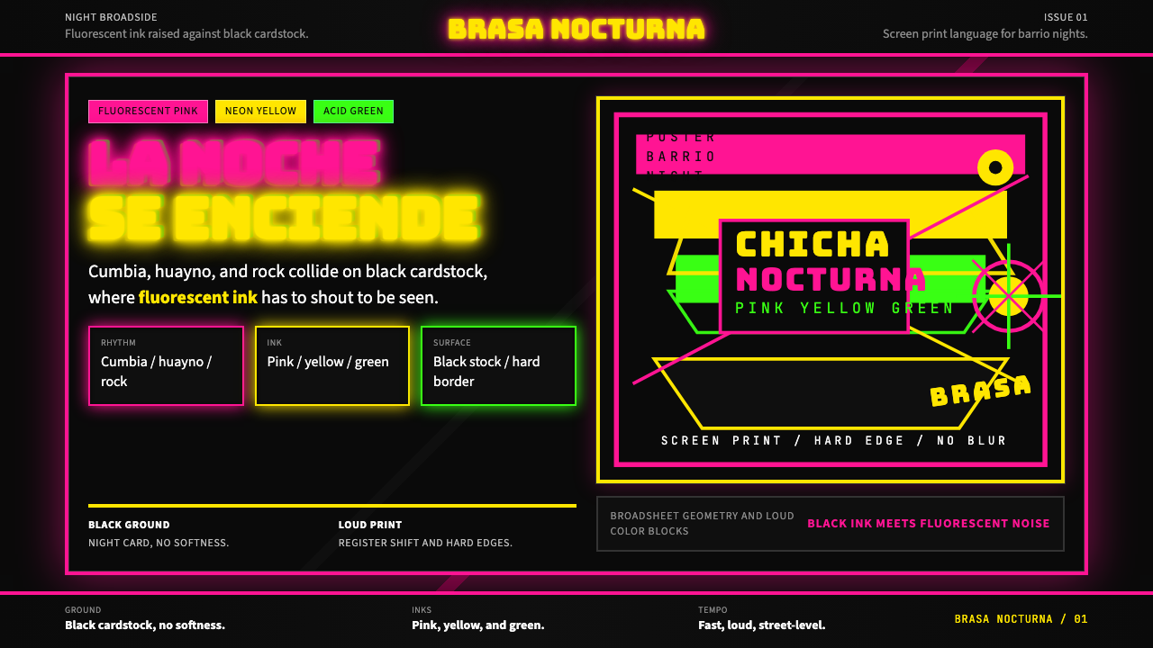 Peruvian Chicha Fluorescent PosterStreet-night fury. Pink, yellow, and green stack on black cardstock in hard b…夜街怒吼。粉黄绿硬边叠在黑卡纸上。
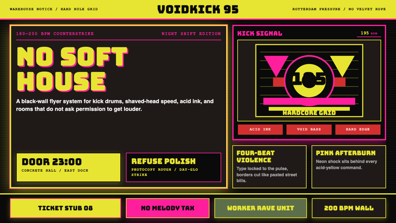 Rotterdam Gabber HardcoreHardcore refuses polish. Acid yellow, neon pink, black grid, and brutal Bunge…硬核拒绝精致:酸黄、霓虹粉与黑色网格,让粗暴 Bungee 字体像传单砸来。
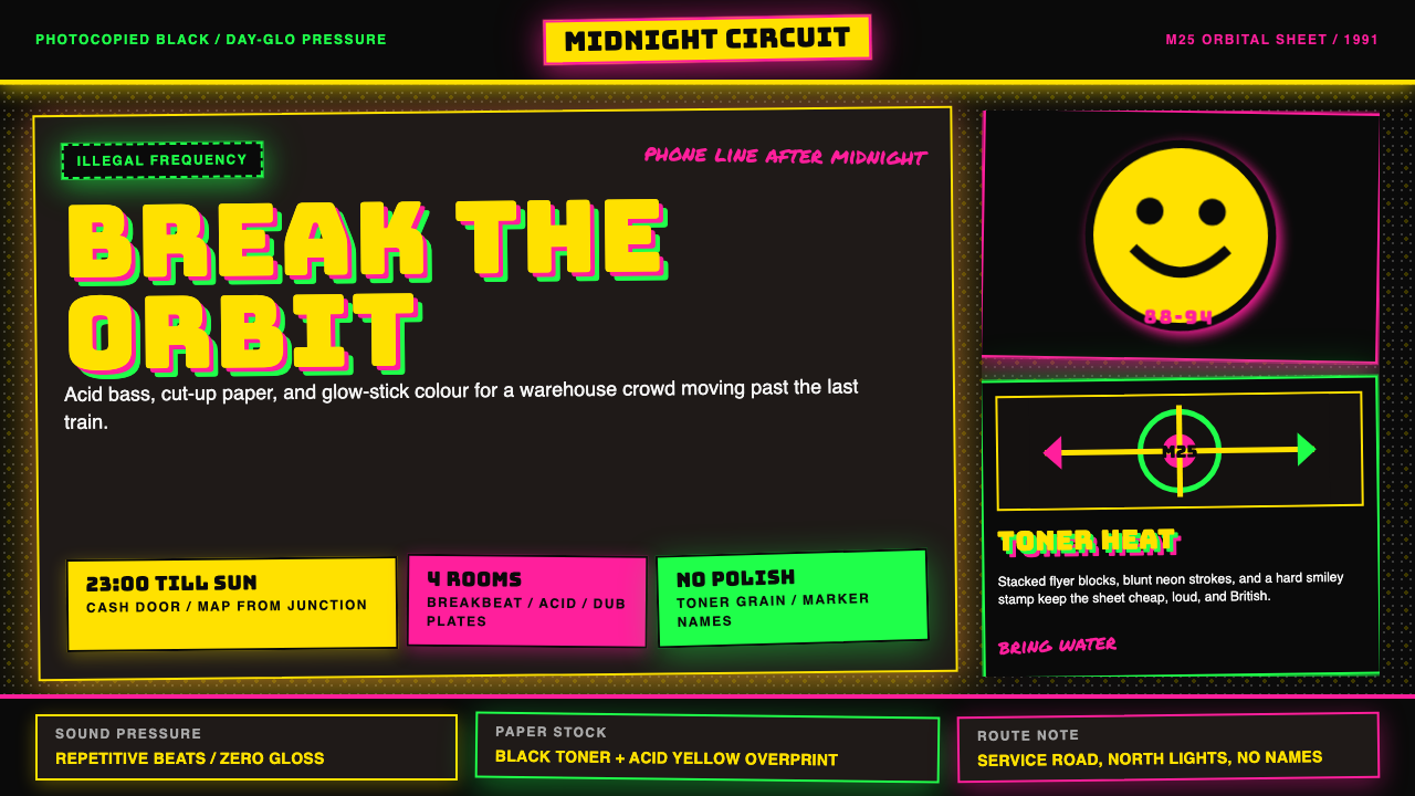 UK Rave Glow-Stick FlyerIllicit euphoria. Acid yellow, rave pink, and laser green slam into photocopi…非法狂喜。荧光黄、粉、绿撞上复印黑。
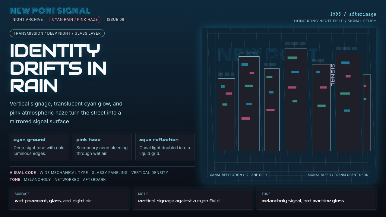 Ghost in the Shell 1995 CyberMelancholy in neon. Cyan glass, pink haze, and vertical signage over a wet gr…霓虹里的忧郁。青蓝玻璃、粉雾和竖向招牌压在雨夜网格上。