What is Ghost in the Shell 1995 Cyber?什么是 Ghost in the Shell 1995 Cyber?
Rain-soaked neon, translucent layers, and the melancholy of a city that never sleeps — Ghost in the Shell 1995 distilled cyberpunk cinema into a visual language still defining how we imagine the digital future.雨夜霓虹、半透明光层,以及一座永不入眠之城的忧郁——1995年的《攻壳机动队》将赛博朋克电影蒸馏为一套视觉语言,至今仍在定义我们对数字未来的想象。
Ghost in the Shell 1995 Cyber in briefGhost in the Shell 1995 Cyber 速览
Ghost in the Shell 1995 Cyber is a design aesthetic drawn directly from Mamoru Oshii's landmark 1995 animated film, itself adapted from Masamune Shirow's 1989 manga. The visual system is built on a deep cyan night sky, hot-pink and magenta neon accents, aqua water-reflection shimmer, and the dense vertical rhythms of kanji signage stacked high above rain-slicked streets. It is the defining look of what became known as Asian-future cyberpunk — dystopian density rendered in jewel-toned saturated light.Ghost in the Shell 1995 Cyber是一套直接源自押井守1995年划时代动画电影的设计美学——该片改编自士郎正宗1989年的漫画原作。这套视觉系统建立在深青色夜空之上,以高饱和度的粉红与品红霓虹为辅色,以水蓝色运河倒影为点缀,以密集垂直排列的汉字招牌勾勒出雨夜街道的天际线。这是后来被称为「亚洲未来赛博朋克」的定义性外观——将反乌托邦密度渲染为宝石色调的饱和光芒。
Unlike the raw, gritty punk texture of earlier Western cyberpunk, the 1995 film introduced a distinctly melancholic beauty. Translucent overlays, glowing atmospheric haze, and the doubling of every light source in canal water give the world an almost impressionistic softness beneath its hard technological surface. The aesthetic holds two opposing moods simultaneously: the cold geometry of surveillance infrastructure and the warm, humid blur of a monsoon city alive with human density.与早期西方赛博朋克原始而粗粝的朋克质感不同,1995年的影片引入了一种截然不同的忧郁之美。半透明叠层、氤氲弥漫的大气光晕,以及每一束光源在运河水面上的倒影,在这个世界坚硬的技术表皮之下赋予了一种近乎印象派的柔软感。这种美学同时承载着两种对立的情绪:监控基础设施的冷峻几何,与季风城市温热、潮湿、因人类密度而模糊的暖意。
The system extends beyond color into typography and hardware design. Geometric-futuristic letterforms — forms that suggest machine origin while remaining legible — sit alongside angular terminal interfaces, sharp-edged mechanical chassis, and scanline overlays that evoke cathode-ray display technology. The result is a design language that feels simultaneously ancient and post-human, rooted in mid-century Hong Kong street life and reaching toward a networked future where the boundary between person and system has dissolved.这套系统的延伸不止于色彩,还包括字体与硬件设计。几何未来主义字形——那些暗示机械起源却保持可读性的字母形态——与有棱有角的终端界面、利落硬边的机械机箱,以及唤起阴极射线显示技术的扫描线叠加并置在一起。最终结果是一套同时感觉上古与后人类的设计语言,植根于二十世纪中叶的香港街头生活,却伸向一个人与系统边界已然消融的网络化未来。
See the Ghost in the Shell 1995 Cyber design system查看 Ghost in the Shell 1995 Cyber 完整设计系统
Where does Ghost in the Shell 1995 Cyber come from?Ghost in the Shell 1995 Cyber 从何而来?
The visual origins of the 1995 film begin with Masamune Shirow's original manga, serialized in Japan from 1989. Shirow's drawings were already dense with technological speculation — cyborg bodies, networked consciousness, overlapping jurisdictions of government and corporate power — but it was Oshii's film adaptation that transformed this material into a sustained cinematic visual argument. Where the manga was kinetic and expository, the film was slow, atmospheric, and philosophical. Oshii spent entire sequences on the city itself: canal reflections, market crowds, rain on windows, the hum of infrastructure.1995年电影的视觉起源可以追溯至士郎正宗的原著漫画——该漫画于1989年起在日本连载。士郎正宗的画面已经充满技术推想:改造人身体、网络化意识、政府与企业权力相互交叠的管辖区——但正是押井守的电影改编将这些素材转化为一场持续的电影视觉论述。漫画是动态的、说明性的,电影则是缓慢的、氛围性的、哲学性的。押井守将整个段落给予了城市本身:运河倒影、市场人群、雨打窗玻璃、基础设施的低鸣。
Art director Hiromasa Ogura was central to building the film's visual world. The setting, called New Port City, was explicitly modeled on Hong Kong — specifically the dense urban fabric of Kowloon, Yau Ma Tei, and Sham Shui Po as they existed in the early 1990s, just before the handover. Ogura and the Production I.G team conducted reference photography in Hong Kong and translated that visual data into a painted, hand-animated world where the neon language of Cantonese commercial signage became the dominant typographic texture. The choice was not incidental: Hong Kong at that moment was itself a city living under the sign of transition, its identity in question, its future uncertain — a perfect mirror for the film's philosophical themes about consciousness and continuity.美术监督冈部弘纯是构建影片视觉世界的核心人物。被称为「新港市」的故事背景明确以香港为蓝本——具体而言,是九十年代初、主权移交前夕的九龙、油麻地与深水埗的密集城市肌理。冈部与Production I.G团队赴香港进行参考摄影,将那些视觉资料转化为一个绘制而成的手绘动画世界,其中粤语商业招牌的霓虹语言成为主导性的排印肌理。这一选择并非偶然:彼时的香港本身就是一座活在过渡符号之下的城市,身份存疑,未来不定——恰是影片关于意识与连续性之哲学主题的完美镜像。
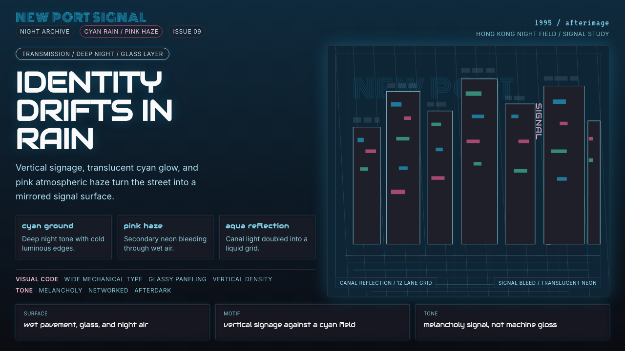
The film's color palette emerged from a specific cinematic decision: to grade the entire world toward cyan and deep blue, pushing the visual temperature of the city into an almost submarine cool, then breaking that coolness with sudden bursts of hot pink and magenta neon. This approach drew on the actual night-lighting conditions of dense Asian commercial districts, where sodium vapor, fluorescent, and neon sources combine into complex chromatic fog, but Ogura and the animation team pushed that naturalistic source material into heightened, saturated territory. The water — the canals, the rain, the harbor — became a compositional device, doubling every light source and turning street-level geometry into shimmering abstraction from above.影片的色彩体系源于一个具体的电影决策:将整个世界的调色向青蓝和深蓝倾斜,将城市的视觉色温推入近乎潜水艇般的冷峻,再以突如其来的粉红与品红霓虹打破这种冷峻。这种方法借鉴了密集亚洲商业区真实的夜间照明条件——钠灯、荧光灯与霓虹灯光源交织形成复杂的色彩雾气——但冈部与动画团队将这一自然主义原材料推向了更高饱和度的夸张领域。水——运河、雨、港湾——成为构图装置,在每个光源下方复制倒影,从高处将街道层面的几何形态化为颤动的抽象。
Kenji Kawai's score contributed to the aesthetic in ways that are worth noting even in a visual design context: the Buddhist chant that opens the film, the sense of ancient ritual encountering technological modernity, shaped the emotional register that the visual system had to match. The film's aesthetics are inseparable from that philosophical mood — a city ancient enough to have a spiritual weight, technological enough to dissolve the self. This tension between the archaic and the networked remains the core emotional signature of the style, and it is this quality that distinguishes it from purely decorative cyberpunk aesthetics that borrow the neon palette without the melancholy.久石让……不,川井宪次的配乐以值得在视觉设计语境中特别提及的方式参与了这套美学:开场的佛教梵唱、古老仪式与技术现代性相遇的感觉,塑造了视觉系统必须匹配的情感寄存。这部影片的美学与那种哲学情绪不可分割——一座古老到具有精神重量、却又技术化到足以消解自我的城市。这种古朴与网络化之间的张力,仍是这套风格的核心情感印记,也正是这种品质将它与那些借用霓虹色板却缺失忧郁的纯装饰性赛博朋克美学区别开来。
What defines the Ghost in the Shell 1995 Cyber look?Ghost in the Shell 1995 Cyber 的视觉特征是什么?
Color Ground底色基调
The dominant ground is a very deep, desaturated cyan-blue — not quite black, not quite navy, but the specific darkness of a rainy night sky over a lit city. Against this ground, all other colors operate as light sources rather than pigments. The palette reads as luminous rather than printed: colors glow from within rather than sitting on a surface.主导底色是一种极深、低饱和度的青蓝色——既不完全是黑色,也不完全是深蓝,而是光亮城市上方雨夜天空特有的那种暗。在这个底色之上,所有其他颜色都作为光源而非颜料发挥作用。整体色板读起来是发光的而非印刷的:颜色从内部发亮,而不是停留在表面之上。
Neon Accent System霓虹强调体系
Hot pink and magenta serve as the primary accent, used for signage, highlights, and interface elements that demand immediate attention. A cooler aqua or teal provides a secondary accent, reserved for water reflections, atmospheric glow, and secondary interface layers. The two accent colors rarely appear at equal weight; the composition always establishes a dominant neon hue and a recessive one.高饱和粉红与品红作为主要强调色,用于招牌、高光与需要立即抓取注意力的界面元素。较冷的水蓝或青绿提供次级强调,保留给水面倒影、大气光晕与次级界面层。两种强调色很少以同等分量出现;构图总是确立一个主导的霓虹色调和一个退缩的色调。
Translucency and Layering半透明与叠层
Transparency is not a technical trick but a philosophical statement in this aesthetic — the dissolution of solid boundaries mirrors the film's themes about identity and the permeable self. Interface panels, overlay text, and atmospheric fog are all rendered as partially transparent, allowing the layers beneath to bleed through. The result is a visual depth that feels less like 3D space and more like looking through multiple panes of rain-fogged glass.在这套美学中,透明度不是技术手法,而是哲学陈述——固体边界的消融映照了影片关于身份认同与可渗透自我的主题。界面面板、叠加文本与大气雾气都被渲染为半透明,让下方的层次渗透显现。结果是一种视觉深度,感觉与其说是三维空间,不如说是透过多层雨雾玻璃向外凝视。
Vertical Typographic Density垂直排印密度
Kanji, katakana, and dense vertical signage stacked in multiple languages create a typographic environment of extraordinary richness. Text is treated as texture and atmosphere rather than pure communication — signs overlap, scale wildly between foreground and background, and read as an urban visual field rather than discrete readable units. Geometric-futuristic letterforms for Latin characters echo machine terminals and early digital display aesthetics.汉字、片假名与多语言密集垂直招牌层叠堆砌,创造出极为丰富的排印环境。文字被当作肌理与氛围而非纯粹传达来处理——招牌相互叠压,在前景与背景之间尺度剧烈变化,作为城市视觉场域而非独立可读单元来阅读。拉丁字符的几何未来主义字形呼应机械终端与早期数字显示美学。
Reflective Surfaces and Water反射表面与水
Rain-slicked streets, canal water, and polished hardware surfaces are not incidental environmental details — they are structural compositional elements. Every light source is doubled by its reflection, creating vertical symmetry that is then broken by ripple and motion. This mirroring device generates compositional richness without adding new visual elements: it multiplies what is already present.湿润雨街、运河水面与抛光硬件表面不是偶然的环境细节——它们是结构性的构图元素。每一个光源都因倒影而倍增,形成垂直对称,再被涟漪与运动所打破。这种镜像装置不需要增加新的视觉元素就能产生构图丰富性:它将已有的东西成倍放大。
Angular Hardware Aesthetic棱角硬件美学
Mechanical and technological objects in this world are characterized by sharp angles, visible seams, exposed bolt patterns, and the suggestion of modular assembly rather than seamless consumer finish. Interface screens have visible scanlines or raster artifacts. Chassis are segmented and angular. The aesthetic treats technology as industrial infrastructure rather than consumer product — it is meant to be operated, not admired.这个世界中的机械与技术对象以锐利棱角、可见接缝、暴露的螺栓排列以及模块化组装的暗示为特征,而非无缝的消费品外观。界面屏幕带有可见扫描线或光栅伪影。机箱被分割成多段,棱角分明。这套美学将技术视为工业基础设施而非消费品——它是为了被操作而存在,而非被欣赏。
Atmospheric Glow and Bloom大气光晕与光溢
Light sources in this aesthetic do not end cleanly at their edges. Every neon sign, every street lamp, every illuminated panel bleeds outward into the surrounding darkness with a soft chromatic bloom — the visual signature of light passing through humid, particulate-laden urban air. This atmospheric diffusion is what distinguishes the palette from flat neon illustration: it gives the world weight, climate, and a sense of genuine nocturnal atmosphere.这套美学中的光源不会在边缘处整洁收尾。每一块霓虹招牌、每一盏路灯、每一个发光面板都向周围的黑暗漫溢,带着柔软的色彩光溢——这是光线穿过潮湿、充满微粒的城市空气时的视觉印记。这种大气漫射正是将这套色板与平面霓虹插图区别开来的东西:它赋予世界重量、气候感,以及真实夜间大气的质感。
See the Ghost in the Shell 1995 Cyber design system查看 Ghost in the Shell 1995 Cyber 完整设计系统
Who shaped Ghost in the Shell 1995 Cyber?谁塑造了 Ghost in the Shell 1995 Cyber?
Director of the 1995 film, Oshii transformed Shirow's action-oriented manga into a philosophical meditation on consciousness, identity, and the boundary between human and machine. His signature approach — long, wordless sequences dwelling on the city's surfaces, rain, and water — established the contemplative visual rhythm that defines the aesthetic. Oshii had previously directed Patlabor 2 (1993), where he began developing the rain-city visual vocabulary he would refine in Ghost in the Shell. His influence on subsequent cyberpunk visual culture — from The Matrix to Blade Runner 2049 — is direct and acknowledged.1995年影片的导演押井守将士郎正宗以动作为主的漫画转化为一场关于意识、身份与人机边界的哲学沉思。他标志性的手法——长段无台词的段落,在城市表面、雨与水上流连——确立了定义这套美学的冥想式视觉节奏。押井守此前曾执导《机动警察2》(1993年),在那部影片中他开始发展后来在《攻壳机动队》中精炼的「雨中城市」视觉词汇。他对后续赛博朋克视觉文化的影响——从《黑客帝国》到《银翼杀手2049》——是直接且被广泛承认的。
As art director, Ogura was responsible for translating Oshii's atmospheric intentions into specific painted backgrounds and color decisions. He led reference trips to Hong Kong and supervised the Production I.G background art team in building the film's visual world frame by frame. His choice to ground the futuristic city in actual, photographically observed Hong Kong urban fabric — rather than generic science fiction architecture — is what gives the aesthetic its specific density and documentary credibility. Ogura's backgrounds are themselves works of extraordinary craft, with each frame containing layered signage, reflected light, and atmospheric perspective handled through color temperature rather than value.作为美术监督,冈部弘纯负责将押井守的氛围意图转化为具体的绘制背景与色彩决策。他主导了赴香港的参考取材之旅,并监督Production I.G背景美术团队逐帧构建影片的视觉世界。他选择将这座未来城市根植于真实的、经过摄影观察的香港城市肌理之中——而非泛化的科幻建筑——这正是这套美学获得其特定密度与纪录片可信度的原因。冈部的背景画本身就是具有非凡工艺的作品,每一帧都包含叠层招牌、反射光线以及通过色温而非明度处理的大气透视。
The manga-ka behind the original 1989 Ghost in the Shell source material, Shirow created the technological and philosophical world that Oshii's film visualized. His manga had already established many of the hardware aesthetics — angular cyborg bodies, dense interface overlays, hybrid human-machine forms — that the film translated into cinematic terms. Shirow's visual approach to technology was always densely annotated and encyclopedic, treating the machinery of the future as something to be understood rather than merely feared or admired, and this intellectual attitude toward technological design persists in the design aesthetic.作为1989年原著漫画的作者,士郎正宗创造了押井守电影所视觉化的技术与哲学世界。他的漫画已经确立了许多硬件美学——棱角分明的改造人身体、密集的界面叠层、人机混合形态——电影将这些转化为电影语言。士郎正宗对技术的视觉处理方式始终是密集注释式和百科全书式的,将未来的机械当作需要被理解的事物,而非仅仅被恐惧或欣赏——这种对技术设计的智识态度在这套设计美学中持续存在。
Composer Kawai's score for the 1995 film is inseparable from its visual identity. His use of Bulgarian vocal techniques and Buddhist chant traditions — ancient forms layered over synthesized textures — created the specific emotional register of the film: something ancient confronting something radically new. In design terms, Kawai's contribution is a reminder that the Ghost in the Shell aesthetic is not purely visual; it carries a mood of contemplative melancholy that resists pure spectacle. Designs inspired by this aesthetic should carry that same emotional weight rather than simply reproducing the neon color palette.作曲家川井宪次为1995年影片创作的配乐与其视觉身份不可分割。他对保加利亚人声技术与佛教梵唱传统的运用——将古老形式叠加于合成音色之上——创造了影片特有的情感寄存:某种古老的事物正在与某种彻底崭新的事物相遇。在设计意义上,川井宪次的贡献提醒我们:《攻壳机动队》美学不纯粹是视觉性的;它承载着一种抵抗纯粹奇观的冥想忧郁情绪。受这套美学启发的设计,应当承载同样的情感重量,而不仅仅是复制霓虹色板。
Production I.G, the animation studio behind the film, developed techniques for the 1995 production that were technically pioneering for their moment — combining hand-drawn cel animation with early digital compositing to achieve the translucent layering effects that define the film's visual depth. The studio's willingness to treat digital tools as a means of achieving atmosphere rather than simply adding effects is what made the compositing feel organic rather than grafted on. This integration of analog and digital techniques, where the seam is deliberately obscured, remains a core principle of the aesthetic.制作公司Production I.G在1995年的制作中开发了在当时具有开创性的技术——将手绘赛璐珞动画与早期数字合成相结合,实现了定义影片视觉深度的半透明叠层效果。这家公司愿意将数字工具作为营造氛围的手段,而非简单地添加特效——这正是合成效果感觉有机而非强加的原因。这种模拟与数字技术的整合,刻意模糊接缝,仍然是这套美学的核心原则。
How do you use Ghost in the Shell 1995 Cyber today?今天怎么用 Ghost in the Shell 1995 Cyber?
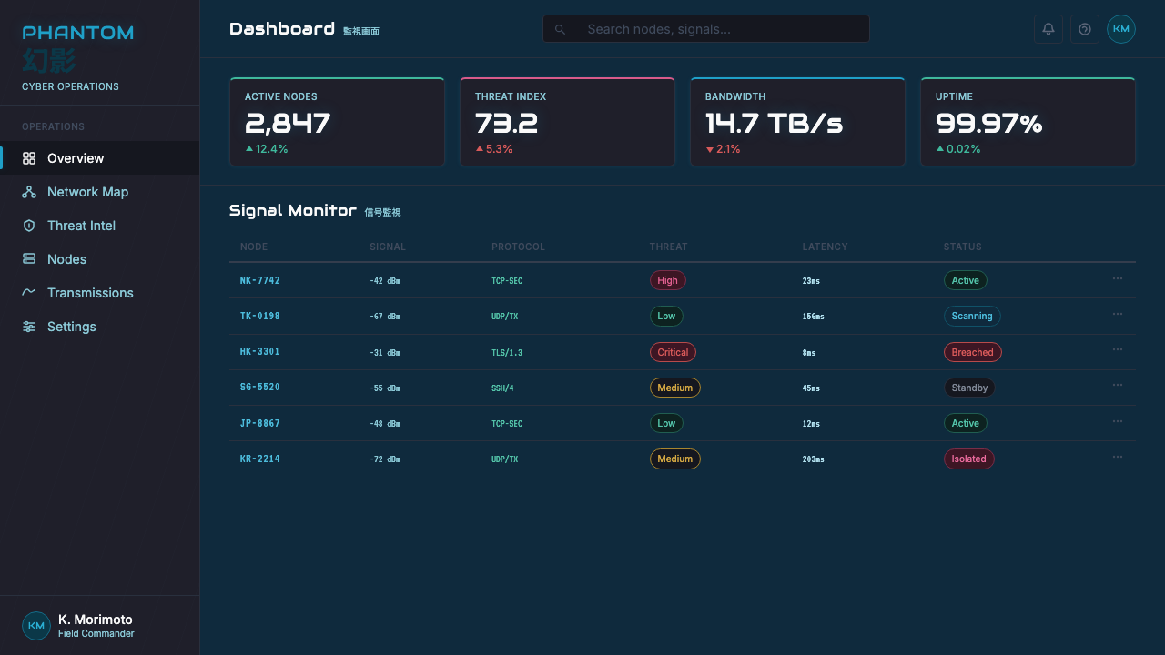
Ghost in the Shell 1995 Cyber is a dark-mode aesthetic by nature — its deep cyan-night ground requires dark interface or document backgrounds to read correctly. Before applying it, confirm that the context supports darkness: this is the right call for a data dashboard, a film industry pitch deck, a cybersecurity product landing page, or a conference presentation on technology futures. It reads as misaligned in bright consumer contexts, health and wellness applications, or anything that requires a sense of openness and daylight.Ghost in the Shell 1995 Cyber本质上是一套深色模式美学——其深青夜色底面需要深色界面或文档背景才能正确呈现。在应用之前,请确认场景支持深色:数据仪表板、电影行业宣讲幻灯片、网络安全产品落地页,或关于技术未来的会议演示,这些都是恰当的选择。在明亮的消费者语境、健康与健身应用,或任何需要开阔感与日光感的场景中,它会显得格格不入。
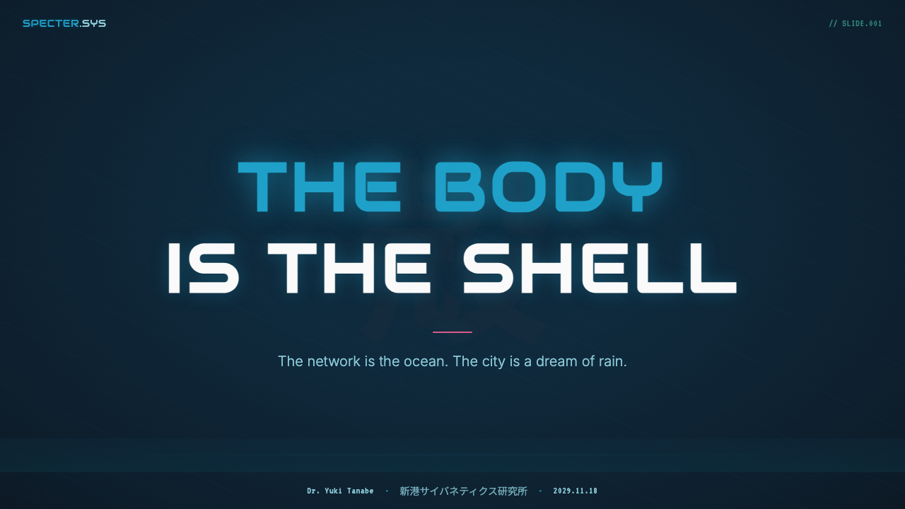
For presentation slides, the style excels at cover pages built around a single dramatic visual moment: a dark ground, a large translucent typographic element or abstract glow shape occupying most of the canvas, and a tight cluster of information in the lower third. Content slides should maintain the dark ground and use the neon accent colors strictly for hierarchy — one color for primary callouts, a cooler hue for secondary labels, white or near-white for body text. Data slides take on a readout quality reminiscent of terminal displays: sparse, monospaced-feeling type, minimal grid lines, and data points colored to match the neon accent palette. Avoid filling every slide with full visual density; the aesthetic needs breathing room between its atmospheric moments.对于演示文稿,这套风格在围绕单一戏剧性视觉时刻构建的封面页上表现出色:深色底面,一个大型半透明排印元素或抽象光晕形状占据画布大部分面积,信息紧凑地聚集在下三分之一处。内容页应保持深色底面,严格以霓虹强调色标示层级——一种颜色用于主要引用,较冷的色调用于次级标签,白色或近白色用于正文。数据页呈现出让人联想到终端显示的读数质感:稀疏、具有等宽感的字体,最少的网格线,以及与霓虹强调色板对应的数据点着色。避免将每张幻灯片都填满完整的视觉密度;这套美学在其氛围时刻之间需要呼吸空间。
For web interfaces and dashboards, the style maps cleanly onto dark-mode component systems. Background layers should be tiered from the deepest near-black through mid-dark panels to surface elements — each tier lighter and slightly more cyan-tinted, creating depth through color temperature rather than shadow alone. Interactive elements, alerts, and primary actions use the hot-pink or magenta accent; secondary information uses the aqua or teal. Typography should feel technical and precise: moderate tracking on headlines, tight line-height on body text. Pricing pages benefit from the style's implicit hierarchy of tiers: a dark-ground base tier, a highlighted featured tier with neon border glow, and a premium tier in the deepest dark with the most saturated accent.对于网页界面与仪表板,这套风格可以清晰地映射到深色模式组件系统上。背景层应从最深的近黑色经由中暗色面板逐级过渡到表面元素——每一层稍浅且稍带青蓝色调,通过色温而非仅仅通过阴影来创造深度。交互元素、警示与主要操作使用粉红或品红强调色;次要信息使用水蓝或青绿色。字体应当感觉技术性而精准:标题适度字距,正文紧凑行高。定价页从这套风格隐含的层级体系中受益:最深暗色的基础档位、带霓虹边框光晕的高亮精选档位,以及使用最饱和强调色的最深暗色高端档位。
For editorial and marketing applications, the aesthetic supports strong narrative content where mystery and technological sophistication are desired brand values. Feature story layouts can use full-bleed dark-ground sections with large translucent pull-quotes as atmospheric elements. Marketing campaign materials — social cards, email headers, event graphics — work well with the compositional approach of centering a single glow-source in the frame and letting the surrounding darkness create drama. The vertical typographic rhythm of stacked signage can inform section headers and category labels that use tight vertical letter-spacing to echo the aesthetic's Hong Kong signage origin.对于编辑与营销应用,这套美学支持神秘感与技术精密感是期望品牌价值的强叙事内容。专题故事版面可以使用铺满版面的深色底面区块,以大型半透明摘引作为氛围元素。营销活动素材——社交卡片、电邮头图、活动图形——适合以在画面中央安置单一光源、让周围黑暗创造戏剧张力的构图方式。叠层招牌的垂直排印节奏可以启发区块标题与分类标签,以紧密的垂直字距呼应这套美学的香港招牌起源。
The most common mistake when applying this aesthetic is treating it as a neon-on-black illustration style — adding bright pink and cyan graphic elements over a flat black background and calling it done. The real system depends on atmospheric quality: the glow that bleeds beyond edges, the layered translucency that creates depth, the sense that light is passing through humid air rather than sitting on a screen. A second common error is using the full neon palette simultaneously at maximum saturation, which destroys the hierarchy the style depends on. In authentic applications of this aesthetic, most of the canvas is very dark and relatively desaturated; neon appears in small, precise applications that feel like discovered light rather than applied decoration.应用这套美学时最常见的错误,是将它当作霓虹色覆黑底的插图风格——在纯黑背景上添加明亮的粉红和青蓝图形元素,就算完成。真正的系统依赖于大气质感:超出边缘漫溢的光晕、创造深度的叠层半透明度、光线穿过潮湿空气而非停留在屏幕上的感觉。第二个常见错误是同时以最大饱和度使用完整的霓虹色板,这会破坏这套风格所依赖的层级体系。在对这套美学的真实应用中,画布的大部分面积是非常暗且相对低饱和度的;霓虹色出现在小而精准的位置,感觉像被发现的光,而非被施加的装饰。
See the Ghost in the Shell 1995 Cyber design system查看 Ghost in the Shell 1995 Cyber 完整设计系统
Ghost in the Shell 1995 Cyber — FAQGhost in the Shell 1995 Cyber · 常见问题
Is this aesthetic the same as general cyberpunk?这套美学和泛化的赛博朋克风格是一回事吗?
Ghost in the Shell 1995 Cyber is a specific subset of the broader cyberpunk visual tradition, and knowing the differences matters for applying it accurately. General cyberpunk visual language — descended from Ridley Scott's Blade Runner (1982) and the American science fiction tradition — tends toward orange and amber neon, dry industrial grit, and a rawer, more chaotic composition. The 1995 film's aesthetic is distinctly more melancholic, more atmospheric, and more specifically Asian in its visual references. The cyan-dominant palette, the water and rain as compositional elements, the Buddhist-influenced philosophical undercurrent, and the Hong Kong street density are all specific to this film's visual world and distinguish it from generic neon-on-black design.Ghost in the Shell 1995 Cyber是更广泛赛博朋克视觉传统的一个具体子集,了解两者之间的差异对于准确应用它至关重要。一般赛博朋克视觉语言——源自雷德利·斯科特的《银翼杀手》(1982年)和美国科幻传统——倾向于橙色和琥珀色霓虹、干燥的工业粗粝感以及更原始、更混乱的构图。1995年影片的美学则明显更忧郁、更具氛围性,在视觉参照上也更具体地是亚洲的。以青蓝为主的色板、作为构图元素的水与雨、受佛教影响的哲学底流,以及香港街头密度,这些都是这部电影视觉世界所特有的,将它与泛化的霓虹覆黑底设计区别开来。
Can this aesthetic work in a light-mode or white-background context?这套美学能在浅色模式或白色背景的场景中使用吗?
With significant modification, yes — but the result will be a loose interpretation rather than an authentic application. The glow effects and atmospheric translucency that define the aesthetic depend on darkness to read as luminous; on a white background, neon colors simply become saturated graphic accents without the sense of light in darkness. A light-mode interpretation might retain the color palette — cyan, pink, aqua — and the geometric-futuristic typographic approach while abandoning the atmospheric and translucency qualities. This produces something closer to a flat graphic style that references the film without capturing its mood. For most applications, if you need a light-mode version, a different aesthetic will serve you better.经过重大修改后可以——但结果将是一种宽泛的诠释,而非真实的应用。定义这套美学的光晕效果与大气半透明度依赖于黑暗才能显现为发光感;在白色背景上,霓虹色只不过成为饱和的图形强调,而没有光在黑暗中的感觉。浅色模式的诠释版本可能保留色板——青蓝、粉红、水蓝——以及几何未来主义的排印方式,但放弃大气与半透明特质。这产生的结果更接近一种平面图形风格,参照了这部电影却未能捕捉其情绪。对于大多数应用场景,如果你需要浅色模式版本,另一套美学会更好地服务于你。
How do I use typography correctly within this aesthetic?在这套美学中如何正确使用字体排印?
Typography in this aesthetic operates at two registers simultaneously. The first is the ambient register: dense, overlapping text used as visual texture — kanji, multiple scripts, stacked labels — which functions as atmosphere rather than readable communication. The second is the functional register: precise, technical-feeling type used for actual hierarchy and navigation. For the functional register, choose geometric or monospaced-leaning typefaces that suggest machine output — clean, deliberate, with no humanist warmth. Headlines benefit from wide, generous spacing that feels like a terminal display; body text should be tight and efficient. Avoid typefaces with organic hand quality or strong calligraphic influence, which undermine the machine-world register.这套美学中的字体排印同时在两个层次上运作。第一是氛围层次:密集、叠压的文字作为视觉肌理使用——汉字、多种文字系统、叠层标签——作为氛围而非可读信息发挥功能。第二是功能层次:精准、技术感的字体用于实际的层级与导航。对于功能层次,选择具有机械输出感的几何或等宽倾向字体——干净、刻意,无人文主义温度。标题适合宽阔、充裕的字距,令人联想到终端显示;正文应当紧凑而高效。避免具有有机手写质感或强烈书法影响的字体,这类字体会破坏机械世界的基调。
What kinds of imagery work well in this aesthetic?哪些类型的图像适合在这套美学中使用?
Photographic imagery works best when it is heavily color-graded toward the aesthetic's palette — pulling blues and cyans into prominence, crushing the shadows toward a deep cyan-black, and adding a slight atmospheric haze. High-angle urban photography, especially of dense Asian cityscapes at night, integrates naturally. Close-up photography of mechanical or electronic hardware — circuit boards, cable runs, server infrastructure — reads well when color-graded and treated as texture. What to avoid: warm-toned photography, daylight-lit scenes, natural landscapes, and any imagery that brings visible human warmth or organic texture into the frame without significant treatment.摄影图像在经过大幅向这套美学色板调色后效果最佳——将蓝色和青蓝色提至突出位置,将阴影压暗为深青黑色,并添加轻微的大气雾气。高角度城市摄影,尤其是密集亚洲城市夜景,能自然融入。机械或电子硬件的特写摄影——电路板、线缆布线、服务器基础设施——经过调色处理后作为肌理效果良好。需要避免的是:暖色调摄影、日光照明场景、自然风景,以及任何未经大量处理就将可见的人文温度或有机质感带入画面的图像。
How does this aesthetic age — will it feel dated quickly?这套美学如何随时间演变——它会很快显得过时吗?
The 1995 film itself has aged remarkably well as a visual artifact, now nearly three decades old and still cited as a reference by contemporary designers and directors. The aesthetic has proven durable because its visual logic is grounded in something real — actual urban light physics, actual Hong Kong street density, actual philosophical and emotional content — rather than in trend-driven surface novelty. That said, the period of 2015–2025 saw heavy commercial adoption of cyberpunk visual cues across gaming, streaming, and marketing, and some surface applications — flat neon gradients, synthwave color palettes — have accumulated associations with a specific cultural moment that may date quickly. The distinction is between applying the aesthetic's underlying logic (atmosphere, translucency, luminosity, melancholy) and simply borrowing its surface palette. The former ages well; the latter ages with the trend cycle.1995年的影片作为视觉作品本身历经将近三十年依然经久不衰,至今仍被当代设计师和导演作为参照引用。这套美学被证明经久耐用,因为它的视觉逻辑根植于真实的事物——真实的城市光照物理、真实的香港街道密度、真实的哲学与情感内容——而非趋势驱动的表面新奇感。话虽如此,2015至2025年间,赛博朋克视觉符号在游戏、流媒体与营销领域经历了大规模商业化采纳,一些表面化的应用——平面霓虹渐变、合成波色板——已经积累了与特定文化时刻相关的联想,这些联想可能会随之迅速过时。关键的区别在于:是应用这套美学的底层逻辑(氛围感、半透明度、发光性、忧郁情绪),还是仅仅借用其表面色板。前者经受时间考验;后者随趋势周期老去。
Related design styles相关设计风格
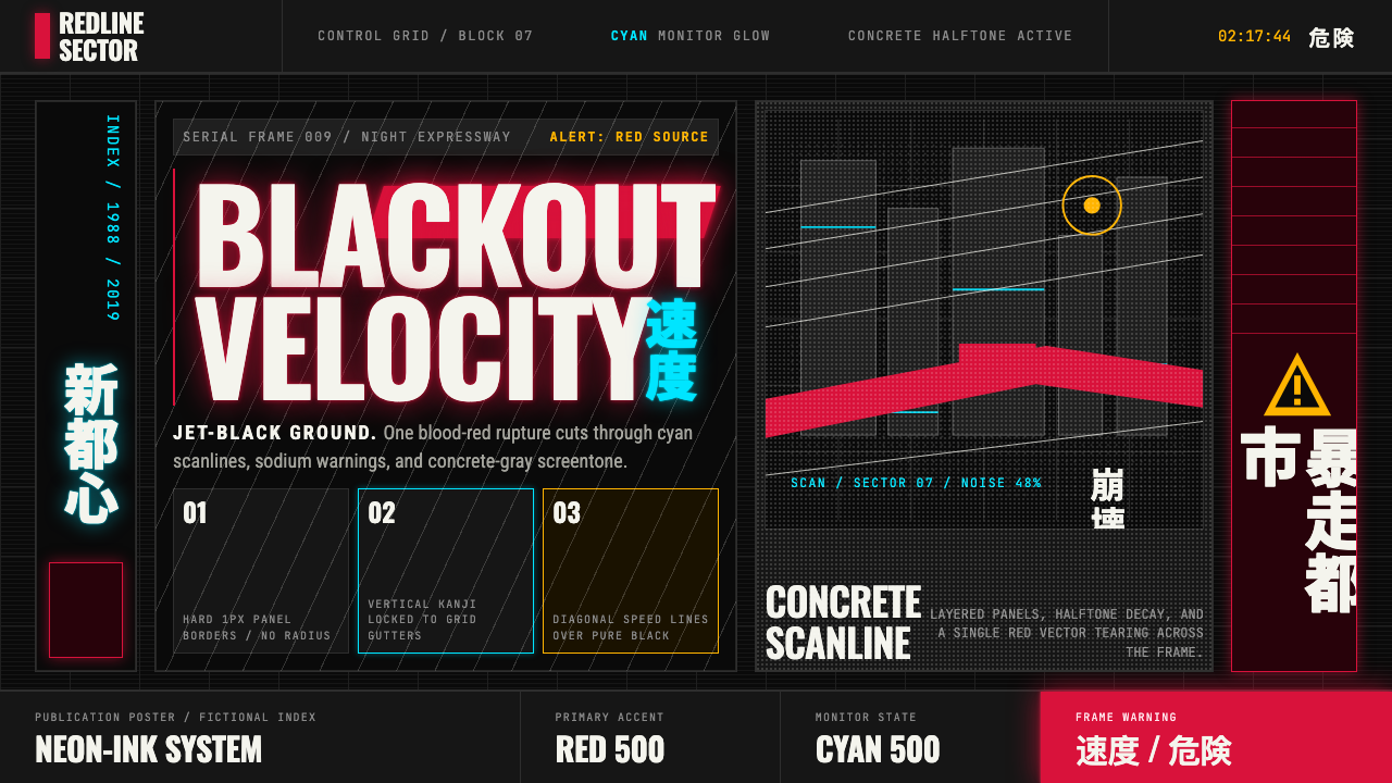 Akira (Otomo)Cyberpunk at impact. Kaneda red, cyan kanji, halftone concrete, and diagonal…冲击式赛博朋克:金田红、青色汉字、混凝土网点与斜向速度线。
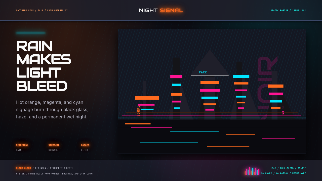 Blade Runner 1982 Neon NoirRain-soaked noir. Orange, magenta, and cyan neon cut black glass.雨夜黑色电影。橙洋红青霓虹切开黑玻璃。
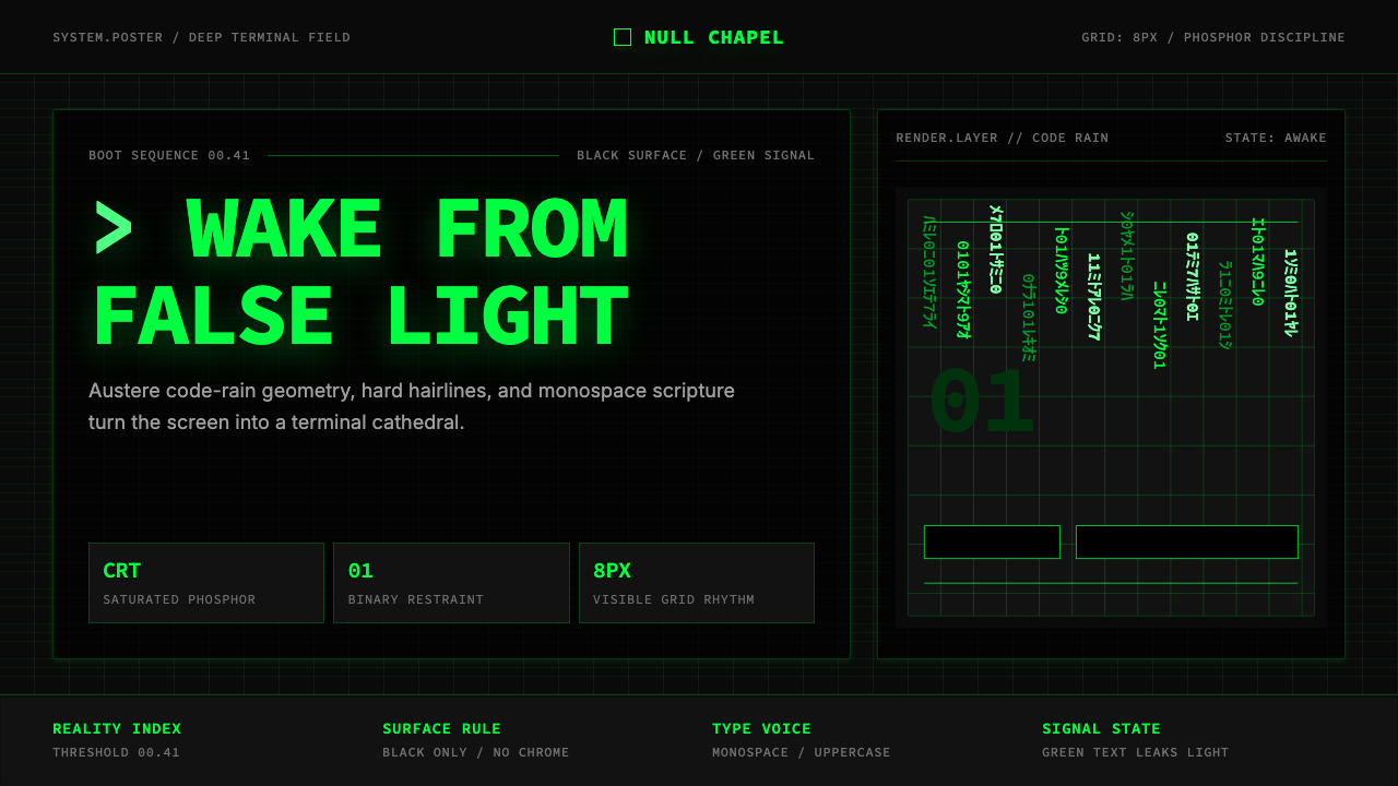 The Matrix (Green-Code)Terminal myth, disciplined. CRT green code rain, black grid, monospace script…终端神话,冷峻克制。CRT 绿代码雨、黑色网格与等宽字成形。
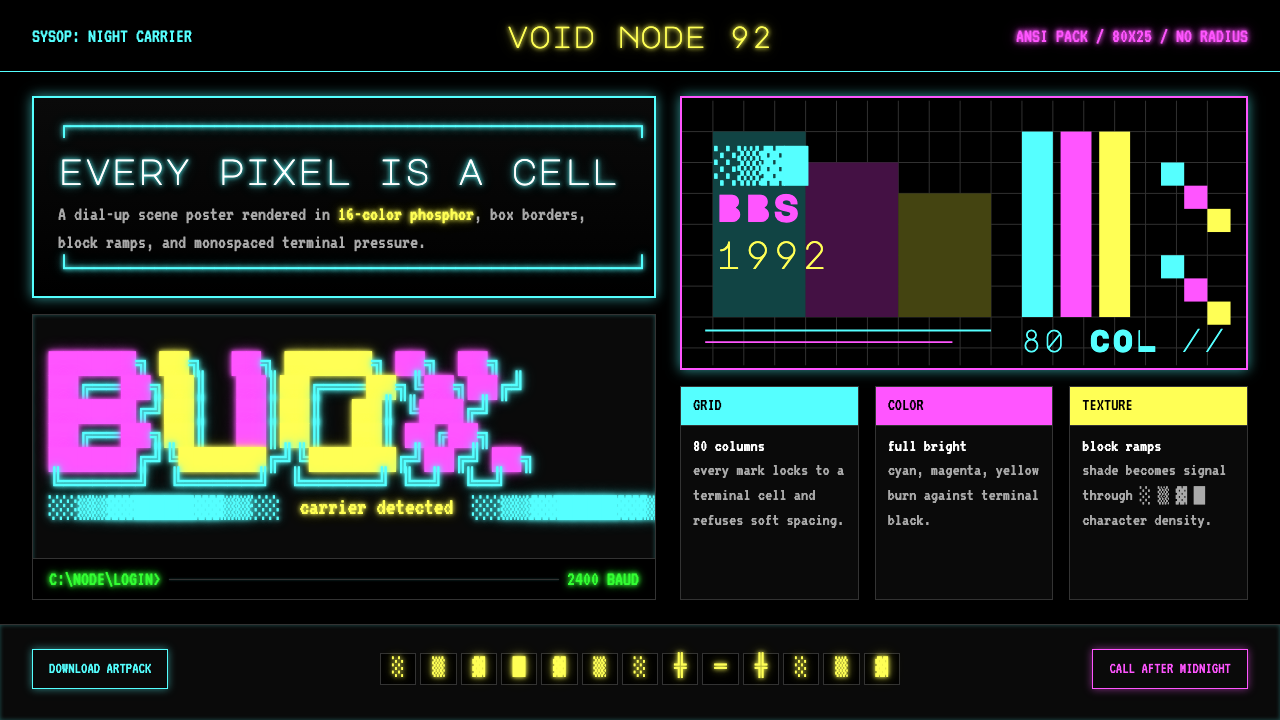 ASCII Art BBS (1992)Terminal art hits hard. Cyan-magenta-yellow glow, box borders, block ramps.终端艺术直击:青品黄磷光、方框边界与方块渐变。
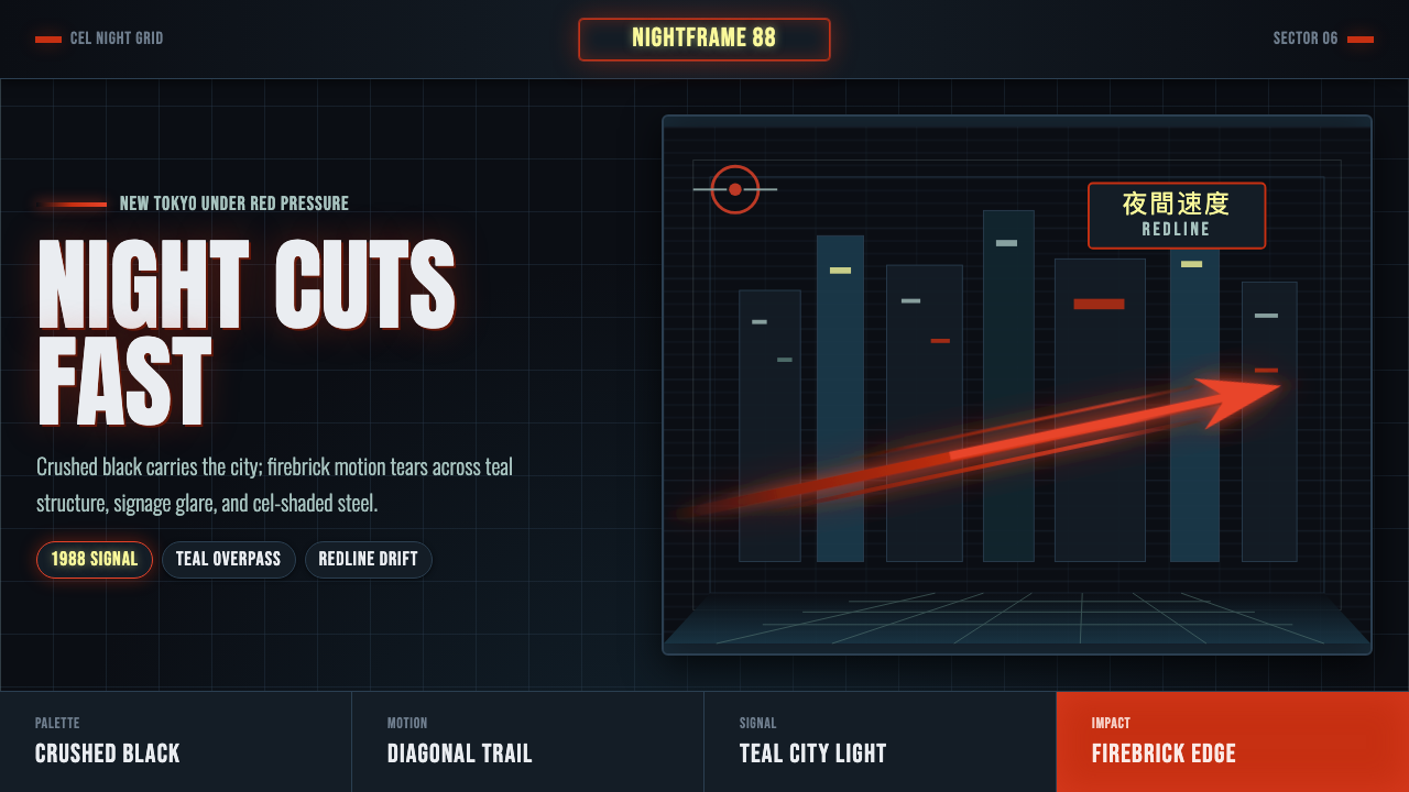 Akira Neo-TokyoNight moves fast. Firebrick trails cut crushed black, teal grids, and condens…黑夜疾驰。砖红光轨切开墨黑、青蓝网格与压缩招牌。
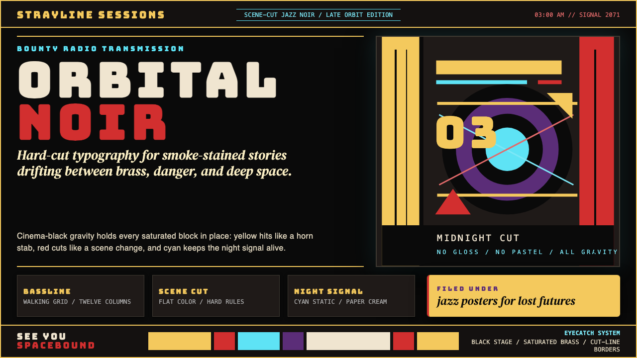 Cowboy Bebop Jazz-NoirCool at 3 AM. Bungee type, jazz yellow, red cuts, and cyan rules hit deep bla…凌晨三点的酷:黑底上 Bungee 字、爵士黄、红切线与青色规则。