What is Polish Cyrk Circus Poster?
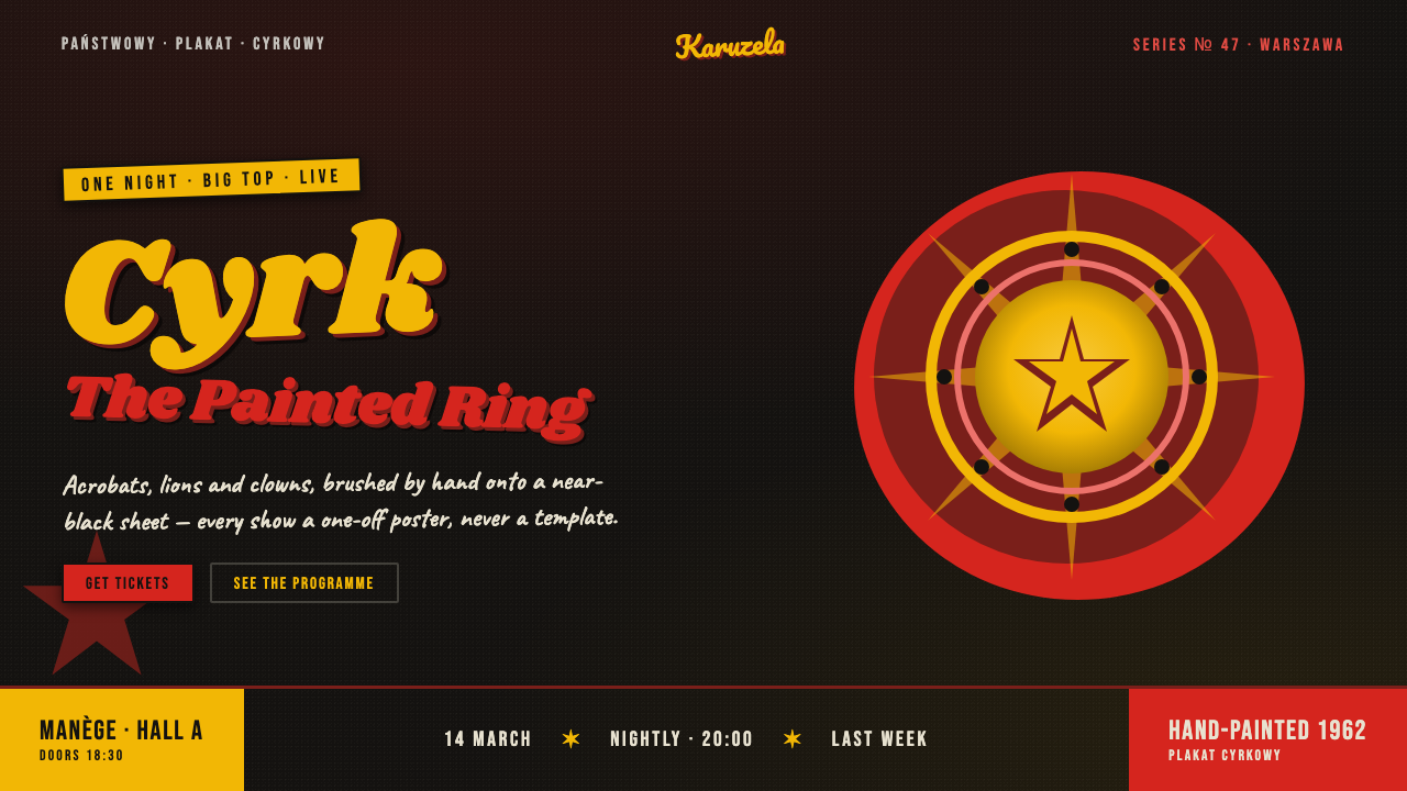
Polish CYRK posters turn the circus into a dark, painterly spectacle: red and yellow flare through blackness while hand-drawn figures seem to shout, stumble, and leap off the paper.
Polish Cyrk Circus Poster in brief
Polish CYRK is the poster language developed for Poland’s national circus from 1962 onward. Created as state commissions by artists associated with the Polish School of Posters, it treated advertising not as a neutral announcement but as an expressive image in its own right. A circus poster did not need to describe an event literally. It could suggest its mood through a clown’s wobble, a lion’s stare, an acrobat’s impossible bend, or an eruption of color against darkness.
Its defining quality is deliberate individuality. Where a corporate campaign might demand a repeatable logo, fixed layout, and uniform message, CYRK posters make room for the artist’s hand. Each composition feels like a singular interpretation: painted rather than assembled, emotional rather than standardized, and willing to be odd, theatrical, humorous, or slightly unsettling. The image carries the invitation before the words do.
Visually, the style thrives on contrast. Near-black grounds create the sensation of a circus tent after the lights dim; vermilion red and circus yellow burst forward with heat and noise. Lettering behaves like a performer, often tilted, irregular, or hand-drawn rather than mechanically composed. Loose brushwork, imperfect contours, splashes, and offset-lithographic texture keep the work tactile. The result is maximalist in feeling even when the page contains only a few elements.
Where does Polish Cyrk Circus Poster come from?
The CYRK series emerged in Poland within the broader culture of the Polish School of Posters. Its period runs from the middle decades of the twentieth century into 1990, with the circus series beginning in 1962 under ZPR and reaching its strongest visibility through the later decades of that period. This was poster art made for a national circus, but it was not reduced to a single official visual formula.
State commissioning gave the circus a recurring public platform while leaving room for distinct artistic responses. That tension is central to the style. The subject remained recognizable — circus, animals, clowns, performers, spectacle — yet the treatment could shift from playful to ominous, tender to grotesque, exuberant to sparse. Consistency came from the theatrical world being pictured, not from a rigid identity system.
The artists named with the tradition include Waldemar Świerzy, Maciej Górowski, Jan Lenica, and Roman Cieślewicz. Their presence signals the connection between CYRK and the Polish School of Posters: a culture in which illustration, typography, gesture, and metaphor could operate together on one printed surface. The poster was a place for visual authorship, not merely a carrier for an approved message.
In digital adaptation, the historical lesson is not to imitate aged paper as decoration or to turn every interface into a vintage advertisement. It is to preserve the logic of expressive commissioning: a dark theatrical field, painterly marks, hot color used as an event, and typography that participates in the drama. A contemporary CYRK-inspired composition should still feel authored, unstable in a productive way, and resistant to corporate smoothness.
What defines the Polish Cyrk Circus Poster look?
Dark Theatrical Ground
The near-black ground is not empty background; it is the implied interior of the tent, the pause before an entrance, and the surface that makes every painted mark feel lit. Darkness gathers the composition and gives bright color a stage on which to perform.
Hot Circus Color
Vermilion red and circus yellow do not function as polite accents. They arrive as flashes, splashes, costumes, signs, and emotional pressure. Their saturation is most powerful when the dark field is allowed to remain visibly dominant, so color reads as flame rather than wallpaper.
Painterly Gesture
Brushwork remains visible and consequential. A line may wobble, thicken, break, or rush past its intended edge; that instability is evidence of a human gesture. Figures should feel discovered through marks rather than constructed from clean, repeatable parts.
Hand-Lettered Type
Display lettering carries posture and temperament. Tilted baselines, uneven rhythm, and drawn contours allow the title to behave like part of the illustration. It should not disappear into a neutral grid; it should enter the ring with the clown, animal, or acrobat.
Asymmetric Drama
The composition refuses the calm certainty of a clean grid. Weight may lean to one side, a figure may be cropped unexpectedly, and text may arrive at an angle. Balance comes through tension and directional energy rather than orderly symmetry.
Offset-Litho Texture
The printed surface should retain a sense of grain, overlap, and imperfect transfer. Texture is not an ornamental filter applied afterward; it supports the impression that color and image have physically met the paper, carrying pressure, friction, and residue.
Who shaped Polish Cyrk Circus Poster?
Świerzy is named among the key figures associated with the CYRK tradition and the Polish School of Posters. In this context, his name represents the poster artist as an author whose painted interpretation could be as memorable as the circus event it announced.
Górowski appears among the artists connected to the state-commissioned circus poster tradition. His inclusion underscores that CYRK was not a single-author style but a shared public commission interpreted through individual visual voices.
Lenica is identified as a key figure in the poster culture surrounding CYRK. The tradition associated with him values metaphor, drawn form, and visual surprise over a uniform promotional formula, making the poster itself an event of interpretation.
Cieślewicz is also listed among the key figures of this Polish poster context. His place in the group reinforces the movement’s central premise: public communication can remain expressive, authored, and visually unruly without losing its ability to attract attention.
How do you use Polish Cyrk Circus Poster today?
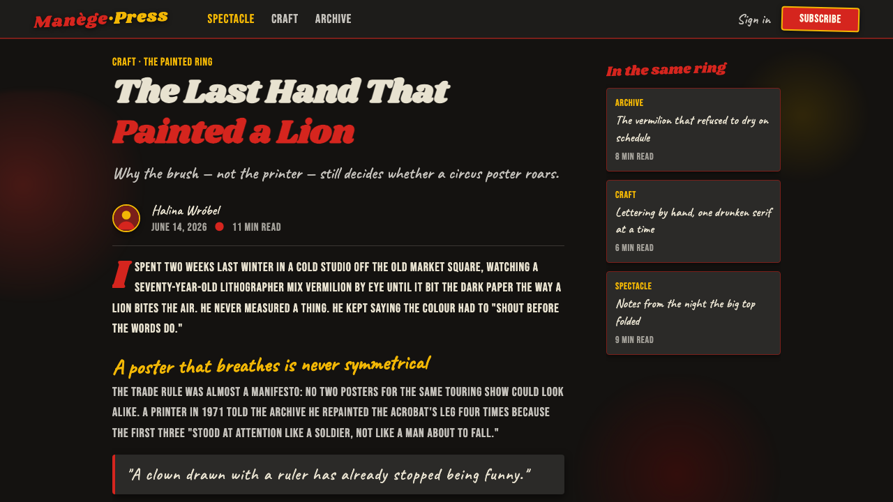
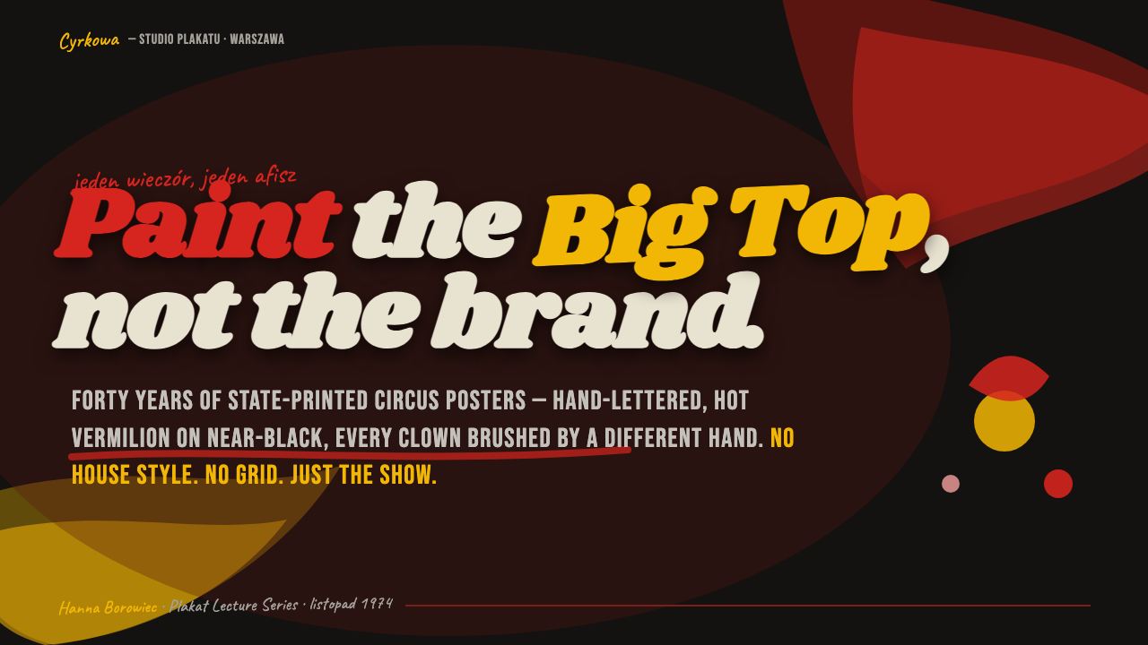
For presentation covers, use the style as an opening act. Let a near-black field hold one charged illustration or gestural emblem, then introduce a hand-lettered title at an angle. The cover should promise movement and anticipation rather than summarize every topic. Keep supporting information quieter, as if it were printed on the edge of a poster rather than competing for the spotlight.
On content slides, translate the painterly energy into a controlled hierarchy. Use a dark ground, a strong title gesture, and a limited number of vivid interruptions to direct the eye. Body copy needs room to remain readable; it should act as the calm announcer beside the spectacle. For data slides, treat charts as performers: emphasize one story with a hot color, allow secondary information to recede, and use irregular illustrated marks only where they clarify the narrative.
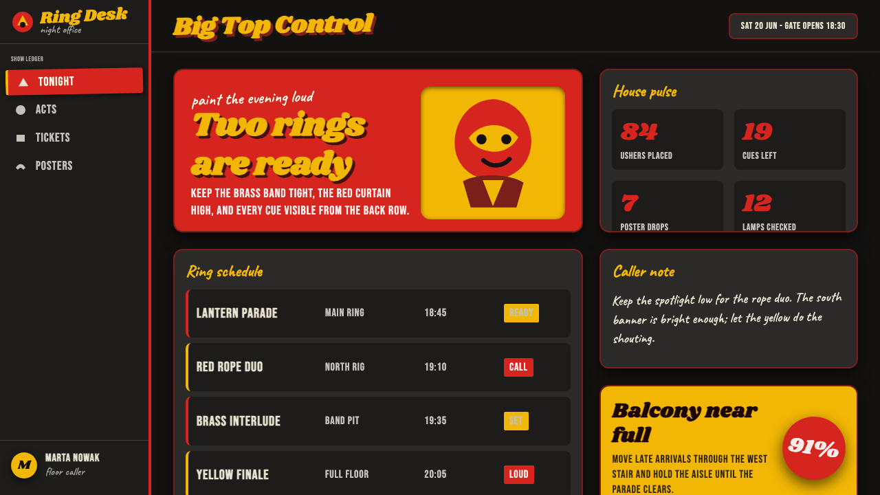
For web interfaces, CYRK works best where a brand needs theatrical presence rather than neutral utility: campaign landings, event programs, cultural portals, creative dashboards, and expressive pricing pages. The interface still needs reliable navigation and legible controls, but the surrounding composition can resist sterile card uniformity. A large painterly graphic, an angled heading, or a burst of color can establish a page’s emotional center before the practical interface takes over.
For editorial and marketing, the style is especially effective when the subject has performance, cultural energy, or a strong point of view. Use cropped figures, gestural illustrations, and dark editorial fields to create pauses between sections. Promotional panels can feel like a sequence of posters rather than a continuous corporate brochure. The writing should match that confidence: compact, vivid, and willing to let a single image carry part of the message.
The common mistake is confusing expressive disorder with unreadable disorder. A CYRK-inspired piece should look authored, not random. Do not scatter every hot color, every texture, and every tilted word across the same surface. Choose one dominant theatrical gesture, protect essential information, and let the dark field create silence around the noise. The style succeeds when its wildness feels staged.
Polish Cyrk Circus Poster — FAQ
Is Polish CYRK simply a retro circus style?
No. Its historical setting is the state-commissioned Polish circus poster, but its deeper principle is expressive poster authorship. Circus imagery matters because it offers motion, danger, humor, and spectacle; the style’s real distinction is the freedom to translate those qualities through painterly metaphor rather than a standardized brand system.
Can CYRK-inspired work use clean digital type?
Yes, especially for supporting information that must remain quickly legible. The key is to preserve contrast between functional text and expressive display lettering. If every line imitates a painted title, the composition loses hierarchy. Let the title perform, while navigation, labels, and explanatory copy provide a steadier countervoice.
Does the style require circus animals and clowns?
No. Those motifs belong to the original CYRK subject matter, but the digital system can carry its character through gesture, dark theatrical space, hot color, and unruly lettering. When the subject is unrelated to performance, an abstract mark or a human gesture may communicate the same sense of arrival and visual risk more honestly.
How should texture be used without making a modern interface feel broken?
Place texture in broad visual fields, illustrations, and promotional moments, not on every control or block of reading text. It should suggest printing and touch without interfering with navigation or legibility. The strongest approach is selective: clean functional areas can sit beside rougher image zones, making the texture feel intentional rather than accidental.
Where does CYRK-inspired design struggle?
It struggles where calm reassurance, dense routine information, or strict visual neutrality is the central requirement. A highly theatrical field can overpower sensitive tasks and make repeated utility screens tiring. Use it where attention, anticipation, and cultural character are valuable; reduce its intensity where users need quiet concentration and predictable operational flow.
Related design styles
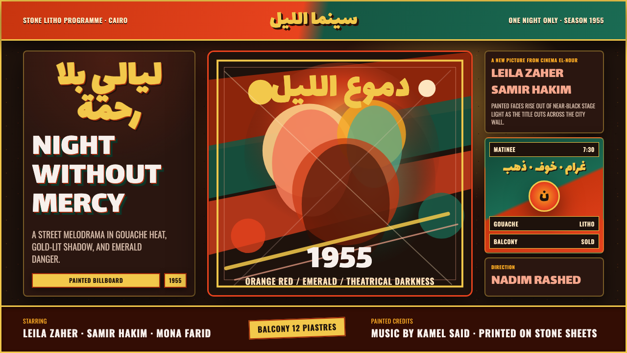 Egyptian Film Poster (Cairo)Melodrama at billboard scale. Near-black ground, ruq'ah titles, orange-red ag…
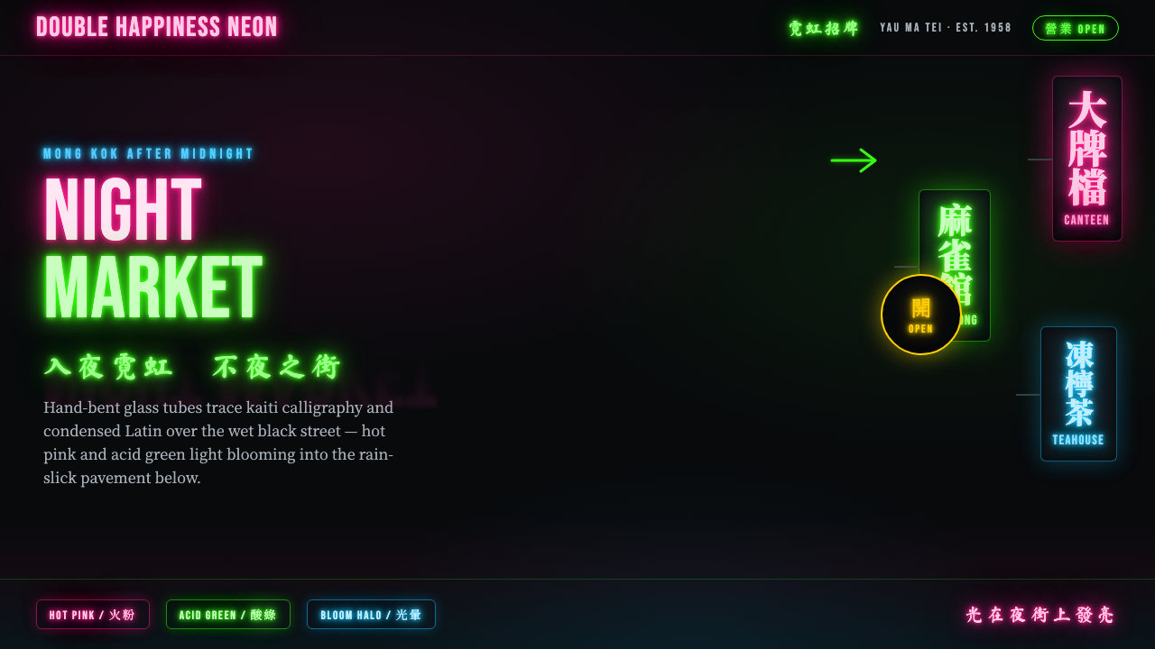 Hong Kong Neon SignboardsLight only reads against the wet black night. Hand-bent pink and green tubes…
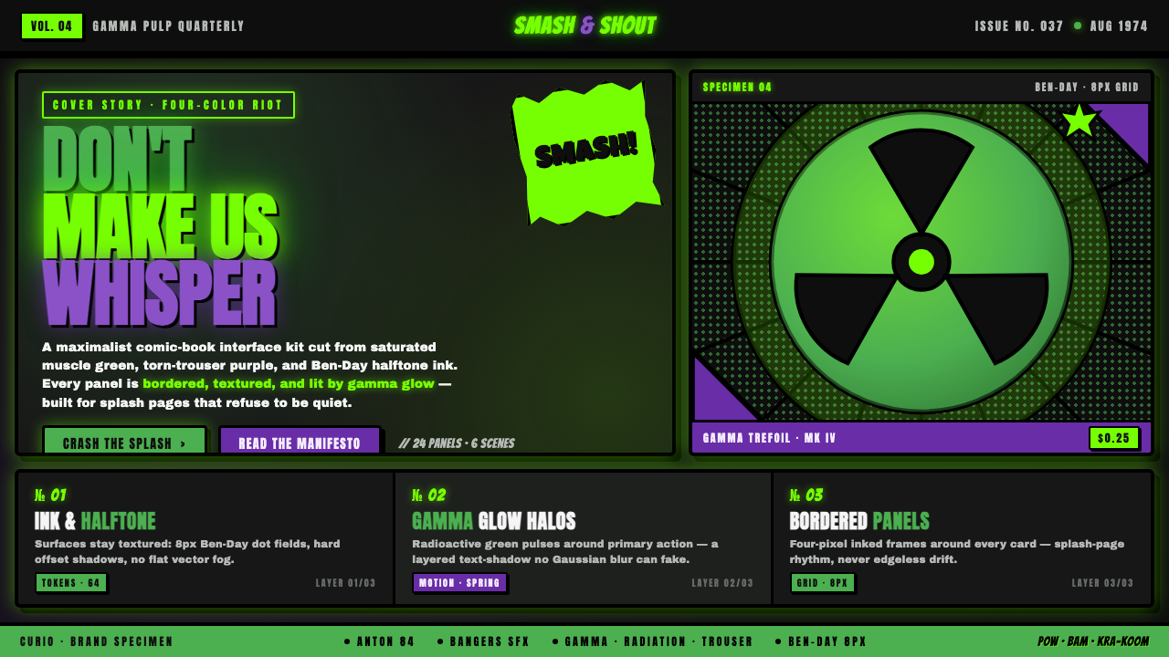 Hulk Gamma GreenDon't make us whisper. Muscle green, trouser purple, inked panels, Ben-Day ha…
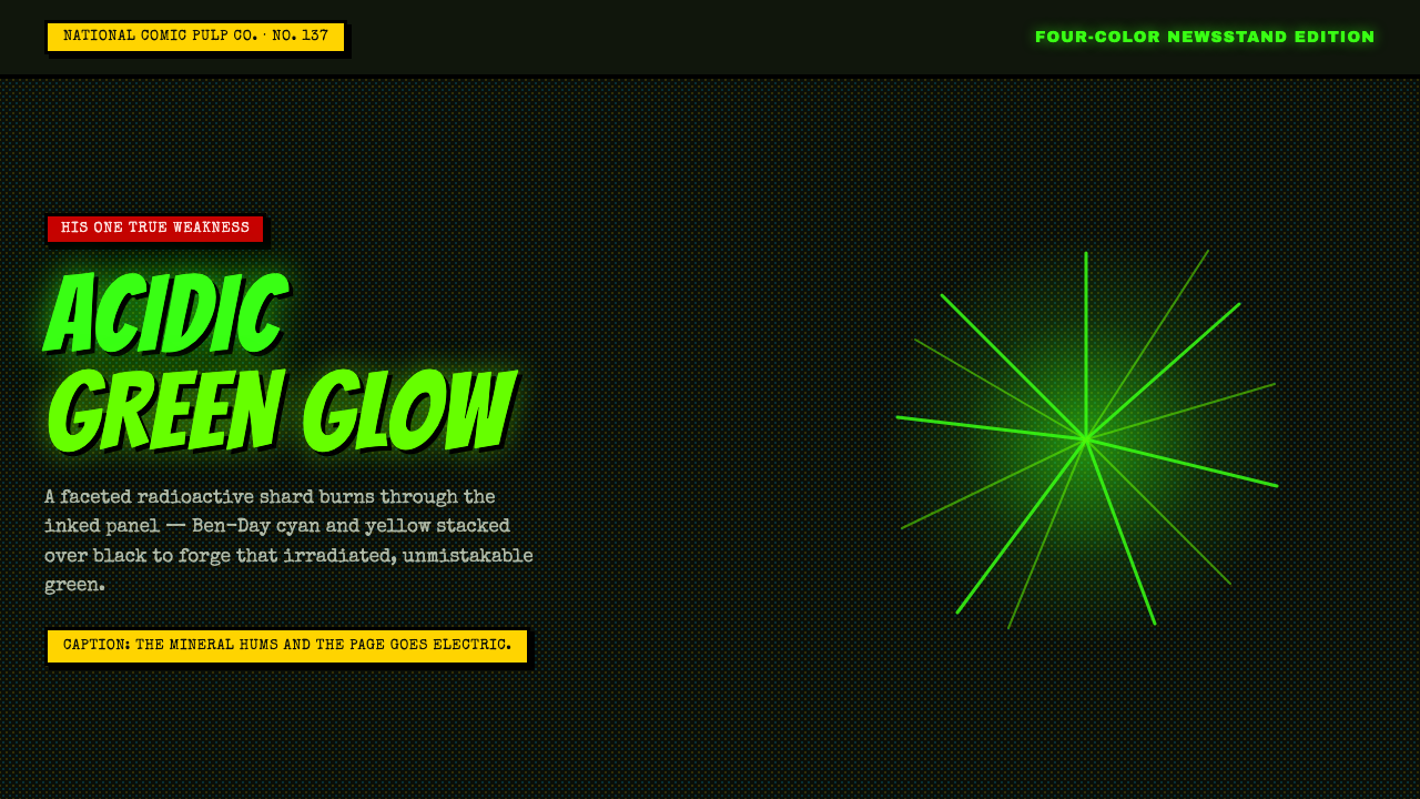 Kryptonite GreenRadioactive pulp glows hard. Neon green shard, black gutters, Ben-Day grit.
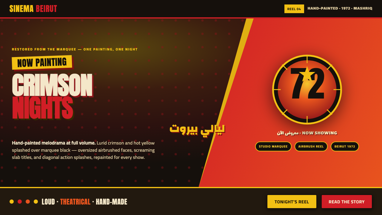 Lebanese Film PosterMelodrama at full volume. Lurid crimson and hot yellow on marquee black, slab…
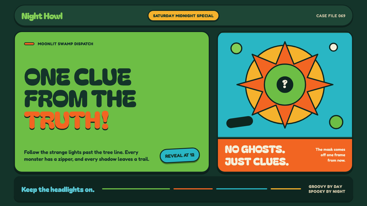 Mystery Machine (Scooby-Doo 1969)Groovy by day, spooky by night. Balloon type and acid-green panels hide the n…