What is Polish Wycinanki Pink?
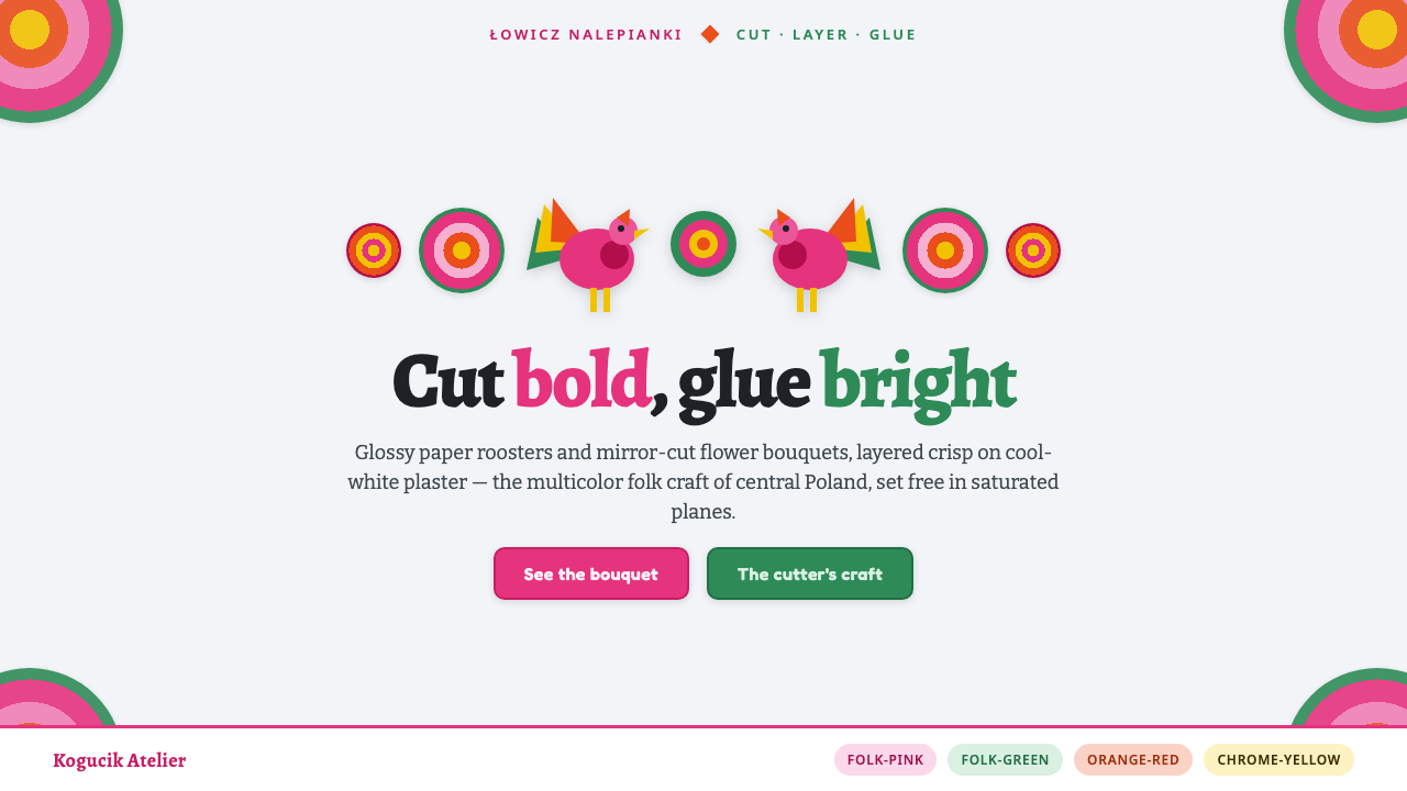
Polish Wycinanki Pink turns village papercutting into a jubilant visual system: hot-pink roosters, mirrored bouquets, glossy layers, and crisp color against cool-white plaster.
Polish Wycinanki Pink in brief
Łowicz wycinanki are the multicolor, layered, glossy papercuts known as nalepianki from central Poland. Made roughly between 1900 and 1950, they assemble saturated paper shapes into ornamental compositions of roosters, stars, and flowers. Their character comes from cutting and pasting rather than painting: every contour is decisive, every color arrives as a separate plane, and the finished image retains the tangible logic of collage.
The defining structure is bilateral symmetry. A central axis holds the composition together while matching bouquets, flowers, birds, or abstract cut forms spread outward on both sides. This symmetry does not make the work quiet. Because the forms are densely layered and vividly colored, it creates abundance with order: visual energy is allowed to multiply, but it never loses its center.
Traditionally, these papercuts were pasted onto whitewashed cottage walls. The pale ground made the saturated glossy paper appear brighter and more immediate. Polish Wycinanki Pink carries that relationship into a contemporary system: cool white acts as open wall space, while hot pink and other bold flat hues gather in stacked decorative clusters. The result is maximalist, handmade, and sharply legible rather than atmospheric or painterly.
Where does Polish Wycinanki Pink come from?
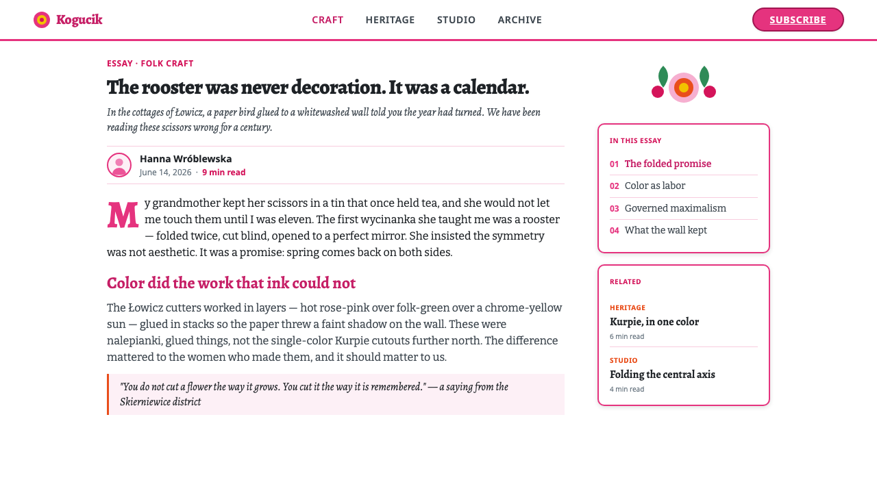
The tradition belongs to the Łowicz region of central Poland, in Eastern Europe. Its multicolor layered form is identified with nalepianki: papercuts built by gluing cut pieces of glossy colored paper together. The materials themselves guided the aesthetic. Scissors created clean silhouettes; bright paper supplied the visual force; layering allowed flowers, stars, and roosters to appear as separate, overlapping presences rather than as a single illustrated scene.
Łowicz village artists made these works during the first half of the twentieth century, when domestic walls offered a direct surface for decoration. Whitewashed cottage interiors were not a neutral gallery backdrop added afterward; they were part of the craft’s visual condition. Against that clear pale ground, saturated forms could read from a distance while their nested cut edges rewarded close viewing. The craft therefore joins architectural surface, household decoration, and paper composition in one object.
The Łowicz approach is especially useful to understand alongside Kurpie cutouts, the contrasting Polish folk papercutting tradition named in this source. Kurpie work is associated here with monochrome cutouts, while Łowicz nalepianki emphasize multicolor layering. That distinction is more than a palette change. Monochrome cutting foregrounds silhouette and perforation; Łowicz collage foregrounds accumulation, color contrast, and the pleasure of one paper shape sitting visibly over another.
When translated into a design style, this history should remain concrete. The goal is not a generic rustic look or a vague Eastern European mood. It is the specific visual behavior of layered papercuts: mirrored organization, hot-pink focal motifs, saturated floral clusters, sharp scissor-like edges, and a cool-white field that lets the decorative work feel pasted on, proud of its surface and deliberately full.
What defines the Polish Wycinanki Pink look?
Cool-White Ground
The background should behave like whitewashed plaster: clear, cool, and spacious enough to make every saturated cut form pop. It is not an empty void or a luxury-minimal surface. It is the wall that receives the decoration. Keep it visually quiet so the layered motifs retain their physical, pasted-on presence.
Hot-Pink Exuberance
Hot pink is the emotional spark of the system. Use it as a confident focal color in roosters, flower petals, title fields, or major decorative cuts. It should feel festive and direct, never softened into a polite accent. Other saturated colors can support it, but pink gives the style its particular folk brightness.
Bilateral Bouquet
Build compositions around a visible centerline. Motifs may mirror exactly or answer each other with closely related forms, but the two sides must feel intentionally paired. Flowers and stars radiate outward like a bouquet, while the axis gives dense decoration a stable grammar. Symmetry is the organizer, not a reason to make the layout static.
Layered Paper Planes
Treat every motif as a flat cut piece placed over another. Overlap should be obvious, with foreground flowers, leaves, stars, and birds retaining clean independent edges. Depth comes from stacking, not from naturalistic lighting, texture, or haze. The image should feel assembled by hand from bright sheets of paper.
Crisp Scissor Edge
Contours should be graphic and decisive. Petals, feathers, stars, and leaves can be intricate, but they should never dissolve into soft painterly detail. The edge is a record of cutting: bold curves, pointed notches, and clear silhouette changes. This crispness keeps maximal ornament readable.
Glossy Saturation
The reference is glossy colored paper, so color should appear solid, bright, and deliberately artificial in the best sense. Avoid dusty, faded, or heavily naturalized treatments. Visual richness comes from adjacent flat colors and the rhythm of repeated forms, not from tonal modeling or restrained neutral palettes.
Who shaped Polish Wycinanki Pink?
The collective makers at the center of the tradition. Their work transformed scissors, glossy colored paper, and cottage walls into dense decorative compositions. In this style, they matter less as individual signatures than as the source of a shared grammar: bright cut forms, bilateral order, and handcrafted abundance.
Nalepianki cutters made a specifically layered form of wycinanki. Their method of cutting separate colored elements and gluing them into one image is the direct origin of the style’s stacked visual logic. Contemporary work should preserve this sense of assembly rather than flattening everything into a single decorative pattern.
The rooster is a named motif in the Łowicz source material and an ideal emblem for the system’s extroverted energy. Its silhouette introduces movement among more radial flowers and stars. Used as a focal figure, it makes the composition feel celebratory, folk-made, and unmistakably alive.
The bouquet is not merely decoration; it is the composition’s governing figure. By arranging flowers and related cuts on either side of an axis, it turns many competing colors into one coherent cluster. It is the device that lets the style be lavish without becoming visually unmoored.
How do you use Polish Wycinanki Pink today?
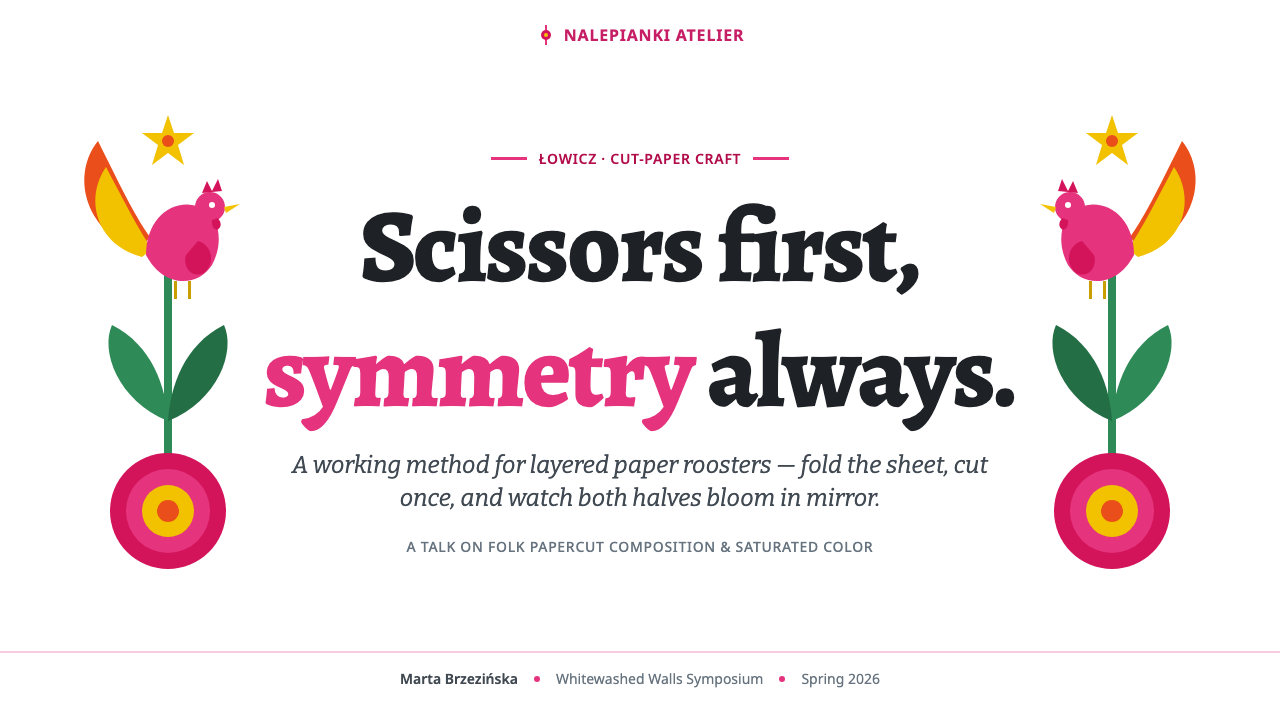
For presentation covers, use the cool-white field as a stage for one strongly centered or corner-anchored bouquet. A hot-pink rooster or floral cluster can establish the theme immediately, while the title remains clear and confident beside it. On content slides, keep the symmetry as a framing device rather than repeating full decorative scenes everywhere. Let small mirrored motifs mark sections and let generous pale space protect readability.
Data slides work best when charts remain plain and their surrounding decoration does the folk work. Use saturated cut-paper-like blocks to distinguish categories, and reserve roosters, stars, or petals for titles, legends, and endpoints rather than chart interiors. A symmetrical floral header or footer can unify a sequence of analytical slides without making values compete with ornament.
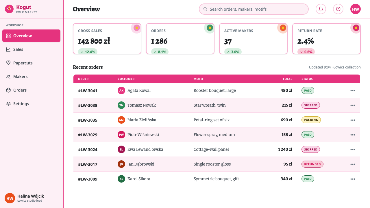
For web interfaces, Polish Wycinanki Pink suits dashboards, campaign pages, event surfaces, and pricing pages that need a cheerful, unmistakable personality. Keep navigation and controls straightforward on the cool-white ground, then use layered floral assemblies to identify sections, plans, milestones, or empty states. Repeated mirrored framing can make a dashboard feel organized even when the visual language is exuberant.
In editorial and marketing work, use the style for launches, cultural programming, seasonal campaigns, and story-led landing pages. Large bouquet clusters can introduce chapters; smaller stars or petals can create continuity between text blocks; rooster motifs can signal a call to action or featured moment. The common mistake is to scatter folk icons randomly. Without a centerline, visible layers, and spacious pale ground, the result becomes generic colorful decoration rather than Łowicz-derived collage.
Polish Wycinanki Pink — FAQ
Is Polish Wycinanki Pink simply a floral folk pattern?
No. Flowers are important, but the style depends on a construction method and a compositional system: separate cut-paper planes, visible layering, bilateral symmetry, glossy saturated color, and a whitewashed-wall-like ground. A seamless floral repeat may borrow motifs, yet it misses the pasted, assembled character of nalepianki.
How is Łowicz wycinanki different from Kurpie cutouts?
In the source material, Kurpie is the contrast tradition of monochrome cutouts, while Łowicz is defined by multicolor layered nalepianki. The practical result is a different visual emphasis. Kurpie foregrounds a single silhouette or cut structure; Łowicz foregrounds stacked colored pieces, bouquets, and bright contrast on a pale wall-like ground.
Can the style work without hot pink?
It can retain a Łowicz-inspired structure through symmetry, layering, glossy saturation, and cool-white contrast, but it loses the specific Pink system described here. Hot pink is not a minor accent in this interpretation; it is the emotional focal point that makes the roosters and bouquets feel especially immediate and exuberant.
Why should the background remain so plain?
Because the traditional craft relied on whitewashed cottage walls to make colored paper stand out. A busy or dark background competes with the cut forms and weakens their collage logic. The pale ground also gives layered decoration room to breathe, so the style reads as joyful abundance rather than uncontrolled visual noise.
Related design styles
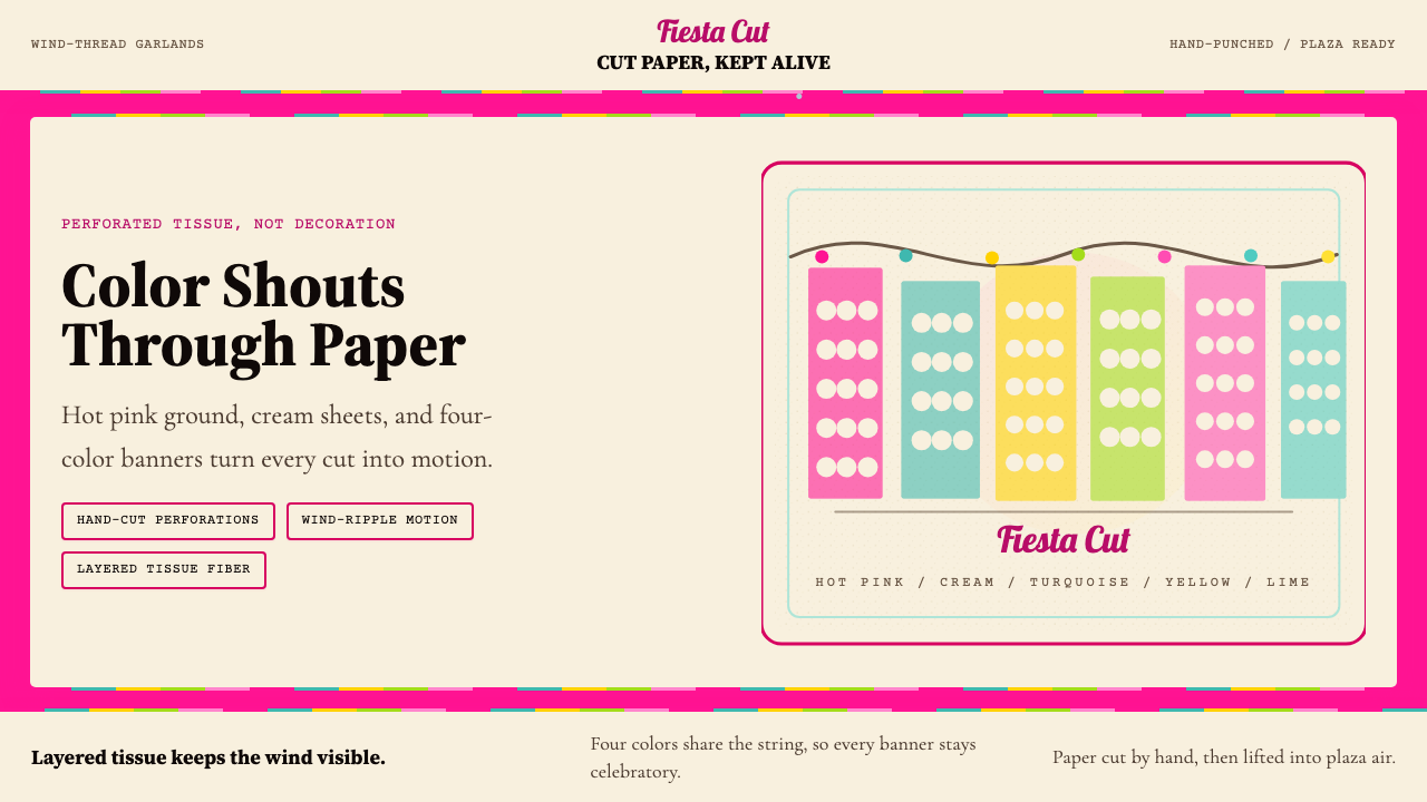 Mexican Papel Picado TissueFiesta cut paper. Hot pink, turquoise, yellow banners and hand-cut perforatio…
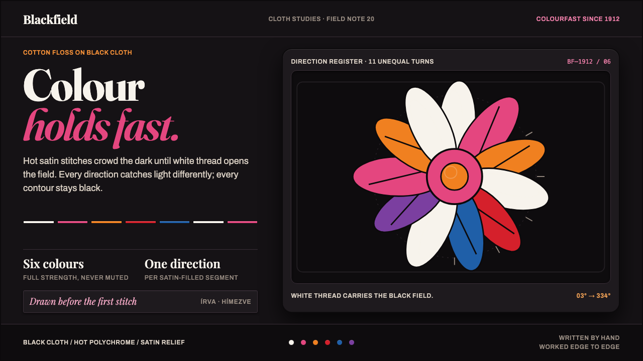 Kalocsa EmbroideryColour burns against black. White thread and hot satin segments pack the fiel…
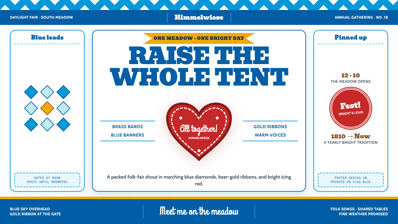 Oktoberfest Munich (1810)Festive and packed. Bavarian blue diamonds, fat slab type, and iced red heart…
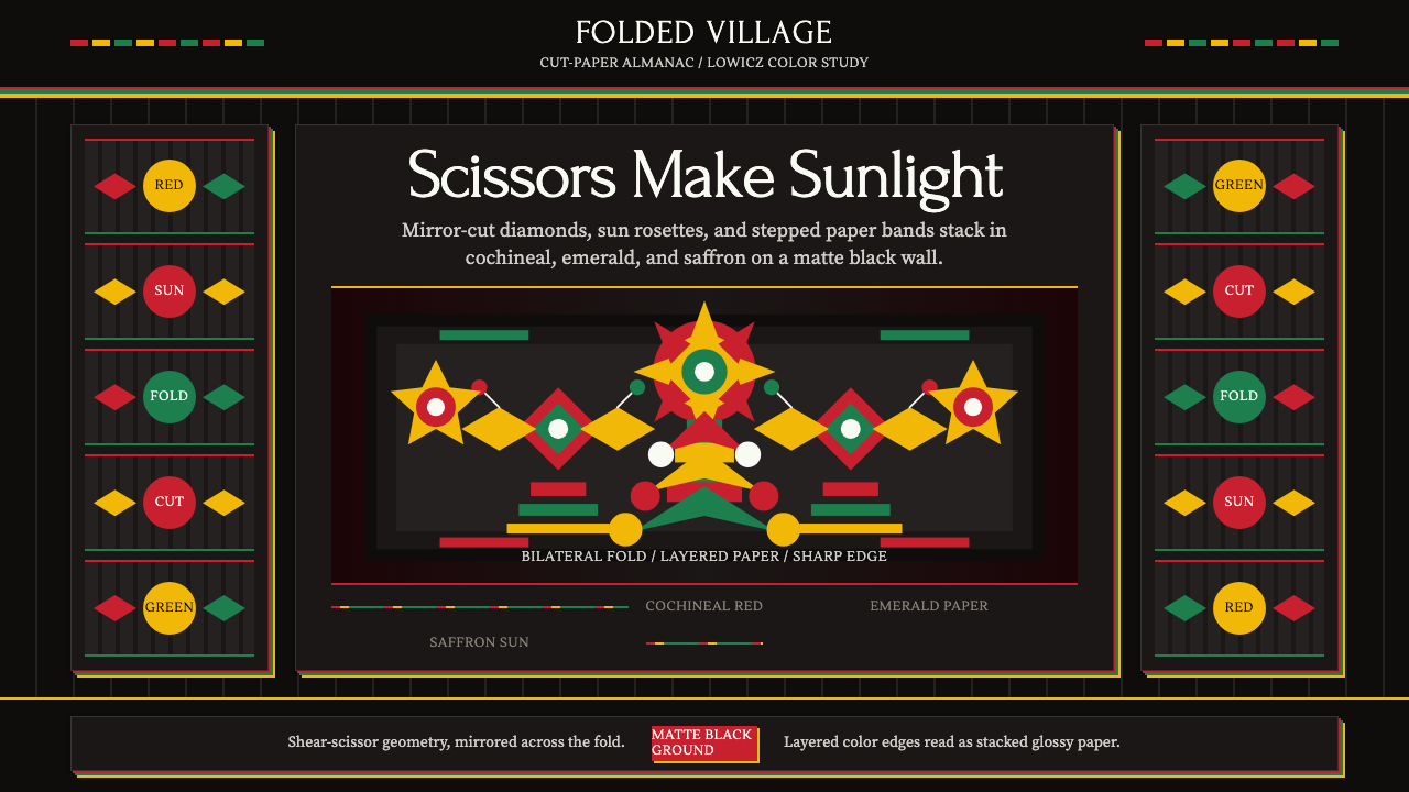 Polish Wycinanki (paper-cut folk art)Cuts sing in symmetry. Cochineal, emerald, and saffron layers blaze on black.
 Russian Matryoshka 1890Warmth nests inward. Birch, cream, russet, and egg-oval type stage handmade d…
 Petrykivka Folk PaintingFolk maximalism that glows. One-stroke red-green-gold blooms radiate from a c…