What is Oktoberfest Munich (1810)?
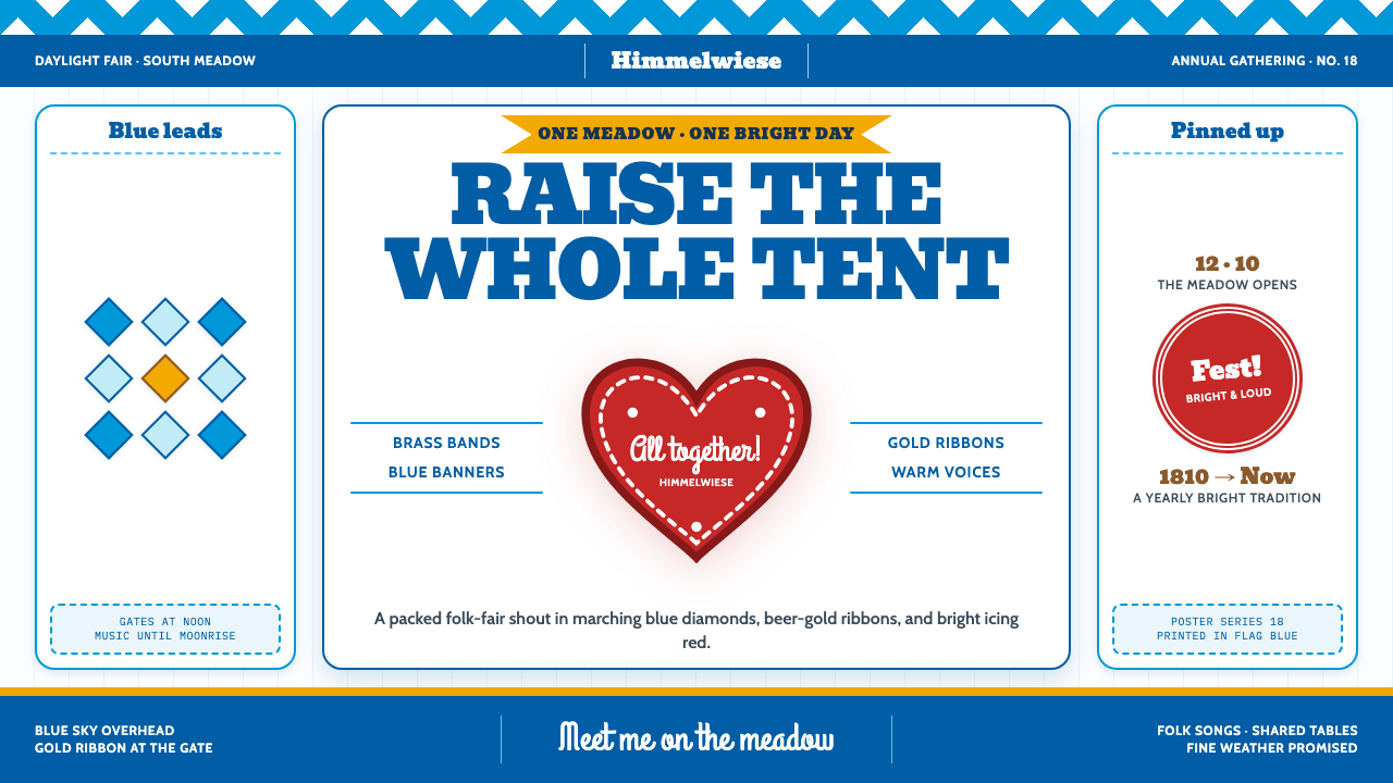
Oktoberfest Munich turns a fairground poster into a celebration: Bavarian blue diamonds, a boisterous slab headline, and a red gingerbread heart crowded together with infectious cheer.
Oktoberfest Munich (1810) in brief
Oktoberfest Munich is a festive visual style rooted in the fair at Munich’s Theresienwiese. Its signature composition resembles a Wiesn poster fixed to a tent pole: a clean white ground, blue Bavarian diamonds across the top, a weighty fairground headline, and a gingerbread-red heart edged with white icing. Beer-gold ribbons bring warmth to the blue and red. The result feels assembled for a crowd rather than arranged for a quiet gallery.
Two traditions give the style its identity. The blue-and-white diamond pattern comes from Wittelsbach heraldry, especially the Rautenflagge; the ribboned Lebkuchenherz supplies the heart, scalloped icing, and handwritten message. German Volkskunst, Jahrmarkt poster art, and gingerbread lettering meet in a language that is both public and personal. The poster announces the celebration, while the heart reads like a small keepsake worn close to the body.
Its defining quality is abundance with recognizable anchors. Blue establishes the setting, red draws attention to the heart, and beer gold connects them through ribbons and accents. Thick letters, repeated diamonds, icing-like curves, and close-packed details make the surface lively. Yet the elements should not become interchangeable decoration: the diamonds signal Bavarian identity, the headline carries the announcement, and the heart gives the whole composition an affectionate voice.
Where does Oktoberfest Munich (1810) come from?
The historical starting point is the wedding fair for Ludwig I of Bavaria and Therese von Sachsen-Hildburghausen on 12 October 1810. Its setting was Munich’s Theresienwiese, the fairground that gives this visual language its sense of place. The date belongs to the celebration’s founding, not to every graphic device now associated with it. A contemporary design can evoke the founding fair without pretending that its fully developed poster and gingerbread-heart vocabulary appeared all at once.
The recognizable poster-and-Lebkuchenherz canon belongs to a later span, from the 1880s to 1910. In that visual pairing, public announcement and edible memento reinforce one another. Jahrmarkt poster art contributes the assertive headline and crowded invitation; Lebkuchen lettering contributes the hand-shaped sentiment, icing trim, and ribbon. The contrast matters: one element needs to call across a busy fairground, while the other rewards a closer look.
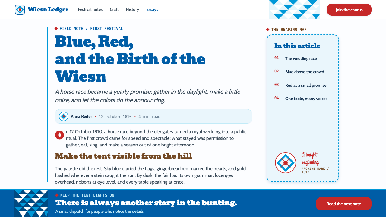
The blue diamonds carry a different inheritance. They descend from the Wittelsbach Rautenflagge and bring Bavarian heraldry into a festive setting. Repeated in a header or border, the pattern can identify the occasion before the viewer reads a word. Set against a crisp white ground, it gives the more irregular heart and lettering a clear visual frame. The design’s energy comes partly from this encounter between an orderly inherited pattern and exuberant handmade forms.
German Volkskunst connects those forms through an affection for visible craft. Hand lettering need not look mechanically uniform; a scalloped icing edge can retain its confectionery character; a ribbon can appear to tie the image together rather than merely underline a heading. The style’s history is therefore best understood as a layered visual tradition: an 1810 founding occasion, Bavarian heraldic identity, and a later fairground poster-and-heart language that makes the celebration immediately legible.
What defines the Oktoberfest Munich (1810) look?
Color
Bavarian blue leads against a crisp white ground. Gingerbread red is concentrated in the heart, while beer gold appears in ribbons and warm accents. The palette is celebratory because its colors have distinct jobs: blue locates the scene, red supplies the emotional focal point, and gold helps the composition feel generous. Letting every color compete equally weakens that sequence.
Typography
The principal headline is fat and slab-like, built to announce itself amid fairground noise. It is paired with looser, hand-lettered script associated with the icing message on a Lebkuchenherz. The two voices should remain distinct: the headline calls to a crowd; the script speaks to one person. Even in a dense layout, supporting information needs enough clarity to be read without deciphering decorative flourishes.
Diamonds and Rhythm
Repeating blue-and-white diamonds across a header establishes a firm rhythm and an immediate Bavarian cue. Their straight edges and regular alternation counterbalance the curves of the heart, ribbon, and icing. The pattern is most useful when it frames or organizes content; scattered diamonds with no relationship to the composition lose the force of a heraldic banner.
Gingerbread Heart
The ribboned Lebkuchenherz is the style’s most intimate emblem. A full red heart, white icing trim, scalloped contours, and a brief handwritten greeting make it feel like an object someone might carry away, not a generic love icon. Its material associations bring pretzel-and-icing warmth to the otherwise crisp poster structure.
Ribbon and Edge
Beer-gold ribbons can connect otherwise competing parts of the page, leading the eye from headline to heart or gathering a group of details into one festive cluster. Scalloped icing edges offer a softer counterpoint to the diamonds. Both should appear attached to something meaningful; ribbons and scallops used everywhere become visual noise rather than signs of celebration.
Festive Density
The composition is deliberately packed: pattern, headline, heart, ribbon, and small flourishes share the same surface. Its density should feel like a lively fair, not an accidental pileup. A clear headline, a dominant heart, and a readable path through the remaining information allow the ornament to amplify the invitation instead of obscuring it.
Who shaped Oktoberfest Munich (1810)?
Ludwig is named in the founding wedding fair of 12 October 1810. In the style’s historical account, his significance is as part of that originating occasion, not as the author of its later posters or lettering. Keeping the distinction clear helps separate the celebration’s founding from the visual canon that developed afterward.
Therese is the other person named in the founding wedding fair, and Theresienwiese gives the celebration a place-name tied to her. Her presence anchors the otherwise exuberant graphic language in a particular Munich occasion. The diamonds, heart, and poster can then be read as layers of celebration around a historical event rather than as a timeless collection of party motifs.
Dall’Armi appears among the key figures associated with the theme’s origins. The supplied account does not specify his individual contribution, so it would be misleading to assign him a particular poster, emblem, or role in the fair. His inclusion points instead to the human history behind the occasion while leaving the details of that contribution open.
Hupp is also listed among the theme’s key figures, without a specified work or dated action in the supplied account. Rather than crediting him with the blue diamonds or the gingerbread-heart design, it is more accurate to place his name alongside the heraldic and poster traditions that the style draws together, while distinguishing that association from a documented attribution.
How do you use Oktoberfest Munich (1810) today?
For presentation slides, begin with the difference between invitation and explanation. A cover can behave like a fairground poster: blue diamonds establish the top edge, a broad slab headline announces the subject, and one ribboned red heart supplies an unmistakable focal point. Content slides need a quieter version of the same language. Keep the white ground and a modest diamond header, then let section titles carry the fairground character while paragraphs remain straightforward to read.
Data slides should borrow the style’s organizing rhythm without turning every chart into confectionery. Use blue as the main series or structural cue, red to mark a genuinely important comparison, and beer gold to connect a callout to its explanation. A short patterned header or heart-shaped annotation may identify the deck, but the values and labels must remain legible. If every data point becomes a heart or a ribbon, the celebration overwhelms the evidence.
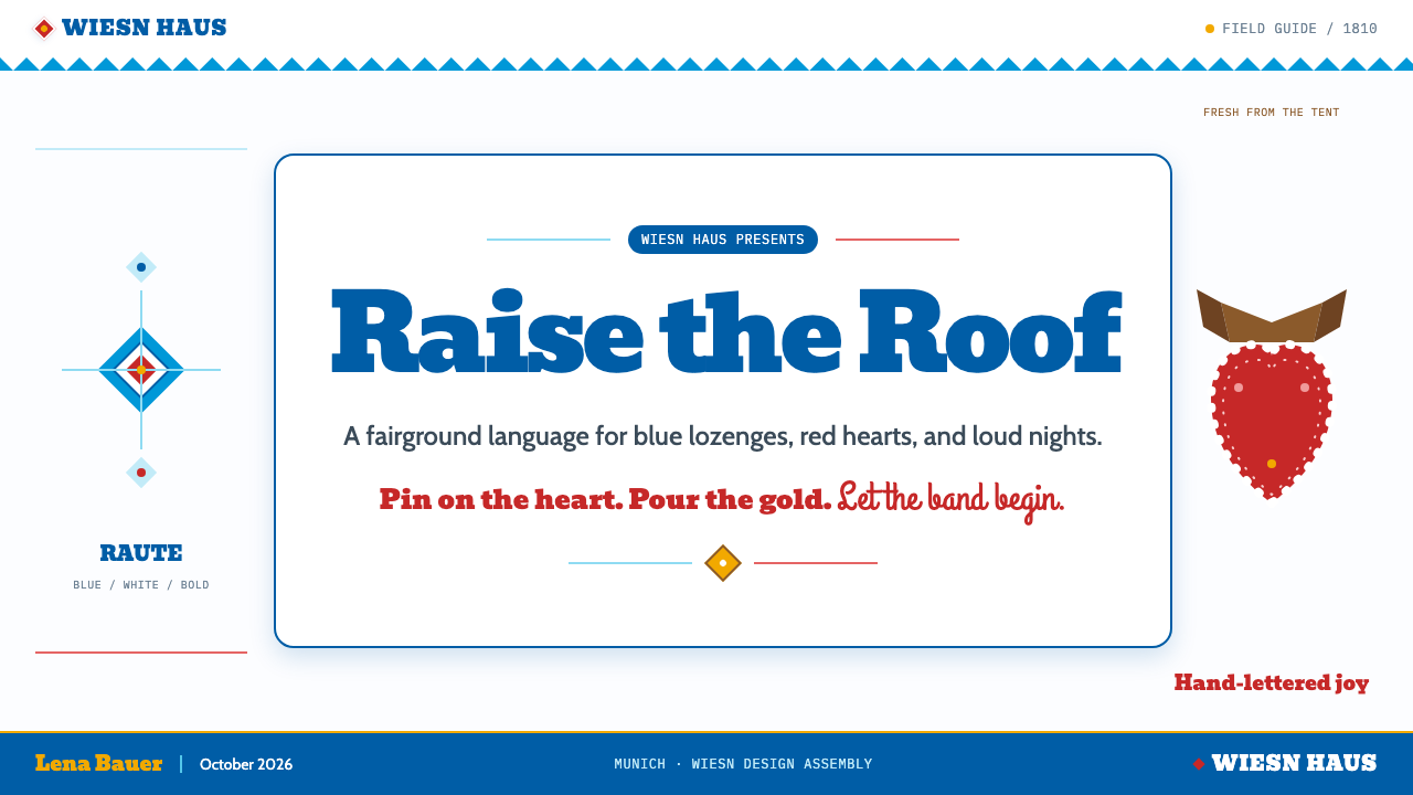
For web interfaces, the style fits an event dashboard or festive pricing page when the route through the information remains obvious. A diamond band can identify the page, thick headline type can distinguish major sections, and a red heart can focus attention on one featured action or offer. Use the hand-lettered voice sparingly for greetings and highlights. Controls, prices, and navigation should read plainly; a user should never have to interpret icing script to complete a task.
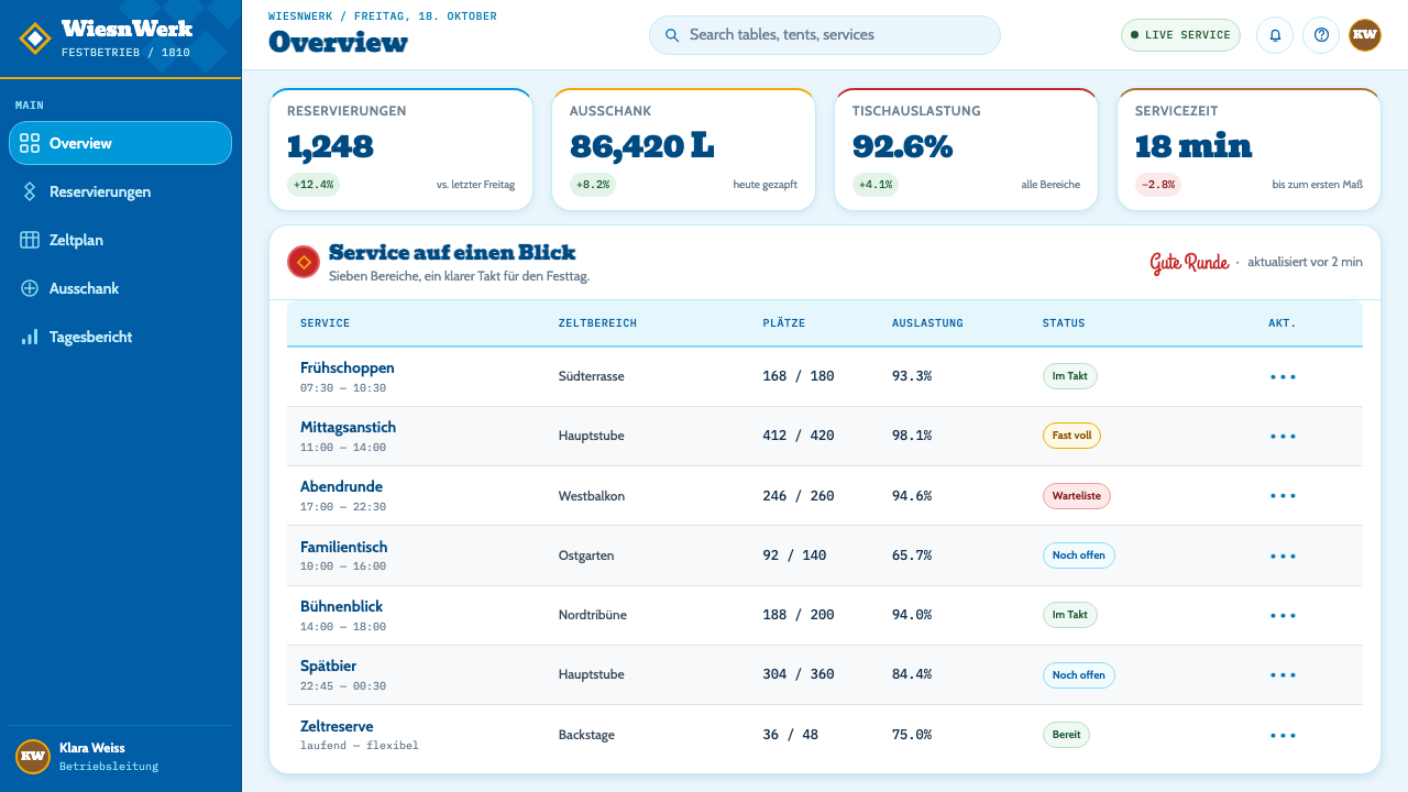
Editorial and marketing layouts can lean further into the poster tradition. An article opening might pair a large headline with a diamond border and a heart carrying a short phrase, while the body moves into calmer columns on white. A campaign page can alternate generous headline moments with compact clusters of ribbon, pattern, and confectionery detail. The most convincing applications preserve the contrast between public announcement and personal keepsake rather than applying the same decoration to every section.
The common mistake is to confuse festive density with unlimited ornament. A page filled with diamonds, hearts, scallops, ribbons, and competing display lettering may contain all the right ingredients yet communicate nothing. Choose which element leads: the Bavarian banner for identity, the slab headline for the message, or the gingerbread heart for warmth. Let the others support it, and keep the underlying information clear enough to survive the party.
Oktoberfest Munich (1810) — FAQ
Did the complete Oktoberfest poster style begin in 1810?
No. The wedding fair of Ludwig and Therese on 12 October 1810 is the celebration’s founding occasion. The supplied chronology places the recognizable poster-and-Lebkuchenherz canon much later, from the 1880s to 1910. Treating the founding date as the date of every familiar graphic element compresses a layered tradition into a single event.
Why are the blue diamonds more than a decorative pattern?
They descend from the Wittelsbach Rautenflagge and carry a Bavarian identity into the composition. As a repeated header, the diamonds give the poster a recognizable frame and a measured rhythm. That structure makes room for the livelier heart, script, and ribbons. Removing the pattern’s contextual role leaves only an attractive shape and weakens the style’s sense of place.
Can the gingerbread heart be replaced with an ordinary heart icon?
An ordinary heart preserves the outline but loses much of the reference. The Lebkuchenherz is a ribboned, confectionery object with a red body, white icing edge, and handwritten greeting. Those details connect it to the fairground’s handmade warmth and to the idea of a personal keepsake. If simplification is necessary, retain enough of the icing or lettering to make that origin recognizable.
How can a packed layout remain readable?
Give the crowded elements different responsibilities. Let the diamonds frame the page, the slab headline carry the main announcement, and the heart hold one short, affectionate message. Keep practical details in simpler lettering on the white ground. Density then becomes a sequence of discoveries rather than a contest in which every shape and word demands attention at once.
Is this style suitable for a restrained professional interface?
Only selectively. Its source language is festive, crowded, handwritten, and deliberately loud. A professional interface can borrow a blue diamond band or a confident slab heading to suggest the occasion, while leaving controls and dense information quiet. If the whole interface imitates a tent-pole poster, the visual celebration may interfere with the tasks users came to perform.
Related design styles
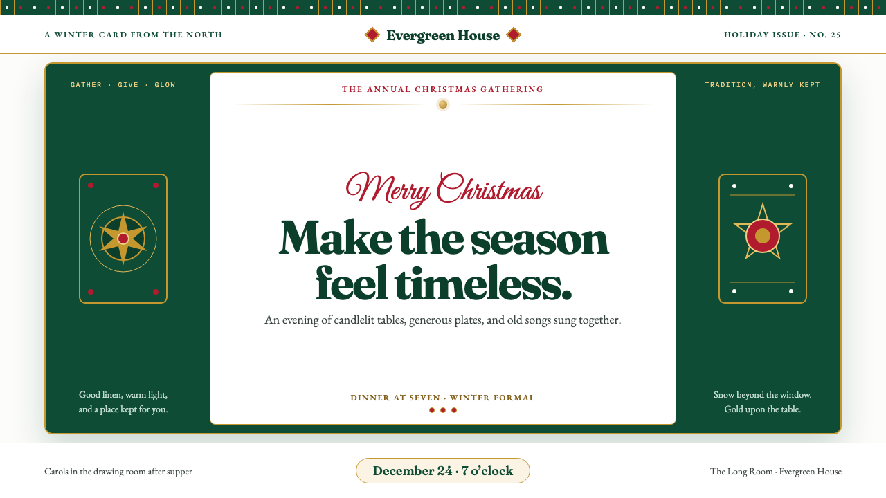 Christmas ClassicTradition glows warmly. Evergreen panels, berry-red notes and burnished-gold…
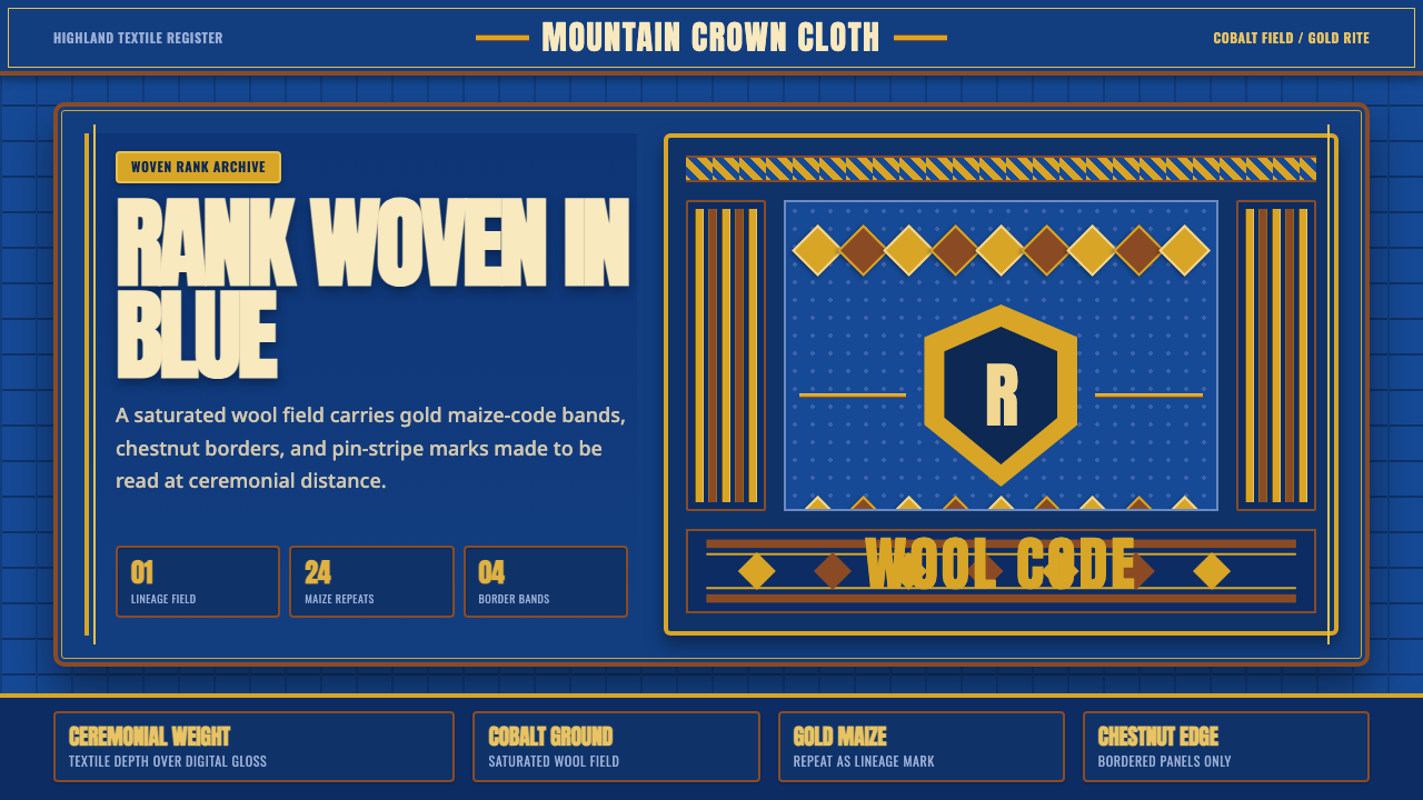 Basotho Seanamarena BlanketRank made visible. Cobalt wool, gold maize diamonds, and chestnut borders rea…
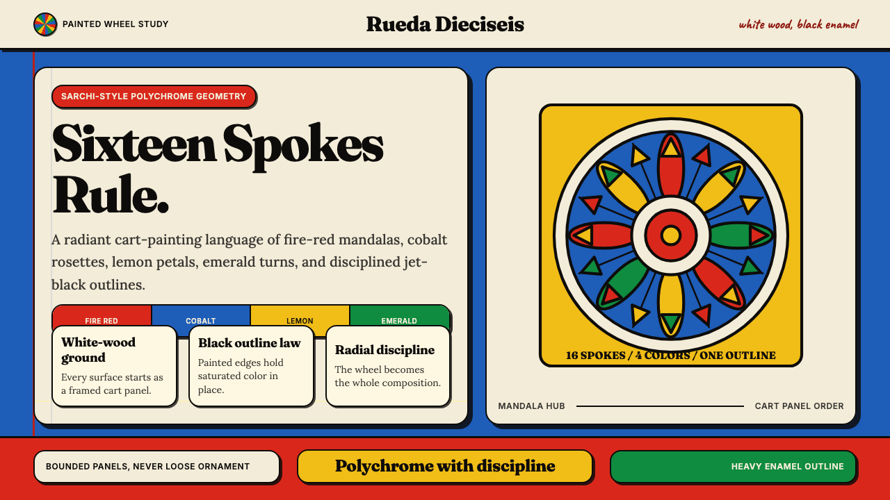 Costa Rican Oxcart Sarchí 1900Geometry sings. Fire red, cobalt, lemon and black outlines turn the wheel int…
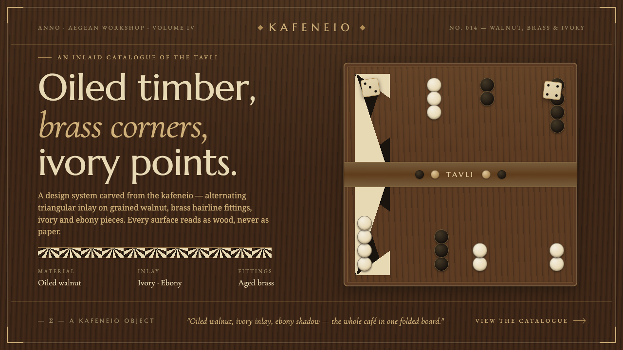 Greek Backgammon Tavli BoardThe kafeneio folded into a board. Ivory-and-ebony triangles inlaid on oiled w…
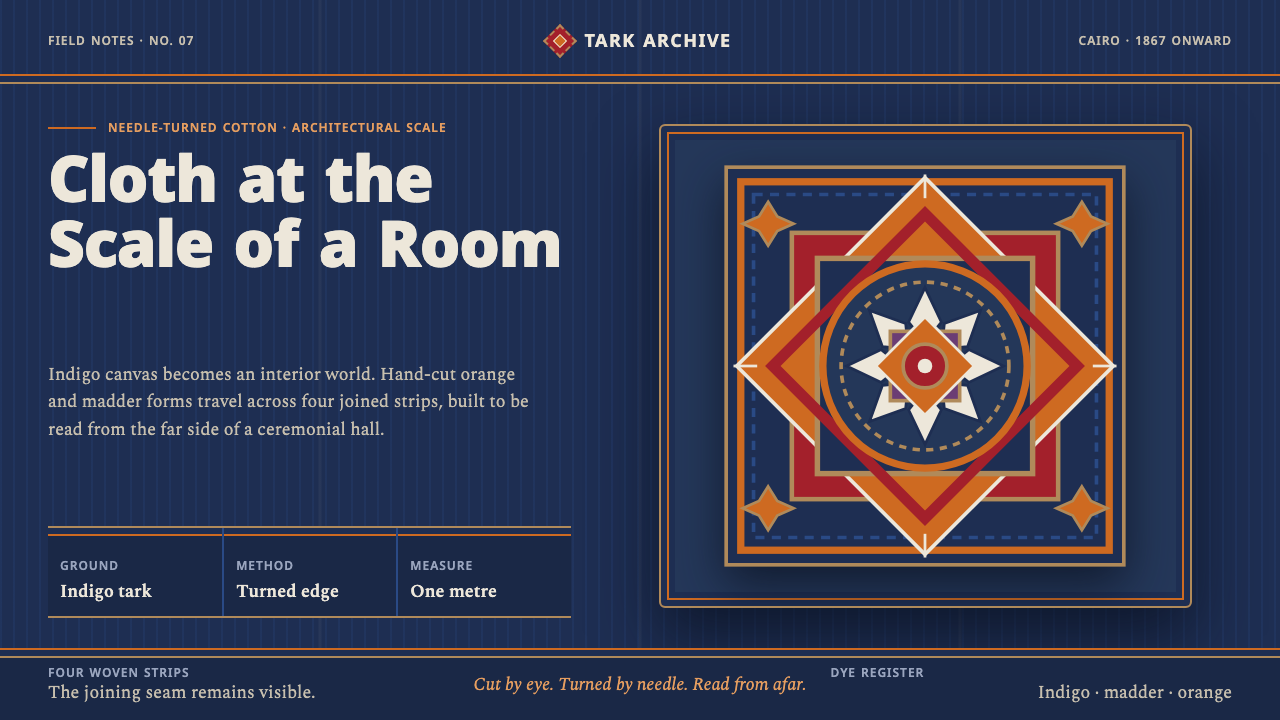 Khayamiya Tentmaker AppliquéCloth becomes architecture. Indigo canvas holds monumental orange and madder…
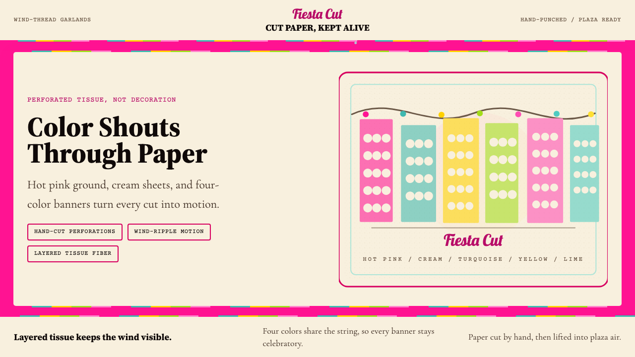 Mexican Papel Picado TissueFiesta cut paper. Hot pink, turquoise, yellow banners and hand-cut perforatio…