What is Bolesławiec Pottery?
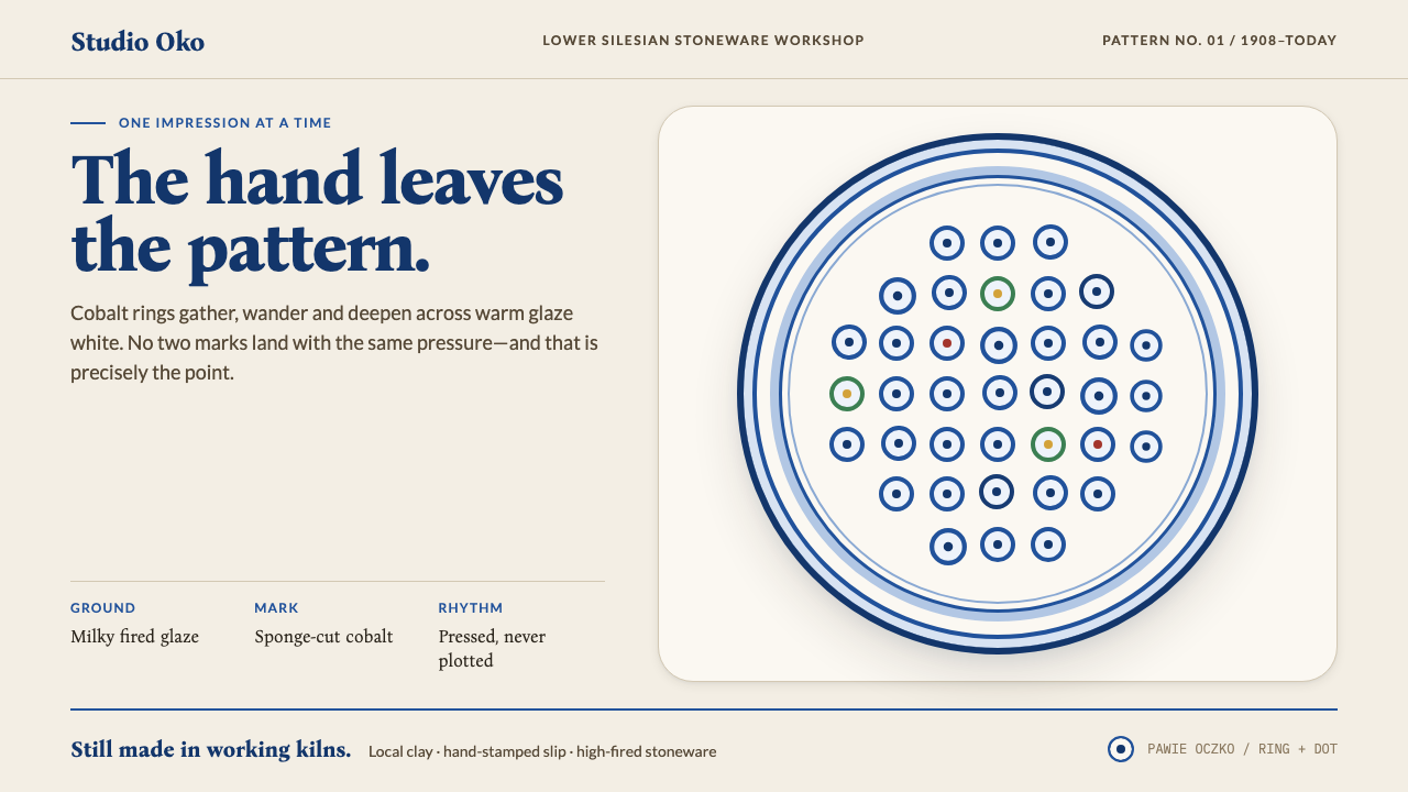
Bolesławiec pottery is a design that refuses to be tidy — cobalt stamps pressed one at a time onto warm white glaze, with every wobble left in on purpose.
Bolesławiec Pottery in brief
Bolesławiec pottery is the stoneware tradition of the Silesian town of Bolesławiec, in Lower Silesia, Poland, known in German as Bunzlau. Its modern look is a milky white glaze printed with cobalt-blue stamps, and its signature motif is the peacock's eye, pawie oczko in Polish: a small ring with a dot at its centre, cut from a natural sea sponge, dipped in pigment and pressed onto the clay one impression at a time. Around that core motif, leaves, flowers and simple borders grow in the same stamped vocabulary.
The one-at-a-time part is not a detail of production. It is the whole design. Where the potter pressed harder, the pattern thickens; where the wall of a bowl curves away, the repeating motif drifts out of register; where cobalt gathered in the sponge, the centre of each stamp is deep and the edge is thin. Nothing is exactly aligned, and that is exactly why the surface looks alive. The visual signature is a rhythm of near-repetition, as if a pattern had been written by hand, over and over, by someone who never tired and never quite repeated themselves.
In Curio's interpretation, the white glaze is the page and the cobalt is drawn on it. The ground is a warm, slightly creamy white rather than a clinical one. Blue stamps travel across it in rows, rings and borders, with density shifting from place to place. Touches of green, brick red and ochre appear only at flower centres and small leaves, never as large fields. It is a living workshop style, made by people who are still firing kilns today, not a museum piece behind glass.
Where does Bolesławiec Pottery come from?
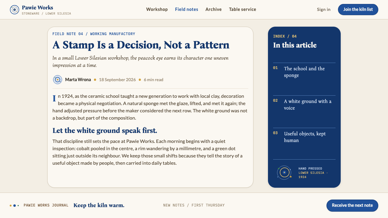
Bolesławiec has fired stoneware from local Silesian clay since the Middle Ages. Stoneware is a clay body fired at high temperature until it becomes dense, hard and watertight, and the region's earth suited it well. Before the cobalt-on-white look existed, the town's reputation rested on salt-glazed ware, a tough, practical, brown-grey stoneware whose surface comes from salt thrown into the kiln. These are the pre-1900 roots of the craft: sturdy domestic vessels made for kitchens and cellars, not decorative showpieces. The material and the workshop habits were already in place long before the pattern that now defines the town.
The look the world recognises today is younger. Around the early 1900s, milky white glaze with cobalt stamping settled into its familiar form around the town's ceramic school. Schools matter in this story because a craft does not become an idiom by accident; someone has to decide which marks are the right ones, teach them, and pass them on. The sponge-stamp technique, called stempelki in Polish, gave the town a pattern language that could be learned quickly, produced by many hands and still look individually made. It belongs to the wider family of European folk ceramics, in which simple tools and a short list of motifs yield endless variation.
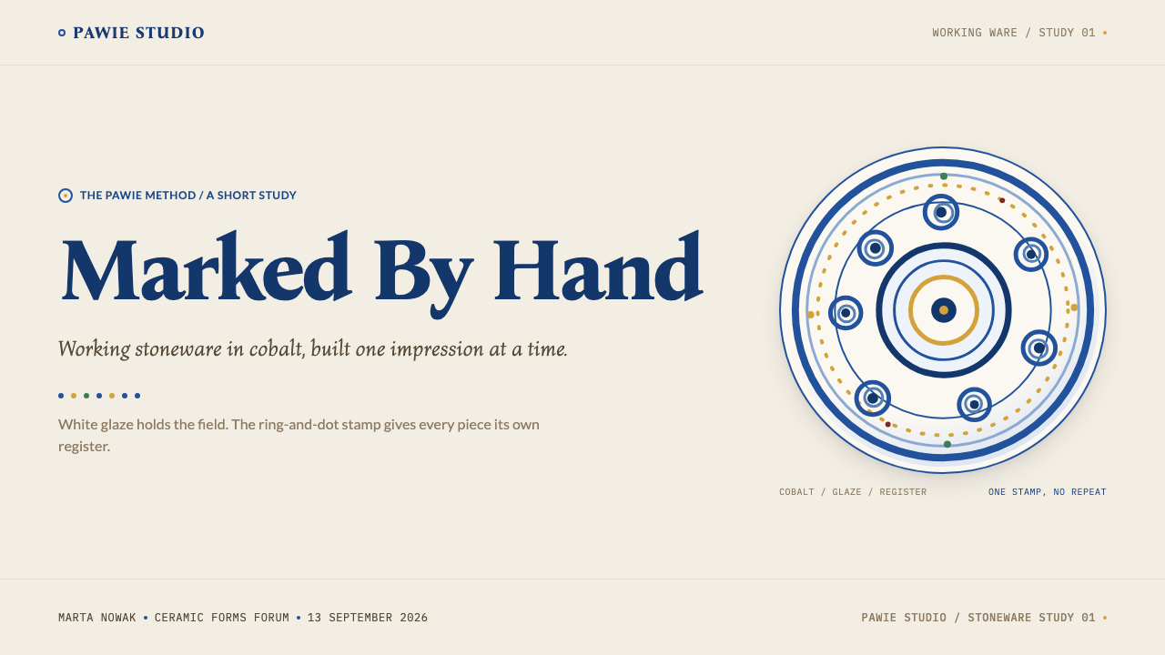
The peacock's eye is the keystone of that language. It is made from natural sea sponge, cut into a ring-and-dot shape, loaded with pigment and pressed straight onto the surface. A ring with a dot is simple enough that anyone can stamp it and flexible enough to become a flower, a berry, a feather or a border. The motif's name points to the fan of a peacock's tail, but the feeling is humbler and more domestic: it is pattern that comes from touch, pressure and repetition rather than from drawing. Because the stamp is pressed rather than painted, each impression records how it was made.
The workshop tradition has continued under many names and regimes. Bunzlau's ceramic school workshops formed the early milieu, and the Zakłady Ceramiczne Bolesławiec, the Bolesławiec Ceramic Works, stands for the continuing manufacturing tradition in the town. Through all of it the essential logic has stayed the same. Work is done by hand, in small steps, with a shared vocabulary and plenty of room for human variation. This continuity is why designers can treat the style as a live idiom rather than a historical costume, and why its quirks, which a machine would remove, are treated here as the point.
What defines the Bolesławiec Pottery look?
Color
The palette is warm white and cobalt blue. The white is a milky, slightly creamy glaze tone, never a stark screen white, and the blue is a deep, saturated cobalt that looks darker where pigment has pooled and lighter at the edges. Everything else is a small accent: green, brick red and ochre dabbed sparingly. The result is calm and cheerful at once, with blue doing nearly all the work.
The Ring-and-Dot Stamp
The basic mark is a ring with a dot at its heart, the peacock's eye, pressed as a single impression. From that one shape the pattern grows into flowers, berries, feathers, scalloped edges and borders. Its outline is soft because it comes from a sponge, not a vector tool, and it never has a perfectly clean circle. Variety comes from arrangement and pressure, not from adding new motifs.
Hand Pressure and Density
Density is not uniform. Where the hand pressed harder or the stamper worked faster, marks crowd together; elsewhere they loosen and let the white show. This unevenness gives a surface its sense of movement, like a field where the weather has been heavier in some places. In a layout, it translates to clusters and gaps that feel organic rather than gridded to a perfect rhythm.
Drifting Registration
Because a bowl's wall curves, a row of stamps cannot stay perfectly straight or evenly spaced. Rows tilt, spacing shifts, and motifs slip slightly out of alignment. The style treats this drift as a feature. Stamps should wander a little from their rows, borders should waver gently, and corners should never close with machine precision. A pattern that lines up perfectly looks less like Bolesławiec, not more.
Cobalt Pooling
Within each stamp, the pigment gathers into a darker centre and thins toward the rim, much as it does under fired glaze. The effect gives each mark a tiny interior depth and a soft, slightly irregular edge. Designs should echo this with soft-edged shapes and tonal variation inside each element, not flat fills with hard outlines. The darkest blue is kept for where the stamp has held the most colour.
Glaze as Page
The white is not a background behind the decoration; it is the surface the decoration is drawn on. Large areas are left empty on purpose, and the white should feel glossy and slightly warm, as if light were sitting inside the glaze. Text, cards and interface elements all live on this one ground. Separation between sections is made with changes in density of stamps, not with heavy boxes or lines.
Sparing Spot Colour
Green, brick red and ochre are used only as tiny touches at flower centres and on small leaves. They are punctuation, not paragraphs. A page that adds large areas of those colours stops being Bolesławiec and becomes a generic folk-craft theme. Keep the ratio firmly in favour of white and blue, and let one small warm dot make an entire flower.
Who shaped Bolesławiec Pottery?
The ceramic school and its workshops in Bunzlau, today's Bolesławiec, are where the cobalt-on-white idiom settled in the early 1900s. A school turns a local habit into a teachable method: it decides what counts as a correct mark, trains new hands to make it and carries the pattern across generations. For a design system, the school is a reminder that this style is a shared grammar, learned and repeated, not the invention of one artist.
The Bolesławiec Ceramic Works represents the town's continuing manufacturing tradition, the organised workshop side of the craft where the stamped pattern has been reproduced at scale without losing its handmade character. It matters here because it shows that this aesthetic is not fragile or museum-bound. It lives in working kilns and everyday tableware, which is why the style should look usable and cheerful rather than precious.
The anonymous decorators who cut sea sponge into stamps, load them with cobalt and press them onto the pot are the hands inside the style. Their skill is a feel for pressure, rhythm and spacing: knowing how hard to press, how far to move, when to leave white. Everything the design system calls organic density or drifting registration is a record of their touch.
How do you use Bolesławiec Pottery today?
Bolesławiec works best for friendly, tactile, human-scale products: food and kitchenware, home goods, craft marketplaces, hospitality, community projects, education for younger audiences and anything that wants to feel handmade without feeling rustic. It is a light-ground system built on a warm white page and a single strong blue, so it sits comfortably in everyday, daylight contexts.
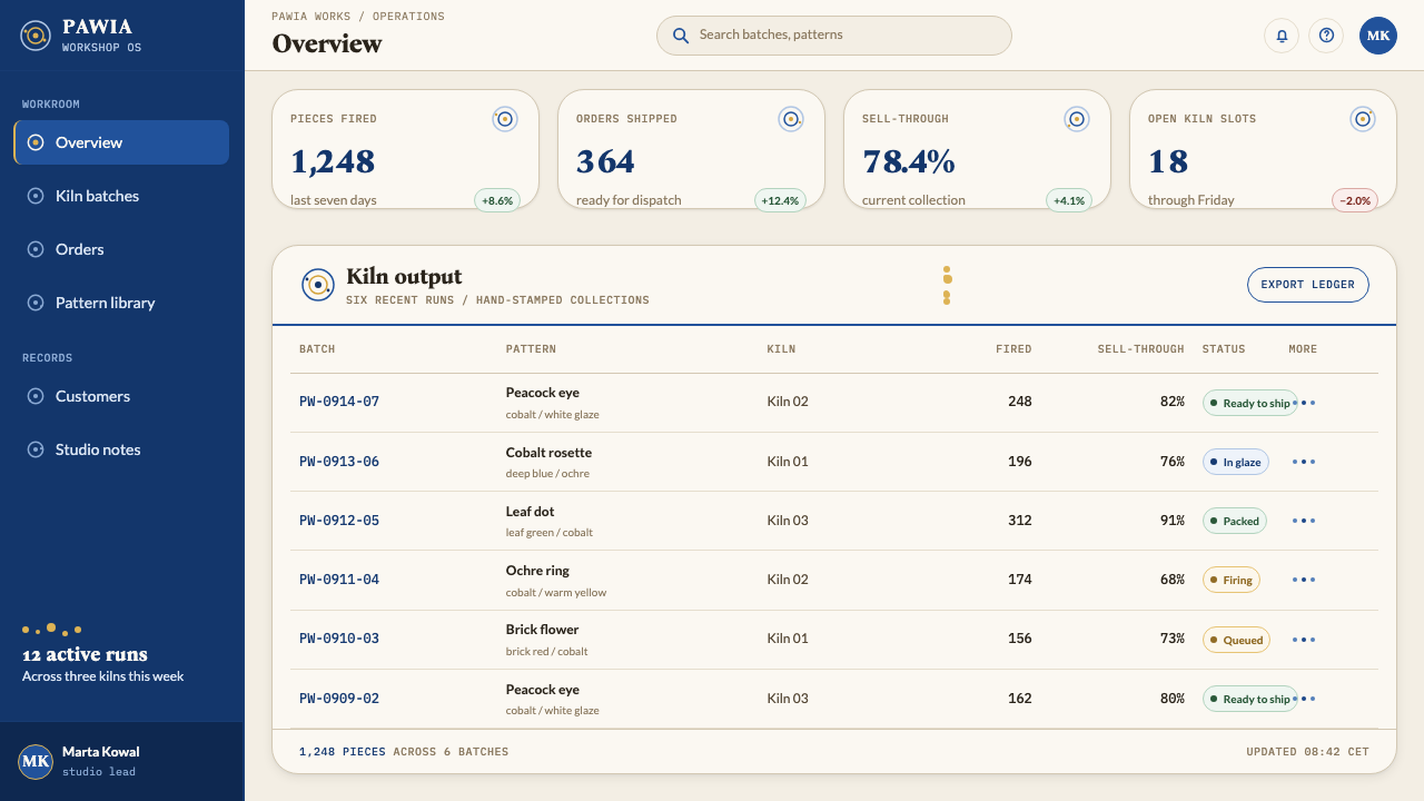
For presentation slides, a cover can be nearly all white with a loose border of ring-and-dot stamps running around one or two edges and the title set in a clear dark blue. Content slides should keep large areas empty and let a few clusters of stamps mark section changes. Data slides suit round, soft marks: dot charts, bubble charts and simple bar charts coloured in cobalt, with small warm accents to highlight a single value.
For web interfaces, treat the page as glazed ceramic. Cards, forms and navigation sit directly on the warm white ground with little chrome. Buttons can be solid cobalt with a gentle inner variation, and decorative stamp borders can mark headers and footers. Dividers can be a short row of stamps that wavers slightly instead of a ruled line. Keep the interface friendly: rounded shapes, soft edges, plenty of air and an occasional warm accent for success or highlight states.
For editorial and marketing work, the style excels at product storytelling, recipes, shop pages and maker profiles. Use a border of stamps at the top of a page, let headline type be warm and slightly irregular in feel, and place photographs inside softly rounded frames. Pull quotes can be set inside a loose ring of dots. Photography should be natural-light and slightly warm, never harsh studio white.
The most common mistake is making the pattern perfect. A seamless vector tile with exact spacing and identical circles looks like wallpaper and kills the handmade effect, so add variation in size, spacing and density. The second mistake is overusing the accent colours: green, brick red and ochre are tiny touches. The third is placing the pattern on top of a cold grey or pure white ground, which makes the blue look digital. Keep the white warm and the blue deep.
Bolesławiec Pottery — FAQ
What is the peacock's eye motif?
The peacock's eye, pawie oczko in Polish, is the signature stamp of Bolesławiec pottery: a small ring with a dot at the centre. It is cut from natural sea sponge, dipped in cobalt pigment and pressed onto the clay one impression at a time. Flowers, berries, feathers and borders are all assembled from this single shape, which is why the pattern looks both simple and endlessly varied. The unevenness of each impression is part of its character.
Why should the pattern look imperfect?
Because the imperfection is how the pattern is made. Each stamp is pressed by hand, so pressure changes, rows drift across the curved wall and cobalt gathers unevenly. A perfectly regular pattern would be technically easier to produce on a screen, but it would hide the one thing that tells the viewer a person made it. In design terms, tiny variations in position, size and tone are what separate this style from generic dotted wallpaper.
How is Bolesławiec different from other blue-and-white pottery?
Many traditions pair blue with white, but Bolesławiec is defined by its method. Pattern comes from pressed sponge stamps rather than from fine brush painting or printed transfers, so marks are soft, circular and unfinished at the edges. Decoration is built from a short list of motifs repeated with variation, and the ground is a warm, milky glaze. The result is closer to a folk-craft rhythm than to formal porcelain painting, and the design language should stay informal and tactile.
Can this style work on a dark background?
It is a light-ground system. The idea is that glaze is the page and cobalt is drawn on it, so the white has to be a real, warm, glossy surface. A dark inversion changes the logic: the blue stamps would need to become pale, and the sense of pigment pooling inside a glaze disappears. If you need a dark variant, treat it as a different design rather than a flipped one, and keep the stamps as the main texture.
What kinds of products suit this style?
It suits products that want to feel warm, human and made with care: kitchen and tableware brands, food and drink, home and lifestyle shops, craft marketplaces, hospitality, family and community services, and educational products. It is less suited to austere, high-precision contexts such as financial analytics or industrial control panels, where a hand-pressed, slightly wandering pattern would feel out of place. Match its friendliness to your product's tone.
Related design styles
 Bulgarian Rose Attar (Valley of Roses)Quietly precious craft. Moss green, dusty rose and brass borders frame a dawn…
 Burmese Cane RattanWoven warmth holds the page. Walnut cane lattice glows with cinnabar rim line…
 Fulani Milk CalabashMatte craft burns bright. Oiled gourd tan meets charred concentric linework.
 Kuba Calabash BrownPrestige in dark wood. Calabash brown ground, dense incisions, tukula red rel…
 Bashkir Honeycomb Felt OrnamentSteppe craft feels weighty. Umber felt holds blue honeycomb and raw-wool hook…
 Čiurlionis SymbolismCosmos becomes music. Midnight blue-violet washes and pale gold stars drift i…